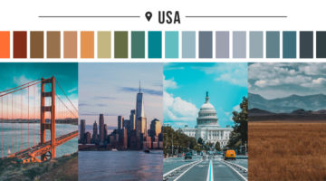
Luxury travel specialists Sovereign have come up with a series of color palettes of 18 popular destinations from across the globe. The objective was to highlight the range of unique colorscapes that can be seen around the world. Each palette consists of 20 colors that were derived from iconic locations in that country. The palettes are a reflection of their culture, … [Read more...]
28 Epic Memes For Graphic Designers
Are you in the middle of a tough project with a stiff deadline? Is your boss or client being a d*ck? Are you tired of creating "Buy Two, Get One Free" flyers and banners? If yes, then indulge in some meme-therapy and brighten up your day. Scientific research has proven that memes help reduce work-related stress by stimulating the release of endorphins that trigger a sense of … [Read more...]
Free Photoshop Pack Of Beautiful Gradients For All Your Design Needs
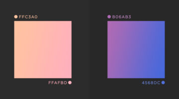
Vibrant colors and gradients are one of the major trends in graphic, web, and UI design nowadays. To make life easier for designers everywhere, Paris-based graphic designer Leo Simon has compiled a set of 300 beautiful gradients into a Photoshop gradient file (GRD), available for free. We've shortlisted some of our favourites from Leo's collection and shared them below with … [Read more...]
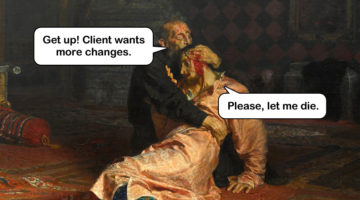
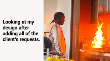
Shit Clients Say – 13 Most Unforgettable Quotes
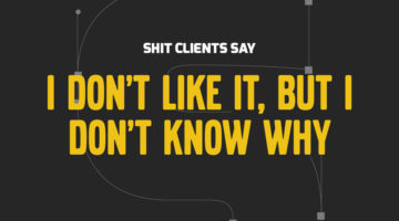
How many times have you had a client send a list of "final" changes AFTER they've approved the design? What about when they ask you to find an image from Google, or copy someone else's logo, or when they tell you to deliver designs by Monday after briefing on Friday? We all come across unreasonable client demands on a daily basis, but the folks at BeeWits have a dedicated … [Read more...]
Designer Creates Clever Negative Space Logos That Visualize The Name Of The Company
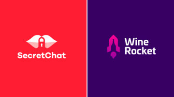
Lithuania-based graphic designer Leo has come up with a series of clever logos that combine the name or initials of the company into one unique symbol using negative space. The logo in each case visually represents the name of the company. For example, the logo for Secret Chat is a pair of lips with a padlock in the negative space between the lips. The logo for Wine Rocket … [Read more...]
Simple, Useful Design Tips For UI/UX Designers
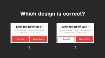
'Sparklin Design Tips' is a series of short, useful UI/UX tips by New Delhi-based digital agency Sparklin, shared every Tuesday on their social media channels. Using before-and-after mockup images, the team at Sparklin explains good UI/UX practices with visual examples, making them easy to understand and comprehend. Whether you're a newbie or a seasoned designer, these … [Read more...]
Graphic Designer Creates Logos Of Famous Painters – Picasso, Van Gogh, Da Vinci, And More
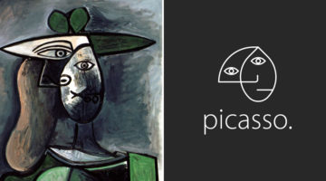
Brazilian art director Milton Omena has come up with an interesting project that imagines what logos of famous painters from Renaissance, Impressionist, and Modern Art periods would look like. He studied the painting styles and personalities of legendary artists like Leonardo Da Vinci, Vincent Van Gogh, Pablo Picasso, and created a unique symbol for each one of them. Milton, … [Read more...]
Designer Uses Beautiful Gradients And Abstract Shapes To Describe Meanings Of Words
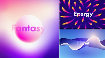
UK-based graphic designer Evgeniya Righini-Brand has come up with a fascinating project titled “Gradient Studies” in which she uses vibrant gradients and abstract shapes to visually describe the meanings of various words. For example, the visual for the word "flow" is an abstract liquid shape with multiple gradient meshes in blue and white. The visual for the word "energy" is a … [Read more...]
15 Brilliant Art Tributes To The MARVELous Stan Lee
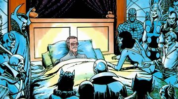
Stan Lee, the legendary writer, editor and publisher of Marvel Comics, passed away on November 12, 2018 in Los Angeles, California. He was 95. In collaboration with artists Jack Kirby and Steve Ditko, Lee co-created iconic superhero characters like Spider-Man, the Hulk, the X-Men, the Fantastic Four, Doctor Strange, Black Panther, and Daredevil. He also co-created the … [Read more...]
10 Great Fonts You Should Use, And 9 Awful Fonts You Should Avoid
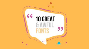
"Typography is an art. Good typography is art." - Paul Rand. Font and typography choices can make or break your design. But with so many fonts to choose from nowadays, which ones should you use, and which ones should you avoid? Tom Cargill from Satori Graphics has come up with an excellent video that features ten prominent fonts used by professional designers, along with … [Read more...]
Designing Logos For Companies With Long Names Can Be Tricky, Here Are 25 Great Examples
When it comes to logo design, a long company name can be quite a challenge. You want to create a logo that's clean and memorable, but lengthy lines of text can look cluttered and uninspiring. Professional designers use different techniques to solve the visual challenges of a long brand name. These include: 1. Splitting the name into two or three lines 2. Using different … [Read more...]
20 Memes Every Designer Will Relate To
Are you in the middle of a tough project with a stiff deadline? Is your client or boss being a prick? Are you tired of creating "Buy One, Get One" ads and banners? If yes, then indulge in some meme-therapy and brighten up your day. Memes have been scientifically proven to help reduce work stress by stimulating the release of endorphins that trigger a sense of well-being … [Read more...]
Clever Illustrations Of Words That Sound The Same But Have Different Meanings
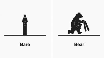
Michigan-based illustrator Bruce Worden creates funny, witty illustrations of homophones - words that have the same pronunciation but different meanings, spellings, or origins. A self-professed grammar nerd, Worden explains the differences between the words with minimalist pictograms that visualize their meanings. Over a period of five years, he has created over 300 … [Read more...]
Graphic Designer Combines Two Completely Unrelated Objects Into Clever Logos
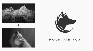
Indonesian designer Rendy Cemix has come up with an interesting project in which he combines the shapes of two completely different objects into one unique logo. The logo in each case is a visual representation of the brand name. For example, the logo for Mountain-Fox is an aesthetically designed symbol of a fox with ears that look like snow-capped peaks. The logo for … [Read more...]
Photographer Shows Off Mad Skills By Sharing Raw Behind-The-Scenes Images Alongside Stunning Final Photos
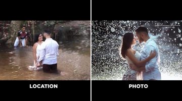
Brazilian photographer Gilmar Silva has come up with an impressive project titled “Lugar x Foto” (Place and Photo), in which he shares behind-the-scenes images of his shoots alongside the final photograph. The series focuses on showing what a photoshoot really looks like before it turns into a polished image. The first photo shows the actual location and the working … [Read more...]
LOL: Designers Show What Superheroes Would Look Like In Ads For Household Products
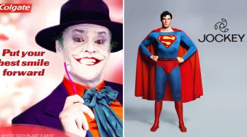
What would famous superheroes and villains look like in ad campaigns for household items we use everyday? DesignCrowd ran a Photoshop contest recently in which designers had to imagine famous superheroes and villains endorsing household products to earn an extra buck. Here are some of the best entries. … [Read more...]
27 Clever Ambigram Logos That Look The Same When Viewed Upside Down
An ambigram is a typographical design or symbol consisting of text modified in such a way that it can be read in different orientations - inverted, rotated, mirror-image, etc. For example, the logo of Sun Microsystems (no. 4 below) is a brilliantly-designed ambigram that reads 'SUN' from all directions. Another famous example is the New Man logo (no. 6 below), designed by … [Read more...]
Remember The Graphic Designer Who Trolled Photoshop Requests? He’s Back!
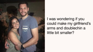
Are you looking for someone who can Photoshop your ex-boyfriend or girlfriend out of a photo? Or fix your bald patch and cut some flab off your waist? Is there a favourite photo of yours that needs some minor Photoshopping to make it even better? If yes, then James Fridman is the man for the job. The British designer is an internet star with nearly 1.5 million followers on … [Read more...]
Designer Creates Beautiful Team Badges During The World Cup
Venezuela-based illustrator and graphic designer Moises Fernandez designed some beautiful team badges for his Instagram page during the World Cup. Created with Adobe Illustrator and Photoshop, the crests feature beautiful illustrations and artwork, with national symbols and relevant colors for each team. Check them out below. … [Read more...]
Designer 3D Prints Famous Logos Into Items You Can Use Everyday
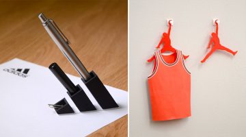
Japanese designer Taku Omura has come up with an amusing project in which he 3D prints famous brand logos into everyday items you can use at home or office. For example, Omura 3D-printed the Adidas logo and turned it into a pen stand. Louis Vuitton's 'LV' monogram logo was turned into a card holder by elongating the 'V'. The Air Jordan logo was turned into a clothes hanger, … [Read more...]
19 Graphic Design Mistakes That Novice Designers Make
After a few years in the graphic design business, you realize how important it is to get the basics right. Like using proper font and color combinations, implementing visual hierarchy, using grids, alignment, white space, and so on. The team at Visme, an online tool for creating infographics and presentations, has come up with an excellent visual list of 19 graphic design … [Read more...]
21 Memes Only Graphic Designers Will Understand
Monday can be a tricky day for designers, with clients, bosses, and deadlines breathing down their necks. We thought you guys could use some meme therapy to help brighten up your day. Check out the compilation below, and don't forget to browse through some of our other popular meme posts. … [Read more...]
Designer Creates Clever Logos By Combining Two Or More Different Shapes Into One
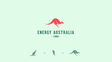
Kochi-based designer Shibu PG has come up with a series of interesting logos in which he combines the shapes of two or more different objects and letters into one unique logo. The logo in each case is a visual representation of the brand name. For example, the logo for Energy Australia is a combination of the shape of a kangaroo and the energy symbol ⚡️. The logo for … [Read more...]
Top 20 Car Logos Of All Time
From American muscle to European exotics, everyone has a favourite car they would like to own one day. But do you also have a favourite car logo? In automotive branding, a logo does more than identify a brand; it embodies the brand’s heritage and values. These emblems are designed with precision to evoke feelings of elegance, power, and cutting-edge technology, creating a … [Read more...]
10 Photoshop Commandments Every Designer Should Follow
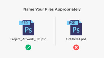
When you’re working in a team and multiple designers and developers are working on the same Photoshop file, there are certain protocols you need to follow. You need to use an appropriate naming convention for PSD files, like ProjectName_Job_Version.psd instead of the default Untitled-1.psd. You should label your layers and organize them into groups. You should also save all … [Read more...]
10 Best Uses Of Color In Movies
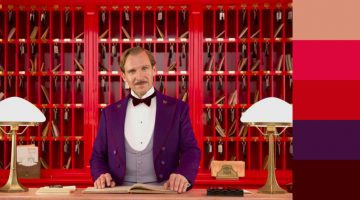
Right from the first scene, color sets the mood and tone of a film before any of the actors have uttered a word. Since the dawn of colored cinema, filmmakers have used color to convey drama and emotion in storytelling. Visual-minded directors and cinematographers have created color palettes almost as memorable as the films themselves. The Wachowskis used a green color … [Read more...]
FIFA World Cup Logos From 1930 – 2022, Which One’s The Best?
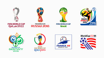
The FIFA World Cup is the most widely viewed and followed sporting event in the world. The logo for the 2022 World Cup in Qatar has been unveiled and we decided to do a round-up of all the World Cup logos from 1930 - 2022. During the first four World Cups from 1930 - 50 (there were no tournaments in '42 and '46 due to World War II), the organizers created posters instead of … [Read more...]
8 Beautiful Flat Color Palettes For Your Next Design Project

UI/UX designer Ebtihaj Khan has created a series of minimalist flat color palettes for graphic, web, and UI projects. Each palette consists of five colors with their hex codes mentioned alongside. Khan has included both linear and contrasting color schemes. The beautiful presentation of these palettes, with the blurred vignette effect in the background, was inspired by … [Read more...]
Clever Logos Of Letters A To Z Based On Common Words That Start With Them
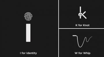
UK-based graphic designers Liam + Jord undertook a 36-day typography challenge to create logos for every letter of the alphabet based on common words that start with them. For example, the letter 'b' has been designed to look like a book, the letter ‘f’ looks like a flag, 'w' looks like a whip, and so on. The objective was to use the shapes of the letters to visually … [Read more...]
9 Things Graphic Designers Want To Tell Clients, And Everyone Else
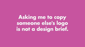
How many times have you received a design brief that asks you to copy someone else's logo? Or a brief that says "Just come up with a few quick logos." Has a client ever asked you to use Comic Sans? London-based product designer Anneke Short has come up with a series of minimalist posters titled "Confessions of a Designer" that feature nine things every graphic designer would … [Read more...]
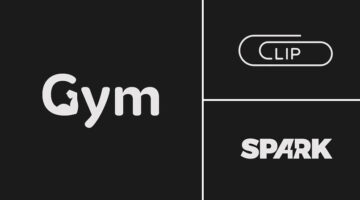
Designer Creates Clever Logos That Visualize The Name And Business Of The Company
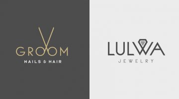
Kuwait-based graphic designer Rami Hoballah has come up with a series of minimalist logos that combine the name and the product (or service) of the company into one unique symbol. The logo in each case visually represents the brand name and the nature of its business. For example, the logo for Groom Salon is a pair of scissors made with the two o's in the word 'Groom'. The … [Read more...]
Two Designers Challenged Themselves To Create A Typographic Logo Every Day For A Year, And They’re Pretty Cool
UK-based graphic designers Liam + Jord undertook a 365-day challenge to create one new typographic logo of a common word we use every day. The objective was to visually represent the meanings of the words by using symbols, negative space, or by adding geometric elements to the letters. For example, the letter 'i' in the word 'drive' looks like a gear stick, the letter 'f' in … [Read more...]
Honest Meanings Of Flag Colors Of 15 Countries
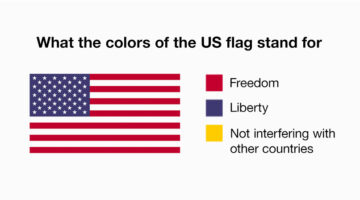
Every country has an official explanation for its flag colors, something about history, heritage, unity, all that. And then there’s… this version. People online have been giving those same colors completely different meanings, based on what each country is actually known for right now. Not the textbook version, the real-world one. The kind shaped by headlines, memes, … [Read more...]
Designer Creates Clever Logos That Visually Represent The Name And Business Of The Company
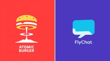
Lithuania-based graphic designer Leo has come up with a series of minimalist logos called "Smart Logos" that combine the name and the product (or service) of the company into one unique symbol. The logo in each case visually represents the brand name and the nature of its business. For example, the logo for Atomic Burger is a burger on top of a mushroom cloud. The logo for … [Read more...]
13 Things Client Servicing Executives Should Never Say To Graphic Designers
If you've ever worked in a creative agency, you must be aware of the love-hate (or hate-hate) relationship between client servicing executives and designers. CSEs have to manage client expectations and their primary objective is to keep the client happy. Designers want to keep the client happy too, but they don't want to compromise on aesthetics and creativity. Taking a … [Read more...]
- « Previous Page
- 1
- …
- 3
- 4
- 5
- 6
- 7
- …
- 15
- Next Page »