Every few years, design goes through a visible shift — not a sudden break, but a gradual reorientation of what feels current versus what feels tired. What's interesting about the trends making the rounds right now is that many of them aren't new inventions. They're revivals, recombinations, and reactions — to digital fatigue, to the sterility of AI-generated imagery, and to … [Read more...]
Top 10 Logo Design Trends For 2026 And How To Use Them
Logo design in 2026 is less about visual novelty and more about meaningful distinction. Brands are no longer competing only on aesthetics, they are competing for attention, trust, and emotional connection across crowded digital environments. A logo today must perform across screens, motion systems, packaging, social feeds, and real world applications, while still feeling … [Read more...]
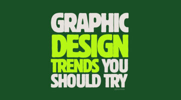
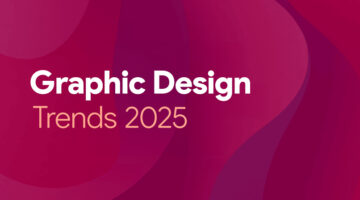
Top 20 Graphic Design Trends For 2026
Graphic design has always been a reflection of its moment, shaped by technology, culture, economics, and taste. What changes year to year is not merely how things look, but what designers choose to emphasise. In 2026, design feels less concerned with perfection and more interested in presence. There is a visible shift toward systems that feel intentional rather than ornamental, … [Read more...]
Portfolios Of Designers Who Have Worked At Apple, Google, Meta, And More
A well-crafted portfolio is more than just a collection of work—it’s a designer’s identity, storytelling tool, and a powerful career asset. Whether you're a seasoned professional or an aspiring UX/UI designer, exploring top-tier portfolios can ignite new ideas, refine your presentation style, and set a benchmark for excellence. In this curated list, UI/UX Designer Shubham … [Read more...]
Top 12 Web Design Trends For 2025
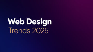
Web design is changing fast, and 2025 is set to push things even further. With technology-driven experiences, immersive visuals, and a strong focus on interactivity, websites are becoming more dynamic, engaging, and emotionally resonant. Designers are blending nostalgia with innovation, bringing back retro aesthetics while experimenting with hyperreal effects and tactile … [Read more...]
19 Elegant And Timeless Font Pairings For That Classic ‘Old Money’ Look
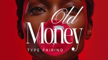
The old money aesthetic is all about quiet confidence—timeless, refined, and effortlessly sophisticated. From tailored fashion to grand interiors, this look is steeped in tradition and understated luxury. Fonts (or typefaces for the purists) play a subtle yet powerful role in capturing that essence, evoking prestige, heritage, and an enduring sense of class. Whether you’re … [Read more...]
Top 8 Typography Trends For 2025
For typography enthusiasts, staying ahead of the curve isn't just about keeping their designs relevant—it's about setting the tone for visual communication that resonates deeply with audiences. Whether it’s the choice of serifs that evoke timeless sophistication or experimental typefaces that challenge conventions, typography holds the power to shape how messages are … [Read more...]
Top 7 UI Design Trends For 2025
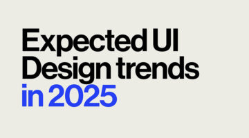
For UI designers, staying attuned to emerging trends is more than just keeping their designs modern—it’s about creating user experiences that truly engage and connect with audiences. In 2025, a mix of technological innovation and daring creativity is transforming the world of UI design. From streamlined minimalism to dynamic immersive scrolling, these trends equip designers … [Read more...]
7 Designer Portfolios That Will Inspire You To Create Your Own
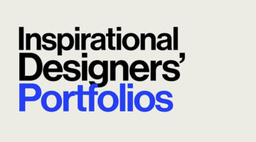
A great portfolio does more than display your work; it tells your story, makes a statement, and illustrates the transformative power of design. This is where creativity meets purpose, not just showcasing a designer's capabilities but revealing how they think, tackle challenges, and breathe life into their ideas. Curated by Basit Designs, here are seven standout portfolios … [Read more...]
30 Amazing Ads That Use Negative Space Brilliantly

In art and design, negative space refers to the area surrounding the focal subject of an image. In designs with two contrasting tones (such as black and white), the subject is often shown in a darker hue (black) while the background remains lighter (white), creating a striking silhouette. Occasionally, this is flipped, with white filling the silhouette instead (see the Coke … [Read more...]
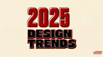
Top 10 Graphic Design Trends Of 2025
For designers, understanding the pulse of current design trends isn't just about keeping their creations stylish - it's crucial for making designs that connect and resonate with audiences. In 2025, we're seeing a blend of technological advancements and nostalgic revivals shaping the design landscape. From immersive 3D animations to eco-inspired designs, knowing these trends … [Read more...]
13 Simple Charts That Brilliantly Explain The Principles Of Design
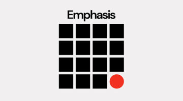
Design isn't just about making things look good; it’s about digging into the 'why' behind every choice. Design principles go beyond mere guidelines - they mirror the balance, harmony, and intention we strive for in life itself. The most striking designs often emerge from simplifying the complicated, choosing boldly, and staying true to creative vision while maintaining … [Read more...]
“Which Current Graphic Design Trend Will Age Badly?” – Here Are The Top Replies
In the ever-changing world of graphic design, every trend carries an expiration date. Some styles manage to capture the zeitgeist and remain relevant for decades, while others quickly fade into the backdrop of dated aesthetics. On a popular Reddit thread initiated by theGrowthDesigner, the community has come together to scrutinize the current design trends that are likely to … [Read more...]
What’s One Design Skill You Think Is Underappreciated But Crucial? Here Are The Best Answers
In graphic design, it's often the overlooked skills that separate good designers from great ones. While tools and techniques often receive the most attention, there are other, equally important abilities that don't get the recognition they deserve. Curious to find out more, we asked our Instagram followers to share the most underrated skills that are also the most crucial. … [Read more...]
8 Must-Have Tools For Designers To Boost Creativity
In the fast-paced world of design, having the right tools can be the difference between good and great work. Whether you're sketching, prototyping, or refining visuals, the proper resources can significantly boost your creativity. Product designer Sergio Cardenas has come up with a useful list of tools every designer should have in their arsenal to unleash their creative … [Read more...]
8 Super-Useful Websites Every Designer Must Know
In today's dynamic design landscape, keeping abreast of essential tools and resources can greatly boost your creative output and efficiency. Whether you are an experienced designer or a newcomer, being aware of key sources for inspiration, tools, and advice is vital. Product designer Sergio Cardenas has come up with a handy list of websites and online tools for fonts, color … [Read more...]
11 Best And Worst Redesigns Of Famous Logos
In the dynamic world of branding, the decision to redesign a logo represents a pivotal moment in a company's journey, signaling evolution, reinvigoration, or sometimes, a return to its roots. The outcomes of such endeavors vary widely, offering a variety of lessons on what resonates with the target audience and what falls flat. As we go through different brands' attempts … [Read more...]
Pepsi Has Found A Hidden Design Flaw In Coke Cans And They’re Trolling Them
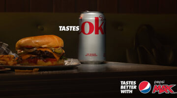
Pepsi Max's new "Tastes OK" campaign in Australia is a clever twist on their established "Tastes Better" messaging, this time putting a spotlight on a subtle detail in the competitor's name that many of us might have overlooked. By focusing on the word "OK" found in Coke's branding on Diet Coke cans, Pepsi Max is inviting consumers to think twice about their beverage choice … [Read more...]
“How Do I Center Texts Correctly Vertically?”
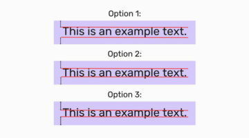
In a recent engaging post on Reddit, a user shared an intriguing image that presented three distinct methods for vertically centering text, using key typographical elements - capital letters, ascenders (the parts of letters that extend above the baseline, such as in "h" or "d"), and descenders (the portions that drop below the baseline, found in letters like "p" or "g"). The … [Read more...]
Design Roles: The 10 Types Of Designers And Their Super Powers
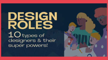
In the ever-evolving landscape of design, the roles and skills of designers have diversified, catering to every imaginable aspect of visual and experiential creation. From the meticulous crafting of brand identities to the intricate art of making data digestible through design, the spectrum of design roles speaks to a world where aesthetics meets functionality in profound … [Read more...]
Find Your ‘Typographic Soulmate’ With This Font-astic New Quiz
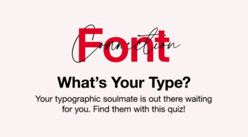
Monotype has rolled out a clever game right before Valentine's Day, serving as a matchmaker between you and your "typographic soulmate," and injecting a fresh vibe into the hunt for your ideal font. The quiz, titled Font Connection, begins with a collection of easy-going questions aimed at understanding your personality, from picking your ultimate holiday spot to how you … [Read more...]
6 Graphic Design Movies Every Designer Will Love
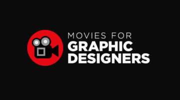
When we're on the lookout for fresh ideas and inspiration, we usually stick to our favorite websites, blogs, and social media. But, did you know there's a whole world of inspiring movies and documentaries on the internet about all sorts of creative topics? The tricky part is to find them. Branding and design agency Web Whisperers have picked out some of the top short … [Read more...]
Influencer Imagines Conversations Between Different Types Of Fonts, Gets 70 Million Views On The Videos
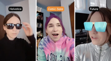
LA-based singer, songwriter, and content-creator Elle Cordova has come up with a series of videos that imagine different types of typefaces hanging out together, and the funny conversations between them. It's a hilarious take on the characters behind our characters, making you think twice about who you're inviting to your next "document party". The videos have gone viral … [Read more...]
Are You A Font Expert Or A Rookie? Take This Tricky Quiz And Find Out
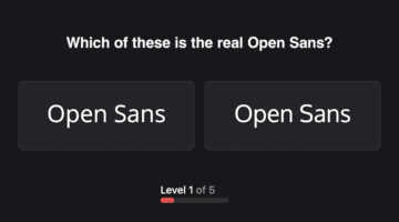
How well do you know the fonts you work with everyday? Bangalore-based UX designer Karan Sanas realised that he was unable to identify a font he uses daily, amongst a group of similar looking fonts. So he made a mini-game called Owen Sans that tests your knowledge of popular fonts (or typefaces, sorry purists). Why 'Owen Sans'? Because Karan works frequently with Open … [Read more...]
I Challenged Myself To Create Good Designs Using The Worst Fonts Of All Time
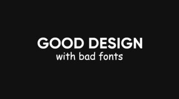
They say that there is no such thing as a bad font. There are only bad uses for fonts. Each font serves its intended purpose. Los Angeles-based freelance graphic designer and YouTuber Jesse Nyberg decided to challenge himself to see how good of a graphic designer he is. He asked his viewers to share their least favourite fonts, and then set out to create good, or at least … [Read more...]
8 Types Of Logos With Examples
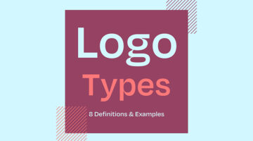
The effectiveness of a logo depends on various factors, including the brand's goals, target audience, industry, and overall brand identity. However, there are a few key types of logos that are often considered effective in different contexts. Ireland-based design director Andrew Warner has come up with a handy visual guide that lists the different types of logo designs, with … [Read more...]
33 Memes That’ll Make Every Designer Laugh
Calling all graphic designers, pixel pushers, and Photoshop wizards! Are you tired of staring at your screen, battling uncooperative clients, and squinting at never-ending lines of code? Well, fear not, because we have the ultimate antidote to your creative woes: funny memes designed especially for you! Prepare to chuckle, snort, and maybe even snort-laugh as we dive into a … [Read more...]
The 20 Best Logos Of All Time
A logo is a visual representation of a company or brand, and an essential part of any successful marketing strategy. A good logo conveys a brand's message, values, and identity in a simple yet memorable way, making it instantly recognizable and easy to remember. Over the years, we’ve seen some great examples of logo design, but only a select few have stood the test of time. … [Read more...]
Top 10 Ways To Use ChatGPT For UX Design
From brainstorming interface ideas to writing microcopy and mapping user journeys, ChatGPT is emerging as a powerful design companion, helping UX designers move faster, think broader, and iterate smarter. Whether you’re building wireframes, crafting personas, or refining landing page content, ChatGPT can support nearly every stage of the UX design process. Used right, it … [Read more...]
The Art Of Deck Making – How To Create Presentations That Win Clients
"The success of your presentation will be judged not by the knowledge you send, but by what the listener receives." - Lilly Walters. A good presentation deck will tell a story that will connect with the client on an emotional level. Before we ask our clients to make a financial investment, we must first ask them to make an emotional one. Just like any form of … [Read more...]
20 Free Games That Graphic Designers Can’t Stop Playing
Who says games can't be educational? In today's post, we've rounded up 20 of the coolest design-centric games that teach the basic concepts and fundamentals of design. These games help you learn about colors, fonts, typography, UI design, Photoshop and Illustrator tools, logos, and more. The best part is that all these games are free and browser-based. You don't have to … [Read more...]
20 Clever Typographic Logos Of Superheroes With Their Names Hidden In Their Faces

Logo designer Sergey Kyrmanov has come up with an interesting project that features typographic logos of superheroes that combine their names with their facial appearance. The logos have been designed in a way that the name of the superhero takes the shape of the character's face or mask. For example, the Batman logo features an illustrated face of the Caped Crusader with … [Read more...]
20 Genius Typographic Logos Of Supervillains With Their Names Hidden In Their Faces
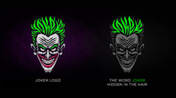
Logo designer Sergey Kyrmanov has come up with an interesting project that features typographic logos of supervillains that combine their names with their facial appearance. The logos have been designed in a way that the name of the supervillain takes the shape of the character’s face or mask. For example, the Joker logo features an illustrated face of the antagonist with … [Read more...]
37 Epic Memes For Graphic Designers
Stuck in the middle of a tough project with a stiff deadline? Is your client giving you sleepless nights? Are you tired of your boss micromanaging everything? If your answer is yes, then you need a healthy dose of meme-therapy to brighten your day. Memes stimulate the release of endorphins that create a sense of well-being in the body. In a study of 472 graphic, web, and UI … [Read more...]
How “Bionic Reading” Uses Typography to Help You Read Faster
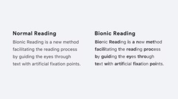
Swiss typographic designer Renato Casutt developed an ingenious reading system called Bionic Reading that helps you read text faster by emphasizing (bolding) the first few letters of a written word and letting your brain fill in the rest. How it works: Bionic Reading is based on the principle that the brain can identify whole words from just the initial few letters. By … [Read more...]
- 1
- 2
- 3
- …
- 7
- Next Page »