Every few years, design goes through a visible shift — not a sudden break, but a gradual reorientation of what feels current versus what feels tired. What's interesting about the trends making the rounds right now is that many of them aren't new inventions. They're revivals, recombinations, and reactions — to digital fatigue, to the sterility of AI-generated imagery, and to … [Read more...]
Top 10 Logo Design Trends For 2026 And How To Use Them
Logo design in 2026 is less about visual novelty and more about meaningful distinction. Brands are no longer competing only on aesthetics, they are competing for attention, trust, and emotional connection across crowded digital environments. A logo today must perform across screens, motion systems, packaging, social feeds, and real world applications, while still feeling … [Read more...]
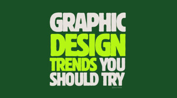
Top 20 Graphic Design Trends For 2026
Graphic design has always been a reflection of its moment, shaped by technology, culture, economics, and taste. What changes year to year is not merely how things look, but what designers choose to emphasise. In 2026, design feels less concerned with perfection and more interested in presence. There is a visible shift toward systems that feel intentional rather than ornamental, … [Read more...]
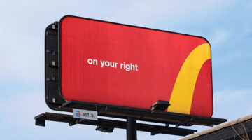
Every Graphic Designer Should Take Notes From Zohran Mamdani’s Masterclass In Political Branding
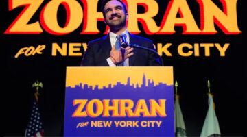
Visual communication has always been a decisive factor in public life. Brands, entertainment, sport, even social movements — the ones that endure are the ones that look like something. Politics is no exception. Barack Obama’s “HOPE” poster showed the world how a single image can give a campaign an emotional temperature. Alexandria Ocasio-Cortez’s debut materials showed how a … [Read more...]
Why Do Designers Use Circles When Presenting Logos To Clients? Genius Geometry Or Designer Drama?
If you’ve browsed logo design breakdowns on Dribbble, Behance, or Reddit, you’ve probably seen those mysterious grids of overlapping circles layered over a logo. They are often presented as if they belong to some sacred geometry that makes the design more precise and universally appealing. The question is whether these circles genuinely enhance the logo or if they are simply … [Read more...]
The Top 10 Brand Sounds Of All Time – The Sounds That Shaped Your Childhood
Close your eyes. Now think back to your first desktop computer. If you heard that iconic five-note da-da-da-daa-daa, your brain probably lit up with the word "Intel." Or maybe it's that cheery ba-da-ba-ba-baa that pulls you back to a McDonald's Happy Meal after school. These aren't just sounds; they're sonic time machines. And that, in essence, is the power of audio … [Read more...]
12 Ad Campaigns So Clever, You Know The Brand Without Seeing The Logo
In today’s world of hyper-branding, some companies are bold enough to ditch the logo entirely, and still be instantly recognizable. These aren’t just ads; they’re masterclasses in brand identity, emotional storytelling, and visual consistency. From the unmistakable golden arches to iconic red cans, these campaigns show that when your branding runs deep, a logo isn’t always … [Read more...]
How To Price Your Services As A Designer: A Smarter Approach
"How much should I charge?" If you’re a designer, you’ve probably asked yourself this question more times than you can count. Price too high, and you risk losing clients; price too low, and you’ll burn out. Finding the right balance is key to building a sustainable design career. But with so many pricing models and client expectations, it’s easy to feel stuck. A structured … [Read more...]
19 Elegant And Timeless Font Pairings For That Classic ‘Old Money’ Look
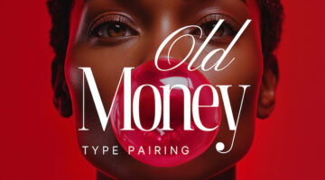
The old money aesthetic is all about quiet confidence—timeless, refined, and effortlessly sophisticated. From tailored fashion to grand interiors, this look is steeped in tradition and understated luxury. Fonts (or typefaces for the purists) play a subtle yet powerful role in capturing that essence, evoking prestige, heritage, and an enduring sense of class. Whether you’re … [Read more...]
Designer Draws Famous Logos Using A Single Line, And Most Of Them Are Better Than The Original
Logos are often celebrated for their ability to distill complex ideas into simple, memorable visuals. But what happens when that simplicity is taken even further? French designer Stephane Leopold, co-founder of Loooop Studio, explores this idea in his project "One Line Famous Logos". By reimagining 44 of the world’s most iconic logos using a single, continuous line, Leopold … [Read more...]
7 Designer Portfolios That Will Inspire You To Create Your Own
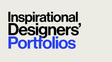
A great portfolio does more than display your work; it tells your story, makes a statement, and illustrates the transformative power of design. This is where creativity meets purpose, not just showcasing a designer's capabilities but revealing how they think, tackle challenges, and breathe life into their ideas. Curated by Basit Designs, here are seven standout portfolios … [Read more...]
30 Amazing Ads That Use Negative Space Brilliantly

In art and design, negative space refers to the area surrounding the focal subject of an image. In designs with two contrasting tones (such as black and white), the subject is often shown in a darker hue (black) while the background remains lighter (white), creating a striking silhouette. Occasionally, this is flipped, with white filling the silhouette instead (see the Coke … [Read more...]
“Which Current Graphic Design Trend Will Age Badly?” – Here Are The Top Replies
In the ever-changing world of graphic design, every trend carries an expiration date. Some styles manage to capture the zeitgeist and remain relevant for decades, while others quickly fade into the backdrop of dated aesthetics. On a popular Reddit thread initiated by theGrowthDesigner, the community has come together to scrutinize the current design trends that are likely to … [Read more...]
“What’s The Most Fraudulent Thing You’ve Done As A Graphic Designer?” – Here’s What Designers Are Saying
Ah, the secret life of graphic designers, it's not all about making pretty pictures. A recent Reddit thread revealed some of the sneaky things designers have done with their skills. It all started with a designer who altered a friend's kid's birth certificate to make her look younger, scoring cheaper Disneyland tickets. Turns out, many designers have their own stories of … [Read more...]
What Has Coca-Cola Done To Their Iconic Logo?
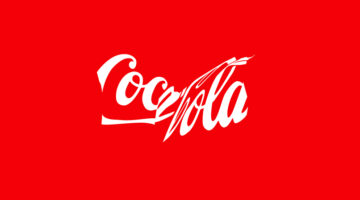
Coca-Cola's timeless logo, a global symbol since 1941, is taking on a new role to promote recycling. Their latest "Recycle Me" campaign, launched in Latin America, showcases the iconic red-and-white logo in a crushed and distorted form, resembling a recycled can. This visual twist aims to leverage the logo's massive recognition—known by 94% of the world—to inspire more … [Read more...]
“My Ex-Boyfriend Is Copying My Design Portfolio. Please Help.”

In a candid account shared on Reddit, a graphic designer recounts her ongoing ordeal with her ex-boyfriend who, after their breakup, has embarked on a surprisingly parallel career path in graphic design. Initially aspiring to be a firefighter, her ex switched gears dramatically, showcasing a portfolio eerily similar to hers, down to the minutest details. From mimicking … [Read more...]
Designers Are Discussing Their Issues With The Design Of Google App Icons, What Are Your Thoughts?
A graphic designer on Reddit initiated an interesting debate over the design of Google app icons, bringing to light a critical issue in the realm of UI/UX design: the delicate balance between aesthetic allure and functional clarity. Feedback from various designers revealed a shared frustration: the current icons, that use all four Google brand colors, often lead to confusion … [Read more...]
11 Best And Worst Redesigns Of Famous Logos
In the dynamic world of branding, the decision to redesign a logo represents a pivotal moment in a company's journey, signaling evolution, reinvigoration, or sometimes, a return to its roots. The outcomes of such endeavors vary widely, offering a variety of lessons on what resonates with the target audience and what falls flat. As we go through different brands' attempts … [Read more...]
8 Color Theory Secrets Every Designer Should Know
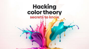
Did you know that our color choices don't remain the same throughout our lives? Research indicates that as we mature, there's a noticeable shift in color preference, with a growing inclination towards hues with shorter wavelengths, suggesting a complex evolution of taste that transcends mere aesthetics. Interestingly, gender differences play a significant role in color … [Read more...]
“Client Used AI To Tweak My Logo Designs And Create Their Own Logo For Free. What Do I Do?”
In the ever-evolving landscape of creative work, the advent of artificial intelligence has introduced new challenges and ethical dilemmas. A recent experience shared by a graphic designer on Reddit highlights the complexities of AI in the freelance world. After creating two rounds of logo designs for a friend, the designer discovered that their work had been fed into an AI … [Read more...]
6 Graphic Design Movies Every Designer Will Love
When we're on the lookout for fresh ideas and inspiration, we usually stick to our favorite websites, blogs, and social media. But, did you know there's a whole world of inspiring movies and documentaries on the internet about all sorts of creative topics? The tricky part is to find them. Branding and design agency Web Whisperers have picked out some of the top short … [Read more...]
Logo Designer Creates Adorable Illustrations And Shows The Inspiration Behind Them
In a world obsessed with AI-generated design, it's good to see some good old human creativity. Creating effective logos is an art that balances simplicity with impact, requiring both talent and dedication to achieve a design that is both straightforward and memorable. Indonesian illustrator and logo designer, Alfrey Davilla, champions the philosophy that "Simpler is … [Read more...]
Only Designers With A Pixel-Perfect Eye Can Answer All 12 Questions Correctly In This Quiz
Good design is often about things people don’t consciously notice. A small change in spacing, a slight shift in contrast, or even a tiny tweak in typography can change how something feels, even if you can’t quite put your finger on it. For designers, this isn’t something you’re taught once and done with. It builds over time. The more you work with layouts, interfaces, and … [Read more...]
Meanings Of Different Symbols, Icons, And Shapes In Design
In the design world, the power of visual language is an open secret. Symbols and icons are more than just decorative elements; they're the shorthand of communication, cutting through the clutter of words to convey complex messages swiftly. Symbols serve as an essential toolkit for graphic designers, facilitating not only aesthetic appeal but also functionality and user … [Read more...]
8 Types Of Logos With Examples
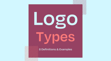
The effectiveness of a logo depends on various factors, including the brand's goals, target audience, industry, and overall brand identity. However, there are a few key types of logos that are often considered effective in different contexts. Ireland-based design director Andrew Warner has come up with a handy visual guide that lists the different types of logo designs, with … [Read more...]
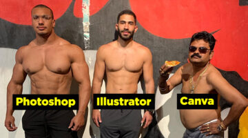
33 Memes That’ll Make Every Designer Laugh
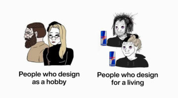
Calling all graphic designers, pixel pushers, and Photoshop wizards! Are you tired of staring at your screen, battling uncooperative clients, and squinting at never-ending lines of code? Well, fear not, because we have the ultimate antidote to your creative woes: funny memes designed especially for you! Prepare to chuckle, snort, and maybe even snort-laugh as we dive into a … [Read more...]
The 20 Best Logos Of All Time
A logo is a visual representation of a company or brand, and an essential part of any successful marketing strategy. A good logo conveys a brand's message, values, and identity in a simple yet memorable way, making it instantly recognizable and easy to remember. Over the years, we’ve seen some great examples of logo design, but only a select few have stood the test of time. … [Read more...]
39 Logo Designs That Should Have Never Been Approved
Ah, logo design fails. They're like a train wreck - you can't help but look, even though you know it's going to be bad. It's amazing how some companies manage to get it so wrong. But hey, we're not here to judge (okay, maybe a little), we're here to appreciate the unintentional hilarity that comes with logo design fails. Now, before we begin, a word of warning: if you're the … [Read more...]
20 Clever Typographic Logos Of Superheroes With Their Names Hidden In Their Faces

Logo designer Sergey Kyrmanov has come up with an interesting project that features typographic logos of superheroes that combine their names with their facial appearance. The logos have been designed in a way that the name of the superhero takes the shape of the character's face or mask. For example, the Batman logo features an illustrated face of the Caped Crusader with … [Read more...]
20 Genius Typographic Logos Of Supervillains With Their Names Hidden In Their Faces
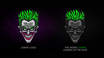
Logo designer Sergey Kyrmanov has come up with an interesting project that features typographic logos of supervillains that combine their names with their facial appearance. The logos have been designed in a way that the name of the supervillain takes the shape of the character’s face or mask. For example, the Joker logo features an illustrated face of the antagonist with … [Read more...]
Why Most Brand Logos Look The Same Nowadays
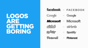
Somewhere between the obsession with minimalism and the pressure to scale globally, brands lost their personalities. Saint Laurent, Balenciaga, Burberry, Balmain — luxury houses that once had distinct, carefully crafted identities have all quietly converged on the same clean, bold, sans-serif wordmark. Open any tech app and the pattern repeats. Revolut, Spotify, Airbnb, eBay … [Read more...]
37 Epic Memes For Graphic Designers
Stuck in the middle of a tough project with a stiff deadline? Is your client giving you sleepless nights? Are you tired of your boss micromanaging everything? If your answer is yes, then you need a healthy dose of meme-therapy to brighten your day. Memes stimulate the release of endorphins that create a sense of well-being in the body. In a study of 472 graphic, web, and UI … [Read more...]
32 Funny Examples Of Misunderstood Logos
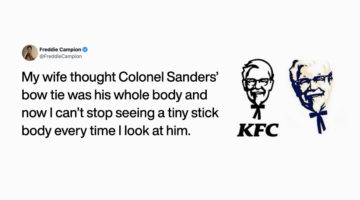
Big corporations spend millions of dollars on their branding in an effort to make their logos memorable and establish brand recall with their consumers. But sometimes people mistake the elements of a logo as something else entirely. One such episode was shared by LA-based content director Freddie Campion when he tweeted that his wife always thought that Colonel Sanders' … [Read more...]
45 Typographic City Logos Based On Their Famous Landmarks
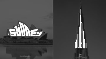
Yemen-based graphic designer Mohamed Aljaadaby has come up with an interesting project that features typographic wordmark logos of cities in the shape of their famous monuments and landmarks. For example, the logo for Sydney is the word 'Sydney' warped in the shape of the Opera House. The logo for Athens is the Acropolis with the word 'Athens' in the negative space between … [Read more...]
Graphic Designer Improves Adidas Ads By Simply Changing The Typography
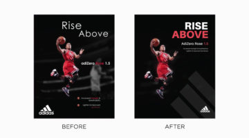
Typography is a fundamental element of design that often goes unnoticed, until it’s ineffective. It has the power to enhance an ad’s visual impact and clarity or, when misused, detract from the message entirely. Even well-established brands can occasionally miss the mark. Tom Cargill from Satori Graphics has come up with an interesting before-and-after tutorial in which he … [Read more...]
- 1
- 2
- 3
- …
- 6
- Next Page »