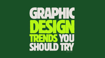
Every few years, design goes through a visible shift — not a sudden break, but a gradual reorientation of what feels current versus what feels tired. What's interesting about the trends making the rounds right now is that many of them aren't new inventions. They're revivals, recombinations, and reactions — to digital fatigue, to the sterility of AI-generated imagery, and to … [Read more...]
Every Graphic Designer Should Take Notes From Zohran Mamdani’s Masterclass In Political Branding
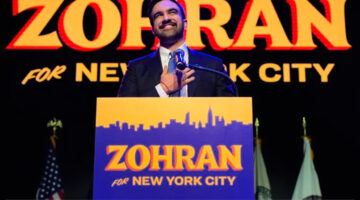
Visual communication has always been a decisive factor in public life. Brands, entertainment, sport, even social movements — the ones that endure are the ones that look like something. Politics is no exception. Barack Obama’s “HOPE” poster showed the world how a single image can give a campaign an emotional temperature. Alexandria Ocasio-Cortez’s debut materials showed how a … [Read more...]
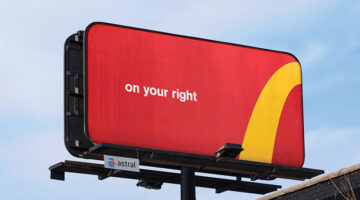
Canva’s Clever Billboards Turn Creative Challenges Into Smart Ads

Campaign: In a striking out-of-home campaign around London’s Waterloo Station, Canva has reimagined billboard advertising with a series of installations that blend wit, self-awareness, and deep design fluency. Created in collaboration with Stink Studios, with media planning handled by OMD, the campaign transforms ordinary ad spaces into playful commentaries on the creative … [Read more...]
The Top 10 Brand Sounds Of All Time – The Sounds That Shaped Your Childhood
Close your eyes. Now think back to your first desktop computer. If you heard that iconic five-note da-da-da-daa-daa, your brain probably lit up with the word "Intel." Or maybe it's that cheery ba-da-ba-ba-baa that pulls you back to a McDonald's Happy Meal after school. These aren't just sounds; they're sonic time machines. And that, in essence, is the power of audio … [Read more...]
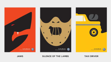
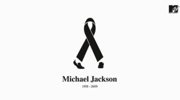
12 Ad Campaigns So Clever, You Know The Brand Without Seeing The Logo
In today’s world of hyper-branding, some companies are bold enough to ditch the logo entirely, and still be instantly recognizable. These aren’t just ads; they’re masterclasses in brand identity, emotional storytelling, and visual consistency. From the unmistakable golden arches to iconic red cans, these campaigns show that when your branding runs deep, a logo isn’t always … [Read more...]
24 Genius Illustrations That Use Negative Space Brilliantly
Negative space design transcends the realm of optical tricks—it serves as a sophisticated method of visual storytelling, where contrast and shape reveal hidden layers of meaning. Few artists have captured this delicate balance as masterfully as Noma Bar. His work exhibits a refined blend of simplicity, symbolism, and subtle wit, inviting viewers to pause and uncover the deeper … [Read more...]
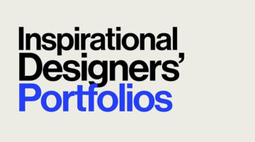
Portfolios Of Designers Who Have Worked At Apple, Google, Meta, And More
A well-crafted portfolio is more than just a collection of work—it’s a designer’s identity, storytelling tool, and a powerful career asset. Whether you're a seasoned professional or an aspiring UX/UI designer, exploring top-tier portfolios can ignite new ideas, refine your presentation style, and set a benchmark for excellence. In this curated list, UI/UX Designer Shubham … [Read more...]
35 Ads With Headlines and Copywriting So Good, You’ll Wish You Wrote Them
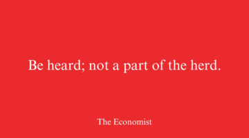
At the heart of every great ad lies great writing. Words have the power to stop you mid-scroll, make you chuckle, spark an idea, or even change your mind. They don’t just sell products—they sell dreams, solutions, and possibilities. In this collection, we explore ads where the writing does the heavy lifting—where headlines cut like a scalpel and copy sings with precision. … [Read more...]
27 Brilliant Ads With Incredible Art Direction
A brilliant advertising idea can fall flat without impeccable art direction. The execution and visual design of a campaign are just as crucial as the concept itself. Great art direction puts the message center stage, compelling consumers to think about the product, the brand, and its value. In today’s post, we’ve curated a collection of outstanding print ads showcasing … [Read more...]
7 Designer Portfolios That Will Inspire You To Create Your Own
A great portfolio does more than display your work; it tells your story, makes a statement, and illustrates the transformative power of design. This is where creativity meets purpose, not just showcasing a designer's capabilities but revealing how they think, tackle challenges, and breathe life into their ideas. Curated by Basit Designs, here are seven standout portfolios … [Read more...]
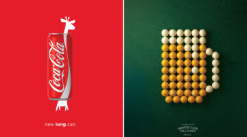
30 Amazing Ads That Use Negative Space Brilliantly

In art and design, negative space refers to the area surrounding the focal subject of an image. In designs with two contrasting tones (such as black and white), the subject is often shown in a darker hue (black) while the background remains lighter (white), creating a striking silhouette. Occasionally, this is flipped, with white filling the silhouette instead (see the Coke … [Read more...]
17 Brilliant Ads With Clever Art Direction
Good art direction is the secret sauce that elevates a basic concept to an iconic visual feast that grabs the audience's attention. In the bustling world of ads, it's the fine line between the mundane and the mesmerizing. Done right, it transforms a mere ad campaign into a vivid experience, stirring emotions and weaving narratives that stick with viewers long after they've … [Read more...]
A 3D Artist Has Created An Ad That Hits Way Harder Than You’d Expect, And People Have Watched It Over 200 Million Times

A recent video on social media has delivered a critical message about road safety through some truly spectacular 3D animation. Crafted by 3D artist and animator Majid Mousavi, this powerful video has not only caught the eye of millions with its impressive visuals but has also ignited important discussions on the need for vigilant driving and adherence to speed limits. The … [Read more...]
6 Graphic Design Movies Every Designer Will Love
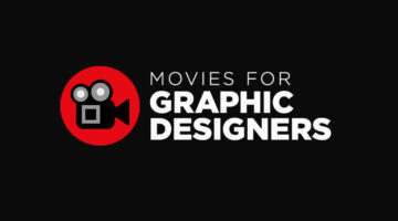
When we're on the lookout for fresh ideas and inspiration, we usually stick to our favorite websites, blogs, and social media. But, did you know there's a whole world of inspiring movies and documentaries on the internet about all sorts of creative topics? The tricky part is to find them. Branding and design agency Web Whisperers have picked out some of the top short … [Read more...]
Australian Lamb Deserves “Ad of The Year” For This Commercial
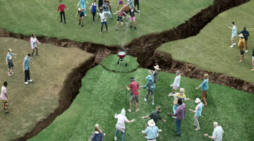
In a stroke of advertising brilliance, Australian Lamb unites diverse generations with a witty and satirical campaign, sparking widespread conversation among all age groups. The centerpiece, a three-minute film titled ‘The Generation Gap,’ humorously delves into the timeless theme of generational differences. Set against a backdrop where Boomers, Millennials, and Gen Z … [Read more...]
Relive The Major Global Moments Of Our Lives In This Epic Video By Google That’s Been Viewed 350 Million Times

Google, in the last quarter-century, has grown beyond its origins as a simple search tool. It's woven into the fabric of our everyday life, influencing how we access and disseminate information. Whether it's for scholarly pursuits or daily curiosities, Google leads the charge, transforming both our cultural and technological realms. This evolution has brought the vast … [Read more...]
CGI Ads Are The Hottest Trend And Here Are The Top 10 Recent Campaigns
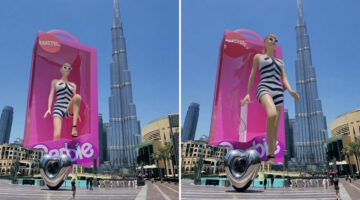
One of the most significant trends in advertising has been the dynamic surge of CGI (Computer-Generated Imagery) videos. What started as a quirky experiment in digital out-of-home (OOH) media, has transformed into a global trend, with brands pushing creativity to new levels to capture people's attention on digital and social media platforms. We've seen some cool CGI OOH … [Read more...]
25 Genius Ads That Will Make You Look Twice
Good advertising goes beyond just trying to sell a product. It's about telling a story that connects with people, gets them thinking, and makes them feel something meaningful. The most effective advertisements capture the essence of what matters to people. They leave a lasting impression, making brands memorable and talked about. Today’s post is a curated selection of 25 … [Read more...]
This Beautiful Chevrolet Christmas Ad Received Over 12 Million Views, With Viewers Demanding A Raise For Its Creators

Chevrolet’s holiday commercial, A Holiday to Remember, hits all the right notes—heartfelt, nostalgic, and unforgettable. Blending raw emotion with timeless themes of love, family, and memory, it beautifully captures the essence of cherished moments that resonate across generations. Spanning over five minutes, the touching narrative unfolds with a family gathering. The story … [Read more...]
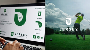
Logo Designer Creates Adorable Illustrations And Shows The Inspiration Behind Them
In a world obsessed with AI-generated design, it's good to see some good old human creativity. Creating effective logos is an art that balances simplicity with impact, requiring both talent and dedication to achieve a design that is both straightforward and memorable. Indonesian illustrator and logo designer, Alfrey Davilla, champions the philosophy that "Simpler is … [Read more...]
20 Smart Life Hacks Explained With Brilliantly Simple Illustrations
We all aspire to improve, grow, and level up in various aspects of our lives—be it in health, finances, relationships, or career. Sometimes, however, the path to self-improvement can seem overwhelming. Visual Hustles is our new favourite Instagram account that features daily infographics to help you adopt a positive, growth-oriented mindset. The visuals consist of simple … [Read more...]
The Real World Is Way More Amazing Than AI, Says Nikon In Brilliant Ad Campaign
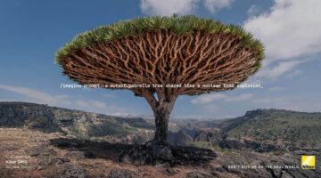
The growth of AI-generated images is the biggest threat to the traditional photography industry, potentially diminishing the value of creativity and skill in the business. AI-enabled platforms are fulfilling people's imaging needs with a few keywords at a fraction of the cost. Editorial and advertising photographers are facing a shortage of assignments and income, specially in … [Read more...]
The 20 Best Logos Of All Time
A logo is a visual representation of a company or brand, and an essential part of any successful marketing strategy. A good logo conveys a brand's message, values, and identity in a simple yet memorable way, making it instantly recognizable and easy to remember. Over the years, we’ve seen some great examples of logo design, but only a select few have stood the test of time. … [Read more...]
This Milk Packaging Is Genius, I’m Buying 12 Cartons To Get All The Designs
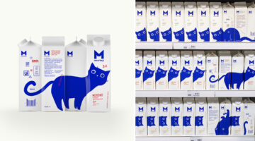
Branding agency Depot has come up with a cool identity and packaging for Bryansk Dairy Plant's Milgrad product line. The milk cartons feature an illustrated blue cat in a variety of playful poses, with each face of the carton offering a new pose. The eye-catching design stands out on the dairy shelf, creating different narratives as users rotate the package. The cat concept … [Read more...]
20 Clever Typographic Logos Of Superheroes With Their Names Hidden In Their Faces

Logo designer Sergey Kyrmanov has come up with an interesting project that features typographic logos of superheroes that combine their names with their facial appearance. The logos have been designed in a way that the name of the superhero takes the shape of the character's face or mask. For example, the Batman logo features an illustrated face of the Caped Crusader with … [Read more...]
20 Genius Typographic Logos Of Supervillains With Their Names Hidden In Their Faces
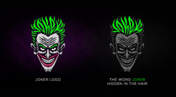
Logo designer Sergey Kyrmanov has come up with an interesting project that features typographic logos of supervillains that combine their names with their facial appearance. The logos have been designed in a way that the name of the supervillain takes the shape of the character’s face or mask. For example, the Joker logo features an illustrated face of the antagonist with … [Read more...]
45 Typographic City Logos Based On Their Famous Landmarks
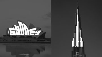
Yemen-based graphic designer Mohamed Aljaadaby has come up with an interesting project that features typographic wordmark logos of cities in the shape of their famous monuments and landmarks. For example, the logo for Sydney is the word 'Sydney' warped in the shape of the Opera House. The logo for Athens is the Acropolis with the word 'Athens' in the negative space between … [Read more...]
Photographer Shows Off Crazy Skills By Sharing Behind-The-Scenes Photos With The Final Photos
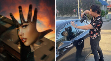
We see beautiful photos on Instagram everyday, and most of them look like they've been shot on elaborate sets with an entire team of professionals. But that is not always the case. LA-based photographer Geo Leon proves that sometimes all you need is a keen imagination and some Photoshop magic to create stunning images that turn heads. He captures his subjects in everyday … [Read more...]
13-Year-Old Boy Makes Miniature Cars Look Life-Size With His Amazing Photography
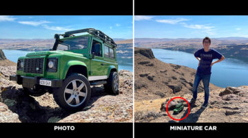
Anthony Schmidt is a 13-year-old boy on the autism spectrum from Woodinville, Washington, with a passion to photograph toy cars so they look life-size. Using an iPhone and forced-perspective photography techniques, he captures vintage and classic car models against backdrops of nature and architecture. Anthony's passion for cars began from an early age. He used to collect … [Read more...]
Photographer Plays With Sunsets To Tell Beautiful Stories
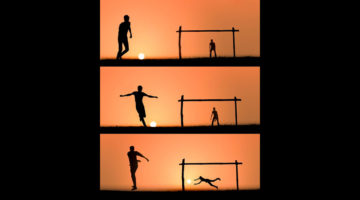
Indian photographer Krutik Thakur captures amusing sunset silhouettes that showcase the orange setting sun as a tangible object that people can hold, move, and play with. His beautiful, whimsical scenes depict people interacting with the sun using different props and situations. They can be seen playing soccer with the sun, fishing the sun out from the ocean, storing it in a … [Read more...]
60 Brilliant Miniature Dioramas That Will Leave You Amazed

Miniature Calendar is an incredible ongoing project by Japanese artist Tatsuya Tanaka, that features beautiful miniature dioramas of everyday life using common household objects such as food, cloth, stationery, electronic devices, and even masks. Tanaka began creating these dioramas in 2011 with an objective to show everyday scenes in a fun, unique way and add a little … [Read more...]
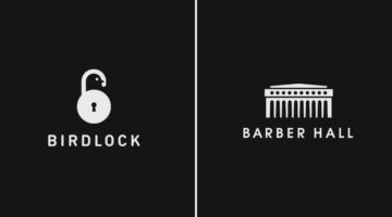
Brilliant Logos With Hidden Meanings By A Designer Who Has Spent 2,500 Days Perfecting His Craft

Indian graphic designer Gary Dimi Pohty has taken on a design challenge titled "One logo a day" in which he creates logos with hidden meanings on an almost daily basis. At the moment, he is on day 2500! Gary's logos are based on common, everyday words and fictitious brands or films. He uses symbolism, negative space, and geometric elements to visually represent the meanings … [Read more...]
35 Beautiful Color Palettes For Your Next Design Project
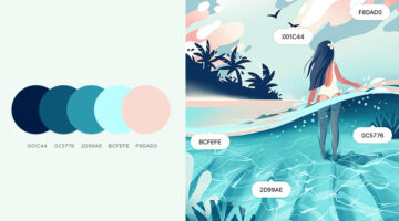
Looking for color palettes for your graphic, web, or UI design? Coolors is a useful online tool that lets you create, save, and share beautiful color schemes and gradients. You can browse and filter palettes by color or popularity, save them to your account, or download them as PNG, PDF, CSS, SVG, and more. Coolors is also available as an iOS App, Adobe Add-on, and a Chrome … [Read more...]
30 Clever Logos With Hidden Meanings, And The Design Thinking Behind Them
Indonesia-based Grafast Design Studio has come up with a series of interesting logos that combine different shapes and letters into unique symbols that visually represent the brand name. In each logo, the letters used are the initials of the brand name and the shapes represent the product or service offered by the company. For example, the logo for Victory Coffee combines … [Read more...]
25 Clever Logos With Hidden Meanings
Russian graphic designer Vlad Smolkin has shared an interesting collection of hidden-meaning logos that he has created for different clients over the years. The designs use clever typography and symbols hidden in negative spaces to visually represent the brand name or explain the nature of the business. For example, the logo for Infinity Cat Cafe is an abstract infinity … [Read more...]
- 1
- 2
- 3
- …
- 8
- Next Page »