Feeling bored at work? Have 5 minutes to spare before your boss comes back from a meeting? If yes, then check out these 25 epic memes that every mouse-weilding, client-bashing, font-loving designer will relate to. Warning: Some of these memes might make you question your choice of profession. This is perfectly normal. If symptoms persist after 48 hours, please talk to a … [Read more...]
29 Images That Prove Why Good Design Is Important
Regular readers of DS know that most of our posts are about inspirational art and design. But once in a while, we like to sneak in a post about design blunders, just to keep the humour alive. Previously, we shared some epic logo disasters, letter-spacing fails, ad-placement blunders, and more. Today's post features some more design fails that are bound to make you laugh at … [Read more...]
Designer Offers To Create Free Logos For Anyone, Ends Up Creating 50 Logos In 32 Hours Non-Stop
Russian graphic designer Di Buenio undertook a personal logo design challenge titled Logotyposhnaya, in which, he offered to create a free logo for any existing company or brand in 30 minutes. He published a post on his Facebook page and received over 70 applications in the first two hours itself. At the end of the challenge, Buenio had created 50 logos, working non-stop for … [Read more...]
Beautiful Alphabet Series Of The World’s Most Famous Cities And Their Iconic Landmarks
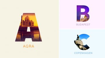
Indian graphic designers Rigved Sathe and Payal Jagwani have come up with a beautiful project titled "Around The World With Type" that mixes typography and photography to represent some of the world's most famous cities and their iconic landmarks. Each letter represents a city and includes a photograph of a famous landmark clip-masked within the letterform. From New York's … [Read more...]
Designer Creates Clever Alphabetical Logos Based On Animal Names And Shapes
Lebanese graphic designer Rami Hoballah, has come up with an amusing typography project titled 'Animals Alphabet' that showcases letters of the alphabet in the shape of animals. Each letter corresponds to the name of the animal. For example, 'a' looks like the head of an ant, 'b' looks like a bee, 'c' looks like a crab, and so on. Rami used Adobe Illustrator to create these … [Read more...]
Designer Challenges Himself To Create A Typographic Logo Every Day For A Year, And They’re Pretty Cool
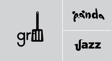
Stockholm-based graphic designer Daniel Carlmatz undertook a 365-day challenge to create one new typographic logo of a common word we use every day. The objective was to visualize the meanings of the words by using symbolism, negative space, or by adding geometric elements to the letters. For example, the letter 'a' in the word 'search' looks like a search bar, the letter 'j' … [Read more...]
23 Beautiful Free Fonts For Your Next Design Project
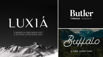
What does a graphic designer love more than a beautiful font? A beautiful font that's available for FREE. There's nothing more heartbreaking than finding a gorgeous font, only to see a big red button next to it that says, "Buy Now for $99". To make life easier for our kind, we at DS have compiled a list of 23 stylish and contemporary fonts that you can download for free. The … [Read more...]
Graphic Designer Substitutes Wordmarks In Famous Logos With The Fonts They Use
Italian graphic designer Emanuele Abrate has come up with an interesting project titled 'Logofonts' that features wordmarks of famous logos substituted with the name of the fonts they use. For example, the Nike wordmark in their swoosh logo has been substituted with 'Futura' written in the same italic style. The WhatsApp wordmark has been substituted with 'HelveticaNeue'. … [Read more...]
Designer Shares Side-By-Side Comparisons Of His Sketches And Final Vector Illustrations
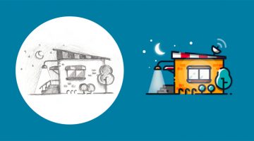
Ukrainian web designer Andrew Kliatskyi has come up with an interesting project in which he shares side-by-side comparisons of his rough sketches and final vector illustrations. Titled "From Sketch to Result", the aim of the project is to show the path between an idea and the final result. After completing his pencil sketches, Andrew uses Adobe Illustrator to create the … [Read more...]
Fonts Used In Famous Logos (With Download Links)
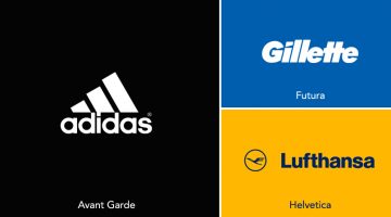
Ever wanted to know the names of the fonts used in the logos of famous brands like Adidas, Calvin Klein, FedEx, Gillette, Jaguar, Lufthansa, Omega, Rolls-Royce, Visa, etc.? We've compiled an alphabetical list of 60 well-known logos with their corresponding fonts and download links. In some cases, the fonts have been tweaked or edited from their original form to create a … [Read more...]
20 Important Design Principles Explained With Simple Illustrations
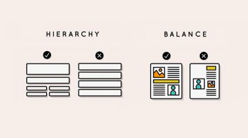
There are no fixed rules or formulas for good design, but there are a few basic principles that will help you create design that is effective, functional, and aesthetically pleasing. Technical jargon can sometimes get confusing or overwhelming, which is why Canva has come up with a fantastic infographic that uses simple illustrations to explain the 20 most important design … [Read more...]
16 Clever Typographic Animations That Visualize The Meanings Of Different Words
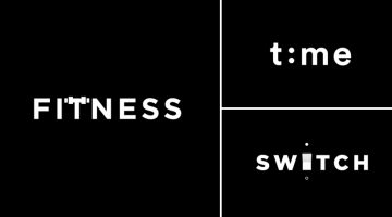
Lithuania-based graphic designer Mindaugas Dudenas has come up with an excellent project titled 'Type in Motion' that visualizes the meanings of different words using typographic animation. For example, the 'T' in the word FITNESS looks like it's lifting weights, the two 'O's in DOORS open and close like doors, the 'H' in CHESS morphs into a chessboard, and so on. Dudenas … [Read more...]
5 True Stories Behind Famous Hollywood Studio Logos
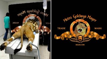
Before the opening credits of a film, there is usually a short animation of the logo of the film studio (also known as production logo). Some famous examples include DreamWorks, Paramount, Columbia, MGM, and Disney. You must have seen the logos of these major film studios many times, but have you ever wondered about the story behind them? For example, why does the DreamWorks … [Read more...]
27 Beautiful Color Gradients For Your Next Design Project
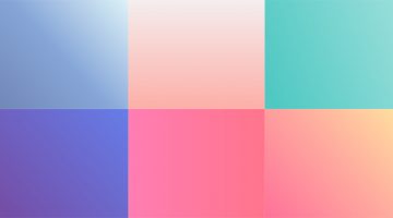
Looking for beautiful gradients for your graphic, web, or UI design? UVdesk has created a useful online tool called coolHue – a free collection of over 60 gradients that you can use for design and code. You can browse through the swatches, copy their CSS codes and even download a .PNG version of each one. Here are some of our favourites from the collection. … [Read more...]
10 Famous Logos Get Transformed Into Female Versions To Honour Women
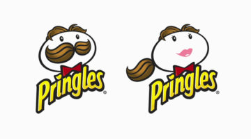
Creative Equals, an organisation dedicated to diversity in the creative industries, decided to replace male characters of famous brand logos with female versions for Women's Day this year. The objective was to raise awareness about the lack of female mascots in branding. According to the organization's founder and CEO Ali Hanan, 89.5% of design directors are male, which … [Read more...]
Graphic Designer’s Interesting Experiment Shows How The Placement Of An Element Affects Its Meaning
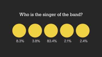
Brazilian designer Nei Valente has come up with an intriguing design experiment titled 'Thoughts on Position' that studies the relationship between the placement of an element and its meaning. The objective was to find out if the same element can communicate different messages when placed in different positions. In this experiment, Valente surveyed 288 participants with a … [Read more...]
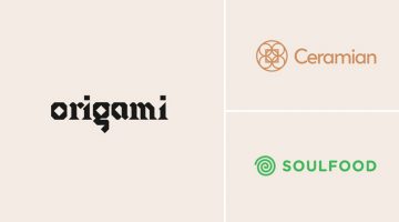
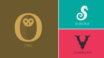
Designer Creates Clever Brand Logos By Combining Two Different Objects Into One
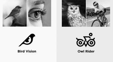
Kochi-based designer Shibu PG has come up with an interesting project in which he combines icons of two different objects into one unique logo based on the brand name. The logo in each case is a visual representation of the brand name. For example, the logo for Bird Vision is an aesthetically designed symbol of a bird and an eye. The logo for Owl Rider is a clever … [Read more...]
31 Useful Design Techniques For Creative Two-Letter Logos
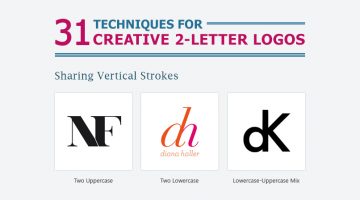
Two-letter logos are one of the most popular logo styles in the world. They're memorable because they use the brand's initials to form a unique symbol. When executed properly, a two-letter logo conveys power, luxury, style, and exclusivity. Some of the world's most well-known brands like General Motors, Volkswagen, Hewlett-Packard, General Electric, LG, Warner Bros., Louis … [Read more...]
33 Beautiful Color Schemes For Your Next Design Project
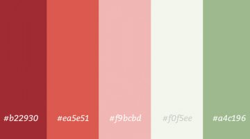
Looking for color combinations for your graphic, web or UI design? CoSchedule has come up with a handy infographic that shares 33 beautiful palettes organized by primary and secondary colors. They've also compiled two additional infographics on color + word associations and color psychology. Check them all out below. … [Read more...]
Vibrant, Dream-Like Illustrations Made With Gradients And Blend Modes
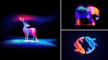
Russian designer Ilya Shapko has come up with a series of vibrant, neon-style artworks using gradients, blend modes, and transparency in Adobe Illustrator and Photoshop. The project, titled 'Fantasy Light', showcases colorful illustrated shapes intricately placed over each other to form abstract animals and objects against dark backgrounds. Shapko's inspiration for this … [Read more...]
Top 20 Logo Placements That Had The Whole City Laughing

Vehicle advertising can be a branding goldmine or a complete disaster. Ad and logo placements on vans and buses, especially those with sliding doors, require serious visual foresight. What looks perfectly aligned in a static mockup can fall apart the moment the doors open, turning a smart campaign into an accidental punchline. Any experienced graphic designer knows that … [Read more...]
26 Brilliant Ads With Incredible Art Direction And Post Production
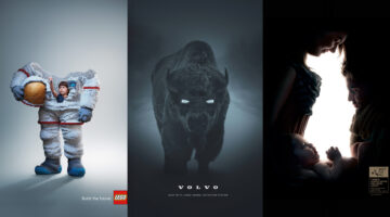
In advertising, the magic often lies in how the message is visually delivered. A campaign can have the best creative concept, but if the art direction misses the mark, it cannot be a success. It's imperative for designers, illustrators, and art directors to ensure every visual detail works harmoniously to captivate the audience and make the ad memorable. In this article, … [Read more...]
29 Beautiful Lion Logos For Design Inspiration
The lion symbolizes strength, courage, and leadership. It is one of the most widely used symbols of power and royalty since ancient times. Today, lion symbols are used on national flags and as logos for sports teams, luxury brands, hotels, automobile manufacturers, financial institutions, and more. In today's post, we've collated a few inspiring examples of lion logo … [Read more...]
9 Funny WhatsApp Conversations Between Clients And Designers
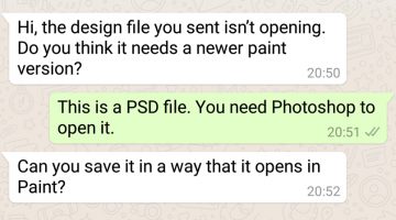
Conventional wisdom says that you should avoid work-related conversations with a client on WhatsApp. All professional communication should take place via email. Not only does that avoid confusion and unaccountability, but it also saves you from the headache of having an unreasonable client breathing down your neck with a message every five minutes. On that note, Egypt-based … [Read more...]
A’ Design Award Releases Rankings Of Countries That Have Won The Most Design Titles
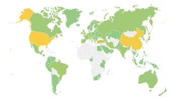
The World Design Rankings (WDR) have released the current ranking of countries based on the number of designers that have won the A' Design Awards. The countries are represented by the participating designer's nationality and the rankings are based on the current aggregated scores of participants between 2010 and 2017. … [Read more...]
12 Visual Hierarchy Principles Every Designer Should Know
Visual hierarchy is the arrangement and presentation of design elements in order of their importance. It influences the order in which the human eye perceives the information that is being displayed. A simple example would be a business card - the name of the organisation is usually the most prominent element, followed by the name of the card holder, job title, and contact … [Read more...]
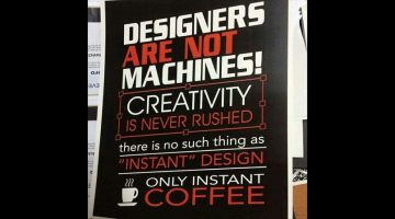
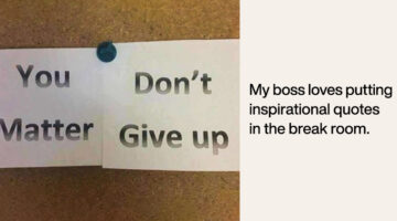
17 Memes Every Graphic Designer Will Relate To
Having a long day at work? Boss giving you a hard time? Client being a prick? Then indulge in some meme therapy and brighten up your day. Memes stimulate the release of endorphins in your brain, which reduces stress levels and makes you forget about work problems and deadline-related anxiety. In a study of more than 150 working professionals, scientists found that when … [Read more...]
17 Images That Prove Viktoria Solidarnyh Is The Queen Of Photoshop
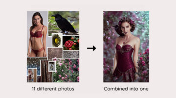
Ukrainian digital artist Viktoria Solidarnyh is a Photoshop wizard who has mastered the art of photo manipulation and composition. She combines multiple images (that look like they won't blend together) into one surreal, dream-like visual that doesn't look like a composite. Viktoria takes 3 to 5 days to create one artwork. She uses Photoshop, Lightroom, and a graphics … [Read more...]
Designers Share Valuable Advice They Would Give To Their Younger Selves If They Could Go Back In Time
If you could go back in time and give advice about the graphic design profession to your younger self, what would it be? Would you suggest building a diverse portfolio early on, or networking more effectively? What about the importance of continual learning and staying abreast of evolving design trends? Understanding the value of constructive criticism and resilience in … [Read more...]
Designer Turns Popular Gadgets Into Letters Of The Alphabet, And They’re Pretty Cool
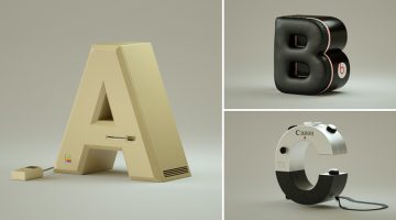
Brazilian designer Vinicius Araújo has come up with an exceptional typography project which showcases the letters of the alphabet in the shape of well-known gadgets, based on their initials. For example, the letter 'J' has been designed to look like a JBL speaker. The letter 'C' is based on the industrial design of a Canon Camera. The letter ‘L’ has been created using an LG … [Read more...]
8 Types Of Clients You Never Want To Work With

Which type of clients do you find the most difficult to work with? The design experts who think they have an eye for design? The penny pinching visionaries with tiny budgets and huge expectations? Or the workaholic clients who work round the clock and expect you to do so as well? GetCRM has put together a relatable infographic that lists the eight types of difficult clients … [Read more...]
What Hollywood Movies Look Like Without Visual Effects
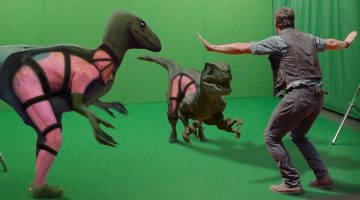
In the old days, what you would see on a movie set would pretty much be what you saw in the final movie. With modern technology giving us the capability of computer generated imagery (CGI), all you need is a green screen and a couple of props. Because of this, movie sets nowadays look completely different to what you see in the final movie. Fame Focus has come up with a … [Read more...]
Short, Useful Design Tips For UI/UX Designers
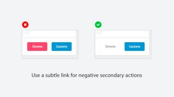
Steve Schoger is a multidisciplinary designer based in Kitchener, Ontario. When he finds time off from running his design and illustration studio, he curates 'Little UI Details' - a Twitter collection of short, useful design tips for UI/UX designers. Steve's tweets cover different elements of UI design and also include before-after mockup images that make them all the more … [Read more...]
Beautiful Images Of Everyday Objects Organized By Color
Caroline South is a photographer and content-creator based in West Sussex, UK. A graduate of the Surrey Institute of Art and Design, Caroline loves to paint, draw, and craft artwork using natural or 'found' items. She spends a lot of time exploring the Southern Coast collecting pottery and sea glass which she often uses in her photography. Color is an important aspect of … [Read more...]
This Guy Photoshopped Himself Into His Childhood Pics To Hang Out With His Younger Self

What would it be like to meet your childhood self? Until time travel is invented, we'll probably never know. But Montreal-based photographer Conor Nickerson used a handy little time machine called Photoshop to travel back in time photographically and hang out with his younger self. He photoshopped his present self into his childhood photos from 1997-2005, and by the looks of … [Read more...]
- « Previous Page
- 1
- …
- 4
- 5
- 6
- 7
- 8
- …
- 15
- Next Page »