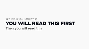
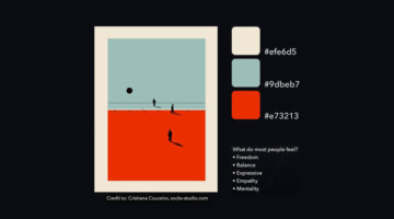
Visual hierarchy is the arrangement and presentation of design elements in order of their importance. It influences the order in which the human eye perceives the information that is being displayed. A simple example would be a business card – the name of the organisation is usually the most prominent element, followed by the name of the card holder, job title, and contact … [Read more...]
40 Brilliant Logos With Hidden Meanings

Indian graphic designer Gary Dimi Pohty has taken on a design challenge titled "One logo a day" in which he creates logos with hidden meanings on an almost daily basis. At the moment, he is on day 2278! Gary's logos are based on common, everyday words and fictitious brands or films. He uses symbolism, negative space, and geometric elements to visually represent the meanings … [Read more...]
7 Design Terms You Will Never Get Wrong Again
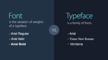
When starting out, most designers don’t know the difference between a font and a typeface. They use the two terms interchangeably. A font is the variation of weights (regular, bold, italic) of a typeface. A typeface is a family of fonts, such as Helvetica, Futura, Bebas, Gotham, etc. Another example is the use of the terms hue and color. Hue is any of the primary colors - … [Read more...]
35 Beautiful Color Palettes For Your Next Design Project
Looking for color palettes for your graphic, web, or UI design? Coolors is a useful online tool that lets you create, save, and share beautiful color schemes and gradients. You can browse and filter palettes by color or popularity, save them to your account, or download them as PNG, PDF, CSS, SVG, and more. Coolors is also available as an iOS App, Adobe Add-on, and a Chrome … [Read more...]
30 Clever Logos With Hidden Meanings, And The Design Thinking Behind Them
Indonesia-based Grafast Design Studio has come up with a series of interesting logos that combine different shapes and letters into unique symbols that visually represent the brand name. In each logo, the letters used are the initials of the brand name and the shapes represent the product or service offered by the company. For example, the logo for Victory Coffee combines … [Read more...]
Designers Are Sharing Their Redesigns Of Famous Logos And Some Of Them Are Better Than The Original
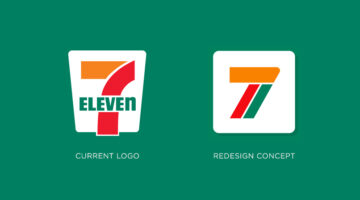
Have you ever looked at a famous logo and thought that you could have done a better job? Of course you have! With so many brands opting for redesigning their logos nowadays, designers from all over the world are sharing their rebranding concepts and reimagined versions of iconic brand logos. We've shortlisted some of the best redesigns on Dribbble and Behance, and a few of … [Read more...]
Free And Cheaper Alternatives To Photoshop, Illustrator, And Other Adobe Creative Software
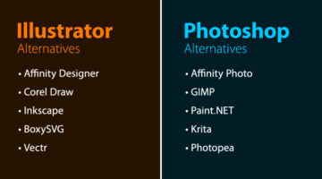
Looking for free options for Adobe Creative Cloud programs? Quze has compiled a list of free and cheaper (one-time purchase) alternatives to Adobe Photoshop, Illustrator, InDesign, XD, Dreamweaver, After Effects, Animate, and Audition. The list includes some well-known alternatives like Affinity Suite, Corel Draw, Canva, Sketch, Figma, etc. and also a few relatively … [Read more...]
22 Images That Show Why Letter-Spacing Is Important
Ever wondered why professional designers focus so much on kerning, i.e., adjusting the spacing between letters or characters in a piece of text? Improper kerning (or keming as it is humorously known) can change the meaning of a sentence to a great extent. And sometimes, the results can be hilarious. These 22 epic images show you why letter-spacing is important not just in … [Read more...]
25 Clever Logos With Hidden Meanings
Russian graphic designer Vlad Smolkin has shared an interesting collection of hidden-meaning logos that he has created for different clients over the years. The designs use clever typography and symbols hidden in negative spaces to visually represent the brand name or explain the nature of the business. For example, the logo for Infinity Cat Cafe is an abstract infinity … [Read more...]
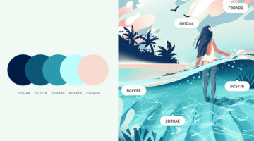
Tri-Color Palette Ideas For Your Next Design Project
It's easy to find two colors that go well with each other, but things get tricky when you add a third color to the mix. Each color must complement the other two perfectly. If you’re looking for tri-color palettes for your graphic, web, or UI design, Wolvus Technology has come up with a series of beautiful combinations that look great together. You can use these colors for … [Read more...]
Names And Codes Of All Color Shades
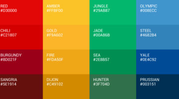
It's "maroon", not dark red. Just like it’s "navy", not dark blue. Graf1x has created a handy Color Thesaurus – a collection of charts and posters that list the correct names and hex codes of all major color shades. The charts are a useful reference tool for artists, designers, studios, students, teachers, interior decorators, make-up professionals, and just about anyone. … [Read more...]
32 Brilliant Logos With Hidden Meanings
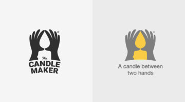
Looking for some logo design inspiration? Here are 32 brilliant examples with dual and hidden meanings, also known as visual double-entendres. In most cases, the hidden symbols are a visual representation of the brand name, and in others, they explain the nature of the business. Clever typography, negative space, and visual symbolism are some of the design techniques used to … [Read more...]
No One Has Been Able To Guess All The Countries In These Visual Wordplays – Can You Be The First?
Bahrain-based art director Faraz Manzoor has come up with an interesting project that features names of countries visualized as icons + letters. The phonetic pronunciation of the icons combined with a few letters of the country name completes the riddle. This clever technique is known as a rebus, where pictures, symbols, and letters are used to phonetically or visually … [Read more...]
30 Clever Wordmarks That Use Negative Space Brilliantly
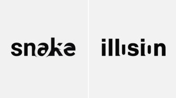
Netherlands-based logo designer Sander has come up with an interesting project that features typographic logos (or wordmarks as he prefers to call them) of common words we use every day. He uses the negative space between the letters to create objects that visually represent the meanings of the words. For example, the design of the word SHARP consists of a knife in the … [Read more...]
Top 8 Websites For Free Vector Art And Graphics
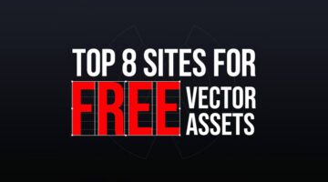
As a designer, it’s imperative that you know where to find the right assets for your design projects. Previously, we featured resources for free stock images, fonts, colors, gradients, and some handy design tools to improve your workflow. Today, we focus on the top resources for free vector assets. Wolvus Technology has come up with a handy list of websites that let you … [Read more...]
9 Useful Design Tools You Probably Haven’t Heard Of
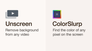
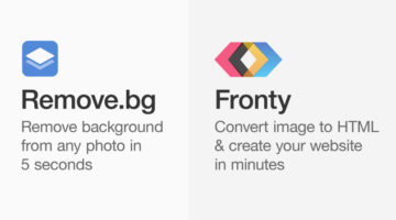
Online design tools and web apps can help designers boost their creativity by providing them with resources and inspiration. They can also speed up workflow by finding design assets quickly and performing relevant tasks. Ottawa-based visual designer Ismail Benmbarek has come up with a handy list of (relatively less known) websites that let you remove backgrounds from videos, … [Read more...]
Top 10 Netflix Documentaries For Graphic Designers
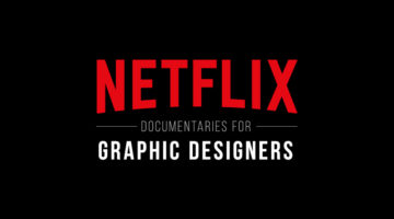
When we're looking for creative ideas and inspiration, we usually browse our favourite websites, blogs, and social media channels. But did you know that Netflix is packed with inspiring documentaries on all kinds of creative topics? The only challenge is finding them. Creative Bloq, InVision, and we at Digital Synopsis have shortlisted some of the best Netflix documentaries … [Read more...]
39 Epic Memes For Graphic Designers
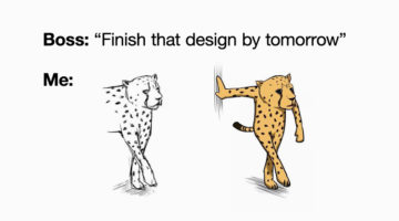
Are you in the middle of a tough project with a tight deadline? Are your clients giving you sleepless nights? Are you tired of your creative director micromanaging everything? If yes, then what you need is a healthy dose of meme-therapy to help brighten up your day. Memes stimulate the release of endorphins that create a sense of well-being within the body. In a study of 450 … [Read more...]
25 Free Beautiful Vector Gradients For Your Next Design Project
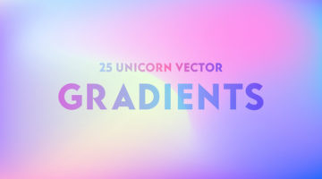
New Delhi-based designer and 3D illustrator Amrit Pal Singh has come up with a free collection of 25 trendy vector gradients inspired by Unicorns. These kind of holographic and multicolored pastel gradients are one of the major trends in graphic, web, and UI design nowadays. Amrit claims that no unicorns were harmed during the making of this product ?. Check out the … [Read more...]
Forget AI, This Guy’s Unreal Photoshop Skills Prove Nothing Beats A Human Touch
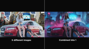
Good Photoshop work isn’t just about technical execution, it’s about restraint, balance, and intention. With composite images, it’s easy to go overboard, too much contrast, unnatural cutouts, inconsistent shadows. What makes a great edit stand out is how invisible the editing feels. When everything sits together naturally, the image doesn’t just look edited, it looks … [Read more...]
Designer Replaces Wordmarks In Famous Logos With The Names Of The Artists And Agencies Who Designed Them
Italian graphic designer Emanuele Abrate has come up with an interesting project titled 'Who Designed it?', in which he substitutes wordmarks of famous logos with the names of the designers and agencies who created them. The objective of the project is to highlight the artists who designed these well-known symbols, and make them an integral part of their respective … [Read more...]
Graphic Designer Fixes The 9 Worst Logos Ever
Regular readers of Digital Synopsis must have read our article on 25 epic logo design fails. Now, Italian graphic designer Emanuele Abrate has come up with an interesting project in which he has redesigned the 9 worst logos out of that list. Emanuele has tried to recreate these logos as if they were commissioned to him. He's used different typography techniques, created … [Read more...]
8 Free Design Tools To Improve Your Workflow
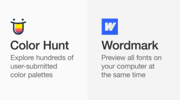
Online design tools and web apps can help designers boost their creativity by providing them with resources and inspiration. They can also speed up workflow by helping you collaborate better, find design assets, and perform relevant tasks. Montana-based graphic/web designer Josh Corbett has come up with a list of free tools that can help you explore color palettes, browse … [Read more...]
Designer Redesigns Famous Logos In The Time Of Coronavirus And Social Distancing
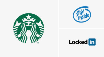
Slovenian graphic designer Jure Tovrljan has come up with a clever project that features famous logos reimagined for the age of coronavirus and social distancing. For instance, the Starbucks logo has been redesigned to show the siren wearing a mask. The "Intel Inside" logo has been rebranded to "Stay Inside", LinkedIn has been rebranded to "LockedIn", and so on. Check out … [Read more...]
Designer Explains Coronavirus Precautions Using Graphic Design Terms
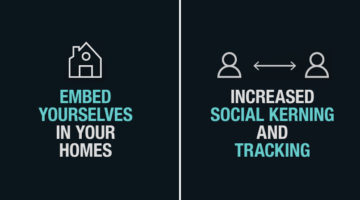
Maaz Afzal from Pen28 Creatives has come up with a clever project that explains Covid-19 precautions using graphic and web design terms. The objective is to guide designers to practice safe procedures using terms that they relate to. For example, the project advises designers to "increase social kerning", "avoid condense layouts", and "embed yourselves at home". Check out … [Read more...]
Graphic Designer Replaces Wordmarks In Popular Logos With The Fonts They Use
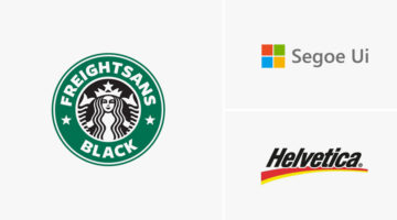
Italian graphic designer Emanuele Abrate has come up with a clever project titled Logofonts, in which he substitutes wordmarks of famous logos with the name of the fonts they use. For example, the word "Omega" in the Swiss watchmaker’s logo has been changed to "Futura" written in the same style as the original logo. Nutella’s wordmark logo has been changed to "Avant Garde", … [Read more...]
Hidden Meanings In 50 Famous Brand Logos

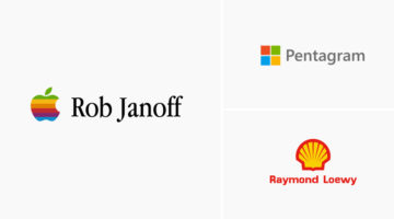
Did you know that the orange arrow in the Amazon logo points from the letter "A" to "Z", symbolizing that Amazon has every item from A to Z. The Nike "Swoosh" logo is not just a checkmark. It also symbolizes the wing of Nike, the Greek goddess of victory. Apple logo designer Rob Janoff took a bite out of an apple as an experiment, then realized that the word "bite" sounds … [Read more...]
Top 8 AI Tools For Graphic Designers
Artificial Intelligence can help designers boost their creativity by providing them with material and inspiration. It can also speed up workflow by taking care of boring and tedious tasks that require a lot of time and effort. Albanian UI/UX designer Dorjan Vulaj has come up with a handy list of AI tools that can help you enhance images, create font combinations, generate … [Read more...]
7 Graphic Design Mistakes That Novice Designers Make
After a few years in the design business, you realize how important it is to get the basics right. Like using the right number of fonts, maintaining consistency among UI elements, using grids, the importance of whitespace, etc. Montana-based graphic/web designer Josh Corbett has come up with a handy list of 7 graphic/UI design 'sins' that differentiate the pros from the … [Read more...]
Average Salaries Of Designers, Developers, And Photographers Around The World
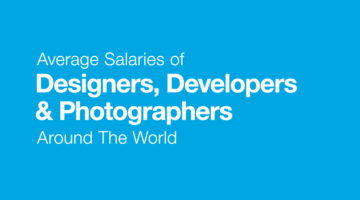
Digital marketing service provider Yell Business looked into some of UK's most popular job roles and calculated the equivalent earnings for those jobs in other countries. We've shared the data for graphic designers, web developers, and photographers below. Yell has taken into account the cost-of-living index of each country in comparison to the UK, and calculated the … [Read more...]
Graphic Designer Replaces Wordmarks In 30 Famous Logos With The Fonts They Use
Italian graphic designer Emanuele Abrate has come up with a brilliant project titled Logofonts that replaces wordmarks of famous logos with the name of the fonts they use. For example, the word "Google" in the tech giant's logo has been changed to "Product Sans" (name of the font used) written in the same colorful style. The wordmark in Amazon's logo has been changed to … [Read more...]
55 Valuable Resources For Logo Designers
Before you begin work on a design project, it's always good to have a list of handy resources you can browse through for tips, ideas, and inspiration. But with so many resources available online, which ones are worth bookmarking? Kalypso Designs has come up with an excellent list of logo design resources across eight categories. These include design tools, type tools, font … [Read more...]
47 Beautiful Color Schemes For Your Next Design Project
Looking for color schemes for your graphic, web, or UI design? SchemeColor is a handy online tool that lets you create, save, and customize beautiful color palettes. You can browse and filter schemes by color or keywords like pastel, rainbow, monochromatic, etc. You can modify the color palettes, and download them in .PNG format. The RGB, CMYK, and hexcodes of each color are … [Read more...]
12 Important Design Principles Explained With Simple Graphics
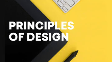
There are no formulas or fixed rules for good design, but there are a few enduring principles that quietly underpin everything we see. They’re what allow you to create design that is functional, effective, and visually compelling, whether you’re working across graphic design, branding, advertising, or UI and UX. Concepts like contrast, balance, hierarchy, alignment, and … [Read more...]
6 Useful Tips To Help You Create Better Gradients
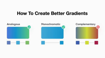
Gradients are a popular trend in graphic, web, and UI design nowadays, but it's important to know how to use them correctly. Smooth, minimal transitions look great in UIs. Use analogous and monochromatic colors instead of complementary colors. When it comes to text, you can use gradients for headings and quotes, but never for body copy. Venezuelan product designer Dan Romero … [Read more...]
- « Previous Page
- 1
- 2
- 3
- 4
- 5
- …
- 15
- Next Page »