Ask any designer about their most memorable project and you’ll likely hear a story that starts with a mood board and ends with the words “can you make the logo bigger?” The gap between how designers see a project and how clients see it is one of the oldest running jokes in the creative industry — and one of the most relatable.
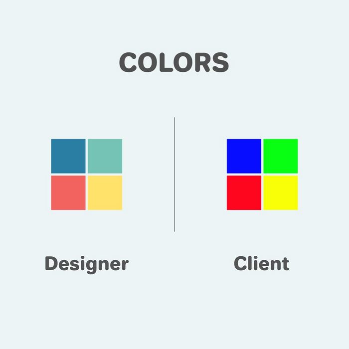
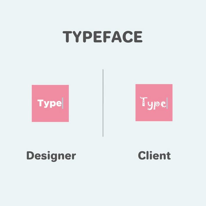
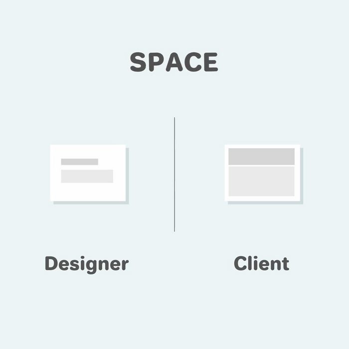
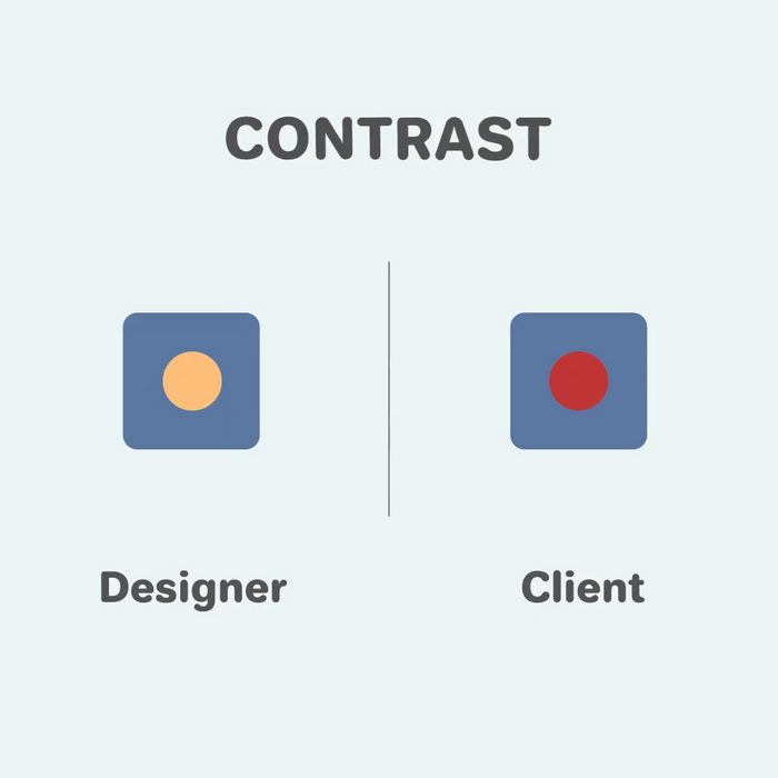
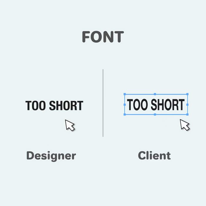
It comes down to perspective. Designers obsess over white space, restrained color palettes, and typography with actual personality. Clients, meanwhile, want brighter colors, a bolder logo, and a font that “pops.” Neither side is wrong, exactly. They’re just fluent in completely different languages, and that translation gap is where all the comedy (and occasional heartbreak) lives.
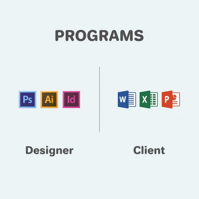
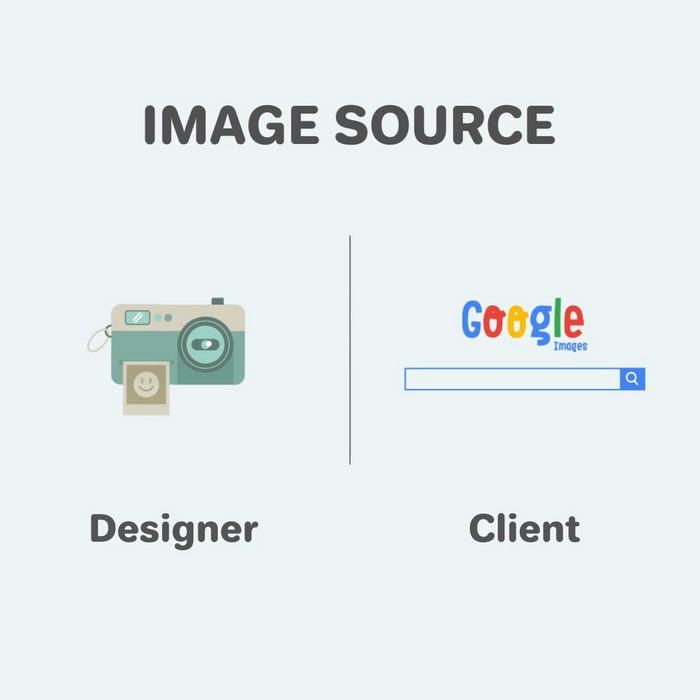
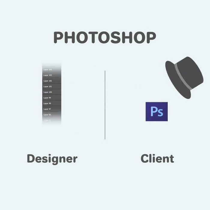
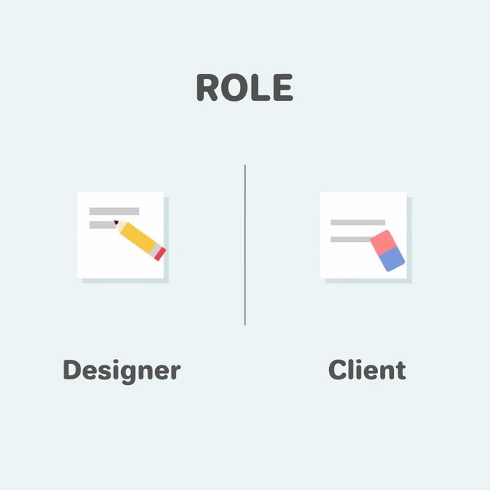
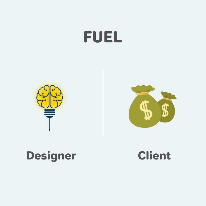
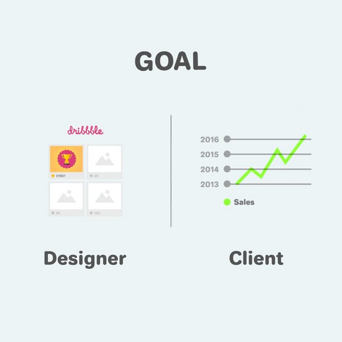
This tension has been captured in a series of minimalist illustrations by Pixelo called “Graphic Designer vs Client.” Each one distills a familiar creative-industry standoff — colors, contrast, fonts, image sourcing — into a single side-by-side image that any working designer will recognize instantly. Scroll down to see all 11, plus the animated version.
1.
2.
3.
4.
5.
6.
7.
8.
9.
10.
11.
Watch the animated version
It’s all in good fun, of course. For every “make it pop” there’s a client who trusts the process completely, and for every stubborn designer there’s one who’s learned that the best work comes from listening as much as pushing back. These illustrations exaggerate the friction because that’s what makes them funny, but underneath the humor is a real reminder of why clear communication matters so much in creative work.