Regular readers of Digital Synopsis must have read our article on 25 epic logo design fails. Now, Italian graphic designer Emanuele Abrate has come up with an interesting project in which he has redesigned the 9 worst logos out of that list.
Emanuele has tried to recreate these logos as if they were commissioned to him. He’s used different typography techniques, created aesthetic logomarks, and kept the brand colors as close to the original ones as possible.
Which do you think is the most successful redesign? Check out the project below and share your feedback in the comments.
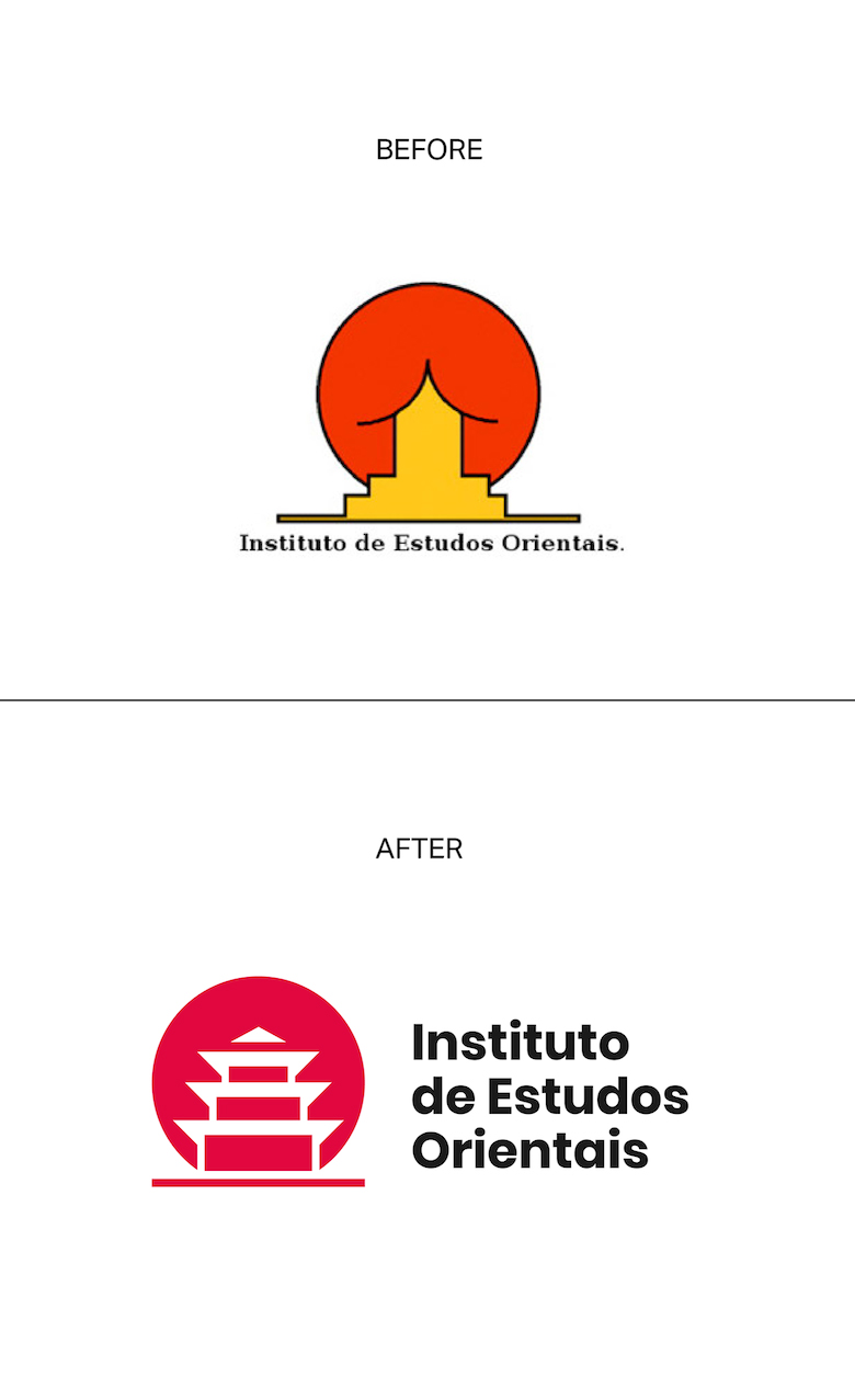
1. Institute of Oriental Studies – Santa Catarina University
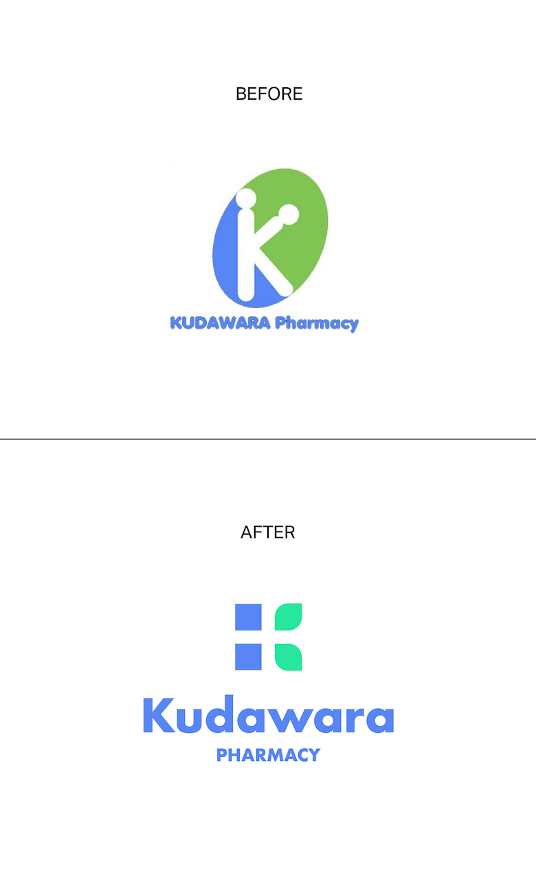
2. Kudawara Pharmacy
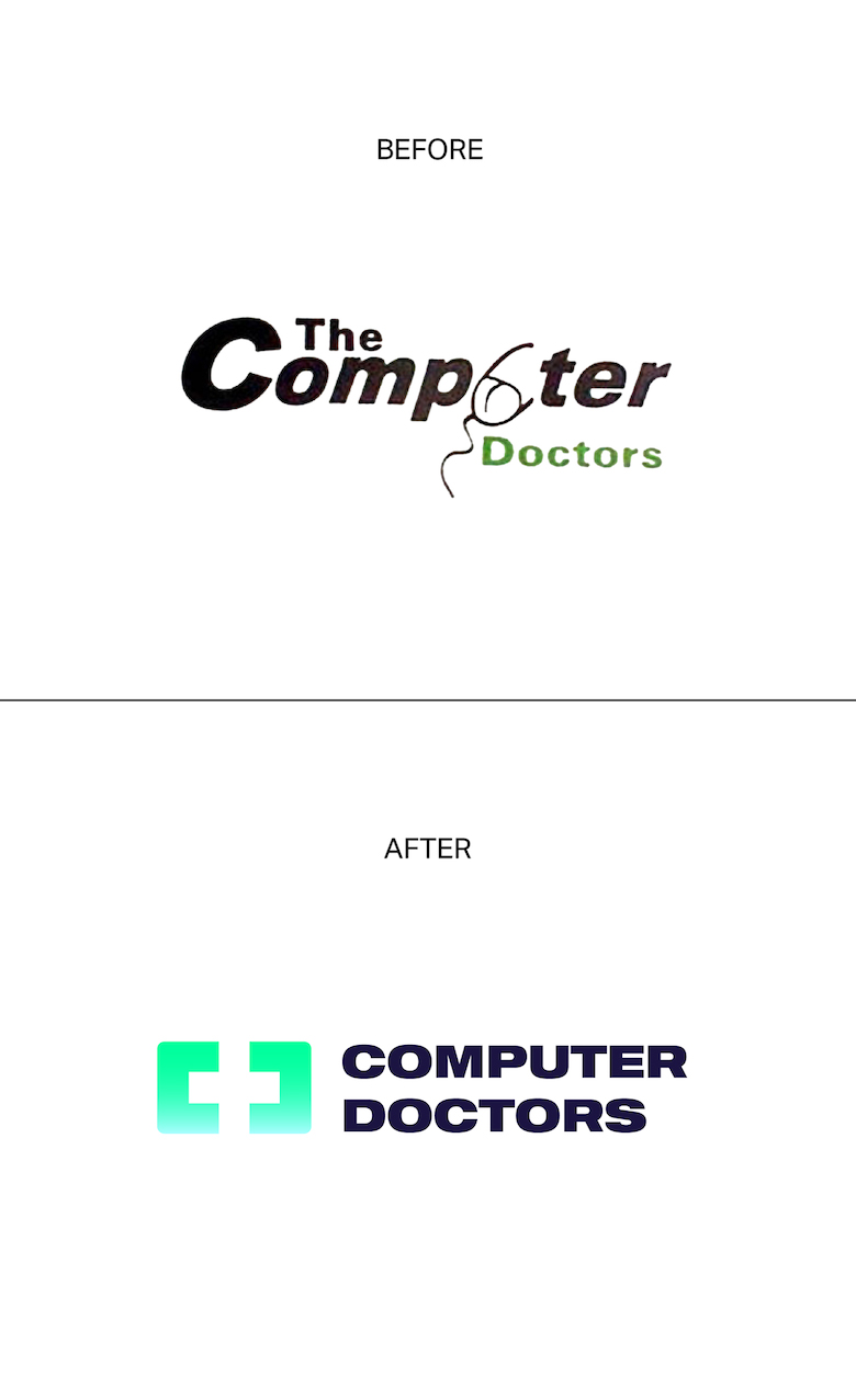
3. The Computer Doctors
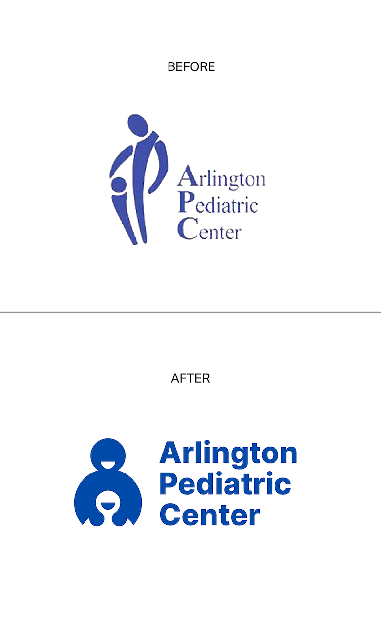
4. Arlington Pediatric Center
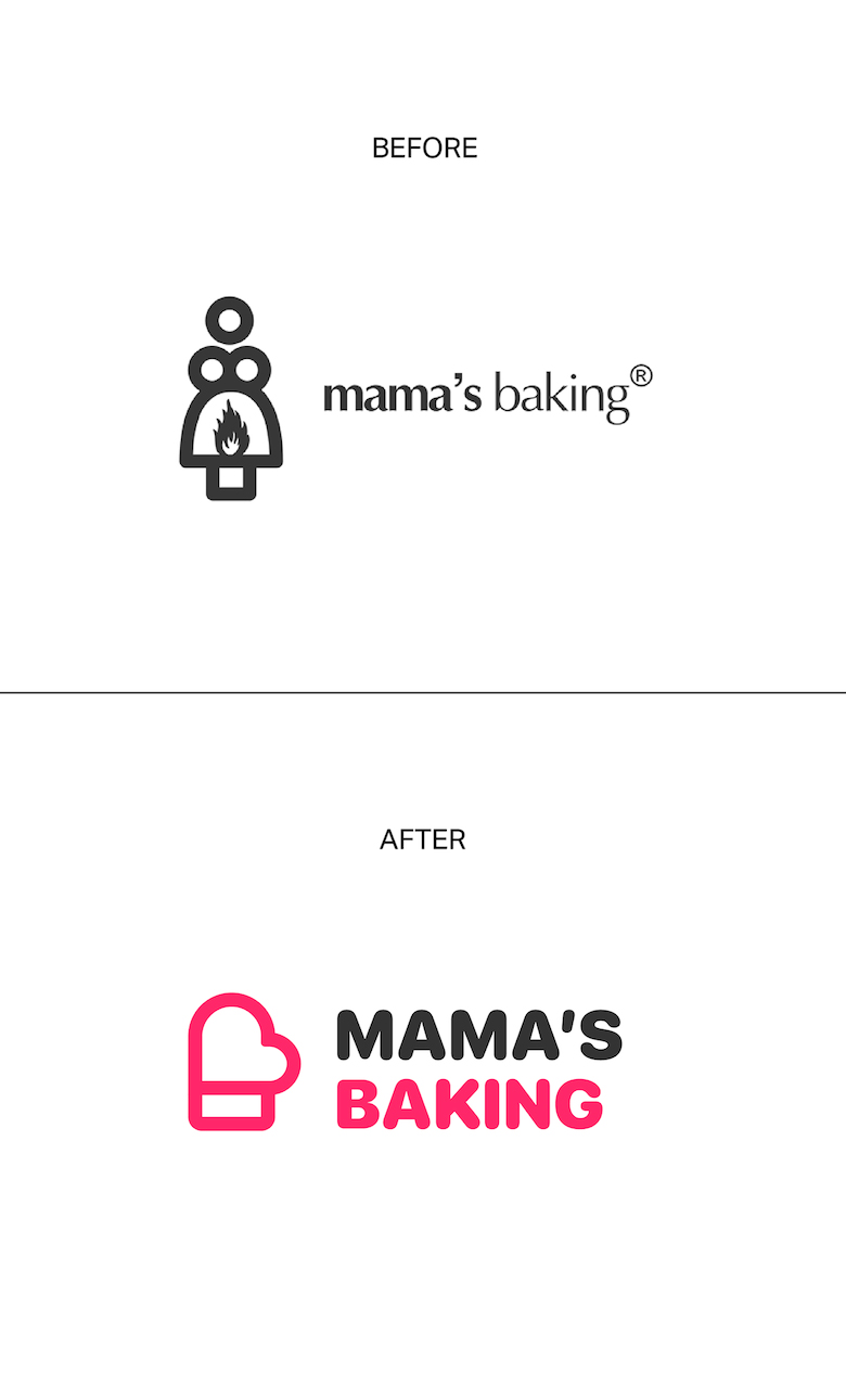
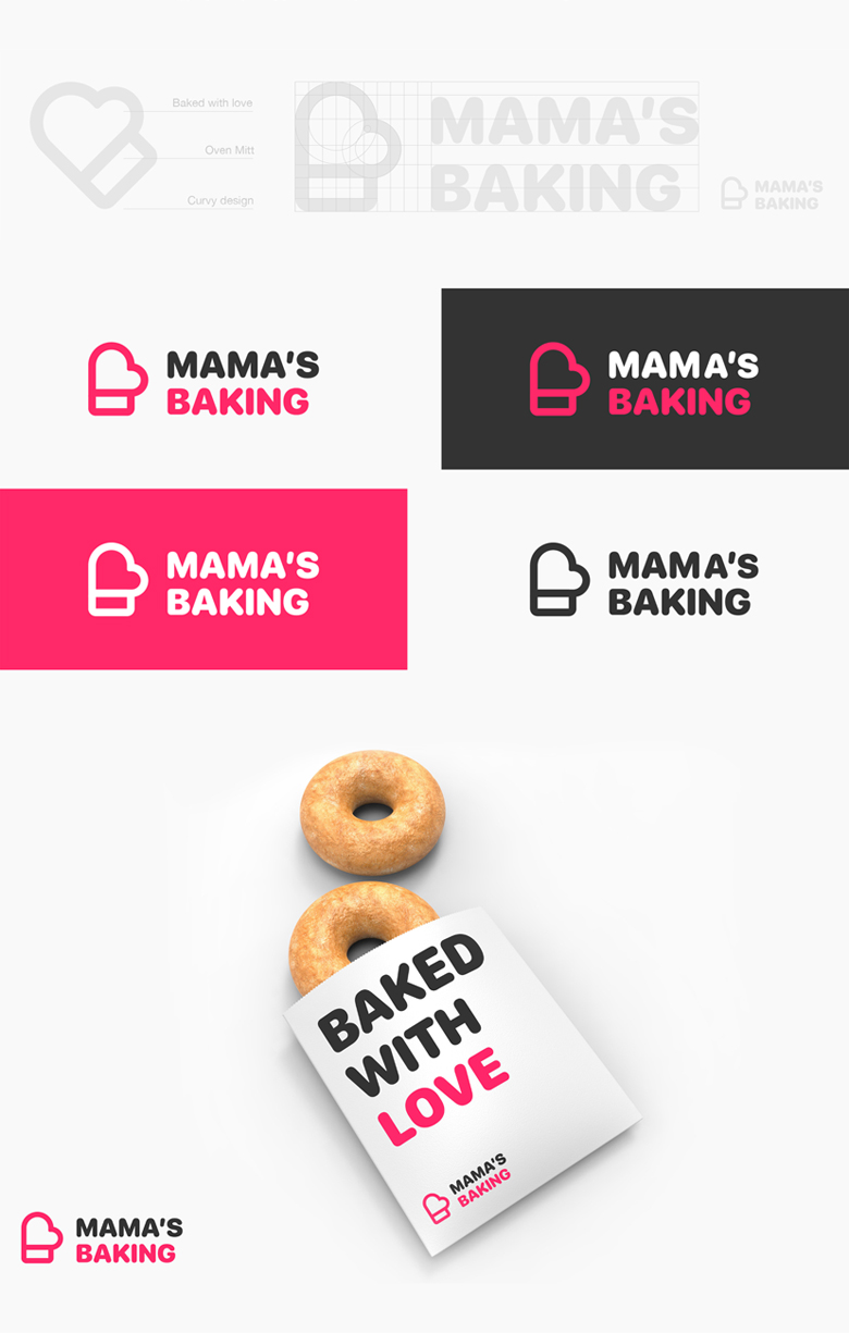
5. Mama’s Baking
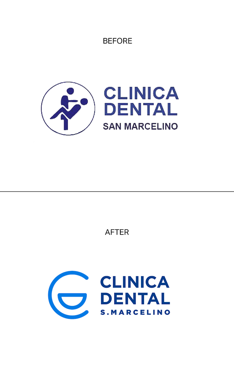
6. Clinica Dental
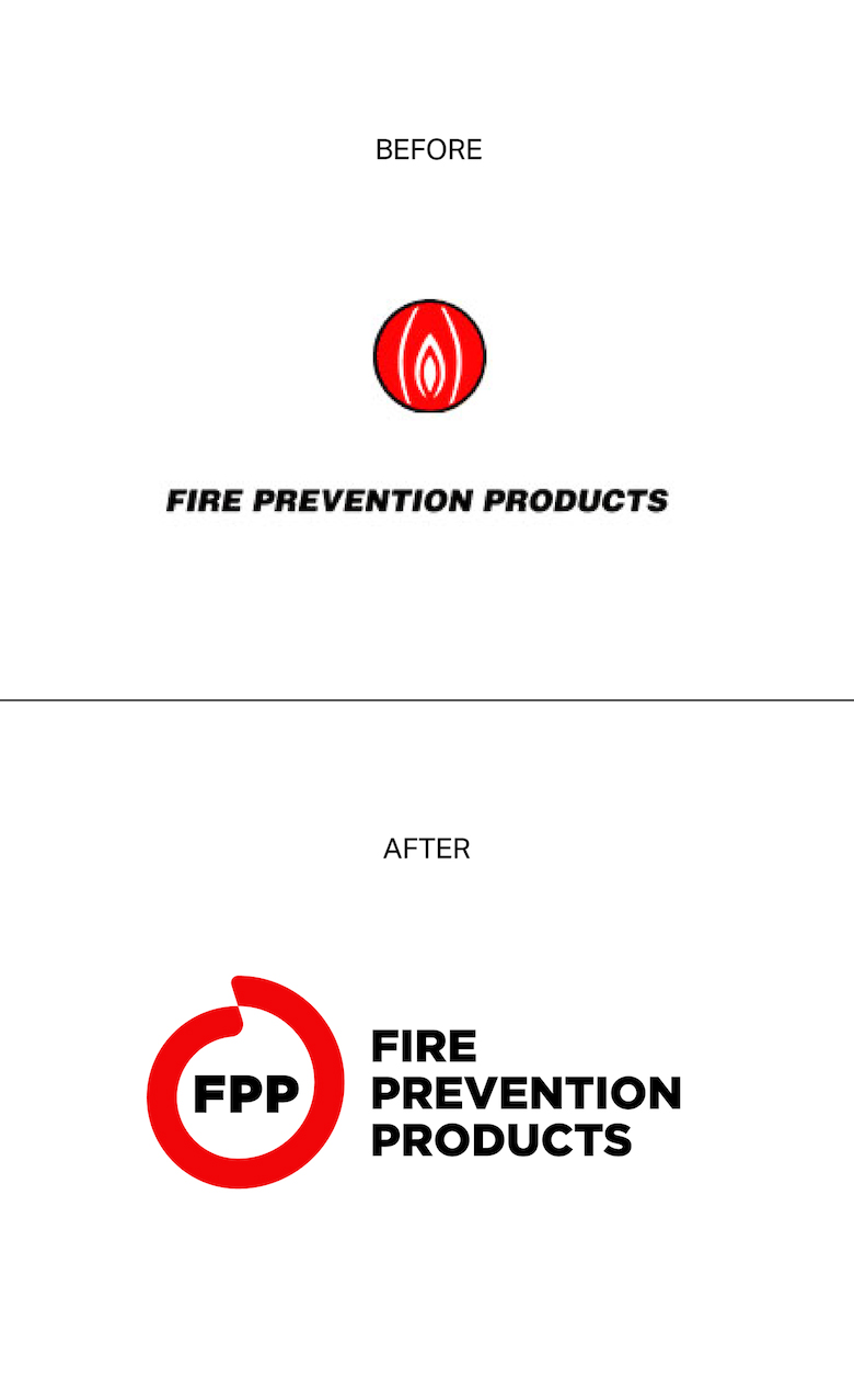
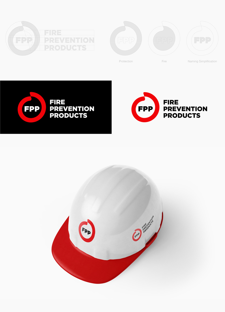
7. Fire Prevention Products
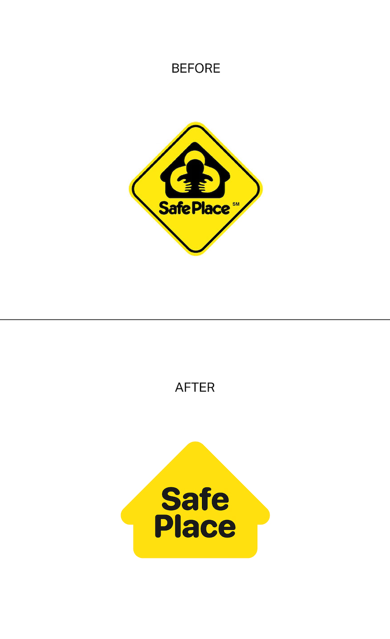
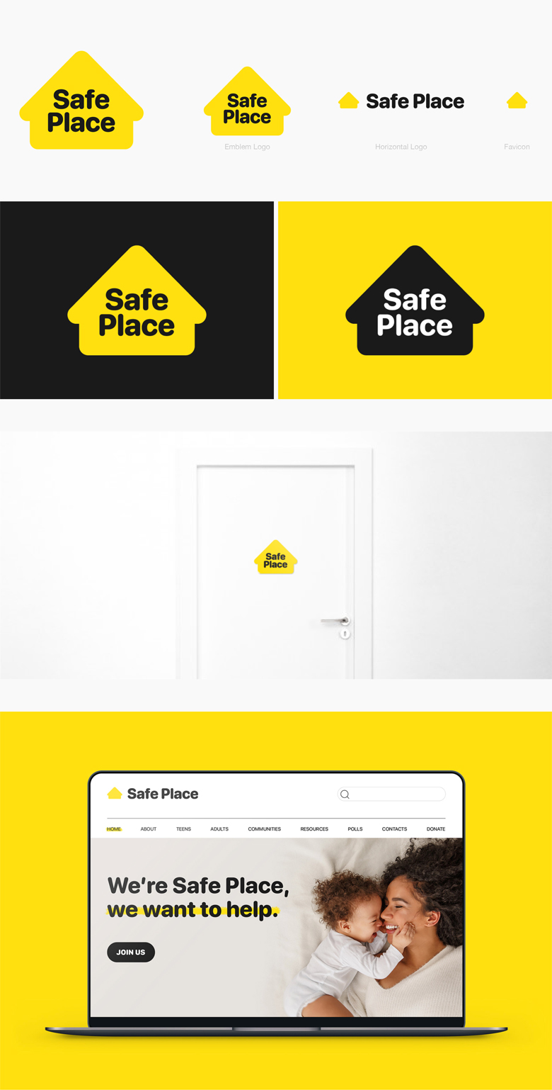
8. Safe Place
Safe Place is a national outreach program for youth in need of immediate help and safety.
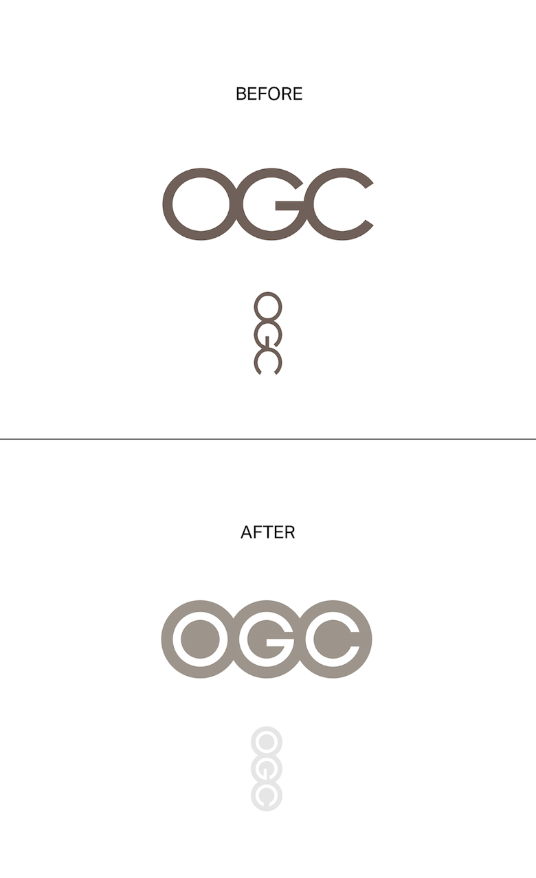
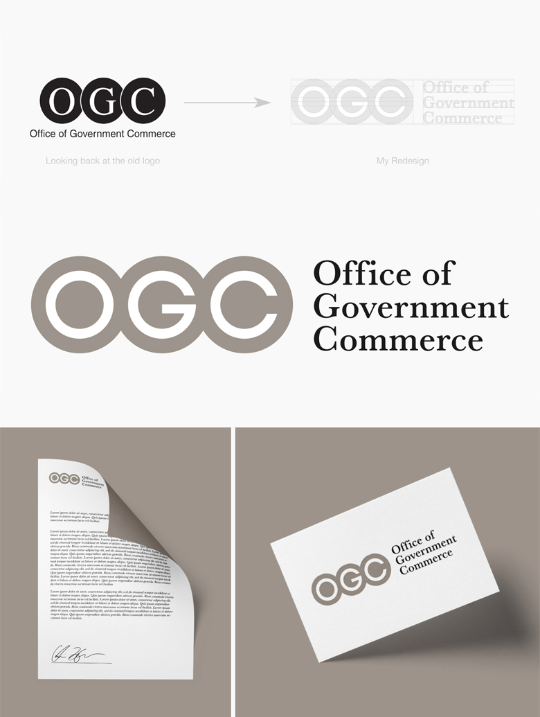
9. Office of Government Commerce
Share this post with a designer friend and voice your views in the comments below.