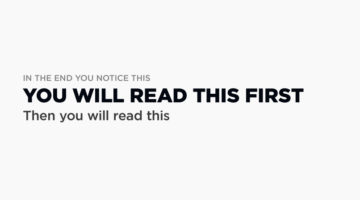
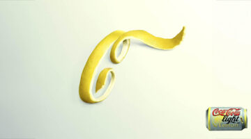
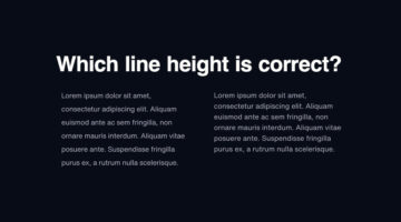
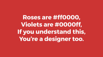
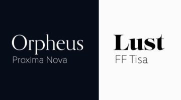
Visual hierarchy is the arrangement and presentation of design elements in order of their importance. It influences the order in which the human eye perceives the information that is being displayed. A simple example would be a business card – the name of the organisation is usually the most prominent element, followed by the name of the card holder, job title, and contact … [Read more...]
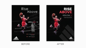
Graphic Designer Improves Adidas Ads By Simply Changing The Typography
Typography is a fundamental element of design that often goes unnoticed, until it’s ineffective. It has the power to enhance an ad’s visual impact and clarity or, when misused, detract from the message entirely. Even well-established brands can occasionally miss the mark. Tom Cargill from Satori Graphics has come up with an interesting before-and-after tutorial in which he … [Read more...]
40 Brilliant Logos With Hidden Meanings
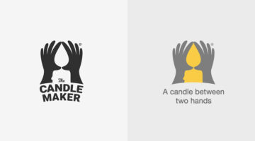
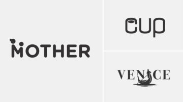
Indian graphic designer Gary Dimi Pohty has taken on a design challenge titled "One logo a day" in which he creates logos with hidden meanings on an almost daily basis. At the moment, he is on day 2278! Gary's logos are based on common, everyday words and fictitious brands or films. He uses symbolism, negative space, and geometric elements to visually represent the meanings … [Read more...]
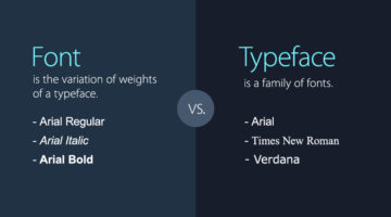
7 Design Terms You Will Never Get Wrong Again
When starting out, most designers don’t know the difference between a font and a typeface. They use the two terms interchangeably. A font is the variation of weights (regular, bold, italic) of a typeface. A typeface is a family of fonts, such as Helvetica, Futura, Bebas, Gotham, etc. Another example is the use of the terms hue and color. Hue is any of the primary colors - … [Read more...]
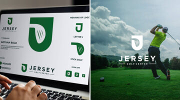
30 Clever Logos With Hidden Meanings, And The Design Thinking Behind Them
Indonesia-based Grafast Design Studio has come up with a series of interesting logos that combine different shapes and letters into unique symbols that visually represent the brand name. In each logo, the letters used are the initials of the brand name and the shapes represent the product or service offered by the company. For example, the logo for Victory Coffee combines … [Read more...]
Graphic Designer Improves Professional Ads By Simply Changing The Typography
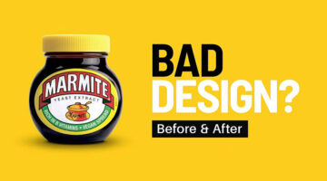
Tom Cargill from Satori Graphics has put together an insightful before-and-after tutorial that demonstrates how subtle yet strategic typography tweaks can make a significant impact on design and layout. In this video, he breaks down real-world advertisements from brands like Gucci, Heineken, Marmite, and more, showing how minor adjustments in typography can enhance hierarchy, … [Read more...]
Designers Are Sharing Their Redesigns Of Famous Logos And Some Of Them Are Better Than The Original
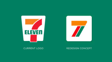
Have you ever looked at a famous logo and thought that you could have done a better job? Of course you have! With so many brands opting for redesigning their logos nowadays, designers from all over the world are sharing their rebranding concepts and reimagined versions of iconic brand logos. We've shortlisted some of the best redesigns on Dribbble and Behance, and a few of … [Read more...]
22 Images That Show Why Letter-Spacing Is Important
Ever wondered why professional designers focus so much on kerning, i.e., adjusting the spacing between letters or characters in a piece of text? Improper kerning (or keming as it is humorously known) can change the meaning of a sentence to a great extent. And sometimes, the results can be hilarious. These 22 epic images show you why letter-spacing is important not just in … [Read more...]
25 Clever Logos With Hidden Meanings
Russian graphic designer Vlad Smolkin has shared an interesting collection of hidden-meaning logos that he has created for different clients over the years. The designs use clever typography and symbols hidden in negative spaces to visually represent the brand name or explain the nature of the business. For example, the logo for Infinity Cat Cafe is an abstract infinity … [Read more...]
32 Brilliant Logos With Hidden Meanings
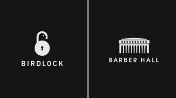
Looking for some logo design inspiration? Here are 32 brilliant examples with dual and hidden meanings, also known as visual double-entendres. In most cases, the hidden symbols are a visual representation of the brand name, and in others, they explain the nature of the business. Clever typography, negative space, and visual symbolism are some of the design techniques used to … [Read more...]
8 Useful AI Tools For Graphic Designers
Artificial Intelligence can help designers boost their creativity by providing them with resources and inspiration. AI design tools can also speed up workflow by taking care of tedious tasks that require a lot of time and effort. Wolvus Technology has come up with a handy list of AI tools that can generate color combinations, remove backgrounds from images, suggest font … [Read more...]
No One Has Been Able To Guess All The Countries In These Visual Wordplays – Can You Be The First?
Bahrain-based art director Faraz Manzoor has come up with an interesting project that features names of countries visualized as icons + letters. The phonetic pronunciation of the icons combined with a few letters of the country name completes the riddle. This clever technique is known as a rebus, where pictures, symbols, and letters are used to phonetically or visually … [Read more...]
30 Clever Wordmarks That Use Negative Space Brilliantly
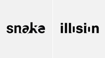
Netherlands-based logo designer Sander has come up with an interesting project that features typographic logos (or wordmarks as he prefers to call them) of common words we use every day. He uses the negative space between the letters to create objects that visually represent the meanings of the words. For example, the design of the word SHARP consists of a knife in the … [Read more...]
9 Useful Design Tools You Probably Haven’t Heard Of
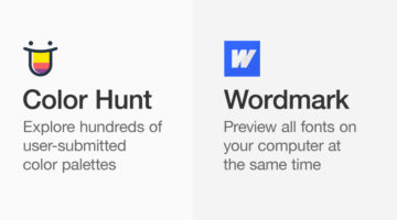
Online design tools and web apps can help designers boost their creativity by providing them with resources and inspiration. They can also speed up workflow by finding design assets quickly and performing relevant tasks. Ottawa-based visual designer Ismail Benmbarek has come up with a handy list of (relatively less known) websites that let you remove backgrounds from videos, … [Read more...]
27 Valuable Resources For Graphic Designers
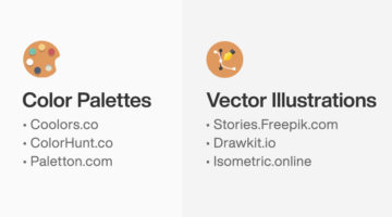
Online toolkits and web apps can help designers boost their creativity by providing them with resources, tutorials, and inspiration. They can also speed up workflow by helping you find design assets quickly, thereby reducing project turnaround time. Wolvus Technology has come up with a handy list of websites that let you browse, explore, and download color palettes, icons, … [Read more...]
39 Epic Memes For Graphic Designers
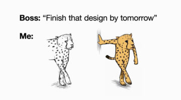
Are you in the middle of a tough project with a tight deadline? Are your clients giving you sleepless nights? Are you tired of your creative director micromanaging everything? If yes, then what you need is a healthy dose of meme-therapy to help brighten up your day. Memes stimulate the release of endorphins that create a sense of well-being within the body. In a study of 450 … [Read more...]
8 Free Design Tools To Improve Your Workflow
Online design tools and web apps can help designers boost their creativity by providing them with resources and inspiration. They can also speed up workflow by helping you collaborate better, find design assets, and perform relevant tasks. Montana-based graphic/web designer Josh Corbett has come up with a list of free tools that can help you explore color palettes, browse … [Read more...]
Graphic Designer Replaces Wordmarks In Popular Logos With The Fonts They Use
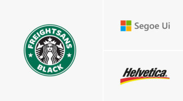
Italian graphic designer Emanuele Abrate has come up with a clever project titled Logofonts, in which he substitutes wordmarks of famous logos with the name of the fonts they use. For example, the word "Omega" in the Swiss watchmaker’s logo has been changed to "Futura" written in the same style as the original logo. Nutella’s wordmark logo has been changed to "Avant Garde", … [Read more...]
Top 8 AI Tools For Graphic Designers
Artificial Intelligence can help designers boost their creativity by providing them with material and inspiration. It can also speed up workflow by taking care of boring and tedious tasks that require a lot of time and effort. Albanian UI/UX designer Dorjan Vulaj has come up with a handy list of AI tools that can help you enhance images, create font combinations, generate … [Read more...]
Nike Says Goodbye To Kobe Bryant With A Beautiful Tribute
They say images speak louder than words, but Nike just proved that is not always the case. The sportswear giant released a touching tribute to Kobe Bryant just ahead of the public memorial service at the Staples Center for the Lakers legend and his daughter Gianna. The two-minute video features no images or footage, just text and audio clips that highlight the various … [Read more...]
7 Graphic Design Mistakes That Novice Designers Make
After a few years in the design business, you realize how important it is to get the basics right. Like using the right number of fonts, maintaining consistency among UI elements, using grids, the importance of whitespace, etc. Montana-based graphic/web designer Josh Corbett has come up with a handy list of 7 graphic/UI design 'sins' that differentiate the pros from the … [Read more...]
Graphic Designer Replaces Wordmarks In 30 Famous Logos With The Fonts They Use
Italian graphic designer Emanuele Abrate has come up with a brilliant project titled Logofonts that replaces wordmarks of famous logos with the name of the fonts they use. For example, the word "Google" in the tech giant's logo has been changed to "Product Sans" (name of the font used) written in the same colorful style. The wordmark in Amazon's logo has been changed to … [Read more...]
12 Important Design Principles Explained With Simple Graphics
There are no formulas or fixed rules for good design, but there are a few enduring principles that quietly underpin everything we see. They’re what allow you to create design that is functional, effective, and visually compelling, whether you’re working across graphic design, branding, advertising, or UI and UX. Concepts like contrast, balance, hierarchy, alignment, and … [Read more...]
39 Clever Ads That Play With Text And Typography
“Typography is an art. Good typography is art.” – Paul Rand. Previously, we featured ads with brilliant art direction, clever copywriting, powerful social issue campaigns, and ads that make good use of negative space. In today's post, we look at some great examples of how brands use typographic art and illustrations in advertising to get their message across. The list … [Read more...]
8 Biggest Typography Mistakes That Novice Graphic Designers Make
One of the key differences between an amateur designer and a professional designer is the way in which they set their type. Professional designers know how many fonts to use and in what size. They know what the correct line-height is, the optimum paragraph length, the right contrast ratio, etc. Polish designer Tom Koszyk has come up with an excellent list of do's and don'ts … [Read more...]
8 Great Google Font Combinations For Your Next Design Project
Previously, we featured 15 great Adobe Font combinations for your graphic, web, and UI design projects. In today’s post, we look at some beautiful Google Font combinations, with the help of this excellent list by Polish designer Tom Koszyk. Koszyk also suggests which font combinations to use for a particular type of app or website. For example, Merriweather and Libre … [Read more...]
7 Mistakes You Should Avoid In Logo Design
Whether you're a beginner or a pro, designing a successful logo for your client is always a tricky task. You need to keep in mind the brand objective, the target audience, and the industry in which the company operates. From an execution point of view, you need to ensure your logo is scalable, the colors are relevant, and the typography is spot on. A successful logo is one … [Read more...]
35 Epic Memes For Graphic Designers
Are you in the middle of difficult project with a stiff deadline? Is your client giving you sleepless nights? Are you tired of your boss micromanaging everything? If yes, then what you need is a healthy dose of meme-therapy to help brighten up your day. In a study of 520 designers and developers, neuroscientists found that memes helped reduce work burnout by upto 64%. They … [Read more...]
8 Great Adobe Font Combinations For Your Next Design Project
Previously, we featured 15 great Google Font combinations for your graphic, web, and UI design projects. In today's post, we look at some beautiful Adobe Font combinations, with the help of this excellent list compiled by Polish designer Tom Koszyk. Koszyk also suggests which font combinations to use for a particular type of app or website. For example, DIN and Neue Haas … [Read more...]
42 Clever Logos With Hidden Meanings Inspired By Everyday Words
Istanbul-based designer Mustafa Ömerli has come up with an interesting project that features typographic logos of common words we use every day. He visually represents the meanings of the words by using symbols, negative space, or by adding geometric elements to the letters. For example, the letter 'k' in the word 'kickboxing' looks like its landing a kick on the letter 'i'. … [Read more...]
Top 7 Laws Of UX Design, Explained With Simple Graphics
Dubai-based UI/UX designer Alejandro Ausejo has compiled a useful series of design tips titled "7 laws of UX design" based on several studies on human behavior and psychology by respectful scientists. These include: • Von Restorff Effect - Hedwig von Restorff • Hick’s Law - William Edmund Hick and Ray Hyman • Fitt’s Law - Paul Fitts • Zeigarnik Effect - Bluma Wulfovna … [Read more...]
8 Useful Tips For Better UI Design
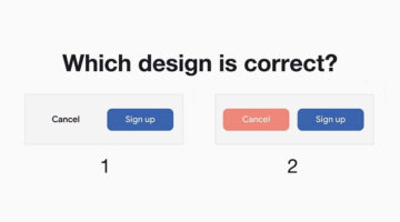
The success of an app or website depends significantly upon its UI/UX design. A recent study by Microsoft found that the average human attention span is down to 8 seconds, compared to 12 seconds in the year 2000. Users now have a lower tolerance for bad UI than ever before. If they can't find what they're looking for quickly enough, they will go elsewhere. Albanian UI/UX … [Read more...]
8 Must-Have Chrome Extensions For Designers
Chrome has a 63.69% market share and most designers prefer the Google-powered browser for its speed, UI, and the ability to add useful extensions. Albanian UI/UX designer Dorjan Vulaj has come up with a handy list of Chrome extensions that can help you find design inspiration, identify fonts and colors from web pages, view CSS, take full page screenshots, generate palettes, … [Read more...]
13 Useful Tips For Better Typography
"Typography is an art. Good typography is art." - Paul Rand. Good typography is what separates the pros from the rookies. It's not just about picking the right font and selecting the right size. It's about attention to details. It's about knowing how much to kern, lead, track, and justify. It's about knowing when to use uppercase and lowercase, and what weights to use. … [Read more...]
32 Epic Memes For Graphic Designers
Stuck in the middle of tough project with a stiff deadline? Is your client being an unreasonable prick? Has your boss put the entire workload on you? If yes, then now is the time to indulge in some meme-therapy and brighten up your day. Memes have been scientifically proven to reduce work-related burnout by upto 57%. In a study of 480 designers and developers, … [Read more...]
- « Previous Page
- 1
- 2
- 3
- 4
- …
- 6
- Next Page »
