Stuck in the middle of tough project with a stiff deadline? Is your client being an unreasonable prick? Has your boss put the entire workload on you? If yes, then now is the time to indulge in some meme-therapy and brighten up your day. Memes have been scientifically proven to reduce work-related burnout by upto 57%. In a study of 480 designers and developers, … [Read more...]
11 Great Font Combinations For Your Next Design Project
One of the best ways to tell an amateur designer from a seasoned professional is by their font pairings. A good designer knows which fonts complement each other, and how to strike typographical balance by using contrast and hierarchy. Here's a list of 10 golden rules of typography that'll help you get it right. If you're looking for examples of good font pairings, Kalypso … [Read more...]
Beautiful Typographic Alphabet Series Of Countries And Their Iconic Landmarks
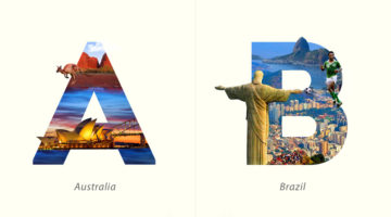
Dubai-based graphic designer Yuhab Ismail has come up with an interesting project titled “LETTRAVEL” that mixes typography and photography to showcase some of the world’s most beautiful countries and their iconic landmarks. Each letter represents the initial of a country and includes images of its famous monument or landscape clip-masked within the letterform. From the … [Read more...]
21 Beautiful Free Fonts For Your Next Design Project
As a designer, no matter how many fonts you have on your system, you always want more. You might use just a fraction of those fonts on a regular basis, but you need to have a gorgeous collection in your repository at all times. And what's the one thing designers love more than a beautiful font? A beautiful font that's available for FREE! Today's post is a collection of 21 … [Read more...]
What Is The Golden Ratio, And How To Use It In Graphic Design
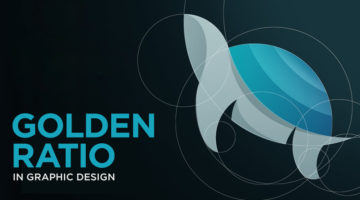
The Golden Ratio, also known as the Golden Section or Divine Proportion, is a mathematical ratio of 1:1.618 based on the Fibonacci sequence. It can be found in nature (flower petals, seeds, shells), in food (artichokes, broccoli, pineapple), and in the human anatomy. The Golden Ratio can also be found in art (Mona Lisa, The Last Supper, Vitruvian Man) and architecture … [Read more...]
3 Designer Friends Created An Alphabet Series Using Logos They’ve Designed Over The Years
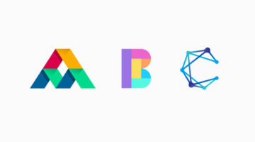
Three graphic designers, colleagues, and friends, Alex Tass, Dalius Stuoka, and Deividas Bielskis decided to put together an A-Z alphabet series made from logo symbols, lettermarks, and monograms they've created over the years. All three designers have been in the industry for over 10 years, and have worked with a variety of clients, brands, and agencies. For this project, … [Read more...]
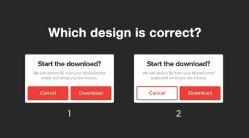
Only Expert Graphic Designers Can Reach The Platinum Level In This UI Design Quiz
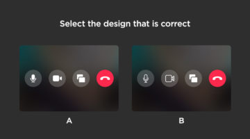
How sharp is your eye for UI/UX design details? Seattle-based UX designer Alex Kotliarskyi has created an addictive UI design quiz called Can’t Unsee that challenges your eye for detail. The web-based game presents two versions of iOS interface screens and asks you to pick which one is correct. Each right answer earns you coins, making the experience both fun and … [Read more...]
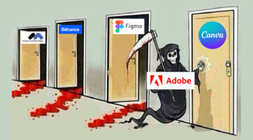
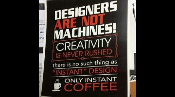
28 Epic Memes For Graphic Designers
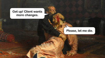
Are you in the middle of a tough project with a stiff deadline? Is your boss or client being a d*ck? Are you tired of creating "Buy Two, Get One Free" flyers and banners? If yes, then indulge in some meme-therapy and brighten up your day. Scientific research has proven that memes help reduce work-related stress by stimulating the release of endorphins that trigger a sense of … [Read more...]
What Logo Styles Do Consumers Trust Most?
SurveyMonkey and infographic maker Venngage surveyed over 1000 adults living in the U.S. on what logo styles they trusted the most. The respondents were shown a series of logos for imaginary companies in six different industries: Jewellery retail, education, financial services, law firm, news/media, and technology. Six variations of each logo were presented: Icon dominant, … [Read more...]
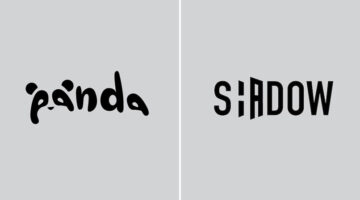
Designer Creates Clever Negative Space Logos That Visualize The Name Of The Company
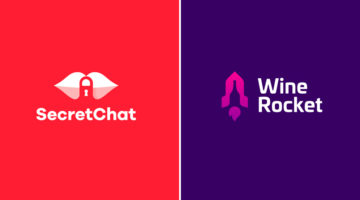
Lithuania-based graphic designer Leo has come up with a series of clever logos that combine the name or initials of the company into one unique symbol using negative space. The logo in each case visually represents the name of the company. For example, the logo for Secret Chat is a pair of lips with a padlock in the negative space between the lips. The logo for Wine Rocket … [Read more...]
Learn In One Minute How To Wrap Text Around Any Image In Photoshop
How do you wrap text around images in Photoshop? Do you manually adjust the length of each line? In this one-minute tutorial, Photoshop instructor Unmesh Dinda from PiXimperfect shows you a simple technique to wrap text around any object, image, or shape, using a custom path created with the Pen tool. With this technique, you don't have to manually adjust the length of … [Read more...]
Simple, Useful Design Tips For UI/UX Designers
'Sparklin Design Tips' is a series of short, useful UI/UX tips by New Delhi-based digital agency Sparklin, shared every Tuesday on their social media channels. Using before-and-after mockup images, the team at Sparklin explains good UI/UX practices with visual examples, making them easy to understand and comprehend. Whether you're a newbie or a seasoned designer, these … [Read more...]
Adobe Fontphoria Can Capture Text In Images And Convert Them To Fonts
How many times have you wanted to know the name of a font used in a particular design or artwork? In some cases, the letters have been hand-drawn and the font doesn't actually exist. But imagine if there was a technology that could scan the text in an image and create an entire font out of it. Well, Adobe is working on a brilliant new tool called Fontphoria – a glyph … [Read more...]
You Can Now Fine People For Design Offenses With This Typographic Ticket Book
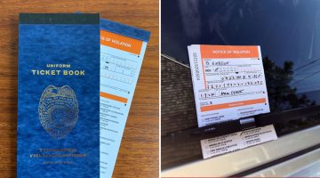
The designers at type foundry Hoefler & Co. have come up with a Typographic Ticket Book that lets you write people up for 32 common design crimes. These include poor typeface choice, improper kerning, inappropriate typeface weight, excessive use of boldface, insufficient leading, and more. Each offence has its own violation code and appropriate penalty. The book contains … [Read more...]
10 Great Fonts You Should Use, And 9 Awful Fonts You Should Avoid
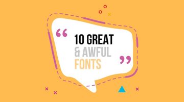
"Typography is an art. Good typography is art." - Paul Rand. Font and typography choices can make or break your design. But with so many fonts to choose from nowadays, which ones should you use, and which ones should you avoid? Tom Cargill from Satori Graphics has come up with an excellent video that features ten prominent fonts used by professional designers, along with … [Read more...]
Designing Logos For Companies With Long Names Can Be Tricky, Here Are 25 Great Examples
When it comes to logo design, a long company name can be quite a challenge. You want to create a logo that's clean and memorable, but lengthy lines of text can look cluttered and uninspiring. Professional designers use different techniques to solve the visual challenges of a long brand name. These include: 1. Splitting the name into two or three lines 2. Using different … [Read more...]
20 Memes Every Designer Will Relate To
Are you in the middle of a tough project with a stiff deadline? Is your client or boss being a prick? Are you tired of creating "Buy One, Get One" ads and banners? If yes, then indulge in some meme-therapy and brighten up your day. Memes have been scientifically proven to help reduce work stress by stimulating the release of endorphins that trigger a sense of well-being … [Read more...]
27 Clever Ambigram Logos That Look The Same When Viewed Upside Down
An ambigram is a typographical design or symbol consisting of text modified in such a way that it can be read in different orientations - inverted, rotated, mirror-image, etc. For example, the logo of Sun Microsystems (no. 4 below) is a brilliantly-designed ambigram that reads 'SUN' from all directions. Another famous example is the New Man logo (no. 6 below), designed by … [Read more...]
19 Graphic Design Mistakes That Novice Designers Make
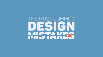
After a few years in the graphic design business, you realize how important it is to get the basics right. Like using proper font and color combinations, implementing visual hierarchy, using grids, alignment, white space, and so on. The team at Visme, an online tool for creating infographics and presentations, has come up with an excellent visual list of 19 graphic design … [Read more...]
Graphic Designer Turns Football Star Neymar’s Dramatic Falls Into A Free Font
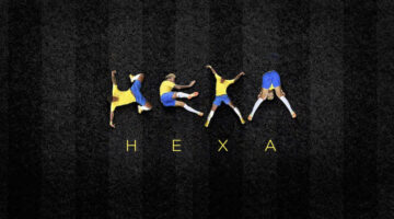
Every World Cup produces its icons. Neymar gave us something no one asked for — a typeface. The internet had its memes, but one designer had a theory. While the rest of the world was busy counting how many times Brazil's star forward hit the turf, São Paulo-based art director Luciano Jacob was quietly noticing something else: the man's body, mid-agony, was forming letters. … [Read more...]
The Font On Adidas’ Football World Cup Jerseys Is Causing A Lot Of Confusion
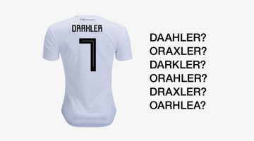
The official Adidas' font, used on its FIFA World Cup jerseys, is causing confusion due to its square, Cyrillic-style letters and numbers. Inspired by traditional Soviet imagery, the font uses sharp 90-degree strokes which causes confusion between letters like 'A' and 'R', 'X' and 'K', 'Z' and '2', etc. FIFA's equipment regulations state that the font used on all apparels … [Read more...]
FIFA World Cup Logos From 1930 – 2026, Which One’s The Best?
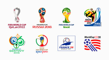
Every four years, the world stops for football. And before a single ball is kicked, a logo arrives — a small piece of graphic design tasked with capturing an entire nation's identity, optimism, and footballing soul. The FIFA World Cup logo is arguably the most scrutinized design brief in the world. The weight of the assignment. Few creative challenges match it: design a … [Read more...]
Clever Logos Of Letters A To Z Based On Common Words That Start With Them
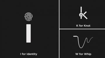
UK-based graphic designers Liam + Jord undertook a 36-day typography challenge to create logos for every letter of the alphabet based on common words that start with them. For example, the letter 'b' has been designed to look like a book, the letter ‘f’ looks like a flag, 'w' looks like a whip, and so on. The objective was to use the shapes of the letters to visually … [Read more...]
Designer Creates Clever Logos That Visualize The Name And Business Of The Company
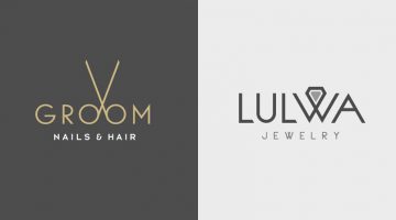
Kuwait-based graphic designer Rami Hoballah has come up with a series of minimalist logos that combine the name and the product (or service) of the company into one unique symbol. The logo in each case visually represents the brand name and the nature of its business. For example, the logo for Groom Salon is a pair of scissors made with the two o's in the word 'Groom'. The … [Read more...]
Two Designers Challenged Themselves To Create A Typographic Logo Every Day For A Year, And They’re Pretty Cool
UK-based graphic designers Liam + Jord undertook a 365-day challenge to create one new typographic logo of a common word we use every day. The objective was to visually represent the meanings of the words by using symbols, negative space, or by adding geometric elements to the letters. For example, the letter 'i' in the word 'drive' looks like a gear stick, the letter 'f' in … [Read more...]
Designer Creates Clever Logos That Visually Represent The Name And Business Of The Company
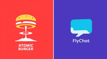
Lithuania-based graphic designer Leo has come up with a series of minimalist logos called "Smart Logos" that combine the name and the product (or service) of the company into one unique symbol. The logo in each case visually represents the brand name and the nature of its business. For example, the logo for Atomic Burger is a burger on top of a mushroom cloud. The logo for … [Read more...]
25 Memes Designers And Agencies Will Relate To
Feeling bored at work? Have 5 minutes to spare before your boss comes back from a meeting? If yes, then check out these 25 epic memes that every mouse-weilding, client-bashing, font-loving designer will relate to. Warning: Some of these memes might make you question your choice of profession. This is perfectly normal. If symptoms persist after 48 hours, please talk to a … [Read more...]
Designer Offers To Create Free Logos For Anyone, Ends Up Creating 50 Logos In 32 Hours Non-Stop
Russian graphic designer Di Buenio undertook a personal logo design challenge titled Logotyposhnaya, in which, he offered to create a free logo for any existing company or brand in 30 minutes. He published a post on his Facebook page and received over 70 applications in the first two hours itself. At the end of the challenge, Buenio had created 50 logos, working non-stop for … [Read more...]
Beautiful Alphabet Series Of The World’s Most Famous Cities And Their Iconic Landmarks
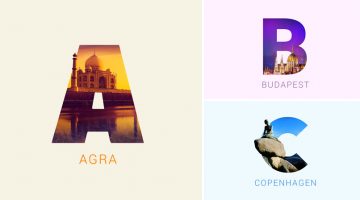
Indian graphic designers Rigved Sathe and Payal Jagwani have come up with a beautiful project titled "Around The World With Type" that mixes typography and photography to represent some of the world's most famous cities and their iconic landmarks. Each letter represents a city and includes a photograph of a famous landmark clip-masked within the letterform. From New York's … [Read more...]
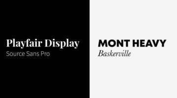
How To Pair Fonts That Complement Each Other (With Examples)
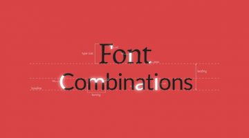
Good font pairing is one of the key differentiators between amateur and professional design. Rookie designers often use more fonts than required and there is lack of typographical contrast in their design. It's tricky because there are no fixed rules as to what kind of fonts work well together, but there are certain guidelines that can help you pick fonts that complement each … [Read more...]
Designer Creates Clever Alphabetical Logos Based On Animal Names And Shapes
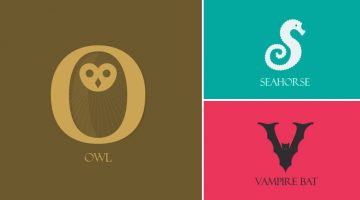
Lebanese graphic designer Rami Hoballah, has come up with an amusing typography project titled 'Animals Alphabet' that showcases letters of the alphabet in the shape of animals. Each letter corresponds to the name of the animal. For example, 'a' looks like the head of an ant, 'b' looks like a bee, 'c' looks like a crab, and so on. Rami used Adobe Illustrator to create these … [Read more...]
Designer Challenges Himself To Create A Typographic Logo Every Day For A Year, Each With A Hidden Meaning
Turning one word into a clever typographic logo is impressive. Doing it every single day for a year, with a new word each time, is where it starts to feel like genius. Stockholm-based graphic designer Daniel Carlmatz set himself a simple but brutal challenge: every day for 365 days, take one ordinary word and redesign its letters so the word visually becomes what it means — … [Read more...]
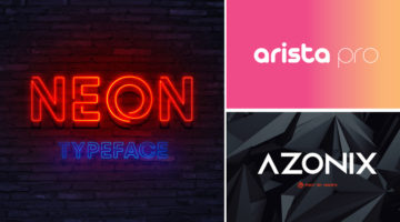
23 Beautiful Free Fonts For Your Next Design Project
What does a graphic designer love more than a beautiful font? A beautiful font that's available for FREE. There's nothing more heartbreaking than finding a gorgeous font, only to see a big red button next to it that says, "Buy Now for $99". To make life easier for our kind, we at DS have compiled a list of 23 stylish and contemporary fonts that you can download for free. The … [Read more...]
Graphic Designer Substitutes Wordmarks In Famous Logos With The Fonts They Use
Italian graphic designer Emanuele Abrate has come up with an interesting project titled 'Logofonts' that features wordmarks of famous logos substituted with the name of the fonts they use. For example, the Nike wordmark in their swoosh logo has been substituted with 'Futura' written in the same italic style. The WhatsApp wordmark has been substituted with 'HelveticaNeue'. … [Read more...]
6 Important Logo Design Principles Every Designer Should Know
Before you start a logo design project, you need to know who the logo is for? Who is the target audience? The logo will define what the business is all about. Should it be masculine or feminine, traditional or modern, exclusive or inclusive? The colors, typography, and geometry of the symbol will depend on all these factors. DesignMantic has come up with a handy infographic … [Read more...]
- « Previous Page
- 1
- 2
- 3
- 4
- 5
- …
- 7
- Next Page »