12 Important Design Principles Explained With Simple Examples
Great design can look effortless, even inevitable, but it’s never an accident. Behind it sits a handful of enduring principles, and they’re what let you create design that is functional, effective, and impossible to ignore, whether you work in graphic design, branding, advertising, or UI and UX.
The proof is in the work you already love. The website you trust the second it loads. The poster whose image stayed with you for years. That one interface so intuitive you never once had to think about it. None of it is luck. It’s the principles of design at work, the quiet logic deciding whether a composition holds together or falls apart.
Great design is often built on the same twelve foundations. Contrast, balance, emphasis, proportion, hierarchy, repetition, rhythm, pattern, white space, movement, variety, and unity. These design principles govern how a layout breathes, where the eye travels, how meaning takes shape inside a frame. Master them and you stop guessing at what looks right. You start to understand why it does.
Handled with intent, these principles vanish, and that’s the point. Nobody notices the balance in a well-set page, or the hierarchy walking them through it. They just feel the work is resolved. Ignore those same principles and even polished visuals turn restless and disjointed, and no one can quite say why.
The trouble is that most explanations bury these ideas in jargon. A definition can tell you what contrast means. It won’t help you spot it doing its job on a real page. That distance, between reading a principle and recognizing it in the wild, is where most design education quietly gives out.
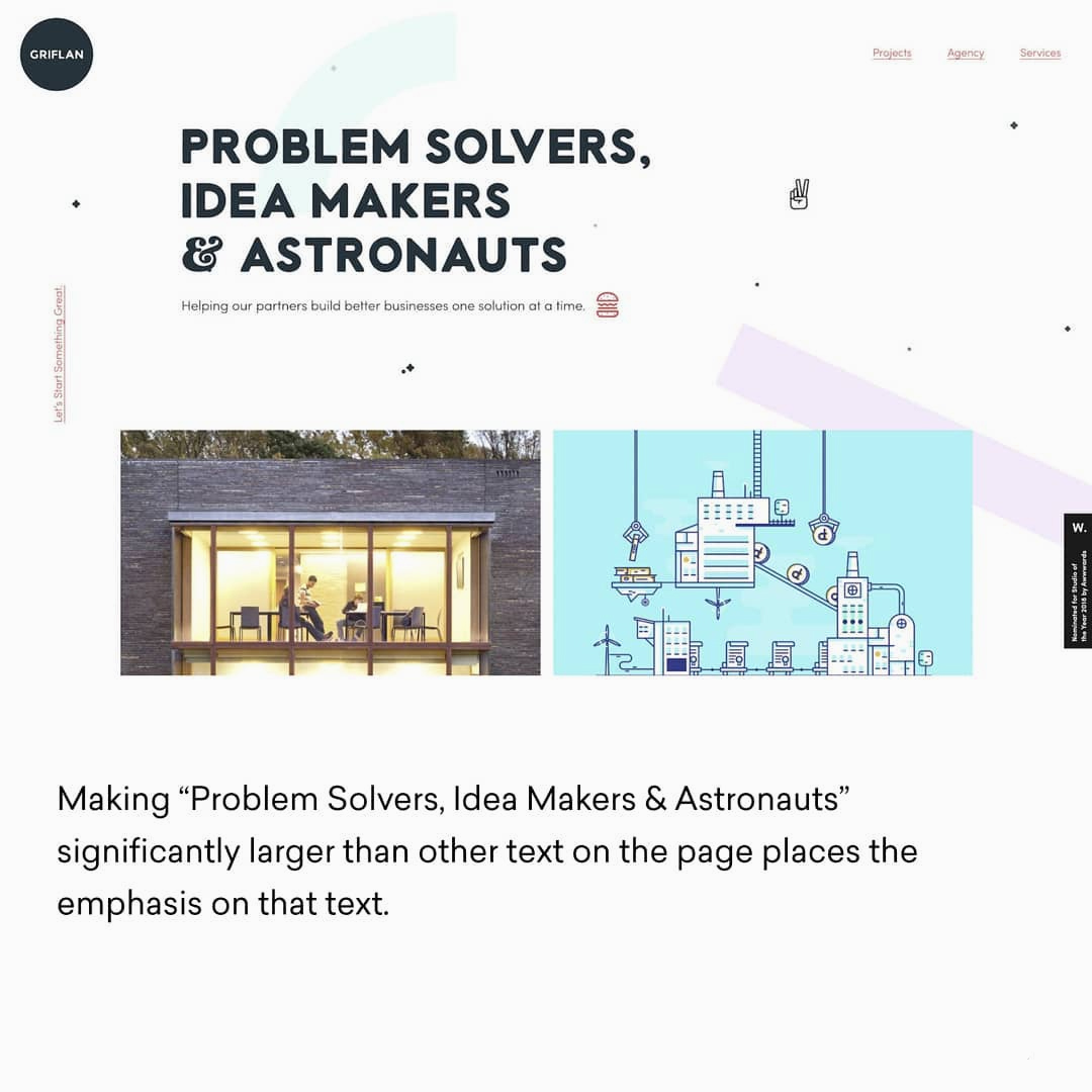
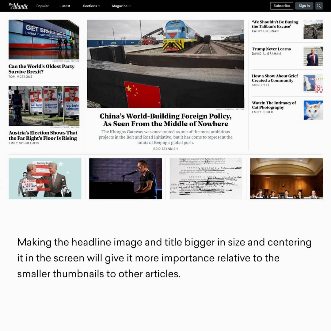
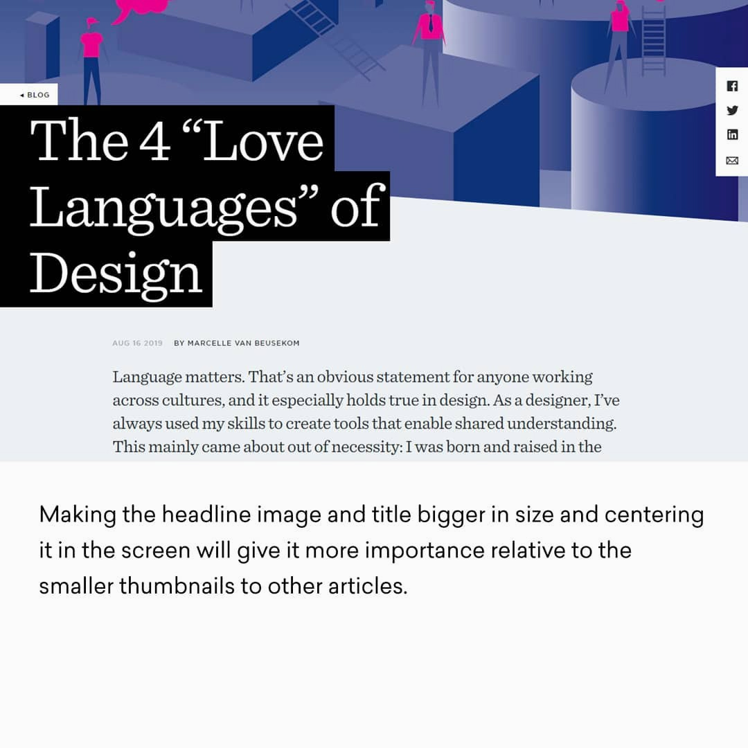
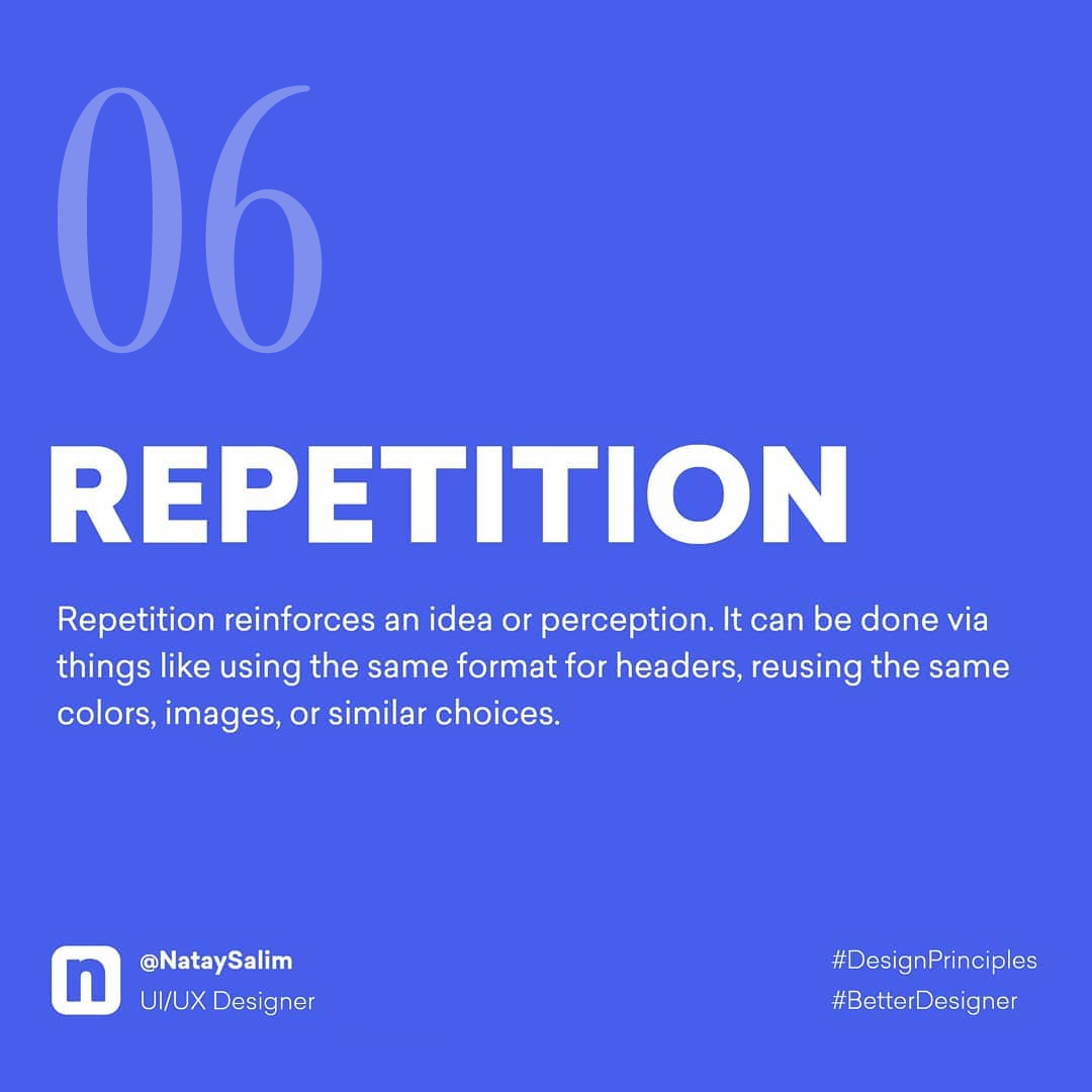
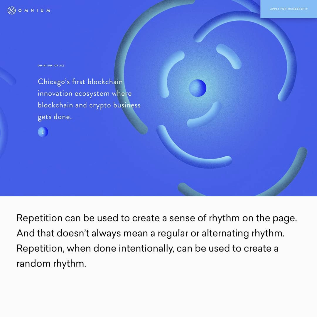
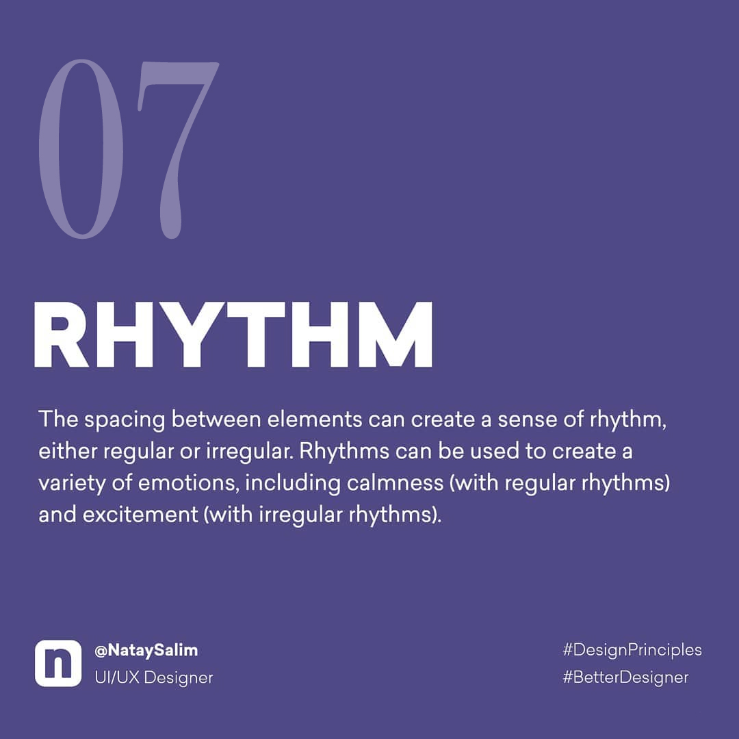
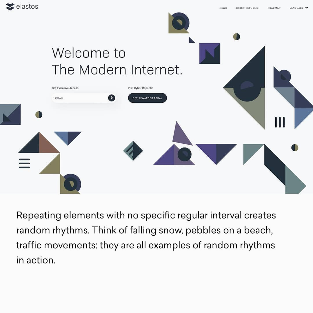
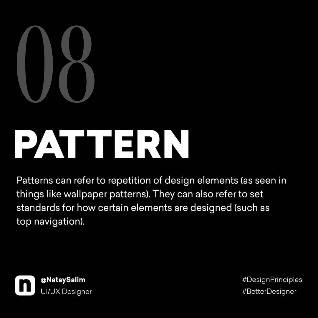
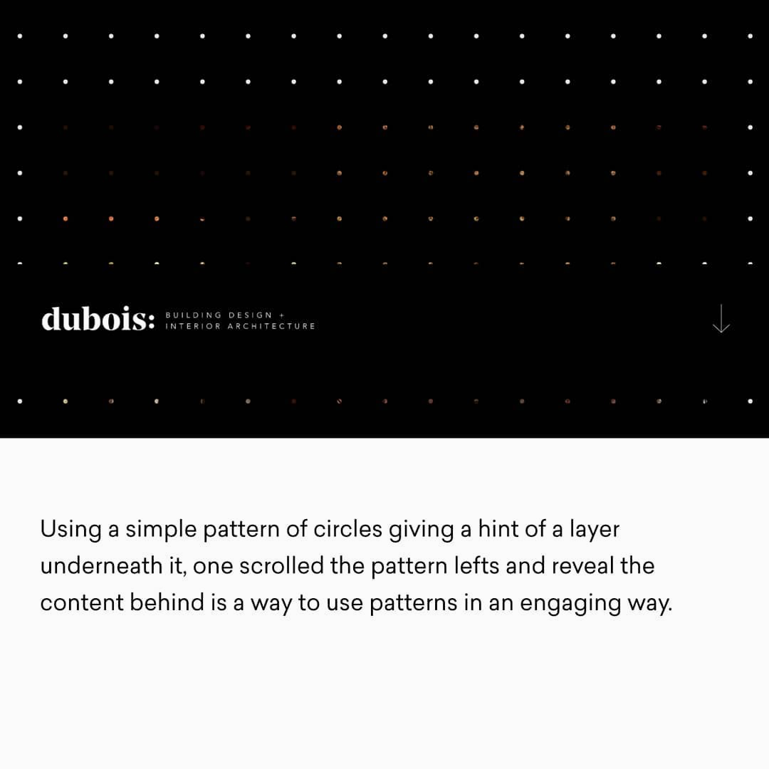
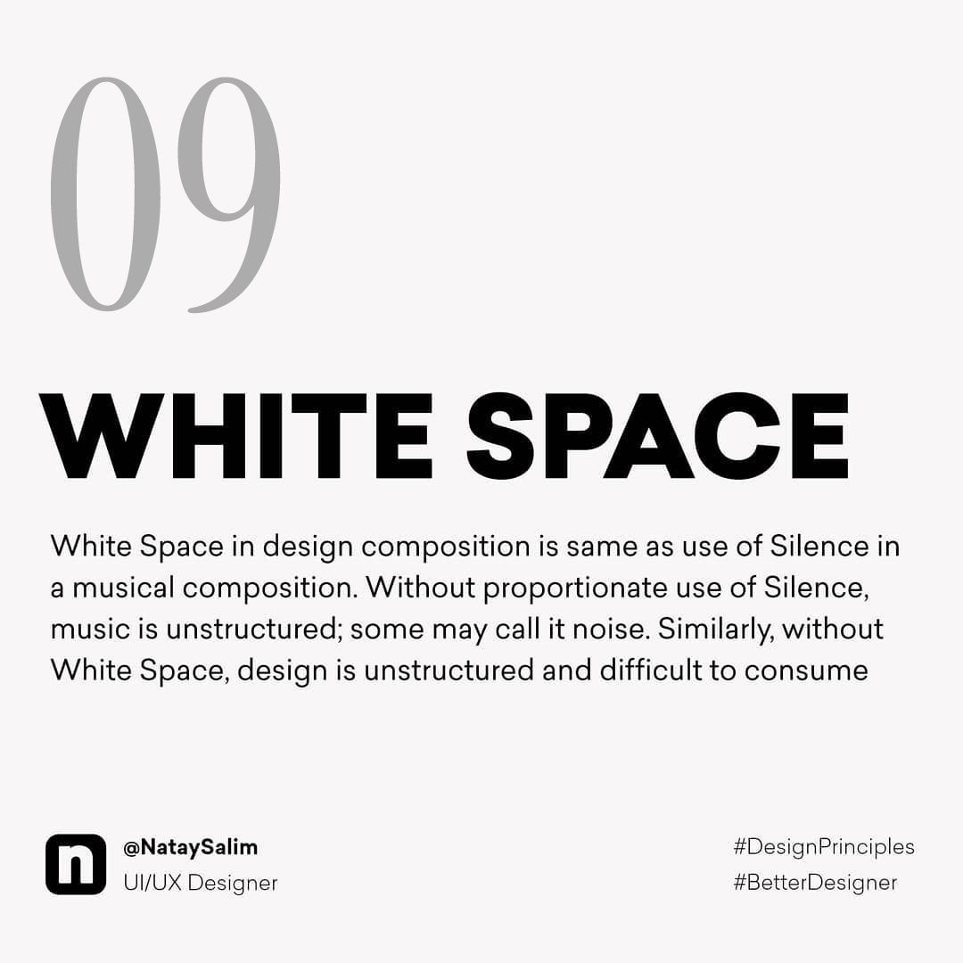
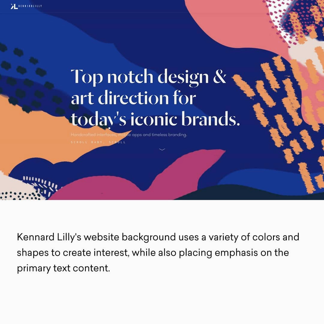
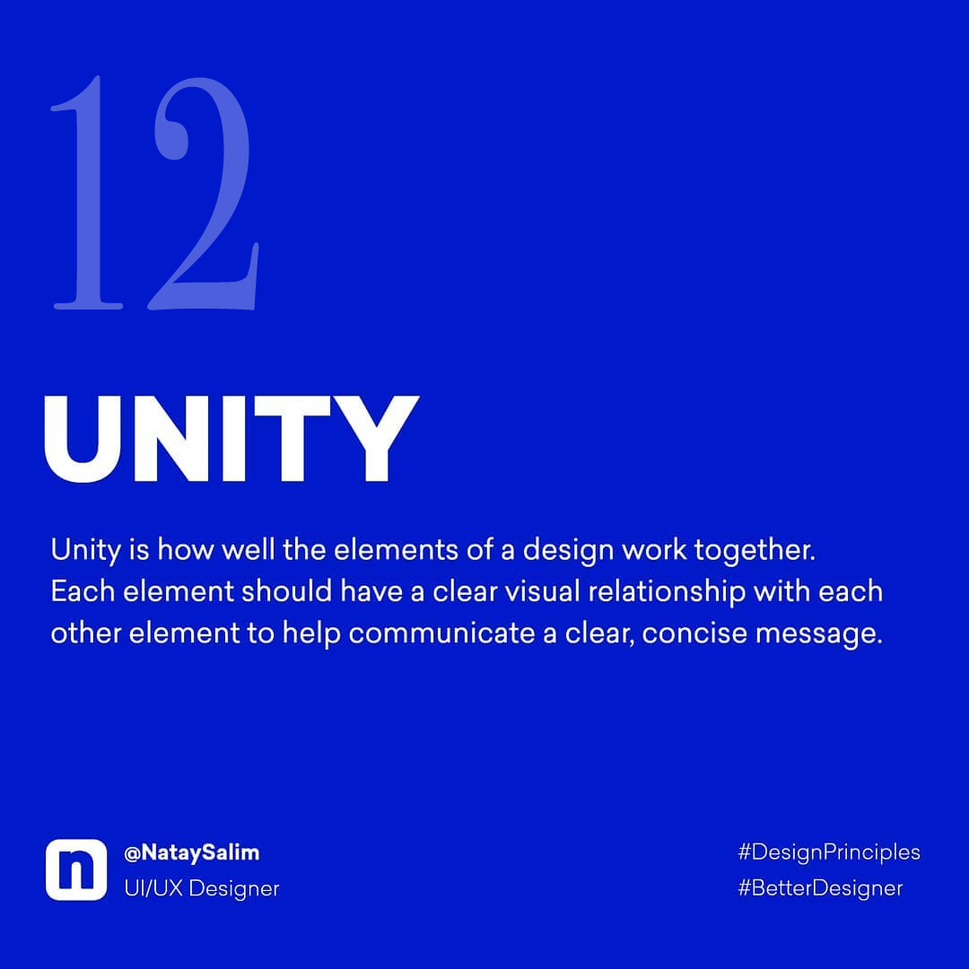
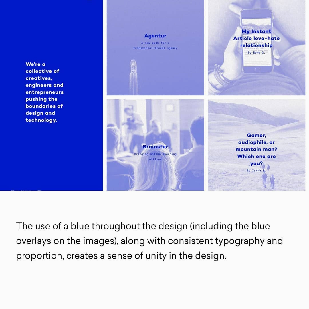
The fastest way to learn a principle is to catch it in the act. That’s what Turkish designer Natay Salim makes easy here. He distills all twelve principles into clean, minimal visuals, then sets each beside a working website that demonstrates it in practice. So the concept doesn’t land as theory. It lands as something you can see. Study them once, and you’ll never look at screens, pages, and layouts quite the same way again.
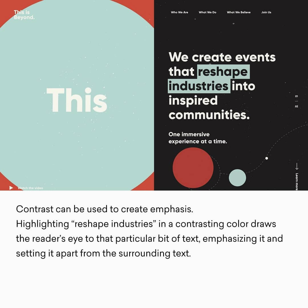
1. Contrast
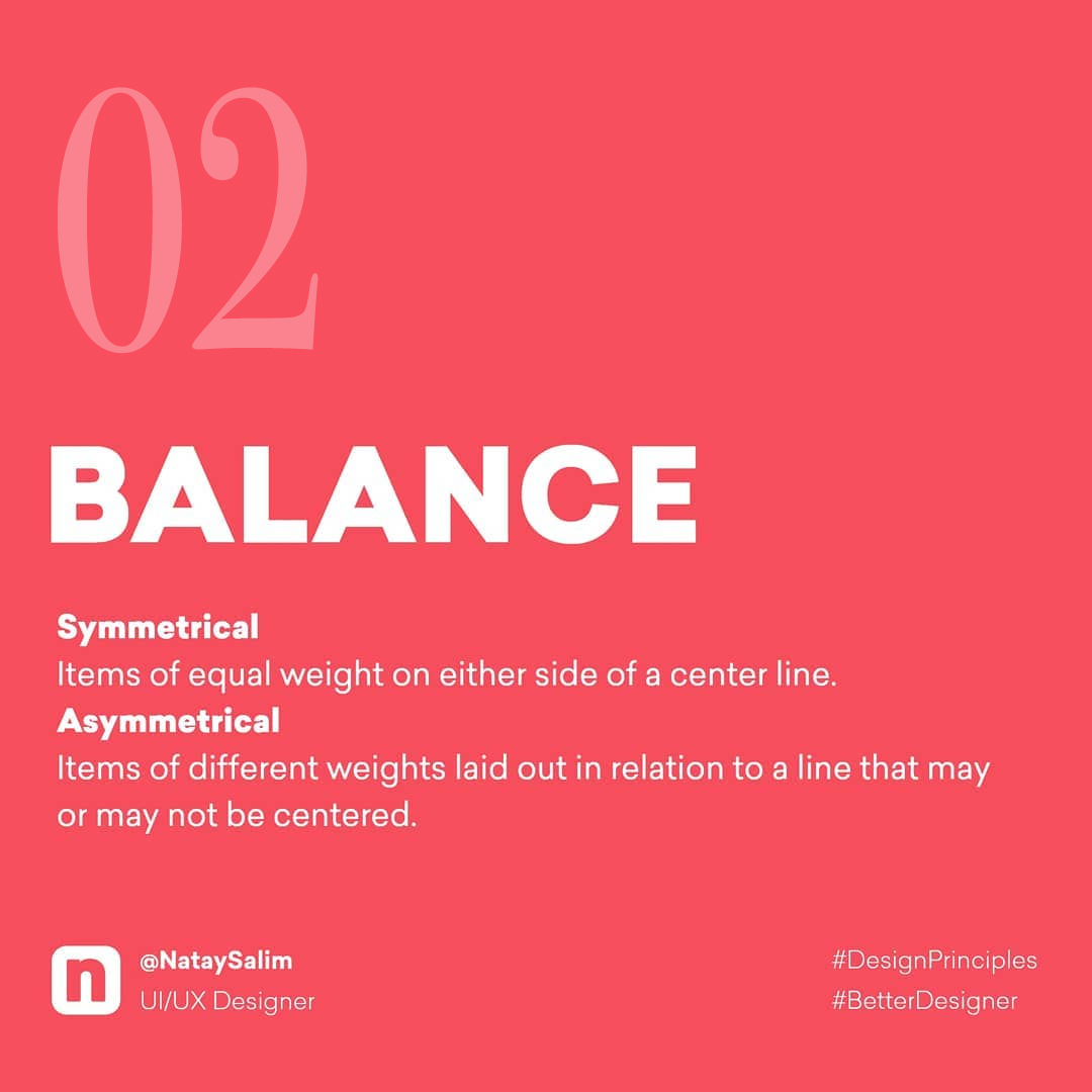
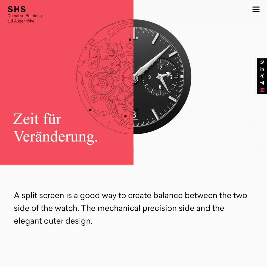
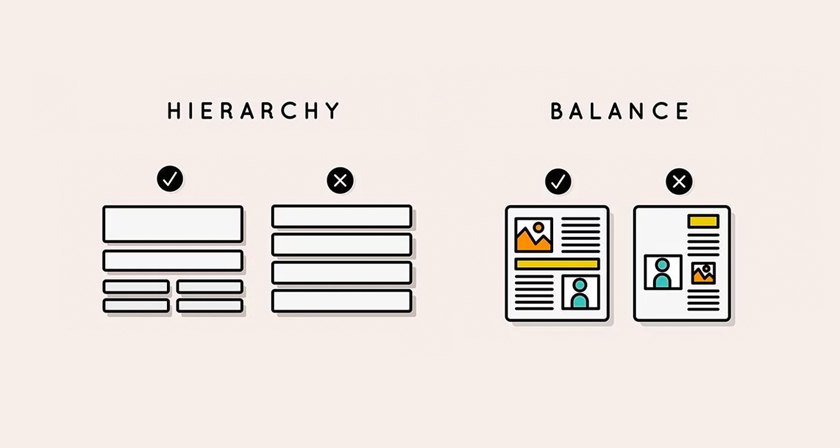
2. Balance
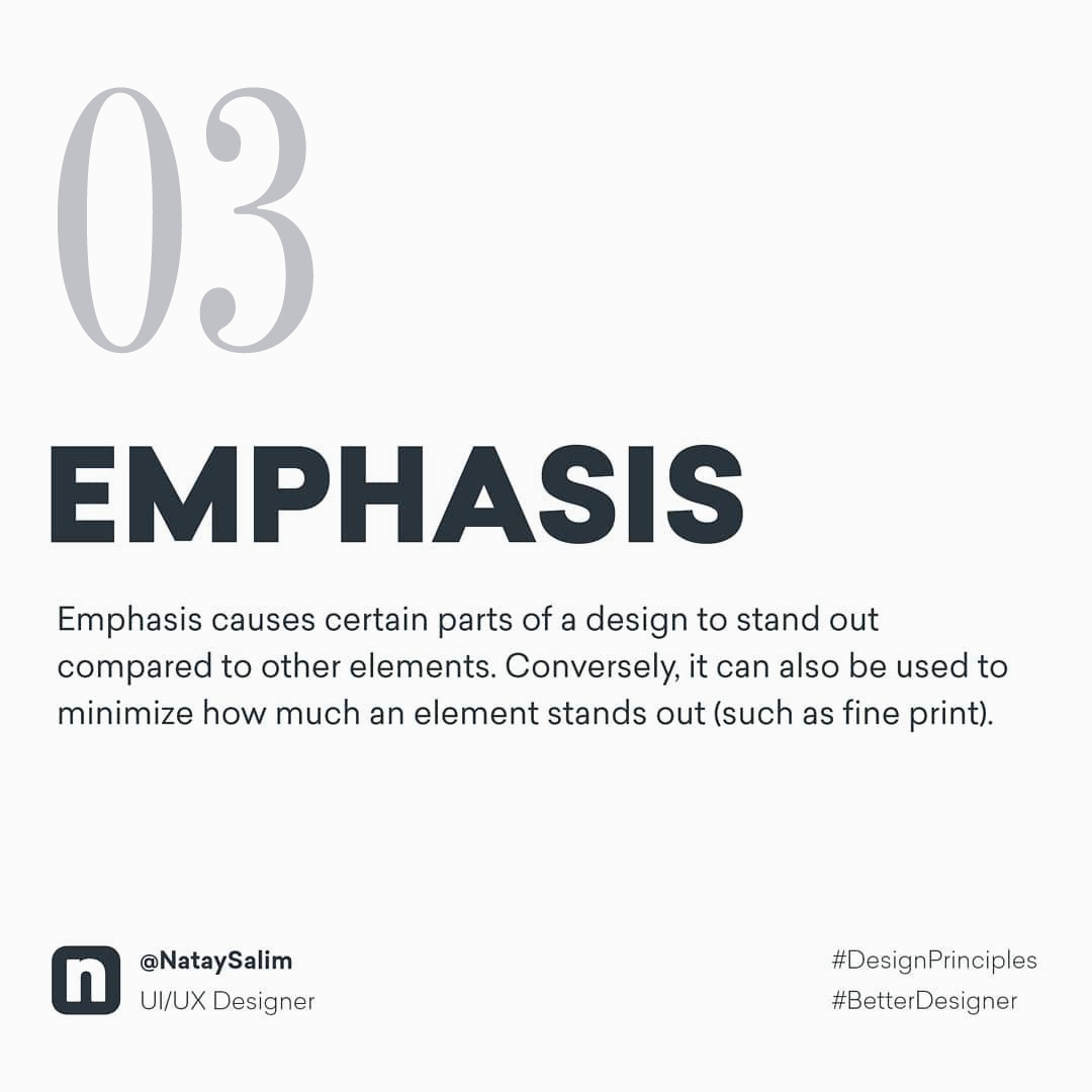
3. Emphasis
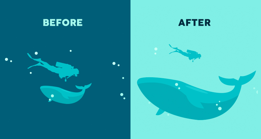
4. Proportion
5. Hierarchy
6. Repetition
7. Rhythm
8. Pattern
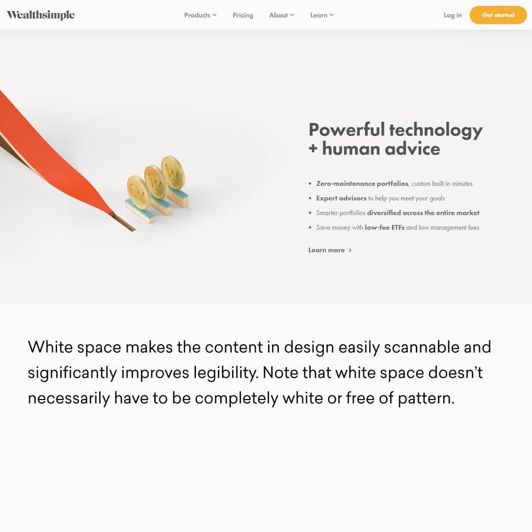
9. White Space
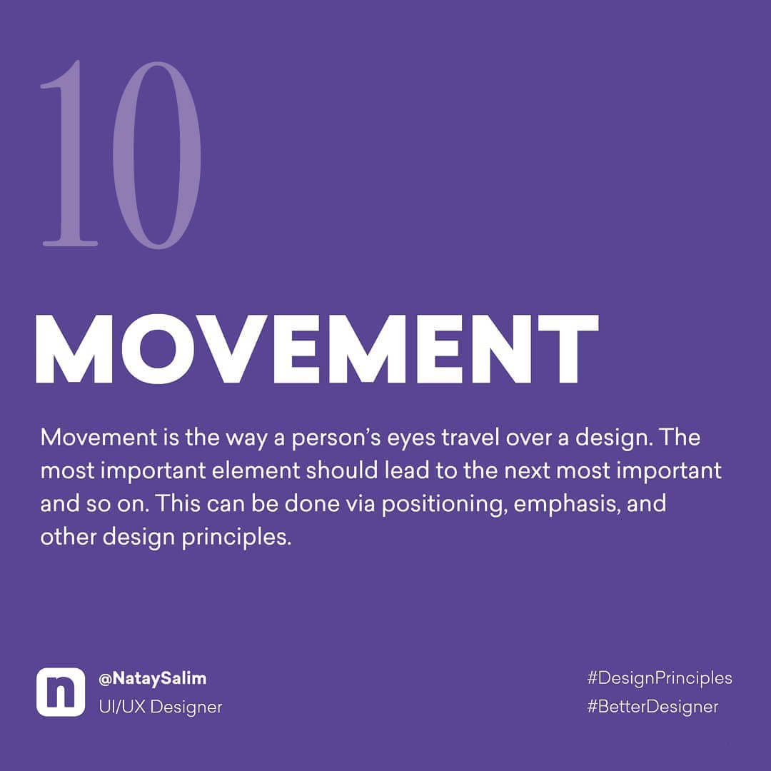
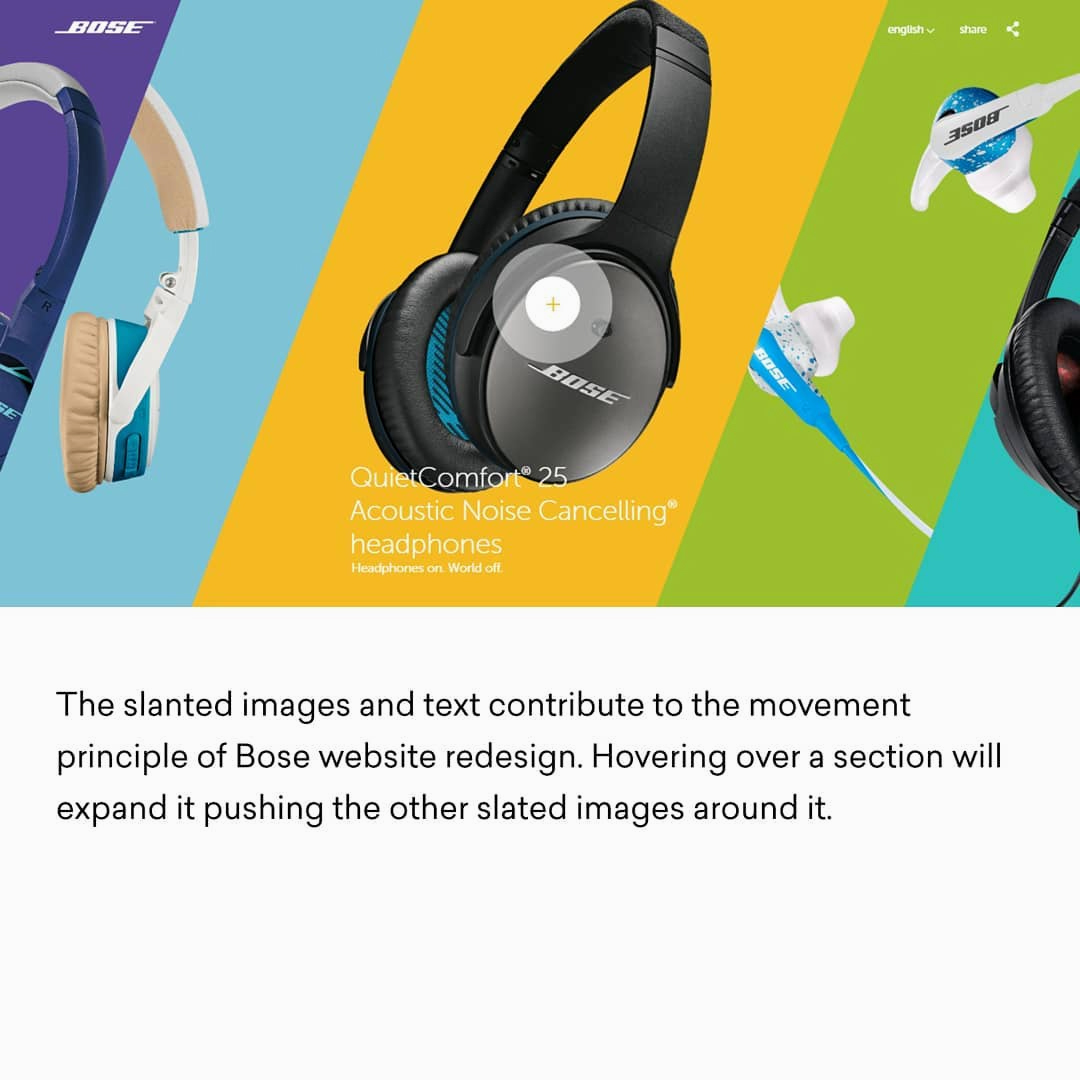
10. Movement
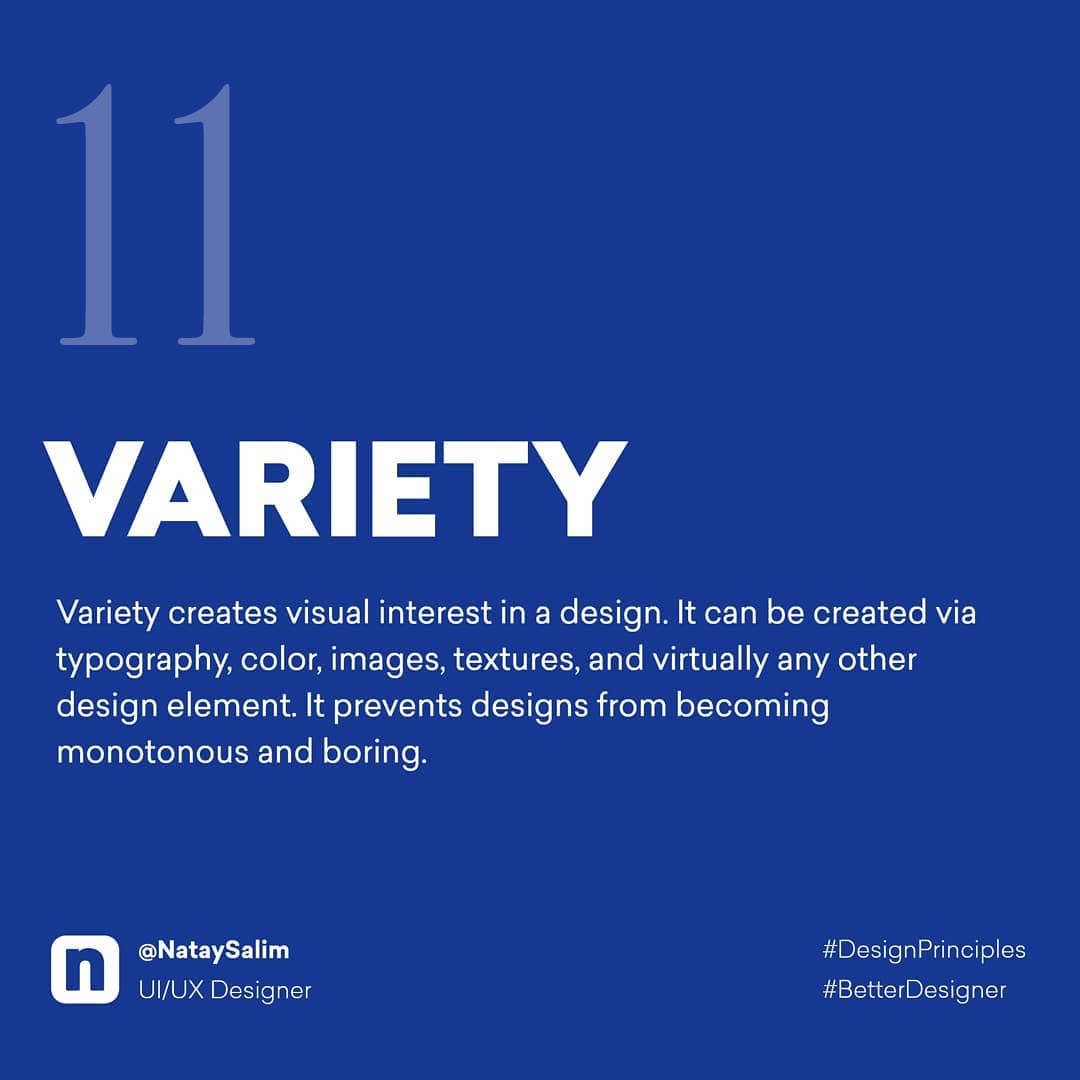
11. Variety
12. Unity
The principles outlast every trend that borrows them. Skeuomorphism yields to flat, minimalism to maximalism, and next year something else will feel new, yet contrast, balance, and hierarchy carry on beneath all of it, unmoved. Chase the trend and you’re rebuilding your instincts every season. Master these twelve design principles and you’re fluent in the grammar every trend is written in.
That fluency is the real craft. It’s what lets you open any brief, in any medium, and know not just what looks right, but why.
Share this post with a designer friend and voice your views in the comments below.