Here's a cool collection of funny posters about graphic design and typography from Dubuque-based marketing executive Sara Heffernen. Using puns on design terms and font names, Sara tells you to "Crop it like it's hot" and have a "Helvetica good time". The posters also advise you to practice safe sex design by using a condom concept and to choose sensibly between common sense … [Read more...]
What Do The World’s Most Popular Logos Have In Common?
Logos may look different at first glance, but many of the world’s most successful brands share disciplined design choices. Across industries, clear patterns emerge in color, typography, shape, and structure. Strong logos are not accidental. They are built for clarity, memorability, and long term recognition. … [Read more...]
Elegant Typography Posters That Give You Font And Color Ideas For Your Next Project
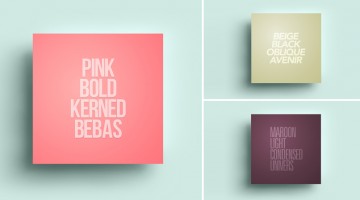
Lisbon-based designer/copywriter Filipe de Carvalho has created a series of self-descriptive posters titled MetaType that show the colors, fonts and text-styles used in them. Filipe works as a copywriter for excentricGREY and has created award-winning work for brands like Vodafone, Volvo, Samsung, Chevrolet and Heineken to name a few. … [Read more...]
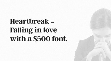
What Designers Think Of You Based On Your Font Choices
A designer's tolerance for bad design is inversely proportional to his/her skill level. The higher the skill, the less tolerant they are to poor design. That's why good designers won't be caught dead eating at a restaurant that uses Comic Sans on the menu. Or attending a wedding where the hosts used Papyrus on the invite. … [Read more...]
10 Useful Kerning Tips To Improve Your Typography
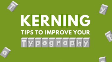
“Typography is an art. Good typography is art.” – Paul Rand. If you’re a typography freak like us, you’ll enjoy this handy infographic by Creative Market that shares some useful kerning tips and tricks to improve your typography. It covers some good points like kerning each letter individually, using visual space not actual space, and even a few unconventional hacks like … [Read more...]
Watch This Artist Create Beautiful Calligraphy Using Different Pens And Techniques
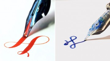
Designer, calligrapher and stationery enthusiast King Blotto III creates short videos of beautiful calligraphy that are an absolute delight to watch. Using all sorts of fountain pens, Blotto weaves his magical strokes on a blank piece of paper, creating gorgeous calligraphy that leaves you mesmerized. Check it out below. … [Read more...]
Designer Turns Everyday Words Into Clever Logos With Hidden Meanings
Almost twenty years ago, New York-based designer Ji Lee received a typography assignment in art school: take a word and express its meaning using only the graphic elements of its letters. No added shapes, no illustrations — just the letterforms themselves. Lee kept exploring the idea over time and eventually created more than 100 such designs. In 2011, he published a book … [Read more...]
Designer Creates Adorable Alphabetical Series Of Dog Breeds From A To Z
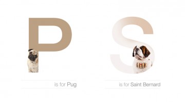
Romanian designer Andrei Clompos recently bought a Beagle. He took a few portrait shots of the little fella and was playing around with the images when he came up with an interesting idea for a project – an informative alphabetical series of dog breeds using their images and typography. How did it go? Check it out below. … [Read more...]
15 Signs That You’re A Font Addict
Do you spend more time on DaFont than you do with your wife? Is your font library bigger than Kim Kardashian's assets? Do you have an orgasm every time you see a beautifully designed ampersand? … [Read more...]
Beautiful 3D Calligraphic Drawings That Look Like They’re Popping Out Of The Page
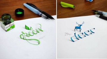
Turkish artist Tolga Girgin is an electrical and electronics engineer by day and a master calligrapher by night. In his latter role, he creates stunning 3D calligraphic art that looks like it's standing or peeling off the paper it's drawn on. The illusion is created by Tolga's skillful use of shades, shadows and perspective. Check out his work below. … [Read more...]
Clever Animal Logos That Show Their Shapes Within Their Names
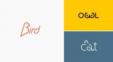
What if a logo didn't just represent an animal — it became one? That's exactly the idea behind this clever series of animal wordmarks by Shibu PG, a graphic designer based in Kochi, India. Each design uses custom typography and carefully placed symbols to hide the silhouette of the animal within its own name. The 'e' in eagle sweeps into a pair of wings. The 'g' in frog … [Read more...]
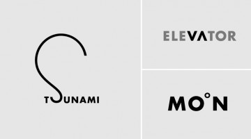
15 Images That Show Why Letter-Spacing Is Important
Ever wondered why good designers focus so much on kerning, i.e., adjusting the spacing between characters in a piece of text? These 15 epic images show you why letter-spacing is important not just in logos and graphic design, but also in everyday handwriting. … [Read more...]
Beautiful Typographic Art Created With Food Items
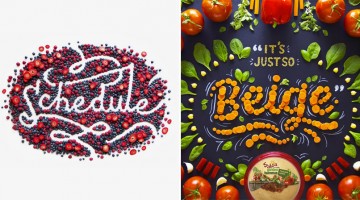
Utah-based designer and lettering artist Becca Clason creates beautiful typographic art using food products and other items. She handles everything from prop styling to art direction, photography and post-production. Her clients include Disney, American Express, Kellog's, Citibank and L'Oréal to name a few. Check out some of her work below. It's the yummiest thing you'll see … [Read more...]
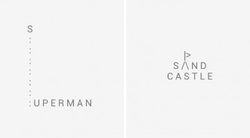
45 Clever Typographic Logos Of Common Words We Use Every Day
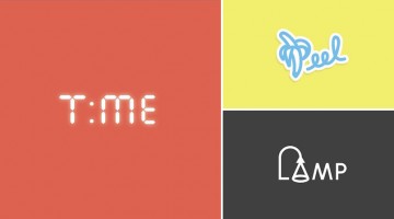
California-based design studio Quillo Creative has come up with a series of impressive typographic logos of common words we use every day. They've combined, altered, and replaced letters with visuals that symbolize the word. For example, the letters 'H' and 'A' in the word SHAVE have been designed to look like a razor. The 'M' in CAMP looks like a tent. The words 'H' and 'E' … [Read more...]
Beautiful, Hand-Lettered Logos Of Countries From A To Z
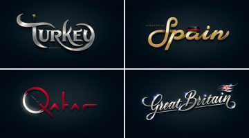
Alphabet of the Countries™ is a non-commercial, just-for-fun project by art director Pavel Zertsikel at Zergutdesign Studio. The idea was to make 26 hand-lettered logotypes, from A to Z, based on common notions of a particular country. The logos were to be hand drawn and created without the use of fonts (allowed for small captions only). The end result is a beautiful … [Read more...]
36 Inspiring Quotes On Typography That Every Designer Should Live By
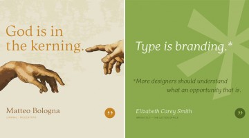
Los Angeles-based graphic designer Bill Dawson has designed a wonderful collection of posters featuring typography quotes from famous designers and type artists. Titled 'Typethos', the project shares tips and words of wisdom from design greats such as Paul Rand, Erik Spiekermann, John Boardley and more. Check it out below. … [Read more...]
27 Useful Design Tips Explained With Beautiful, Inspiring Graphics
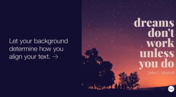
Poppie Pack, senior graphic designer at Canva, has put together a handy list of design tips complemented by beautiful images with inspiring quotes. From typography and layout to image editing and color usage, the list covers some crucial aspects of design that both newbies and professionals will appreciate. We've shortlisted 27 of our favourites to share with you. Check them … [Read more...]
Clever Typographic Art Created With A Phone Keypad Using Letters And Symbols Only
TypoSpective is a minimalist typographic experiment by Cairo-based creative director Sherif Samy. He blends meanings and visual representations of daily-used words to form type-art using letters and symbols found on a mobile keypad. Check it out below. … [Read more...]
From A To Z, These Superhero-Themed Alphabets Are Super Cool
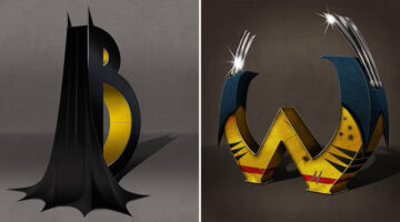
'Superbet' is a superhero-themed alphabet series by Sydney-based illustrator and art director Simon Koay. Each alphabet corresponds to the initial of a superhero and has been designed in 3D using elements from their costumes and weapons. For example, the letter B features Batman's cape and cowl with two pointed ears protruding from the top of the letter. The two arms on the … [Read more...]
11 Fonts That Designers Love To Hate
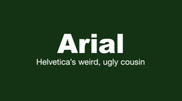
Every design project is unique and requires a typeface that matches the visual aesthetics and compliments the content. However, there are some typefaces that designers try to steer clear of, because they find them ugly, outdated or overused. Today's post showcases a cool series of posters by Creative Market titled "Fonts designers love to hate". Bear in mind that some of … [Read more...]
Signatures Of 25 Famous Entrepreneurs And Their Hidden Meanings
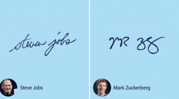
Handwriting has fascinated psychologists, historians, and branding experts for decades. But signatures? They're something else entirely. From the sharp, controlled strokes of corporate leaders to the flamboyant flourishes of creative visionaries, the way someone signs their name often feels like a window into who they really are, and that's exactly what graphology, the study of … [Read more...]
25 Clever Logos Of Common Words You Use Every Day
Using typography and clever symbolism, Spanish graphic designer Lucas Gil-Turner has created a series of impressive logos for the 25 most commonly used nouns in the Oxford English Dictionary. The list was released by Oxford University Press researchers after the analysis of over a billion words. Typographic logos are always fun to look at and Lucas has done a fantastic job … [Read more...]
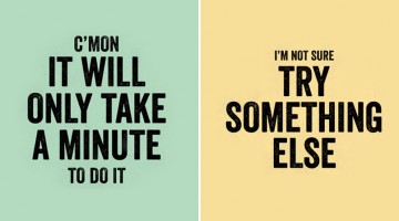
LOL: 9 Things Clients Say When They Don’t Want To Pay For Work
Mumbai-based creative agency Pixel Fox Studios has come up with a hilarious series of typography posters that show the stuff clients say when they don't want to pay full (or any) price for creative work. If you've been in the business long enough, we bet you've come across at least one of these phrases. If you're just venturing into the industry, think of these as a heads up. … [Read more...]
They Had No Money For Education, But This Brilliant Project Changed These People’s Lives
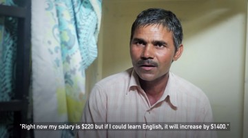
Labourers and blue collar workers in Dubai can get much better jobs and salaries if they learn English. But with relatively low monthly salaries and 12-hour shifts of hard labour, they neither have the money nor the time to educate themselves. SmartLife, an NGO for Dubai's labourers, wanted to help them improve their status and quality of life. They created Project Akshar … [Read more...]
This Hilarious Comic Strip Shows How Clients Ruin Web Design Projects
Renowned cartoonist Matthew Inman (a.k.a. founder of The Oatmeal) has come up with an epic comic strip that shows how idiotic clients drive web designers nuts with horrible feedback that makes their website look like crap. The sequence of events is hilariously depicted with footnotes from the author's actual experiences. If you've been in the business long enough you must … [Read more...]
27 Funny Posters And Charts That Graphic Designers Will Relate To
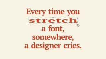
We at DS come across a lot of memes, comics and artworks that offer a hilarious look into the life and mind of a graphic designer. So we thought, why not collate a few good ones into one cool post? Who knows, it might even drive some sense into an unreasonable client and make him/her change his/her attitude? Wishful thinking, we guess. Enough talk, check them out below. … [Read more...]
32 Creative Business Card Designs That Are Clever, Unique, And Memorable

A business card is the smallest piece of real estate in your brand arsenal — and the best designers treat it like a billboard. The finest business card designs do far more than transfer contact information. They communicate personality, demonstrate craft, and leave a lasting impression before a single word is spoken. In a world of LinkedIn requests and digital portfolios, a … [Read more...]
27 Inspiring Quotes Beautifully Illustrated With Minimalist Posters
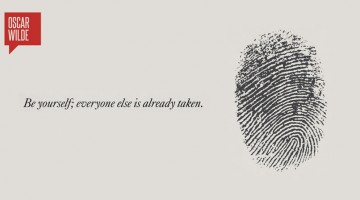
Get inspired by these famous words of wisdom that have been wonderfully illustrated by Toronto-based artist Ryan McArthur. Using monochromatic design, Ryan manages to create a beautiful visual representation of the quote which is elegantly minimal, yet impactful. The typography is spot on and so are the shades of grey (and in some cases blue). Check out the compilation … [Read more...]
50 Incredibly Creative Logos With Hidden Meanings
A great logo does two things at once: it's immediately recognisable, and it rewards a second look. Hidden symbols in logo design are one of the oldest tricks in the branding playbook — and for good reason. A logo with a visual double meaning becomes a conversation starter. People share it, talk about it, remember it. That's rarely an accident. It's usually a decision. We've … [Read more...]
This Designer Publicly Humiliated a TV Network For Asking Him To Work For Free
A few days back, New York-based designer/illustrator Dan Cassaro received a mail from American cable TV network Showtime, asking him to join their design contest to promote the Mayweather vs. Maidana boxing match on September 13. They said they "dug his style" and the contest winner would be flown to Las Vegas and have their artwork displayed at the MGM Grand. … [Read more...]
19 Things That Clients And Bosses Should Never Say To Designers
Dear clients, account managers, creative directors and whomsoever it may concern - take note of these 19 statements that break the rules of design etiquette and sends creative karma on a 6-ton lead ball headed straight for your rear end. It doesn't matter if you use these phrases unintentionally or wether you see little difference between designers and hamsters. We are a … [Read more...]
This Brilliant Charity Project Converts The Handwriting Of The Homeless Into Fonts You Can Buy
You must have come across homeless people on the streets, holding handwritten cardboard signs asking for a donation. But Cyranos McCann and the Arrels Foundation in Barcelona had the creative vision to look beyond the obvious. They saw a unique opportunity to raise money for these people and converted these handwritten alphabets into a font-family. These typefaces are available … [Read more...]
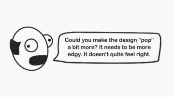
Designer’s Guide To What Clients Really Mean When Providing Feedback
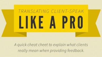
Designers, we salute you. No one takes more client crap than you (except coders). Every day in office is an anger management exercise for you. Everyone knows Photoshop is just as easy as MS Word and all it takes is 2 clicks to create the next Mona Lisa. Not everyone can become a writer but everyone has an inborn desire to design, specially the clients. In times like these, we … [Read more...]
Top 10 Tips To Help You Choose The Right Fonts For Your Next Project
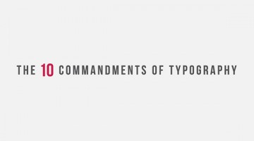
Typography is an art. Done the right way, it can breathe life into even the most mundane of designs. These 10 commandments lay down the key principles of good typography and act as a definitive guide to help you shortlist the right fonts for your next design project. A must view for everyone in the business. Thanks to Evan Brown at DesignMantic for this brilliant infographic. … [Read more...]
A Cool, Animated Version Of The ‘Franchise’ Font Created By 110 Animators (Free Download)
Animography, an Amsterdam-based webshop/type foundry, roped in 110 animators and a type designer to create an animated version of the popular Franchise typeface. They asked each animator to choose a glyph/character and animate it using 4 colors, 25 frames and a 500×600 px canvas in Adobe After Effects. The animators brought their own individual style to the table resulting … [Read more...]
- « Previous Page
- 1
- …
- 4
- 5
- 6
- 7
- Next Page »