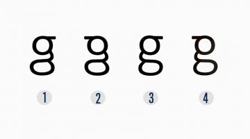
You’ve seen it a million times, but do you really remember what it looks like? Most people don't realize that the lowercase 'g' actually comes in two different forms. The one we usually write by hand is simple - a circle with a little tail, also known as the single-storey 'g'. But the version used in most printed text, in fonts like Times New Roman, Georgia, and Calibri, has … [Read more...]
Fonts Used In Famous Logos (With Download Links)
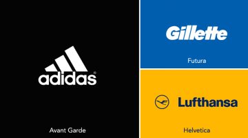
Ever wanted to know the names of the fonts used in the logos of famous brands like Adidas, Calvin Klein, FedEx, Gillette, Jaguar, Lufthansa, Omega, Rolls-Royce, Visa, etc.? We've compiled an alphabetical list of 60 well-known logos with their corresponding fonts and download links. In some cases, the fonts have been tweaked or edited from their original form to create a … [Read more...]
How Companies Use Deceptive UI Design To Trick You Online
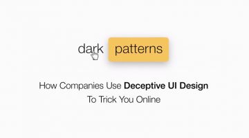
A 'dark pattern' is a user interface that has been craftily designed to trick users into doing things they might not want to do, in order to benefit the business in question. The term was coined by UK-based UI designer Harry Brignull, who runs DarkPatterns.org - a website dedicated to "naming and shaming websites that use deceptive user interfaces". For example, have you … [Read more...]
20 Important Design Principles Explained With Simple Illustrations
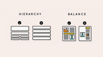
There are no fixed rules or formulas for good design, but there are a few basic principles that will help you create design that is effective, functional, and aesthetically pleasing. Technical jargon can sometimes get confusing or overwhelming, which is why Canva has come up with a fantastic infographic that uses simple illustrations to explain the 20 most important design … [Read more...]
16 Clever Typographic Animations That Visualize The Meanings Of Different Words
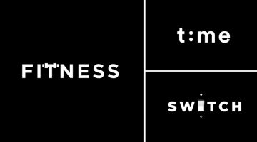
Lithuania-based graphic designer Mindaugas Dudenas has come up with an excellent project titled 'Type in Motion' that visualizes the meanings of different words using typographic animation. For example, the 'T' in the word FITNESS looks like it's lifting weights, the two 'O's in DOORS open and close like doors, the 'H' in CHESS morphs into a chessboard, and so on. Dudenas … [Read more...]
What Your Font Choices Say About You
Every designer has a set of favourite fonts that they prefer to use in a majority of projects. These are the first fonts that come to your mind every time you start a new project. In our previous posts, we've explained how every font has a unique personality, a purpose, and an emotion. But did you know that the font you choose says a lot about you as well? GetVOIP has come … [Read more...]
New Oscar Envelopes Have Huge Fonts To Avoid Last Year’s Design Fail
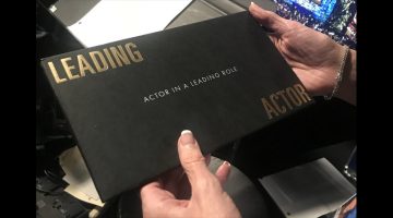
The most cringeworthy part of last year's Academy Awards was when Warren Beatty and Faye Dunaway announced the wrong winner for Best Picture. It wasn't their fault, someone backstage gave Beatty the envelope for Best Actress in a Leading Role (Emma Stone, La La Land) instead of the envelope for Best Picture (Moonlight). … [Read more...]
31 Useful Design Techniques For Creative Two-Letter Logos
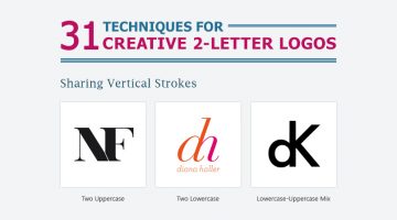
Two-letter logos are one of the most popular logo styles in the world. They're memorable because they use the brand's initials to form a unique symbol. When executed properly, a two-letter logo conveys power, luxury, style, and exclusivity. Some of the world's most well-known brands like General Motors, Volkswagen, Hewlett-Packard, General Electric, LG, Warner Bros., Louis … [Read more...]
Learn In One Minute How To Kern Properly Between Different Types Of Letters
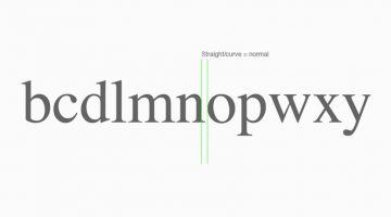
The difference between good type and great type is the kerning. In this short video by The Futur, typography and lettering instructor Nils Lindstrom shows you how to kern effectively between different kinds of letters - curved, straight, and diagonal. Nils explains how different letterforms create different kinds of optical spacing between characters, and how proper kerning … [Read more...]
5 Trendy Google Font Combinations For Your Next Design Project
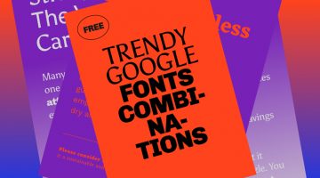
In our previous posts, we've shared some great Google Font combinations and free font collections that you can use in your designs. If you're looking for some more trendy and modern pairings of Google Fonts, have a look at this compilation from digital product company Great Simple Studio. They've also created a series of mockups to offer previews of what the fonts look like in … [Read more...]
Designer Brilliantly Explains Why The New F1 Logo Is A Success, Despite What Everyone’s Saying
Is the new Formula One logo good or bad? Award-winning designer Chris Do reviews the new F1 logo with an in-depth look at its history, design brief, application, and reasons for change. He also discusses why it's important to view logo launches and rebrands from a business point of view rather than just aesthetics. Watch below. … [Read more...]
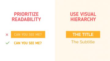
12 Visual Hierarchy Principles Every Designer Should Know
Visual hierarchy is the arrangement and presentation of design elements in order of their importance. It influences the order in which the human eye perceives the information that is being displayed. A simple example would be a business card - the name of the organisation is usually the most prominent element, followed by the name of the card holder, job title, and contact … [Read more...]
17 Memes Every Graphic Designer Will Relate To
Having a long day at work? Boss giving you a hard time? Client being a prick? Then indulge in some meme therapy and brighten up your day. Memes stimulate the release of endorphins in your brain, which reduces stress levels and makes you forget about work problems and deadline-related anxiety. In a study of more than 150 working professionals, scientists found that when … [Read more...]
Amazing Typographic Portraits Of Celebrities Made Using Their Movie Titles And Lyrics
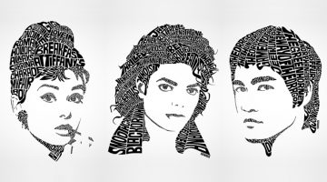
Sean Williams is a Canadian illustrator and creative director known for his typographic portraits of musicians, actors, and pop culture influencers. Each type design is hand illustrated and uses text from the celebrity's movie titles, song lyrics, or famous quotes, to create a recognizable face of that person. The list includes Audrey Hepburn, Beyonce, Bob Marley, Elvis, … [Read more...]
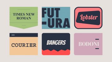
The Most Popular Font Types In America
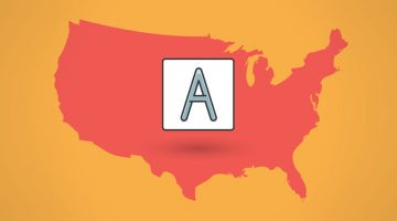
Venngage is a popular online tool that lets you create free infographics for reports, data presentations, promotions, and more. It is used by over 1 million users and 21,000 businesses worldwide. Recently, they analyzed the usage statistics of 50+ fonts they offer on their platform, to see where in the US certain types of fonts are most commonly used. These included serif, sans … [Read more...]
Designer Turns Popular Gadgets Into Letters Of The Alphabet, And They’re Pretty Cool
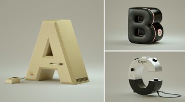
Brazilian designer Vinicius Araújo has come up with an exceptional typography project which showcases the letters of the alphabet in the shape of well-known gadgets, based on their initials. For example, the letter 'J' has been designed to look like a JBL speaker. The letter 'C' is based on the industrial design of a Canon Camera. The letter ‘L’ has been created using an LG … [Read more...]
7 Reasons Why The 7-Eleven Logo Works Even Though It Breaks Design Rules
Some logos are designed to be admired. Others are designed to disappear into everyday life so completely that they stop feeling like design altogether. The 7-Eleven logo belongs to the second category. It hangs above storefronts, appears on cups, receipts, delivery bags, roadside signs, and convenience store shelves across the world. Most people have seen it thousands of … [Read more...]
10 Typography Mistakes That Novice Designers Make
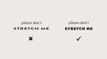
"Typography is an art. Good typography is art." - Paul Rand. Toronto-based designer Meagen Higginbottom, who runs design blog Forth And Create, has shared a list of 10 common typography mistakes that make your designs look amateurish. These include improper kerning and leading, stretched fonts, lack of contrast, using too many fonts, and more. Even if you've spent years in … [Read more...]
5 Surprising Reasons Why Google’s Geometrically Flawed Logo Works Better Than A Perfect One
Some logos are built to be noticed. Others are built to be trusted — to show up everywhere, on everything, and never once make you think about them. The Google logo belongs to the second kind. It appears on browser tabs, app icons, phone screens, loading screens, and the front door of the most visited website on earth. Most people have seen it more times than they've seen … [Read more...]
How To Choose The Right Font For Your Brand
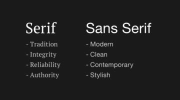
Every font has a unique personality and characteristic. When choosing a font for your brand, it is imperative that you choose the one that best reflects the personality of your brand. Different fonts evoke different emotions. Serif fonts portray tradition, reliability, and integrity (which is why they're used by most print media brands). Sans-serif fonts give a modern, … [Read more...]
19 Memes Only Graphic Designers Will Understand
Having a long day at work? Client giving you a hard time? Boss being a prick? Then indulge in some meme therapy and brighten up your day. Memes stimulate the release of dopamine in your brain and make you forget about work problems and deadline-driven stress. In a study of more than 200 working professionals, scientists found that when co-workers receive memes from you, it … [Read more...]
Clever, Minimal Typographic Logos Of Cities
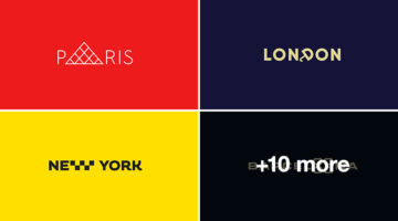
Vladislav Smolkin is a graphic designer and logo artist based in Saint Petersburg, Russia. He specializes in identity and logo design for small and medium-sized companies, and has clients all over the world. Smolkin's forte lies in minimalism. He believes he is able to showcase his talent best using a minimalist style. One of his personal projects is CITIESET - a series of … [Read more...]
20 Typography Rules Every Designer Should Know
Good typography is the difference between amateur and professional design. It arouses the user's interest and ensures that your message gets read. Typography is an art, and though they say art has no rules, there are certain principles you should follow when it comes to typography. Nothing says "amateur" like stretched fonts, lack of kerning, illegible text, and using too … [Read more...]
51 Creative Logos That Use Negative Space Brilliantly
In art and design, negative space is the background space around and between the subject of an image. For example, in a picture of a palm tree against the sky, the shape of the tree is the positive space. The sky and the space between the branches and leaves is the negative space. Negative space can be used creatively to form compelling visuals that have dual or hidden … [Read more...]
29 Clever Logos That Use Numbers
Over the past few weeks, we've showcased some brilliant logos that use minimalism, monograms, single-letters, and more. Today's post features 29 clever logos that use numbers and digits in their design. Observe the typography and the use of number shapes to create visual meanings. … [Read more...]
Designer Challenges Herself To Create A Logo In 60 Minutes, Every Day For 60 Days
Karoline Tynes is a freelance graphic designer and economics student based in Oslo, Norway. To develop and promote herself as a designer, she undertook a design challenge in which she had to create a new logo every day for 60 days. The rule was to use a maximum of 60 minutes on each logo, which is why ideation was important. She used Copic markers for sketching, followed by … [Read more...]
23 Memes Every Graphic Designer Will Relate To
Bored at work? Have five minutes to spare before your boss comes back from lunch? If yes, then check out these graphic design memes that every client-bashing, mouse-weilding, Photoshop-loving designer will relate to. … [Read more...]
Designer Creates Clever Typographic Logos Of Common Words We Use Every Day
Morocco-based brand designer Bachir Bachchar has come up with an interesting project titled "66 Smart Words" that showcases typographic logos of common words we use every day. The impressive bit is that the letters of each word have been designed in a way that they form a visual image associated with the meaning of the words themselves (a.k.a. calligrams). For example, the … [Read more...]
27 Beautiful Free Fonts For Your Next Design Project
As a designer, no matter how many fonts you own, you always want more. And then there's that heartbreaking moment when you've found a gorgeous typeface, only to see a big green button next to it that says "Buy Now for $75". Let's face it. We designers want freebies. We're drawn to them like a moth to a flame. … [Read more...]
The Homepages Of America’s Fastest Growing Companies Have These Elements In Common

“You never get a second chance to make a first impression.” – Will Rogers. The homepage of your website is a user/customer’s first impression of your company. You have 0-8 seconds to engage a user, after which the majority of them leave. A one-second delay in your site speed can result in a 7% reduction in conversions. The key ingredients of an effective homepage are speed, … [Read more...]
25 Beautiful Free Fonts For Your Next Design Project
Fonts are to designers what shoes are to women. They can never have enough of them. And what's better than a beautiful font? A beautiful font that's available for FREE. We've compiled a list of 25 stylish and contemporary fonts that designers will love to get their hands on. Check them out below. … [Read more...]
45 Clever Alphabet Logos With Hidden Meanings
Last week, we featured 50 monogram logos that merged two or more alphabets to form one unique symbol. In today's post, we focus on logos that use just one alphabet and typographical creativity to form a distinctive brand identity. Single-letter logos are trickier to execute than monogram logos because you just have one letter to play with. But the designers who crafted these … [Read more...]
30 Brilliant Logos That Turn Simple Letters Into Hidden Genius
Letterforms have always played a central role in logo design. At the most basic level, they’re just there to represent a name, an initial, an identity. Simple enough. But in the hands of a skilled designer, letters can be shaped, extended, and reworked to carry meaning, turning something functional into something more expressive. Monograms: A lot of this kind of expressive … [Read more...]
41 Clever Logos With Hidden Meanings
There’s something deeply satisfying about a logo that’s both simple and smart. As designers, we know how deceptively hard that is to pull off. You try to reduce, refine, remove, and somewhere along the way, the soul of the idea can slip through the cracks. But when it works? When a minimal logo manages to be clean, memorable, and packed with meaning? That’s design … [Read more...]
Gorgeous Animations Of Hand-Lettered Logos Where Every Frame Is Hand-Drawn
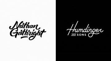
Mantas Grauzinis is a freelance illustrator and animator based in Vilnius, Lithuania. He loves good stories and "splashy, smoother than butter movements". His passion for the latter can be observed in a series of slick animations of hand-lettered logos created by him, that are extremely satisfying to watch. … [Read more...]