
“You never get a second chance to make a first impression.” – Will Rogers. The homepage of your website is a user/customer’s first impression of your company. You have 0-8 seconds to engage a user, after which the majority of them leave. A one-second delay in your site speed can result in a 7% reduction in conversions. The key ingredients of an effective homepage are speed, … [Read more...]
45 Clever Alphabet Logos With Hidden Meanings
Last week, we featured 50 monogram logos that merged two or more alphabets to form one unique symbol. In today's post, we focus on logos that use just one alphabet and typographical creativity to form a distinctive brand identity. Single-letter logos are trickier to execute than monogram logos because you just have one letter to play with. But the designers who crafted these … [Read more...]
30 Brilliant Logos That Turn Simple Letters Into Hidden Genius
Letterforms have always played a central role in logo design. At the most basic level, they’re just there to represent a name, an initial, an identity. Simple enough. But in the hands of a skilled designer, letters can be shaped, extended, and reworked to carry meaning, turning something functional into something more expressive. Monograms: A lot of this kind of expressive … [Read more...]
You Can Get Sued For Using These 8 Colors In Your Designs
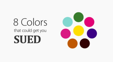
Companies can trademark colors, granting them exclusive use in their industry. For example, Mattel's Barbie Pink (Pantone 219 C) is trademarked in over 100 categories. Tiffany & Co.'s blue color has been trademarked since 1998. Its custom Pantone number, 1837, is the year the company was founded. … [Read more...]
41 Minimal Logos With Hidden Meanings
There’s something deeply satisfying about a logo that’s both simple and smart. As designers, we know how deceptively hard that is to pull off. You try to reduce, refine, remove, and somewhere along the way, the soul of the idea can slip through the cracks. But when it works? When a minimal logo manages to be clean, memorable, and packed with meaning? That’s design … [Read more...]
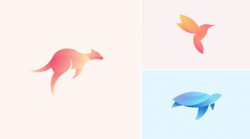
Beautiful, Colorful Animal Logos Based On Circular Geometry
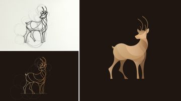
California-based designer Anuja Kanani has come up with a series of colorful animal logos using circle geometry. Being an animal lover, she wanted to undertake this design experiment to highlight their elegant structure and form. For each logo, Anuja initially sketched a basic structure guided by circles. She then defined the animal using just line forms. Programs used were … [Read more...]
Beautiful, Minimal Photographs Of Sunsets For Color Inspiration
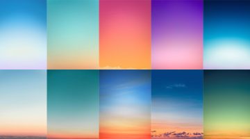
'Sky Series' is a gorgeous collection of sunrise and sunset photos by New York-based photographer Eric Cahan. He captures the natural polychromatic colors of the sky during dawn and dusk, and records the exact time and location of each photograph. … [Read more...]
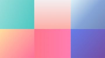
50 Beautiful Color Combinations For Your Next Design Project
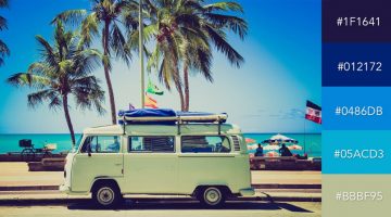
Looking for some nifty color combinations for your next project? The design team at Visme, an online tool for creating presentations and infographics, has created a list of 50 beautiful color schemes you can use in your designs. These color presets are available within Visme to use in any charts or graphics that you create with it. Check out the list below. … [Read more...]
How Filmmakers Use Color Psychology To Shape Emotion In Movies
Before a character speaks, before the music swells, before the story reveals its hand, color has already started telling us what to feel. That feeling may arrive as a warning, a memory, a seduction, or a strange unease. Red can make a room feel dangerous, romantic or completely out of control. Pink can turn a scene soft, sweet, artificial or strangely fragile. Yellow can … [Read more...]
30 Beautiful Color Gradients For Your Next Design Project
Looking for cool background gradients for your UI? Software and design company Itmeo has created a useful online tool called WebGradients – a free collection of 180 linear gradients that you can use as content backdrops in any part of your website. You can download a .PNG version of each gradient and copy their CSS3 cross-browser codes. Sketch and Photoshop packs are … [Read more...]
These Chameleon Pens Change Their Ink Color So You Can Create Gradients, Blends And More
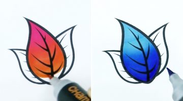
Chameleon Art Products have developed a set of alcohol-based markers that change their ink tone while drawing so you can create seamless color gradients, blends, highlights and shadows using a single pen. The inks are refillable and the nibs are replaceable.The pens cost $21.59 for a pack of 5 and $79.99 for a deluxe set of 22. Check them out below. … [Read more...]
The Most Popular Brand Colours In Each Industry And Their Impact On Consumers
Colour psychology has become an increasingly important part of branding, identity and logo design for businesses as each shade has a specific psychological impact on the consumer they are targeting. UK insurance intermediary Towergate Insurance analysed 520 company logos in a variety of sectors and compiled them into an infographic to determine which industry favours which … [Read more...]
CMYK Playing Cards For Designers And Artists

Get creative at your next poker session with these colorful CMYK playing cards that designers and artists will love. The deck, created by Hundred Million, includes 54 minimally designed cards of different ink percentages. For the uninitiated, CMYK stands for cyan, magenta, yellow and key (black), the four inks used in most color printing. Cardists will also enjoy creating a … [Read more...]
12 Clever Charts That Highlight The Importance Of Color
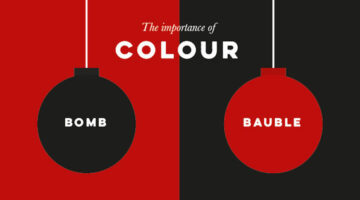
Color is one of the most powerful tools in visual communication—and UK-based designer and illustrator Stephen Wildish shows just how much of a difference it can make, using sharp wit and a minimalist touch. In this playful series of infographics, he explores how a simple color change can completely shift what we see, what we feel, and what something seems to be. The visuals … [Read more...]
Web Design Psychology: How To Create A Site That Influences People
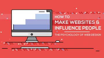
"Good design is obvious. Great design is transparent." - Joe Sparano. An effective website is one that builds trust with its user and influences him/her to take your preferred course of action. From layout and typeface to colors and CTAs, each element plays an important role in engaging users and creating profitable conversions. … [Read more...]
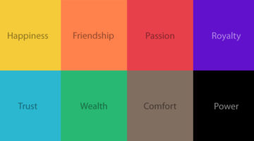
The Psychology of Colors in Marketing (Infographic)
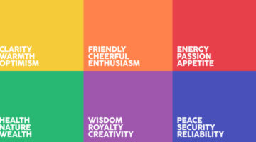
When buying a product, 93% of buyers focus on its visual appearance. 84.7% of buyers claim that color is the primary draw card. Different colors have different psychological effects on consumers - red encourages appetite, blue provides a sense of security, green stimulates harmony, orange promotes enthusiasm, purple is associated with royalty, and so on. Homestead has … [Read more...]
Designer Challenges Himself To Create 25 Logos In 25 Days Using The Golden Ratio
Dhaka-based Graphic/UI designer Kazi Mohammed Erfan undertook a 25-day logo challenge to create one new logo every day based on the golden ratio. His objective was to reintroduce viewers to the beauty of the golden ratio and to promote himself as a designer. Erfan used Adobe Illustrator and Photoshop to create the logos. He has also shared working sketches to show the … [Read more...]
The 10 Types Of Designers – Which One Are You?
"The life of a designer is a life of fight. Fight against the ugliness." - Massimo Vignelli. Although we're all working towards the same objective, we designers have our distinct skill sets and preferences. There are designers who love flat design and there are designers who love skeuomorphism. Similarly, there are designers who like pastel shades and minimalism and there are … [Read more...]
The Best Colors For Productivity And Creativity In Your Workplace
Did you know that yellow induces a sense of optimism and is a good color for high energy creative spaces? Red boosts heart rate, increases brain activity and is good for places where people work at night. Green boosts creativity, promotes harmony and is a good choice for brainstorming spaces. If you’re working remotely or looking to redesign your home office, platforms like … [Read more...]
Interesting Facts About Flag Colors And Design That You Probably Didn’t Know
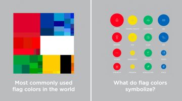
Flag Stories is an award-winning data visualisation project by Danish designers Jeppe Morgenstjerne and Birger Morgenstjerne, co-founders of Copenhagen-based infographic agency Ferdio. The project consists of a series of infographics that share interesting facts and trivia about flag colors, layouts, design, history and more. … [Read more...]
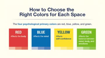
How To Choose The Best Colors For Your Logo
Picking colors for your logo is not just an artistic decision based on personal preference. Different colors elicit different psychological responses that impact consumer behaviour. Red stands for excitement, passion, appetite and urgency. Green is associated with nature, wealth and conservation. Blue stands for confidence, trust and reliability. Yellow is associated with … [Read more...]
27 Amazing Body Art Illusions That Will Make You Go Wow

Johannes Stoetter is a self-taught artist, musician and fine art body painter born and based in South Tyrol, Italy. After completing his education at the University of Innsbruck in Austria, he developed a curious interest in body art and crafted his own unique style and technique of body painting. In 2009, he joined the international body painting community at the World … [Read more...]
37 Amazing Ads That Use Negative Space Brilliantly
In art and design, negative space is the background space around the main object of an image. In a two-tone image (eg. black and white), the object is usually depicted in a darker color (black) than the background (white), thereby forming a silhouette. Sometimes, the tones are reversed and white is used to fill the silhouette (refer Coke examples below). When an artist carves … [Read more...]
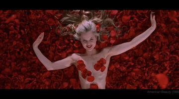
Color Palettes From Famous Movies Show How Colors Set The Mood Of A Film
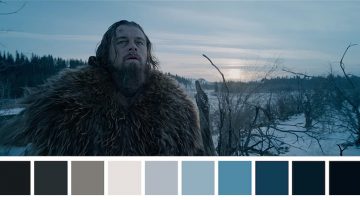
Color sets the tone and mood of a film before any of the actors have even uttered a word. Directors Lilly and Lana Wachowski used a green tint in The Matrix (1999) to create a mood palette that was suggestive of the early monochrome computer monitors. Yellow was used in Kill Bill (2003) to depict Uma Thurman’s character’s madness and instability. Romantic comedies use pastel … [Read more...]
Designer Challenges Himself To Create 30 Animal Logos In 30 Days Using The Golden Ratio
Ukranian designer Andriy Yurchenko took on a 30-day logo challenge to create one animal logo each day, using the principles of the golden ratio. The Kyiv-based artist specialises in web, UI/UX, and identity design. For this project he used Adobe Illustrator, Photoshop, and experimented with different color schemes to get the desired look. Check it out below. … [Read more...]
What Do The World’s Most Popular Logos Have In Common?
Logos may look different at first glance, but many of the world’s most successful brands share disciplined design choices. Across industries, clear patterns emerge in color, typography, shape, and structure. Strong logos are not accidental. They are built for clarity, memorability, and long term recognition. … [Read more...]
5 Color Choices You Must Avoid When Designing For The Web
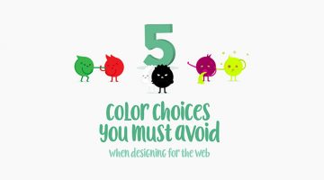
When it comes to web design, colors play a vital role in increasing conversions, reducing bounce rate and ensuring a smooth user experience. We often see websites compromising on readability by using light-colored text on light backgrounds. Also, it's never ok to use red and green in excess, even if you're making a Christmas-themed website. … [Read more...]
Elegant Typography Posters That Give You Font And Color Ideas For Your Next Project
Lisbon-based designer/copywriter Filipe de Carvalho has created a series of self-descriptive posters titled MetaType that show the colors, fonts and text-styles used in them. Filipe works as a copywriter for excentricGREY and has created award-winning work for brands like Vodafone, Volvo, Samsung, Chevrolet and Heineken to name a few. … [Read more...]
Vibrant, Beautiful Logos And Illustrations Made With Blend Modes And Transparency
Russian graphic designer Ilya Shapko has created a series of vibrant icons using blend modes and transparency in Adobe Illustrator. The project, titled 'Overlays', showcases colorful illustrated shapes cleverly placed over each other to form abstract animals and human figures against light and dark backgrounds. Shapko resides in Saratov and is a popular contributor on … [Read more...]
What Different Colors Mean And How To Use Them
Did you know that blue is used for corporate and business designs because it represents dependability, trustworthiness and security? Orange is used to give a friendly impression without being overpowering. Darker shades of purple characterize wealth and luxury. TechKing has come up with a handy infographic that covers the psychology of different colors, their appropriate … [Read more...]
The Amazing Ways Color Can Alter Your Mind (Infographic)
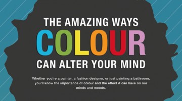
Whether you're a painter, a graphic designer, or just doing up your home, it's essential to know the significance of various colors and the effect they have on our mind and moods. Here's an interesting infographic by Vanessa Arbuthnott Fabrics that shows us what different colors represent, their effects, usability and more. … [Read more...]
This Incredible Drawing Pen Lets You Scan And Pick Colors From Objects Around You

An artist's tool is only as good as the artist. But a great tool can help an artist see things in a different light. Introducing Scribble, a color picker pen and stylus that let's you scan colors from any object and use them in your drawings. Check it out below. … [Read more...]
8 Beautiful Color Palettes For Your Next Design Project
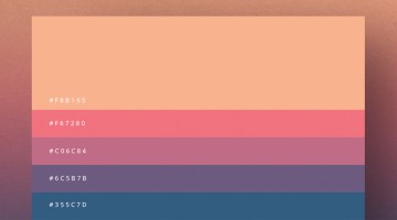
Milan-based creative director Duminda Perera has created a series of minimalist color palette posters that are both handy and beautiful. Not only do they give you color ideas (with hex codes) for your next project, you can use these posters to decorate your studio, office or home. Check them out below. … [Read more...]
Male Vs Female Color Perceptions And Preferences
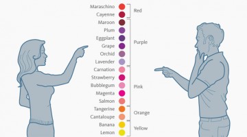
Traditionally, baby boys are wrapped in blue and baby girls in pink. A few years later, you can tell a boy's room from a girl's room just by observing the color combos (and the cleanliness ;) ). As we grow up, gender color preferences are visible in everything from wardrobes to cars (though nowadays the line is thinning). … [Read more...]
“Don’t Let Colors Run Out When You Need Them” – These Ink Cartridge Ads Are Hilarious
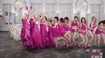
Here's a funny campaign by Ogilvy Colombia for Ecofill Printer Cartridges that won a Gold Lion under the outdoor category at Cannes. The 4-ad series shows different groups of people, inappropriately losing their cyan/magenta/yellow/black (CMYK) clothes with a tagline that says "Don't let colors run out when you need them the most." Check out the ads below. … [Read more...]