The Most Popular Brand Colours In Each Industry And Their Impact On Consumers
Long before a brand tells you what it does, its colours have already told you how to feel.
Colour psychology is doing quiet work at the heart of branding, brand identity, and logo design. Most of us never notice it, but it’s the reason nearly every fast-food chain reaches for red, and why banks almost always settle on blue. One colour, chosen well, can nudge you toward trust or hunger or a sense of luxury before you’ve read a single word. For designers and brand strategists, that’s not a nice-to-have. Knowing which colours an industry favours, and the reasons behind it, is genuine leverage.
The data reveals the pattern. UK insurance intermediary Towergate Insurance went through 520 company logos, spanning everything from restaurants and airlines to pharmaceuticals and couriers, and mapped which colours each industry actually leans on. What the infographic shows is something brands rarely admit: these choices aren’t random. Industries inherit a set of colour conventions, then keep reinforcing them until the association just feels normal.
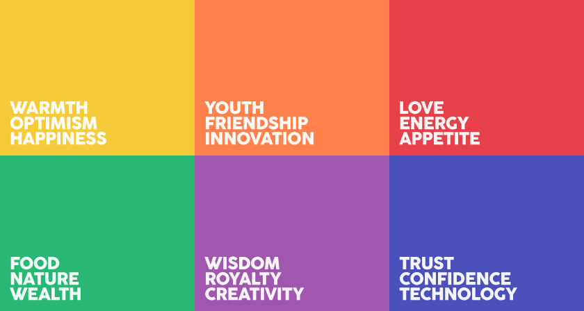
And a clear visual language emerges. Red tends to energise, and it has a strange way of making people hungry. Blue reads as dependable, calm, safe. Black does something else entirely, carrying a sense of authority and polish. Over the years each sector has learned to speak in a colour its customers already understand, even if nobody in the room could quite explain why.
Below, you’ll find the most popular brand colours in every major industry, the psychology behind each one, and what your own palette might be saying about you to the people you’re hoping to reach.
The takeaway isn’t that every brand should follow its industry’s colour playbook. It’s that you should know the playbook before you decide whether to follow it or break it. The brands that stand out are usually the ones that understood the convention, then chose their moment to defy it — the black luxury label in a sea of gold, the purple challenger in a category owned by blue.
Colour is a language your customers already speak fluently, even if they’ve never studied it. The same principle extends to other forms of visual communication, including book cover design, where colour can signal genre, mood, and audience expectations before a reader has processed the title. The only real question is whether you’re saying what you think you’re saying.
What factors do you keep in mind when deciding on a colour for a brand or a logo? Share this post with a designer friend and voice your views in the comments below.