SurveyMonkey and infographic maker Venngage surveyed over 1000 adults living in the U.S. on what logo styles they trusted the most. The respondents were shown a series of logos for imaginary companies in six different industries: Jewellery retail, education, financial services, law firm, news/media, and technology. Six variations of each logo were presented: Icon dominant, … [Read more...]
Shit Clients Say – 13 Most Unforgettable Quotes
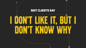
How many times have you had a client send a list of "final" changes AFTER they've approved the design? What about when they ask you to find an image from Google, or copy someone else's logo, or when they tell you to deliver designs by Monday after briefing on Friday? We all come across unreasonable client demands on a daily basis, but the folks at BeeWits have a dedicated … [Read more...]
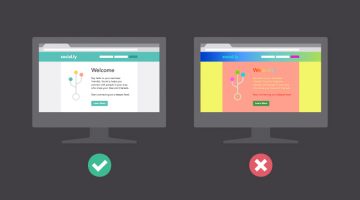
Simple, Useful Design Tips For UI/UX Designers
'Sparklin Design Tips' is a series of short, useful UI/UX tips by New Delhi-based digital agency Sparklin, shared every Tuesday on their social media channels. Using before-and-after mockup images, the team at Sparklin explains good UI/UX practices with visual examples, making them easy to understand and comprehend. Whether you're a newbie or a seasoned designer, these … [Read more...]
Designer Uses Beautiful Gradients And Abstract Shapes To Describe Meanings Of Words
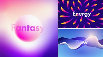
UK-based graphic designer Evgeniya Righini-Brand has come up with a fascinating project titled “Gradient Studies” in which she uses vibrant gradients and abstract shapes to visually describe the meanings of various words. For example, the visual for the word "flow" is an abstract liquid shape with multiple gradient meshes in blue and white. The visual for the word "energy" is a … [Read more...]
This Handy New Tool Shows You Color Palettes Of Artworks From Different Eras
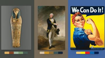
Kentucky-based graphic designer Brandon Shepherd has released a handy online tool called Color Leap that showcases a collection of color palettes used in paintings and artworks throughout different eras in history - from ancient Egypt to the 1960s. The tool consists of 180 palettes spread over 12 different time periods. You can select any time period, browse through … [Read more...]
This Brilliant Free Tool Is Like Google Search For Colors
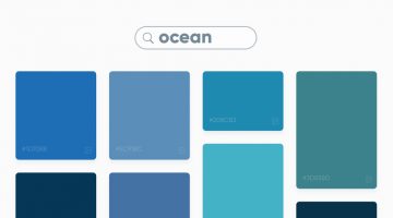
Swedish digital studio Future Memories has launched an excellent tool called Picular that lets you search for colors by keyword and displays a range of colors based on the top 20 Google Image search results for that keyword. For example, if you search for ‘ocean’, Picular analyzes the top 20 Google Images for ‘ocean’ and displays the most prominent color in each image and … [Read more...]
Learn In One Minute How To Change The Color Of Anything In Photoshop
Did you know that you can use the Hue/Saturation Adjustment Layer in Photoshop to target a specific color in your image and change it to any color you want? In this handy one-minute tutorial, Photoshop instructor Unmesh Dinda from PiXimperfect shows you a simple technique to change the color of any object in your image by using the hand tool in the Hue/Saturation Adjustment … [Read more...]
Learn In One Minute How To Make Skies Gorgeously Dramatic In Photoshop

Did you know that you can use Adjustment layers and the Blend If mode in Photoshop to enhance skies and make them look more dramatic in your photos? In this one-minute tutorial, Photoshop instructor Unmesh Dinda from PiXimperfect shows you a simple technique to add details and definition to clouds by using Adjustment Layer, Mask, Brush Tool, and Blend If: Underlying Layer. … [Read more...]
19 Graphic Design Mistakes That Novice Designers Make
After a few years in the graphic design business, you realize how important it is to get the basics right. Like using proper font and color combinations, implementing visual hierarchy, using grids, alignment, white space, and so on. The team at Visme, an online tool for creating infographics and presentations, has come up with an excellent visual list of 19 graphic design … [Read more...]
10 Best Uses Of Color In Movies

Right from the first scene, color sets the mood and tone of a film before any of the actors have uttered a word. Since the dawn of colored cinema, filmmakers have used color to convey drama and emotion in storytelling. Visual-minded directors and cinematographers have created color palettes almost as memorable as the films themselves. The Wachowskis used a green color … [Read more...]
FIFA World Cup Logos From 1930 – 2022, Which One’s The Best?
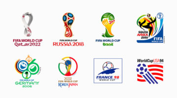
The FIFA World Cup is the most widely viewed and followed sporting event in the world. The logo for the 2022 World Cup in Qatar has been unveiled and we decided to do a round-up of all the World Cup logos from 1930 - 2022. During the first four World Cups from 1930 - 50 (there were no tournaments in '42 and '46 due to World War II), the organizers created posters instead of … [Read more...]
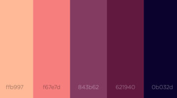
8 Beautiful Flat Color Palettes For Your Next Design Project

UI/UX designer Ebtihaj Khan has created a series of minimalist flat color palettes for graphic, web, and UI projects. Each palette consists of five colors with their hex codes mentioned alongside. Khan has included both linear and contrasting color schemes. The beautiful presentation of these palettes, with the blurred vignette effect in the background, was inspired by … [Read more...]
Honest Meanings Of Flag Colors Of 15 Countries
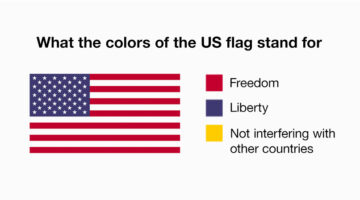
Every country has an official explanation for its flag colors, something about history, heritage, unity, all that. And then there’s… this version. People online have been giving those same colors completely different meanings, based on what each country is actually known for right now. Not the textbook version, the real-world one. The kind shaped by headlines, memes, … [Read more...]
13 Things Client Servicing Executives Should Never Say To Graphic Designers
If you've ever worked in a creative agency, you must be aware of the love-hate (or hate-hate) relationship between client servicing executives and designers. CSEs have to manage client expectations and their primary objective is to keep the client happy. Designers want to keep the client happy too, but they don't want to compromise on aesthetics and creativity. Taking a … [Read more...]
How Companies Use Deceptive UI Design To Trick You Online
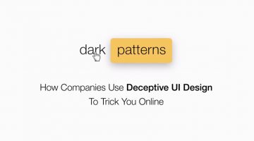
A 'dark pattern' is a user interface that has been craftily designed to trick users into doing things they might not want to do, in order to benefit the business in question. The term was coined by UK-based UI designer Harry Brignull, who runs DarkPatterns.org - a website dedicated to "naming and shaming websites that use deceptive user interfaces". For example, have you … [Read more...]
20 Important Design Principles Explained With Simple Illustrations
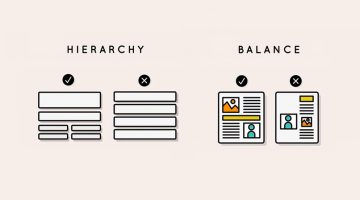
There are no fixed rules or formulas for good design, but there are a few basic principles that will help you create design that is effective, functional, and aesthetically pleasing. Technical jargon can sometimes get confusing or overwhelming, which is why Canva has come up with a fantastic infographic that uses simple illustrations to explain the 20 most important design … [Read more...]
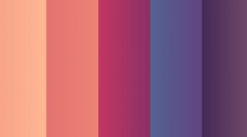
27 Beautiful Color Gradients For Your Next Design Project

Looking for beautiful gradients for your graphic, web, or UI design? UVdesk has created a useful online tool called coolHue – a free collection of over 60 gradients that you can use for design and code. You can browse through the swatches, copy their CSS codes and even download a .PNG version of each one. Here are some of our favourites from the collection. … [Read more...]
33 Beautiful Color Schemes For Your Next Design Project
Looking for color combinations for your graphic, web or UI design? CoSchedule has come up with a handy infographic that shares 33 beautiful palettes organized by primary and secondary colors. They've also compiled two additional infographics on color + word associations and color psychology. Check them all out below. … [Read more...]
Vibrant, Dream-Like Illustrations Made With Gradients And Blend Modes
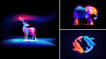
Russian designer Ilya Shapko has come up with a series of vibrant, neon-style artworks using gradients, blend modes, and transparency in Adobe Illustrator and Photoshop. The project, titled 'Fantasy Light', showcases colorful illustrated shapes intricately placed over each other to form abstract animals and objects against dark backgrounds. Shapko's inspiration for this … [Read more...]
Adobe Scribbler Is A Powerful Tool That Can Colorize Any Black & White Image Within Seconds
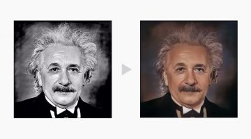
Have you ever wanted to colorize old black and white photos of yourself or your loved ones? The conventional process involves meticulous preliminary research followed by hours and hours of work in Photoshop. Hundreds of layers of color are added and blended together with precision. The physics of how light works also needs to be taken into account. … [Read more...]
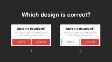
Short, Useful Design Tips For UI/UX Designers
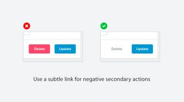
Steve Schoger is a multidisciplinary designer based in Kitchener, Ontario. When he finds time off from running his design and illustration studio, he curates 'Little UI Details' - a Twitter collection of short, useful design tips for UI/UX designers. Steve's tweets cover different elements of UI design and also include before-after mockup images that make them all the more … [Read more...]
Beautiful Images Of Everyday Objects Organized By Color
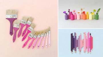
Caroline South is a photographer and content-creator based in West Sussex, UK. A graduate of the Surrey Institute of Art and Design, Caroline loves to paint, draw, and craft artwork using natural or 'found' items. She spends a lot of time exploring the Southern Coast collecting pottery and sea glass which she often uses in her photography. Color is an important aspect of … [Read more...]
5 Ways To Change The Color Of Anything In Photoshop
Nathaniel Dodson from Tutvid has come up with an excellent Photoshop tutorial that shows you five different ways to change the color of any object in an image. These include using hue-saturation masks, blend modes, adjustment layers, targeting a specific color channel, and using the LAB mode to match an exact color. So the next time a client asks you to change the colors of … [Read more...]
Photographer Captures Beautiful, Minimal Photos Of California That Have A Soothing Effect

Ludwig Favre is a French photographer specializing in landscape photography of American cities. His images have been used for advertising campaigns, magazine editorials, books, galleries, and more. … [Read more...]
Beautiful, Vibrant Illustrations Of City Skylines Made With Photoshop And Affinity Designer
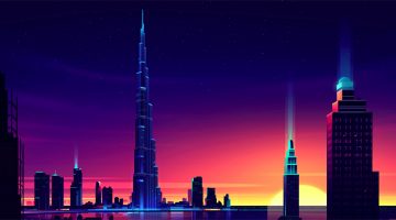
Romain Trystram is a freelance illustrator and art director based in Agadir, Morocco. He is known for his stunning illustrations of urban architecture, skylines and technology using a vibrant color palette. Most of his work follows a UV-like theme in which he uses bright neon colors for buildings and city lights, with darker shades in the background for the night sky and … [Read more...]
21 Free Geometric And Blurred Background Packs For Your Design Projects
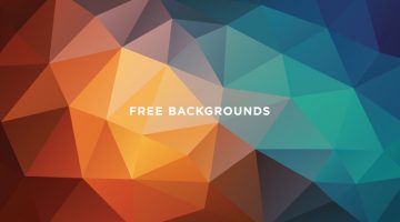
Geometric polygon and soft-blurred backgrounds are a popular trend nowadays in graphic, web and UI design. Low-poly patterns look great on print collaterals like business cards, brochures, flyers, packaging, signage, etc. They're also used in digital presentations, kiosks, app start up screens and more. Soft-blurred, gradient backgrounds became a rage after Apple started … [Read more...]
This Handy Infographic Helps You Choose The Right Colors For Your Brand
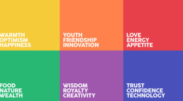
Did you know that the color red encourages appetite, which is why it is frequently used in the fast-food sector? Blue is the color of strength, wisdom and trust, which is why it is used so widely. We have a strong primitive relationship with green as it represents life, which is why it is commonly used for organic food and pharmaceuticals. Yellow represents youth, happiness … [Read more...]
34 Beautiful Color Palettes For Your Next Design Project
Looking for color schemes for your graphic, web or UI design? Coolors is a fast and easy tool that lets you create, save and share beautiful color palettes. You can browse and filter schemes by color or popularity, save them to your account, or export them as .PNG, .PDF, .SVG, and more. Coolors is also available as an iOS App, Android App, Figma Plugin, and Chrome Extension. … [Read more...]
Convert Any Image Into A Stylish Duotone With These 7 Free Photoshop Actions

Duotone images are the rage nowadays in graphic and web design. But creating the perfect duotone image in Photoshop can be quite a challenge. You need to adjust the colors, brightness, contrast, opacity, create gradient maps, and more. … [Read more...]
36 Beautiful Color Gradients For Your Next Design Project
Looking for cool gradients for your graphic, web or UI design? Product designer and front end developer Indrashish Ghosh has created a useful online tool called uiGradients – a free collection of over 260 linear gradients that you can use for design and code. You can browse gradients by color, copy their hexadecimal or CSS codes, and even download a .JPG version of each one. … [Read more...]
Designer Creates Clever Typographic Logos Of Common Words We Use Every Day

Morocco-based brand designer Bachir Bachchar has come up with an interesting project titled "66 Smart Words" that showcases typographic logos of common words we use every day. The impressive bit is that the letters of each word have been designed in a way that they form a visual image associated with the meaning of the words themselves (a.k.a. calligrams). For example, the … [Read more...]
What Do The Logos Of Successful Companies Have In Common?
What makes a successful logo? Is it color, simplicity, or the way symbols and typography work together? To find out, Smart Sign analyzed 2,000 logos from the Inc. 5000 list of America’s fastest growing companies and identified the most common design patterns among them. … [Read more...]
29 Beautiful Color Schemes From Award-Winning Websites
Looking for color schemes for your website or UI? The design team at Visme, an online tool for creating presentations and infographics, has created a list of beautiful color schemes from websites that have been recognized by Awwwards, the world's largest web design awarding body. The list includes a wide range of color schemes - natural, earthy, contemporary, bold, elegant, … [Read more...]
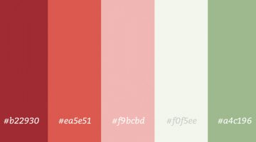
36 Beautiful Color Palettes For Your Next Design Project

Looking for color palettes for your next design project? Whether it’s UI, branding, or web design, the right combination of shades can set the tone and make your work stand out. Color Hex is a great tool with nearly 40,000 ready-made palettes you can explore, copy hex codes from, and even download as PNGs for quick use. We’ve handpicked some of the most versatile and … [Read more...]
This Animated Video Brilliantly Explains How To Choose The Right Colors For Your Designs
Choosing the right color palette is essential to the success of any design project. But how do we know which colors look good together and which ones don't? How do the pros do it? The answer is color theory. Artists and designers have used color theory for centuries, but anyone can learn more about it. … [Read more...]