Designers Studied The World’s Flags And Found Patterns You Can’t Unsee
Every national flag is a piece of graphic design with an unusually tough brief. It has to work at the size of a lapel pin and the size of a stadium, survive being printed cheaply and stitched by hand, and carry the identity of an entire nation. Most have to do all that in two to four colors. No logo designer has ever faced a client quite that demanding.
Taken together, the world’s flags become a dataset. That’s the idea Danish designers Jeppe Morgenstjerne and Birger Morgenstjerne explored with Flag Stories, an award-winning data visualization project from their Copenhagen-based infographic agency Ferdio. The duo analyzed the colors, layouts, symbols and meanings of every UN member state’s flag, and turned the results into a series of beautifully minimal infographics.
For symbols of independence, flags are remarkably conformist. Romania and Chad fly what is essentially the same flag. Entire regions share a handful of flag “families”. Stars beat every other symbol, and purple is almost nowhere to be found. Here are 13 of our favorite graphics from the project, starting with the colors the world can’t stop using.
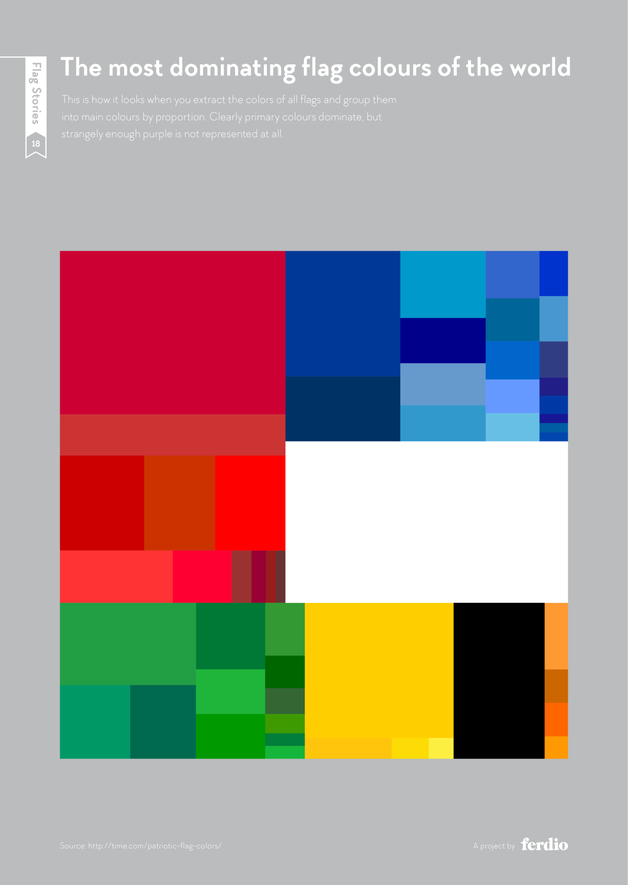
1. The Most Dominant Flag Colors In The World
Extract every color from every national flag, group them by proportion, and this is the result. Red takes the largest share, followed by blue and white, which together make up the default palette of national identity. The surprise is what’s missing: purple barely registers. Historically, purple dye was so expensive it was reserved for royalty, which made it a poor choice for a flag meant to belong to everyone.
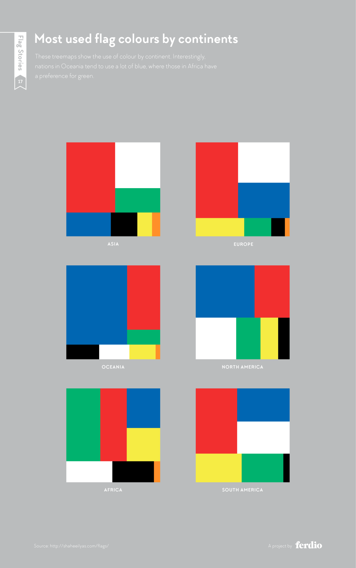
2. Flag Colors By Continent
Geography leaves a visible fingerprint. Oceania leans heavily on blue, which is no surprise for a region defined by ocean. Africa favors green more than any other continent. Asia and Europe both default to red, but Europe pairs it with blue far more often.
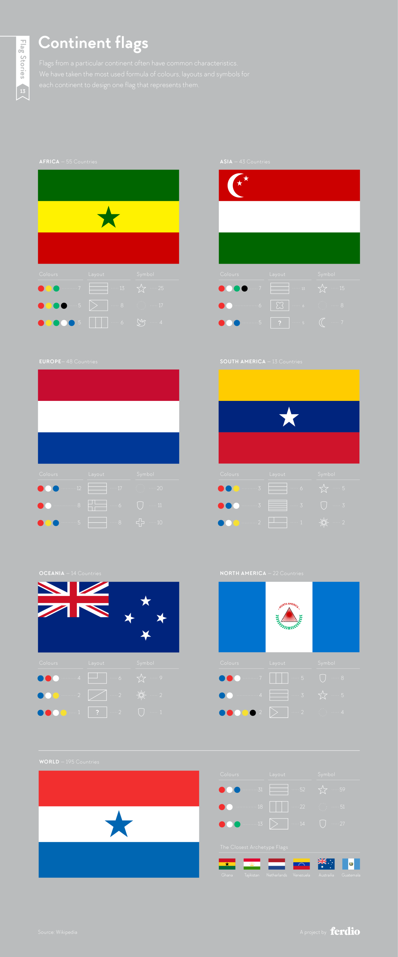
3. If Every Continent Had One Flag
Taking the continental data a step further, Ferdio combined the most common colors, layouts and symbols from each continent into a single flag to represent it. Africa gets a green, yellow and red triband with a star. Europe lands on a red, white and blue design that would pass for the Netherlands. The “world flag” is red, white and blue with a single star. Its closest real-world archetypes are Ghana, Tajikistan, the Netherlands, Venezuela, Australia and Guatemala.
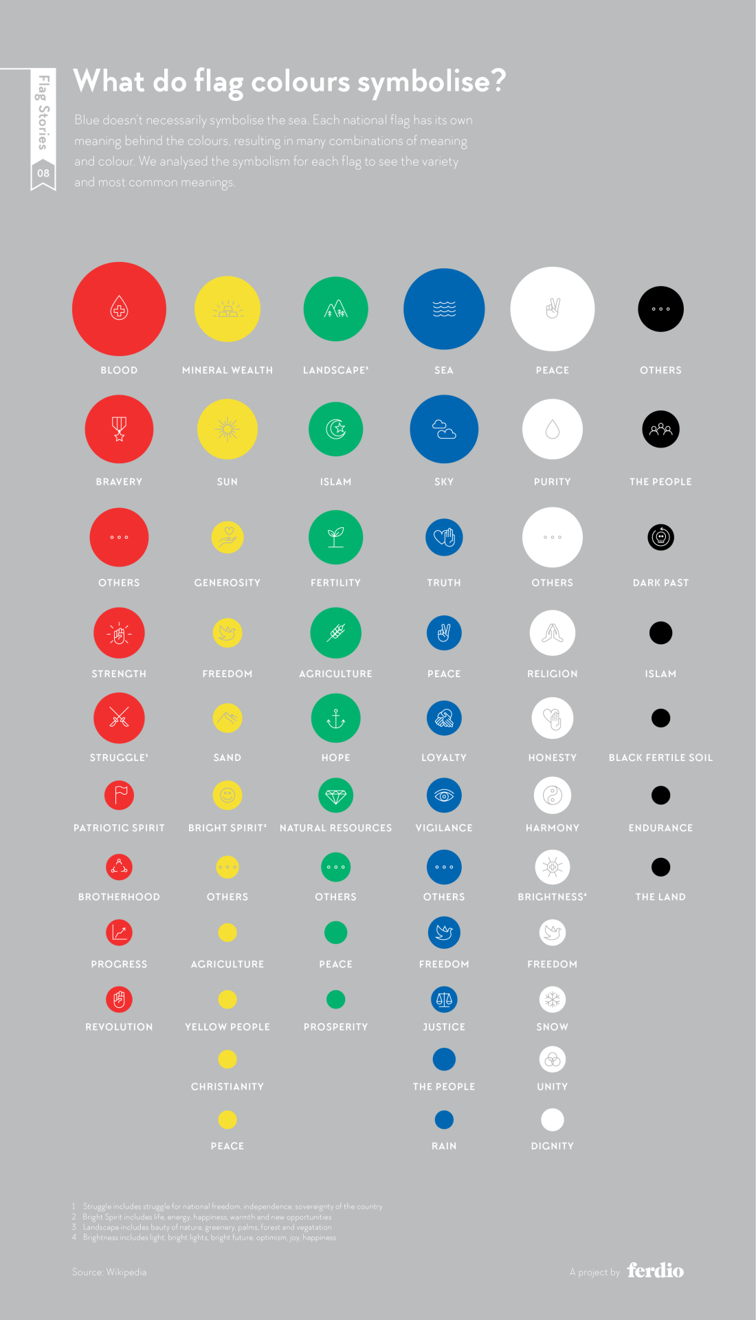
4. What Do Flag Colors Symbolize?
Blue doesn’t always mean the sea, and red doesn’t always mean blood, although it does most often. Ferdio explored the meanings commonly associated with each flag’s colors and found that yellow usually stands for mineral wealth or the sun, green for landscape and fertility, and white for peace and purity. Black has some of the most poignant meanings, from “the people” to “dark past”.
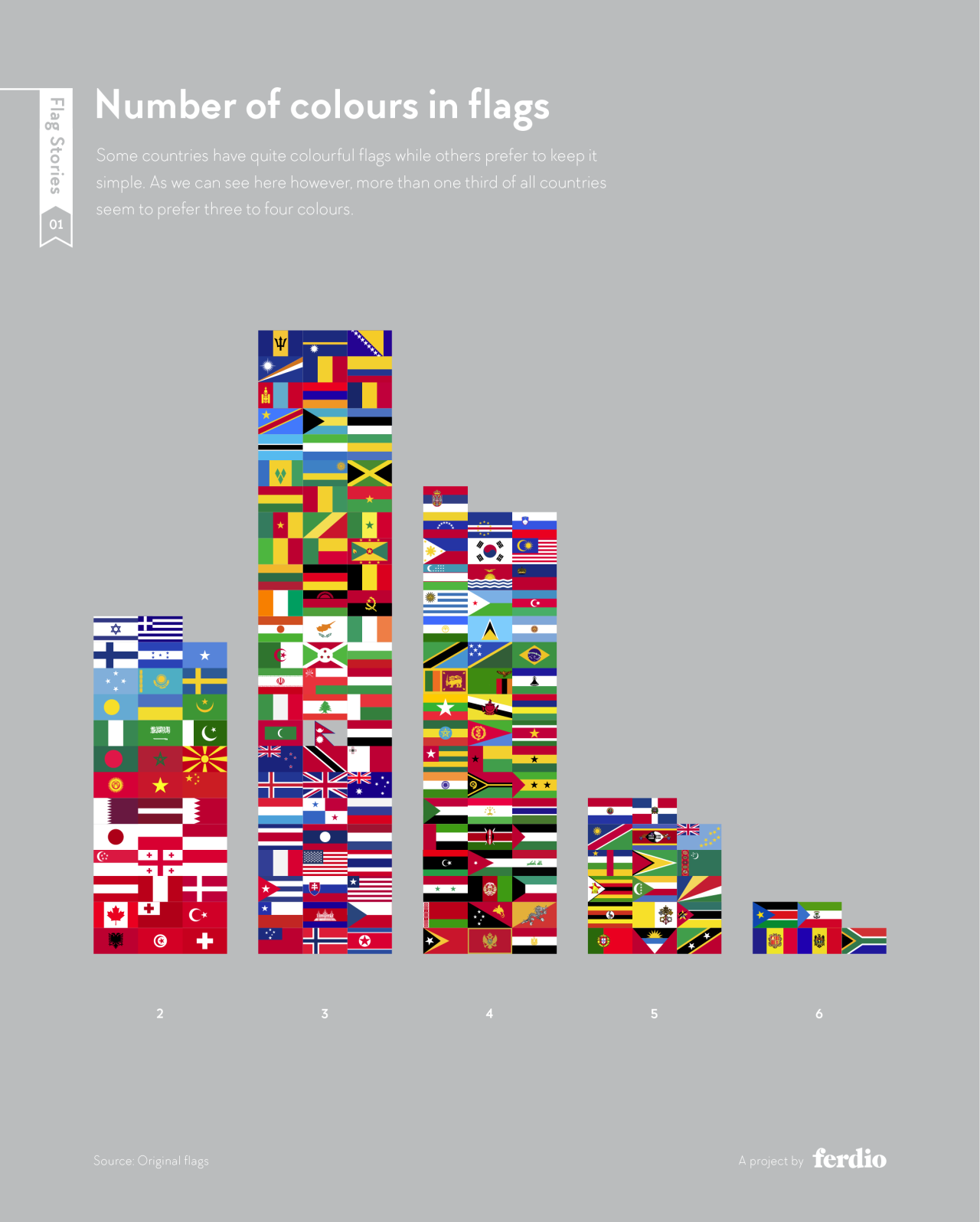
5. How Many Colors Does A Flag Need?
Restraint wins. Three colors is by far the most popular choice, and most national flags use three or four. Two-color flags like Japan, Canada and Switzerland prove how strong simplicity can be, while flags with six colors, such as South Africa’s, are rare exceptions.
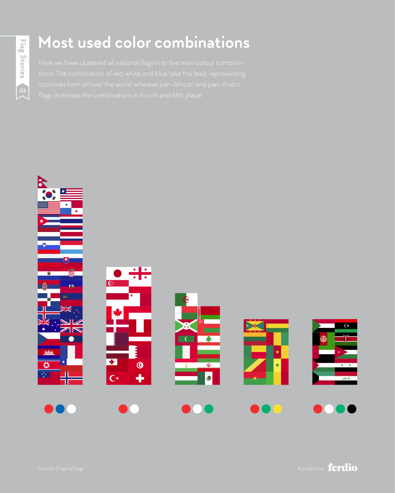
6. The Most Popular Flag Color Combinations
When every flag is clustered into its core palette, red, white and blue easily take the lead, with countries from every continent represented. Red and white come second, followed by red, white and green. Fourth and fifth place show regional identity at work: the red, green and yellow of pan-African flags and the red, white, green and black of pan-Arab flags.
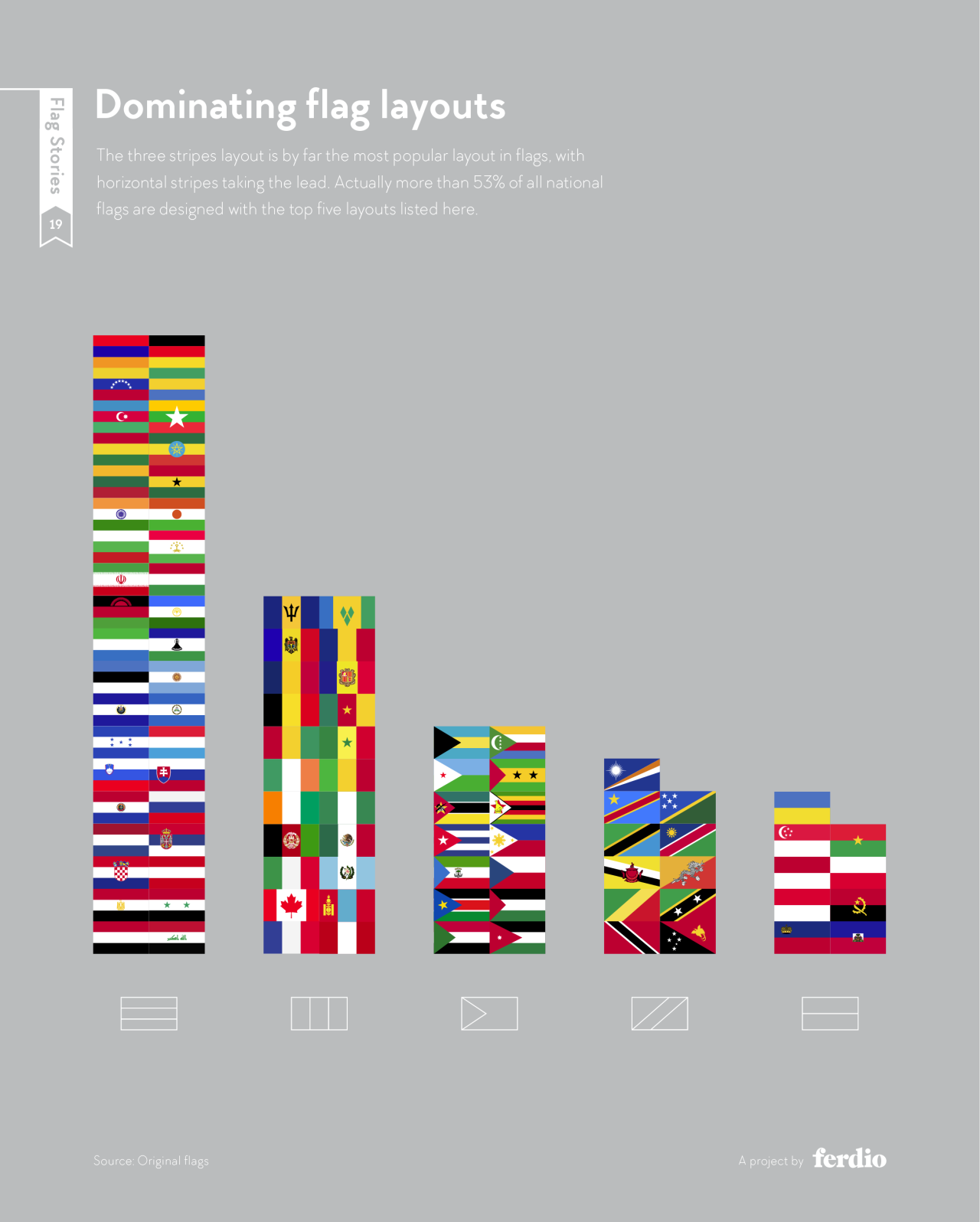
7. The Most Common Flag Layouts
The horizontal triband is the default grid of national flags, and it isn’t close. Vertical stripes, the hoist triangle, the diagonal band and the bicolor fill out the top five. Together they account for more than 53% of all national flags.
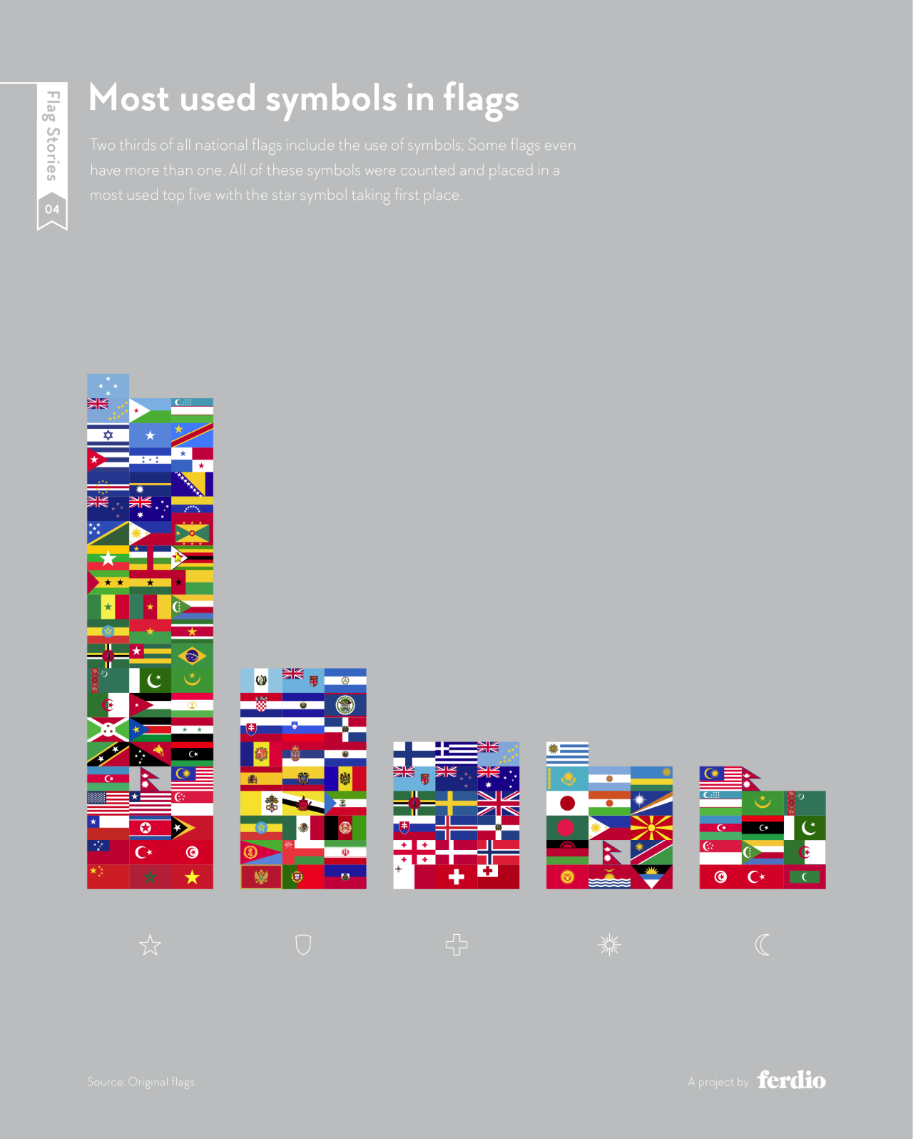
8. The Most Used Symbols In Flags
Two thirds of all national flags carry at least one symbol, and some carry several. The star is the clear favorite, well ahead of coats of arms, crosses, suns and crescents. It’s a simple, scalable shape that reads instantly at any size, which is exactly what a symbol needs to do.
9. Every Flag Element, Counted
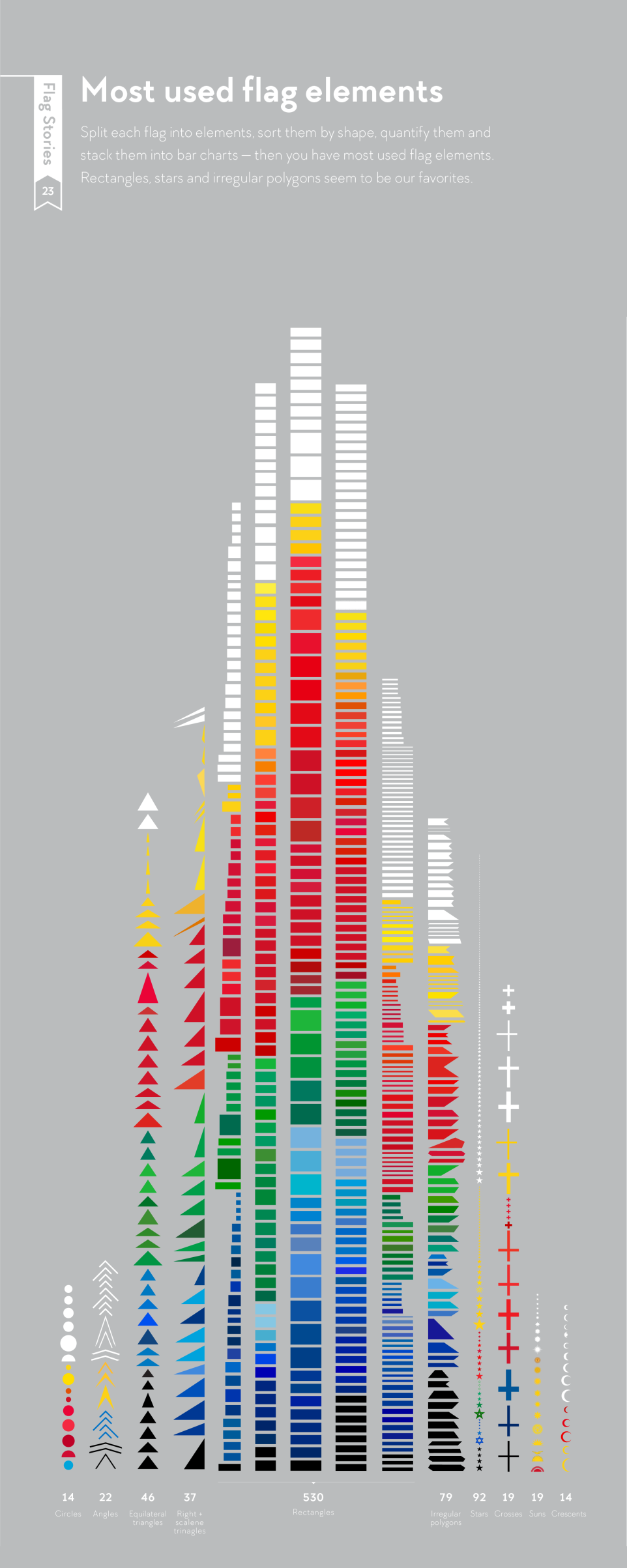
Break every flag down into its basic shapes and the building blocks of vexillology become clear. Rectangles dominate with 530 appearances, followed by 92 stars and 79 irregular polygons. Circles and crescents are the rarest, with just 14 each.
10. Flags That Are Almost Identical
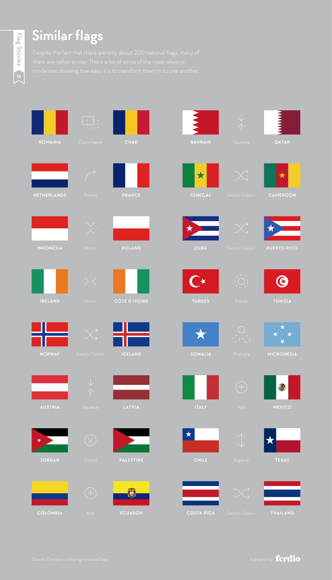
With only around 200 national flags in existence, some were bound to look alike. Romania and Chad are practically copy-and-paste. Ireland and Côte d’Ivoire are mirror images. Norway and Iceland differ only by swapped colors. Ferdio shows the single design move, whether rotate, mirror, squeeze or switch color, that turns one into the other.
11. The Simple Formula Behind Most Flags
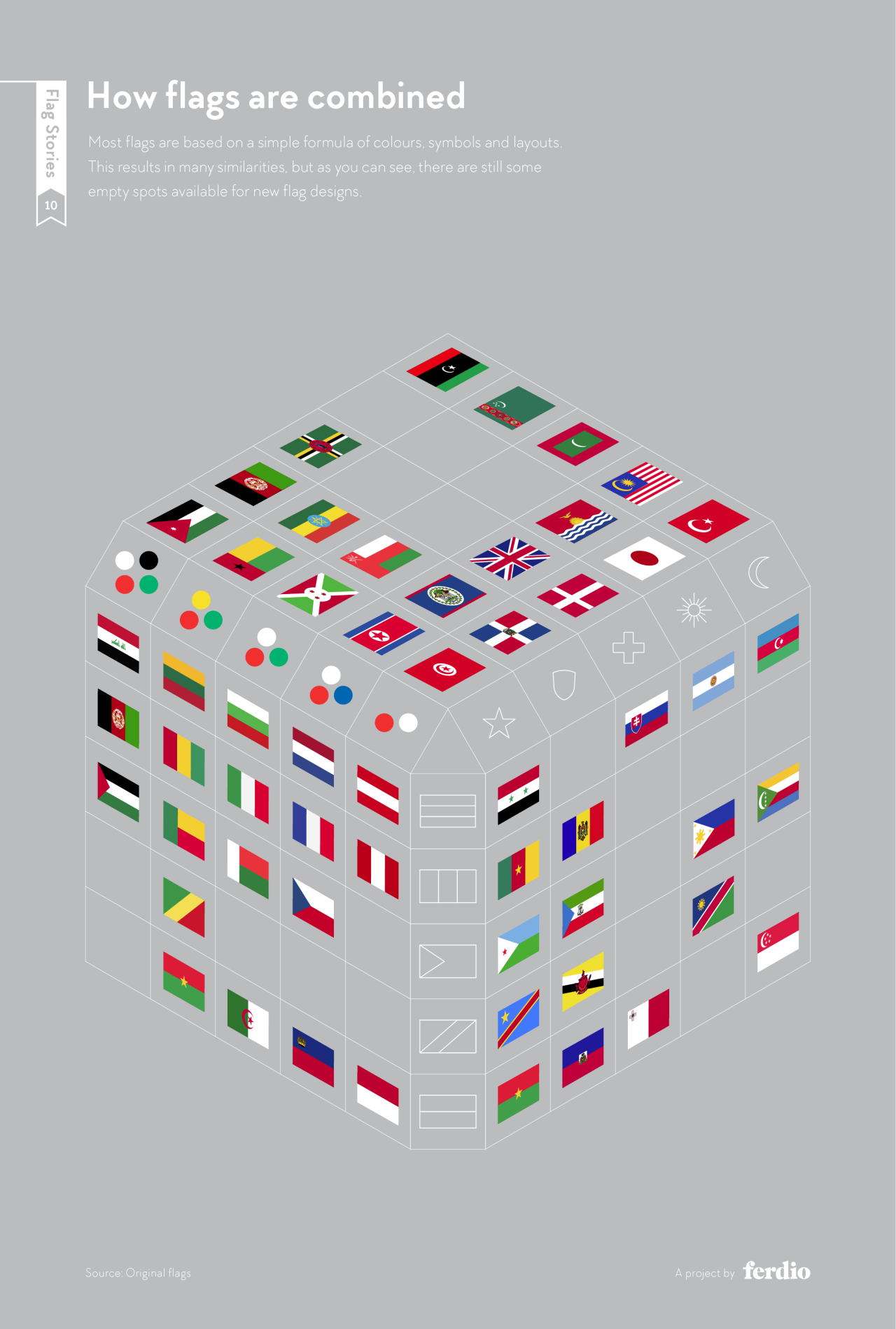
Now put it all together. Most national flags are built from the same three ingredients: a color combination, a layout and a symbol. Ferdio mapped these onto the faces of a cube, with each flag placed where its particular mix of ingredients meets. Many squares are taken, which explains why so many flags feel familiar. The empty ones are more interesting: they’re combinations no country has claimed yet, still open for the next flag design.
12. Flag Families Around The World
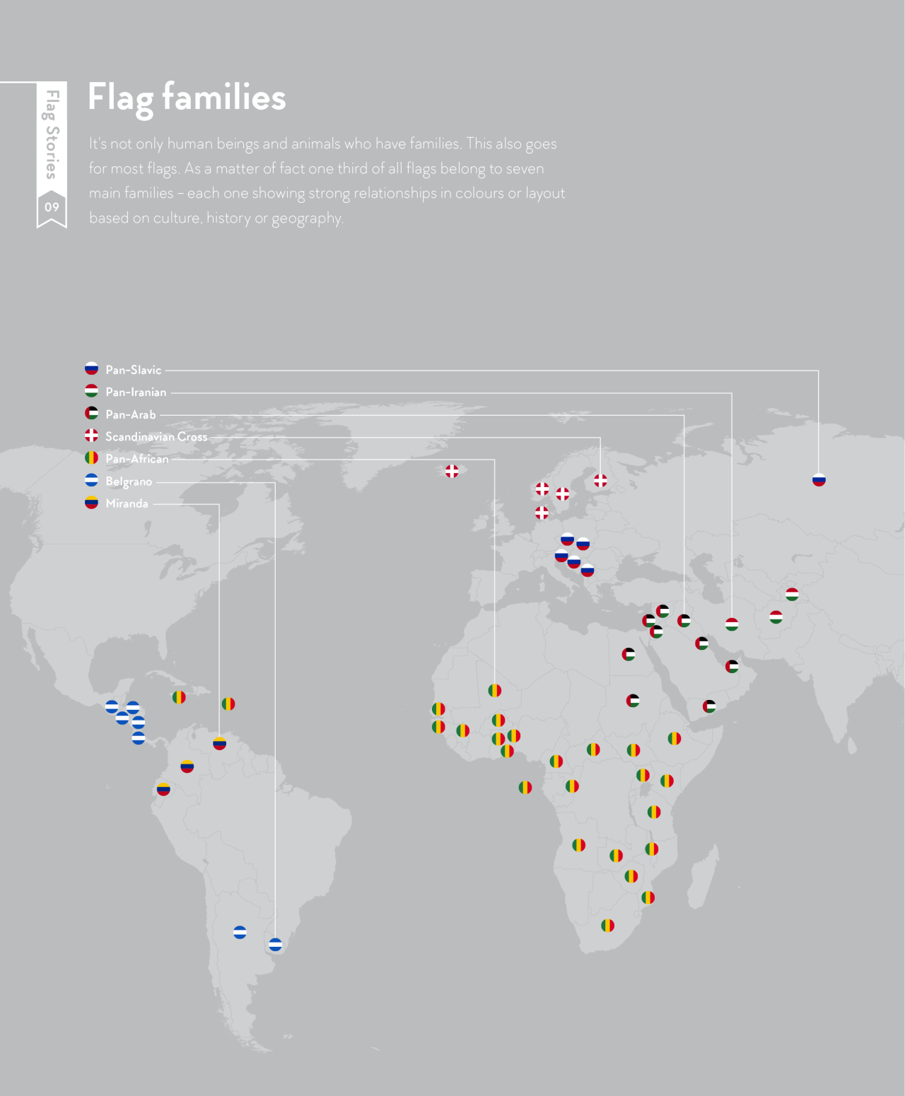
Flags have relatives too. One third of all national flags belong to seven main families: Pan-Slavic, Pan-Iranian, Pan-Arab, Scandinavian Cross, Pan-African, Belgrano and Miranda. Each one is bound by shared history, culture or political movements, and plotted on a map they form neat geographic clusters.
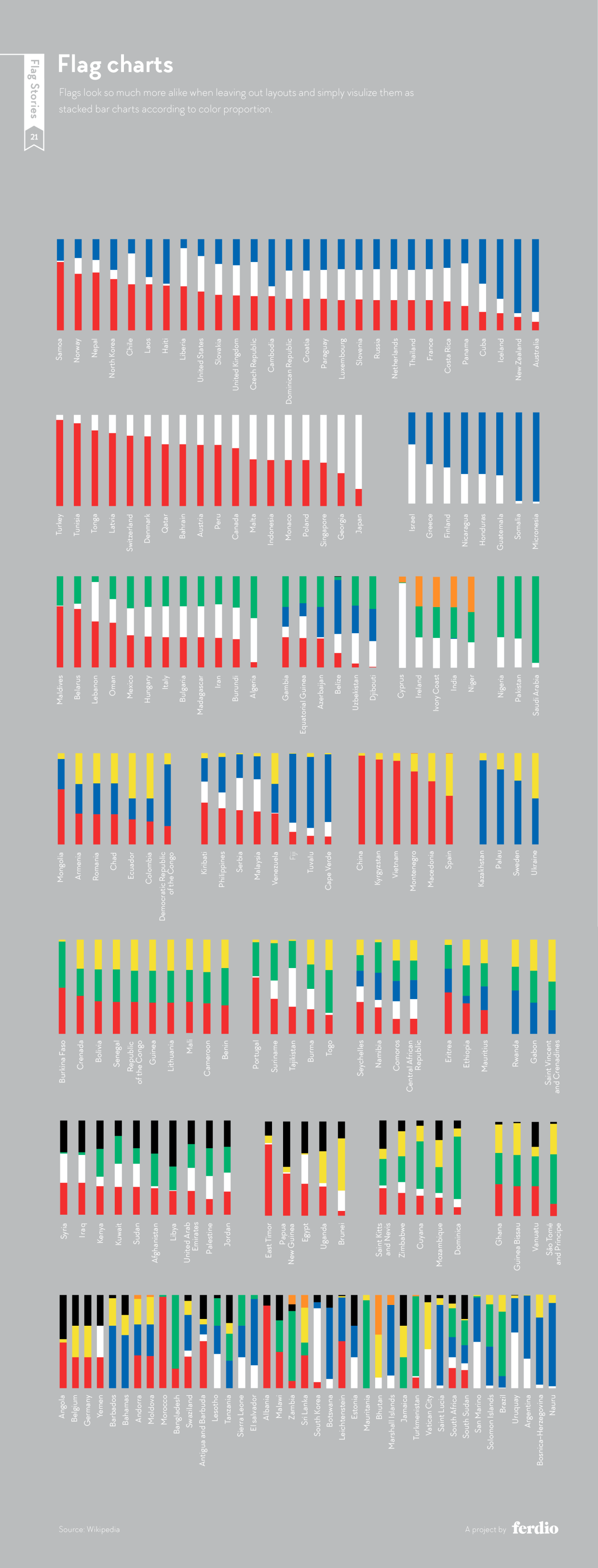
13. Every Flag As A Bar Chart
Strip away the layout and reduce each flag to stacked bars of color proportion, and nations you’d never confuse suddenly look like siblings. It’s a striking reminder of how much of a flag’s identity comes from composition, not color alone, and a fitting final lesson for any designer.
Look closely and flag design follows the same rules good branding always has: limit the palette, keep the shapes simple, and make every color mean something. So here’s a challenge for you. Can you name a national flag that breaks every one of these patterns, with an unusual color, an uncommon layout and a rare symbol? Or, if you think the world flag above got it wrong, how would you design it instead? Tell us in the comments below.