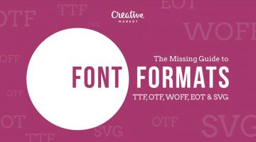
There are many choices of font formats but not a single one works across all browsers. You will have to use multiple font formats to deliver a consistent experience. These include TrueType Font (TTF), OpenType (OTF), Embedded OpenType (EOT), Web Open Font Format (WOFF) and Scalable Vector Graphics font (SVG). … [Read more...]
This Clever Pen Tool Technique Shows You How To Place Anchor Points And Curves In Illustrator
The Pen Tool is one of the most powerful tools in Adobe Illustrator and also the hardest to master. You don't always know where the anchor points have to go and where the bezier handles are supposed to be directed. Too many anchor points result in choppy curves and can also cause printing errors. The bezier handles need to be in the right direction and at the right length to … [Read more...]
Smooth, Clean Animations Of Beautiful Hand-Lettered Logos For Design Inspiration
Russian designers Starov Evgeniy (lettering artist) and Alexey Dubnichenko (motion designer) have come up with a series of impressive animations of commercial lettering work they've created over the last year. The objective of this collection is to show lettering logos in a new perspective. … [Read more...]
This Animated Video Brilliantly Explains Layout And Composition In Graphic Design
Layout and composition are the foundation of design. They give your work structure and make it easier to navigate. Without a well-composed layout, your elements would basically fall apart. GCFLearnFree has come up with an excellent animated tutorial on the five basic layout and composition principles that can help transform your work and sharpen your eye for design. Check it … [Read more...]
Work-From-Home Designer Earns $1 Million Selling Fonts and Graphics Online

Nicky Laatz is a designer, entrepreneur and stay-at-home mom who runs her business from her home in Cape Town, South Africa. She creates fonts, graphics, templates, add-ons, etc. and sells them on Creative Market, an online marketplace for community-generated design assets. She's the first person to have crossed $1 million USD in sales on Creative Market. Watch her inspiring … [Read more...]
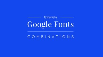
30 Great Font Combinations For Your Next Design Project
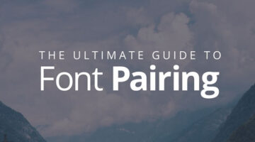
Designers often spend a lot of time deciding which typefaces to pair up and most sites don’t offer a real preview of what the text will look like. To make life easier for everyone, designer Poppie Pack from Canva has created a set of mock-ups that show different headline and body font combinations for a variety of design projects. Pack has also specified the font size and … [Read more...]
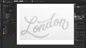
How To Convert Your Hand Lettering From Paper To Digital In Adobe Illustrator
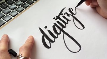
Yesterday, we featured Mackey Saturday's 60 second tutorial on how to create a custom logotype. Today, we'll be focusing in depth on the process of converting your hand-lettering to vector, with the help of this brilliant tutorial from designer Jenn Coyle at Hello Brio Studio. Watch below. … [Read more...]
25 Clever Logos Of Common Verbs We Use Every Day
Following up to the previously published 25 adjective logo collection, Spanish designer Lucas Gil-Turner has created a series of impressive logos for the 25 most commonly used verbs in the Oxford English Dictionary. The list was released by Oxford University Press researchers after the analysis of over a billion words. Lucas has created illustrative and representative logos, … [Read more...]
Designer Who Created The Instagram Logo Shows You How To Design A Logotype
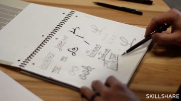
A logotype is the name of a brand or a company designed in a visually unique way for use by that company. The logos of Google, Coca-Cola, Facebook, Disney, Cadbury, Nokia and Philips are examples of famous logotypes. The wordmarks are created using a custom or an existing typeface. If you're looking to create a custom logotype, check out this handy tutorial by Skillshare … [Read more...]
25 Images That Prove Why Good Design Is Important
“Good design is invisible. Bad design is everywhere.” is a well-known concept among designers. It means that you don’t always notice great design because it brings the focus on the product, business or service and enhances their value. Bad design, on the other hand, sticks out like a sore thumb. Today’s post is an epic list of design fails that validate this concept and make … [Read more...]
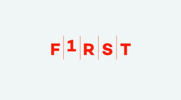
10 Clever Typographic Posters Of Scientists And Their Achievements
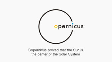
To celebrate Science Day in India, Mumbai-based graphic designer Kapil Bhagat came up with a series of minimalist typographic posters featuring the names of famous scientists. Each name was designed in a way that it symbolized the invention, theory or achievement that the scientist is famous for. For example, the "a" in Pythagoras is in the shape of a right-angled … [Read more...]
25 Clever Logos Of Common Adjectives You Use Every Day
Following up to the previously published 25 nouns logo collection, Spanish designer Lucas Gil-Turner has created a series of impressive logos for the 25 most commonly used adjectives in the Oxford English Dictionary. The list was released by Oxford University Press researchers after the analysis of over a billion words. … [Read more...]
What Different Types Of Fonts Mean And How To Use Them
Every font has a unique personality and purpose. While working on a project, it's imperative to know which font matches the intended tone of communication. Serif fonts portray tradition, sophistication and a formal tone. Sans serif fonts are modern, humanist and neutral. Slab serifs are bold and contemporary. Script fonts are elegant, classic, stylish and formal. We've … [Read more...]
The Story Behind The World’s Most Controversial Font – Comic Sans
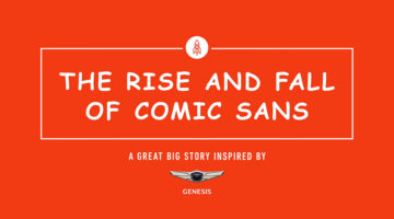
Full marks if you knew which font we were referring to, before you landed on this page. Created by designer Vincent Connare, Comic Sans is arguably the world's most contentious font - the subject of innumerable memes and websites. … [Read more...]
Next Time You Present A Logo To A Client, Try Using Animations Like This Design Studio Does

Here's a logo presentation technique you would like to use in your next client meeting. Venice-based branding agency Concreate Studio presents their logos using animations that explain the ideology behind the design process. For example, the logo animation for furniture maker Emporio Freguglia starts with the icon of a bed that cleverly morphs into a chair-like symbol that … [Read more...]
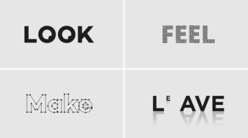
29 Clever Typographic Logos Of Common Words We Use Every Day
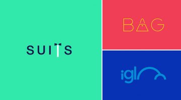
Milan-based creative director Duminda Perera has created a series of clever wordmarks/calligrams of common words we use every day. He’s altered, combined or replaced letters with shapes and symbols that visualize the meaning of the word. So the letter ‘n’ in ‘wine’ looks like a wine bottle, the two o's in ‘igloo’ form the shape of an igloo, and so on. Check them out below. … [Read more...]
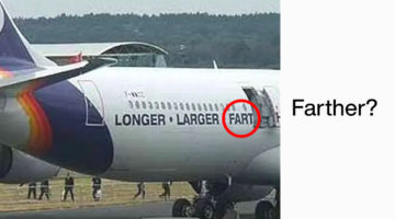
20 Images That Show Why Letter-Spacing Is Important

Kerning is one of those things you never notice — until it goes catastrophically, hilariously wrong. Great typography is invisible, and that's precisely the point. When letter-spacing and kerning are done right, text reads effortlessly and nobody thinks twice. But give those characters a little too much breathing room — or squeeze them a little too close together — and your … [Read more...]
Clever Illustrations Of Historical Events Using Digits From The Year They Occurred In
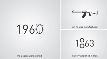
Levan Patsinashvili and Davit Babiashvili are a designer duo based in Georgia, Europe. When they're not busy creating advertising campaigns at Saatchi and Saatchi Tbilisi, they apply their creative skills in a project titled D1G1TAL CHR0N1CLES - a series of pictograms that visualize major historical events using digits from the year they occurred in. Check them out below. … [Read more...]
27 Famous Logos With Hidden Meanings

A logo is more than just an emblem that represents a brand; it's a visual representation of a company's identity, values, and mission. Some logos, however, go above and beyond in delivering a message. These logos have hidden meanings that are deliberately incorporated into their design, adding another layer of intrigue and interest to the brand. These cleverly crafted … [Read more...]
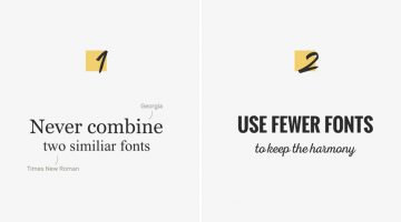
10 Typography Rules That Separate Good Designers From Great Ones
There are two types of typography — expressive typography, where type functions as a visual element, and functional typography, where type exists to be read. Most designers learn the flashy stuff first. The rules that actually make type work? Those take longer. Emmy Award-winning designer Chris Do distilled everything he learned in design school into a single Typography … [Read more...]
Designer Morphs Uppercase Letters To Lowercase In This Fascinating Handmade Typography Experiment
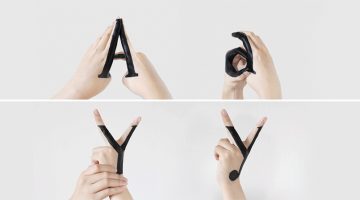
'Handmade Type' is a self-initiated typographic experiment by New York-based designer Tien-Min Liao that explores the relationship between uppercase and lowercase letters and records the transformation between them. … [Read more...]
Web Design Psychology: How To Create A Site That Influences People
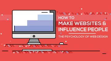
"Good design is obvious. Great design is transparent." – Joe Sparano. That line has stuck around for years because it gets at something most people building websites still miss: the best-performing sites aren't the flashiest ones. They're the ones that feel effortless to use. Web design psychology is what sits behind that effortlessness. It's the reason you trust certain … [Read more...]
9 Useful Tips For Better Typography
Like any form of art, there is no set formula to create good typography. Typographic choices that work for one form of text won’t necessarily work for another. There are however good practices to follow. Design resource website Pixelo has come up with a nifty animated video that shares a few useful tips to keep in mind when combining typefaces and working with … [Read more...]
10 Great Google Font Combinations For Your Next Design Project
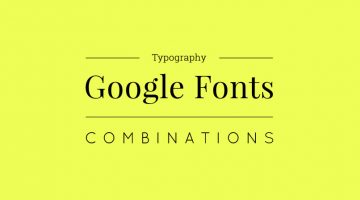
Designers often spend a lot of time deciding which typefaces to pair up and most sites just give one-sentence examples that don't offer a real preview of what the text will look like. To make life easier for everyone, the team at Milo Themes has created a set of mock-ups that show different Google Font combinations for headline and body copy. They've used filler text from … [Read more...]
Watch This Calligrapher Draw Famous Logos With Remarkable Accuracy Entirely By Hand
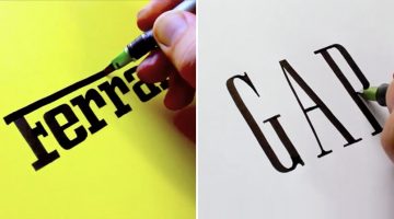
Sebastian "Seb" Lester is an English artist, type designer and calligrapher known for his prominent type designs and calligraphic prints. He started designing typefaces for Monotype in the early 2000s after graduating from Central Saint Martins, London, where he studied graphic design. … [Read more...]
15 Great Google Font Combinations For Your Next Design Project
Designers often spend a lot of time deciding which typefaces to pair up and most sites just give one-sentence examples that don't offer a real preview of what the text will look like. To make life easier for everyone, the team at Milo Themes has created a set of mock-ups that show different Google Font combinations for headline and body copy. They've used filler text from … [Read more...]
29 Memes That’ll Make Every Designer Laugh
Need something to stare at to pretend you’re working? Have a look at these hilarious memes by Instagram account screensaviors that’ll fill your day with laughter and self-doubt. When you’re done, share this post with a designer working on a deadline and waste his time as well. … [Read more...]
A Useful, Comprehensive List Of Typography Terms For Designers
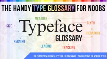
Do you know the difference between kerning and tracking, beak and serif, baseline and descender line? As a designer, it's imperative that you know what different typography terms mean, even if you don't use them every day. Here's a brilliant typeface glossary/infographic by DesignMantic that explains the meanings of terms like kerning, leading, tracking, glyph, serif, etc. and … [Read more...]
After Working With Difficult Clients, This Designer Turned Their Comments Into Funny Posters
In the design business, if you put a nickel in a jar every time a client says something stupid, you'll have a jar full of nickels by the end of the week. After receiving his fair share of nonsensical client feedback over the years, Jonathan Quintin, founder and creative director of UK agency Studio–JQ, decided to collate a few of them into a poster series titled "The Client … [Read more...]
The 10 Types Of Designers – Which One Are You?
"The life of a designer is a life of fight. Fight against the ugliness." - Massimo Vignelli. Although we're all working towards the same objective, we designers have our distinct skill sets and preferences. There are designers who love flat design and there are designers who love skeuomorphism. Similarly, there are designers who like pastel shades and minimalism and there are … [Read more...]
14 Graphic Design Terms That Most Designers Get Wrong
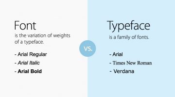
Most amateur designers don't know the difference between a font and a typeface. They use the two terms interchangeably. A font is the variation of weights (bold, italic, thin) of a typeface. A typeface is a family of fonts, like Arial, Helvetica, Bebas, etc. Another example is the usage of the terms 'color' and 'hue'. Color is an all-encompassing word referring to a hue, … [Read more...]
Beautiful, Inspiring Hand-Lettered Tips For Designers And Creatives
Sean McCabe is a hand lettering artist, type designer, and illustrator based in San Antonio, Texas. He runs a media company called seanwes by day and creates gorgeous hand-lettered typography by night. Using Pigma Micron pens, Sean weaves his magic on paper, offering inspiring tips and mantras for artists, designers, creatives, and just about anyone. He has spent over 9000 … [Read more...]
How To Transform A Face Into A Powerful Text Portrait In Photoshop
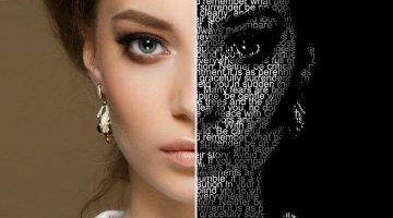
You've seen typographic portraits of famous luminaries like Muhammad Ali, Steve Jobs, John Lennon, Audrey Hepburn, etc., but do you know how to create them? Marty from Blue Lightning TV shows you how to transform a photograph into a striking text portrait in these nifty Photoshop tutorials below. … [Read more...]
37 Amazing Ads That Use Negative Space Brilliantly
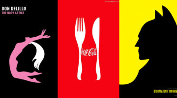
In art and design, negative space is the background space around the main object of an image. In a two-tone image (eg. black and white), the object is usually depicted in a darker color (black) than the background (white), thereby forming a silhouette. Sometimes, the tones are reversed and white is used to fill the silhouette (refer Coke examples below). When an artist … [Read more...]
16 Clever Typographic Movie Titles
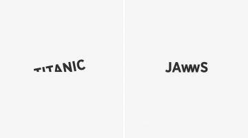
Istanbul-based digital creative Ali Erkurt has created a series of typographic movie titles that subtly hint at the plot or the central elements of the films. So, the 'w' in Jaws looks like the teeth of a shark, the 'i' in Matrix is replaced with the number 1 (the chosen one), the 'o' in Indiana Jones looks like his whip, and so on. Check them out below. … [Read more...]
- « Previous Page
- 1
- …
- 3
- 4
- 5
- 6
- 7
- Next Page »