What Different Types Of Fonts Mean And How To Use Them
Font psychology is the study of how typefaces shape our emotions and perceptions, often before we’ve read a single word. Every font has a personality, and that first impression is what makes typography such a powerful design tool. It explains why a law firm in Comic Sans feels wrong, why a luxury brand reaches for a high-contrast Didone, and why the right type choice can quietly do half your persuading.
Type speaks before the copy does. Serif fonts suggest tradition, sophistication and a formal tone. Sans serifs feel modern, clean and neutral. Slab serifs are bold and confident, while script fonts are elegant, personal and a little romantic. Pick the wrong one and your audience senses it, even if they can’t say why.
This is where good design separates from guesswork. While working on a project, it’s imperative to know which font matches the intended tone of communication. A typeface works like a speaking voice. The words may be identical, but the emotion they carry depends on how they’re set.
To help you choose with intent, we’ve rounded up four handy infographics on font psychology and how fonts affect emotions. They cover everything from the personality of each type family and which fonts pair well together, to the moods behind grunge, geometric and vintage lettering, plus one firm warning about Comic Sans. Keep them bookmarked for your next branding, editorial or web project.
Check them out below.
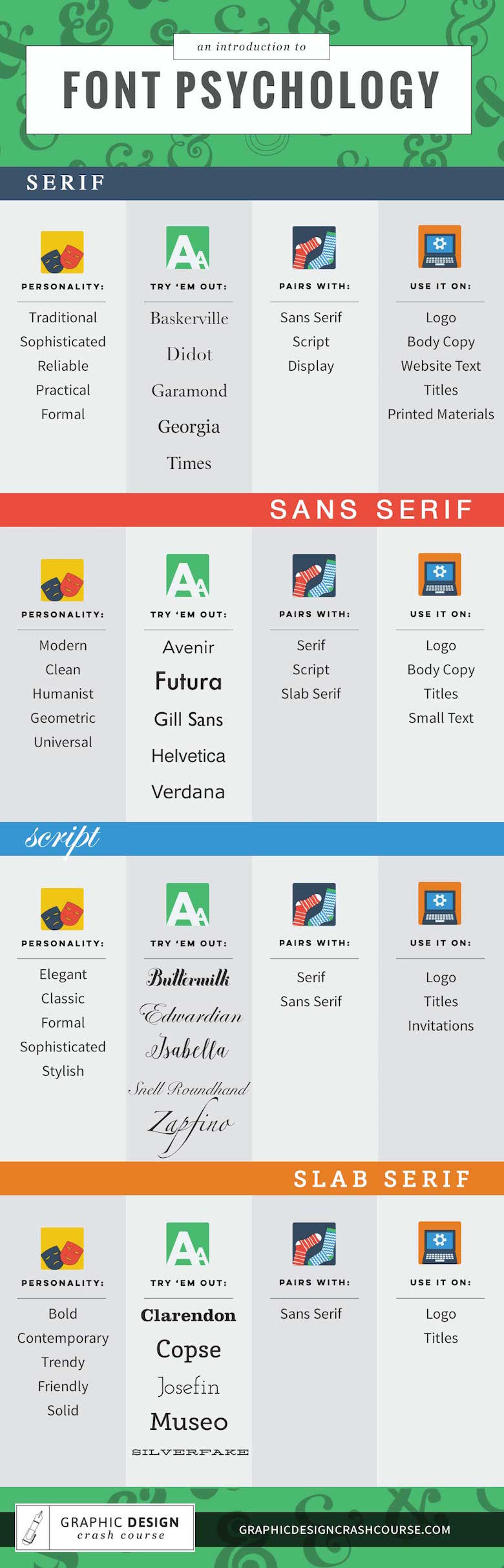
1. An Introduction To Font Psychology
A clean starting point if you’re new to the subject. This guide breaks down the four core type families (serif, sans serif, script and slab serif) by personality, then suggests classic fonts to try, what each pairs well with, and where it works best, from logos and titles to body copy and invitations.
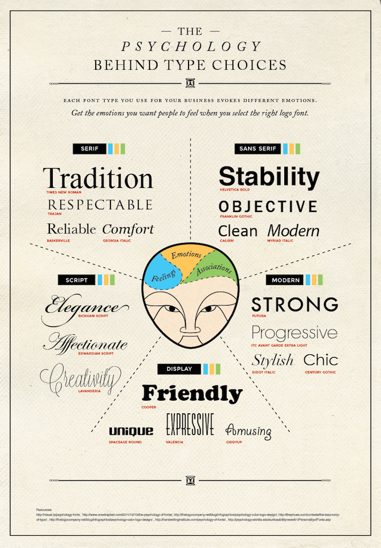
Built with logo design in mind, this one maps typefaces to the feelings they trigger. Times New Roman reads as tradition, Helvetica Bold as stability, Futura as strength and Cooper as friendly. It’s a useful gut check before you commit to a wordmark.
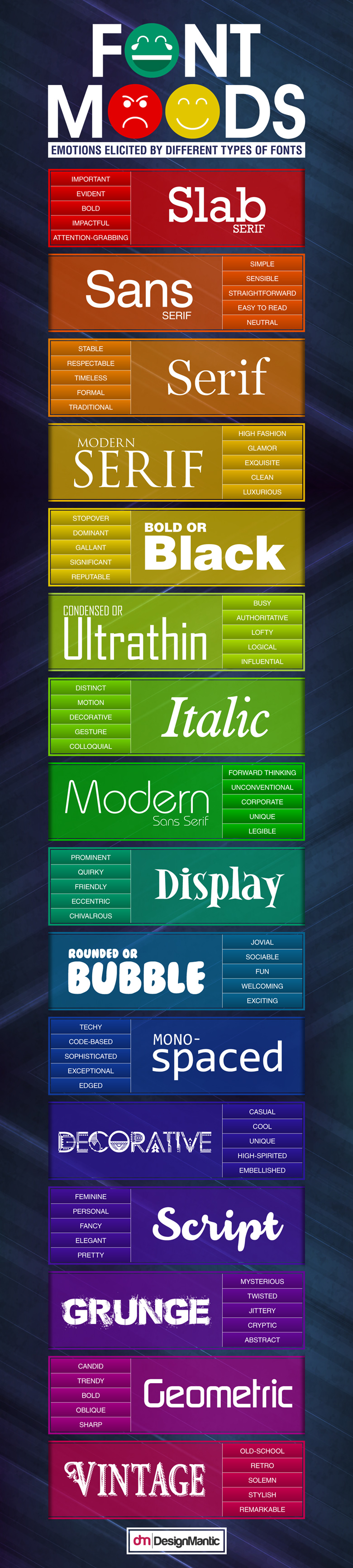
3. Font Moods: Emotions Elicited By Different Types Of Fonts
Sixteen font styles, five moods each. Beyond the usual suspects, this chart covers ultrathin, rounded, monospaced, grunge and vintage type, so you know whether a font will come across as authoritative, jovial, techy or downright cryptic.
The most complete of the lot. It walks through type classifications, the anatomy of a letterform, what each style is really saying, layout basics, and the principles of direction, contrast and rhythm. It also delivers the best typography advice we’ve seen in a single line: don’t try to be original, just try to be good.
Font psychology isn’t a set of rigid rules. It’s a shared visual language that audiences have learned over centuries of print, signage and screens. That’s also why the best designers know when to break it. A serif can feel rebellious in a tech brand, and a playful script can soften a serious message, but only when the choice is deliberate. Know what a typeface says by default, and you’ll know exactly how far you can push it.
Share this post with a designer friend and then tell us: which well-known brand do you think is using the wrong font, and what would you replace it with? Drop your pick in the comments below.