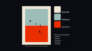
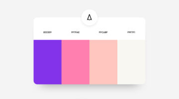
It's easy to find two colors that go well with each other, but things get tricky when you add a third color to the mix. Each color must complement the other two perfectly. If you’re looking for tri-color palettes for your graphic, web, or UI design, Wolvus Technology has come up with a series of beautiful combinations that look great together. You can use these colors for … [Read more...]
32 Brilliant Logos With Hidden Meanings
Looking for some logo design inspiration? Here are 32 brilliant examples with dual and hidden meanings, also known as visual double-entendres. In most cases, the hidden symbols are a visual representation of the brand name, and in others, they explain the nature of the business. Clever typography, negative space, and visual symbolism are some of the design techniques used to … [Read more...]
30 Clever Wordmarks That Use Negative Space Brilliantly
Netherlands-based logo designer Sander has come up with an interesting project that features typographic logos (or wordmarks as he prefers to call them) of common words we use every day. He uses the negative space between the letters to create objects that visually represent the meanings of the words. For example, the design of the word SHARP consists of a knife in the … [Read more...]
Forget AI, This Guy’s Unreal Photoshop Skills Prove Nothing Beats A Human Touch
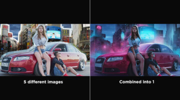
Good Photoshop work isn’t just about technical execution, it’s about restraint, balance, and intention. With composite images, it’s easy to go overboard, too much contrast, unnatural cutouts, inconsistent shadows. What makes a great edit stand out is how invisible the editing feels. When everything sits together naturally, the image doesn’t just look edited, it looks … [Read more...]
Nike Shares Powerful Anti-Racism Message; Rival Adidas Surprises Everyone By Resharing It
Nike's iconic brand slogan "Just Do It" is well-known across the world. Following the death of George Floyd in Minneapolis, the sportswear giant has released a powerful anti-racism film with an altered slogan that tells people "Don't Do It." Created by Wieden+Kennedy, the one-minute video begins with the words "For once, Don't Do It. Don't pretend there's not a problem in … [Read more...]
Artist Turns Household Items Into Spaceship Designs That Are Out Of This World
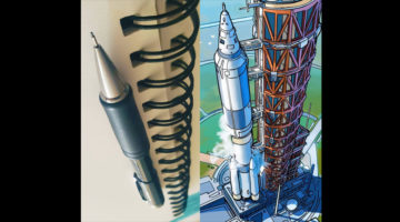
Artist and software engineer Eric Geusz has come up with a fascinating project that reimagines everyday objects as futuristic spaceships. Eric, a huge science fiction and fantasy fan, has been making spaceships out of Legos since he saw Star Wars in 1997. Armed with an exceptional imagination, he turns household items like potato peelers, bottle openers, trimmers, game … [Read more...]
Car Photographer’s Shoot Gets Cancelled Due To Covid Pandemic, So He Clicks Stunning Pics With A Toy Car At Home
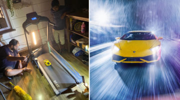
Talk about using your time productively during this lockdown. Mumbai-based automotive photographer Kunal Kelkar had been in talks with Lamborghini about a photography assignment in Tuscany. Unfortunately, due to the coronavirus pandemic, the photoshoot was cancelled. Rather than getting bogged down, Kunal decided to channel his energy into something creative. Using a … [Read more...]
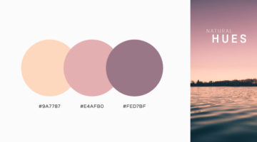
47 Beautiful Color Schemes For Your Next Design Project
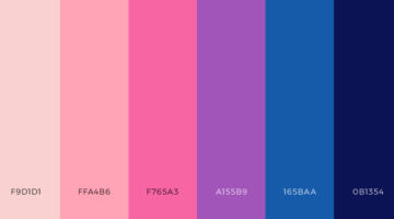
Looking for color schemes for your graphic, web, or UI design? SchemeColor is a handy online tool that lets you create, save, and customize beautiful color palettes. You can browse and filter schemes by color or keywords like pastel, rainbow, monochromatic, etc. You can modify the color palettes, and download them in .PNG format. The RGB, CMYK, and hexcodes of each color are … [Read more...]
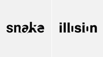
29 Clever Ads That Play With Text And Typography
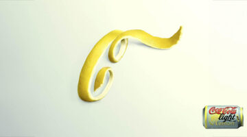
“Typography is an art. Good typography is art.” — Paul Rand Typography stops being decoration the moment it becomes the message. The best print ads in this collection prove it: a lemon peel curling into Coca-Cola’s distinctive lettering, words shaped into objects, and letterforms stretched, blurred or rearranged to communicate an idea before the copy is even read. In each … [Read more...]
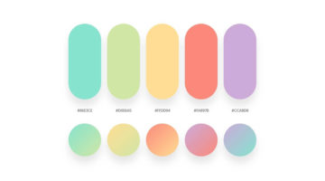
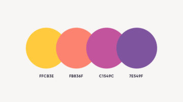
39 Beautiful Color Palettes For Your Next Design Project
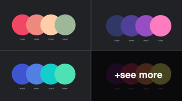
Looking for color schemes for your graphic, web, or UI design? Ocean.ui is a handy Instagram account that shares a beautiful new palette everyday, with hex codes of each color. They also share font combinations, patterns, and UI elements made using their color palettes. We’ve shortlisted some of the best palettes on the Ocean.ui page in terms of aesthetic appeal, usability, … [Read more...]
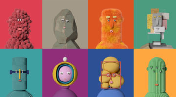
8 Beautiful Illustration Projects For Design Inspiration
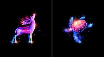
Custom illustrations are one of the key design trends in graphic, print, and packaging design nowadays. We've shortlisted some of the most gorgeous illustration projects of the year across different art styles. Check them out below and tell us your favourites in the comments. … [Read more...]
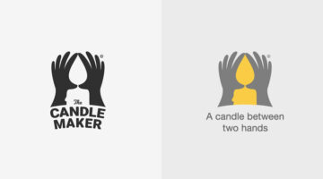
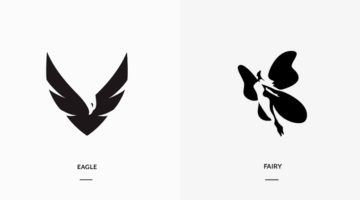
42 Clever Logos With Hidden Meanings Inspired By Everyday Words
Istanbul-based designer Mustafa Ömerli has come up with an interesting project that features typographic logos of common words we use every day. He visually represents the meanings of the words by using symbols, negative space, or by adding geometric elements to the letters. For example, the letter 'k' in the word 'kickboxing' looks like its landing a kick on the letter 'i'. … [Read more...]
37 Beautiful Color Palettes For Your Next Design Project
Looking for color palettes for your graphic, web, or UI design? The Colour Lab is a handy Instagram account that shares a beautiful new palette everyday, with hex codes and gradients. The colors are derived from beautiful images of nature, architecture, and urban landscapes. If you design something using Colour Lab's palettes, you can get featured on their page as well. … [Read more...]
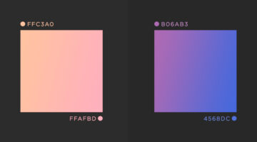
37 Beautiful Color Gradients For Your Next Design Project
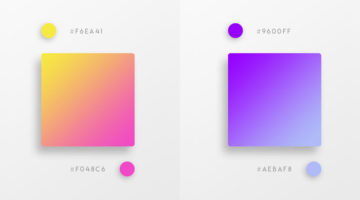
Vibrant colors and vivid gradients are one of the key trends in UI, web, and graphic design nowadays. Spain-based designer Yaroslav Iakovlev from Zeka Design has come up with a series of gradient color combinations that you can use in your next project. The hex codes of each color are mentioned on the palettes. Check them out below and tell us your favourites in the … [Read more...]
24 Beautiful Color Combinations For Your Next Logo Design
Previously, we showed you how to choose the right colors for your brand, and also featured the most popular brand colors in each industry. Now, Lindsay Kramer from 99 designs has come up with a handy list of color combinations you can try for your next logo design, depending upon the client brief and the industry the brand belongs to. We've also generated palettes from … [Read more...]
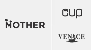
21 Beautiful Negative Space Logos
In art, negative space is the background space (or white space) around and between the subject of an image. For example, in a picture of a black vase against a white wall, the vase is the positive space, and the white wall is the negative space. In design, negative space can be used to create hidden meaning logos and illustrations. In today's post, we feature a series of … [Read more...]
Beautiful Typographic Alphabet Series Of Countries And Their Iconic Landmarks
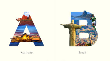
Dubai-based graphic designer Yuhab Ismail has come up with an interesting project titled “LETTRAVEL” that mixes typography and photography to showcase some of the world’s most beautiful countries and their iconic landmarks. Each letter represents the initial of a country and includes images of its famous monument or landscape clip-masked within the letterform. From the … [Read more...]
32 Beautiful Color Palettes With Their Corresponding Gradient Palettes
Looking for color palettes for your graphic, web, or UI design? Mr.Pugo is a handy Instagram account that shares beautiful color palettes (with hex codes) and also their corresponding gradient palettes. We’ve shortlisted some of the best ones in terms of aesthetic appeal, usability, and current design trends. Check them out below and tell us your favourites in the … [Read more...]
21 Beautiful Free Fonts For Your Next Design Project
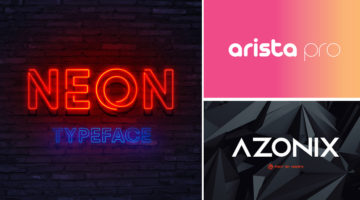
As a designer, no matter how many fonts you have on your system, you always want more. You might use just a fraction of those fonts on a regular basis, but you need to have a gorgeous collection in your repository at all times. And what's the one thing designers love more than a beautiful font? A beautiful font that's available for FREE! Today's post is a collection of 21 … [Read more...]
This Brilliant Quiz By Adobe Tells You Exactly What Type Of Creative Personality You Have
Adobe Create Magazine has put together a fun quiz called Creative Types to help you uncover your unique creative personality. It analyzes your daily habits and creative tendencies, giving you a fresh perspective on how you think, work, and bring ideas to life. When you’re done, you’ll get practical tips on how to make the most of your strengths and even see which creative … [Read more...]
3 Designer Friends Created An Alphabet Series Using Logos They’ve Designed Over The Years
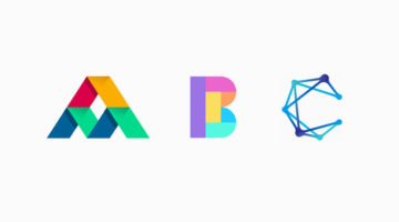
Three graphic designers, colleagues, and friends, Alex Tass, Dalius Stuoka, and Deividas Bielskis decided to put together an A-Z alphabet series made from logo symbols, lettermarks, and monograms they've created over the years. All three designers have been in the industry for over 10 years, and have worked with a variety of clients, brands, and agencies. For this project, … [Read more...]
31 Beautiful Gradient Logos For Design Inspiration
When Apple launched iOS 7 in 2014, it not only changed the face of UI design, but also branding, graphic and logo design. Skeuomorphic interfaces and glossy app icons were out. Flat design, vibrant colors and gradients were in. In 2016, when Instagram came up with a bright new look and multicolored logo, a vast majority of its users hated the vivid gradients and demanded the … [Read more...]
43 Beautiful Color Palettes For Your Next Design Project
Looking for color palettes for your graphic, web, or UI design? Awsmcolor is a handy Instagram account that shares a beautiful new palette everyday, with hex codes of each color. At the end of every month, they feature the top nine palettes for that month. If you create something exceptional using their palettes, you can get featured on their page as well. We've shortlisted … [Read more...]
41 Beautiful Color Palettes For Your Next Design Project
Looking for color palettes for your graphic, web, or UI design? Colours.cafe is a handy Instagram account that shares a beautiful new palette everyday, with hex codes of each color. They also hold design challenges in which users have to use a specific palette to create illustrations and calligraphy. The best works are then featured on their page. We've shortlisted some of … [Read more...]
Free Photoshop Pack Of Beautiful Gradients For All Your Design Needs
Vibrant colors and gradients are one of the major trends in graphic, web, and UI design nowadays. To make life easier for designers everywhere, Paris-based graphic designer Leo Simon has compiled a set of 300 beautiful gradients into a Photoshop gradient file (GRD), available for free. We've shortlisted some of our favourites from Leo's collection and shared them below with … [Read more...]
Japanese Artist Turns Product Packaging Into Amazing Artworks
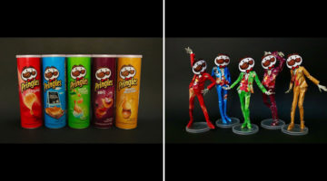
Japanese artist Haruki transforms packaging of everyday items like Pringles chips, Oreo cookies, Nestle milk, etc. into amazing paper sculptures and artworks. He uses a technique known as kirigami, a variation of origami, which involves cutting and folding paper to create intricate designs. Kirigami is usually associated with traditional Japanese art, but Haruki applies the … [Read more...]
Designer Creates Clever Negative Space Logos That Visualize The Name Of The Company
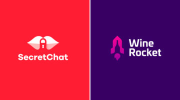
Lithuania-based graphic designer Leo has come up with a series of clever logos that combine the name or initials of the company into one unique symbol using negative space. The logo in each case visually represents the name of the company. For example, the logo for Secret Chat is a pair of lips with a padlock in the negative space between the lips. The logo for Wine Rocket … [Read more...]
Designer Uses Beautiful Gradients And Abstract Shapes To Describe Meanings Of Words
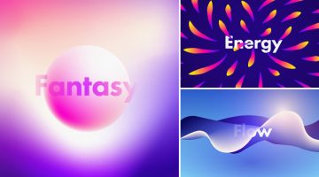
UK-based graphic designer Evgeniya Righini-Brand has come up with a fascinating project titled “Gradient Studies” in which she uses vibrant gradients and abstract shapes to visually describe the meanings of various words. For example, the visual for the word "flow" is an abstract liquid shape with multiple gradient meshes in blue and white. The visual for the word "energy" is a … [Read more...]
15 Brilliant Art Tributes To The MARVELous Stan Lee

Stan Lee, the legendary writer, editor and publisher of Marvel Comics, passed away on November 12, 2018 in Los Angeles, California. He was 95. In collaboration with artists Jack Kirby and Steve Ditko, Lee co-created iconic superhero characters like Spider-Man, the Hulk, the X-Men, the Fantastic Four, Doctor Strange, Black Panther, and Daredevil. He also co-created the … [Read more...]
Designing Logos For Companies With Long Names Can Be Tricky, Here Are 25 Great Examples
When it comes to logo design, a long company name can be quite a challenge. You want to create a logo that's clean and memorable, but lengthy lines of text can look cluttered and uninspiring. Professional designers use different techniques to solve the visual challenges of a long brand name. These include: 1. Splitting the name into two or three lines 2. Using different … [Read more...]
Graphic Designer Combines Two Completely Unrelated Objects Into Clever Logos
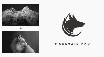
Indonesian designer Rendy Cemix has come up with an interesting project in which he combines the shapes of two completely different objects into one unique logo. The logo in each case is a visual representation of the brand name. For example, the logo for Mountain-Fox is an aesthetically designed symbol of a fox with ears that look like snow-capped peaks. The logo for … [Read more...]
Photographer Shows Off Mad Skills By Sharing Raw Behind-The-Scenes Images Alongside Stunning Final Photos
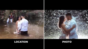
Brazilian photographer Gilmar Silva has come up with an impressive project titled “Lugar x Foto” (Place and Photo), in which he shares behind-the-scenes images of his shoots alongside the final photograph. The series focuses on showing what a photoshoot really looks like before it turns into a polished image. The first photo shows the actual location and the working … [Read more...]
27 Clever Ambigram Logos That Look The Same When Viewed Upside Down
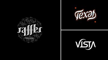
An ambigram is a typographical design or symbol consisting of text modified in such a way that it can be read in different orientations - inverted, rotated, mirror-image, etc. For example, the logo of Sun Microsystems (no. 4 below) is a brilliantly-designed ambigram that reads 'SUN' from all directions. Another famous example is the New Man logo (no. 6 below), designed by … [Read more...]
This Designer’s FIFA World Cup Badge Concepts Are Better Than The Real Thing
Every four years, the FIFA World Cup turns the planet into a design brief. Flags get waved, kits get debated, and somewhere in between, a few designers take it upon themselves to imagine what national football identity could look like if the brief had no constraints. These badge concepts are that rare thing: football design with genuine craft behind it. Venezuelan … [Read more...]
Designer Creates Clever Logos By Combining Two Or More Different Shapes Into One
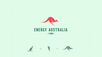
Kochi-based designer Shibu PG has come up with a series of interesting logos in which he combines the shapes of two or more different objects and letters into one unique logo. The logo in each case is a visual representation of the brand name. For example, the logo for Energy Australia is a combination of the shape of a kangaroo and the energy symbol ⚡️. The logo for … [Read more...]
- « Previous Page
- 1
- 2
- 3
- 4
- …
- 8
- Next Page »