
Indian graphic designer Gary Dimi Pohty has taken on a design challenge titled "One logo a day" in which he creates logos with hidden meanings on an almost daily basis. At the moment, he is on day 2500! Gary's logos are based on common, everyday words and fictitious brands or films. He uses symbolism, negative space, and geometric elements to visually represent the meanings … [Read more...]
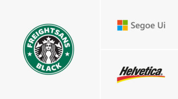
7 Design Terms You Will Never Get Wrong Again
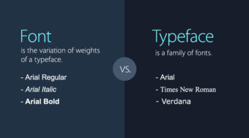
When starting out, most designers don’t know the difference between a font and a typeface. They use the two terms interchangeably. A font is the variation of weights (regular, bold, italic) of a typeface. A typeface is a family of fonts, such as Helvetica, Futura, Bebas, Gotham, etc. Another example is the use of the terms hue and color. Hue is any of the primary colors - … [Read more...]
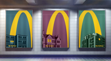
McDonald’s Logo Is So Iconic, Only Half Is Enough In These Brilliant Home Delivery Ads
DDB Colombia has come up with an exceptional campaign for McDonald's that uses just half of it's iconic 'Golden Arches' logo to promote their home delivery (McDelivery) service across Latin America. Titled "Good moments don't need to wait", the campaign consists of 5 minimalist outdoor/print ads that feature skylines of Latin American cities with a yellow curve that starts … [Read more...]
30 Clever Logos With Hidden Meanings, And The Design Thinking Behind Them
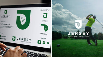
Indonesia-based Grafast Design Studio has come up with a series of interesting logos that combine different shapes and letters into unique symbols that visually represent the brand name. In each logo, the letters used are the initials of the brand name and the shapes represent the product or service offered by the company. For example, the logo for Victory Coffee combines … [Read more...]
This Graphic Design Teacher Has A Unique Way Of Providing Feedback To His Students’ Designs
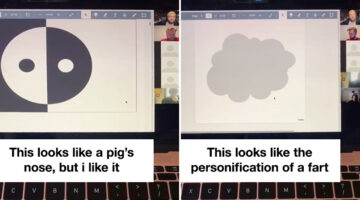
TikToker Natasha Badger recently uploaded a video of her Graphic Design teacher Danny Rankin conducting a "Rapid Roast" session in which he quickly goes through his students' work and shares his first impressions about what's good or bad about the designs. In the preface to the roast session, Danny mentions that the aim of this exercise is not to embarrass anyone, but to … [Read more...]
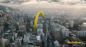
McDonald’s Iconic Logo Is So Recognizable, Only Half Is Enough In These Brilliant Home Delivery Ads
Leo Burnett London has come up with an ingenious campaign for McDonald's that uses just half of it's iconic 'Golden Arches' logo to promote their home delivery (McDelivery) service during the COVID-19 lockdown in the UK. Titled "Lights On", the campaign consists of 5 minimalist outdoor/print ads that feature an illustrated yellow curve soaring over rooftops and into the … [Read more...]
Designers Are Sharing Their Redesigns Of Famous Logos And Some Of Them Are Better Than The Original
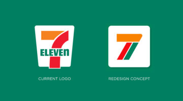
Have you ever looked at a famous logo and thought that you could have done a better job? Of course you have! With so many brands opting for redesigning their logos nowadays, designers from all over the world are sharing their rebranding concepts and reimagined versions of iconic brand logos. We've shortlisted some of the best redesigns on Dribbble and Behance, and a few of … [Read more...]
25 Clever Logos With Hidden Meanings
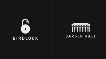
Russian graphic designer Vlad Smolkin has shared an interesting collection of hidden-meaning logos that he has created for different clients over the years. The designs use clever typography and symbols hidden in negative spaces to visually represent the brand name or explain the nature of the business. For example, the logo for Infinity Cat Cafe is an abstract infinity … [Read more...]
32 Brilliant Logos With Hidden Meanings
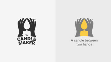
Looking for some logo design inspiration? Here are 32 brilliant examples with dual and hidden meanings, also known as visual double-entendres. In most cases, the hidden symbols are a visual representation of the brand name, and in others, they explain the nature of the business. Clever typography, negative space, and visual symbolism are some of the design techniques used to … [Read more...]
No One Has Been Able To Guess All The Countries In These Visual Wordplays – Can You Be The First?
Bahrain-based art director Faraz Manzoor has come up with an interesting project that features names of countries visualized as icons + letters. The phonetic pronunciation of the icons combined with a few letters of the country name completes the riddle. This clever technique is known as a rebus, where pictures, symbols, and letters are used to phonetically or visually … [Read more...]
30 Clever Wordmarks That Use Negative Space Brilliantly
Netherlands-based logo designer Sander has come up with an interesting project that features typographic logos (or wordmarks as he prefers to call them) of common words we use every day. He uses the negative space between the letters to create objects that visually represent the meanings of the words. For example, the design of the word SHARP consists of a knife in the … [Read more...]
8 Brilliant Mastercard Ads That Show Why Great Logos Are Worth Millions

Most brands treat their logo like a signature — something to slap in the corner of an ad and call it done. Mastercard did the opposite. The idea that changed everything. McCann Colombia, in collaboration with Wernersam Studio and Latina Studio, built an entire campaign around Mastercard's most recognizable asset — its two overlapping circles. Instead of placing the logo … [Read more...]
Designer Replaces Wordmarks In Famous Logos With The Names Of The Artists And Agencies Who Designed Them
Italian graphic designer Emanuele Abrate has come up with an interesting project titled 'Who Designed it?', in which he substitutes wordmarks of famous logos with the names of the designers and agencies who created them. The objective of the project is to highlight the artists who designed these well-known symbols, and make them an integral part of their respective … [Read more...]
Graphic Designer Fixes The 9 Worst Logos Ever
Regular readers of Digital Synopsis must have read our article on 25 epic logo design fails. Now, Italian graphic designer Emanuele Abrate has come up with an interesting project in which he has redesigned the 9 worst logos out of that list. Emanuele has tried to recreate these logos as if they were commissioned to him. He's used different typography techniques, created … [Read more...]
Designer Redesigns Famous Logos In The Time Of Coronavirus And Social Distancing
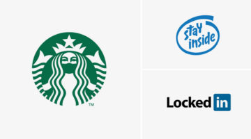
Slovenian graphic designer Jure Tovrljan has come up with a clever project that features famous logos reimagined for the age of coronavirus and social distancing. For instance, the Starbucks logo has been redesigned to show the siren wearing a mask. The "Intel Inside" logo has been rebranded to "Stay Inside", LinkedIn has been rebranded to "LockedIn", and so on. Check out … [Read more...]
Graphic Designer Replaces Wordmarks In Popular Logos With The Fonts They Use
Italian graphic designer Emanuele Abrate has come up with a clever project titled Logofonts, in which he substitutes wordmarks of famous logos with the name of the fonts they use. For example, the word "Omega" in the Swiss watchmaker’s logo has been changed to "Futura" written in the same style as the original logo. Nutella’s wordmark logo has been changed to "Avant Garde", … [Read more...]
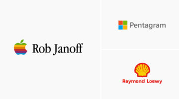
Hidden Meanings In 50 Famous Brand Logos

Did you know that the orange arrow in the Amazon logo points from the letter "A" to "Z", symbolizing that Amazon has every item from A to Z. The Nike "Swoosh" logo is not just a checkmark. It also symbolizes the wing of Nike, the Greek goddess of victory. Apple logo designer Rob Janoff took a bite out of an apple as an experiment, then realized that the word "bite" sounds … [Read more...]
Graphic Designer Replaces Wordmarks In 30 Famous Logos With The Fonts They Use
Italian graphic designer Emanuele Abrate has come up with a brilliant project titled Logofonts that replaces wordmarks of famous logos with the name of the fonts they use. For example, the word "Google" in the tech giant's logo has been changed to "Product Sans" (name of the font used) written in the same colorful style. The wordmark in Amazon's logo has been changed to … [Read more...]
55 Valuable Resources For Logo Designers
Before you begin work on a design project, it's always good to have a list of handy resources you can browse through for tips, ideas, and inspiration. But with so many resources available online, which ones are worth bookmarking? Kalypso Designs has come up with an excellent list of logo design resources across eight categories. These include design tools, type tools, font … [Read more...]
5 Useful Tips To Help You Create Better Logos
A good logo is one that is memorable, versatile, appropriate, and timeless. It should make a great first impression of the company, and create brand recall as the years go by. From an execution point of view, the colors, typography, and geometry of the logo symbol should be relevant to the brand, to the target audience, and the industry in which the brand operates. A logo … [Read more...]
7 Mistakes You Should Avoid In Logo Design
Whether you're a beginner or a pro, designing a successful logo for your client is always a tricky task. You need to keep in mind the brand objective, the target audience, and the industry in which the company operates. From an execution point of view, you need to ensure your logo is scalable, the colors are relevant, and the typography is spot on. A successful logo is one … [Read more...]
Colors Used By Famous Brands (With Their Codes)
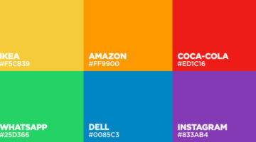
BrandColors is the largest collection of official colors of popular brands. It was created by Design Bombs to serve as a useful reference for brand color codes that are needed most often. The site features over 600 brands with 1600 colors, and the collection is ever-growing. You can search by brand name or color code. We've shortlisted some of the most well-known companies … [Read more...]
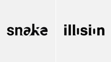
42 Clever Logos With Hidden Meanings Inspired By Everyday Words
Istanbul-based designer Mustafa Ömerli has come up with an interesting project that features typographic logos of common words we use every day. He visually represents the meanings of the words by using symbols, negative space, or by adding geometric elements to the letters. For example, the letter 'k' in the word 'kickboxing' looks like its landing a kick on the letter 'i'. … [Read more...]
8 Important Rules For Perfect Icon Design
Icons are an essential element of UI design. They act as a visual aid for users to interact with the interface, identify options, and make selections. But as simple as they look, there are certain rules you should follow to ensure a seamless user experience. Albanian UI/UX designer Dorjan Vulaj has come up with a handy list of icon design rules inspired from the most used … [Read more...]
24 Beautiful Color Combinations For Your Next Logo Design
Previously, we showed you how to choose the right colors for your brand, and also featured the most popular brand colors in each industry. Now, Lindsay Kramer from 99 designs has come up with a handy list of color combinations you can try for your next logo design, depending upon the client brief and the industry the brand belongs to. We've also generated palettes from … [Read more...]
29 Honest Logos Of Famous Companies
Swedish graphic designer and filmmaker Viktor Hertz has come up with a new series of Honest Logos of famous companies that reveal what they're really all about. Viktor started this project in 2011, and we had previously published his initial set of logos here. Check out the new series below and tell us your favourites in the comments. … [Read more...]
These Are The Bird’s-Eye Views Of Famous Logos, How Many Can You Guess?
Audio branding and motion design agency Why Do Birds has come up with an interesting quiz that features bird’s-eye-view images of famous logos, rendered in 3D. You have to guess which brands they belong to. You see these logos everyday, but it's tricky to recognize them from this unusual overhead perspective. As designers, we thought it'll be a cakewalk but it wasn't. The … [Read more...]
Agency Creates Avengers-Inspired Superhero Logos For Agency Job Titles
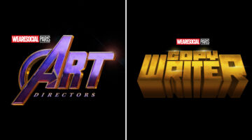
Paris-based creative agency We Are Social has come up with a cool Instagram campaign that celebrates the talent, passion, and superpowers that go into some of advertising's most important jobs. The campaign features Avengers-inspired superhero logos for several agency job titles such as art director, copywriter, designer, producer, account manager, strategic planner, and … [Read more...]
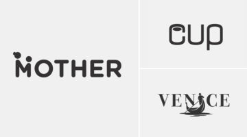
21 Beautiful Negative Space Logos
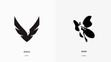
In art, negative space is the background space (or white space) around and between the subject of an image. For example, in a picture of a black vase against a white wall, the vase is the positive space, and the white wall is the negative space. In design, negative space can be used to create hidden meaning logos and illustrations. In today's post, we feature a series of … [Read more...]
What Is The Golden Ratio, And How To Use It In Graphic Design
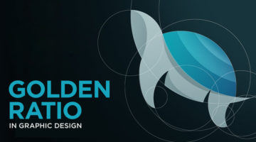
The Golden Ratio, also known as the Golden Section or Divine Proportion, is a mathematical ratio of 1:1.618 based on the Fibonacci sequence. It can be found in nature (flower petals, seeds, shells), in food (artichokes, broccoli, pineapple), and in the human anatomy. The Golden Ratio can also be found in art (Mona Lisa, The Last Supper, Vitruvian Man) and architecture … [Read more...]
3 Designer Friends Created An Alphabet Series Using Logos They’ve Designed Over The Years
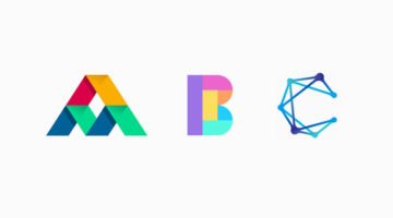
Three graphic designers, colleagues, and friends, Alex Tass, Dalius Stuoka, and Deividas Bielskis decided to put together an A-Z alphabet series made from logo symbols, lettermarks, and monograms they've created over the years. All three designers have been in the industry for over 10 years, and have worked with a variety of clients, brands, and agencies. For this project, … [Read more...]
31 Beautiful Gradient Logos For Design Inspiration
When Apple launched iOS 7 in 2014, it not only changed the face of UI design, but also branding, graphic and logo design. Skeuomorphic interfaces and glossy app icons were out. Flat design, vibrant colors and gradients were in. In 2016, when Instagram came up with a bright new look and multicolored logo, a vast majority of its users hated the vivid gradients and demanded the … [Read more...]
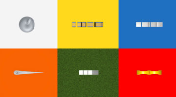
What Logo Styles Do Consumers Trust Most?
SurveyMonkey and infographic maker Venngage surveyed over 1000 adults living in the U.S. on what logo styles they trusted the most. The respondents were shown a series of logos for imaginary companies in six different industries: Jewellery retail, education, financial services, law firm, news/media, and technology. Six variations of each logo were presented: Icon dominant, … [Read more...]
Shit Clients Say – 13 Most Unforgettable Quotes
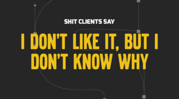
How many times have you had a client send a list of "final" changes AFTER they've approved the design? What about when they ask you to find an image from Google, or copy someone else's logo, or when they tell you to deliver designs by Monday after briefing on Friday? We all come across unreasonable client demands on a daily basis, but the folks at BeeWits have a dedicated … [Read more...]
Designer Creates Clever Negative Space Logos That Visualize The Name Of The Company
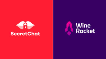
Lithuania-based graphic designer Leo has come up with a series of clever logos that combine the name or initials of the company into one unique symbol using negative space. The logo in each case visually represents the name of the company. For example, the logo for Secret Chat is a pair of lips with a padlock in the negative space between the lips. The logo for Wine Rocket … [Read more...]
- « Previous Page
- 1
- 2
- 3
- 4
- …
- 6
- Next Page »