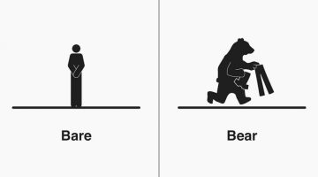
Michigan-based illustrator Bruce Worden creates funny, witty illustrations of homophones - words that have the same pronunciation but different meanings, spellings, or origins. A self-professed grammar nerd, Worden explains the differences between the words with minimalist pictograms that visualize their meanings. Over a period of five years, he has created over 300 … [Read more...]
Graphic Designer Combines Two Completely Unrelated Objects Into Clever Logos
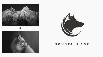
Indonesian designer Rendy Cemix has come up with an interesting project in which he combines the shapes of two completely different objects into one unique logo. The logo in each case is a visual representation of the brand name. For example, the logo for Mountain-Fox is an aesthetically designed symbol of a fox with ears that look like snow-capped peaks. The logo for … [Read more...]
The Weather Channel Uses Incredible Augmented Reality Graphics To Explain Hurricane Florence

Weather reports on news channels are usually boring and mundane in terms of presentation, but not when it comes to US-based The Weather Channel. Last week, while covering the impact of Hurricane Florence on the Southeast Coast, TWC decided to present the gravity of the floods using Augmented Reality (AR). The broadcast began with TWC's on-camera meteorologist Erika Navarro … [Read more...]
Photoshop’s New, More Powerful ‘Content-Aware Fill’ Can Realistically Remove Any Object From Your Photos
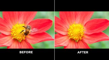
Adobe Photoshop's Content-Aware Fill is a useful tool to remove unwanted objects from your photos, but sometimes the results can fall short and there are no options to customize the results. Well, all that has changed in the latest version of Photoshop CC (20.0). Content-Aware Fill has received a powerful new upgrade that gives the tool its own workspace and additional … [Read more...]
Designers, You’ll Love These $5 Keychains Of Popular Graphic Design Softwares And Memes
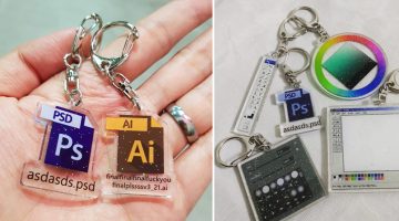
Singapore-based graphic artist Yu Xin has come up with a cool series of $5 keychains for graphic designers, based on popular Adobe programs and their interfaces. If you've ever worked with a demanding client, you'll relate to the meme-based Photoshop and Illustrator keychains that feature PS and AI file icons with funny filenames. The idea came to Xin when she was working on … [Read more...]
This Guy Uses Forced Perspective To Capture Awesome Photos With Toy Superheroes
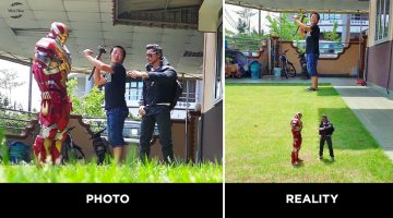
Malaysian photographer and toy collector Wire Hon uses his smart phone camera, a few props, and clever forced perspective techniques to capture hilarious photos of himself with Marvel and DC superhero action figures. He makes it look like the figures are life-size and he is actually interacting with them. Sometimes, he also gets his family into the act. Check out the photos … [Read more...]
This Handy New Tool Shows You Color Palettes Of Artworks From Different Eras
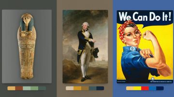
Kentucky-based graphic designer Brandon Shepherd has released a handy online tool called Color Leap that showcases a collection of color palettes used in paintings and artworks throughout different eras in history - from ancient Egypt to the 1960s. The tool consists of 180 palettes spread over 12 different time periods. You can select any time period, browse through … [Read more...]
This Brilliant Free Tool Is Like Google Search For Colors
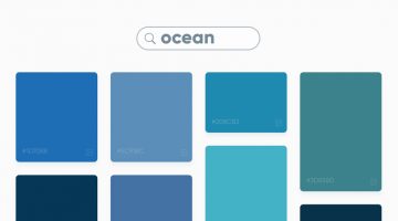
Swedish digital studio Future Memories has launched an excellent tool called Picular that lets you search for colors by keyword and displays a range of colors based on the top 20 Google Image search results for that keyword. For example, if you search for ‘ocean’, Picular analyzes the top 20 Google Images for ‘ocean’ and displays the most prominent color in each image and … [Read more...]
Learn In One Minute How To Change The Color Of Anything In Photoshop
Did you know that you can use the Hue/Saturation Adjustment Layer in Photoshop to target a specific color in your image and change it to any color you want? In this handy one-minute tutorial, Photoshop instructor Unmesh Dinda from PiXimperfect shows you a simple technique to change the color of any object in your image by using the hand tool in the Hue/Saturation Adjustment … [Read more...]
Learn In One Minute How To Make Skies Gorgeously Dramatic In Photoshop

Did you know that you can use Adjustment layers and the Blend If mode in Photoshop to enhance skies and make them look more dramatic in your photos? In this one-minute tutorial, Photoshop instructor Unmesh Dinda from PiXimperfect shows you a simple technique to add details and definition to clouds by using Adjustment Layer, Mask, Brush Tool, and Blend If: Underlying Layer. … [Read more...]
Photographer Shows Off Mad Skills By Sharing Raw Behind-The-Scenes Images Alongside Stunning Final Photos
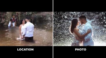
Brazilian photographer Gilmar Silva has come up with an impressive project titled “Lugar x Foto” (Place and Photo), in which he shares behind-the-scenes images of his shoots alongside the final photograph. The series focuses on showing what a photoshoot really looks like before it turns into a polished image. The first photo shows the actual location and the working … [Read more...]
LOL: Designers Show What Superheroes Would Look Like In Ads For Household Products
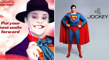
What would famous superheroes and villains look like in ad campaigns for household items we use everyday? DesignCrowd ran a Photoshop contest recently in which designers had to imagine famous superheroes and villains endorsing household products to earn an extra buck. Here are some of the best entries. … [Read more...]
27 Clever Ambigram Logos That Look The Same When Viewed Upside Down
An ambigram is a typographical design or symbol consisting of text modified in such a way that it can be read in different orientations - inverted, rotated, mirror-image, etc. For example, the logo of Sun Microsystems (no. 4 below) is a brilliantly-designed ambigram that reads 'SUN' from all directions. Another famous example is the New Man logo (no. 6 below), designed by … [Read more...]
Remember The Graphic Designer Who Trolled Photoshop Requests? He’s Back!
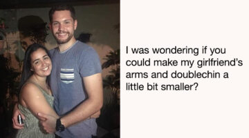
Are you looking for someone who can Photoshop your ex-boyfriend or girlfriend out of a photo? Or fix your bald patch and cut some flab off your waist? Is there a favourite photo of yours that needs some minor Photoshopping to make it even better? If yes, then James Fridman is the man for the job. The British designer is an internet star with nearly 1.5 million followers on … [Read more...]
This Designer’s FIFA World Cup Badge Concepts Are Better Than The Real Thing
Every four years, the FIFA World Cup turns the planet into a design brief. Flags get waved, kits get debated, and somewhere in between, a few designers take it upon themselves to imagine what national football identity could look like if the brief had no constraints. These badge concepts are that rare thing: football design with genuine craft behind it. Venezuelan … [Read more...]
Designer 3D Prints Famous Logos Into Items You Can Use Everyday
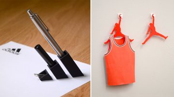
Japanese designer Taku Omura has come up with an amusing project in which he 3D prints famous brand logos into everyday items you can use at home or office. For example, Omura 3D-printed the Adidas logo and turned it into a pen stand. Louis Vuitton's 'LV' monogram logo was turned into a card holder by elongating the 'V'. The Air Jordan logo was turned into a clothes hanger, … [Read more...]
This Clever Photoshop Trick Lets You Add Realistic Light Or Shine To Any Object
Did you know that you can add realistic-looking lights and shine to images of lamps and jewellery by using the magic of blend modes in Photoshop? In this tutorial, Photoshop instructor Unmesh Dinda shows you how to use color dodge and layer styles to mimic the properties of light and shine. He takes you through five different image examples and shares two different methods … [Read more...]
19 Graphic Design Mistakes That Novice Designers Make
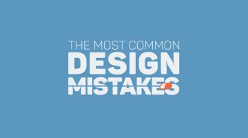
After a few years in the graphic design business, you realize how important it is to get the basics right. Like using proper font and color combinations, implementing visual hierarchy, using grids, alignment, white space, and so on. The team at Visme, an online tool for creating infographics and presentations, has come up with an excellent visual list of 19 graphic design … [Read more...]
21 Memes Only Graphic Designers Will Understand
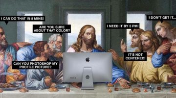
Monday can be a tricky day for designers, with clients, bosses, and deadlines breathing down their necks. We thought you guys could use some meme therapy to help brighten up your day. Check out the compilation below, and don't forget to browse through some of our other popular meme posts. … [Read more...]
Designer Creates Clever Logos By Combining Two Or More Different Shapes Into One
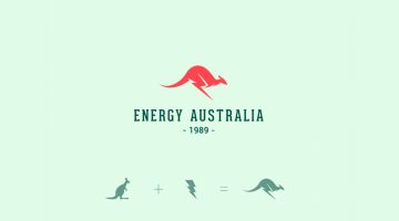
Kochi-based designer Shibu PG has come up with a series of interesting logos in which he combines the shapes of two or more different objects and letters into one unique logo. The logo in each case is a visual representation of the brand name. For example, the logo for Energy Australia is a combination of the shape of a kangaroo and the energy symbol ⚡️. The logo for … [Read more...]
India Today Comes Up With A Brilliant Cover To Raise Awareness About Saving The Taj Mahal
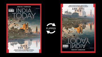
News magazine India Today has come up with a powerful cover for its Save the Taj campaign (July 30 issue) that features a cleverly-inverted photograph of the Taj Mahal and its reflection in the neighbouring Yamuna river. At first glance, the cover photo looks like an eroded image of the Taj surrounded by garbage. When flipped upside down, you realise that the eroded image is … [Read more...]
Top 20 Car Logos Of All Time
From American muscle to European exotics, everyone has a favourite car they would like to own one day. But do you also have a favourite car logo? In automotive branding, a logo does more than identify a brand; it embodies the brand’s heritage and values. These emblems are designed with precision to evoke feelings of elegance, power, and cutting-edge technology, creating a … [Read more...]
Graphic Designer Turns Football Star Neymar’s Dramatic Falls Into A Free Font
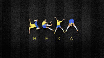
Every World Cup produces its icons. Neymar gave us something no one asked for — a typeface. The internet had its memes, but one designer had a theory. While the rest of the world was busy counting how many times Brazil's star forward hit the turf, São Paulo-based art director Luciano Jacob was quietly noticing something else: the man's body, mid-agony, was forming letters. … [Read more...]
NVIDIA Develops AI That Can Remove Noise, Grain, And Even Watermarks From Photos

Researchers from NVIDIA, Aalto University, and MIT have developed an AI that can remove noise from grainy photos and automatically enhance them. This technology can be beneficial in several real-world situations where it is difficult to obtain clear image data like MRI scans, astronomical imaging, and more. Existing noise-reduction AI systems require both noisy and clean … [Read more...]
This Simple Chart Explains What Common Terms In A Logo Design Brief Mean
What do clients mean when they say their logo needs to be modern, luxurious, or subtle? Dubai-based logo designer Jefferson Pascual has created a handy infographic that uses an illustration of a bird to explain common terms used in logo design briefs. The chart features bird logos designed in different styles (eg. young, modern, feminine) with their visual opposites on the … [Read more...]
This Clever Photoshop Trick Lets You Generate Unlimited Filters With Just One Click
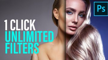
Did you know that the Gradient Editor in Photoshop has a 'Randomize' feature that lets you browse through unlimited gradients which you can use as filters on your photos? In this tutorial, Photoshop instructor Unmesh Dinda shows you how to combine the concepts of Gradient Fill, Gradient Maps, and Blend Modes to create beautiful color combinations and filters automatically in … [Read more...]
10 Photoshop Commandments Every Designer Should Follow
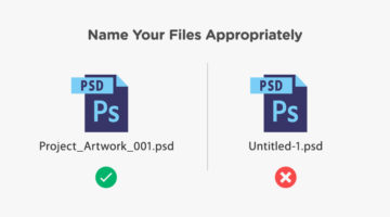
When you’re working in a team and multiple designers and developers are working on the same Photoshop file, there are certain protocols you need to follow. You need to use an appropriate naming convention for PSD files, like ProjectName_Job_Version.psd instead of the default Untitled-1.psd. You should label your layers and organize them into groups. You should also save all … [Read more...]
Fix And Sharpen A Blurry Photo With This Clever Photoshop Technique
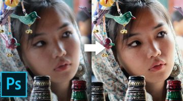
Most cameras nowadays have 'image stabilization' or 'anti-shake' features to reduce the likelihood of taking blurry photos. It works by moving the camera lens automatically to compensate for handheld movements. But once in a while, you do end up with a great capture that's slightly blurred and you don't really want to delete that image. What do you do then? Mumbai-based … [Read more...]
The Font On Adidas’ Football World Cup Jerseys Is Causing A Lot Of Confusion
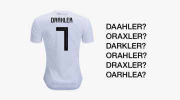
The official Adidas' font, used on its FIFA World Cup jerseys, is causing confusion due to its square, Cyrillic-style letters and numbers. Inspired by traditional Soviet imagery, the font uses sharp 90-degree strokes which causes confusion between letters like 'A' and 'R', 'X' and 'K', 'Z' and '2', etc. FIFA's equipment regulations state that the font used on all apparels … [Read more...]
10 Best Uses Of Color In Movies

Right from the first scene, color sets the mood and tone of a film before any of the actors have uttered a word. Since the dawn of colored cinema, filmmakers have used color to convey drama and emotion in storytelling. Visual-minded directors and cinematographers have created color palettes almost as memorable as the films themselves. The Wachowskis used a green color … [Read more...]
FIFA World Cup Logos From 1930 – 2026, Which One’s The Best?
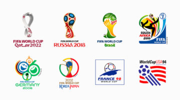
Every four years, the world stops for football. And before a single ball is kicked, a logo arrives — a small piece of graphic design tasked with capturing an entire nation's identity, optimism, and footballing soul. The FIFA World Cup logo is arguably the most scrutinized design brief in the world. The weight of the assignment. Few creative challenges match it: design a … [Read more...]
8 Beautiful Flat Color Palettes For Your Next Design Project

UI/UX designer Ebtihaj Khan has created a series of minimalist flat color palettes for graphic, web, and UI projects. Each palette consists of five colors with their hex codes mentioned alongside. Khan has included both linear and contrasting color schemes. The beautiful presentation of these palettes, with the blurred vignette effect in the background, was inspired by … [Read more...]
23 Clever Typographic Logos Of Common Words We Use Every Day
Colombo-based graphic designer Samadara Ginige has come up with a series of typographic logos of common nouns and verbs we use every day. The project, titled "Verbicons", visualizes the meanings of the chosen words by using symbolism, negative space, or by adding geometric elements to the letters. For example, the letter 'c' in the word 'cash' looks like a dollar bill. The … [Read more...]
Clever Logos Of Letters A To Z Based On Common Words That Start With Them
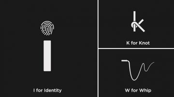
UK-based graphic designers Liam + Jord undertook a 36-day typography challenge to create logos for every letter of the alphabet based on common words that start with them. For example, the letter 'b' has been designed to look like a book, the letter ‘f’ looks like a flag, 'w' looks like a whip, and so on. The objective was to use the shapes of the letters to visually … [Read more...]
How To Rotate Or Straighten A Tilted Image In Photoshop Without Cropping The Edges
Usually, when you try to rotate or straighten a tilted image in Photoshop, you end up cropping and losing a bit of the corners and edges. Well, not anymore. Mumbai-based Photoshop instructor Unmesh Dinda has come up with an excellent tutorial that shows you how to straighten an image in Photoshop without cutting out the edges. He shows you how to use the straighten and … [Read more...]
- « Previous Page
- 1
- …
- 8
- 9
- 10
- 11
- 12
- …
- 25
- Next Page »