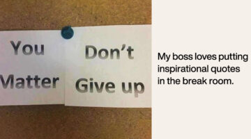
How many times have you received a design brief that asks you to copy someone else's logo? Or a brief that says "Just come up with a few quick logos." Has a client ever asked you to use Comic Sans? London-based product designer Anneke Short has come up with a series of minimalist posters titled "Confessions of a Designer" that feature nine things every graphic designer would … [Read more...]
Designer Creates Clever Logos That Visualize The Name And Business Of The Company
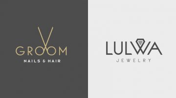
Kuwait-based graphic designer Rami Hoballah has come up with a series of minimalist logos that combine the name and the product (or service) of the company into one unique symbol. The logo in each case visually represents the brand name and the nature of its business. For example, the logo for Groom Salon is a pair of scissors made with the two o's in the word 'Groom'. The … [Read more...]
Two Designers Challenged Themselves To Create A Typographic Logo Every Day For A Year, And They’re Pretty Cool
UK-based graphic designers Liam + Jord undertook a 365-day challenge to create one new typographic logo of a common word we use every day. The objective was to visually represent the meanings of the words by using symbols, negative space, or by adding geometric elements to the letters. For example, the letter 'i' in the word 'drive' looks like a gear stick, the letter 'f' in … [Read more...]
Honest Meanings Of Flag Colors Of 15 Countries
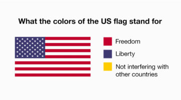
Every country has an official explanation for its flag colors, something about history, heritage, unity, all that. And then there’s… this version. People online have been giving those same colors completely different meanings, based on what each country is actually known for right now. Not the textbook version, the real-world one. The kind shaped by headlines, memes, … [Read more...]
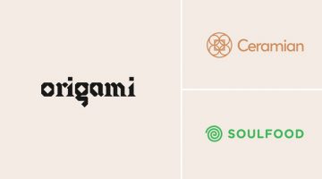
Designer Creates Clever Logos That Visually Represent The Name And Business Of The Company
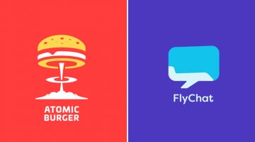
Lithuania-based graphic designer Leo has come up with a series of minimalist logos called "Smart Logos" that combine the name and the product (or service) of the company into one unique symbol. The logo in each case visually represents the brand name and the nature of its business. For example, the logo for Atomic Burger is a burger on top of a mushroom cloud. The logo for … [Read more...]
13 Things Client Servicing Executives Should Never Say To Graphic Designers
If you've ever worked in a creative agency, you must be aware of the love-hate (or hate-hate) relationship between client servicing executives and designers. CSEs have to manage client expectations and their primary objective is to keep the client happy. Designers want to keep the client happy too, but they don't want to compromise on aesthetics and creativity. Taking a … [Read more...]
National Geographic Comes Up With An Iconic Cover To Raise Awareness About Plastic Pollution
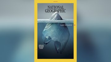
National Geographic magazine has launched a campaign titled 'Planet or Plastic' to raise awareness about plastic pollution and the threat it poses to the oceans. For their June 2018 cover, Mexican artist Jorge Gamboa has come up with an iconic photo-illustration that looks like an iceberg at first, but is actually a plastic bag partially submerged in the ocean. The tagline … [Read more...]
25 Memes Designers And Agencies Will Relate To
Feeling bored at work? Have 5 minutes to spare before your boss comes back from a meeting? If yes, then check out these 25 epic memes that every mouse-weilding, client-bashing, font-loving designer will relate to. Warning: Some of these memes might make you question your choice of profession. This is perfectly normal. If symptoms persist after 48 hours, please talk to a … [Read more...]
29 Images That Prove Why Good Design Is Important
Regular readers of DS know that most of our posts are about inspirational art and design. But once in a while, we like to sneak in a post about design blunders, just to keep the humour alive. Previously, we shared some epic logo disasters, letter-spacing fails, ad-placement blunders, and more. Today's post features some more design fails that are bound to make you laugh at … [Read more...]
Designer Offers To Create Free Logos For Anyone, Ends Up Creating 50 Logos In 32 Hours Non-Stop
Russian graphic designer Di Buenio undertook a personal logo design challenge titled Logotyposhnaya, in which, he offered to create a free logo for any existing company or brand in 30 minutes. He published a post on his Facebook page and received over 70 applications in the first two hours itself. At the end of the challenge, Buenio had created 50 logos, working non-stop for … [Read more...]
Beautiful Alphabet Series Of The World’s Most Famous Cities And Their Iconic Landmarks
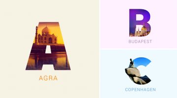
Indian graphic designers Rigved Sathe and Payal Jagwani have come up with a beautiful project titled "Around The World With Type" that mixes typography and photography to represent some of the world's most famous cities and their iconic landmarks. Each letter represents a city and includes a photograph of a famous landmark clip-masked within the letterform. From New York's … [Read more...]
Photoshop’s Patch Tool Does More Than You Think, Watch Here
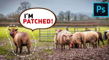
Mumbai-based Photoshop educator and commercial retoucher Unmesh Dinda has come up with a handy tutorial that offers an in-depth look at the Patch Tool in Photoshop. Apart from the basic functions of the tool, Unmesh shares some interesting tips and techniques that can be of great help when working with images. Watch below. … [Read more...]
How To Pair Fonts That Complement Each Other (With Examples)
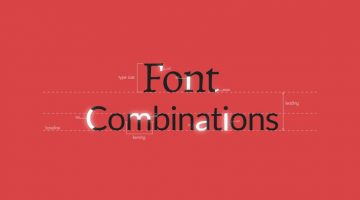
Good font pairing is one of the key differentiators between amateur and professional design. Rookie designers often use more fonts than required and there is lack of typographical contrast in their design. It's tricky because there are no fixed rules as to what kind of fonts work well together, but there are certain guidelines that can help you pick fonts that complement each … [Read more...]
Designer Creates Clever Alphabetical Logos Based On Animal Names And Shapes
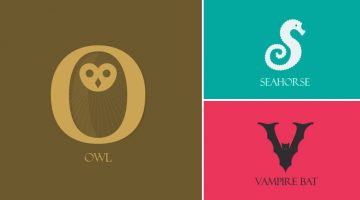
Lebanese graphic designer Rami Hoballah, has come up with an amusing typography project titled 'Animals Alphabet' that showcases letters of the alphabet in the shape of animals. Each letter corresponds to the name of the animal. For example, 'a' looks like the head of an ant, 'b' looks like a bee, 'c' looks like a crab, and so on. Rami used Adobe Illustrator to create these … [Read more...]
Designer Challenges Himself To Create A Typographic Logo Every Day For A Year, Each With A Hidden Meaning
Turning one word into a clever typographic logo is impressive. Doing it every single day for a year, with a new word each time, is where it starts to feel like genius. Stockholm-based graphic designer Daniel Carlmatz set himself a simple but brutal challenge: every day for 365 days, take one ordinary word and redesign its letters so the word visually becomes what it means — … [Read more...]
NVIDIA Develops A.I. That Can Fix Damaged Photos And Remove Unwanted Objects With Amazing Accuracy
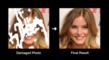
Researchers from American technology company NVIDIA have developed a deep learning method that can reconstruct damaged, corrupted, or partially-erased photos with realistic results. The method performs a process called "image inpainting" that can also be used in photo editing software to remove unwanted objects and fill those areas with realistic computer-generated … [Read more...]
Designer Fixes Ugly Interfaces, Shares Valuable UI Tips In The Process

Previously, we featured designer Steve Schoger's Little UI Details project in which he shares short, useful design tips for UI/UX designers. Steve has now come up with another excellent project titled 'Refactoring UI' in which he uses Sketch to fix websites and interfaces submitted by developers, and teaches you valuable UI design concepts in the process. The series is just … [Read more...]
How To Blend Images Seamlessly And Create A Perfect Composite In Photoshop
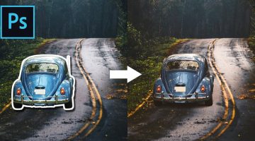
One of the most skillful tasks in Photoshop is to blend objects from multiple images that have different colors, tones, and lighting, into one single image and make it look perfect. This is one of the key differentiators between the work of a professional designer and an amateur. Photoshop instructor Unmesh Dinda from PiXimperfect has come up with a brilliant tutorial that … [Read more...]
23 Beautiful Free Fonts For Your Next Design Project
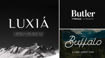
What does a graphic designer love more than a beautiful font? A beautiful font that's available for FREE. There's nothing more heartbreaking than finding a gorgeous font, only to see a big red button next to it that says, "Buy Now for $99". To make life easier for our kind, we at DS have compiled a list of 23 stylish and contemporary fonts that you can download for free. The … [Read more...]
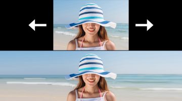
This Hidden Feature In Photoshop Lets You Convert Low-Res Images To High-Res
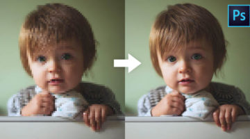
There are times when we as designers have no choice but to work with low-resolution images. Perhaps an asset from a client is too small, or we need to scale something up to fit a larger layout. The usual result is exactly what we expect: loss of sharpness, visible artifacts, and an overall drop in quality that no amount of clever retouching can fully fix. Photoshop … [Read more...]
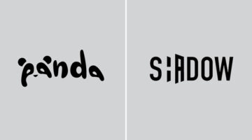
Graphic Designer Substitutes Wordmarks In Famous Logos With The Fonts They Use
Italian graphic designer Emanuele Abrate has come up with an interesting project titled 'Logofonts' that features wordmarks of famous logos substituted with the name of the fonts they use. For example, the Nike wordmark in their swoosh logo has been substituted with 'Futura' written in the same italic style. The WhatsApp wordmark has been substituted with 'HelveticaNeue'. … [Read more...]
10 Clever Tricks Used To Make Food Look Delicious In Photos And Ads
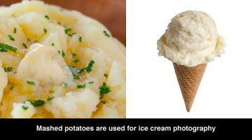
Did you know that scoops of mashed potatoes are dyed in different colors and used in ice cream ads because they don't melt during long shoots under hot studio lights? Cereal ads often use glue instead of milk because it doesn't make the cereal soggy. Shaving cream is used instead of whipped cream because it has a consistent thickness and doesn't melt. Top Trending has come … [Read more...]
Designer Shares Side-By-Side Comparisons Of His Sketches And Final Vector Illustrations

Ukrainian web designer Andrew Kliatskyi has come up with an interesting project in which he shares side-by-side comparisons of his rough sketches and final vector illustrations. Titled "From Sketch to Result", the aim of the project is to show the path between an idea and the final result. After completing his pencil sketches, Andrew uses Adobe Illustrator to create the … [Read more...]
6 Important Logo Design Principles Every Designer Should Know
Before you start a logo design project, you need to know who the logo is for? Who is the target audience? The logo will define what the business is all about. Should it be masculine or feminine, traditional or modern, exclusive or inclusive? The colors, typography, and geometry of the symbol will depend on all these factors. DesignMantic has come up with a handy infographic … [Read more...]
A Research Study Has Proved That Most People Don’t Know What A Lowercase ‘G’ Looks Like
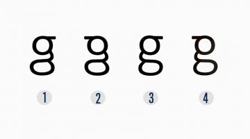
You’ve seen it a million times, but do you really remember what it looks like? Most people don't realize that the lowercase 'g' actually comes in two different forms. The one we usually write by hand is simple - a circle with a little tail, also known as the single-storey 'g'. But the version used in most printed text, in fonts like Times New Roman, Georgia, and Calibri, has … [Read more...]
Fonts Used In Famous Logos (With Download Links)
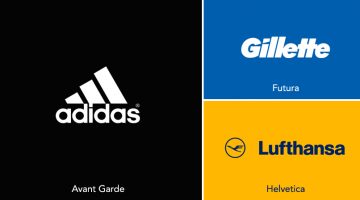
Ever wanted to know the names of the fonts used in the logos of famous brands like Adidas, Calvin Klein, FedEx, Gillette, Jaguar, Lufthansa, Omega, Rolls-Royce, Visa, etc.? We've compiled an alphabetical list of 60 well-known logos with their corresponding fonts and download links. In some cases, the fonts have been tweaked or edited from their original form to create a … [Read more...]
How Companies Use Deceptive UI Design To Trick You Online
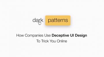
A 'dark pattern' is a user interface that has been craftily designed to trick users into doing things they might not want to do, in order to benefit the business in question. The term was coined by UK-based UI designer Harry Brignull, who runs DarkPatterns.org - a website dedicated to "naming and shaming websites that use deceptive user interfaces". For example, have you … [Read more...]
20 Important Design Principles Explained With Simple Illustrations
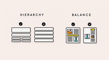
There are no fixed rules or formulas for good design, but there are a few basic principles that will help you create design that is effective, functional, and aesthetically pleasing. Technical jargon can sometimes get confusing or overwhelming, which is why Canva has come up with a fantastic infographic that uses simple illustrations to explain the 20 most important design … [Read more...]
This Clever Photoshop Trick Lets You Stretch Backgrounds Without Distorting Your Subject
The Content-Aware Scale tool under the Edit menu in Photoshop lets you stretch or scale an image seamlessly by filling the selection with surrounding pixels and blending them together. However the tool has a stretch limit, beyond which, the subject of the image starts getting distorted. In this short tutorial, Mumbai-based Photoshop expert Unmesh Dinda shares a few useful … [Read more...]
These Stunning Artworks Were Created In MS Paint By A 92-Year-Old Grandma From Spain

Concha García Zaera is a 92-year-old grandmother from Valencia, Spain, with a hobby that would surprise most people. She creates spectacular artwork of nature and architecture in Microsoft Paint using a regular old mouse on a Windows 7 machine. After her husband fell ill, Zaera had to take care of him, so she couldn't go out very often. She used to take art classes at the … [Read more...]
5 Crucial Steps To Make A Consistent And Professional Brand Identity
Businesses across the world enthusiastically adopt branding strategies to lure quality business from customers. In most cases, they achieve the initial phase of branding, the implementation stage, without any issues. But when it comes to the advanced stages and constant updation, they miss out due to a variety of reasons. It becomes an issue of consistency of branding as … [Read more...]
16 Clever Typographic Animations That Visualize The Meanings Of Different Words
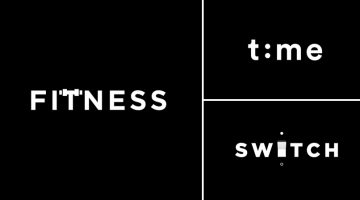
Lithuania-based graphic designer Mindaugas Dudenas has come up with an excellent project titled 'Type in Motion' that visualizes the meanings of different words using typographic animation. For example, the 'T' in the word FITNESS looks like it's lifting weights, the two 'O's in DOORS open and close like doors, the 'H' in CHESS morphs into a chessboard, and so on. Dudenas … [Read more...]
5 True Stories Behind Famous Hollywood Studio Logos
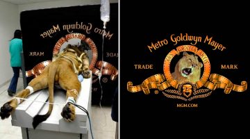
Before the opening credits of a film, there is usually a short animation of the logo of the film studio (also known as production logo). Some famous examples include DreamWorks, Paramount, Columbia, MGM, and Disney. You must have seen the logos of these major film studios many times, but have you ever wondered about the story behind them? For example, why does the DreamWorks … [Read more...]
What Your Font Choices Say About You
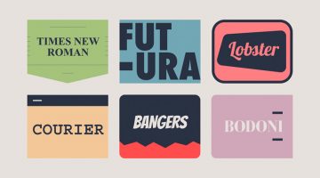
Every designer has a set of favourite fonts that they prefer to use in a majority of projects. These are the first fonts that come to your mind every time you start a new project. In our previous posts, we've explained how every font has a unique personality, a purpose, and an emotion. But did you know that the font you choose says a lot about you as well? GetVOIP has come … [Read more...]
All You Need To Know About Wix Logo Maker
The digital graphics industry is filled with thousands of logo makers. But not all of them are up to the mark and suitable for professional branding. In this article, we take a look at the online logo maker by Wix, the second largest website building platform after WordPress. Wix Logo Maker is a free logo maker that lets you create stunning logos with its simple and … [Read more...]
- « Previous Page
- 1
- …
- 9
- 10
- 11
- 12
- 13
- …
- 25
- Next Page »