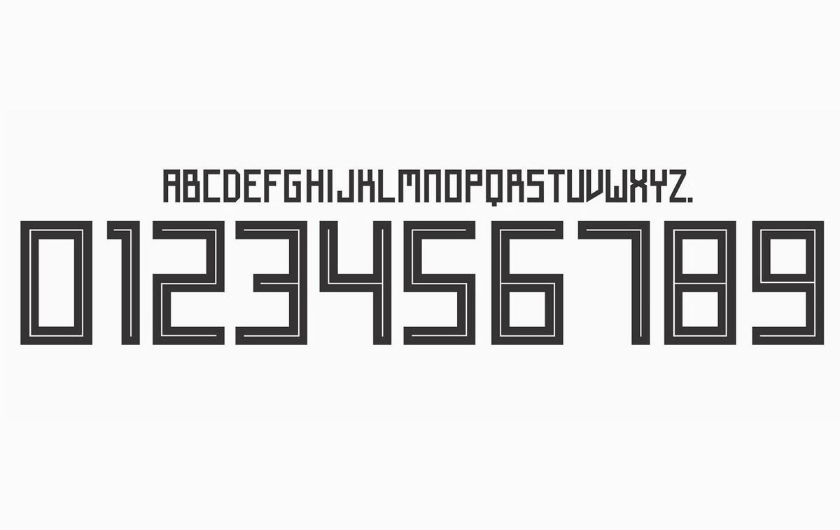
The official Adidas’ font, used on its FIFA World Cup jerseys, is causing confusion due to its square, Cyrillic-style letters and numbers. Inspired by traditional Soviet imagery, the font uses sharp 90-degree strokes which causes confusion between letters like ‘A’ and ‘R’, ‘X’ and ‘K’, ‘Z’ and ‘2’, etc.
FIFA’s equipment regulations state that the font used on all apparels must be legible and distinguishable by all players, match officials, spectators and the media. Adidas’ font is neither clearly legible or distinguishable as pointed out by Twitter users over the past one week.
Adidas’ World Cup Font
Social Media Reactions
This perfectly illustrates the problem about this “typeface”.
Thanks, Julian …
OAAXLEA?
DARKLER?
ORAHLEA?
DAAHLER?
ORAXLER?
ORAHLER?
DRAXLER?
OARHLEA?
DAAXLEA?
OAAHLER?
DARXLER?
OARXLEA?
ORAXLER?
DRRXLER?
DRAHLEA?
DRRHLER?
ORAXLEA?
OAAXLER?
ORRHLER?
DARHLEA? pic.twitter.com/YqJIyIpxyw— sportsfonts.com (@sportsfonts_com) March 20, 2018
I can't get over how terrible the font that #adidas is using on their jerseys for the #worldcup is… pic.twitter.com/EPinixHa9W
— Anne ???????????? (@picaae) June 15, 2018
The font for these Adidas numbers is shocking. 11 or 17 or 77. (Obviously not 77 in the World Cup but still) pic.twitter.com/TyM9D7Rm0k
— Craig Williams (@craigawilliams) June 15, 2018
I am fully on board with this Adidas font for #BEL turning Mertens into MEATENS pic.twitter.com/50n8jiujKQ
— Brody Logan (@BrodyLogan) June 18, 2018
The Adidas font is absolute garbage. I dare anyone who doesn't know these players to try to figure out Khedira's name by reading his shirt.
— Cory Mizer (@CoryMizer) June 17, 2018
Because of this illegible Adidas font, Timo Werner appears to have "Weaner" on his back
— Bob Guerrero (@PassionateFanPH) June 17, 2018
I get that @adidas were going for a Russian Constructivism vibe, but their #WorldCup typeface feels too clunky and quirky and often illegible. Given their fondness for 80s retro kits this year would they have been better off using this? https://t.co/rvgqmXMB8U @sportsfonts_com
— James Taylor (@jamestaylor) June 20, 2018
This adidas font is awful. 17’s look like 11’s, R’s look like A’s
— Michael Schwartz (@MistahSchwartz) June 17, 2018
Have you seen Odriozola? pic.twitter.com/Thh0152TBz
— Daniel Busch (@dan_bu) March 23, 2018
japan living in 3018 pic.twitter.com/Ibu47zZqtA
— Dank Memes ???????????? (@FreeMemesKids) June 19, 2018
Also See:
Share this post with a designer or a football fan and voice your views in the comments below. Source: DesignTAXI