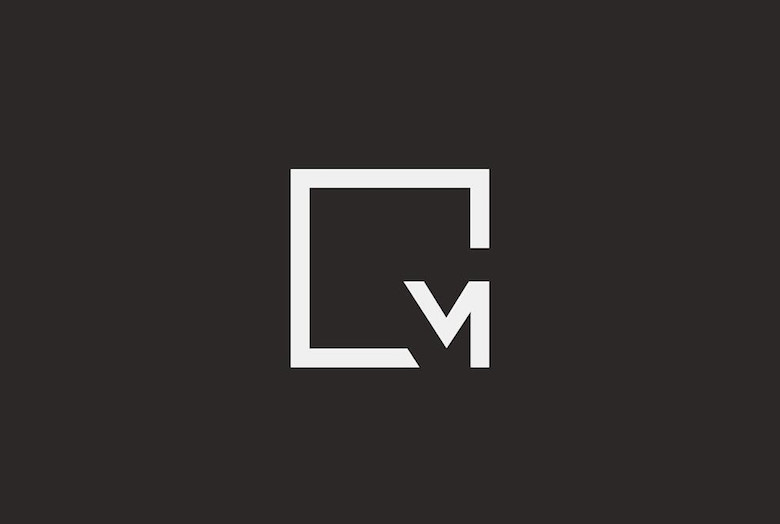
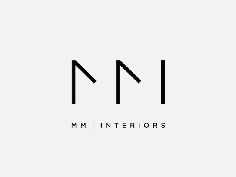
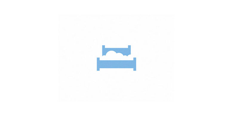
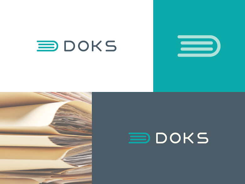
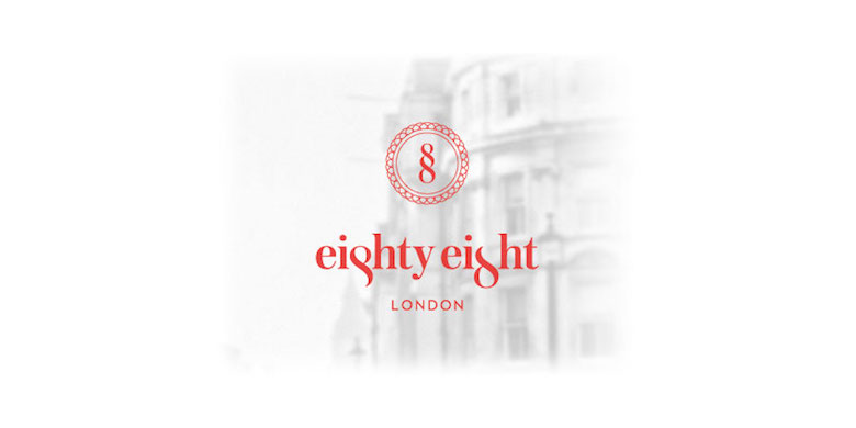
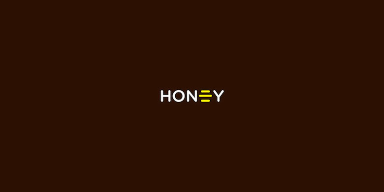
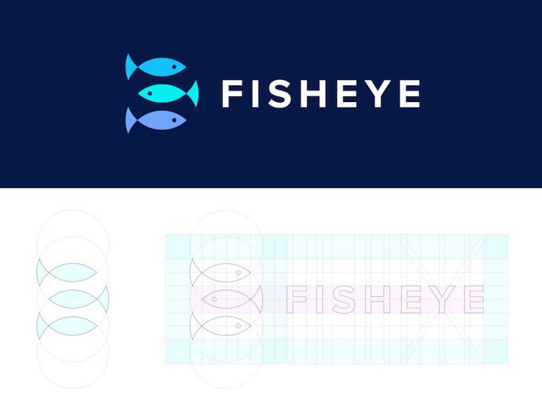
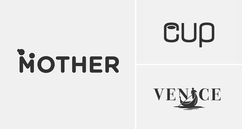
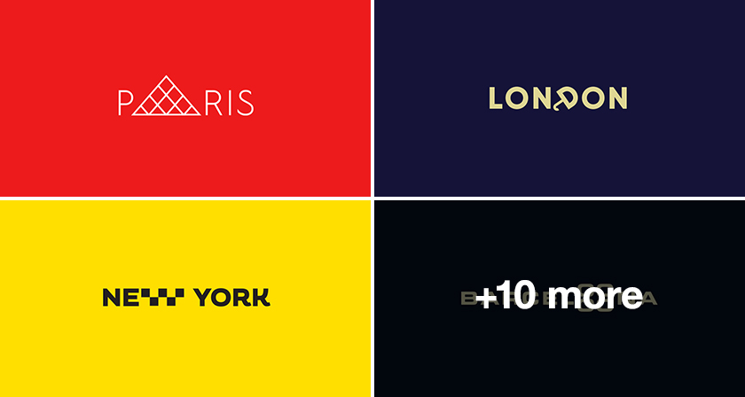
Hidden meaning logos are one of the hardest tricks in branding to pull off well. Anyone can draw a wordmark or an icon, but folding a second idea into a shared line, a clever overlap, a curve that reads differently depending on how long you look, that takes a different level of craft entirely. It’s not about being clever for its own sake. It’s about building a mark that gives people a reason to look twice, and then rewards them for it.
One outline doing two jobs is usually the trick. A single contour reads as a letter, then as an object. A gap between two shapes reads as empty space, then as a third shape entirely. You see the first image instantly, then a beat later the second one clicks into place, and something in your brain lights up. That tiny “oh, I see what they did there” is what makes a logo memorable long after the pitch deck is closed. It’s also what separates a forgettable icon from one that gets shared, saved, and picked apart by other designers trying to figure out how it was built.
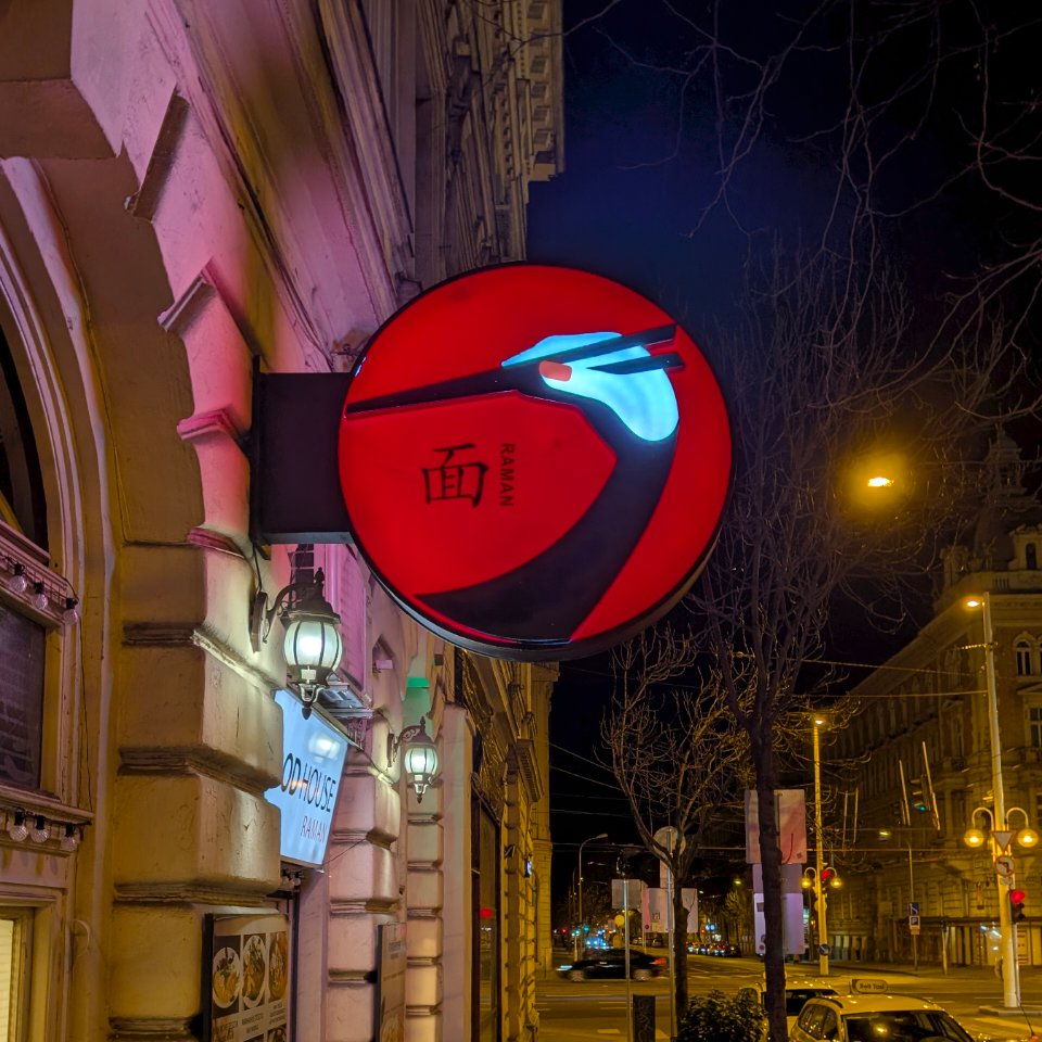
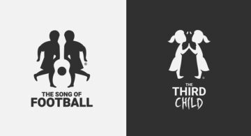
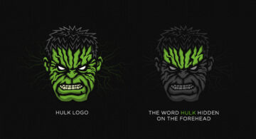
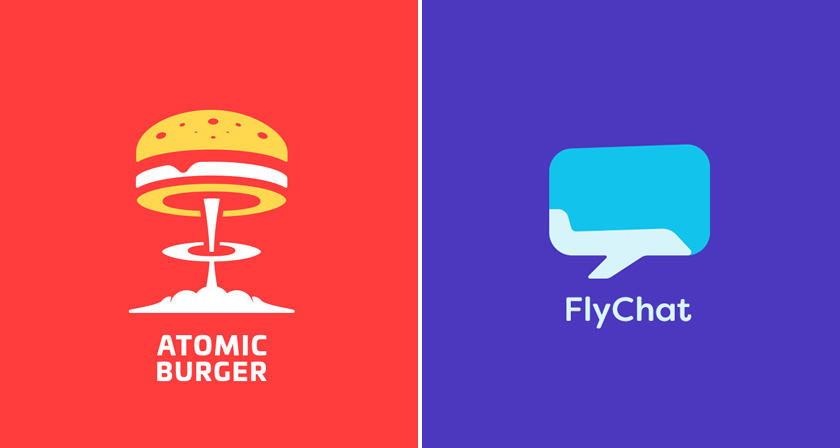
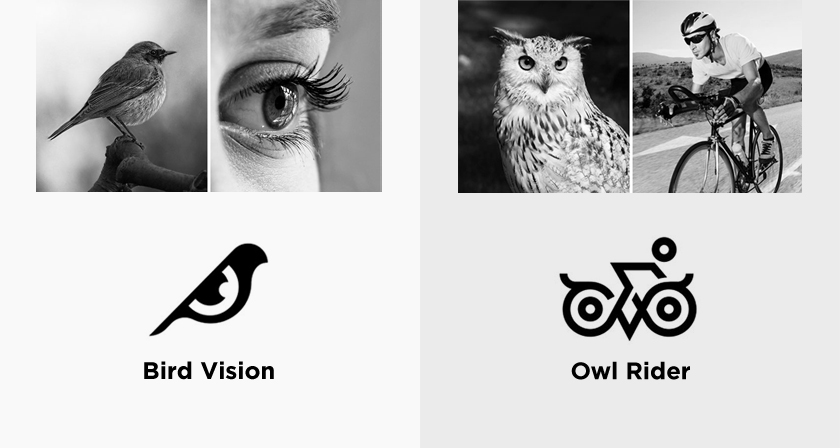
iBrandStudio has rounded up a sharp set of logos that do exactly this, marks that stay clean on the surface but hide a second idea just beneath it. From letterforms concealing a hidden object to icons that fuse two concepts into a single shape, these are the kind of designs that make you stop scrolling.
Look twice at each one in this collection. The second glance is where the good part is, and it’s usually the difference between a logo you forget by lunch and one you screenshot for later.
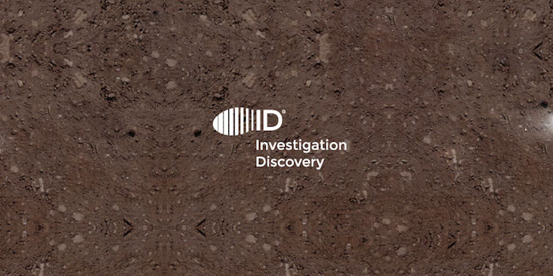
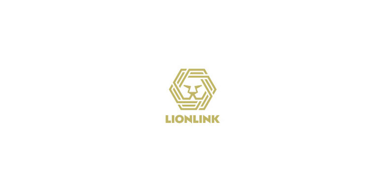
Our favourites: Investigation Discovery and Lionlink. What about you? Share this post with a designer friend and voice your views in the comments below.