Clever, Minimal Typographic Logos Of Cities – Can You Decode Them All
City branding is one of the hardest briefs in logo design. A city has no single product, millions of stakeholders and centuries of reputation to live up to. That’s why so many official city logos fade into abstract swooshes and forgettable slogans. The ones that last, like Milton Glaser’s I ♥ NY, don’t invent a new image. They distil one that people already hold.
Landmarks already do the branding. A bridge, a tower or a black cab becomes shorthand for an entire city long before any agency gets involved. Rhetoricians call this synecdoche, a part standing in for the whole. For graphic designers, it means the visual association already exists. The work lies in choosing the right symbol and drawing it well.
City logos are identity design in miniature. You get a name, a symbol and a single line to work with, and that’s all. The process is the same as any branding job, just compressed: you research the place, find the symbol that represents it, reduce that symbol to its essentials, and make it fit into the letterforms. That’s why typographic city logos are such an interesting design exercise. There’s very little room to hide.
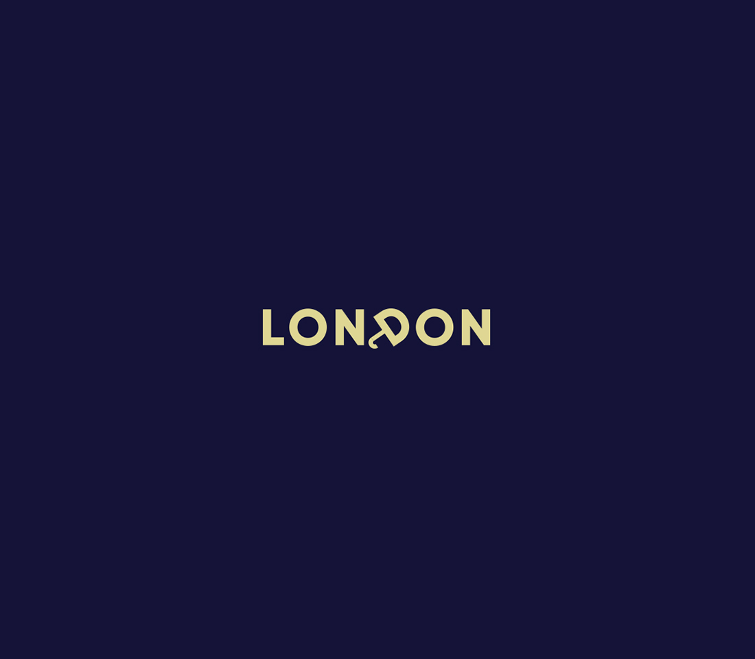
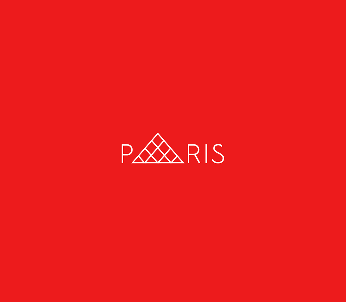
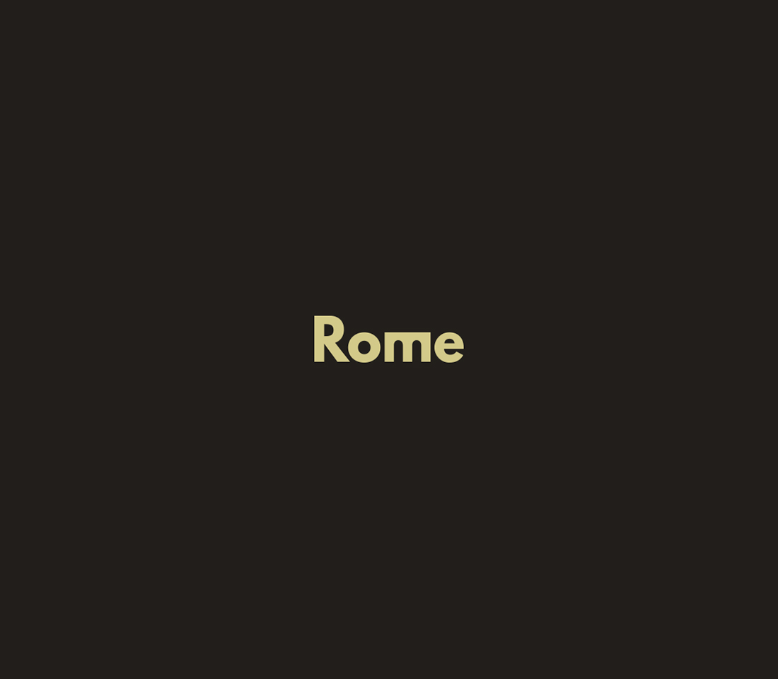
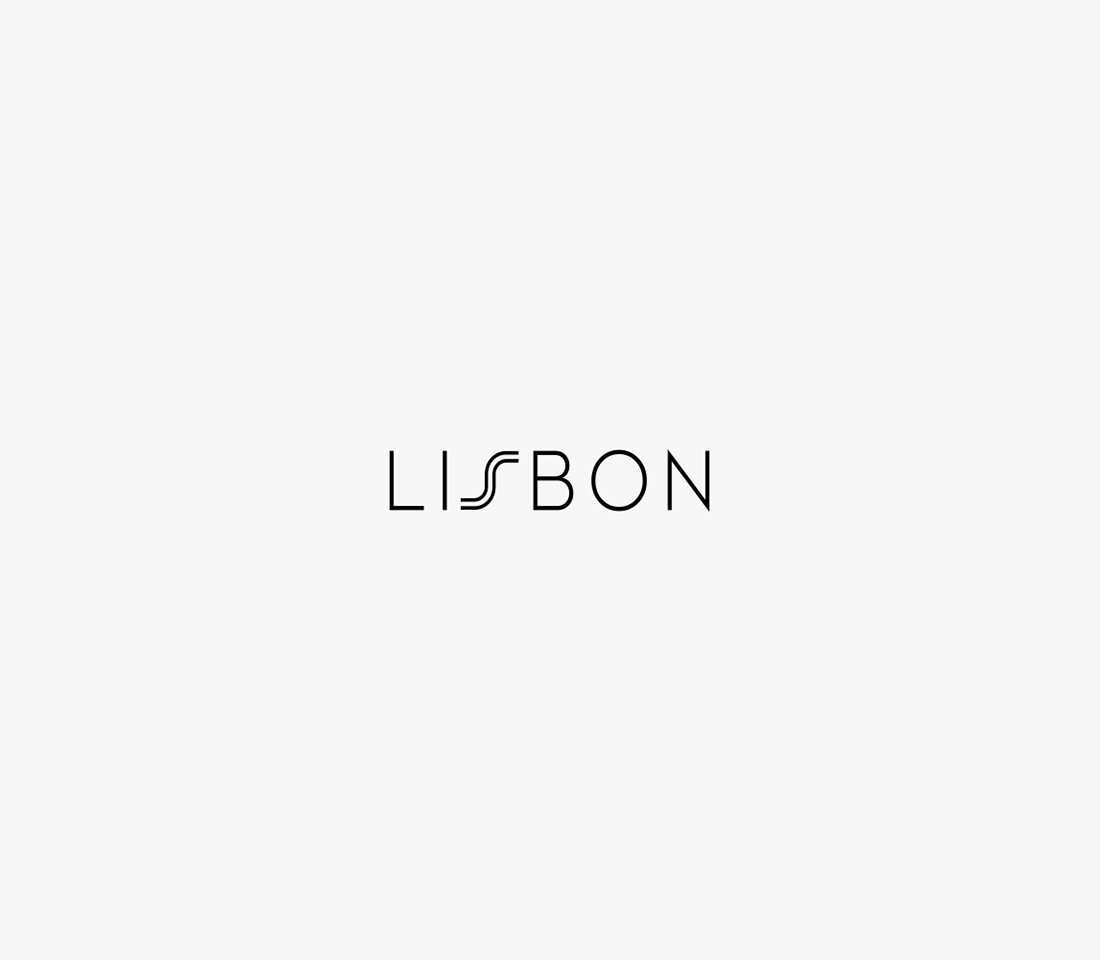
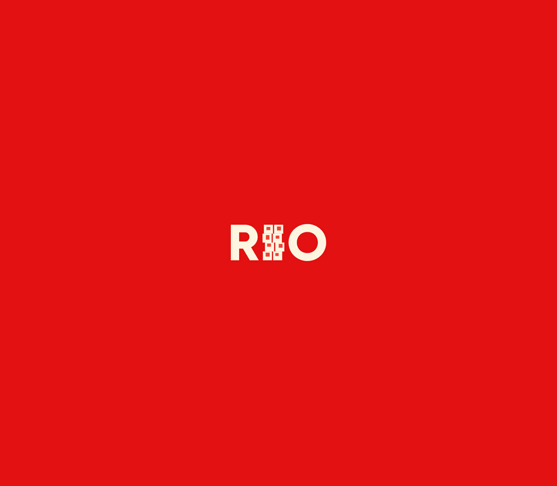
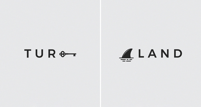
The payoff is a half-second delay. Good typographic logos don’t show you everything at once. You read the name first, and the hidden image appears a moment later. That small gap is what makes a wordmark memorable. CITIESET, a series of minimal typographic city logos by Saint Petersburg graphic designer Vladislav Smolkin, is built around that moment. Each city gets its own typographic treatment, colour palette and a single visual reference woven into its name. See how many you can spot at first glance.
1.
2.
3.
4.
5.
6.
7.
8.
9.
10.
11.
12.
13.
Smolkin created CITIESET using Photoshop and Illustrator. The real challenge in a series like this is choosing the right visual reference. It has to be recognisable at a glance, but also distinctive enough to belong to one city. Minimalism makes the choice even harder, because few symbols survive being reduced to a handful of lines.
Share this article with a designer friend. If your city were next, what symbol would you weave into its name? Tell us in the comments.