Filipino designer Eisen Bernard Bernardo has come up with a fun project titled 'Logomorphia' that showcases mashups of popular logos that look like amusing creatures and situations. How many of these can you guess correctly? … [Read more...]
29 Clever Typographic Logos Of Common Words We Use Every Day
Milan-based creative director Duminda Perera has created a series of clever wordmarks/calligrams of common words we use every day. He’s altered, combined or replaced letters with shapes and symbols that visualize the meaning of the word. So the letter ‘n’ in ‘wine’ looks like a wine bottle, the two o's in ‘igloo’ form the shape of an igloo, and so on. Check them out below. … [Read more...]
20 Images That Show Why Letter-Spacing Is Important

Ever wondered why good designers focus so much on kerning, i.e., adjusting the spacing between characters in a piece of text? These 20 epic images show you why letter-spacing is important not just in logos and graphic design, but also in everyday handwriting. … [Read more...]
Dad Creates Epic Images With Son Using His Expert Photoshop Skills
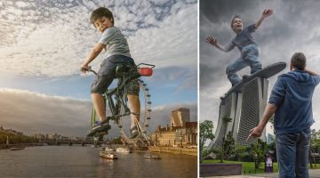
Remember those embarrassing childhood photos your parents pull out every time your girlfriend comes over? Well this little fella isn't going to have that problem because his dad's a Photoshop wizard. Using his expert composition and digital manipulation skills, Dutch photographer/digital artist Adrian Sommeling photoshops his son into surreal scenarios that show him riding … [Read more...]
Artist Turns Shadows Of Everyday Objects Into Funny Sketches
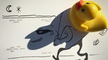
Talk about a vivid imagination. Belgian artist and filmmaker Vincent Bal turns shadows of everyday objects into whimsical doodles that are totally unrelated to the object but ingeniously clever. For example, he doodles around the shadow of a rubber duck and turns it into a burglar walking with a bag of loot. Similarly, the shadow of a leaf becomes a bird, a phone charger … [Read more...]
Clever Illustrations Of Historical Events Using Digits From The Year They Occurred In
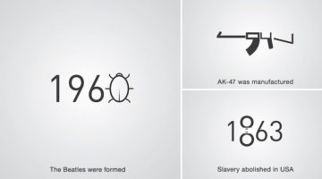
Levan Patsinashvili and Davit Babiashvili are a designer duo based in Georgia, Europe. When they're not busy creating advertising campaigns at Saatchi and Saatchi Tbilisi, they apply their creative skills in a project titled D1G1TAL CHR0N1CLES - a series of pictograms that visualize major historical events using digits from the year they occurred in. Check them out below. … [Read more...]
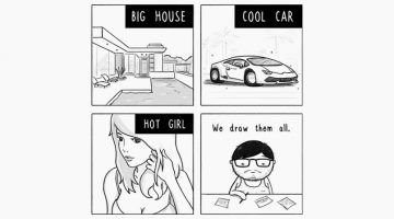
10 Differences Between Designers And Regular People
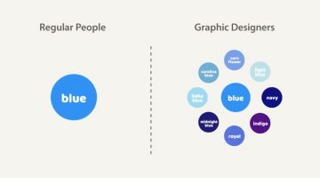
The word "lobster" might remind you of the 10-legged crustacean delicacy, but for us designers, Lobster is a common typeface that novices use on promo flyers and take-out menus. Similarly, the word "tracking" might remind you of GPS or Google Maps or the time when your over-protective boyfriend/girlfriend stalked you, but for designers, it refers to the adjustment of space for … [Read more...]
20+ Amazing Images Before And After Photoshop
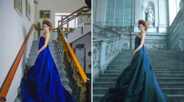
When the name of a software becomes a verb, you can imagine the impact it has had on the industry. Adobe Photoshop was released on 19 February 1990 and it changed the creative business forever with its powerful features and ease of use. Today's post is a compilation of before-and-after images that show how Photoshop helps designers and photographers transform their images … [Read more...]
11 Illustrations That Show The Two Kinds Of Graphic Designers
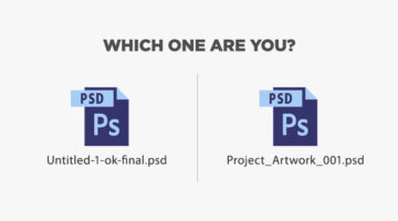
There are two kinds of designers in the world - those who follow a naming convention for layers and files (ProjectName_revision3_final.psd) and those who don't (Untitled-1-ok-final.psd). Similarly, there are designers whose desks resemble a war zone and there are designers who have an OCD attack if there's even one extra object on their desk. Design resource site Pixelo has … [Read more...]
27 Famous Logos With Hidden Meanings

A logo is more than just an emblem that represents a brand; it's a visual representation of a company's identity, values, and mission. Some logos, however, go above and beyond in delivering a message. These logos have hidden meanings that are deliberately incorporated into their design, adding another layer of intrigue and interest to the brand. These cleverly crafted … [Read more...]
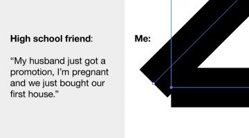
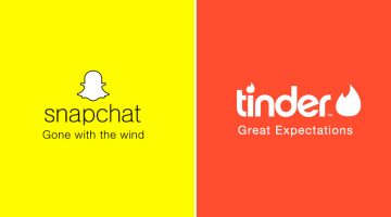
Graphic Design – Expectations Vs Reality
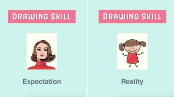
When you graduate from art school, a career in Graphic Design looks like one big canvas which you're ready to paint with the colors of your talent. After spending six months in the business, things seem a bit different. Design resource site Pixelo highlights these differences in a series of illustrations titled "Graphic Design: Expectations vs Reality". Check them out below. … [Read more...]
20 GIF Memes Every Graphic Designer Will Relate To
You know that feeling when you’ve finally found the perfect font for your project and you’re having an orgasm as you browse through the characters, only to find a ‘BUY NOW for $199’ button at the end of the page? To visually describe such moments we’ve compiled a list of 15 epic GIFs that designers and creatives will relate to. Check them out below. … [Read more...]
The Top 50 Companies That Creatives Would Love To Work For
Creative talent network Working Not Working surveyed their community (77% freelance, 23% full-time) for the third consecutive year to find out which companies they would 'kill' to work for full-time. Here are the results from over 300 votes. … [Read more...]
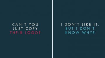
11 Differences Between Designers And Clients
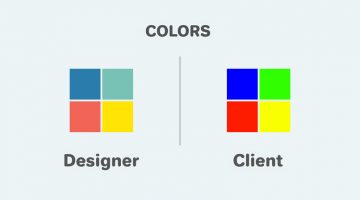
In a perfect world, the client-designer relationship is built upon a common sense of purpose, goals, and objectives. In reality, their varying perspectives make things a little bit more complicated. The client wants the logo to be bigger, colors to be brighter, and the typeface to be groovier. The designer wants more white space, subtle colors, and the font equivalent of … [Read more...]
These Behind-The-Scenes Photos Show How Photographers Capture The Perfect Shot
"You don’t take a photograph, you make it." – Ansel Adams. The art of photography is more than just angles, equipment, lighting and Photoshop. From planning and conceptualizing to implementation and execution, a lot of mental and physical work goes into capturing the perfect picture - one that is actually worth a thousand words. … [Read more...]
Paper Drawings Come To Life In These Amazing Illusions That Make You Go Wow
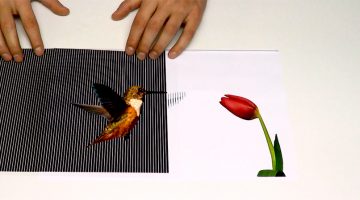
These animated optical illusions by YouTube channels Brusspup, Home Science and Antarez are the coolest thing you'll see today. The artists create two sets of vertical black bar patterns, one on paper and the other on a transparent sheet. By sliding the transparent sheet over the paper, the artists create an illusion of movement in various still drawn objects like gear cogs, … [Read more...]
Designer Creates Surreal Images By Photoshopping Two Completely Different Objects Into One
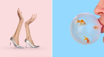
New York-based art director and designer Daniel Forero has created a series of minimalist images that merge two completely different objects into one, creating bizarre amalgamations that boggle the mind. Forero's "curiosity and love for things that first appear as nonsense" inspired his conceptual experiments that "play with emotions and contradicting feelings." Check out his … [Read more...]
45 Clever Alternative Posters Of Famous Films
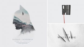
Sydney-based graphic designer Peter Majarich has successfully completed a 365-day creative challenge to design a movie poster every day for a year. The project, titled A Movie Poster A Day, aimed to provide an alternate take on the existing poster for each film. Majarich used storylines and elements from the films to create these clever, minimalist posters and kudos to him … [Read more...]
10 Comic Strips Every Artist Will Relate To
When someone tells you they're an artist by profession, you probably picture them hanging out in their sweatpants all day with a cup of coffee (or a beer), using "magical" computer software that designs and writes everything on its own. They're living the dream life and getting paid to follow their passion, right? … [Read more...]
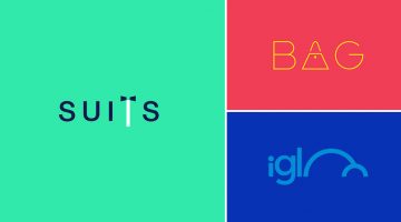
A Minimalist Approach To Product Packaging Of 20 Famous Brands
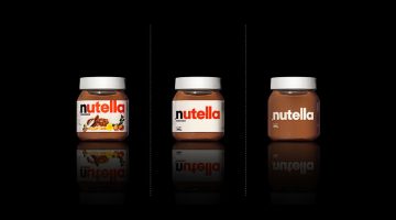
If you're into minimalist design, you'll like this project by Turkish designer Mehmet Gozetlik that tries to find alternate simple versions of product packaging of international brands. The project exhibits three types of packaging: 1. The original version 2. The simple version 3. An even simpler version It's interesting to note how most of them look better with the … [Read more...]
25 Powerful Illustrations That Will Make You Stop And Think
In a world that often feels overwhelming and chaotic, art can be a powerful tool for making sense of the chaos. Satirical art, in particular, has a unique ability to highlight the absurdity of societal trends and norms, and expose the flaws in our collective thinking. In today's post, we feature the work of Belgium-based artist Brecht Vandenbroucke, who captures the darker … [Read more...]
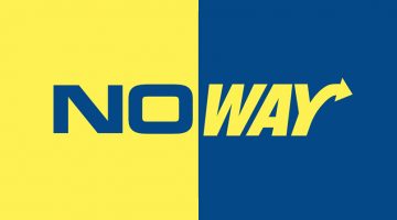
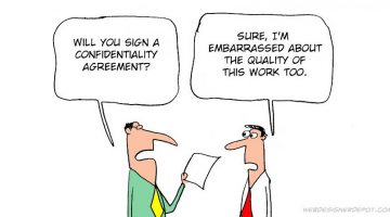
10 Times Designers Should Just Say “No”
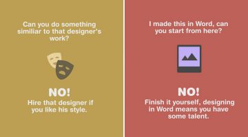
It's good to go the extra mile for your clients but sometimes it can be detrimental to say yes to every unreasonable request - like copying another designer's work or working for free in exchange for "exposure". Design resource website Pixelo shares 10 situations where designers should learn to say NO. Check them out below. … [Read more...]
Designer Challenges Himself To Create 25 Logos In 25 Days Using The Golden Ratio
Dhaka-based Graphic/UI designer Kazi Mohammed Erfan undertook a 25-day logo challenge to create one new logo every day based on the golden ratio. His objective was to reintroduce viewers to the beauty of the golden ratio and to promote himself as a designer. Erfan used Adobe Illustrator and Photoshop to create the logos. He has also shared working sketches to show the … [Read more...]
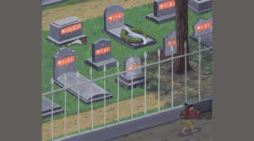
16 Funny Illustrations That Show The Cultural Differences Between The East And The West
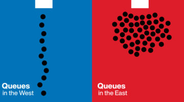
Yang Liu is a Berlin-based graphic artist, professor and the head of the Department of Communications Design at the Berlin Technical Art University. She moved to the German capital from her hometown, Beijing, in 1990, at the age of 13. Drawing from her own experiences as a child and an adult, Liu's illustrated project titled "East meets West" depicts the cultural differences … [Read more...]
These Behind-The-Scenes Photos Show How Photographers Use Lighting To Capture The Perfect Shot
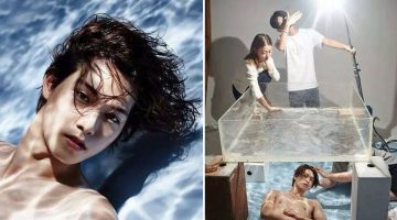
"Light makes photography. Embrace light. Admire it. Love it. But above all, know light. Know it for all you are worth, and you will know the key to photography." - George Eastman, inventor of the Kodak camera. Vietnamese photography site 1PX.VN has compiled a series of images that show how professional photographers use creative lighting techniques and props to capture … [Read more...]
Watch This Calligrapher Draw Famous Logos With Remarkable Accuracy Entirely By Hand
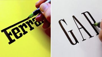
Sebastian "Seb" Lester is an English artist, type designer and calligrapher known for his prominent type designs and calligraphic prints. He started designing typefaces for Monotype in the early 2000s after graduating from Central Saint Martins, London, where he studied graphic design. … [Read more...]
15 Great Google Font Combinations For Your Next Design Project
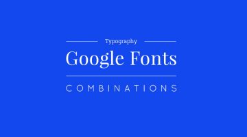
Designers often spend a lot of time deciding which typefaces to pair up and most sites just give one-sentence examples that don't offer a real preview of what the text will look like. To make life easier for everyone, the team at Milo Themes has created a set of mock-ups that show different Google Font combinations for headline and body copy. They've used filler text from … [Read more...]
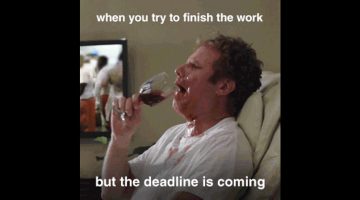
29 Memes That’ll Make Every Designer Laugh
Need something to stare at to pretend you’re working? Have a look at these hilarious memes by Instagram account screensaviors that’ll fill your day with laughter and self-doubt. When you’re done, share this post with a designer working on a deadline and waste his time as well. … [Read more...]
Ad Student Replaces Brand Taglines With Book And Movie Titles
Andrea Erali, an Art Direction intern at Saatchi & Saatchi New York, has found a creative way to blend his love for books, movies, and advertising. In a fun personal project, he swaps well-known brand taglines with book and movie titles that perfectly capture the brand’s essence. The result is a clever mix of humor and insight, showing how pop culture and marketing … [Read more...]
20 Funny Comic Strips That Designers Will Love
Award-winning cartoonist Jerry King draws a weekly comic series for Web Designer Depot that focuses on the funny situations designers and developers face in their daily lives. Check out a few good ones below. … [Read more...]
37 Brilliant Ads That Grab Your Attention With Clever Headlines And Copywriting

"Nobody reads ads. People read what interests them. Sometimes it’s an ad.” Howard Gossage's words resonate deeply in the marketing world, capturing a fundamental truth about consumer engagement. Building on this insight, we’ve curated a collection of ads that do more than grab attention, they captivate and draw you in. Featuring examples from the Golden Age of Advertising to … [Read more...]
After Working With Difficult Clients, This Designer Turned Their Comments Into Funny Posters
In the design business, if you put a nickel in a jar every time a client says something stupid, you'll have a jar full of nickels by the end of the week. After receiving his fair share of nonsensical client feedback over the years, Jonathan Quintin, founder and creative director of UK agency Studio–JQ, decided to collate a few of them into a poster series titled "The Client … [Read more...]
14 Honest Illustrations That Show How We Behave On Social Media
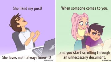
Hands up if you've ever deleted a Facebook post because no one 'liked' it. How about the time when you spent ten minutes trying to take the right picture of your dinner for Instagram? Oh, and how many times have you switched to some random, unnecessary document on your computer when someone creeps up behind your shoulder? … [Read more...]
The 10 Types Of Designers – Which One Are You?
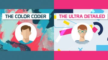
"The life of a designer is a life of fight. Fight against the ugliness." - Massimo Vignelli. Although we're all working towards the same objective, we designers have our distinct skill sets and preferences. There are designers who love flat design and there are designers who love skeuomorphism. Similarly, there are designers who like pastel shades and minimalism and there are … [Read more...]
Funny Posters Dedicated To Our Friendship With Our Favourite Software
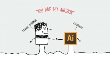
Good friends know each other inside out and make life easier for each other. With Friendship Day around the corner, Mumbai-based digital agency Pixel Fox Studios thought of paying tribute to the work buddy we all have - software. They've created a series of posters dedicated to the friendship between different types of professionals and their most used softwares. What's also … [Read more...]
- « Previous Page
- 1
- …
- 7
- 8
- 9
- 10
- 11
- …
- 15
- Next Page »