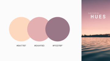
Looking for color palettes for your graphic, web, or UI design? The Colour Lab is a handy Instagram account that shares a beautiful new palette everyday, with hex codes and gradients. The colors are derived from beautiful images of nature, architecture, and urban landscapes. If you design something using Colour Lab's palettes, you can get featured on their page as well. … [Read more...]
37 Beautiful Color Gradients For Your Next Design Project
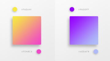
Vibrant colors and vivid gradients are one of the key trends in UI, web, and graphic design nowadays. Spain-based designer Yaroslav Iakovlev from Zeka Design has come up with a series of gradient color combinations that you can use in your next project. The hex codes of each color are mentioned on the palettes. Check them out below and tell us your favourites in the … [Read more...]
8 Must-Have Chrome Extensions For Designers
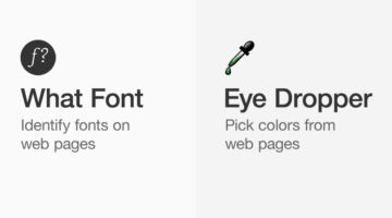
Chrome has a 63.69% market share and most designers prefer the Google-powered browser for its speed, UI, and the ability to add useful extensions. Albanian UI/UX designer Dorjan Vulaj has come up with a handy list of Chrome extensions that can help you find design inspiration, identify fonts and colors from web pages, view CSS, take full page screenshots, generate palettes, … [Read more...]
Agency Creates Avengers-Inspired Superhero Logos For Agency Job Titles
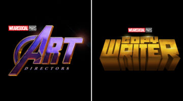
Paris-based creative agency We Are Social has come up with a cool Instagram campaign that celebrates the talent, passion, and superpowers that go into some of advertising's most important jobs. The campaign features Avengers-inspired superhero logos for several agency job titles such as art director, copywriter, designer, producer, account manager, strategic planner, and … [Read more...]
21 Beautiful Negative Space Logos
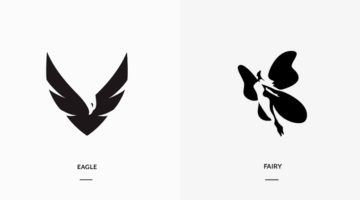
In art, negative space is the background space (or white space) around and between the subject of an image. For example, in a picture of a black vase against a white wall, the vase is the positive space, and the white wall is the negative space. In design, negative space can be used to create hidden meaning logos and illustrations. In today's post, we feature a series of … [Read more...]
Beautiful Typographic Alphabet Series Of Countries And Their Iconic Landmarks
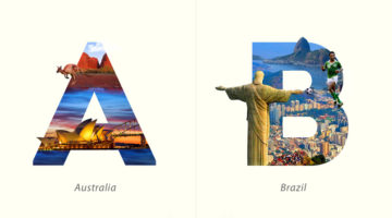
Dubai-based graphic designer Yuhab Ismail has come up with an interesting project titled “LETTRAVEL” that mixes typography and photography to showcase some of the world’s most beautiful countries and their iconic landmarks. Each letter represents the initial of a country and includes images of its famous monument or landscape clip-masked within the letterform. From the … [Read more...]
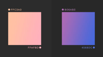
32 Beautiful Color Palettes With Their Corresponding Gradient Palettes
Looking for color palettes for your graphic, web, or UI design? Mr.Pugo is a handy Instagram account that shares beautiful color palettes (with hex codes) and also their corresponding gradient palettes. We’ve shortlisted some of the best ones in terms of aesthetic appeal, usability, and current design trends. Check them out below and tell us your favourites in the … [Read more...]
This Brilliant Quiz By Adobe Tells You Exactly What Type Of Creative Personality You Have
Adobe Create Magazine has put together a fun quiz called Creative Types to help you uncover your unique creative personality. It analyzes your daily habits and creative tendencies, giving you a fresh perspective on how you think, work, and bring ideas to life. When you’re done, you’ll get practical tips on how to make the most of your strengths and even see which creative … [Read more...]
What Is The Golden Ratio, And How To Use It In Graphic Design
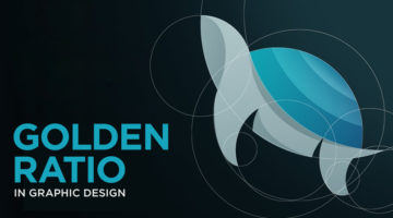
The Golden Ratio, also known as the Golden Section or Divine Proportion, is a mathematical ratio of 1:1.618 based on the Fibonacci sequence. It can be found in nature (flower petals, seeds, shells), in food (artichokes, broccoli, pineapple), and in the human anatomy. The Golden Ratio can also be found in art (Mona Lisa, The Last Supper, Vitruvian Man) and architecture … [Read more...]
3 Designer Friends Created An Alphabet Series Using Logos They’ve Designed Over The Years
Three graphic designers, colleagues, and friends, Alex Tass, Dalius Stuoka, and Deividas Bielskis decided to put together an A-Z alphabet series made from logo symbols, lettermarks, and monograms they've created over the years. All three designers have been in the industry for over 10 years, and have worked with a variety of clients, brands, and agencies. For this project, … [Read more...]
31 Beautiful Gradient Logos For Design Inspiration
When Apple launched iOS 7 in 2014, it not only changed the face of UI design, but also branding, graphic and logo design. Skeuomorphic interfaces and glossy app icons were out. Flat design, vibrant colors and gradients were in. In 2016, when Instagram came up with a bright new look and multicolored logo, a vast majority of its users hated the vivid gradients and demanded the … [Read more...]
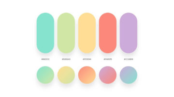
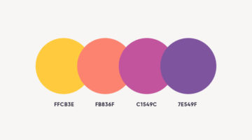
43 Beautiful Color Palettes For Your Next Design Project
Looking for color palettes for your graphic, web, or UI design? Awsmcolor is a handy Instagram account that shares a beautiful new palette everyday, with hex codes of each color. At the end of every month, they feature the top nine palettes for that month. If you create something exceptional using their palettes, you can get featured on their page as well. We've shortlisted … [Read more...]
NVIDIA Develops Incredible AI That Can Turn Rough Sketches Into Landscape Images
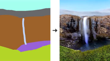
Researchers at NVIDIA have developed a deep learning model that can turn rough doodles into photorealistic landscapes using generative adversarial networks, or GANs. The interactive app has been named GauGAN, after the post-Impressionist painter Paul Gauguin. The deep learning model has been trained on a million images. When you draw the shapes of the objects you want, the … [Read more...]
41 Beautiful Color Palettes For Your Next Design Project
Looking for color palettes for your graphic, web, or UI design? Colours.cafe is a handy Instagram account that shares a beautiful new palette everyday, with hex codes of each color. They also hold design challenges in which users have to use a specific palette to create illustrations and calligraphy. The best works are then featured on their page. We've shortlisted some of … [Read more...]
Designer Who Created Iconic Movie Posters Shares The Secrets Behind Hollywood Poster Designs
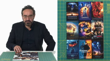
James Verdesoto, known for designing some of Hollywood’s most recognizable movie posters, understands how visuals shape audience perception. His work demonstrates how color and composition influence expectations before a film even begins. If you’ve ever been drawn to the posters for Pulp Fiction, Ocean’s Eleven, Training Day, or Girl, Interrupted, you’ve already seen … [Read more...]
Free Photoshop Pack Of Beautiful Gradients For All Your Design Needs
Vibrant colors and gradients are one of the major trends in graphic, web, and UI design nowadays. To make life easier for designers everywhere, Paris-based graphic designer Leo Simon has compiled a set of 300 beautiful gradients into a Photoshop gradient file (GRD), available for free. We've shortlisted some of our favourites from Leo's collection and shared them below with … [Read more...]
Japanese Artist Turns Product Packaging Into Amazing Artworks
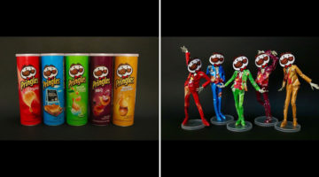
Japanese artist Haruki transforms packaging of everyday items like Pringles chips, Oreo cookies, Nestle milk, etc. into amazing paper sculptures and artworks. He uses a technique known as kirigami, a variation of origami, which involves cutting and folding paper to create intricate designs. Kirigami is usually associated with traditional Japanese art, but Haruki applies the … [Read more...]
Legendary Painters ‘Deliver’ Their Paintings In Brilliant Ads For Art Transport Company
Welti-Furrer is a leading Swiss company for fine art transports. Their experts transport valuable art with the utmost care. To communicate their services to museums, galleries, curators, and art collectors, agency Ruf Lanz (Zurich) came up with a brilliantly art-directed campaign featuring four legendary painters: Salvador Dali, Vincent van Gogh, Andy Warhol, and Frida … [Read more...]
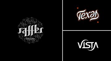
Designer Creates Clever Negative Space Logos That Visualize The Name Of The Company
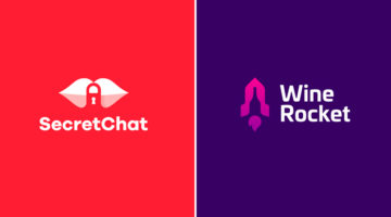
Lithuania-based graphic designer Leo has come up with a series of clever logos that combine the name or initials of the company into one unique symbol using negative space. The logo in each case visually represents the name of the company. For example, the logo for Secret Chat is a pair of lips with a padlock in the negative space between the lips. The logo for Wine Rocket … [Read more...]
Motherboards Look Like Agricultural Fields In Brilliant Ads For Volkswagen’s Tech-Savvy Trucks
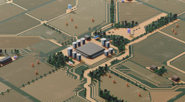
Volkswagen Argentina wanted to promote its Amarok V6 4x4 pickup truck to young, tech-savvy agricultural workers who work in crop fields and rely on technology to get the job done. The Amarok has 4x4 capabilities but also comes loaded with technology that these "rural millennials" will appreciate. Agency Geometry Argentina came up with a brilliant print and outdoor campaign … [Read more...]
Graphic Designer Creates Logos Of Famous Painters – Picasso, Van Gogh, Da Vinci, And More
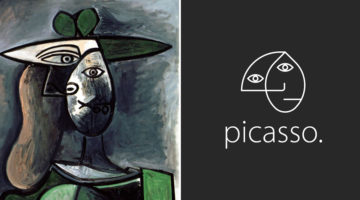
Brazilian art director Milton Omena has come up with an interesting project that imagines what logos of famous painters from Renaissance, Impressionist, and Modern Art periods would look like. He studied the painting styles and personalities of legendary artists like Leonardo Da Vinci, Vincent Van Gogh, Pablo Picasso, and created a unique symbol for each one of them. Milton, … [Read more...]
Designer Uses Beautiful Gradients And Abstract Shapes To Describe Meanings Of Words
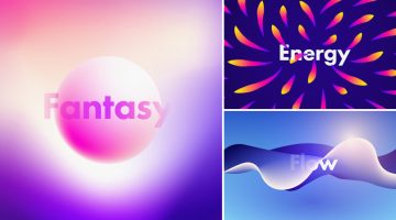
UK-based graphic designer Evgeniya Righini-Brand has come up with a fascinating project titled “Gradient Studies” in which she uses vibrant gradients and abstract shapes to visually describe the meanings of various words. For example, the visual for the word "flow" is an abstract liquid shape with multiple gradient meshes in blue and white. The visual for the word "energy" is a … [Read more...]
Adobe ‘Good Bones’ Lets You Change Vector Shapes Easily By Adding A Skeleton Structure
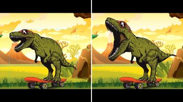
When you create artwork in Adobe Illustrator, the underlying geometry of the vector graphics can be quite complex. If you need to change the appearance of your vector figure, you'll need to edit each anchor point individually, which can be quite a task. For example, if you want to open the mouth of a vector dinosaur that you've created, you'll need to tweak each anchor point … [Read more...]
15 Brilliant Art Tributes To The MARVELous Stan Lee

Stan Lee, the legendary writer, editor and publisher of Marvel Comics, passed away on November 12, 2018 in Los Angeles, California. He was 95. In collaboration with artists Jack Kirby and Steve Ditko, Lee co-created iconic superhero characters like Spider-Man, the Hulk, the X-Men, the Fantastic Four, Doctor Strange, Black Panther, and Daredevil. He also co-created the … [Read more...]
Pacifier Ads Cleverly Show What All You Can Do Once Your Baby Is Busy

Agency Geometry Global in Colombia has come up with a well-crafted campaign for Munchi Pacifiers that shows what all you can do in your spare time, once your baby is self-soothing. The three-ad series features overhead photographs of a baby with a pacifier in his/her mouth, the handle of which, looks like a couple kissing, a gaming remote, and a woman practising yoga. The … [Read more...]
Clever Illustrations Of Words That Sound The Same But Have Different Meanings
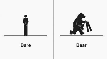
Michigan-based illustrator Bruce Worden creates funny, witty illustrations of homophones - words that have the same pronunciation but different meanings, spellings, or origins. A self-professed grammar nerd, Worden explains the differences between the words with minimalist pictograms that visualize their meanings. Over a period of five years, he has created over 300 … [Read more...]
Graphic Designer Combines Two Completely Unrelated Objects Into Clever Logos
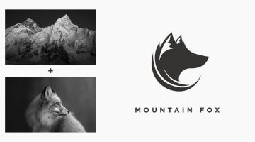
Indonesian designer Rendy Cemix has come up with an interesting project in which he combines the shapes of two completely different objects into one unique logo. The logo in each case is a visual representation of the brand name. For example, the logo for Mountain-Fox is an aesthetically designed symbol of a fox with ears that look like snow-capped peaks. The logo for … [Read more...]
This Handy New Tool Shows You Color Palettes Of Artworks From Different Eras
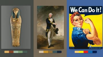
Kentucky-based graphic designer Brandon Shepherd has released a handy online tool called Color Leap that showcases a collection of color palettes used in paintings and artworks throughout different eras in history - from ancient Egypt to the 1960s. The tool consists of 180 palettes spread over 12 different time periods. You can select any time period, browse through … [Read more...]
27 Clever Ambigram Logos That Look The Same When Viewed Upside Down
An ambigram is a typographical design or symbol consisting of text modified in such a way that it can be read in different orientations - inverted, rotated, mirror-image, etc. For example, the logo of Sun Microsystems (no. 4 below) is a brilliantly-designed ambigram that reads 'SUN' from all directions. Another famous example is the New Man logo (no. 6 below), designed by … [Read more...]
Designer Creates Beautiful Team Badges During The World Cup
Venezuela-based illustrator and graphic designer Moises Fernandez designed some beautiful team badges for his Instagram page during the World Cup. Created with Adobe Illustrator and Photoshop, the crests feature beautiful illustrations and artwork, with national symbols and relevant colors for each team. Check them out below. … [Read more...]
Designer Creates Clever Logos By Combining Two Or More Different Shapes Into One
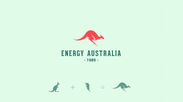
Kochi-based designer Shibu PG has come up with a series of interesting logos in which he combines the shapes of two or more different objects and letters into one unique logo. The logo in each case is a visual representation of the brand name. For example, the logo for Energy Australia is a combination of the shape of a kangaroo and the energy symbol ⚡️. The logo for … [Read more...]
Shutterstock Comes To The Rescue Of Creatives Everywhere In These Clever Ads
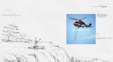
Stock photography site Shutterstock is used by designers, creatives, and agencies all over the world, everyday. To highlight how important and useful the site is for creatives, agency Cazar DDB in Santo Domingo (Dominican Republic) has come up with a witty print campaign that plays on the idea of Shutterstock "rescuing" creatives when they need it most. The three-ad series … [Read more...]
JBL Shows How Effective Their Headphones Are With These Brilliantly Art-Directed Ads

Last year, JBL China came up with an award-winning print/outdoor campaign that used 3D illustrations and negative space to show how effective their noise-cancelling headphones are. The campaign, titled "Block Out The Chaos", was created by Cheil Worldwide Hong Kong and the illustrations were created by Bangkok-based CGI studio Illusion. Now, JBL has released two new ads in … [Read more...]
FIFA World Cup Logos From 1930 – 2022, Which One’s The Best?
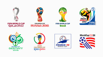
The FIFA World Cup is the most widely viewed and followed sporting event in the world. The logo for the 2022 World Cup in Qatar has been unveiled and we decided to do a round-up of all the World Cup logos from 1930 - 2022. During the first four World Cups from 1930 - 50 (there were no tournaments in '42 and '46 due to World War II), the organizers created posters instead of … [Read more...]
Clever Logos Of Letters A To Z Based On Common Words That Start With Them
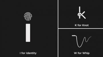
UK-based graphic designers Liam + Jord undertook a 36-day typography challenge to create logos for every letter of the alphabet based on common words that start with them. For example, the letter 'b' has been designed to look like a book, the letter ‘f’ looks like a flag, 'w' looks like a whip, and so on. The objective was to use the shapes of the letters to visually … [Read more...]
- « Previous Page
- 1
- 2
- 3
- 4
- …
- 9
- Next Page »