When it comes to consumer behaviour, logos play an important psychological role in influencing decision making, especially when there is lack of time or information. It takes just 400 milliseconds for our brain to recognize a logo and trigger a response based on our preferences and previous experiences with the brand. Brands that we like elicit activity in the part of the … [Read more...]
Search Results for: logo
29 Beautiful Lion Logos For Design Inspiration
The lion symbolizes strength, courage, and leadership. It is one of the most widely used symbols of power and royalty since ancient times. Today, lion symbols are used on national flags and as logos for sports teams, luxury brands, hotels, automobile manufacturers, financial institutions, and more. In today's post, we've collated a few inspiring examples of lion logo … [Read more...]
How To Successfully Present Logo Designs To Clients
How do you show logo designs to clients? Do you just email multiple options and let them choose the one they like? Do your clients ask for excessive revisions? Do they often change their minds after you show your designs? If the logo is the product, the presentation is the packaging. In this video, Ben Burns, digital director at California-based creative agency Blind, shares … [Read more...]
Designer Brilliantly Explains Why The New F1 Logo Is A Success, Despite What Everyone’s Saying
Is the new Formula One logo good or bad? Award-winning designer Chris Do reviews the new F1 logo with an in-depth look at its history, design brief, application, and reasons for change. He also discusses why it's important to view logo launches and rebrands from a business point of view rather than just aesthetics. Watch below. … [Read more...]
Designer Brilliantly Explains Why 7-Eleven’s Symmetrically Flawed Logo Is Not A Design Error
If you've never noticed it before, 7-Eleven's logo uses a mix of upper and lowercase letters (ELEVEn). Also, the 'E' doesn't align with the top edge of the 7 and the center alignment of the logo is off. The design community is abuzz on this topic after a Reddit thread brought these capitalization and symmetrical imperfections to light. … [Read more...]
150 People Were Asked To Draw 10 Famous Logos From Their Memory, And The Results Are Hilarious
The logos of global brands like Apple, Starbucks, and Adidas are seen and recognized by billions of people every day. Their logos have become iconic to the point that they create an instant brand association in the minds of consumers. But how well do consumers know the exact shape and colors of these famous logos? … [Read more...]
Designer Brilliantly Explains Why Google’s Geometrically Flawed Logo Is Not A Design Error
Google's "G" logo is not geometrically perfect. It's not a perfect circle and the color arcs don't align with each other. The internet and the design community are abuzz on this topic after a Reddit thread brought these geometrical imperfections to light. … [Read more...]
Clever, Minimal Typographic Logos Of Cities
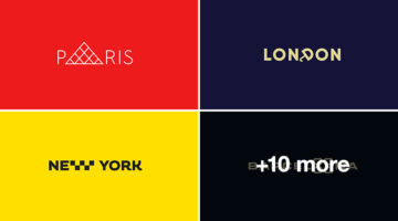
Vladislav Smolkin is a graphic designer and logo artist based in Saint Petersburg, Russia. He specializes in identity and logo design for small and medium-sized companies, and has clients all over the world. Smolkin's forte lies in minimalism. He believes he is able to showcase his talent best using a minimalist style. One of his personal projects is CITIESET - a series of … [Read more...]
51 Creative Logos That Use Negative Space Brilliantly
In art and design, negative space is the background space around and between the subject of an image. For example, in a picture of a palm tree against the sky, the shape of the tree is the positive space. The sky and the space between the branches and leaves is the negative space. Negative space can be used creatively to form compelling visuals that have dual or hidden … [Read more...]
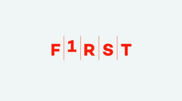
29 Creative Logo Designs That Use Numbers
Over the past few weeks, we've showcased some brilliant logos that use minimalism, monograms, single-letters, and more. Today's post features 29 clever logos that use numbers and digits in their design. Observe the typography and the use of number shapes to create visual meanings. … [Read more...]
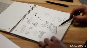
Designer Challenges Herself To Create A Logo In 60 Minutes, Every Day For 60 Days
Karoline Tynes is a freelance graphic designer and economics student based in Oslo, Norway. To develop and promote herself as a designer, she undertook a design challenge in which she had to create a new logo every day for 60 days. The rule was to use a maximum of 60 minutes on each logo, which is why ideation was important. She used Copic markers for sketching, followed by … [Read more...]
This AI Can Review Your Logo Design And Provide Feedback For Free
Vancouver-based designer and engineer Jack Qiao has come up with an A.I. system called Logo Rank that critiques your logo design and provides feedback for free. It reviews the logo on a number of parameters such as uniqueness, legibility, color, contrast, and offers tips and ideas to improve your design. The A.I. system is trained on a million+ logo images and can also be … [Read more...]
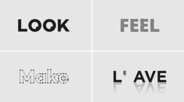
Designer Creates Clever Typographic Logos Of Common Words We Use Every Day
Morocco-based brand designer Bachir Bachchar has come up with an interesting project titled "66 Smart Words" that showcases typographic logos of common words we use every day. The impressive bit is that the letters of each word have been designed in a way that they form a visual image associated with the meaning of the words themselves (a.k.a. calligrams). For example, the … [Read more...]
What Do The Logos Of Successful Companies Have In Common?
56% of America's fastest growing companies use blue or dark colors (black and gray) as primary colors for their logos. 66% of these companies use both an icon and a wordmark. 94% of the logos are minimal. … [Read more...]
Cool, Disney-Style Animations Of Logos Of Popular Social Networks
The students at Motion Design School in Kharkov (Ukraine) have come up with a series of gorgeous animations of logos of popular social networks, messaging platforms, and portfolio sites. The list includes Facebook, Twitter, Instagram, LinkedIn, Google, Pinterest, Snapchat, Skype, Reddit, Tumblr, Flickr, Behance, Dribbble, Slack, and Telegram. The challenge was to create the … [Read more...]
45 Brilliant Alphabet Logos With Hidden Meanings
Last week, we featured 50 monogram logos that merged two or more alphabets to form one unique symbol. In today's post, we focus on logos that use just one alphabet and typographical creativity to form a distinctive brand identity. Single-letter logos are trickier to execute than monogram logos because you just have one letter to play with. But the designers who crafted these … [Read more...]
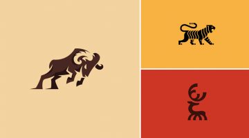
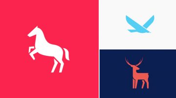
Beautiful Logos Of Animals In Charging Positions
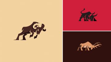
Bodea Daniel is a freelance graphic designer and illustrator based in Timișoara, Romania. A travel buff by nature, his love for beer is second only to his love for design. Bodea is also one of the most popular designers on Behance, with over 342,178 project views and 9,506 followers. One of our favourite projects from his portfolio is a series of animal logos in charging or … [Read more...]
50 Brilliant Monogram Logos
A monogram is a motif or symbol made by combining two or more letters. The earliest known examples of monograms date back to 350BC when the names of Greek cities used to be engraved on coins. Over the centuries, monograms have been used in religion, architecture and in royal symbols to denote power and authority. In the late 19th century, companies and businesses started … [Read more...]
11 Famous Logos That Look Ridiculously Similar
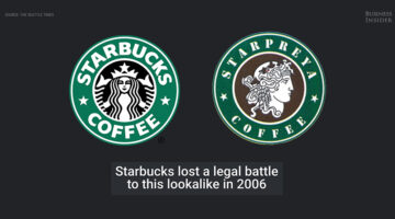
In logo design, it's inevitable that ideas will be repeated. But some of them are a little too close for comfort. Business Insider has come up with an intriguing list of famous logos that are eerily similar. Check them out below. … [Read more...]
41 Minimal Logos With Double Meanings
When it comes to logo design, minimalism can be tricky to achieve. If executed improperly, the logo can come across as too simple or boring. In the process of removing unnecessary elements, you have to ensure that your logo remains memorable and distinctive. … [Read more...]
Gorgeous Animations Of Hand-Lettered Logos Where Every Frame Is Hand-Drawn
Mantas Grauzinis is a freelance illustrator and animator based in Vilnius, Lithuania. He loves good stories and "splashy, smoother than butter movements". His passion for the latter can be observed in a series of slick animations of hand-lettered logos created by him, that are extremely satisfying to watch. … [Read more...]
Beautiful, Colorful Animal Logos Based On Circular Geometry
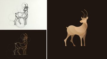
California-based designer Anuja Kanani has come up with a series of colorful animal logos using circle geometry. Being an animal lover, she wanted to undertake this design experiment to highlight their elegant structure and form. For each logo, Anuja initially sketched a basic structure guided by circles. She then defined the animal using just line forms. Programs used were … [Read more...]
Smooth, Clean Animations Of Beautiful Hand-Lettered Logos For Design Inspiration
Russian designers Starov Evgeniy (lettering artist) and Alexey Dubnichenko (motion designer) have come up with a series of impressive animations of commercial lettering work they've created over the last year. The objective of this collection is to show lettering logos in a new perspective. … [Read more...]
Designers Create Beautiful Animal Logos To Raise Awareness For Endangered Species
European designers Bodea Daniel, Cajvanean Alexandru, Petar Shalamanov and Martigny Matthieu have come together to create a series of striking animal logos to raise awareness about endangered species. They've used different design styles and techniques like golden ratio, negative space, blend modes and minimalism. Each logo is accompanied by a caption that describes the … [Read more...]
25 Clever Logos Of Common Verbs We Use Every Day
Following up to the previously published 25 adjective logo collection, Spanish designer Lucas Gil-Turner has created a series of impressive logos for the 25 most commonly used verbs in the Oxford English Dictionary. The list was released by Oxford University Press researchers after the analysis of over a billion words. Lucas has created illustrative and representative logos, … [Read more...]
Designer Who Created The Instagram Logo Shows You How To Design A Logotype
A logotype is the name of a brand or a company designed in a visually unique way for use by that company. The logos of Google, Coca-Cola, Facebook, Disney, Cadbury, Nokia and Philips are examples of famous logotypes. The wordmarks are created using a custom or an existing typeface. If you're looking to create a custom logotype, check out this handy tutorial by Skillshare … [Read more...]
Designer Brilliantly Explains How To Charge Clients For Logos And Other Design Services

Chris Do is an Emmy award-winning designer and founder of Blind, a brand strategy design consultancy in Santa Monica. He also runs an online venture called The Futur which teaches the business of design to creative entrepreneurs. In this video, Chris explains how to correctly charge clients for logos and other design services. He provides some brilliant tips on negotiation, … [Read more...]
Designer Creates Clean, Minimalist Animal Logos And Shares His Design Process
Korean graphic designer Jahng Hyoung joon has come up with a series of minimalist animal pictograms and two short time-lapse videos that show his design process. Though the clips are sped up, it's always good to see the workflow used by the designer and pick up valuable pointers. Check them out below. … [Read more...]
25 Clever Logos Of Common Adjectives You Use Every Day
Following up to the previously published 25 nouns logo collection, Spanish designer Lucas Gil-Turner has created a series of impressive logos for the 25 most commonly used adjectives in the Oxford English Dictionary. The list was released by Oxford University Press researchers after the analysis of over a billion words. … [Read more...]
What If Famous Brands Combined Logos With Their Biggest Rivals?
Imagine if the world's most famous brands and companies teamed up with their biggest competitors and created a new company logo that's a combination of the two. DesignCrowd ran a contest asking its community to do just that - take two company logos that compete in the same product or service category and combine them into a new hybrid logo. Here are some of the results. … [Read more...]
Next Time You Present A Logo To A Client, Try Using Animations Like This Design Studio Does
Here's a logo presentation technique you would like to use in your next client meeting. Venice-based branding agency Concreate Studio presents their logos using animations that explain the ideology behind the design process. For example, the logo animation for furniture maker Emporio Freguglia starts with the icon of a bed that cleverly morphs into a chair-like symbol that … [Read more...]
The Recipe For Creating Epic Logo Designs
A logo is not just a graphical symbol, it is the embodiment of your organization. Designing a logo is not just about creating a business identity, it's about creating a connection between the customer and your brand. A successful logo is one that is memorable, versatile, appropriate and timeless. … [Read more...]
The Original Names And Logos Of 12 Famous Companies
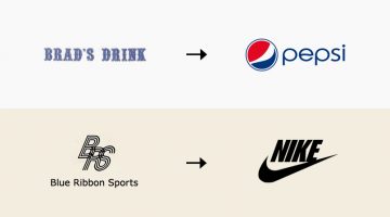
In 1996, Larry Page and Sergey Brin started collaborating on a search engine called BackRub. It operated on Stanford servers for more than a year, eventually taking up too much bandwidth. On September 15, 1997, Page and Brin registered the domain name Google.com - a play on the word "googol", a mathematical term for the number ten raised to the power hundred (10100). The rest … [Read more...]
14 Funny Mashups Of Famous Logos
Filipino designer Eisen Bernard Bernardo has come up with a fun project titled 'Logomorphia' that showcases mashups of popular logos that look like amusing creatures and situations. How many of these can you guess correctly? … [Read more...]
29 Clever Typographic Logos Of Common Words We Use Every Day
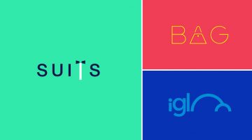
Milan-based creative director Duminda Perera has created a series of clever wordmarks/calligrams of common words we use every day. He’s altered, combined or replaced letters with shapes and symbols that visualize the meaning of the word. So the letter ‘n’ in ‘wine’ looks like a wine bottle, the two o's in ‘igloo’ form the shape of an igloo, and so on. Check them out below. … [Read more...]
- « Previous Page
- 1
- 2
- 3
- 4
- 5
- …
- 7
- Next Page »