In the competitive world of logo design, where distinctiveness is key, noticeable similarities between logos often ignite discussions about the line between inspiration and outright imitation.
As brands compete to differentiate themselves in a bustling market, their logos occasionally reveal surprising resemblances or secretive connections. Such instances prompt a closer examination of the design process. Are these resemblances just coincidental, or do they suggest a creativity deficit in an industry driven by stringent deadlines and intense client expectations?
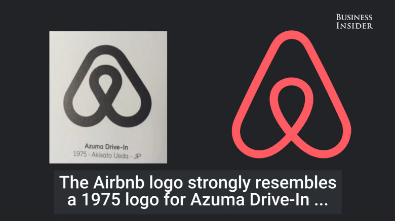
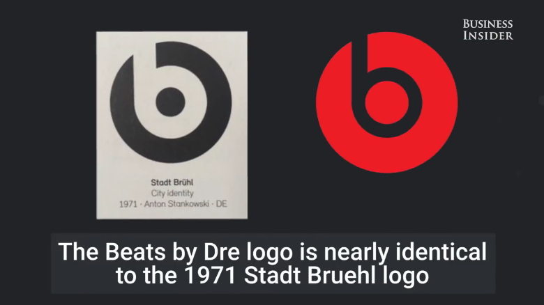
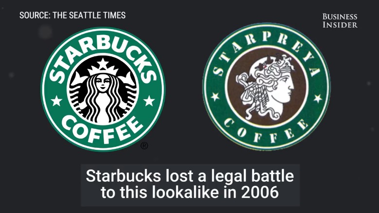
Business Insider has come up with an intriguing list of famous logos that are eerily similar, shedding light on the curious case of design doppelgängers in the branding industry. Check them out below.
1.
2.
3.
4.
5.
Watch below for more
Jump to:
00:14 – Medium
00:19 – Airbnb
00:27 – Flipboard
00:31 – Beats by Dre
00:37 – Sega
00:42 – Gucci
00:47 – Columbia
00:52 – LA Lakers
00:57 – Ford
01:06 – Starbucks
01:17 – NBC
What’s your take on this topic? Have you ever come across a logo that looked strikingly similar to one of your designs? Use the comments below to voice your views and share this post with a designer friend.
