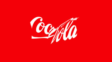
Coca-Cola's timeless logo, a global symbol since 1941, is taking on a new role to promote recycling. Their latest "Recycle Me" campaign, launched in Latin America, showcases the iconic red-and-white logo in a crushed and distorted form, resembling a recycled can. This visual twist aims to leverage the logo's massive recognition—known by 94% of the world—to inspire more … [Read more...]
Search Results for: logo
10 Best And Worst Redesigns Of Famous Logos
In the dynamic world of branding, the decision to redesign a logo represents a pivotal moment in a company's journey, signaling evolution, reinvigoration, or sometimes, a return to its roots. The outcomes of such endeavors vary widely, offering a variety of lessons on what resonates with the target audience and what falls flat. As we go through different brands' attempts … [Read more...]
“Client Used AI To Tweak My Logo Designs And Create Their Own Logo For Free”
In the ever-evolving landscape of creative work, the advent of artificial intelligence has introduced new challenges and ethical dilemmas. A recent experience shared by a graphic designer on Reddit highlights the complexities of AI in the freelance world. After creating two rounds of logo designs for a friend, the designer discovered that their work had been fed into an AI … [Read more...]
Logo Designer Creates Adorable Illustrations And Shows The Inspiration Behind Them
In a world obsessed with AI-generated design, it's good to see some good old human creativity. Creating effective logos is an art that balances simplicity with impact, requiring both talent and dedication to achieve a design that is both straightforward and memorable. Indonesian illustrator and logo designer, Alfrey Davilla, champions the philosophy that "Simpler is … [Read more...]
8 Types Of Logos With Examples
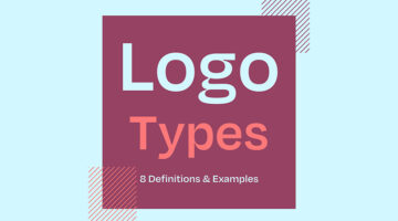
The effectiveness of a logo depends on various factors, including the brand's goals, target audience, industry, and overall brand identity. However, there are a few key types of logos that are often considered effective in different contexts. Ireland-based design director Andrew Warner has come up with a handy visual guide that lists the different types of logo designs, with … [Read more...]
The 20 Best Logos Of All Time
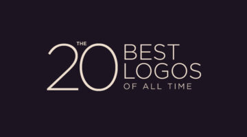
A logo is a visual representation of a company or brand, and an essential part of any successful marketing strategy. A good logo conveys a brand's message, values, and identity in a simple yet memorable way, making it instantly recognizable and easy to remember. Over the years, we’ve seen some great examples of logo design, but only a select few have stood the test of time. … [Read more...]
39 Logo Designs That Should Have Never Been Approved
Ah, logo design fails. They're like a train wreck - you can't help but look, even though you know it's going to be bad. It's amazing how some companies manage to get it so wrong. But hey, we're not here to judge (okay, maybe a little), we're here to appreciate the unintentional hilarity that comes with logo design fails. Now, before we begin, a word of warning: if you're the … [Read more...]
Designer Creates Typographic Logos Of Superheroes Using Their Faces And Names
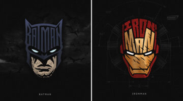
Logo designer Sergey Kyrmanov has come up with an interesting project that features typographic logos of superheroes that combine their names with their facial appearance. The logos have been designed in a way that the name of the superhero takes the shape of the character's face or mask. For example, the Batman logo features an illustrated face of the Caped Crusader with … [Read more...]
Designer Creates Typographic Logos Of Supervillains Using Their Faces And Names
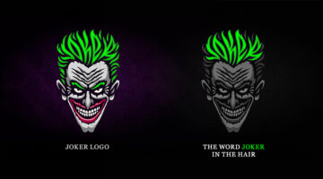
Logo designer Sergey Kyrmanov has come up with an interesting project that features typographic logos of supervillains that combine their names with their facial appearance. The logos have been designed in a way that the name of the supervillain takes the shape of the character’s face or mask. For example, the Joker logo features an illustrated face of the antagonist with … [Read more...]
Why Most Brand Logos Look The Same Nowadays
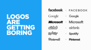
Minimalism is a major trend in logo design nowadays with most brands stripping their logos down to a simple wordmark in a sans-serif typeface. These minimal, type-only logos look clean and are legible across all devices and screens, from mobile phones to smart watches. But have we reached a point where the personalities and characteristics of one logo are indistinguishable … [Read more...]
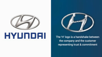
32 People Who Realized Famous Logos Are Not What They Thought They Were
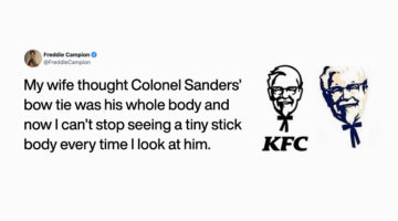
Big corporations spend millions of dollars on their branding in an effort to make their logos memorable and establish brand recall with their consumers. But sometimes people mistake the elements of a logo as something else entirely. One such episode was shared by LA-based content director Freddie Campion when he tweeted that his wife always thought that Colonel Sanders' … [Read more...]
Graphic Designer Creates Typographic City Logos Based On Their Famous Landmarks
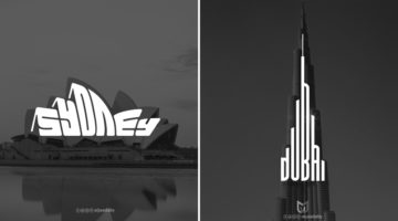
Yemen-based graphic designer Mohamed Aljaadaby has come up with an interesting project that features typographic wordmark logos of cities in the shape of their famous monuments and landmarks. For example, the logo for Sydney is the word 'Sydney' warped in the shape of the Opera House. The logo for Athens is the Acropolis with the word 'Athens' in the negative space between … [Read more...]
This Brilliant Free Tool Can Remove The Background From Your Photo Or Logo Within Seconds
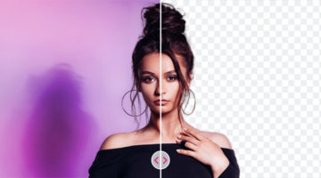
The team at fashion portal Fynd has come up with a handy new AI tool called Erase.bg that lets you quickly remove backgrounds from any image and download it in the original resolution for free. Simply upload your image (JPEG, PNG, or WEBP upto 5000 × 5000 px) or paste an image URL. The machine learning model automatically detects the subject, removes the background within … [Read more...]
I’ve Been Designing Logos With Hidden Meanings Every Day For 5 Years, How Do You Like My Work?
Indian graphic designer Gary Dimi Pohty has undertaken a design challenge titled "One logo a day" in which he creates logos with hidden meanings on an almost daily basis. At the moment, he is on day 2012, which is roughly 5 years and 5 months! Gary's logos are based on common, everyday words and fictitious brands or films. He uses symbolism, negative space, and geometric … [Read more...]
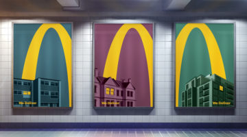
McDonald’s Logo Is So Iconic, Only Half Is Enough In These Brilliant Home Delivery Ads
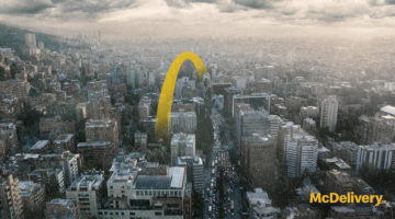
DDB Colombia has come up with an exceptional campaign for McDonald's that uses just half of it's iconic 'Golden Arches' logo to promote their home delivery (McDelivery) service across Latin America. Titled "Good moments don't need to wait", the campaign consists of 5 minimalist outdoor/print ads that feature skylines of Latin American cities with a yellow curve that starts … [Read more...]
30 Dual-Meaning Logos And The Ideas Behind Them
Indonesia-based Grafast Design Studio has come up with a series of interesting logos that combine different shapes and letters into unique symbols that visually represent the brand name. In each logo, the letters used are the initials of the brand name and the shapes represent the product or service offered by the company. For example, the logo for Victory Coffee combines … [Read more...]
McDonald’s Iconic Logo Is So Recognizable, Only Half Is Enough In These Brilliant Home Delivery Ads
Leo Burnett London has come up with an ingenious campaign for McDonald's that uses just half of it's iconic 'Golden Arches' logo to promote their home delivery (McDelivery) service during the COVID-19 lockdown in the UK. Titled "Lights On", the campaign consists of 5 minimalist outdoor/print ads that feature an illustrated yellow curve soaring over rooftops and into the … [Read more...]
Designers Are Sharing Their Redesigns Of Famous Logos And Some Of Them Are Better Than The Original
Have you ever looked at a famous logo and thought that you could have done a better job? Of course you have! With so many brands opting for redesigning their logos nowadays, designers from all over the world are sharing their rebranding concepts and reimagined versions of iconic brand logos. We've shortlisted some of the best redesigns on Dribbble and Behance, and a few of … [Read more...]
25 Clever Logos With Hidden Meanings
Russian graphic designer Vlad Smolkin has shared an interesting collection of hidden-meaning logos that he has created for different clients over the years. The designs use clever typography and symbols hidden in negative spaces to visually represent the brand name or explain the nature of the business. For example, the logo for Infinity Cat Cafe is an abstract infinity … [Read more...]
32 Brilliant Logos With Hidden Meanings
Looking for some logo design inspiration? Here are 32 brilliant examples with dual and hidden meanings, also known as visual double-entendres. In most cases, the hidden symbols are a visual representation of the brand name, and in others, they explain the nature of the business. Clever typography, negative space, and visual symbolism are some of the design techniques used to … [Read more...]
Mastercard Uses Its Iconic Logo To Highlight The Importance Of Experiences

McCann Colombia, Wernersam Studio, and Latina Studio came up with a brilliant campaign for Mastercard that uses their famous 'overlapping circles' logo to highlight the significance of experiences and special moments. The campaign consists of eight print/billboard ads based on different activities like travelling, sports, music, gastronomy, etc. The central objects in each … [Read more...]
Breaking Down The Process Of A Good Logo Design
Designing your logo can be quite a challenge, and if you don't know the design process, it can be almost impossible! But it doesn't have to be this way, because there are steps that professional logo designers take - a combination of investigation, strategic thinking, and implementation. While the process can vary from designer to designer, these steps remain the same. Think … [Read more...]
Designer Replaces Wordmarks In Famous Logos With The Names Of The Artists And Agencies Who Designed Them
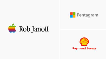
Italian graphic designer Emanuele Abrate has come up with an interesting project titled 'Who Designed it?', in which he substitutes wordmarks of famous logos with the names of the designers and agencies who created them. The objective of the project is to highlight the artists who designed these well-known symbols, and make them an integral part of their respective … [Read more...]
Graphic Designer Fixes The 9 Worst Logos Ever
Regular readers of Digital Synopsis must have read our article on 25 epic logo design fails. Now, Italian graphic designer Emanuele Abrate has come up with an interesting project in which he has redesigned the 9 worst logos out of that list. Emanuele has tried to recreate these logos as if they were commissioned to him. He's used different typography techniques, created … [Read more...]
Designer Redesigns Famous Logos In The Time Of Coronavirus And Social Distancing
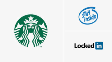
Slovenian graphic designer Jure Tovrljan has come up with a clever project that features famous logos reimagined for the age of coronavirus and social distancing. For instance, the Starbucks logo has been redesigned to show the siren wearing a mask. The "Intel Inside" logo has been rebranded to "Stay Inside", LinkedIn has been rebranded to "LockedIn", and so on. Check out … [Read more...]
Graphic Designer Replaces Wordmarks In Popular Logos With The Fonts They Use
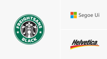
Italian graphic designer Emanuele Abrate has come up with a clever project titled Logofonts, in which he substitutes wordmarks of famous logos with the name of the fonts they use. For example, the word "Omega" in the Swiss watchmaker’s logo has been changed to "Futura" written in the same style as the original logo. Nutella’s wordmark logo has been changed to "Avant Garde", … [Read more...]
Hidden Meanings Of 50 Famous Brand Logos
Did you know that the orange arrow in the Amazon logo points from the letter "A" to "Z", symbolizing that Amazon has every item from A to Z. The Nike "Swoosh" logo is not just a checkmark. It also symbolizes the wing of Nike, the Greek goddess of victory. Apple logo designer Rob Janoff took a bite out of an apple as an experiment, then realized that the word "bite" sounds … [Read more...]
Graphic Designer Replaces Wordmarks In Famous Logos With The Fonts They Use
Italian graphic designer Emanuele Abrate has come up with a brilliant project titled Logofonts that replaces wordmarks of famous logos with the name of the fonts they use. For example, the word "Google" in the tech giant's logo has been changed to "Product Sans" (name of the font used) written in the same colorful style. The wordmark in Amazon's logo has been changed to … [Read more...]
55 Valuable Resources For Logo Designers
Before you begin work on a design project, it's always good to have a list of handy resources you can browse through for tips, ideas, and inspiration. But with so many resources available online, which ones are worth bookmarking? Kalypso Designs has come up with an excellent list of logo design resources across eight categories. These include design tools, type tools, font … [Read more...]
5 Useful Tips To Help You Create Better Logos
A good logo is one that is memorable, versatile, appropriate, and timeless. It should make a great first impression of the company, and create brand recall as the years go by. From an execution point of view, the colors, typography, and geometry of the logo symbol should be relevant to the brand, to the target audience, and the industry in which the brand operates. A logo … [Read more...]
7 Mistakes You Should Avoid In Logo Design
Whether you're a beginner or a pro, designing a successful logo for your client is always a tricky task. You need to keep in mind the brand objective, the target audience, and the industry in which the company operates. From an execution point of view, you need to ensure your logo is scalable, the colors are relevant, and the typography is spot on. A successful logo is one … [Read more...]
Designer Creates Clever Typographic Logos That Visualize The Meanings Of Various Words
Istanbul-based designer Mustafa Ömerli has come up with an interesting project that features typographic logos of common words we use every day. He visually represents the meanings of the words by using symbols, negative space, or by adding geometric elements to the letters. For example, the letter 'k' in the word 'kickboxing' looks like its landing a kick on the letter 'i'. … [Read more...]
24 Beautiful Color Combinations For Your Next Logo Design
Previously, we showed you how to choose the right colors for your brand, and also featured the most popular brand colors in each industry. Now, Lindsay Kramer from 99 designs has come up with a handy list of color combinations you can try for your next logo design, depending upon the client brief and the industry the brand belongs to. We've also generated palettes from … [Read more...]
29 Honest Logos Of Famous Companies
Swedish graphic designer and filmmaker Viktor Hertz has come up with a new series of Honest Logos of famous companies that reveal what they're really all about. Viktor started this project in 2011, and we had previously published his initial set of logos here. Check out the new series below and tell us your favourites in the comments. … [Read more...]
These Are The Overhead Views Of Famous Logos, How Many Can You Guess?
Audio branding and motion design agency Why Do Birds has come up with an interesting quiz that features bird’s-eye-view images of famous logos, rendered in 3D. You have to guess which brands they belong to. You see these logos everyday, but it's tricky to recognize them from this unusual overhead perspective. As designers, we thought it'll be a cakewalk but it wasn't. The … [Read more...]
- 1
- 2
- 3
- …
- 7
- Next Page »