In art, negative space is the background space (or white space) around and between the subject of an image. For example, in a picture of a black vase against a white wall, the vase is the positive space, and the white wall is the negative space. In design, negative space can be used to create hidden meaning logos and illustrations. In today's post, we feature a series of … [Read more...]
Search Results for: logo
3 Designer Friends Created An Alphabet Series Using Logos They’ve Designed Over The Years
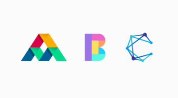
Three graphic designers, colleagues, and friends, Alex Tass, Dalius Stuoka, and Deividas Bielskis decided to put together an A-Z alphabet series made from logo symbols, lettermarks, and monograms they've created over the years. All three designers have been in the industry for over 10 years, and have worked with a variety of clients, brands, and agencies. For this project, … [Read more...]
31 Beautiful Gradient Logos For Design Inspiration
When Apple launched iOS 7 in 2014, it not only changed the face of UI design, but also branding, graphic and logo design. Skeuomorphic interfaces and glossy app icons were out. Flat design, vibrant colors and gradients were in. In 2016, when Instagram came up with a bright new look and multicolored logo, a vast majority of its users hated the vivid gradients and demanded the … [Read more...]
What Logo Styles Do Consumers Trust Most?
SurveyMonkey and infographic maker Venngage surveyed over 1000 adults living in the U.S. on what logo styles they trusted the most. The respondents were shown a series of logos for imaginary companies in six different industries: Jewellery retail, education, financial services, law firm, news/media, and technology. Six variations of each logo were presented: Icon dominant, … [Read more...]
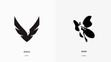
Designer Creates Clever Negative Space Logos That Visualize The Name Of The Company
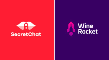
Lithuania-based graphic designer Leo has come up with a series of clever logos that combine the name or initials of the company into one unique symbol using negative space. The logo in each case visually represents the name of the company. For example, the logo for Secret Chat is a pair of lips with a padlock in the negative space between the lips. The logo for Wine Rocket … [Read more...]
What Logos Of Famous Painters Would Look Like
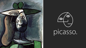
Brazilian art director Milton Omena has come up with an interesting project that imagines what logos of famous painters from Renaissance, Impressionist, and Modern Art periods would look like. He studied the painting styles and personalities of legendary artists like Leonardo Da Vinci, Vincent Van Gogh, Pablo Picasso, and created a unique symbol for each one of them. Milton, … [Read more...]
This Brilliant Free Tool Tests Your Logo For Balance, Scalability, Color Blindness, And More
Kentucky-based designer Brandon Shepherd from Studio Bros. has come up with a useful online tool called Logo Lab that assesses your logo on 10 key factors like balance, scalability, color blindness, recognizability, etc. All you have to do is upload your logo in PNG or SVG format, and the app will display what your logo looks like under each parameter. You can then evaluate … [Read more...]
Designing Logos For Companies With Long Names Can Be Tricky, Here Are 25 Great Examples
When it comes to logo design, a long company name can be quite a challenge. You want to create a logo that's clean and memorable, but lengthy lines of text can look cluttered and uninspiring. Professional designers use different techniques to solve the visual challenges of a long brand name. These include: 1. Splitting the name into two or three lines 2. Using different … [Read more...]
Designer Creates Clever Logos By Combining Two Different Things Into One
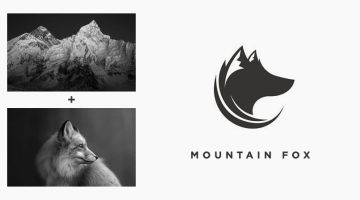
Indonesian designer Rendy Cemix has come up with an interesting project in which he combines the shapes of two completely different objects into one unique logo. The logo in each case is a visual representation of the brand name. For example, the logo for Mountain-Fox is an aesthetically designed symbol of a fox with ears that look like snow-capped peaks. The logo for … [Read more...]
27 Clever Ambigram Logos That Look The Same When Viewed Upside Down
An ambigram is a typographical design or symbol consisting of text modified in such a way that it can be read in different orientations - inverted, rotated, mirror-image, etc. For example, the logo of Sun Microsystems (no. 4 below) is a brilliantly-designed ambigram that reads 'SUN' from all directions. Another famous example is the New Man logo (no. 6 below), designed by … [Read more...]
Designer 3D Prints Famous Logos Into Items You Can Use Everyday
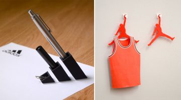
Japanese designer Taku Omura has come up with an amusing project in which he 3D prints famous brand logos into everyday items you can use at home or office. For example, Omura 3D-printed the Adidas logo and turned it into a pen stand. Louis Vuitton's 'LV' monogram logo was turned into a card holder by elongating the 'V'. The Air Jordan logo was turned into a clothes hanger, … [Read more...]
Designer Creates Clever Logos By Combining Two Or More Different Shapes Into One
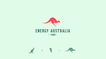
Kochi-based designer Shibu PG has come up with a series of interesting logos in which he combines the shapes of two or more different objects and letters into one unique logo. The logo in each case is a visual representation of the brand name. For example, the logo for Energy Australia is a combination of the shape of a kangaroo and the energy symbol ⚡️. The logo for … [Read more...]
Top 20 Car Logos Of All Time
From American muscle to European exotics, everyone has a favourite car they would like to own one day. But do you also have a favourite car logo? We asked a panel of designers and art directors to rank the best car logos of all time, strictly from a design perspective, not in terms of brand value. Check out the results below and tell us your favourite in the comments. … [Read more...]
This Simple Chart Explains What Common Terms In A Logo Design Brief Mean
What do clients mean when they say their logo needs to be modern, luxurious, or subtle? Dubai-based logo designer Jefferson Pascual has created a handy infographic that uses an illustration of a bird to explain common terms used in logo design briefs. The chart features bird logos designed in different styles (eg. young, modern, feminine) with their visual opposites on the … [Read more...]
FIFA World Cup Logos From 1930 – 2022, Which One’s The Best?
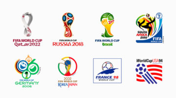
The FIFA World Cup is the most widely viewed and followed sporting event in the world. The logo for the 2022 World Cup in Qatar has been unveiled and we decided to do a round-up of all the World Cup logos from 1930 - 2022. During the first four World Cups from 1930 - 50 (there were no tournaments in '42 and '46 due to World War II), the organizers created posters instead of … [Read more...]
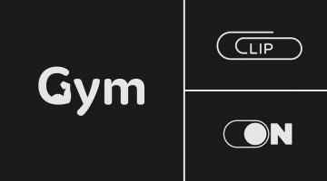
23 Clever Typographic Logos Of Common Words We Use Every Day
Colombo-based graphic designer Samadara Ginige has come up with a series of typographic logos of common nouns and verbs we use every day. The project, titled "Verbicons", visualizes the meanings of the chosen words by using symbolism, negative space, or by adding geometric elements to the letters. For example, the letter 'c' in the word 'cash' looks like a dollar bill. The … [Read more...]
Clever Logos Of Letters A To Z Based On Common Words That Start With Them
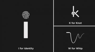
UK-based graphic designers Liam + Jord undertook a 36-day typography challenge to create logos for every letter of the alphabet based on common words that start with them. For example, the letter 'b' has been designed to look like a book, the letter ‘f’ looks like a flag, 'w' looks like a whip, and so on. The objective was to use the shapes of the letters to visually … [Read more...]
Designer Creates Clever Logos That Visualize The Name And Business Of The Company
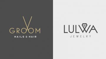
Kuwait-based graphic designer Rami Hoballah has come up with a series of minimalist logos that combine the name and the product (or service) of the company into one unique symbol. The logo in each case visually represents the brand name and the nature of its business. For example, the logo for Groom Salon is a pair of scissors made with the two o's in the word 'Groom'. The … [Read more...]
Designers Challenge Themselves To Create A Typographic Logo Every Day For A Year, And They’re Pretty Cool
UK-based graphic designers Liam + Jord undertook a 365-day challenge to create one new typographic logo of a common word we use every day. The objective was to visually represent the meanings of the words by using symbols, negative space, or by adding geometric elements to the letters. For example, the letter 'i' in the word 'drive' looks like a gear stick, the letter 'f' in … [Read more...]
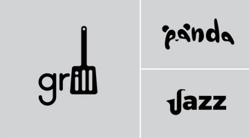
Designer Creates Clever Logos That Visually Represent The Name And Business Of The Company
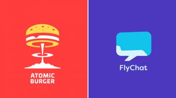
Lithuania-based graphic designer Leo has come up with a series of minimalist logos called "Smart Logos" that combine the name and the product (or service) of the company into one unique symbol. The logo in each case visually represents the brand name and the nature of its business. For example, the logo for Atomic Burger is a burger on top of a mushroom cloud. The logo for … [Read more...]
Designer Offers To Create Free Logos For Anyone, Ends Up Creating 50 Logos In 32 Hours Non-Stop
Russian graphic designer Di Buenio undertook a personal logo design challenge titled Logotyposhnaya, in which, he offered to create a free logo for any existing company or brand in 30 minutes. He published a post on his Facebook page and received over 70 applications in the first two hours itself. At the end of the challenge, Buenio had created 50 logos, working non-stop for … [Read more...]
Designer Creates Clever Alphabetical Logos Based On Animal Names And Shapes
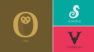
Lebanese graphic designer Rami Hoballah, has come up with an amusing typography project titled 'Animals Alphabet' that showcases letters of the alphabet in the shape of animals. Each letter corresponds to the name of the animal. For example, 'a' looks like the head of an ant, 'b' looks like a bee, 'c' looks like a crab, and so on. Rami used Adobe Illustrator to create these … [Read more...]
Designer Challenges Himself To Create A Typographic Logo Every Day For A Year, And They’re Pretty Cool
Stockholm-based graphic designer Daniel Carlmatz undertook a 365-day challenge to create one new typographic logo of a common word we use every day. The objective was to visualize the meanings of the words by using symbolism, negative space, or by adding geometric elements to the letters. For example, the letter 'a' in the word 'search' looks like a search bar, the letter 'j' … [Read more...]
Graphic Designer Substitutes Wordmarks In Famous Logos With The Fonts They Use
Italian graphic designer Emanuele Abrate has come up with an interesting project titled 'Logofonts' that features wordmarks of famous logos substituted with the name of the fonts they use. For example, the Nike wordmark in their swoosh logo has been substituted with 'Futura' written in the same italic style. The WhatsApp wordmark has been substituted with 'HelveticaNeue'. … [Read more...]
6 Important Logo Design Principles Every Designer Should Know
Before you start a logo design project, you need to know who the logo is for? Who is the target audience? The logo will define what the business is all about. Should it be masculine or feminine, traditional or modern, exclusive or inclusive? The colors, typography, and geometry of the symbol will depend on all these factors. DesignMantic has come up with a handy infographic … [Read more...]
Fonts Used In Famous Logos (With Download Links)
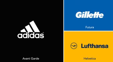
Ever wanted to know the names of the fonts used in the logos of famous brands like Adidas, Calvin Klein, FedEx, Gillette, Jaguar, Lufthansa, Omega, Rolls-Royce, Visa, etc.? We've compiled an alphabetical list of 60 well-known logos with their corresponding fonts and download links. In some cases, the fonts have been tweaked or edited from their original form to create a … [Read more...]
5 True Stories Behind Famous Hollywood Studio Logos
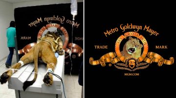
Before the opening credits of a film, there is usually a short animation of the logo of the film studio (also known as production logo). Some famous examples include DreamWorks, Paramount, Columbia, MGM, and Disney. You must have seen the logos of these major film studios many times, but have you ever wondered about the story behind them? For example, why does the DreamWorks … [Read more...]
All You Need To Know About Wix Logo Maker
The digital graphics industry is filled with thousands of logo makers. But not all of them are up to the mark and suitable for professional branding. In this article, we take a look at the online logo maker by Wix, the second largest website building platform after WordPress. Wix Logo Maker is a free logo maker that lets you create stunning logos with its simple and … [Read more...]
Famous Logos Get Transformed Into Female Versions To Honour Women
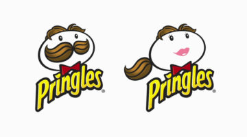
Creative Equals, an organisation dedicated to diversity in the creative industries, decided to replace male characters of famous brand logos with female versions for Women's Day this year. The objective was to raise awareness about the lack of female mascots in branding. According to the organization's founder and CEO Ali Hanan, 89.5% of design directors are male, which … [Read more...]
Designer Creates Clever Brand Logos By Combining Two Different Objects Into One
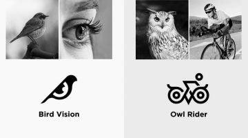
Kochi-based designer Shibu PG has come up with an interesting project in which he combines icons of two different objects into one unique logo based on the brand name. The logo in each case is a visual representation of the brand name. For example, the logo for Bird Vision is an aesthetically designed symbol of a bird and an eye. The logo for Owl Rider is a clever … [Read more...]
31 Useful Design Techniques For Creative Two-Letter Logos
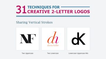
Two-letter logos are one of the most popular logo styles in the world. They're memorable because they use the brand's initials to form a unique symbol. When executed properly, a two-letter logo conveys power, luxury, style, and exclusivity. Some of the world's most well-known brands like General Motors, Volkswagen, Hewlett-Packard, General Electric, LG, Warner Bros., Louis … [Read more...]
5 Crucial Things To Consider When Hiring A Freelance Logo Designer
Every business needs a great logo, especially in the digital age where logos often play a major role in a company’s overall marketing strategy. However, securing a great logo first requires you to find a great logo designer, and this step is vitally important if you hope to come up with a creative, original logo that will portray the right message to your customers. Before … [Read more...]
Graphic Designer Pranks Restaurant Owner With Phallic Logos In Response To Job Ad
A couple who opened an Italian restaurant placed an ad on Craigslist looking for a graphic designer who could design their restaurant logo, menu, and various other things. A ‘cocky’ graphic designer (pun intended) decided to prank the restaurant owners with a series of phallic logos that left them speechless. Check out the conversation below. … [Read more...]
20 Worst Ad And Logo Placements On Vehicles

Ad and logo placements on vehicles can be tricky, specially on vans and buses with sliding doors. Designers need to evaluate and visualize how the name, logo, or advertisement will look when the doors slide open. Here's a series of images that explain what we're trying to say. … [Read more...]
How Your Brain “Sees” A Logo, According To Science
When it comes to consumer behaviour, logos play an important psychological role in influencing decision making, especially when there is lack of time or information. It takes just 400 milliseconds for our brain to recognize a logo and trigger a response based on our preferences and previous experiences with the brand. Brands that we like elicit activity in the part of the … [Read more...]
- « Previous Page
- 1
- 2
- 3
- 4
- …
- 7
- Next Page »