• Home
  • Design
  • Advertising
  • Inspiration
  • Tools
  • Buzz
  • Follow Us ▾
    • Facebook
    • Facebook Group
    • LinkedIn
    • LinkedIn Group
    • Threads
    • Instagram
    • Pinterest
    • Twitter / X

Digital Synopsis

Design, Advertising & Creative Inspiration

  • Photoshop
  • Logo Design
  • UI/UX
  • AI
  • Web Design
  • Typography
  • Photography
  • About Us
  • Advertise

156 People Drew Famous Logos From Memory. Which Logos Were Remembered Most Accurately?

You’ve seen the Apple logo ten thousand times. Now try to draw it from memory. Which way does the leaf point? Is there a stalk? Suddenly you’re not so sure.

That uncertainty is the whole point. We look at famous logos constantly without ever truly seeing them, and the gap between recognition and recall turns out to be enormous. A logo can be instantly familiar and almost impossible to reproduce at the same time, which is exactly what makes this experiment so revealing about how brand memory actually works.

So someone decided to test it. Custom signage firm Signs.com asked 156 Americans, between the ages of 20 and 70, to draw 10 famous brand logos as accurately as possible from memory. No visual aids or hints were provided. The results range from near-perfect renderings to drawings so far off they’re almost unrecognizable, and the pattern hiding underneath them says a lot about what makes a logo stick.

Here’s the twist most people get wrong. The logos we see most often aren’t the ones we remember best. Familiarity breeds a strange kind of blindness, where the brands plastered across our daily lives are frequently the ones people butcher when asked to draw them from scratch. Fame and accuracy, it turns out, are two very different things.

So before you scroll, take a guess. Out of ten globally recognized brands, which logo do you think people reproduced most accurately from memory? Hold that thought, because the answer probably isn’t the one you’d expect. Here are the results.

10. Starbucks

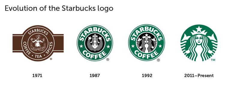
Evolution of the Starbucks logo from the original 1971 design to the current green siren logo

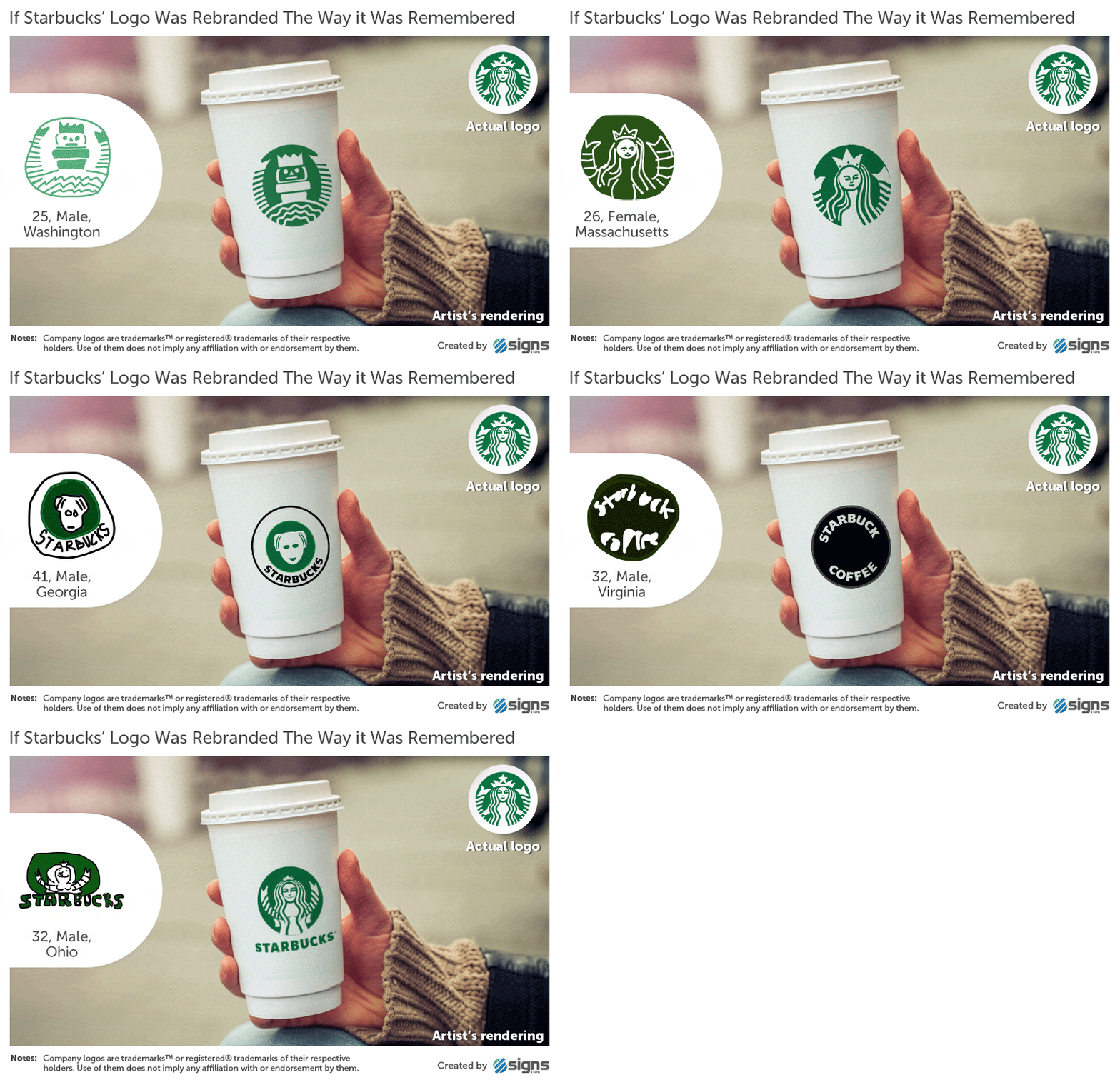
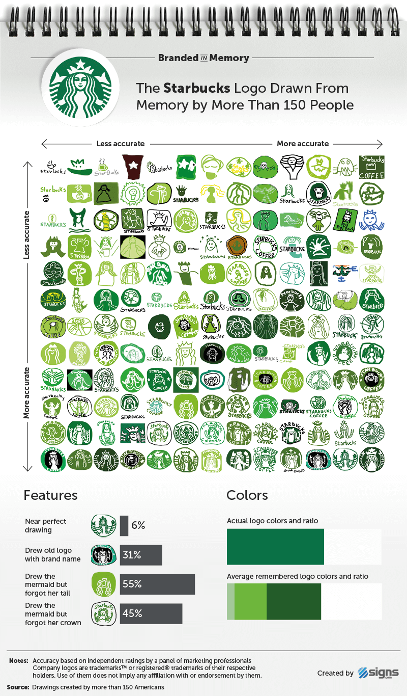
Starbucks logo drawings created from memory by 156 people and ranked from least to most accurate

Artist’s rendering of a Starbucks coffee cup using an inaccurate logo drawn from memory

9. Foot Locker

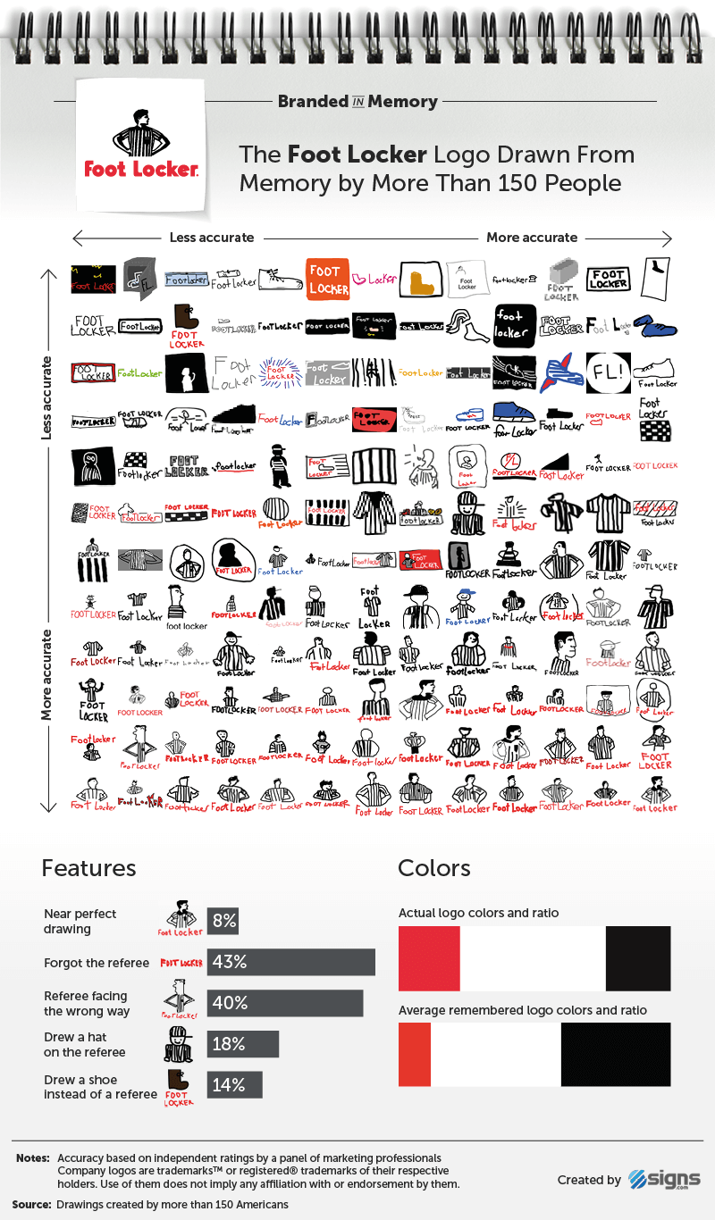
Foot Locker logo drawings created from memory by 156 people and ranked from least to most accurate

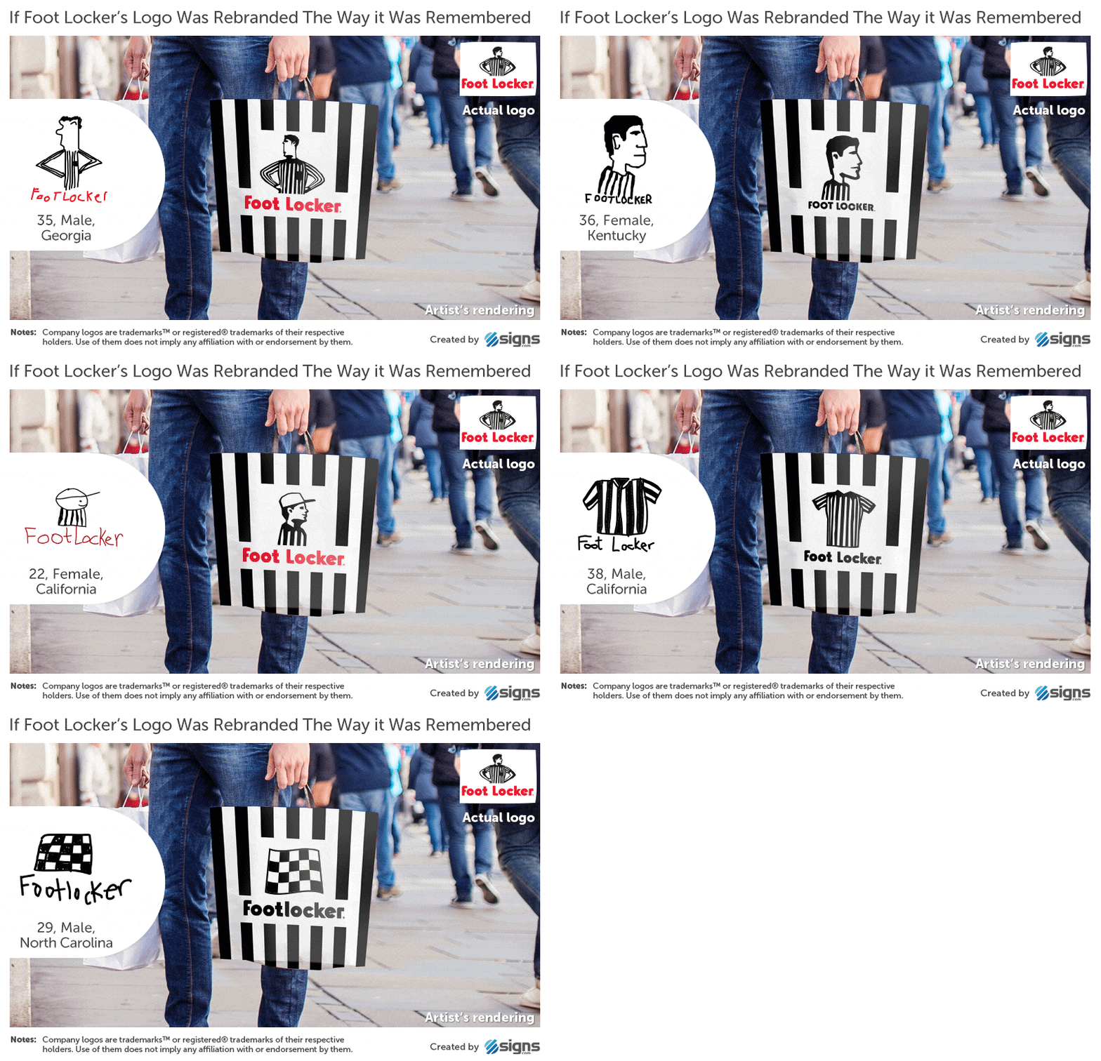
Artist’s rendering of a Foot Locker shopping bag using an inaccurate logo drawn from memory

8. Walmart

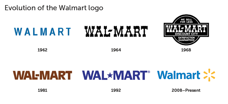
Evolution of the Walmart logo from the 1962 wordmark to the blue and yellow spark design

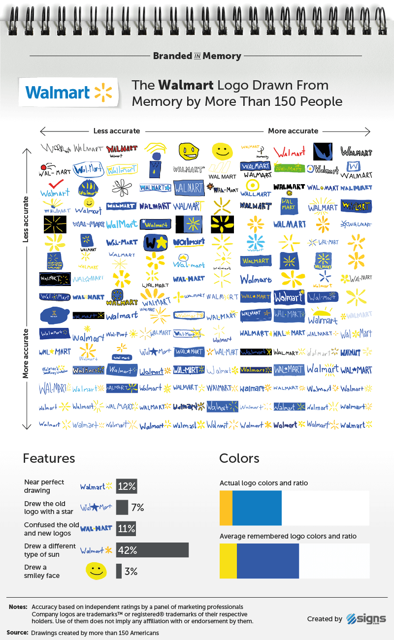
Walmart logo drawings created from memory by 156 people and ranked from least to most accurate

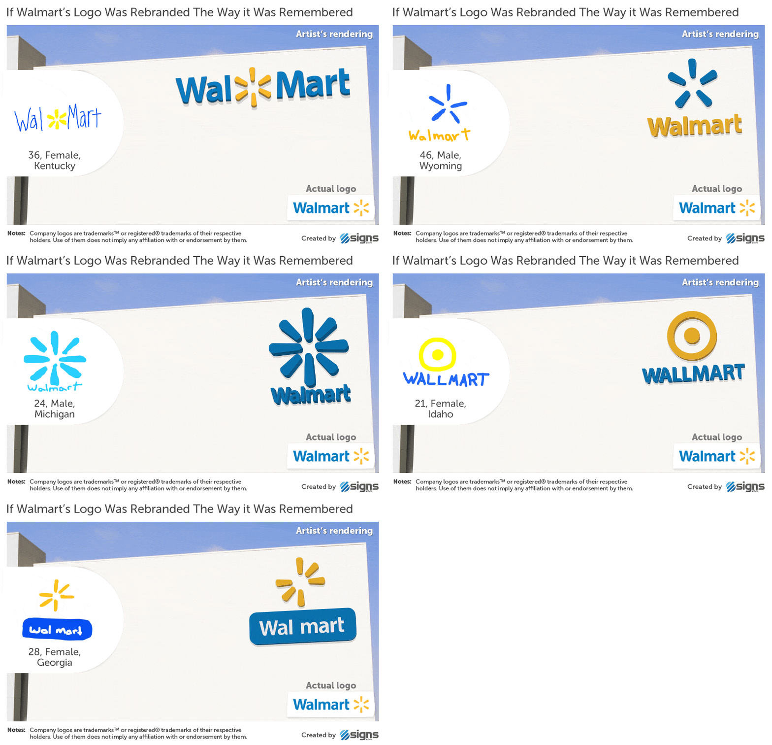
Artist’s rendering of a Walmart storefront using an inaccurate logo drawn from memory

7. Adidas

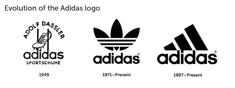
Evolution of the Adidas logo from the 1949 wordmark to the trefoil and three-stripe performance logos

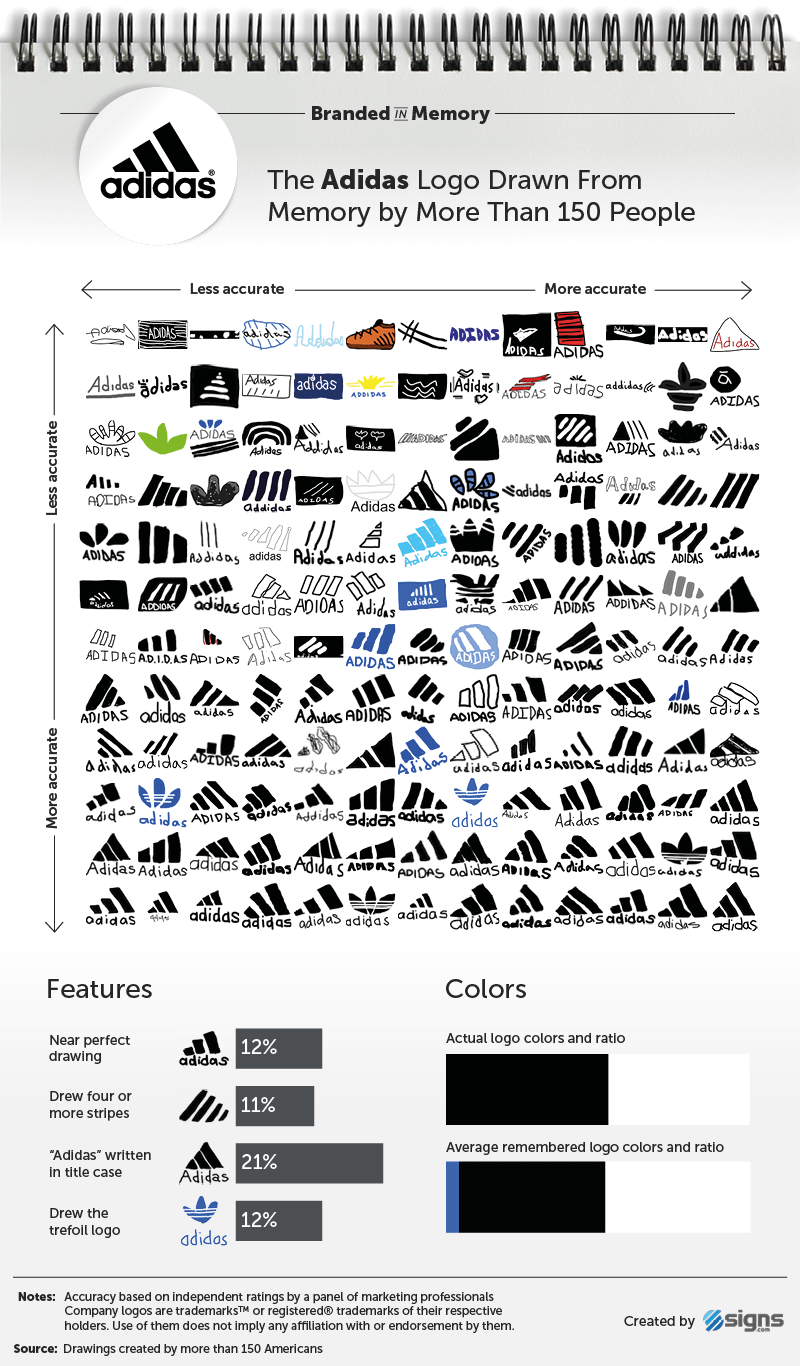
Adidas logo drawings created from memory by 156 people and ranked from least to most accurate

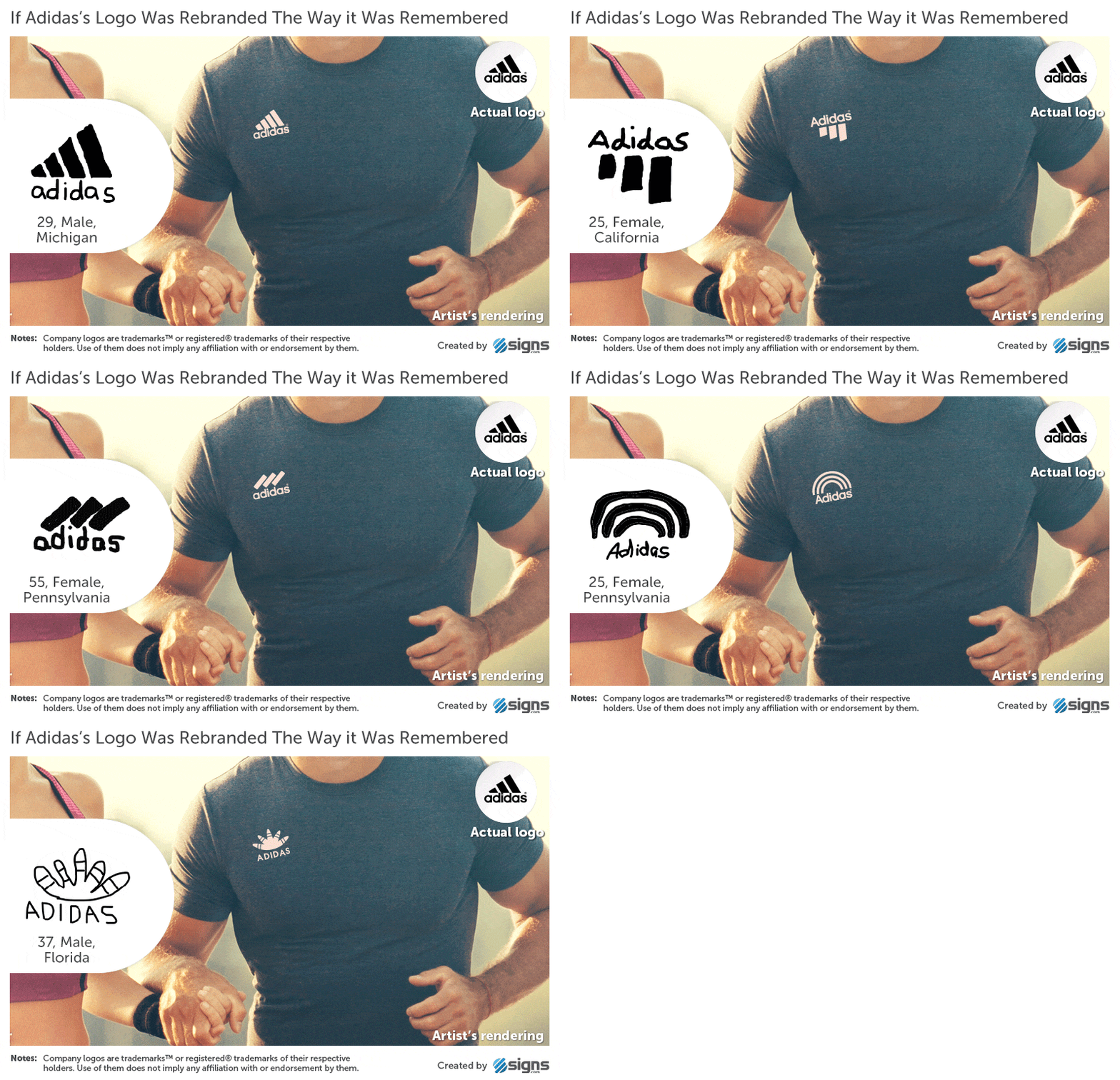
Artist’s rendering of an Adidas shirt using an inaccurate logo drawn from memory

6. Domino’s

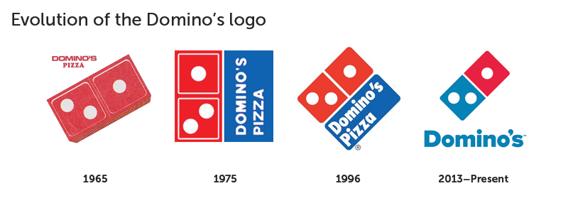
Evolution of the Domino’s logo from the 1965 pizza box design to the current red and blue logo

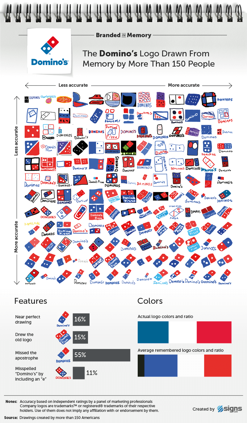
Domino’s logo drawings created from memory by 156 people and ranked from least to most accurate

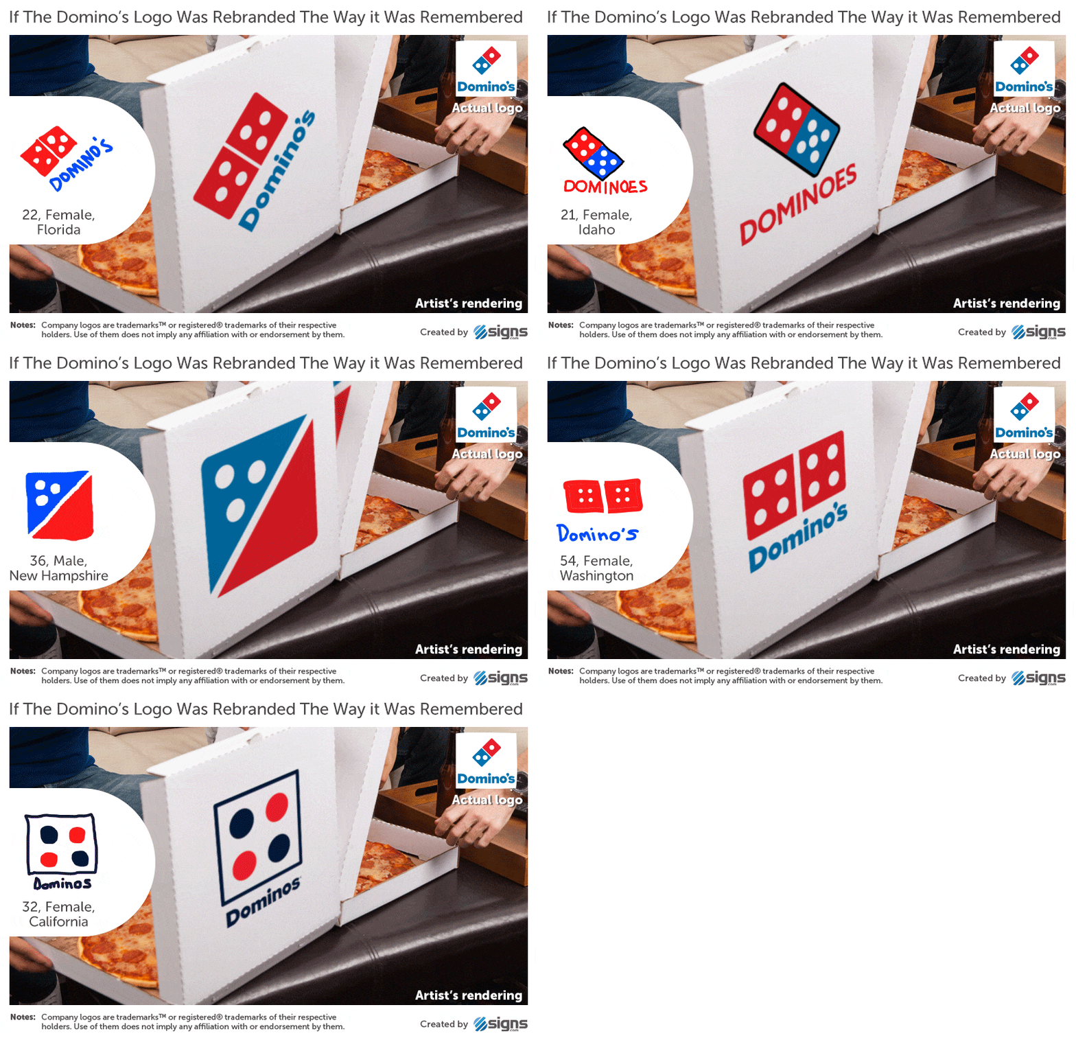
Artist’s rendering of a Domino’s pizza box using an inaccurate logo drawn from memory

5. Burger King

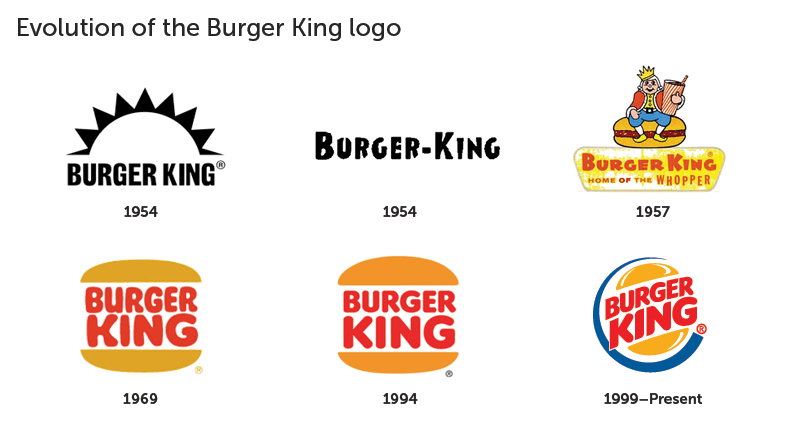
Evolution of the Burger King logo from its 1954 designs to the 1999 circular logo

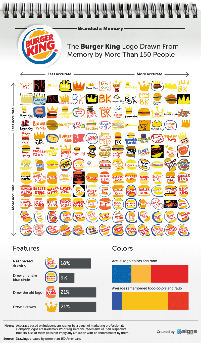
Burger King logo drawings created from memory by 156 people and ranked from least to most accurate

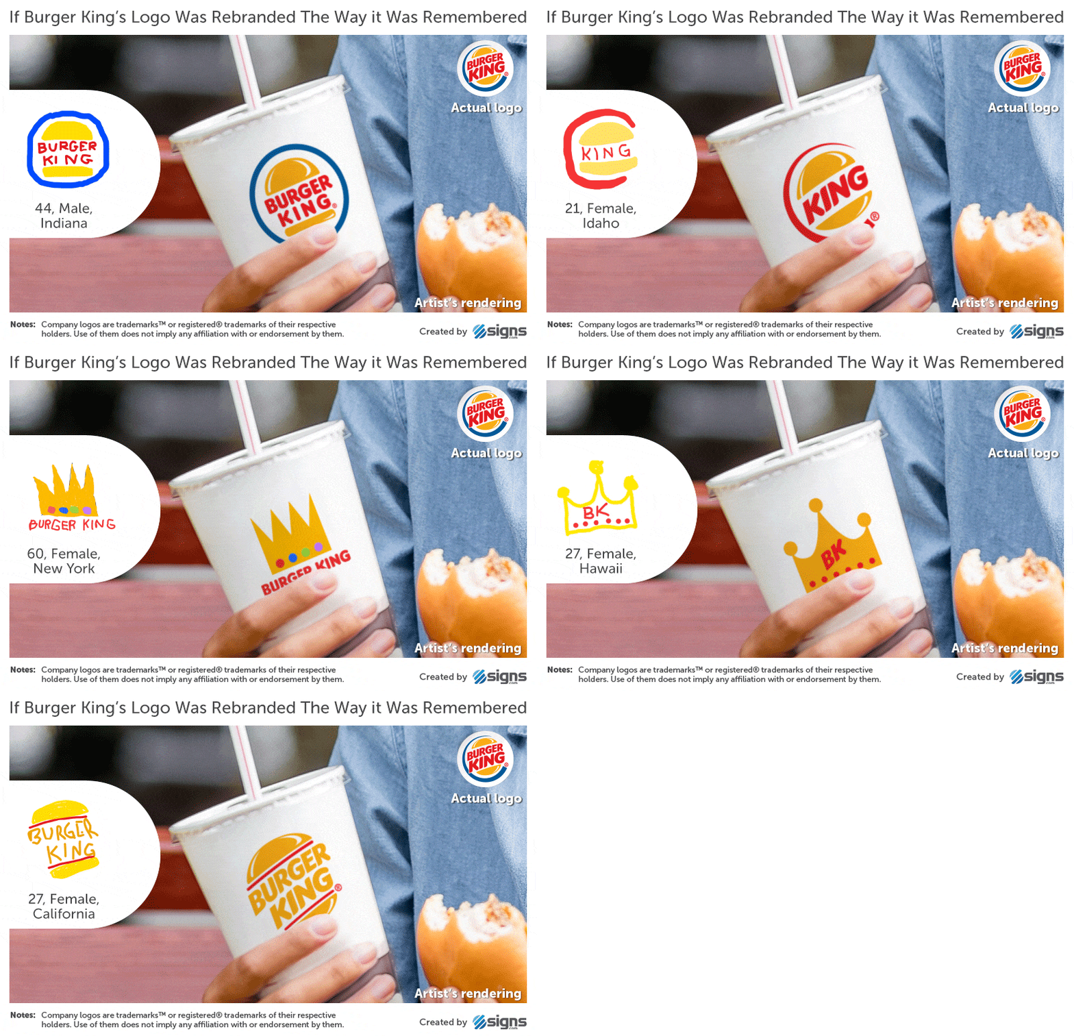
Artist’s rendering of a Burger King cup using an inaccurate logo drawn from memory

4. 7-Eleven

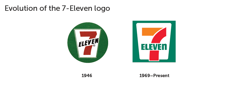
Evolution of the 7-Eleven logo from the 1946 design to the current red, orange, and green logo

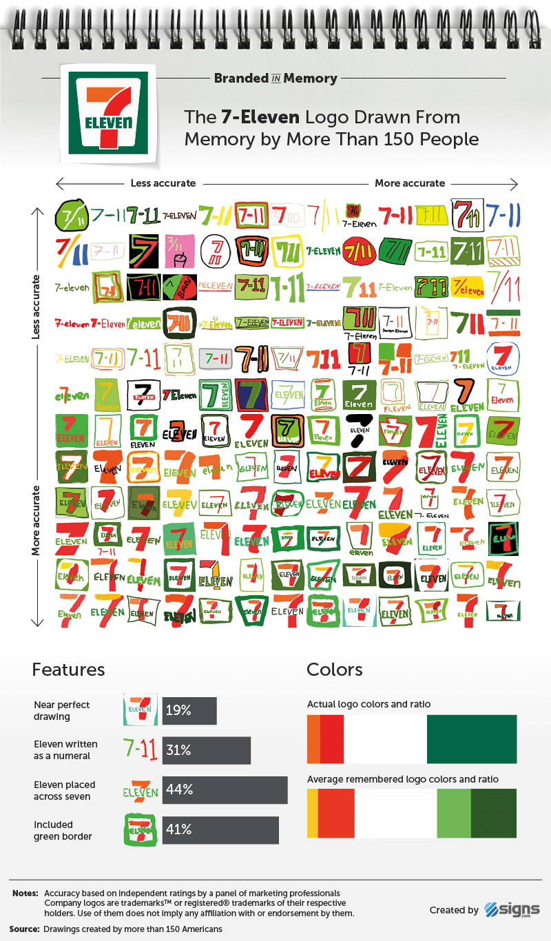
7-Eleven logo drawings created from memory by 156 people and ranked from least to most accurate

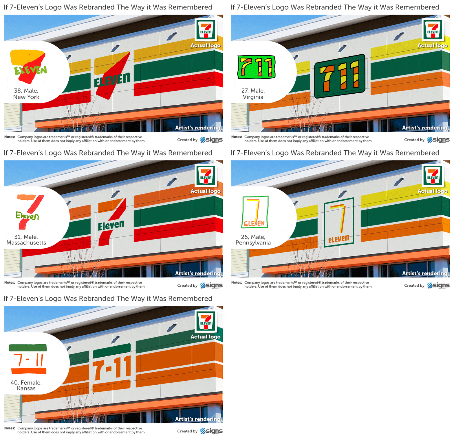
Artist’s rendering of a 7-Eleven storefront using an inaccurate logo drawn from memory

3. Apple

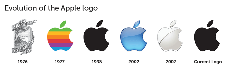
Evolution of the Apple logo from 1976 to the current monochrome design

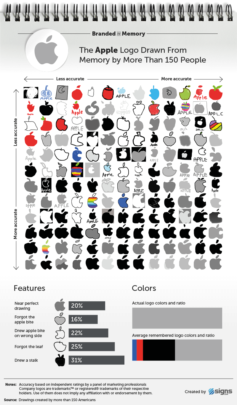
Apple logo drawings created from memory by 156 people and ranked by accuracy

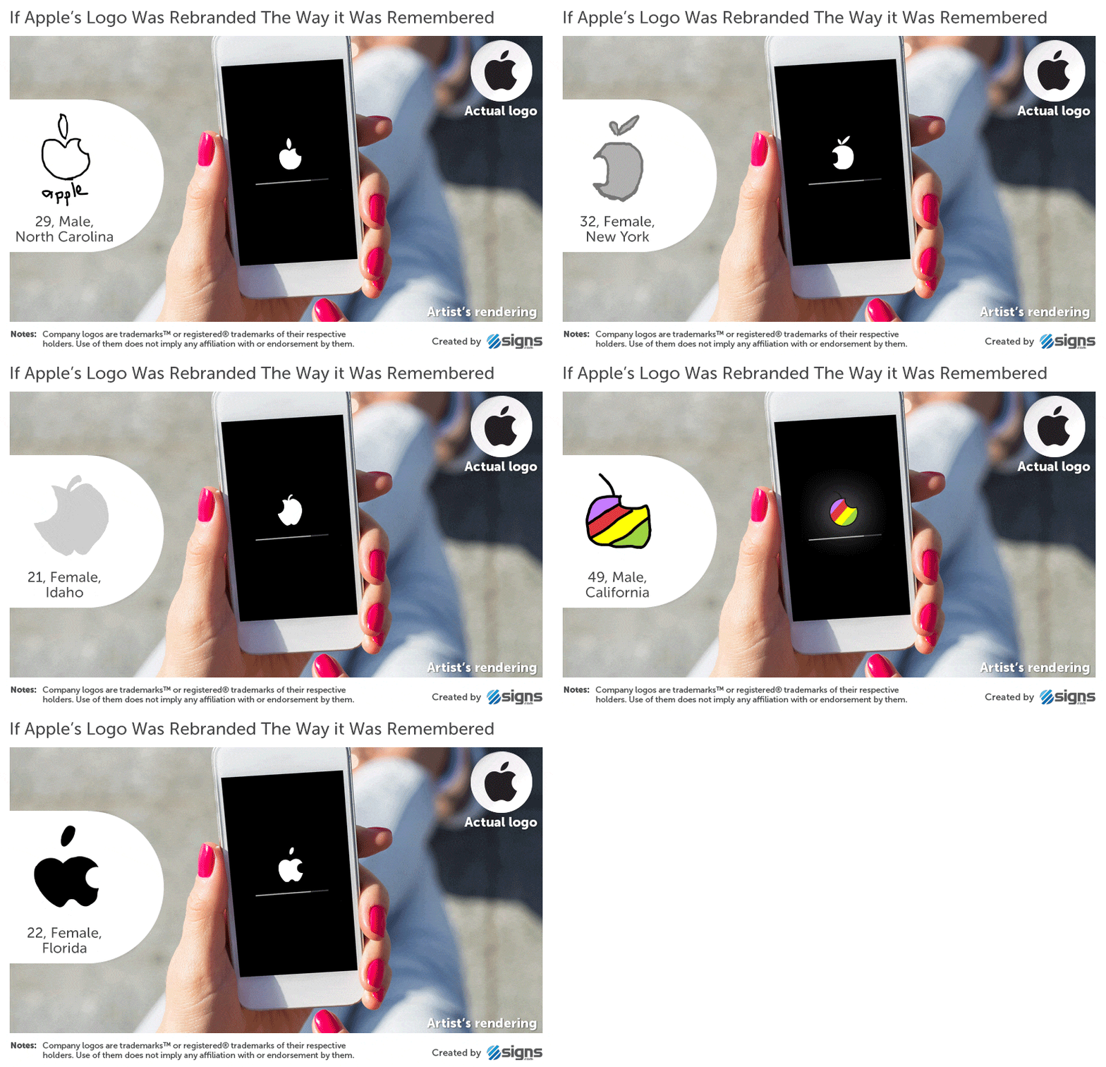
Artist’s rendering of the Apple logo based on an inaccurate drawing from memory

2. Target

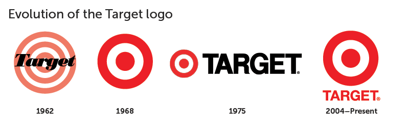
Evolution of the Target logo from the 1962 bullseye design to the current red logo

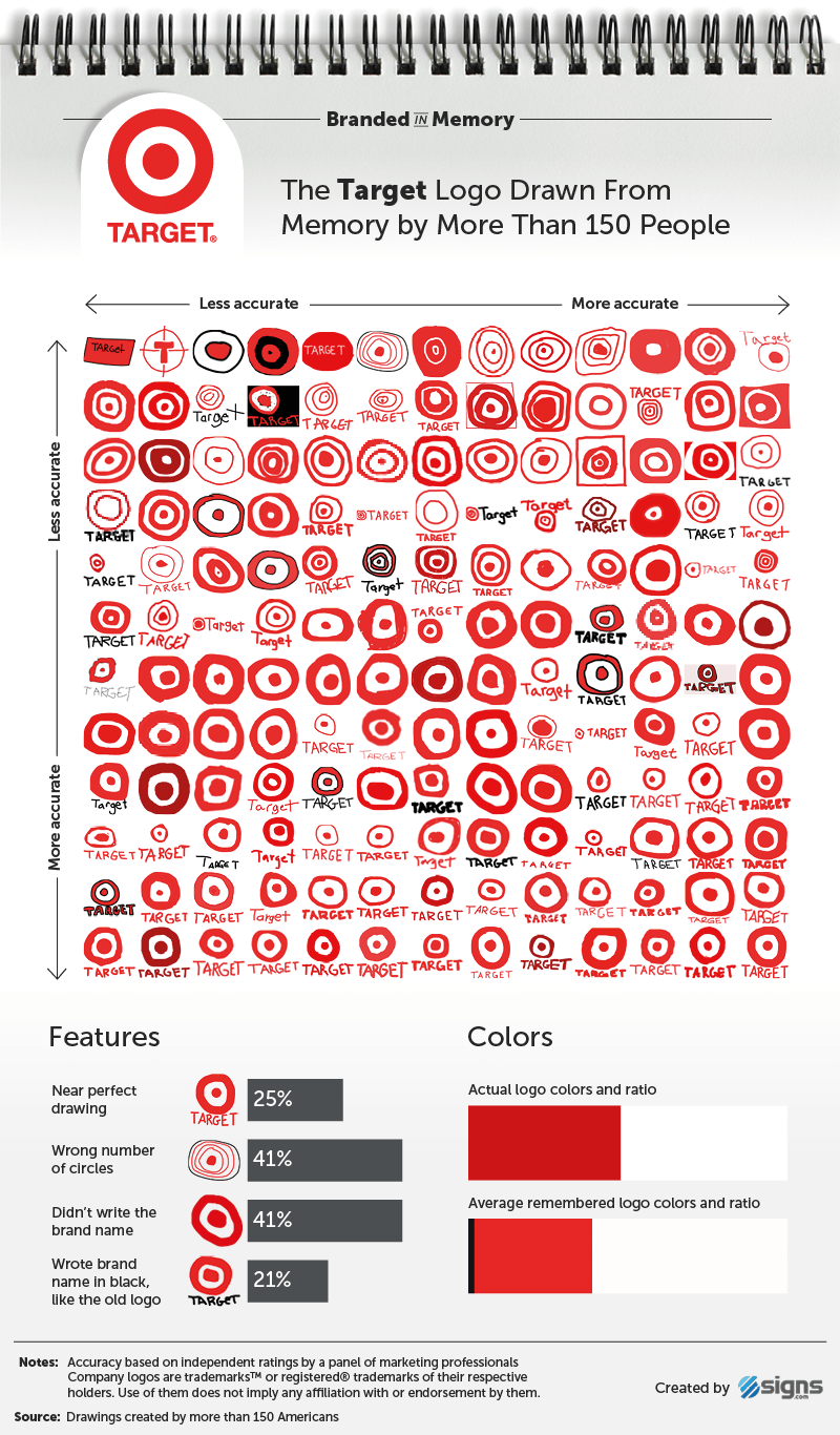
Target logo drawings created from memory by 156 people and ranked from least to most accurate

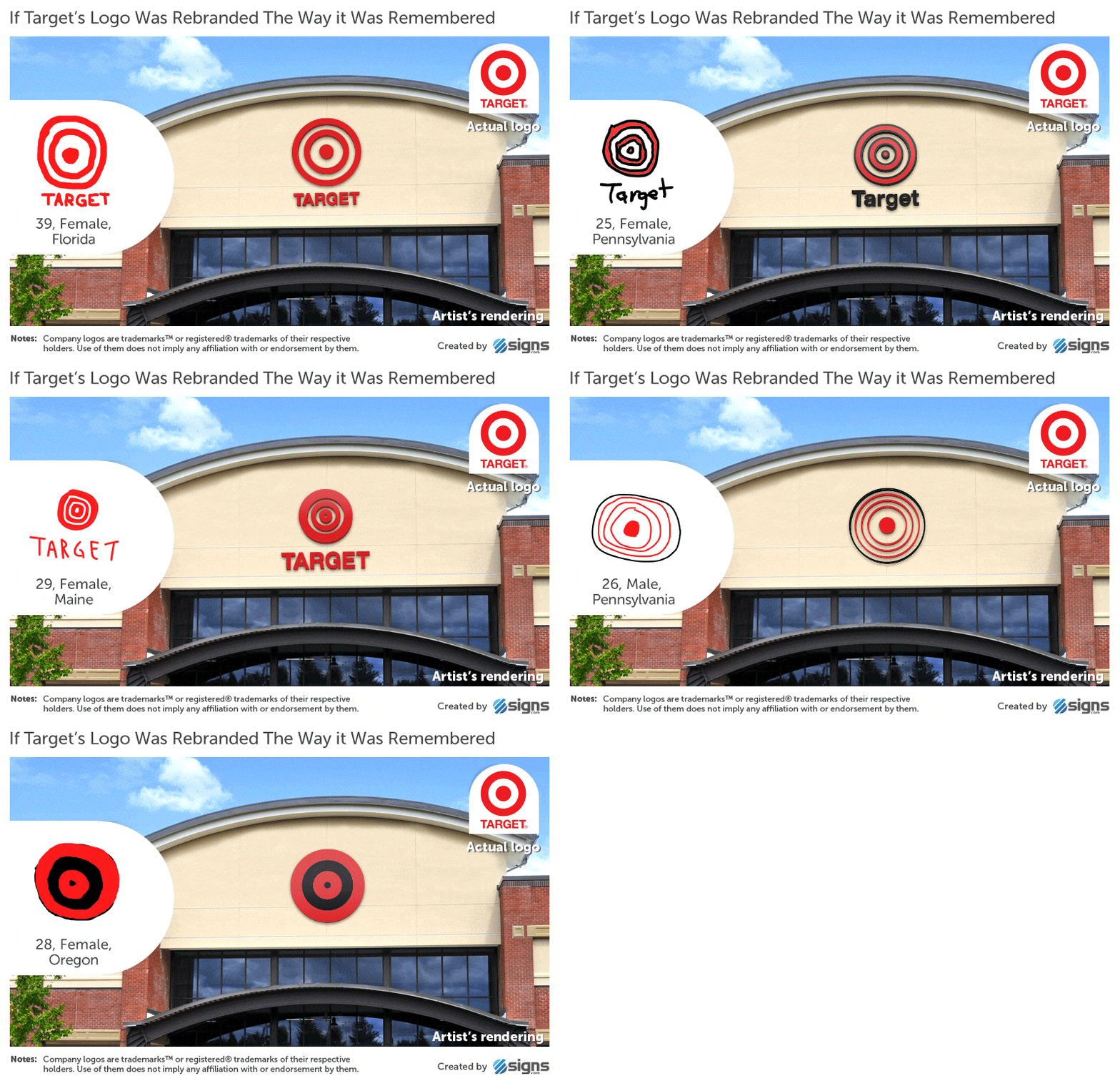
Artist’s rendering of a Target storefront using an inaccurate logo drawn from memory

1. IKEA

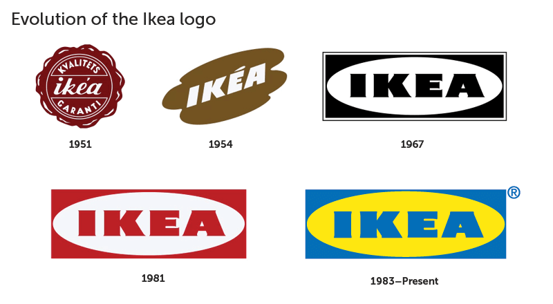
Evolution of the IKEA logo from the 1951 emblem to the current blue and yellow design

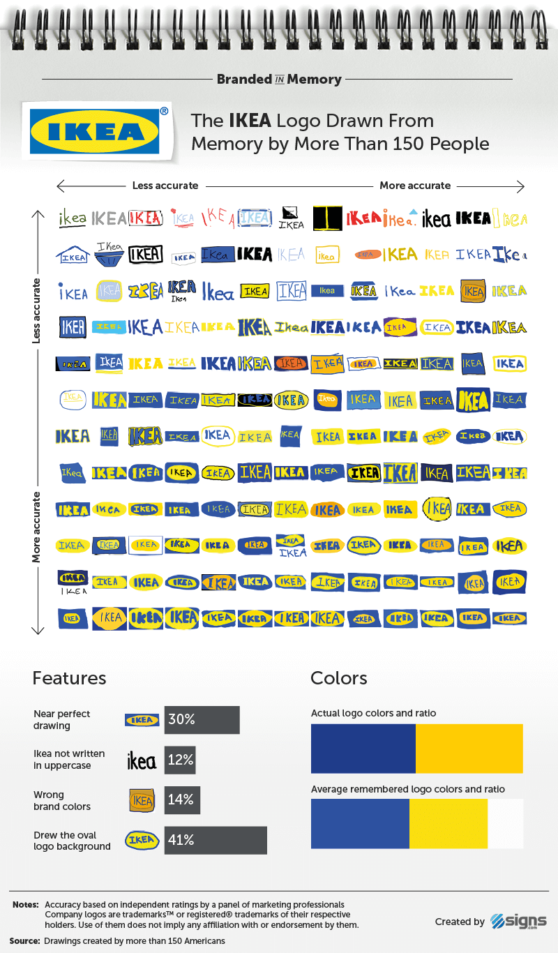
IKEA logo drawings created from memory by 156 people and ranked from least to most accurate

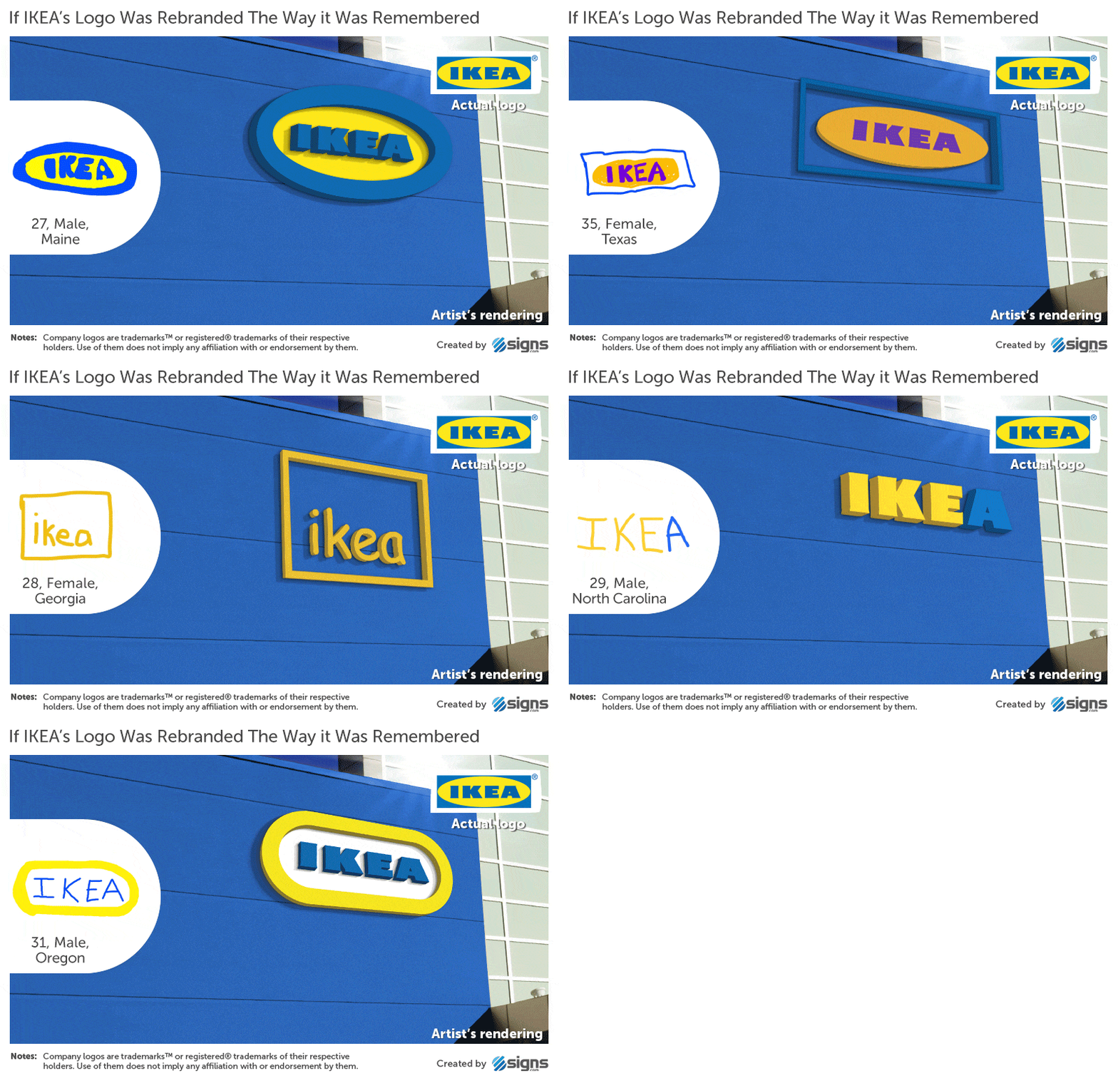
Artist’s rendering of an IKEA storefront using an inaccurate logo drawn from memory

Complete Accuracy Ranking

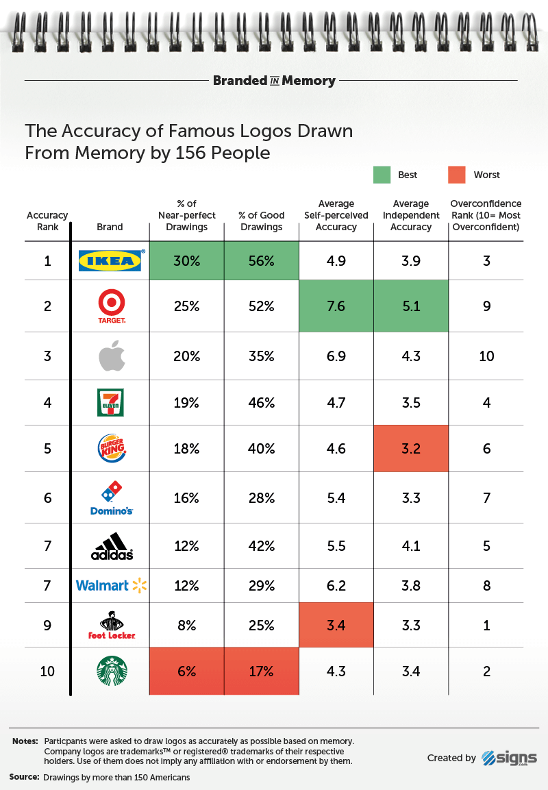
Accuracy ranking of 10 famous logos drawn from memory by 156 people, with IKEA ranked first and Starbucks last

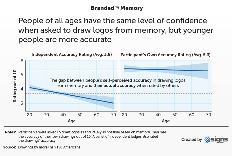
Accuracy and Confidence by Age

Chart showing that younger people drew famous logos more accurately from memory, while confidence remained similar across age groups

So what separates the logos people nailed from the ones they mangled? Look at the top of the leaderboard and a pattern emerges. The logos reproduced most accurately tend to be the simplest — a wordmark in a colored block, a circle inside a circle, a shape with very few moving parts. The ones that fell apart are the detail-rich logos, where a single figure, a specific number of elements, or a precise arrangement has to be remembered exactly right. The more a logo asks you to recall, the more there is to get wrong.

That’s the real takeaway for designers. Recognition and recall are not the same skill. A logo can be beautifully crafted, instantly familiar, and still difficult to reproduce from memory — none of which makes it a weak design. But it’s a useful reminder of what simplicity buys you: marks stripped down to one unmistakable idea survive in memory long after the reference image is gone. In a world where people glance at a brand far more often than they study it, that kind of recall is worth designing for.

Think you could draw these logos any better from memory? Share this post with a friend and voice your views in the comments below.
Don't Miss:

  • stories-behind-hollywood-studio-logos
    5 True Stories Behind Famous Hollywood Studio Logos
  • Famous brand logos and their fonts – PayPal Futura, Google Product Sans, and Post-it Helvetica.
    Graphic Designer Replaces Wordmarks In 30 Famous Logos With The Fonts They Use
  • creative-minimal-typographic-city-logos
    Clever, Minimal Typographic Logos Of Cities
  • honest-logos
    29 Honest Logos Of Famous Companies
  • graphic-designer-craigslist-ad-phallic-logo-prank
    Graphic Designer Pranks Restaurant Owner With Phallic Logos In Response To Job Ad
  • original-famous-brand-logos-history-evolution
    What Logos Of Famous Companies Looked Like When They First Started Out

Share Your Views:

Comments for this post are now closed.
Share your thoughts with 433,000+ design lovers on our Facebook Page.

Popular

  • Graphic Designer Fixes The 9 Worst Logos Ever
  • 50 Incredibly Creative Logos With Hidden Meanings
  • 11 Best And Worst Redesigns Of Famous Logos
  • Top 10 Netflix Documentaries For Graphic Designers
  • 11 Differences Between Designers And Clients

TRENDING

  • Top 20 Graphic Design Trends For 2026
  • Top 10 Logo Design Trends For 2026 And How To Use Them
  • Portfolios Of Designers Who Have Worked At Apple, Google, Meta, And More
  • Designers Are Sharing Their Redesigns Of Famous Logos And Some Of Them Are Better Than The Original
  • “Which Current Graphic Design Trend Will Age Badly?” – Here Are The Top Replies

Follow Us On

  • Facebook
  • Facebook Group
  • LinkedIn
  • LinkedIn Group
  • Threads
  • Instagram
  • Pinterest
  • X / Twitter

Copyright © 2012-2026 Digital Synopsis | Privacy Policy | Affiliate Disclosure | Advertise With Us