Color Psychology In Branding: What Every Color Really Says About Your Brand
Color is the first thing your brain registers about a brand, and it does the job before you’ve read a word or even worked out what you’re looking at. Research suggests people size up a product within about 90 seconds, and as much as 90% of that gut reaction comes down to color. So when a brand picks its palette, it isn’t decorating. It’s making one of the most consequential decisions it will ever make.
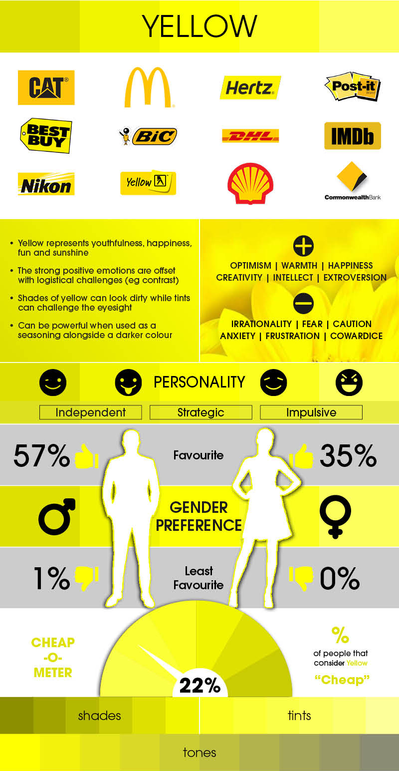
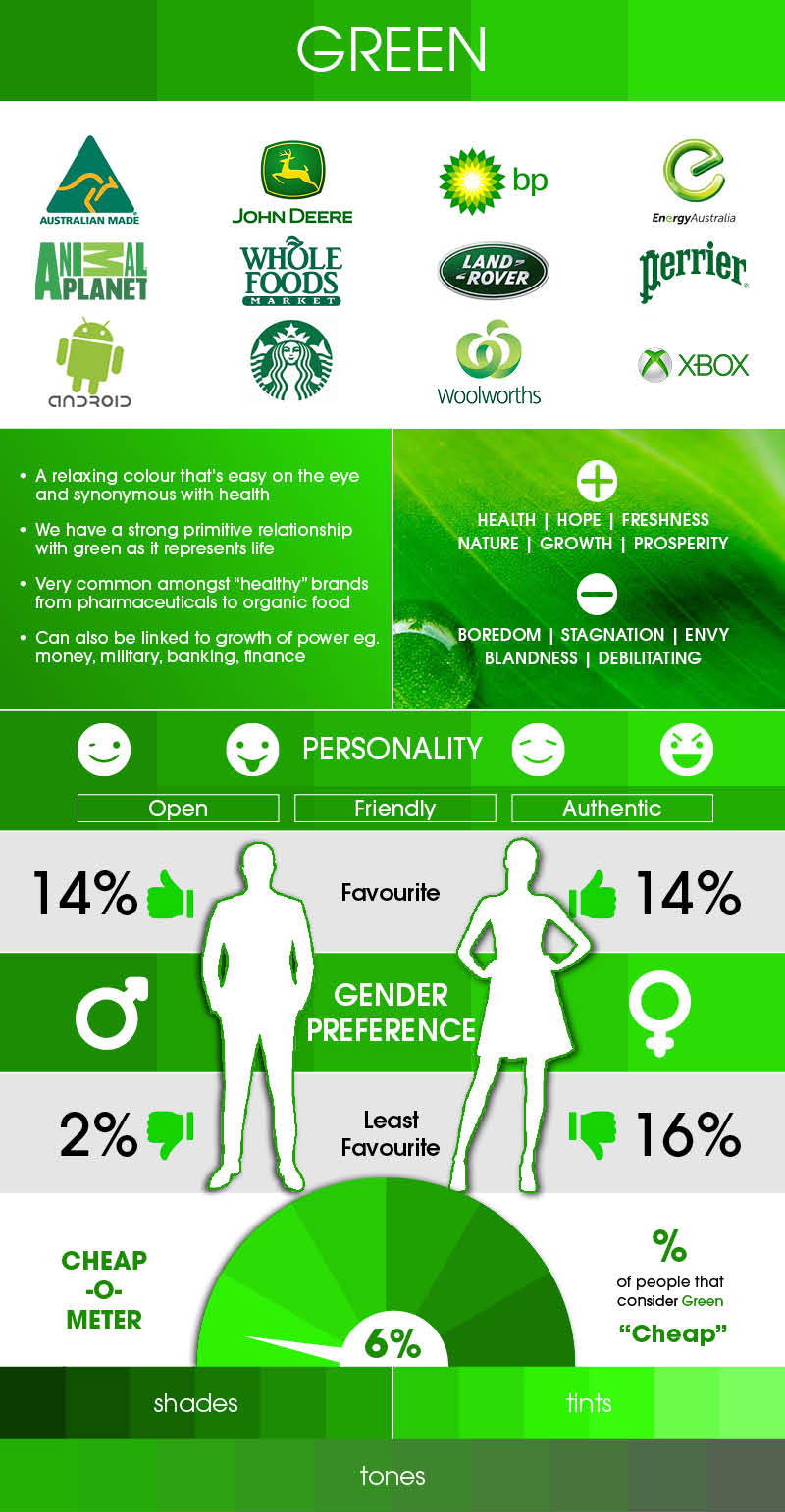
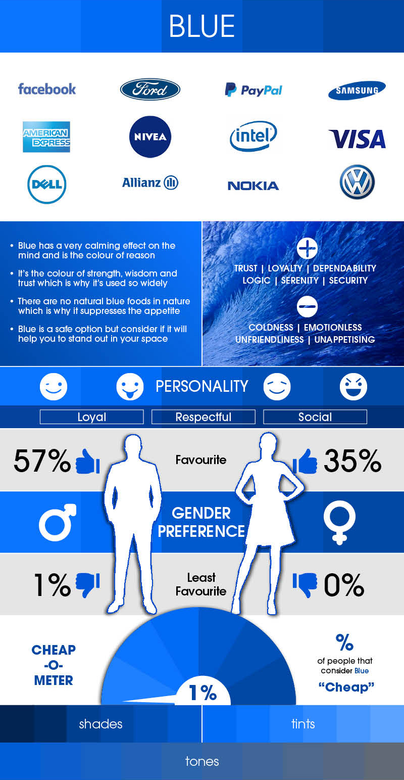
Every great brand is fluent in a language it never speaks out loud. Think about why red owns the fast-food aisle: it nudges appetite and creates a low hum of urgency. Blue turns up everywhere from PayPal to Facebook because it quietly signals trust, logic, and dependability. Green leans on something older and more primal, our link to nature and life itself, which is exactly why organic and pharmaceutical brands reach for it. And yellow grabs the eye faster than almost anything, all youth and optimism and sunshine.
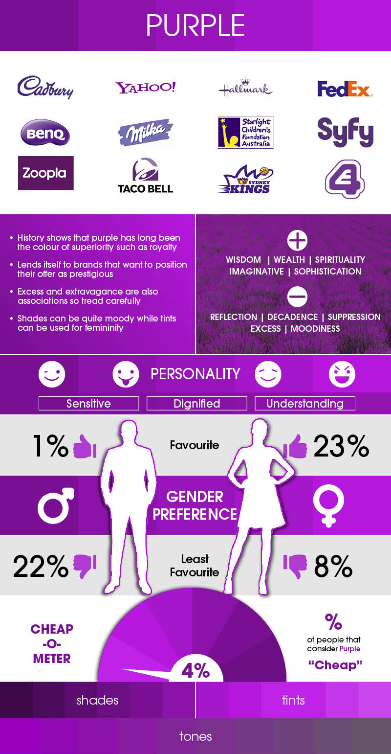
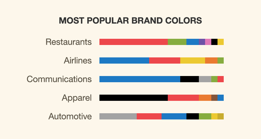
The same color can be an asset in one industry and a liability in the next. None of this works as a universal rulebook. A shade that feels luxurious on a fashion label can look badly out of place on a healthcare brand, and preferences split along gender lines too, with purple landing far better with women than men. A few tones even read as “cheap” to a surprising number of people. Choosing well means thinking past what a color supposedly means and asking who’s actually looking, and where.
The best palette isn’t the prettiest one, it’s the most strategic. So how do you know which color is right for your brand? It starts with understanding what each one is really saying, and who’s actually listening.
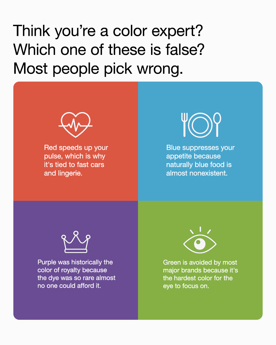
Quiz of the Day
Green is false. The eye focuses on green better than any other color, which is why it feels so calm.
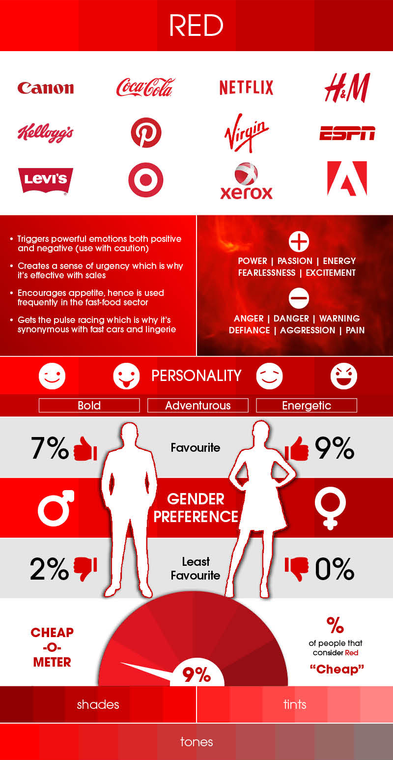
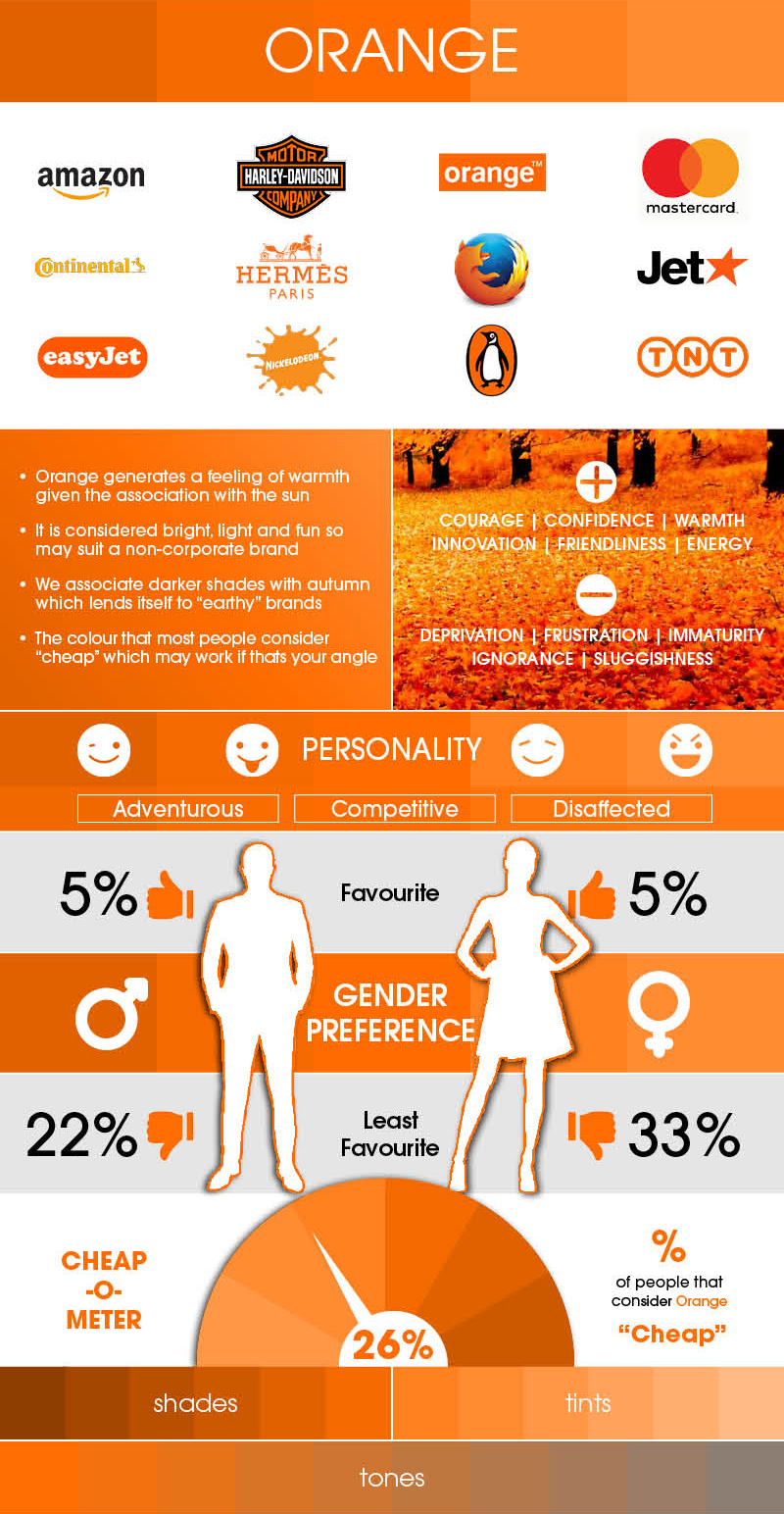
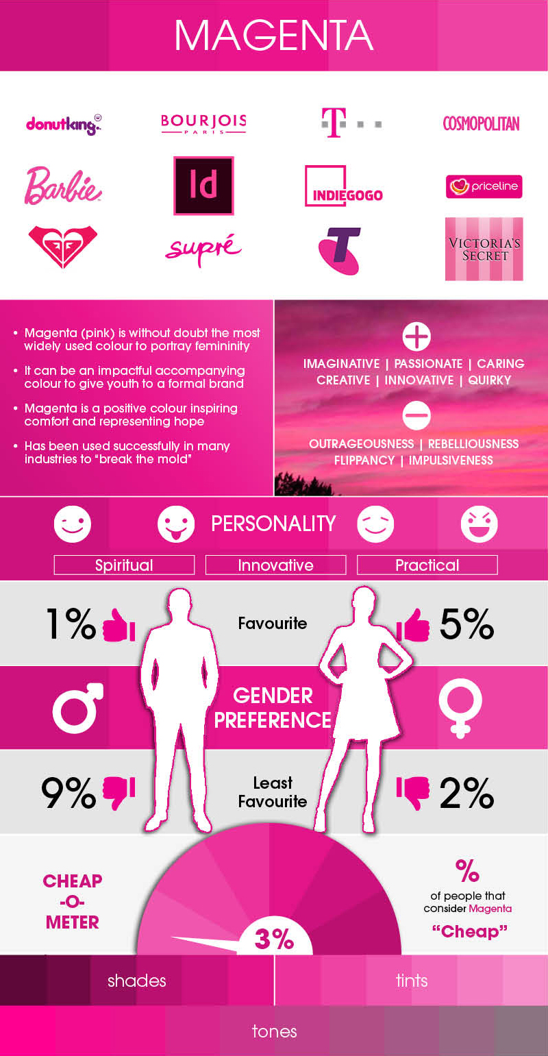
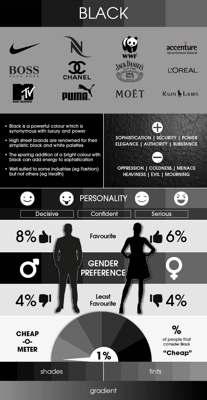
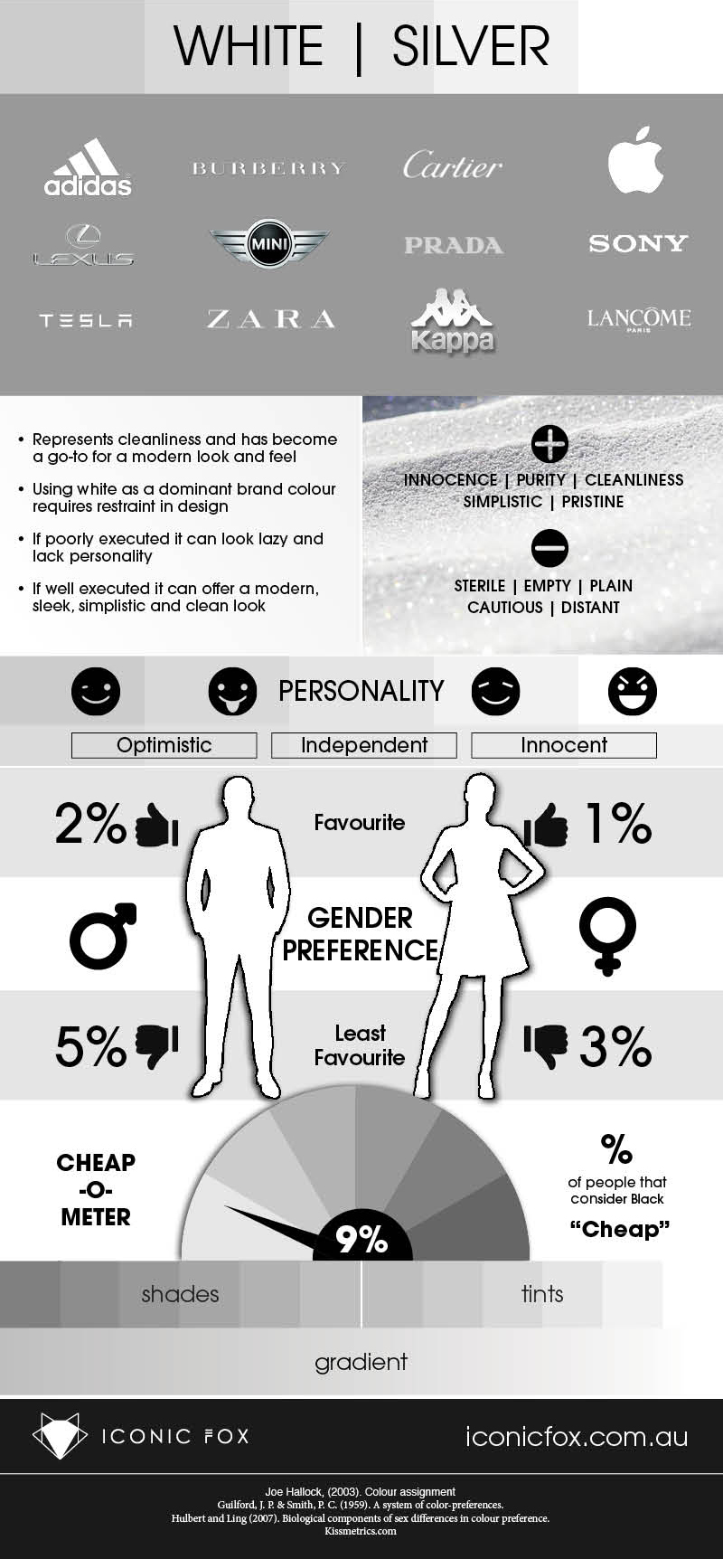
The infographic below, created by Sydney-based branding agency Iconic Fox, breaks down the psychology of every major color, the emotion each one triggers, real brand examples, and the gender preferences behind why certain colors work. A sharp reference for working designers, and close to essential for branding and design students.
1. Red
2. Orange
3. Yellow
4. Green
5. Blue
6. Purple
7. Magenta
8. Black
9. White | Silver
Here’s the paradox worth sitting with: you can only break these rules well once you actually know them. The charts above aren’t a rulebook to obey blindly, they’re the shared language your audience already reads on instinct. Master it, and you get a choice most brands never realize they have.
Fluency in color gives you a move most brands never see. Speak your category’s expected color and you signal that you belong; break from it deliberately and you signal that you’re different. A red-soled shoe and a purple chocolate bar stick in your memory precisely because someone understood the convention well enough to defy it. Color is one of the smallest line items a brand pays for, yet it does more heavy lifting than most of that budget combined. So learn the psychology first, then decide whether to honor it or challenge it. Just never choose by accident.
Share this post with a designer friend, and anyone building a brand worth remembering.