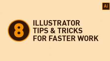
Did you know that the Symbols panel in Adobe Illustrator is a great way of building a collection of artwork that you can quickly draw from in-between projects? Also, the Graphic Styles panel lets you save and reuse an appearance (fill, stroke, opacity, etc.) that you've created. Ctrl/Cmd + D is useful for rapidly repeating the last transformation action performed. … [Read more...]
Legendary Designer Brilliantly Explains How To Charge Clients For Logos And Other Design Services

Chris Do is an Emmy award-winning designer and the visionary founder of Blind—a respected brand strategy and design consultancy based in Santa Monica. With a wealth of experience in the design industry, Chris also leads The Futur, an online platform dedicated to empowering creative professionals with the business skills they need to succeed. In this engaging video, Chris … [Read more...]
22 Graphic Design Mistakes That Novice Designers Make
After a few years in the graphic design business, you realize how important it is to get the basics right. Like following a file naming convention, creating scalable logos, ensuring proper kerning and leading, using high-res images for printing, and so on. … [Read more...]
How Filmmakers Use Color Psychology To Shape Emotion In Movies
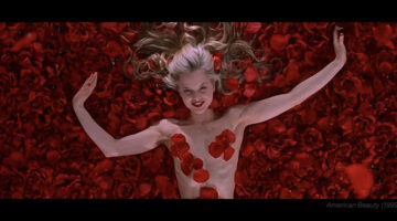
Before a character speaks, before the music swells, before the story reveals its hand, color has already started telling us what to feel. That feeling may arrive as a warning, a memory, a seduction, or a strange unease. Red can make a room feel dangerous, romantic or completely out of control. Pink can turn a scene soft, sweet, artificial or strangely fragile. Yellow can … [Read more...]
10 Clever Typographic Posters Of Scientists And Their Achievements
To celebrate Science Day in India, Mumbai-based graphic designer Kapil Bhagat came up with a series of minimalist typographic posters featuring the names of famous scientists. Each name was designed in a way that it symbolized the invention, theory or achievement that the scientist is famous for. For example, the "a" in Pythagoras is in the shape of a right-angled … [Read more...]
30 Beautiful Color Gradients For Your Next Design Project
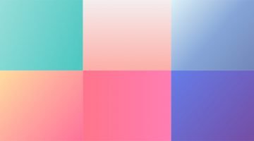
Looking for cool background gradients for your UI? Software and design company Itmeo has created a useful online tool called WebGradients – a free collection of 180 linear gradients that you can use as content backdrops in any part of your website. You can download a .PNG version of each gradient and copy their CSS3 cross-browser codes. Sketch and Photoshop packs are … [Read more...]
Designer Creates Clean, Minimalist Animal Logos And Shares His Design Process
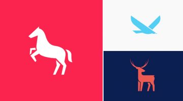
Korean graphic designer Jahng Hyoung joon has come up with a series of minimalist animal pictograms and two short time-lapse videos that show his design process. Though the clips are sped up, it's always good to see the workflow used by the designer and pick up valuable pointers. Check them out below. … [Read more...]
10 Types Of Relationships Between Clients And Agencies
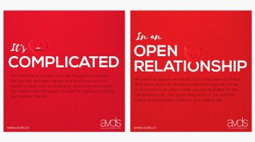
Valentine's day is over but the love-hate saga between clients and agencies continues. Arun Verma Design Studio has come up with a series of valentine-themed images that describe the different types of clients and the relationship they share with their agencies. Check it out below. … [Read more...]
5 Tips For A Killer Portfolio

Your portfolio should showcase only your best work. Don't use mediocre work as filler. Also, develop your skills using the "T-shaped" model, i.e., hold a thorough knowledge and strong skill-set in one subject, but also work beyond your area of expertise to collaborate in other fields. … [Read more...]
25 Clever Logos Of Common Adjectives You Use Every Day
Following up to the previously published 25 nouns logo collection, Spanish designer Lucas Gil-Turner has created a series of impressive logos for the 25 most commonly used adjectives in the Oxford English Dictionary. The list was released by Oxford University Press researchers after the analysis of over a billion words. … [Read more...]
These Chameleon Pens Change Their Ink Color So You Can Create Gradients, Blends And More
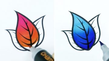
Chameleon Art Products have developed a set of alcohol-based markers that change their ink tone while drawing so you can create seamless color gradients, blends, highlights and shadows using a single pen. The inks are refillable and the nibs are replaceable.The pens cost $21.59 for a pack of 5 and $79.99 for a deluxe set of 22. Check them out below. … [Read more...]
What Different Types Of Fonts Mean And How To Use Them
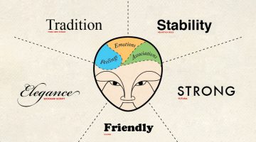
Every font has a unique personality and purpose. While working on a project, it's imperative to know which font matches the intended tone of communication. Serif fonts portray tradition, sophistication and a formal tone. Sans serif fonts are modern, humanist and neutral. Slab serifs are bold and contemporary. Script fonts are elegant, classic, stylish and formal. We've … [Read more...]
Adobe Illustrator ‘Pen Tool’ Cheat Sheet For Designers
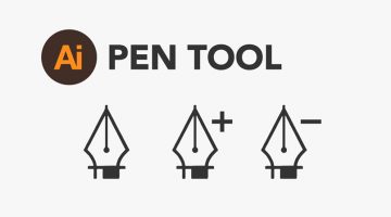
Paul Trani, Senior Worldwide Creative Cloud Evangelist for Adobe, has created a handy 'Pen Tool' cheat sheet for Adobe Illustrator. The 8-point visual guide covers the basics and shows you how to create straight and curved lines, add/delete/move anchor points and use bezier handles. We've also collated a few tutorials that Illustrator newbies might find useful. Check them … [Read more...]
Artist Brings His Drawings To Life Using Simple Paper Folds
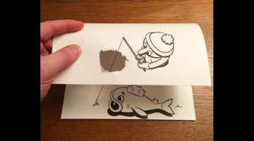
Danish artist HuskMitNavn turns his playful 2D black-and-white drawings to 3D using clever paper folding tricks and techniques. He cuts, tweaks and shreds sheets of paper in a way that they complete his sketches. For instance, he draws a clothes iron on the right side of the paper and crumples the left side to make it look like the iron is flattening the sheet. He draws a … [Read more...]
24 Stunning Photo Edits By The King Of Photoshop
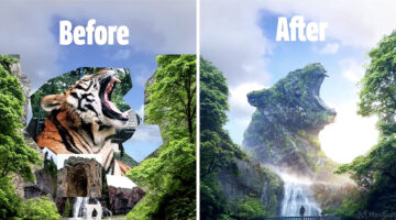
A strong composition can make or break a visual. In photo editing, it’s not just about placing a subject against a different background, it’s about achieving cohesion. When lighting, perspective, and tone align across every element, the result feels believable, even if the scene itself is surreal. That’s what separates casual edits from high-level composite work. Max Asabin … [Read more...]
7 Brilliant Negative Space Illustrations Of Animal Predators And Their Preys
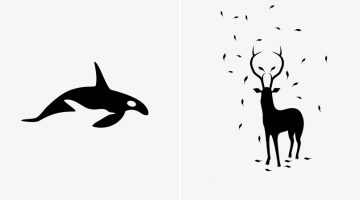
‘Predators and Preys’ is a fascinating project by Italian illustrator and graphic designer Andrea Minini. The series explores negative space illustration through a collection of black and white animal artworks, where predators and their prey are seamlessly combined within a single composition. Using clean silhouettes and minimal forms, Minini creates images that reveal a … [Read more...]
What If Famous Brands Combined Logos With Their Biggest Rivals?
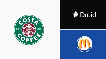
Imagine if the world's most famous brands and companies teamed up with their biggest competitors and created a new company logo that's a combination of the two. DesignCrowd ran a contest asking its community to do just that - take two company logos that compete in the same product or service category and combine them into a new hybrid logo. Here are some of the results. … [Read more...]
The Story Behind The World’s Most Controversial Font – Comic Sans
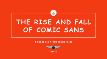
Full marks if you knew which font we were referring to, before you landed on this page. Created by designer Vincent Connare, Comic Sans is arguably the world's most contentious font - the subject of innumerable memes and websites. … [Read more...]
This Graphic Designer Wasn’t Able To Land A Job, So He Pretended To Be A Client

August Laustsen, a young Danish art director who recently moved from Copenhagen to Stockholm, applied to all the big advertising agencies in Stockholm but didn't get a reply from any of them. So, to catch their attention, he pretended to be a client looking for an agency and sent out the following letter. … [Read more...]
Who Legally Owns A Website Once It’s Designed?
"I paid a professional web designer to create my site, of course I own it!" - this is probably the belief that almost every website client holds. It makes perfect sense - you paid someone to develop a website for you. Why then would you not own what you paid for? … [Read more...]
Next Time You Present A Logo To A Client, Try Using Animations Like This Design Studio Does
Here's a logo presentation technique you would like to use in your next client meeting. Venice-based branding agency Concreate Studio presents their logos using animations that explain the ideology behind the design process. For example, the logo animation for furniture maker Emporio Freguglia starts with the icon of a bed that cleverly morphs into a chair-like symbol that … [Read more...]
How Art Directors And Copywriters Can Avoid Annoying Each Other
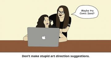
Copywriter Stephanie Vicari and Art Director Caitlin Hickey wanted to tackle the potential complicated relationship that can exist between copywriters and art directors. The result? They created airline-style safety cards for budding creatives to ensure that no one steps on any toes. Check them out below. … [Read more...]
30 Amazing Images Before And After Photoshop

When the name of a software becomes a verb, you know it's redefined the way we work. Adobe Photoshop was released on 19 February 1990, and it changed the creative business forever with its powerful features and surprisingly intuitive interface. Over the decades, Photoshop has become more than just a tool — it’s a rite of passage for designers, photographers, and retouchers … [Read more...]
Designer Creates Adobe-Inspired Chocolate Bars For Job Interviews And Clients
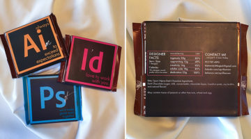
To end her job interviews on a sweet note, Brooklyn-based graphic designer April Hansen created custom packages for Ritter Sport chocolate bars that look like icons of Adobe Suite's core design programs. The front of the packaging bears logos of Adobe Illustrator, Photoshop and InDesign. Using their initials (Ai, Ps, Id), April added personalized messages that highlight her … [Read more...]
28 Epic Outdoor Ads That Made The Whole City Say “Damn, That’s Clever”

How many billboards do you see on your daily commute, and how many do you actually remember? The average human attention span is just eight seconds, and if advertisers don’t work their magic in that tiny window, the message is lost forever. The best outdoor ads don’t just grab attention; they own it. In this feature, we’ve gathered 28 epic examples of outdoor, ambient, and … [Read more...]
What Your Relatives Think When You Tell Them You’re A Designer
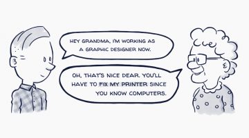
How often have your relatives asked you to fix their printer or computer just because you’re a designer? It’s like being a designer automatically qualifies you to be a software or a hardware engineer. Then there are relatives who think you need to get a "real" job like a doctor or a lawyer (basically the same profession they've forced down their children). And of course, … [Read more...]
Dogs Explain What Different HTTP Status Codes Mean
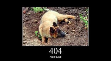
Every time you visit a website, your browser asks for a page and the server answers with a quick code — like 200 OK when all’s well, or 404 Not Found when the page isn’t there. These are called HTTP status codes: short, three‑digit messages that say what happened. To make this easier to understand, San Francisco‑based software programmer Mike Lee created HTTP Status Dogs, a … [Read more...]
What Is SSL? Why Every Website Needs SSL Encryption for Security, Trust, and SEO

SSL (Secure Sockets Layer) is a core web security technology that encrypts the connection between a website and its visitors. This encryption ensures that sensitive data — such as login credentials, payment details, and personal information — cannot be intercepted, altered, or misused by hackers. … [Read more...]
The Recipe For Creating Epic Logo Designs
A logo is not just a graphical symbol, it is the embodiment of your organization. Designing a logo is not just about creating a business identity, it's about creating a connection between the customer and your brand. A successful logo is one that is memorable, versatile, appropriate and timeless. … [Read more...]
16 Images That Prove Why Good Design Is Important
Dear clients, if you think good designers aren't worth their price, here are 16 images that might change your mind. … [Read more...]
The Original Names And Logos Of 12 Famous Companies
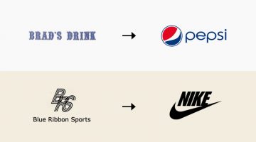
In 1996, Larry Page and Sergey Brin started collaborating on a search engine called BackRub. It operated on Stanford servers for more than a year, eventually taking up too much bandwidth. On September 15, 1997, Page and Brin registered the domain name Google.com - a play on the word "googol", a mathematical term for the number ten raised to the power hundred (10100). The rest … [Read more...]
14 Funny Mashups Of Famous Logos
Filipino designer Eisen Bernard Bernardo has come up with a fun project titled 'Logomorphia' that showcases mashups of popular logos that look like amusing creatures and situations. How many of these can you guess correctly? … [Read more...]
The Most Popular Brand Colours In Each Industry And Their Impact On Consumers
Colour psychology has become an increasingly important part of branding, identity and logo design for businesses as each shade has a specific psychological impact on the consumer they are targeting. UK insurance intermediary Towergate Insurance analysed 520 company logos in a variety of sectors and compiled them into an infographic to determine which industry favours which … [Read more...]
CMYK Playing Cards For Designers And Artists

Get creative at your next poker session with these colorful CMYK playing cards that designers and artists will love. The deck, created by Hundred Million, includes 54 minimally designed cards of different ink percentages. For the uninitiated, CMYK stands for cyan, magenta, yellow and key (black), the four inks used in most color printing. Cardists will also enjoy creating a … [Read more...]
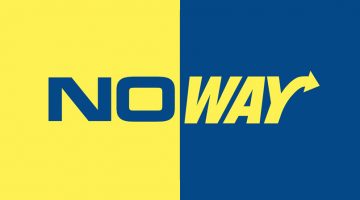
29 Clever Typographic Logos Of Common Words We Use Every Day
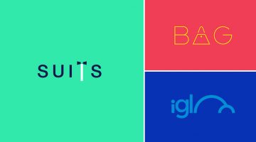
Milan-based creative director Duminda Perera has created a series of clever wordmarks/calligrams of common words we use every day. He’s altered, combined or replaced letters with shapes and symbols that visualize the meaning of the word. So the letter ‘n’ in ‘wine’ looks like a wine bottle, the two o's in ‘igloo’ form the shape of an igloo, and so on. Check them out below. … [Read more...]
- « Previous Page
- 1
- …
- 14
- 15
- 16
- 17
- 18
- …
- 25
- Next Page »