Designer Challenges Himself To Create A Typographic Logo Every Day For A Year, Each With A Hidden Meaning
Turning one word into a clever typographic logo is impressive. Doing it every single day for a year, with a new word each time, is where it starts to feel like genius.
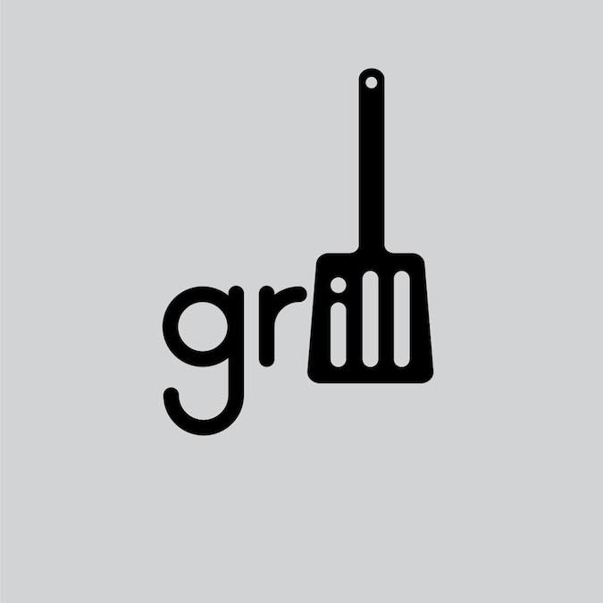
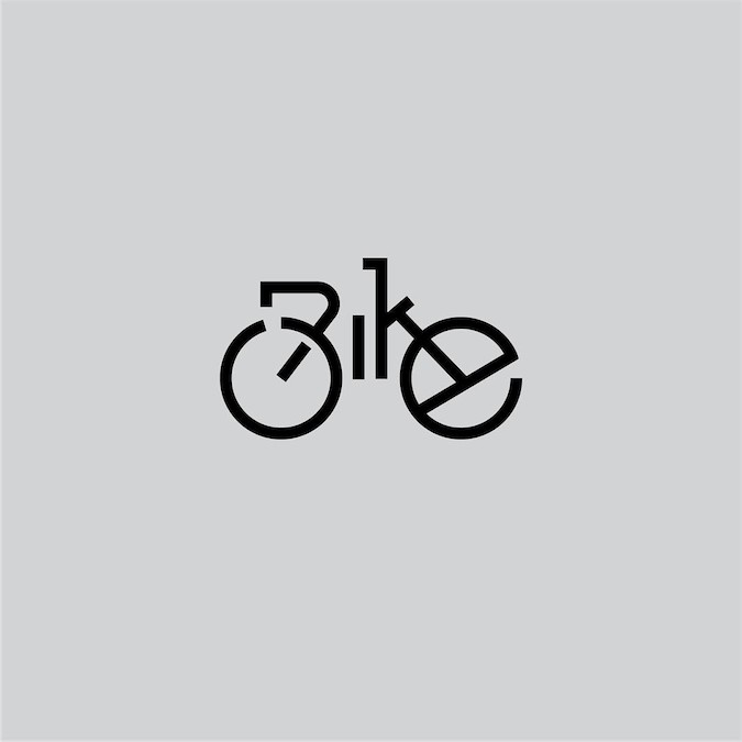
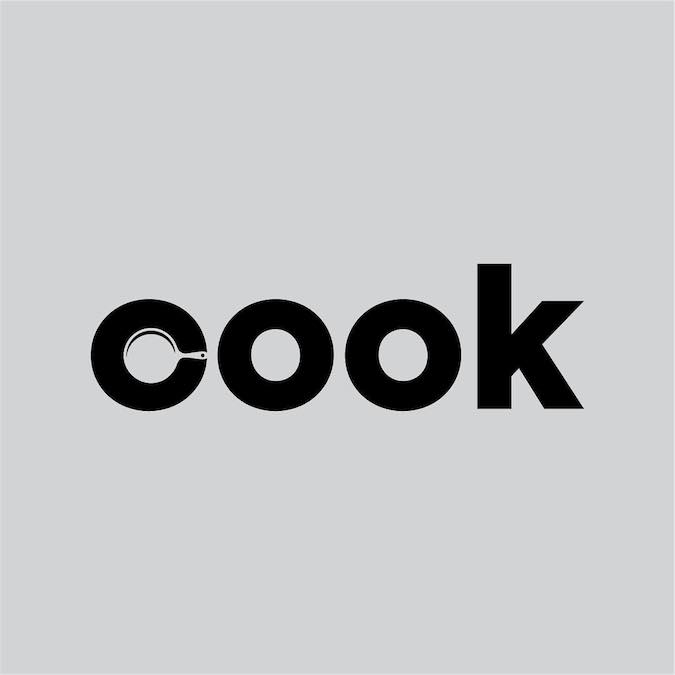
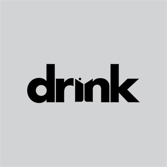
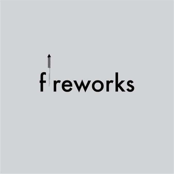
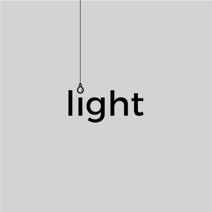
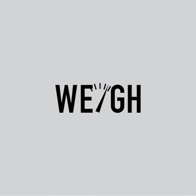
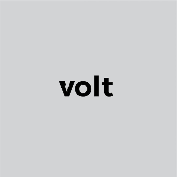
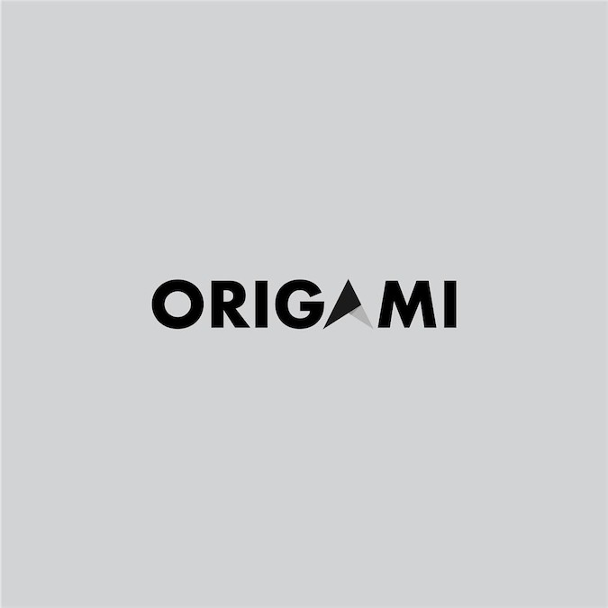
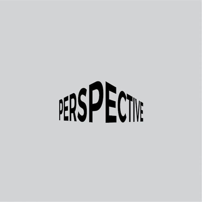
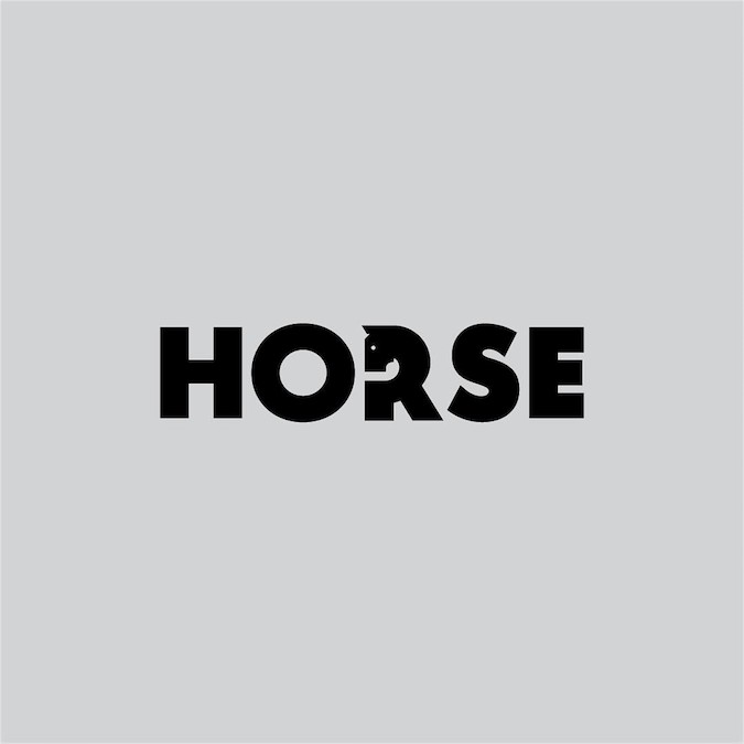
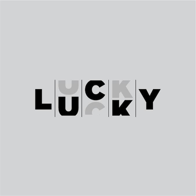
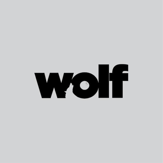
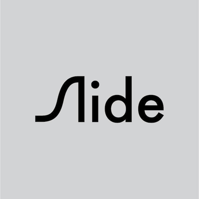
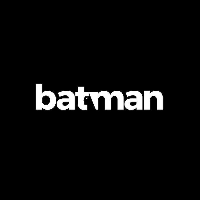
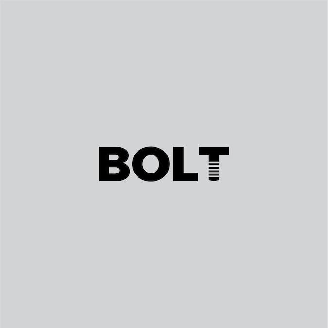
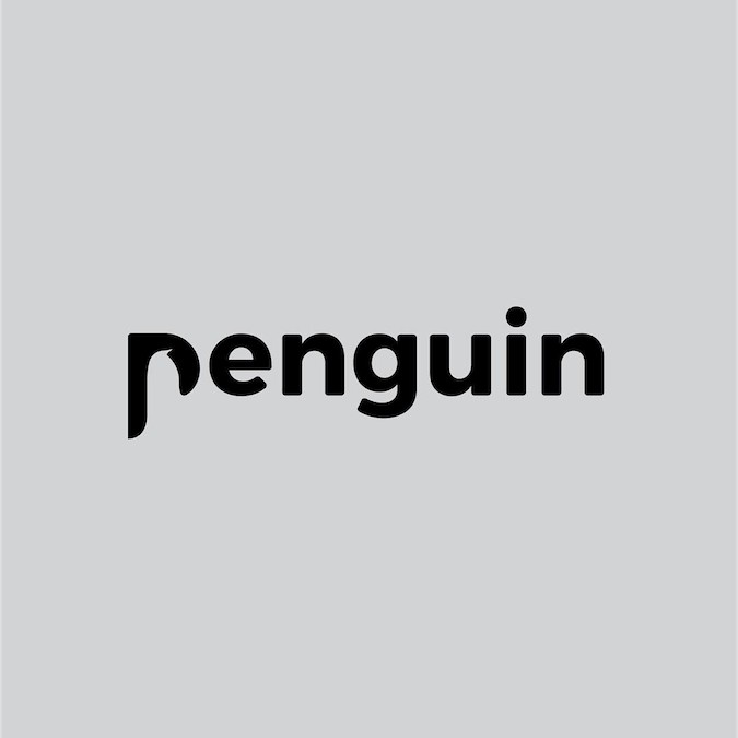
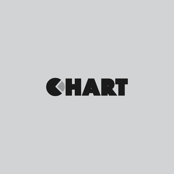
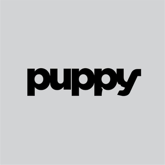
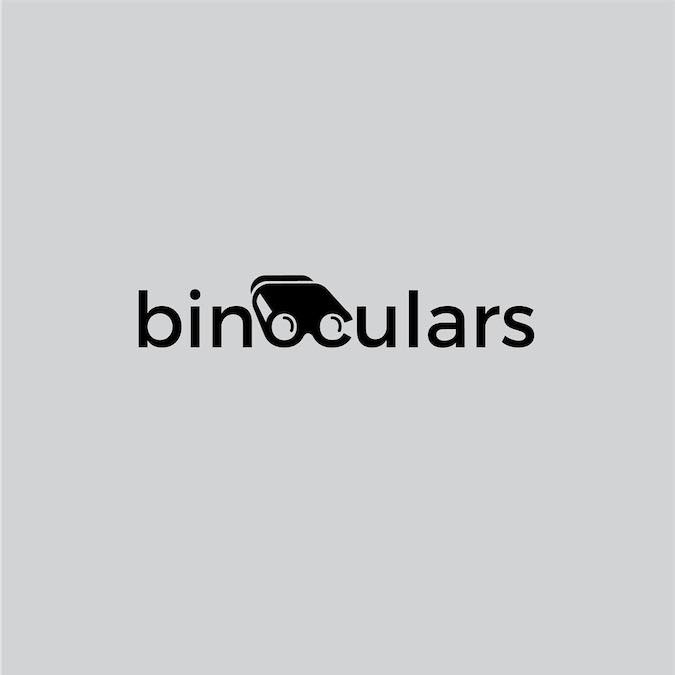
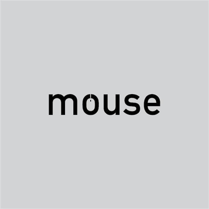
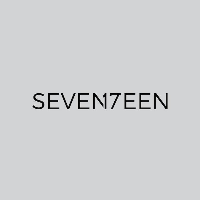
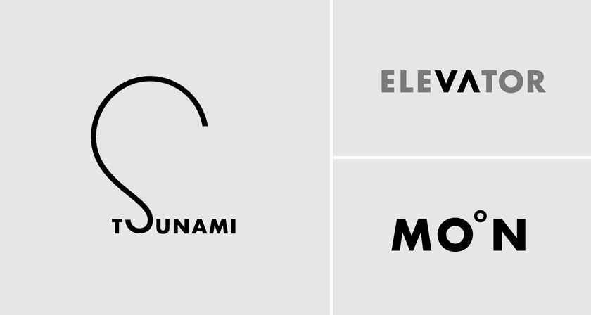
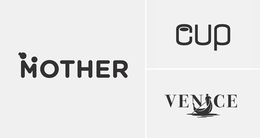
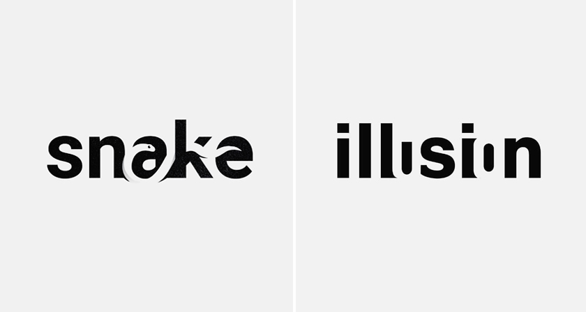
Stockholm-based graphic designer Daniel Carlmatz set himself a simple but brutal challenge: every day for 365 days, take one ordinary word and redesign its letters so the word visually becomes what it means — using negative space, symbolism, and geometry.
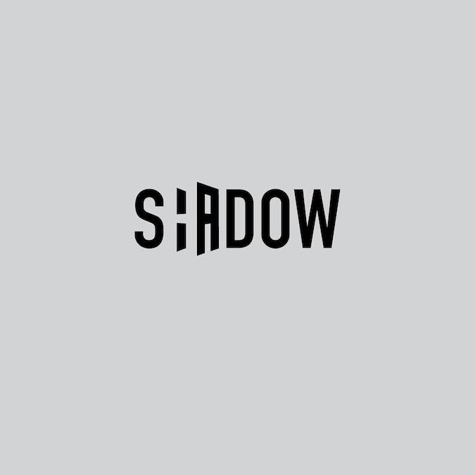
The ‘j’ in ‘jazz’ curves into a saxophone. The ‘a’ in ‘search’ becomes a search bar. The letters in ‘shadow’ cast one.
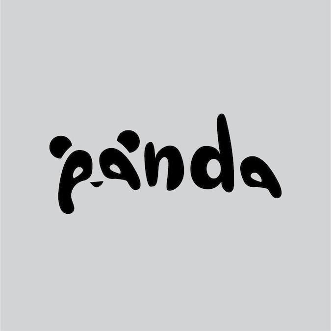
What’s remarkable is how long some ideas took to get right. The panda logo — the one most people love instantly — was in Carlmatz’s head from day one. It wasn’t published until day 251.
He never missed a single day. We’ve picked some of the best typographic logos from the project below. See if you can spot the hidden meaning before scrolling past.