Netherlands-based logo designer Sander has come up with an interesting project that features typographic logos (or wordmarks as he prefers to call them) of common words we use every day. He uses the negative space between the letters to create objects that visually represent the meanings of the words. For example, the design of the word SHARP consists of a knife in the … [Read more...]
New Feature In Illustrator Can Extract Colors From An Image And Apply Them To Your Vector Artwork
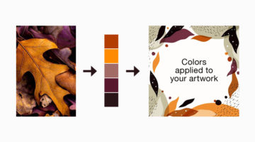
The Recolor Artwork tool in Illustrator lets you select and change the colors of your existing vector artwork using a color wheel. But choosing the right colors and changing them individually can be a tedious process. Now, Adobe is coming up with a Color Theme Picker for the Recolor Artwork tool that will let you extract colors from an image or palette of your choice, and … [Read more...]
Top 8 Websites For Free Vector Art And Graphics
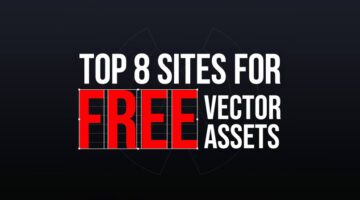
As a designer, it’s imperative that you know where to find the right assets for your design projects. Previously, we featured resources for free stock images, fonts, colors, gradients, and some handy design tools to improve your workflow. Today, we focus on the top resources for free vector assets. Wolvus Technology has come up with a handy list of websites that let you … [Read more...]
27 Valuable Resources For Graphic Designers
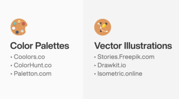
Online toolkits and web apps can help designers boost their creativity by providing them with resources, tutorials, and inspiration. They can also speed up workflow by helping you find design assets quickly, thereby reducing project turnaround time. Wolvus Technology has come up with a handy list of websites that let you browse, explore, and download color palettes, icons, … [Read more...]
25 Free Beautiful Vector Gradients For Your Next Design Project
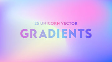
New Delhi-based designer and 3D illustrator Amrit Pal Singh has come up with a free collection of 25 trendy vector gradients inspired by Unicorns. These kind of holographic and multicolored pastel gradients are one of the major trends in graphic, web, and UI design nowadays. Amrit claims that no unicorns were harmed during the making of this product ?. Check out the … [Read more...]
Designer Explains Coronavirus Precautions Using Graphic Design Terms
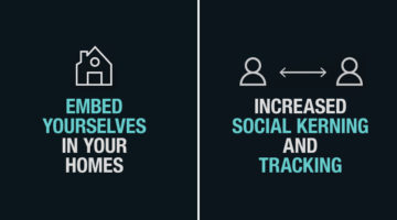
Maaz Afzal from Pen28 Creatives has come up with a clever project that explains Covid-19 precautions using graphic and web design terms. The objective is to guide designers to practice safe procedures using terms that they relate to. For example, the project advises designers to "increase social kerning", "avoid condense layouts", and "embed yourselves at home". Check out … [Read more...]
This Feature In Photoshop Lets You Convert Raster To Vector With Just One Slider
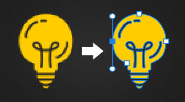
Did you know that you can now convert a raster image into a vector graphic within just a few seconds in Photoshop? You can also import the vector into other Adobe applications. In this handy tutorial, Photoshop instructor Unmesh Dinda from PiXimperfect shows you how to use Libraries to open the Adobe Capture interface and create vector shapes out of raster images. Keep in … [Read more...]
7 Mistakes You Should Avoid In Logo Design
Whether you're a beginner or a pro, designing a successful logo for your client is always a tricky task. You need to keep in mind the brand objective, the target audience, and the industry in which the company operates. From an execution point of view, you need to ensure your logo is scalable, the colors are relevant, and the typography is spot on. A successful logo is one … [Read more...]
8 Beautiful Illustration Projects For Design Inspiration
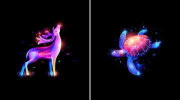
Custom illustrations are one of the key design trends in graphic, print, and packaging design nowadays. We've shortlisted some of the most gorgeous illustration projects of the year across different art styles. Check them out below and tell us your favourites in the comments. … [Read more...]
8 Important Rules For Perfect Icon Design
Icons are an essential element of UI design. They act as a visual aid for users to interact with the interface, identify options, and make selections. But as simple as they look, there are certain rules you should follow to ensure a seamless user experience. Albanian UI/UX designer Dorjan Vulaj has come up with a handy list of icon design rules inspired from the most used … [Read more...]
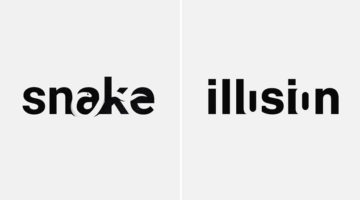
21 Beautiful Negative Space Logos
In art, negative space is the background space (or white space) around and between the subject of an image. For example, in a picture of a black vase against a white wall, the vase is the positive space, and the white wall is the negative space. In design, negative space can be used to create hidden meaning logos and illustrations. In today's post, we feature a series of … [Read more...]
Free And Cheaper Options To Photoshop, Illustrator, And Other Adobe Creative Software
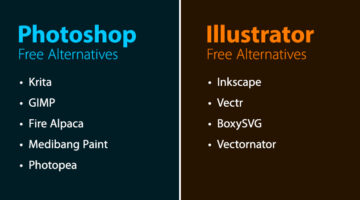
Freelance illustrator, artist, and author Michael Sexton has compiled a list of free and cheaper (single purchase) alternatives to Adobe Photoshop, Illustrator, InDesign, Animate, Lightroom, Dreamweaver, After Effects, and Audition. Michael created the list after Adobe's recent price hike of its photography plan from $9.99 to $19.99. After an outcry from creatives, the price … [Read more...]
What Is The Golden Ratio, And How To Use It In Graphic Design
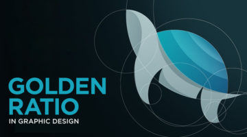
The Golden Ratio, also known as the Golden Section or Divine Proportion, is a mathematical ratio of 1:1.618 based on the Fibonacci sequence. It can be found in nature (flower petals, seeds, shells), in food (artichokes, broccoli, pineapple), and in the human anatomy. The Golden Ratio can also be found in art (Mona Lisa, The Last Supper, Vitruvian Man) and architecture … [Read more...]
3 Designer Friends Created An Alphabet Series Using Logos They’ve Designed Over The Years
Three graphic designers, colleagues, and friends, Alex Tass, Dalius Stuoka, and Deividas Bielskis decided to put together an A-Z alphabet series made from logo symbols, lettermarks, and monograms they've created over the years. All three designers have been in the industry for over 10 years, and have worked with a variety of clients, brands, and agencies. For this project, … [Read more...]
31 Beautiful Gradient Logos For Design Inspiration
When Apple launched iOS 7 in 2014, it not only changed the face of UI design, but also branding, graphic and logo design. Skeuomorphic interfaces and glossy app icons were out. Flat design, vibrant colors and gradients were in. In 2016, when Instagram came up with a bright new look and multicolored logo, a vast majority of its users hated the vivid gradients and demanded the … [Read more...]
Designer Creates Clever Negative Space Logos That Visualize The Name Of The Company
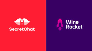
Lithuania-based graphic designer Leo has come up with a series of clever logos that combine the name or initials of the company into one unique symbol using negative space. The logo in each case visually represents the name of the company. For example, the logo for Secret Chat is a pair of lips with a padlock in the negative space between the lips. The logo for Wine Rocket … [Read more...]
Graphic Designer Creates Logos Of Famous Painters – Picasso, Van Gogh, Da Vinci, And More
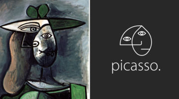
Brazilian art director Milton Omena has come up with an interesting project that imagines what logos of famous painters from Renaissance, Impressionist, and Modern Art periods would look like. He studied the painting styles and personalities of legendary artists like Leonardo Da Vinci, Vincent Van Gogh, Pablo Picasso, and created a unique symbol for each one of them. Milton, … [Read more...]
Designer Uses Beautiful Gradients And Abstract Shapes To Describe Meanings Of Words
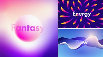
UK-based graphic designer Evgeniya Righini-Brand has come up with a fascinating project titled “Gradient Studies” in which she uses vibrant gradients and abstract shapes to visually describe the meanings of various words. For example, the visual for the word "flow" is an abstract liquid shape with multiple gradient meshes in blue and white. The visual for the word "energy" is a … [Read more...]
Adobe ‘Good Bones’ Lets You Change Vector Shapes Easily By Adding A Skeleton Structure
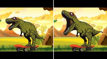
When you create artwork in Adobe Illustrator, the underlying geometry of the vector graphics can be quite complex. If you need to change the appearance of your vector figure, you'll need to edit each anchor point individually, which can be quite a task. For example, if you want to open the mouth of a vector dinosaur that you've created, you'll need to tweak each anchor point … [Read more...]
Short, Useful Animations To Help You Create Icons Easily In Adobe Illustrator
Melbourne-based designer and entrepreneur Marc Edwards has come up with a series of speedrun videos that show you simple techniques to create vector icons in Adobe Illustrator. Each video lasts only a few seconds and takes you through an optimal (and sometimes surprising) method to create common UI icons like bluetooth, headphones, inbox, settings, hourglass, lightning … [Read more...]
Adobe Fontphoria Can Capture Text In Images And Convert Them To Fonts
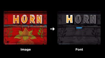
How many times have you wanted to know the name of a font used in a particular design or artwork? In some cases, the letters have been hand-drawn and the font doesn't actually exist. But imagine if there was a technology that could scan the text in an image and create an entire font out of it. Well, Adobe is working on a brilliant new tool called Fontphoria – a glyph … [Read more...]
10 Great Fonts You Should Use, And 9 Awful Fonts You Should Avoid
"Typography is an art. Good typography is art." - Paul Rand. Font and typography choices can make or break your design. But with so many fonts to choose from nowadays, which ones should you use, and which ones should you avoid? Tom Cargill from Satori Graphics has come up with an excellent video that features ten prominent fonts used by professional designers, along with … [Read more...]
When You’re President Of The United States, But Also A Graphic Designer
Every designer has a list of design software that they prefer, and a list of software that they absolutely detest, but are compelled to use sometimes. Based on common likes and dislikes for popular design software, Gombo Digital has come up with an epic video meme that shows what President Obama's preferences would be, if he were a graphic/web/UI designer. Which programs and … [Read more...]
Graphic Designer Combines Two Completely Unrelated Objects Into Clever Logos
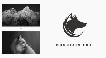
Indonesian designer Rendy Cemix has come up with an interesting project in which he combines the shapes of two completely different objects into one unique logo. The logo in each case is a visual representation of the brand name. For example, the logo for Mountain-Fox is an aesthetically designed symbol of a fox with ears that look like snow-capped peaks. The logo for … [Read more...]
Designers, You’ll Love These $5 Keychains Of Popular Graphic Design Softwares And Memes
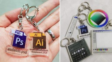
Singapore-based graphic artist Yu Xin has come up with a cool series of $5 keychains for graphic designers, based on popular Adobe programs and their interfaces. If you've ever worked with a demanding client, you'll relate to the meme-based Photoshop and Illustrator keychains that feature PS and AI file icons with funny filenames. The idea came to Xin when she was working on … [Read more...]
27 Clever Ambigram Logos That Look The Same When Viewed Upside Down
An ambigram is a typographical design or symbol consisting of text modified in such a way that it can be read in different orientations - inverted, rotated, mirror-image, etc. For example, the logo of Sun Microsystems (no. 4 below) is a brilliantly-designed ambigram that reads 'SUN' from all directions. Another famous example is the New Man logo (no. 6 below), designed by … [Read more...]
Designer Creates Clever Logos By Combining Two Or More Different Shapes Into One
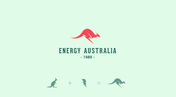
Kochi-based designer Shibu PG has come up with a series of interesting logos in which he combines the shapes of two or more different objects and letters into one unique logo. The logo in each case is a visual representation of the brand name. For example, the logo for Energy Australia is a combination of the shape of a kangaroo and the energy symbol ⚡️. The logo for … [Read more...]
Clever Logos Of Letters A To Z Based On Common Words That Start With Them
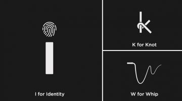
UK-based graphic designers Liam + Jord undertook a 36-day typography challenge to create logos for every letter of the alphabet based on common words that start with them. For example, the letter 'b' has been designed to look like a book, the letter ‘f’ looks like a flag, 'w' looks like a whip, and so on. The objective was to use the shapes of the letters to visually … [Read more...]
Designer Creates Clever Logos That Visualize The Name And Business Of The Company
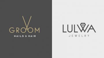
Kuwait-based graphic designer Rami Hoballah has come up with a series of minimalist logos that combine the name and the product (or service) of the company into one unique symbol. The logo in each case visually represents the brand name and the nature of its business. For example, the logo for Groom Salon is a pair of scissors made with the two o's in the word 'Groom'. The … [Read more...]
Designer Creates Clever Logos That Visually Represent The Name And Business Of The Company
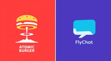
Lithuania-based graphic designer Leo has come up with a series of minimalist logos called "Smart Logos" that combine the name and the product (or service) of the company into one unique symbol. The logo in each case visually represents the brand name and the nature of its business. For example, the logo for Atomic Burger is a burger on top of a mushroom cloud. The logo for … [Read more...]
Designer Offers To Create Free Logos For Anyone, Ends Up Creating 50 Logos In 32 Hours Non-Stop
Russian graphic designer Di Buenio undertook a personal logo design challenge titled Logotyposhnaya, in which, he offered to create a free logo for any existing company or brand in 30 minutes. He published a post on his Facebook page and received over 70 applications in the first two hours itself. At the end of the challenge, Buenio had created 50 logos, working non-stop for … [Read more...]
Designer Creates Clever Alphabetical Logos Based On Animal Names And Shapes
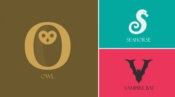
Lebanese graphic designer Rami Hoballah, has come up with an amusing typography project titled 'Animals Alphabet' that showcases letters of the alphabet in the shape of animals. Each letter corresponds to the name of the animal. For example, 'a' looks like the head of an ant, 'b' looks like a bee, 'c' looks like a crab, and so on. Rami used Adobe Illustrator to create these … [Read more...]
Designer Shares Side-By-Side Comparisons Of His Sketches And Final Vector Illustrations

Ukrainian web designer Andrew Kliatskyi has come up with an interesting project in which he shares side-by-side comparisons of his rough sketches and final vector illustrations. Titled "From Sketch to Result", the aim of the project is to show the path between an idea and the final result. After completing his pencil sketches, Andrew uses Adobe Illustrator to create the … [Read more...]
Designer Creates Clever Brand Logos By Combining Two Different Objects Into One
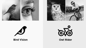
Kochi-based designer Shibu PG has come up with an interesting project in which he combines icons of two different objects into one unique logo based on the brand name. The logo in each case is a visual representation of the brand name. For example, the logo for Bird Vision is an aesthetically designed symbol of a bird and an eye. The logo for Owl Rider is a clever … [Read more...]
6 Adobe Illustrator Tricks To Speed Up Your Design Workflow
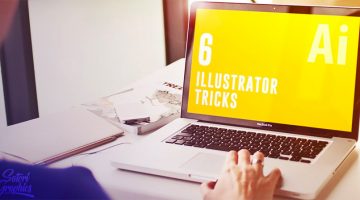
Did you know that you can paste an object in the same position across multiple art boards in Adobe Illustrator using Ctrl/Cmd + Alt + Shift + V. This is a great tip for when you're designing multiple page documents such as brochures or magazines. Tom Cargill from Satori Graphics has come up with a handy video that features six Illustrator tricks that will help speed up your … [Read more...]