Logo design in 2026 is less about visual novelty and more about meaningful distinction. Brands are no longer competing only on aesthetics, they are competing for attention, trust, and emotional connection across crowded digital environments. A logo today must perform across screens, motion systems, packaging, social feeds, and real world applications, while still feeling … [Read more...]
Portfolios Of Designers Who Have Worked At Apple, Google, Meta, And More
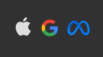
A well-crafted portfolio is more than just a collection of work—it’s a designer’s identity, storytelling tool, and a powerful career asset. Whether you're a seasoned professional or an aspiring UX/UI designer, exploring top-tier portfolios can ignite new ideas, refine your presentation style, and set a benchmark for excellence. In this curated list, UI/UX Designer Shubham … [Read more...]
19 Elegant And Timeless Font Pairings For That Classic ‘Old Money’ Look
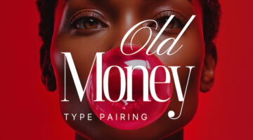
The old money aesthetic is all about quiet confidence—timeless, refined, and effortlessly sophisticated. From tailored fashion to grand interiors, this look is steeped in tradition and understated luxury. Fonts (or typefaces for the purists) play a subtle yet powerful role in capturing that essence, evoking prestige, heritage, and an enduring sense of class. Whether you’re … [Read more...]
Designer Draws Famous Logos Using A Single Line, And Most Of Them Are Better Than The Original
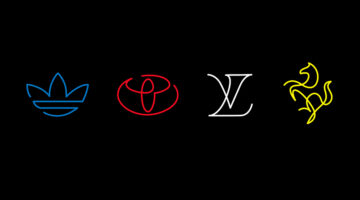
Logos are often celebrated for their ability to distill complex ideas into simple, memorable visuals. But what happens when that simplicity is taken even further? French designer Stephane Leopold, co-founder of Loooop Studio, explores this idea in his project "One Line Famous Logos". By reimagining 44 of the world’s most iconic logos using a single, continuous line, Leopold … [Read more...]
7 Designer Portfolios That Will Inspire You To Create Your Own
A great portfolio does more than display your work; it tells your story, makes a statement, and illustrates the transformative power of design. This is where creativity meets purpose, not just showcasing a designer's capabilities but revealing how they think, tackle challenges, and breathe life into their ideas. Curated by Basit Designs, here are seven standout portfolios … [Read more...]
Adobe’s Groundbreaking New Feature Lets You Rotate A Flat 2D Vector Drawing In 3D
The Adobe Max Creativity Conference is an annual endeavour by the tech giant to showcase potential future technologies, innovative tools, and groundbreaking new features that could eventually be integrated into their product suite. Among this year's big reveals was Project Turntable, an intriguing new feature that’s set to change the game for graphic designers who work with … [Read more...]
“How Much Are You Getting Paid As A Graphic Designer?” – Here Are The Top Replies
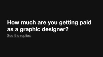
As designers, one of the most elusive topics we face is salary — what are others making, and how does our own pay compare? In a thought-provoking Reddit post, user Waste-Dark-8356 asked the design community to share their earnings, years of experience, and whether they work freelance, in-house, or for an agency. It’s a refreshingly open conversation that touches on an … [Read more...]
What’s One Design Skill You Think Is Underappreciated But Crucial? Here Are The Best Answers
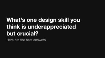
In graphic design, it's often the overlooked skills that separate good designers from great ones. While tools and techniques often receive the most attention, there are other, equally important abilities that don't get the recognition they deserve. Curious to find out more, we asked our Instagram followers to share the most underrated skills that are also the most crucial. … [Read more...]
8 Must-Have Tools For Designers To Boost Creativity
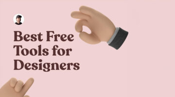
In the fast-paced world of design, having the right tools can be the difference between good and great work. Whether you're sketching, prototyping, or refining visuals, the proper resources can significantly boost your creativity. Product designer Sergio Cardenas has come up with a useful list of tools every designer should have in their arsenal to unleash their creative … [Read more...]
8 Super-Useful Websites Every Designer Must Know
In today's dynamic design landscape, keeping abreast of essential tools and resources can greatly boost your creative output and efficiency. Whether you are an experienced designer or a newcomer, being aware of key sources for inspiration, tools, and advice is vital. Product designer Sergio Cardenas has come up with a handy list of websites and online tools for fonts, color … [Read more...]
“My Ex-Boyfriend Is Copying My Design Portfolio. Please Help.”

In a candid account shared on Reddit, a graphic designer recounts her ongoing ordeal with her ex-boyfriend who, after their breakup, has embarked on a surprisingly parallel career path in graphic design. Initially aspiring to be a firefighter, her ex switched gears dramatically, showcasing a portfolio eerily similar to hers, down to the minutest details. From mimicking … [Read more...]
Affinity Responds With 4 Bold Pledges After Facing Backlash For Canva Acquisition
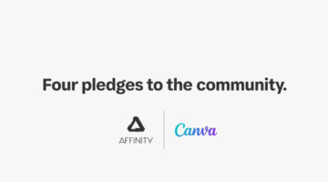
Following the acquisition of Affinity design software by Canva, concerns emerged over the possibility of a shift from its one-time purchase pricing model to a subscription-based format. In response, the two entities have made a commitment, reassuring their user base that the transition to a subscription model will not be mandatory. On Wednesday, a joint statement was … [Read more...]
Canva Acquires Affinity Suite In Landmark Deal To Challenge Adobe’s Dominance. See Details And Reactions From Designers.
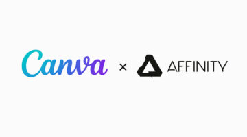
In a strategic move to fortify its position in the creative software market, Canva Inc. has completed its acquisition of the widely admired Affinity suite, targeting a broader competition with Adobe Inc. This marks Canva's most substantial purchase to date, underlining its commitment to challenge the long-standing dominance of Adobe in the creative software … [Read more...]
“How Do I Center Texts Correctly Vertically?”
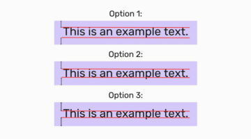
In a recent engaging post on Reddit, a user shared an intriguing image that presented three distinct methods for vertically centering text, using key typographical elements - capital letters, ascenders (the parts of letters that extend above the baseline, such as in "h" or "d"), and descenders (the portions that drop below the baseline, found in letters like "p" or "g"). The … [Read more...]
Design Roles: The 10 Types Of Designers And Their Super Powers
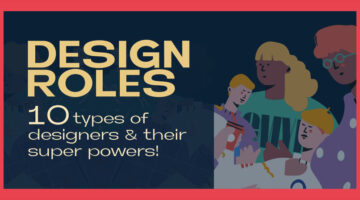
In the ever-evolving landscape of design, the roles and skills of designers have diversified, catering to every imaginable aspect of visual and experiential creation. From the meticulous crafting of brand identities to the intricate art of making data digestible through design, the spectrum of design roles speaks to a world where aesthetics meets functionality in profound … [Read more...]
“Client Used AI To Tweak My Logo Designs And Create Their Own Logo For Free. What Do I Do?”
In the ever-evolving landscape of creative work, the advent of artificial intelligence has introduced new challenges and ethical dilemmas. A recent experience shared by a graphic designer on Reddit highlights the complexities of AI in the freelance world. After creating two rounds of logo designs for a friend, the designer discovered that their work had been fed into an AI … [Read more...]
8 Thought-Provoking Illustrations That Put Men In The Place Of Women
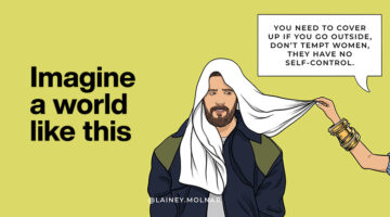
In 2020, during the lockdown, Lainey Molnar began sharing her experiences as a woman through her art, quickly gaining recognition for her compelling portrayals of challenging social issues. Now, with over 1 million followers on social media, Molnar has released a new series that has caught the public's eye. The series, named 'Imagine a World Like This,' creatively flips … [Read more...]
“I’m A Graphic Design Student And I Feel Like I Picked The Wrong Field. What Do I Do?”

A design student recently turned to Reddit to voice their concerns about their future in graphic design, amidst widespread concerns over the industry's downturn and tales of job dissatisfaction. With graduation looming, they're worried about their job prospects, especially since their education didn't cover the wide range of skills listed in job postings. Despite enjoying … [Read more...]
Logo Designer Creates Adorable Illustrations And Shows The Inspiration Behind Them
In a world obsessed with AI-generated design, it's good to see some good old human creativity. Creating effective logos is an art that balances simplicity with impact, requiring both talent and dedication to achieve a design that is both straightforward and memorable. Indonesian illustrator and logo designer, Alfrey Davilla, champions the philosophy that "Simpler is … [Read more...]
8 Types Of Logos With Examples
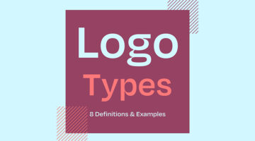
The effectiveness of a logo depends on various factors, including the brand's goals, target audience, industry, and overall brand identity. However, there are a few key types of logos that are often considered effective in different contexts. Ireland-based design director Andrew Warner has come up with a handy visual guide that lists the different types of logo designs, with … [Read more...]
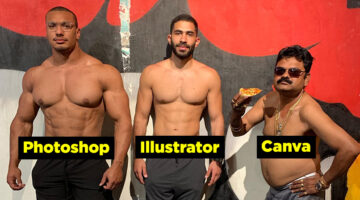
33 Memes That’ll Make Every Designer Laugh
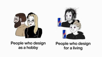
Calling all graphic designers, pixel pushers, and Photoshop wizards! Are you tired of staring at your screen, battling uncooperative clients, and squinting at never-ending lines of code? Well, fear not, because we have the ultimate antidote to your creative woes: funny memes designed especially for you! Prepare to chuckle, snort, and maybe even snort-laugh as we dive into a … [Read more...]
The 20 Best Logos Of All Time
A logo is a visual representation of a company or brand, and an essential part of any successful marketing strategy. A good logo conveys a brand's message, values, and identity in a simple yet memorable way, making it instantly recognizable and easy to remember. Over the years, we’ve seen some great examples of logo design, but only a select few have stood the test of time. … [Read more...]
Adobe Firefly Is A Revolutionary AI Model That Will Change The Way You Design
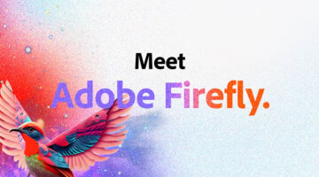
Adobe Firefly is a family of creative generative AI models that will transform the conversation between creator and computer into something more natural, intuitive, and powerful. With Adobe Firefly, creators of all skill levels will be able to generate content such as images, audio, vectors, videos, and 3D to creative ingredients like brushes, color gradients, and video … [Read more...]
22 Differences Between Designers And Non-Designers
For regular people, the word "path" refers to a route or track between two places. But for us designers, paths are vector based-line drawings connected by anchor points. The word "channel" might remind people of their favourite TV channels and shows, but for designers, channels are separate layers of color information in Photoshop. Similarly, the word "tracking" might … [Read more...]
20 Free Games That Graphic Designers Can’t Stop Playing
Who says games can't be educational? In today's post, we've rounded up 20 of the coolest design-centric games that teach the basic concepts and fundamentals of design. These games help you learn about colors, fonts, typography, UI design, Photoshop and Illustrator tools, logos, and more. The best part is that all these games are free and browser-based. You don't have to … [Read more...]
37 Epic Memes For Graphic Designers
Stuck in the middle of a tough project with a stiff deadline? Is your client giving you sleepless nights? Are you tired of your boss micromanaging everything? If your answer is yes, then you need a healthy dose of meme-therapy to brighten your day. Memes stimulate the release of endorphins that create a sense of well-being in the body. In a study of 472 graphic, web, and UI … [Read more...]
13 Hidden Features In Illustrator That You Probably Didn’t Know
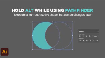
Did you know that holding the alt key while selecting the Pathfinder options creates a non-destructive version of the shape you're working on? This gives you the ability to tweak the shape later on, if you wish to do so. UK-based multidisciplinary designer Mathew Lucas has shared a series of useful tips on relatively less-known features in Adobe Illustrator. These hacks will … [Read more...]
Brilliant Logos With Hidden Meanings By A Designer Who Has Spent 2,500 Days Perfecting His Craft

Indian graphic designer Gary Dimi Pohty has taken on a design challenge titled "One logo a day" in which he creates logos with hidden meanings on an almost daily basis. At the moment, he is on day 2500! Gary's logos are based on common, everyday words and fictitious brands or films. He uses symbolism, negative space, and geometric elements to visually represent the meanings … [Read more...]
7 Design Terms You Will Never Get Wrong Again
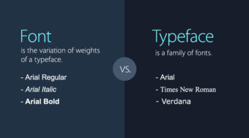
When starting out, most designers don’t know the difference between a font and a typeface. They use the two terms interchangeably. A font is the variation of weights (regular, bold, italic) of a typeface. A typeface is a family of fonts, such as Helvetica, Futura, Bebas, Gotham, etc. Another example is the use of the terms hue and color. Hue is any of the primary colors - … [Read more...]
35 Beautiful Color Palettes For Your Next Design Project
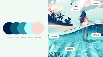
Looking for color palettes for your graphic, web, or UI design? Coolors is a useful online tool that lets you create, save, and share beautiful color schemes and gradients. You can browse and filter palettes by color or popularity, save them to your account, or download them as PNG, PDF, CSS, SVG, and more. Coolors is also available as an iOS App, Adobe Add-on, and a Chrome … [Read more...]
30 Clever Logos With Hidden Meanings, And The Design Thinking Behind Them
Indonesia-based Grafast Design Studio has come up with a series of interesting logos that combine different shapes and letters into unique symbols that visually represent the brand name. In each logo, the letters used are the initials of the brand name and the shapes represent the product or service offered by the company. For example, the logo for Victory Coffee combines … [Read more...]
Free And Cheaper Alternatives To Photoshop, Illustrator, And Other Adobe Creative Software
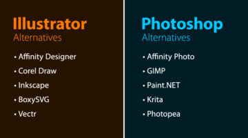
Looking for free options for Adobe Creative Cloud programs? Quze has compiled a list of free and cheaper (one-time purchase) alternatives to Adobe Photoshop, Illustrator, InDesign, XD, Dreamweaver, After Effects, Animate, and Audition. The list includes some well-known alternatives like Affinity Suite, Corel Draw, Canva, Sketch, Figma, etc. and also a few relatively … [Read more...]
25 Clever Logos With Hidden Meanings
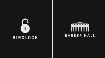
Russian graphic designer Vlad Smolkin has shared an interesting collection of hidden-meaning logos that he has created for different clients over the years. The designs use clever typography and symbols hidden in negative spaces to visually represent the brand name or explain the nature of the business. For example, the logo for Infinity Cat Cafe is an abstract infinity … [Read more...]
32 Brilliant Logos With Hidden Meanings
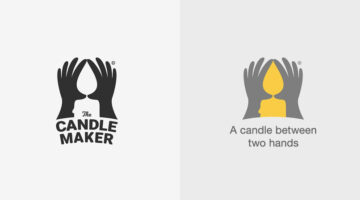
Looking for some logo design inspiration? Here are 32 brilliant examples with dual and hidden meanings, also known as visual double-entendres. In most cases, the hidden symbols are a visual representation of the brand name, and in others, they explain the nature of the business. Clever typography, negative space, and visual symbolism are some of the design techniques used to … [Read more...]
No One Has Been Able To Guess All The Countries In These Visual Wordplays – Can You Be The First?
Bahrain-based art director Faraz Manzoor has come up with an interesting project that features names of countries visualized as icons + letters. The phonetic pronunciation of the icons combined with a few letters of the country name completes the riddle. This clever technique is known as a rebus, where pictures, symbols, and letters are used to phonetically or visually … [Read more...]