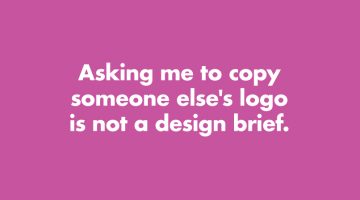
How many times have you received a design brief that asks you to copy someone else's logo? Or a brief that says "Just come up with a few quick logos." Has a client ever asked you to use Comic Sans? London-based product designer Anneke Short has come up with a series of minimalist posters titled "Confessions of a Designer" that feature nine things every graphic designer would … [Read more...]
Search Results for: logo
29 Images That Prove Why Good Design Is Important
Regular readers of DS know that most of our posts are about inspirational art and design. But once in a while, we like to sneak in a post about design blunders, just to keep the humour alive. Previously, we shared some epic logo disasters, letter-spacing fails, ad-placement blunders, and more. Today's post features some more design fails that are bound to make you laugh at … [Read more...]
5 Crucial Steps To Make A Consistent And Professional Brand Identity
Businesses across the world enthusiastically adopt branding strategies to lure quality business from customers. In most cases, they achieve the initial phase of branding, the implementation stage, without any issues. But when it comes to the advanced stages and constant updation, they miss out due to a variety of reasons. It becomes an issue of consistency of branding as well … [Read more...]
A’ Design Award Releases Rankings Of Countries That Have Won The Most Design Titles
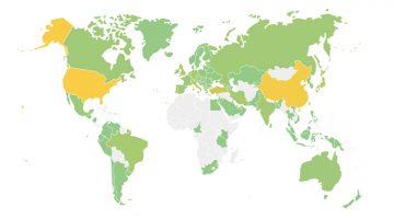
The World Design Rankings (WDR) have released the current ranking of countries based on the number of designers that have won the A' Design Awards. The countries are represented by the participating designer's nationality and the rankings are based on the current aggregated scores of participants between 2010 and 2017. … [Read more...]
Burger King Trolls McDonald’s With Epic Marketing Stunt At ‘IT’ Movie Premiere
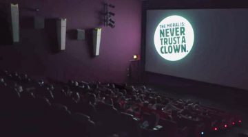
Stephen King's 'IT' stars a frightening clown that reminded Burger King Deutschland of their competitor McDonald's mascot. So they decided to turn the film's pre-premiere in Germany into the longest running ad for Burger King. … [Read more...]
12 Messages That Designers And Creatives Want To Send Clients On Sarahah
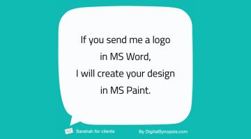
Unless you've been living under a rock, you know what Sarahah is - an app to send and receive anonymous feedback from your colleagues, bosses, friends, and anyone else. Created by Saudi developer ZainAlabdin Tawfiq, the app is meant for constructive feedback, but has come under scrutiny after people started sending lewd messages and death threats under the mask of anonymity. … [Read more...]
27 Cleverly Designed Products That Make Life Easier

"Great design is not just a solution, it is the elimination of the problem." - M. Cobanli. In today's post, we take a break from graphic/web/logo design to focus on innovative examples of product design that make every day tasks easier. Products that will make you ask yourself, "Why wasn't this invented earlier?" … [Read more...]
Kids Build Sculptures Of Their Dream Careers In These Award-Winning Ads From LEGO
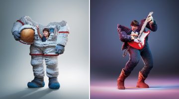
Ogilvy Bangkok came up with a series of well-crafted ads for LEGO that show kids envisioning their future careers by building sculptures of what they want to be when they grow up. … [Read more...]
These Clients Wanted To Pay Artists With “Exposure” Instead Of Money
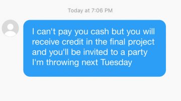
At some point or the other, every artist comes across a douchebag client who expects them to work for free. These requests usually come with promises of "exposure" or future collaborations. Rookie designers with little or no skill fall prey to them and ruin it for the rest of us. … [Read more...]
8 Types Of Graphic Designers On Social Media, Which One Are You?
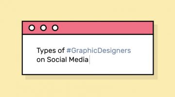
Do you critique Facebook’s UI every time they change it? Do you unfriend people who use Comic Sans? Or are you the ‘Hashtag Bomber’ who drops 20 design-related hashtags with every status update? Design resource site Pixelo has come up with a fun series of illustrations that list the different types of graphic designers on social media. Check them out below and tell us which one … [Read more...]
How To Convert Your Hand Lettering From Paper To Digital In Adobe Illustrator
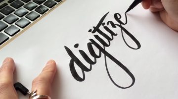
Yesterday, we featured Mackey Saturday's 60 second tutorial on how to create a custom logotype. Today, we'll be focusing in depth on the process of converting your hand-lettering to vector, with the help of this brilliant tutorial from designer Jenn Coyle at Hello Brio Studio. Watch below. … [Read more...]
Designer Creates Clever Pun-Filled Posters For Adobe Creative Software
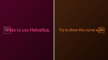
Georgian designer Sergi Devrisashvili has come up with a series of witty posters for popular Adobe creative software. Using their initials (Ai, Ps, Id, etc.), Sergi creates pun-based sentences that highlight the core features of the software. … [Read more...]
22 Graphic Design Mistakes That Novice Designers Make
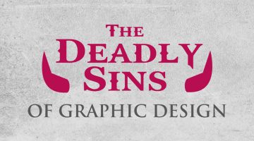
After a few years in the graphic design business, you realize how important it is to get the basics right. Like following a file naming convention, creating scalable logos, ensuring proper kerning and leading, using high-res images for printing, and so on. … [Read more...]
Designer Creates Adobe-Inspired Chocolate Bars For Job Interviews And Clients
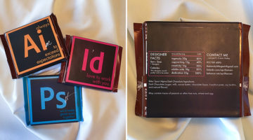
To end her job interviews on a sweet note, Brooklyn-based graphic designer April Hansen created custom packages for Ritter Sport chocolate bars that look like icons of Adobe Suite's core design programs. The front of the packaging bears logos of Adobe Illustrator, Photoshop and InDesign. Using their initials (Ai, Ps, Id), April added personalized messages that highlight her … [Read more...]
What Your Relatives Think When You Tell Them You’re A Designer
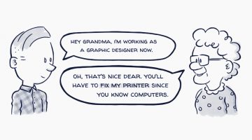
How often have your relatives asked you to fix their printer or computer just because you’re a designer? It’s like being a designer automatically qualifies you to be a software or a hardware engineer. Then there are relatives who think you need to get a "real" job like a doctor or a lawyer (basically the same profession they've forced down their children). And of course, … [Read more...]
The Most Popular Brand Colours In Each Industry And Their Impact On Consumers
Colour psychology has become an increasingly important part of branding, identity and logo design for businesses as each shade has a specific psychological impact on the consumer they are targeting. UK insurance intermediary Towergate Insurance analysed 520 company logos in a variety of sectors and compiled them into an infographic to determine which industry favours which … [Read more...]
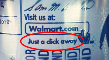
20 Images That Show Why Letter-Spacing Is Important
Ever wondered why good designers focus so much on kerning, i.e., adjusting the spacing between characters in a piece of text? These 20 epic images show you why letter-spacing is important not just in logos and graphic design, but also in everyday handwriting. … [Read more...]
11 Differences Between Designers And Clients
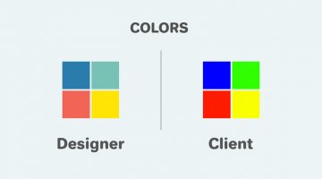
In a perfect world, the client-designer relationship is built upon a common sense of purpose, goals, and objectives. In reality, their varying perspectives make things a little bit more complicated. The client wants the logo to be bigger, colors to be brighter, and the typeface to be groovier. The designer wants more white space, subtle colors, and the font equivalent of … [Read more...]
10 Funny Murphy’s Laws For Designers
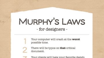
Murphy's Law is a popular proverb that states "Anything that can go wrong, will go wrong." The law's author was Edward A. Murphy, Jr., a U.S. Air Force engineer. He coined the famous statement in 1947, when he was involved in a rocket-sled experiment in which all 16 accelerator instruments were installed in the wrong way. … [Read more...]
How Filmmakers Use Shapes And Geometry In Movies To Trigger Your Emotions

The brain gives abstract meaning to many different shapes in a consistent way and filmmakers use this phenomenon to tell their story. In animation, for example, evil characters have sharper features, pointy noses and long curly fingers. The lovable characters are designed soft and round. … [Read more...]
The Psychology of Colors in Marketing (Infographic)
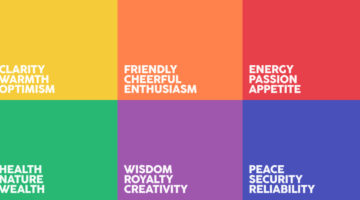
When buying a product, 93% of buyers focus on its visual appearance. 84.7% of buyers claim that color is the primary draw card. Different colors have different psychological effects on consumers - red encourages appetite, blue provides a sense of security, green stimulates harmony, orange promotes enthusiasm, purple is associated with royalty, and so on. Homestead has … [Read more...]
The 100 Best Web Design Tools And Resources
As a designer, it's imperative that you know your tools like an artist knows their paintbrushes. But with so many new apps and resources around, which ones should you bookmark? … [Read more...]
Amazing Illustrations That Use Negative Space Brilliantly
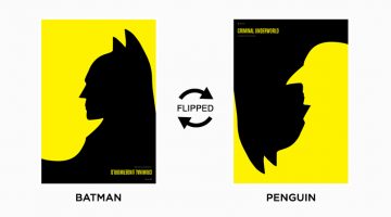
In art, negative space is the background space around the main object of an image. In a two-tone image (eg. black and white), the object is usually depicted in a darker color (black) than the background (white), thereby forming a silhouette. Sometimes, the tones are reversed and white is used to fill the silhouette (refer Coke examples below). When an artist carves out a shape … [Read more...]
16 Clever Typographic Movie Titles
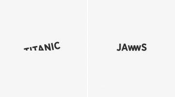
Istanbul-based digital creative Ali Erkurt has created a series of typographic movie titles that subtly hint at the plot or the central elements of the films. So, the 'w' in Jaws looks like the teeth of a shark, the 'i' in Matrix is replaced with the number 1 (the chosen one), the 'o' in Indiana Jones looks like his whip, and so on. Check them out below. … [Read more...]
10 GIF Memes Only Graphic Designers Will Understand
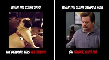
The best part about being a member of the creative tribe is that we can relate to one another, no matter which part of the globe we're in. It's not just our passion for creativity, our quirks, and our intolerance for mediocrity that bind us. It's because we all have that one annoying ass client from hell. … [Read more...]
Incredible Illustrations Of Zodiac Signs By Andreas Preis
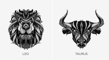
Whether you believe in astrology or not, these stunning illustrations of Zodiac signs by German artist Andreas Preis will leave you gobsmacked. Preis created this series while recovering from a knee surgery over a period of two months. He drew the artwork on paper and used Photoshop for post production. Preis' skill set includes illustration, murals, tape art and live … [Read more...]
Elegant Typography Posters That Give You Font And Color Ideas For Your Next Project
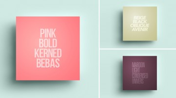
Lisbon-based designer/copywriter Filipe de Carvalho has created a series of self-descriptive posters titled MetaType that show the colors, fonts and text-styles used in them. Filipe works as a copywriter for excentricGREY and has created award-winning work for brands like Vodafone, Volvo, Samsung, Chevrolet and Heineken to name a few. … [Read more...]
The Amusing Decisions That Designers Have To Make Every Now And Then
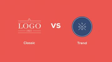
Classic logo or trendy logo? Helvetica or Bebas? Client request or designer sense? Strangle the client or don't strangle the client (ok, ignore that one). DesignTAXI has released a series of relatable illustrations that show the many dilemmas we designers face every now and then. Check them out below. … [Read more...]
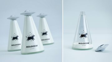
How Cool Is This Milk Packaging That Looks Like A UFO Abducting A Cow?
Talk about a packaging idea that’s literally ‘out of this world’. Imedia Creative Bureau in Bishkek, Kyrgyzstan, has come up with a quirky milk packaging concept that looks like a UFO abducting a cow. The triangular glass bottle resembles a beam of light coming out of a UFO-shaped bottle cap. The brand name is MOLOCOW, derived from moloko which is Russian for milk (молоко). … [Read more...]
42 Clever Calligrams That Visualize The Meanings Of Various Words
New York-based designer Ji Lee started creating calligrams 20 years ago in his typography class at art school. What started as an assignment turned into a lifelong hobby and Lee's passion for typography has led him to create over a 100 calligrams so far. … [Read more...]
Brilliant Travel Ads Want You To Explore The World In Person, Not On Social Media
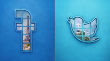
Advertising school Universidade de Fortaleza (UNIFOR) in Brazil has come up with an impressive print campaign for CVC, one of Latin America's biggest travel agencies. The ads show logos of Facebook, Twitter and Instagram as windows through which the viewer can see the Eiffel Tower, the Statue of Christ the Redeemer and the Statue of Liberty respectively. The tagline reads "The … [Read more...]
15 Images That Show Why Letter-Spacing Is Important
Ever wondered why good designers focus so much on kerning, i.e., adjusting the spacing between characters in a piece of text? These 15 epic images show you why letter-spacing is important not just in logos and graphic design, but also in everyday handwriting. … [Read more...]
30 Comic Strips That Perfectly Describe The Life Of A Designer
Designers are like gladiators, battling ugliness in the client's colosseum. Creative Market depicts the best and worst parts of being a designer with #DesignerProblems, a weekly comic strip written and illustrated by Seth Roberts and Brian Hawes. Check it out below. … [Read more...]
36 Brilliant User Interface Animations
Animated interface elements reveal the process and functionality of a UI much better than static text. They enhance user experience and help guide user flow. Like any other element of good design, UI animations should have a purpose. They should be functional without being overly flashy. … [Read more...]
36 Inspiring Quotes On Typography That Every Designer Should Live By
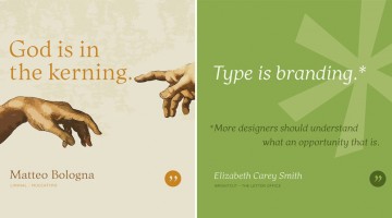
Los Angeles-based graphic designer Bill Dawson has designed a wonderful collection of posters featuring typography quotes from famous designers and type artists. Titled 'Typethos', the project shares tips and words of wisdom from design greats such as Paul Rand, Erik Spiekermann, John Boardley and more. Check it out below. … [Read more...]
- « Previous Page
- 1
- …
- 4
- 5
- 6
- 7
- Next Page »