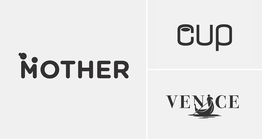
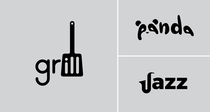
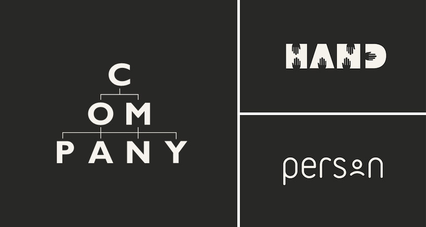
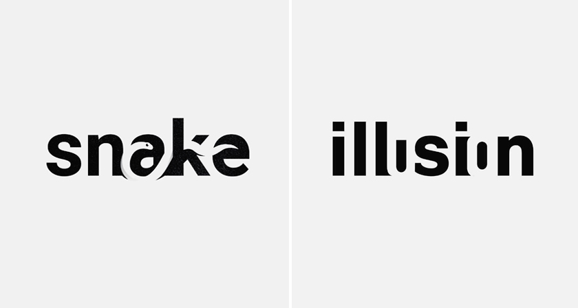
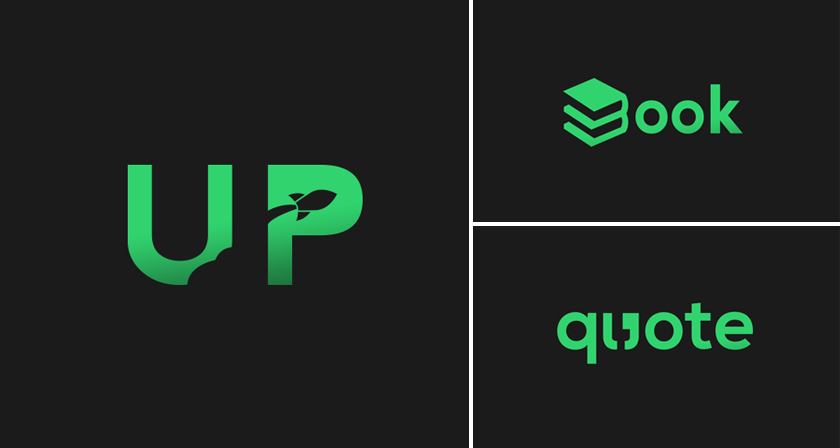
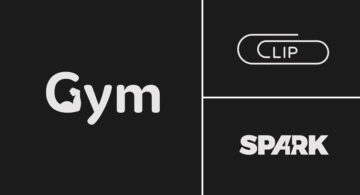
Colombo-based graphic designer Samadara Ginige has come up with a series of typographic logos of common nouns and verbs we use every day. The project, titled “Verbicons”, visualizes the meanings of the chosen words by using symbolism, negative space, or by adding geometric elements to the letters.
For example, the letter ‘c’ in the word ‘cash’ looks like a dollar bill. The ‘i’ in ‘tired’ is a stick figure of a person who looks tired. The ‘h’ in ‘hop’ looks like it’s hopping, and so on. Check out the project below.
1.
![]()
2.
![]()
3.
![]()
4.
![]()
5.
![]()
6.
![]()
7.

8.
![]()
9.
![]()
10.
![]()
11.
![]()
12.
![]()
13.
![]()
14.

15.
![]()
16.

17.
![]()
18.
![]()
19.
![]()
20.
![]()
21.
![]()
22.
![]()
23.
![]()
Our favourites: no. 1 (girl), 4 (tired), and 10 (together). What about you? Share this post with a friend and voice your views in the comments below. All images © Samadara Ginige.
