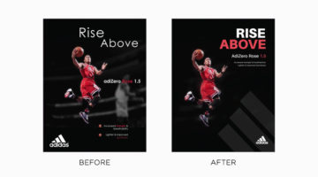
Tom Cargill from Satori Graphics has come up with an interesting before-and-after tutorial in which he improves professional ads by Adidas by making minor changes to their typography and layout. Tom uses different design techniques and principles to improve the hierarchy, contrast, and composition of four ads from different campaigns of the German sportswear brand. Are the … [Read more...]
Search Results for: typography
Graphic Designer Improves Professional Ads By Simply Changing The Typography
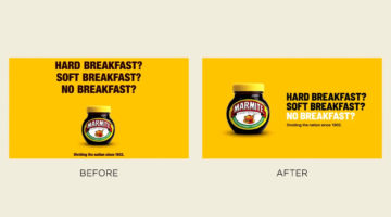
Tom Cargill from Satori Graphics has come up with an interesting before-and-after tutorial that shows you how a design or a layout can be improved considerably by making minor changes to its typography. He uses different techniques to improve the hierarchy, contrast, and legibility of text in professional ads by Gucci, Heineken, Marmite, and more. Are the redesigns better … [Read more...]
39 Clever Ads That Play With Text And Typography

“Typography is an art. Good typography is art.” – Paul Rand. Previously, we featured ads with brilliant art direction, clever copywriting, powerful social issue campaigns, and ads that make good use of negative space. In today's post, we look at some great examples of how brands use typographic art and illustrations in advertising to get their message across. The list … [Read more...]
8 Biggest Typography Mistakes That Novice Graphic Designers Make
One of the key differences between an amateur designer and a professional designer is the way in which they set their type. Professional designers know how many fonts to use and in what size. They know what the correct line-height is, the optimum paragraph length, the right contrast ratio, etc. Polish designer Tom Koszyk has come up with an excellent list of do's and don'ts … [Read more...]
13 Useful Tips For Better Typography
"Typography is an art. Good typography is art." - Paul Rand. Good typography is what separates the pros from the rookies. It's not just about picking the right font and selecting the right size. It's about attention to details. It's about knowing how much to kern, lead, track, and justify. It's about knowing when to use uppercase and lowercase, and what weights to use. … [Read more...]
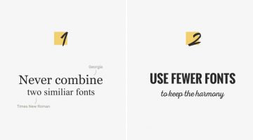
10 Typography Mistakes That Novice Designers Make
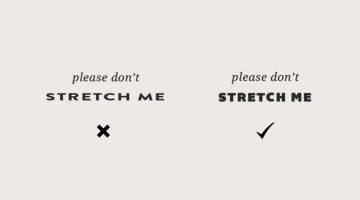
"Typography is an art. Good typography is art." - Paul Rand. Toronto-based designer Meagen Higginbottom, who runs design blog Forth And Create, has shared a list of 10 common typography mistakes that make your designs look amateurish. These include improper kerning and leading, stretched fonts, lack of contrast, using too many fonts, and more. Even if you've spent years in … [Read more...]
20 Typography Rules Every Designer Should Know
Good typography is the difference between amateur and professional design. It arouses the user's interest and ensures that your message gets read. Typography is an art, and though they say art has no rules, there are certain principles you should follow when it comes to typography. Nothing says "amateur" like stretched fonts, lack of kerning, illegible text, and using too … [Read more...]
10 Golden Rules To Improve Your Typography Skills
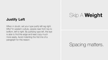
There are two types of typography - expressive typography (where type is used as a visual element) and functional typography (type that is meant to be read). Emmy Award-winning designer Chris Do's Typography Manual focuses on the latter and shares 10 golden rules to help you improve your type skills. Vietnam-based designer Leo Dinh has created an animated version of … [Read more...]
Designer Morphs Uppercase Letters To Lowercase In This Fascinating Handmade Typography Experiment
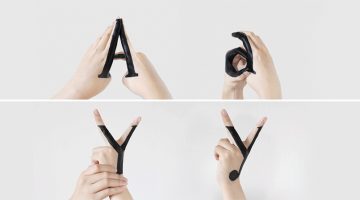
'Handmade Type' is a self-initiated typographic experiment by New York-based designer Tien-Min Liao that explores the relationship between uppercase and lowercase letters and records the transformation between them. … [Read more...]
9 Useful Tips For Better Typography
Like any form of art, there is no set formula to create good typography. Typographic choices that work for one form of text won’t necessarily work for another. There are however good practices to follow. Design resource website Pixelo has come up with a nifty animated video that shares a few useful tips to keep in mind when combining typefaces and working with … [Read more...]
A Useful, Comprehensive List Of Typography Terms For Designers
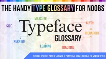
Do you know the difference between kerning and tracking, beak and serif, baseline and descender line? As a designer, it's imperative that you know what different typography terms mean, even if you don't use them every day. Here's a brilliant typeface glossary/infographic by DesignMantic that explains the meanings of terms like kerning, leading, tracking, glyph, serif, etc. and … [Read more...]
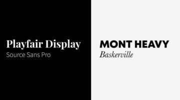
Elegant Typography Posters That Give You Font And Color Ideas For Your Next Project
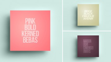
Lisbon-based designer/copywriter Filipe de Carvalho has created a series of self-descriptive posters titled MetaType that show the colors, fonts and text-styles used in them. Filipe works as a copywriter for excentricGREY and has created award-winning work for brands like Vodafone, Volvo, Samsung, Chevrolet and Heineken to name a few. … [Read more...]
10 Useful Kerning Tips To Improve Your Typography
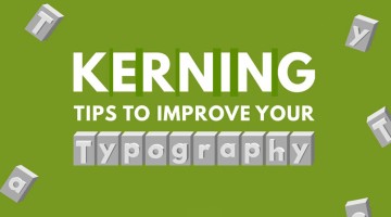
“Typography is an art. Good typography is art.” – Paul Rand. If you’re a typography freak like us, you’ll enjoy this handy infographic by Creative Market that shares some useful kerning tips and tricks to improve your typography. It covers some good points like kerning each letter individually, using visual space not actual space, and even a few unconventional hacks like … [Read more...]
36 Inspiring Quotes On Typography That Every Designer Should Live By
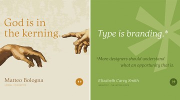
Los Angeles-based graphic designer Bill Dawson has designed a wonderful collection of posters featuring typography quotes from famous designers and type artists. Titled 'Typethos', the project shares tips and words of wisdom from design greats such as Paul Rand, Erik Spiekermann, John Boardley and more. Check it out below. … [Read more...]
Design Roles: The 10 Types Of Designers And Their Super Powers
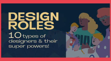
In the ever-evolving landscape of design, the roles and skills of designers have diversified, catering to every imaginable aspect of visual and experiential creation. From the meticulous crafting of brand identities to the intricate art of making data digestible through design, the spectrum of design roles speaks to a world where aesthetics meets functionality in profound … [Read more...]
Top 10 Graphic Design Trends For 2024
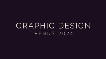
As the design landscape continues to evolve, 2024 promises to be a year filled with innovation and creativity in the world of graphic design. From the use of AI visuals to a resurgence of retro aesthetics, these new graphic design trends are poised to reshape the visual language of our digital and physical environments. In this article, we'll explore the emerging styles … [Read more...]
Are You A Font Expert Or A Rookie? Take This Tricky Quiz And Find Out
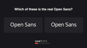
How well do you know the fonts you work with everyday? Bangalore-based UX designer Karan Sanas realised that he was unable to identify a font he uses daily, amongst a group of similar looking fonts. So he made a mini-game called Owen Sans that tests your knowledge of popular fonts (or typefaces, sorry purists). Why 'Owen Sans'? Because Karan works frequently with Open … [Read more...]
8 Types Of Logos With Examples
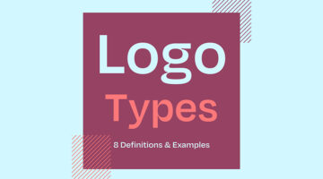
The effectiveness of a logo depends on various factors, including the brand's goals, target audience, industry, and overall brand identity. However, there are a few key types of logos that are often considered effective in different contexts. Ireland-based design director Andrew Warner has come up with a handy visual guide that lists the different types of logo designs, with … [Read more...]
Top 7 Graphic Design Trends Of 2023
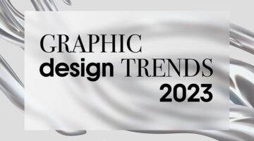
In today’s visually driven world, graphic design holds the power to shape the way we communicate, interact, and engage with our surroundings. As the foundation for branding, advertising, and digital media, graphic design not only fuels creative innovation but also has the potential to influence consumer behavior and evoke emotional connections. Understanding and staying … [Read more...]
Top 20 Free Games For Graphic Designers
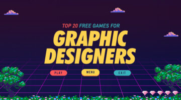
Who says games can't be educational? In today's post, we've rounded up 20 of the coolest design-centric games that teach the basic concepts and fundamentals of design. These games help you learn about colors, fonts, typography, UI design, Photoshop and Illustrator tools, logos, and more. The best part is that all these games are free and browser-based. You don't have to … [Read more...]
8 Effective Tips For Usability In Web Design

Usability in web design is about more than an easy-to-use UX and some pre-installed text-to-speech page readers. It’s about thinking across the unique groups of people who might visit your website and catering to their needs. Today, we’ll look at usability in web design in a whole new way; and that means designing for everyone including the differently-abled. Creative Brand … [Read more...]
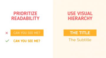
6 Visual Hierarchy Tips That Will Make You A Better Designer
Visual hierarchy is the arrangement and presentation of design elements in order of their importance. It influences the order in which the human eye perceives the information that is being displayed. A simple example would be a business card – the name of the organisation is usually the most prominent element, followed by the name of the card holder, job title, and contact … [Read more...]
7 Design Terms You Will Never Get Wrong Again
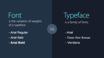
When starting out, most designers don’t know the difference between a font and a typeface. They use the two terms interchangeably. A font is the variation of weights (regular, bold, italic) of a typeface. A typeface is a family of fonts, such as Helvetica, Futura, Bebas, Gotham, etc. Another example is the use of the terms hue and color. Hue is any of the primary colors - … [Read more...]
McDonald’s Iconic Logo Is So Recognizable, Only Half Is Enough In These Brilliant Home Delivery Ads
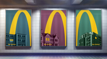
Leo Burnett London has come up with an ingenious campaign for McDonald's that uses just half of it's iconic 'Golden Arches' logo to promote their home delivery (McDelivery) service during the COVID-19 lockdown in the UK. Titled "Lights On", the campaign consists of 5 minimalist outdoor/print ads that feature an illustrated yellow curve soaring over rooftops and into the … [Read more...]
25 Clever Logos With Hidden Meanings
Russian graphic designer Vlad Smolkin has shared an interesting collection of hidden-meaning logos that he has created for different clients over the years. The designs use clever typography and symbols hidden in negative spaces to visually represent the brand name or explain the nature of the business. For example, the logo for Infinity Cat Cafe is an abstract infinity … [Read more...]
32 Brilliant Logos With Hidden Meanings
Looking for some logo design inspiration? Here are 32 brilliant examples with dual and hidden meanings, also known as visual double-entendres. In most cases, the hidden symbols are a visual representation of the brand name, and in others, they explain the nature of the business. Clever typography, negative space, and visual symbolism are some of the design techniques used to … [Read more...]
Graphic Designer Fixes The 9 Worst Logos Ever
Regular readers of Digital Synopsis must have read our article on 25 epic logo design fails. Now, Italian graphic designer Emanuele Abrate has come up with an interesting project in which he has redesigned the 9 worst logos out of that list. Emanuele has tried to recreate these logos as if they were commissioned to him. He's used different typography techniques, created … [Read more...]
5 Useful Tips To Help You Create Better Logos
A good logo is one that is memorable, versatile, appropriate, and timeless. It should make a great first impression of the company, and create brand recall as the years go by. From an execution point of view, the colors, typography, and geometry of the logo symbol should be relevant to the brand, to the target audience, and the industry in which the brand operates. A logo … [Read more...]
7 Mistakes You Should Avoid In Logo Design
Whether you're a beginner or a pro, designing a successful logo for your client is always a tricky task. You need to keep in mind the brand objective, the target audience, and the industry in which the company operates. From an execution point of view, you need to ensure your logo is scalable, the colors are relevant, and the typography is spot on. A successful logo is one … [Read more...]
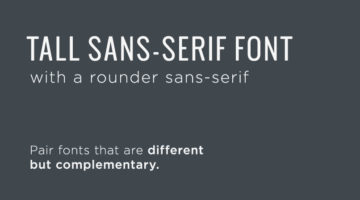
11 Great Font Combinations For Your Next Design Project
One of the best ways to tell an amateur designer from a seasoned professional is by their font pairings. A good designer knows which fonts complement each other, and how to strike typographical balance by using contrast and hierarchy. Here's a list of 10 golden rules of typography that'll help you get it right. If you're looking for examples of good font pairings, Kalypso … [Read more...]
Beautiful Typographic Alphabet Series Of Countries And Their Iconic Landmarks
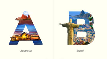
Dubai-based graphic designer Yuhab Ismail has come up with an interesting project titled “LETTRAVEL” that mixes typography and photography to showcase some of the world’s most beautiful countries and their iconic landmarks. Each letter represents the initial of a country and includes images of its famous monument or landscape clip-masked within the letterform. From the … [Read more...]
What Is The Golden Ratio, And How To Use It In Graphic Design
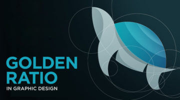
The Golden Ratio, also known as the Golden Section or Divine Proportion, is a mathematical ratio of 1:1.618 based on the Fibonacci sequence. It can be found in nature (flower petals, seeds, shells), in food (artichokes, broccoli, pineapple), and in the human anatomy. The Golden Ratio can also be found in art (Mona Lisa, The Last Supper, Vitruvian Man) and architecture … [Read more...]
3 Designer Friends Created An Alphabet Series Using Logos They’ve Designed Over The Years
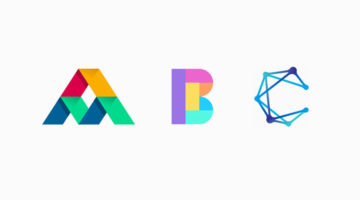
Three graphic designers, colleagues, and friends, Alex Tass, Dalius Stuoka, and Deividas Bielskis decided to put together an A-Z alphabet series made from logo symbols, lettermarks, and monograms they've created over the years. All three designers have been in the industry for over 10 years, and have worked with a variety of clients, brands, and agencies. For this project, … [Read more...]
“Miss The Start, Miss The Story” – Clever Ads By Sky TV Promote Its Restart Movie Feature
Most people in Germany watch linear TV instead of on-demand TV, because they don't like to spend too much time choosing what movie to watch. They tend to just turn on the television and watch what's running. Sky offers movies on-demand, and also on linear channels. The restart function from Sky Q let's you watch movies on linear TV from the start, by accessing the same movie … [Read more...]
You Can Now Fine People For Design Offenses With This Typographic Ticket Book

The designers at type foundry Hoefler & Co. have come up with a Typographic Ticket Book that lets you write people up for 32 common design crimes. These include poor typeface choice, improper kerning, inappropriate typeface weight, excessive use of boldface, insufficient leading, and more. Each offense has its own violation code and appropriate penalty. The book contains … [Read more...]