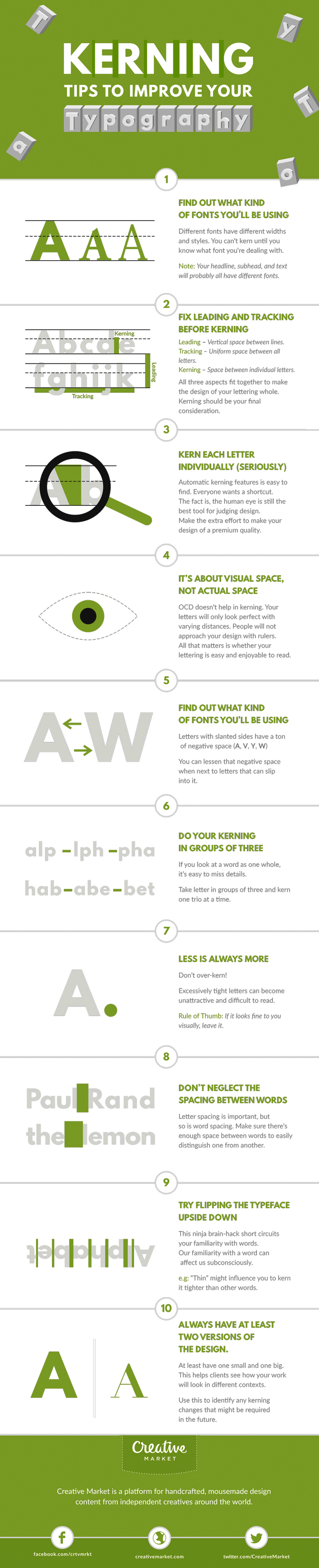
“Typography is an art. Good typography is art.” – Paul Rand. If you’re a typography freak like us, you’ll enjoy this handy infographic by Creative Market that shares some useful kerning tips and tricks to improve your typography. It covers some good points like kerning each letter individually, using visual space not actual space, and even a few unconventional hacks like flipping the typeface upside down. Check it out below.
Have something to add to this graphic? What’s the one piece of typographic advice you would give to a beginner? Use the comments below to voice your views and share this post with a designer friend.


