In the design world, the power of visual language is an open secret. Symbols and icons are more than just decorative elements; they're the shorthand of communication, cutting through the clutter of words to convey complex messages swiftly. Symbols serve as an essential toolkit for graphic designers, facilitating not only aesthetic appeal but also functionality and user … [Read more...]
33 Memes That’ll Make Every Designer Laugh
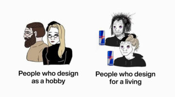
Calling all graphic designers, pixel pushers, and Photoshop wizards! Are you tired of staring at your screen, battling uncooperative clients, and squinting at never-ending lines of code? Well, fear not, because we have the ultimate antidote to your creative woes: funny memes designed especially for you! Prepare to chuckle, snort, and maybe even snort-laugh as we dive into a … [Read more...]
Top 10 Ways To Use ChatGPT For UX Design
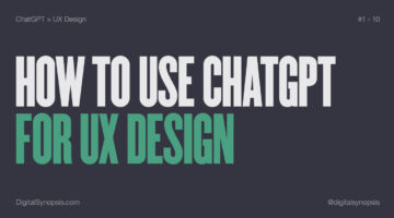
From brainstorming interface ideas to writing microcopy and mapping user journeys, ChatGPT is emerging as a powerful design companion, helping UX designers move faster, think broader, and iterate smarter. Whether you’re building wireframes, crafting personas, or refining landing page content, ChatGPT can support nearly every stage of the UX design process. Used right, it … [Read more...]
20 Free Games That Graphic Designers Can’t Stop Playing
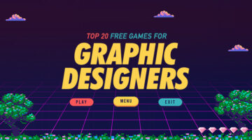
Who says games can't be educational? In today's post, we've rounded up 20 of the coolest design-centric games that teach the basic concepts and fundamentals of design. These games help you learn about colors, fonts, typography, UI design, Photoshop and Illustrator tools, logos, and more. The best part is that all these games are free and browser-based. You don't have to … [Read more...]
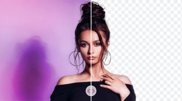
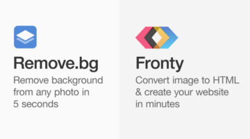
Instantly Remove The Background Of Any Image With This Powerful, Free AI Tool
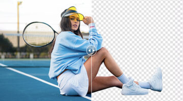
Looking for a quick and easy way to remove or replace the background of your images? PicWish is a powerful background remover tool that uses AI technology to detect and extract the subject from the background without compromising its quality. You can use PicWish for portraits, e-commerce, product photos, ID photos, logos, graphics, marketing, car sales, social media, and … [Read more...]
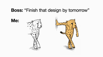
37 Epic Memes For Graphic Designers
Stuck in the middle of a tough project with a stiff deadline? Is your client giving you sleepless nights? Are you tired of your boss micromanaging everything? If your answer is yes, then you need a healthy dose of meme-therapy to brighten your day. Memes stimulate the release of endorphins that create a sense of well-being in the body. In a study of 472 graphic, web, and UI … [Read more...]
How “Bionic Reading” Uses Typography to Help You Read Faster
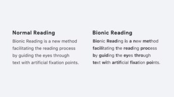
Swiss typographic designer Renato Casutt developed an ingenious reading system called Bionic Reading that helps you read text faster by emphasizing (bolding) the first few letters of a written word and letting your brain fill in the rest. How it works: Bionic Reading is based on the principle that the brain can identify whole words from just the initial few letters. By … [Read more...]
7 Useful Tips To Help You Create Beautiful Gradients
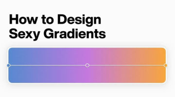
Gradients are a popular trend in graphic, web, and UI design nowadays, widely used in apps, websites, logos, illustrations, packaging, and more. However, the use of gradient as a design element can be tricky. If overdone, it can look tacky and cheap. One of the best ways to find inspiration is to observe nature - the sky, sunsets, plants, landscapes, etc. Find the right mood … [Read more...]
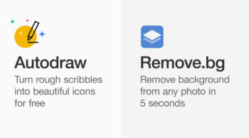
This Brilliant Free Tool Can Remove The Background From Your Photo Or Logo Within Seconds
The team at fashion portal Fynd has come up with a handy new AI tool called Erase.bg that lets you quickly remove backgrounds from any image and download it in the original resolution for free. Simply upload your image (JPEG, PNG, or WEBP upto 5000 × 5000 px) or paste an image URL. The machine learning model automatically detects the subject, removes the background within … [Read more...]
6 Visual Hierarchy Tips That Will Make You A Better Designer

Visual hierarchy is the arrangement and presentation of design elements in order of their importance. It influences the order in which the human eye perceives the information that is being displayed. A simple example would be a business card – the name of the organisation is usually the most prominent element, followed by the name of the card holder, job title, and contact … [Read more...]
How To Create A Stunning Glass Effect For Your UI Designs
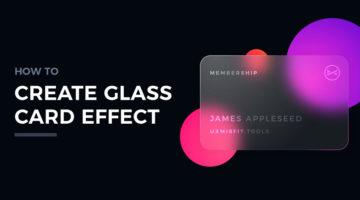
Polish graphic designer Przemyslaw Baraniak, also known as Thalion, has come up with a handy set of tutorials on how to create a glass card effect for your UI and web designs. Glassmorphism is one of the hottest trends in UI/UX right now, and it makes your designs look modern and stylish. Thalion shows you how to use gradient, blur, shadow, and noise to create the glass … [Read more...]
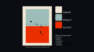
35 Beautiful Color Palettes For Your Next Design Project
Looking for color palettes for your graphic, web, or UI design? Coolors is a useful online tool that lets you create, save, and share beautiful color schemes and gradients. You can browse and filter palettes by color or popularity, save them to your account, or download them as PNG, PDF, CSS, SVG, and more. Coolors is also available as an iOS App, Adobe Add-on, and a Chrome … [Read more...]
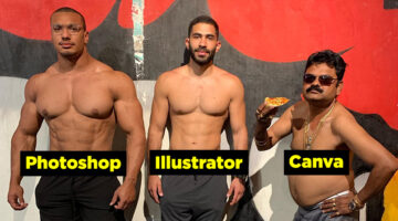
Free And Cheaper Alternatives To Photoshop, Illustrator, And Other Adobe Creative Software
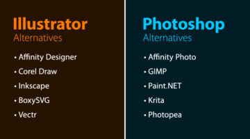
Looking for free options for Adobe Creative Cloud programs? Quze has compiled a list of free and cheaper (one-time purchase) alternatives to Adobe Photoshop, Illustrator, InDesign, XD, Dreamweaver, After Effects, Animate, and Audition. The list includes some well-known alternatives like Affinity Suite, Corel Draw, Canva, Sketch, Figma, etc. and also a few relatively … [Read more...]
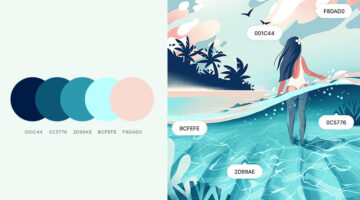
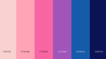
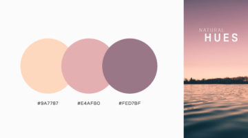
Tri-Color Palette Ideas For Your Next Design Project
It's easy to find two colors that go well with each other, but things get tricky when you add a third color to the mix. Each color must complement the other two perfectly. If you’re looking for tri-color palettes for your graphic, web, or UI design, Wolvus Technology has come up with a series of beautiful combinations that look great together. You can use these colors for … [Read more...]
Names And Codes Of All Color Shades
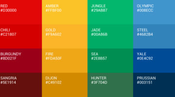
It's "maroon", not dark red. Just like it’s "navy", not dark blue. Graf1x has created a handy Color Thesaurus – a collection of charts and posters that list the correct names and hex codes of all major color shades. The charts are a useful reference tool for artists, designers, studios, students, teachers, interior decorators, make-up professionals, and just about anyone. … [Read more...]
8 Useful AI Tools For Graphic Designers
Artificial Intelligence can help designers boost their creativity by providing them with resources and inspiration. AI design tools can also speed up workflow by taking care of tedious tasks that require a lot of time and effort. Wolvus Technology has come up with a handy list of AI tools that can generate color combinations, remove backgrounds from images, suggest font … [Read more...]
9 Useful Design Tools You Probably Haven’t Heard Of
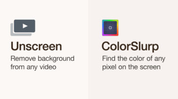
Online design tools and web apps can help designers boost their creativity by providing them with resources and inspiration. They can also speed up workflow by finding design assets quickly and performing relevant tasks. Ottawa-based visual designer Ismail Benmbarek has come up with a handy list of (relatively less known) websites that let you remove backgrounds from videos, … [Read more...]
27 Valuable Resources For Graphic Designers
Online toolkits and web apps can help designers boost their creativity by providing them with resources, tutorials, and inspiration. They can also speed up workflow by helping you find design assets quickly, thereby reducing project turnaround time. Wolvus Technology has come up with a handy list of websites that let you browse, explore, and download color palettes, icons, … [Read more...]
39 Epic Memes For Graphic Designers
Are you in the middle of a tough project with a tight deadline? Are your clients giving you sleepless nights? Are you tired of your creative director micromanaging everything? If yes, then what you need is a healthy dose of meme-therapy to help brighten up your day. Memes stimulate the release of endorphins that create a sense of well-being within the body. In a study of 450 … [Read more...]
25 Free Beautiful Vector Gradients For Your Next Design Project
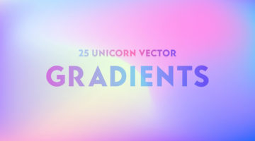
New Delhi-based designer and 3D illustrator Amrit Pal Singh has come up with a free collection of 25 trendy vector gradients inspired by Unicorns. These kind of holographic and multicolored pastel gradients are one of the major trends in graphic, web, and UI design nowadays. Amrit claims that no unicorns were harmed during the making of this product ?. Check out the … [Read more...]
8 Free Design Tools To Improve Your Workflow
Online design tools and web apps can help designers boost their creativity by providing them with resources and inspiration. They can also speed up workflow by helping you collaborate better, find design assets, and perform relevant tasks. Montana-based graphic/web designer Josh Corbett has come up with a list of free tools that can help you explore color palettes, browse … [Read more...]
Top 8 AI Tools For Graphic Designers
Artificial Intelligence can help designers boost their creativity by providing them with material and inspiration. It can also speed up workflow by taking care of boring and tedious tasks that require a lot of time and effort. Albanian UI/UX designer Dorjan Vulaj has come up with a handy list of AI tools that can help you enhance images, create font combinations, generate … [Read more...]
7 Graphic Design Mistakes That Novice Designers Make

After a few years in the design business, you realize how important it is to get the basics right. Like using the right number of fonts, maintaining consistency among UI elements, using grids, the importance of whitespace, etc. Montana-based graphic/web designer Josh Corbett has come up with a handy list of 7 graphic/UI design 'sins' that differentiate the pros from the … [Read more...]
How To Create Color Schemes For Your UI Design Using The 60-30-10 Technique
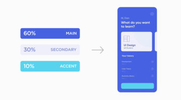
Selecting the right colors for your UI and applying them effectively can be a tricky task. You want to choose colors that go well with each other and create a sense of harmony within the design. You also want to pick the right accent colors to highlight elements like buttons and call-to-actions. Venezuelan product designer Dan Romero has come up with an excellent list of … [Read more...]
47 Beautiful Color Schemes For Your Next Design Project
Looking for color schemes for your graphic, web, or UI design? SchemeColor is a handy online tool that lets you create, save, and customize beautiful color palettes. You can browse and filter schemes by color or keywords like pastel, rainbow, monochromatic, etc. You can modify the color palettes, and download them in .PNG format. The RGB, CMYK, and hexcodes of each color are … [Read more...]
12 Important Design Principles Explained With Simple Graphics
There are no formulas or fixed rules for good design, but there are a few enduring principles that quietly underpin everything we see. They’re what allow you to create design that is functional, effective, and visually compelling, whether you’re working across graphic design, branding, advertising, or UI and UX. Concepts like contrast, balance, hierarchy, alignment, and … [Read more...]
6 Useful Tips To Help You Create Better Gradients
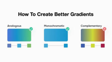
Gradients are a popular trend in graphic, web, and UI design nowadays, but it's important to know how to use them correctly. Smooth, minimal transitions look great in UIs. Use analogous and monochromatic colors instead of complementary colors. When it comes to text, you can use gradients for headings and quotes, but never for body copy. Venezuelan product designer Dan Romero … [Read more...]
8 Biggest Typography Mistakes That Novice Graphic Designers Make
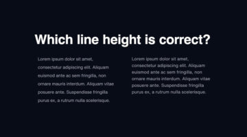
One of the key differences between an amateur designer and a professional designer is the way in which they set their type. Professional designers know how many fonts to use and in what size. They know what the correct line-height is, the optimum paragraph length, the right contrast ratio, etc. Polish designer Tom Koszyk has come up with an excellent list of do's and don'ts … [Read more...]
8 Great Google Font Combinations For Your Next Design Project
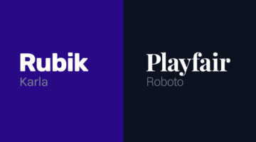
Previously, we featured 15 great Adobe Font combinations for your graphic, web, and UI design projects. In today’s post, we look at some beautiful Google Font combinations, with the help of this excellent list by Polish designer Tom Koszyk. Koszyk also suggests which font combinations to use for a particular type of app or website. For example, Merriweather and Libre … [Read more...]
35 Epic Memes For Graphic Designers
Are you in the middle of difficult project with a stiff deadline? Is your client giving you sleepless nights? Are you tired of your boss micromanaging everything? If yes, then what you need is a healthy dose of meme-therapy to help brighten up your day. In a study of 520 designers and developers, neuroscientists found that memes helped reduce work burnout by upto 64%. They … [Read more...]
39 Beautiful Color Palettes For Your Next Design Project
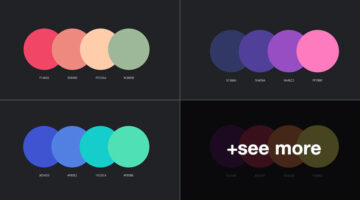
Looking for color schemes for your graphic, web, or UI design? Ocean.ui is a handy Instagram account that shares a beautiful new palette everyday, with hex codes of each color. They also share font combinations, patterns, and UI elements made using their color palettes. We’ve shortlisted some of the best palettes on the Ocean.ui page in terms of aesthetic appeal, usability, … [Read more...]
5 Tips To Design Call-To-Action Buttons That Get Clicks
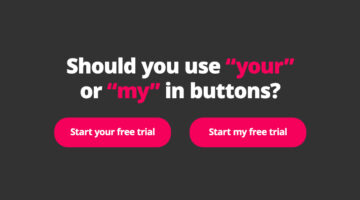
A call-to-action or CTA button is an interactive UI element that guides users to take certain actions on a website or application. For example: Sign Up, Book Now, Buy Now, Subscribe, etc. The objective of a CTA button is goal conversation for your website or application. It is the intended action you want the user to take, like buying your product, making a booking, signing … [Read more...]
8 Great Adobe Font Combinations For Your Next Design Project

Previously, we featured 15 great Google Font combinations for your graphic, web, and UI design projects. In today's post, we look at some beautiful Adobe Font combinations, with the help of this excellent list compiled by Polish designer Tom Koszyk. Koszyk also suggests which font combinations to use for a particular type of app or website. For example, DIN and Neue Haas … [Read more...]
Top 7 Laws Of UX Design, Explained With Simple Graphics
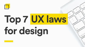
Dubai-based UI/UX designer Alejandro Ausejo has compiled a useful series of design tips titled "7 laws of UX design" based on several studies on human behavior and psychology by respectful scientists. These include: • Von Restorff Effect - Hedwig von Restorff • Hick’s Law - William Edmund Hick and Ray Hyman • Fitt’s Law - Paul Fitts • Zeigarnik Effect - Bluma Wulfovna … [Read more...]
37 Beautiful Color Palettes For Your Next Design Project
Looking for color palettes for your graphic, web, or UI design? The Colour Lab is a handy Instagram account that shares a beautiful new palette everyday, with hex codes and gradients. The colors are derived from beautiful images of nature, architecture, and urban landscapes. If you design something using Colour Lab's palettes, you can get featured on their page as well. … [Read more...]