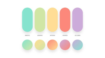
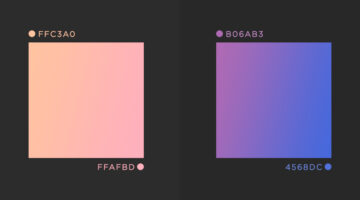
Vibrant colors and vivid gradients are one of the key trends in UI, web, and graphic design nowadays. Spain-based designer Yaroslav Iakovlev from Zeka Design has come up with a series of gradient color combinations that you can use in your next project. The hex codes of each color are mentioned on the palettes. Check them out below and tell us your favourites in the … [Read more...]
8 Useful Tips For Better UI Design
The success of an app or website depends significantly upon its UI/UX design. A recent study by Microsoft found that the average human attention span is down to 8 seconds, compared to 12 seconds in the year 2000. Users now have a lower tolerance for bad UI than ever before. If they can't find what they're looking for quickly enough, they will go elsewhere. Albanian UI/UX … [Read more...]
8 Important Rules For Perfect Icon Design
Icons are an essential element of UI design. They act as a visual aid for users to interact with the interface, identify options, and make selections. But as simple as they look, there are certain rules you should follow to ensure a seamless user experience. Albanian UI/UX designer Dorjan Vulaj has come up with a handy list of icon design rules inspired from the most used … [Read more...]
8 Must-Have Chrome Extensions For Designers
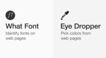
Chrome has a 63.69% market share and most designers prefer the Google-powered browser for its speed, UI, and the ability to add useful extensions. Albanian UI/UX designer Dorjan Vulaj has come up with a handy list of Chrome extensions that can help you find design inspiration, identify fonts and colors from web pages, view CSS, take full page screenshots, generate palettes, … [Read more...]
8 Important Rules For Perfect Button Design
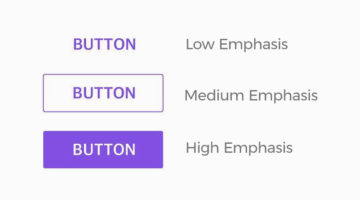
Buttons are an omnipresent element of UI design. They allow users to interact with the interface, select options, and make choices. But as simple as they look, there are certain rules you should follow to ensure a seamless user experience. Albanian UI/UX designer Dorjan Vulaj has come up with a handy list of button design rules inspired from the most used design systems at … [Read more...]
8 Important Color Rules For UI Design
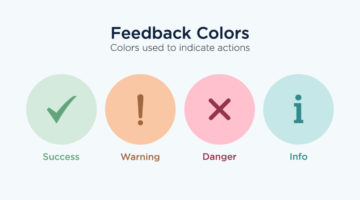
Color is one of the most important elements of UI design. Most rookie designers find an elegant palette online and incorporate the colors into their design, without considering branding, functionality, and accessibility issues like color blindness. London-based product designer Zander Whitehurst has come up with a handy list of color rules every UI designer should know. He … [Read more...]
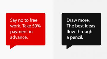
32 Epic Memes For Graphic Designers
Stuck in the middle of tough project with a stiff deadline? Is your client being an unreasonable prick? Has your boss put the entire workload on you? If yes, then now is the time to indulge in some meme-therapy and brighten up your day. Memes have been scientifically proven to reduce work-related burnout by upto 57%. In a study of 480 designers and developers, … [Read more...]
11 Great Font Combinations For Your Next Design Project
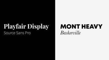
One of the best ways to tell an amateur designer from a seasoned professional is by their font pairings. A good designer knows which fonts complement each other, and how to strike typographical balance by using contrast and hierarchy. Here's a list of 10 golden rules of typography that'll help you get it right. If you're looking for examples of good font pairings, Kalypso … [Read more...]
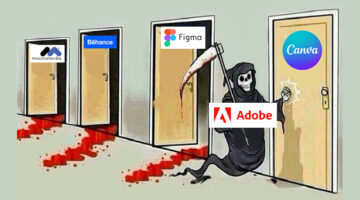
Free And Cheaper Options To Photoshop, Illustrator, And Other Adobe Creative Software
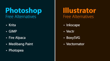
Freelance illustrator, artist, and author Michael Sexton has compiled a list of free and cheaper (single purchase) alternatives to Adobe Photoshop, Illustrator, InDesign, Animate, Lightroom, Dreamweaver, After Effects, and Audition. Michael created the list after Adobe's recent price hike of its photography plan from $9.99 to $19.99. After an outcry from creatives, the price … [Read more...]
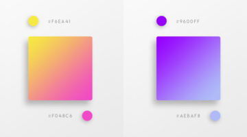
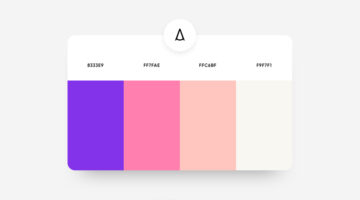
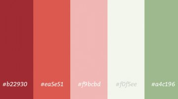
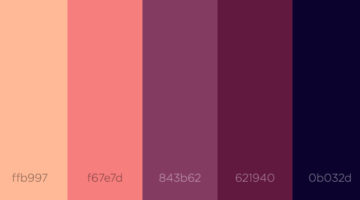
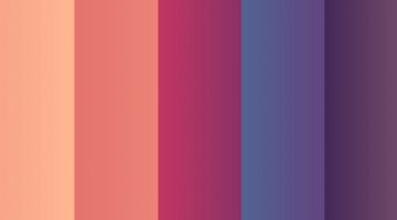
32 Beautiful Color Palettes With Their Corresponding Gradient Palettes
Looking for color palettes for your graphic, web, or UI design? Mr.Pugo is a handy Instagram account that shares beautiful color palettes (with hex codes) and also their corresponding gradient palettes. We’ve shortlisted some of the best ones in terms of aesthetic appeal, usability, and current design trends. Check them out below and tell us your favourites in the … [Read more...]
What Is The Golden Ratio, And How To Use It In Graphic Design

The Golden Ratio, also known as the Golden Section or Divine Proportion, is a mathematical ratio of 1:1.618 based on the Fibonacci sequence. It can be found in nature (flower petals, seeds, shells), in food (artichokes, broccoli, pineapple), and in the human anatomy. The Golden Ratio can also be found in art (Mona Lisa, The Last Supper, Vitruvian Man) and architecture … [Read more...]
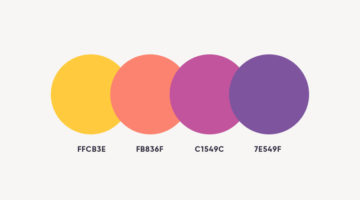
43 Beautiful Color Palettes For Your Next Design Project
Looking for color palettes for your graphic, web, or UI design? Awsmcolor is a handy Instagram account that shares a beautiful new palette everyday, with hex codes of each color. At the end of every month, they feature the top nine palettes for that month. If you create something exceptional using their palettes, you can get featured on their page as well. We've shortlisted … [Read more...]
41 Beautiful Color Palettes For Your Next Design Project
Looking for color palettes for your graphic, web, or UI design? Colours.cafe is a handy Instagram account that shares a beautiful new palette everyday, with hex codes of each color. They also hold design challenges in which users have to use a specific palette to create illustrations and calligraphy. The best works are then featured on their page. We've shortlisted some of … [Read more...]
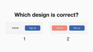
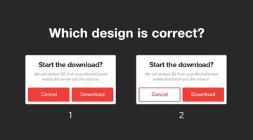
Only Expert Graphic Designers Can Reach The Platinum Level In This UI Design Quiz
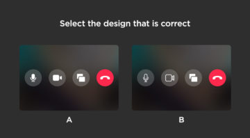
How sharp is your eye for UI/UX design details? Seattle-based UX designer Alex Kotliarskyi has created an addictive UI design quiz called Can’t Unsee that challenges your eye for detail. The web-based game presents two versions of iOS interface screens and asks you to pick which one is correct. Each right answer earns you coins, making the experience both fun and … [Read more...]
Free Photoshop Pack Of Beautiful Gradients For All Your Design Needs
Vibrant colors and gradients are one of the major trends in graphic, web, and UI design nowadays. To make life easier for designers everywhere, Paris-based graphic designer Leo Simon has compiled a set of 300 beautiful gradients into a Photoshop gradient file (GRD), available for free. We've shortlisted some of our favourites from Leo's collection and shared them below with … [Read more...]
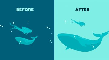
Simple, Useful Design Tips For UI/UX Designers
'Sparklin Design Tips' is a series of short, useful UI/UX tips by New Delhi-based digital agency Sparklin, shared every Tuesday on their social media channels. Using before-and-after mockup images, the team at Sparklin explains good UI/UX practices with visual examples, making them easy to understand and comprehend. Whether you're a newbie or a seasoned designer, these … [Read more...]
Incredible Video Shows Artificial Intelligence Creating A Website Just By Looking At The Wireframe
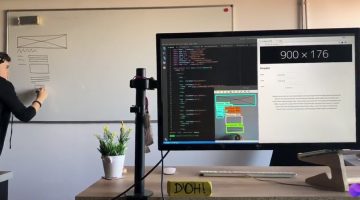
Artificial Intelligence is now being used to create front-end designs from wireframe to HTML code. TeleportHQ, a platform of open-source tools for UI professionals, has released a video demonstrating real-time code generation using TensorFlow machine learning and computer vision image recognition. … [Read more...]
This Brilliant Free Tool Is Like Google Search For Colors
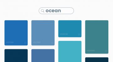
Swedish digital studio Future Memories has launched an excellent tool called Picular that lets you search for colors by keyword and displays a range of colors based on the top 20 Google Image search results for that keyword. For example, if you search for ‘ocean’, Picular analyzes the top 20 Google Images for ‘ocean’ and displays the most prominent color in each image and … [Read more...]
8 Beautiful Flat Color Palettes For Your Next Design Project

UI/UX designer Ebtihaj Khan has created a series of minimalist flat color palettes for graphic, web, and UI projects. Each palette consists of five colors with their hex codes mentioned alongside. Khan has included both linear and contrasting color schemes. The beautiful presentation of these palettes, with the blurred vignette effect in the background, was inspired by … [Read more...]
Designer Fixes Ugly Interfaces, Shares Valuable UI Tips In The Process

Previously, we featured designer Steve Schoger's Little UI Details project in which he shares short, useful design tips for UI/UX designers. Steve has now come up with another excellent project titled 'Refactoring UI' in which he uses Sketch to fix websites and interfaces submitted by developers, and teaches you valuable UI design concepts in the process. The series is just … [Read more...]
How Companies Use Deceptive UI Design To Trick You Online
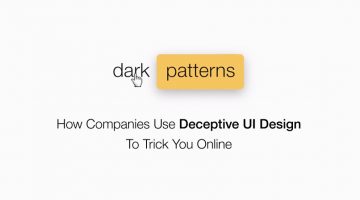
A 'dark pattern' is a user interface that has been craftily designed to trick users into doing things they might not want to do, in order to benefit the business in question. The term was coined by UK-based UI designer Harry Brignull, who runs DarkPatterns.org - a website dedicated to "naming and shaming websites that use deceptive user interfaces". For example, have you … [Read more...]
20 Important Design Principles Explained With Simple Illustrations
There are no fixed rules or formulas for good design, but there are a few basic principles that will help you create design that is effective, functional, and aesthetically pleasing. Technical jargon can sometimes get confusing or overwhelming, which is why Canva has come up with a fantastic infographic that uses simple illustrations to explain the 20 most important design … [Read more...]
27 Beautiful Color Gradients For Your Next Design Project
Looking for beautiful gradients for your graphic, web, or UI design? UVdesk has created a useful online tool called coolHue – a free collection of over 60 gradients that you can use for design and code. You can browse through the swatches, copy their CSS codes and even download a .PNG version of each one. Here are some of our favourites from the collection. … [Read more...]
Graphic Designer’s Interesting Experiment Shows How The Placement Of An Element Affects Its Meaning
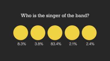
Brazilian designer Nei Valente has come up with an intriguing design experiment titled 'Thoughts on Position' that studies the relationship between the placement of an element and its meaning. The objective was to find out if the same element can communicate different messages when placed in different positions. In this experiment, Valente surveyed 288 participants with a … [Read more...]
33 Beautiful Color Schemes For Your Next Design Project
Looking for color combinations for your graphic, web or UI design? CoSchedule has come up with a handy infographic that shares 33 beautiful palettes organized by primary and secondary colors. They've also compiled two additional infographics on color + word associations and color psychology. Check them all out below. … [Read more...]
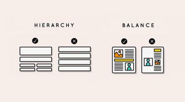
12 Visual Hierarchy Principles Every Designer Should Know
Visual hierarchy is the arrangement and presentation of design elements in order of their importance. It influences the order in which the human eye perceives the information that is being displayed. A simple example would be a business card - the name of the organisation is usually the most prominent element, followed by the name of the card holder, job title, and contact … [Read more...]
Designers Share Valuable Advice They Would Give To Their Younger Selves If They Could Go Back In Time
If you could go back in time and give advice about the graphic design profession to your younger self, what would it be? Would you suggest building a diverse portfolio early on, or networking more effectively? What about the importance of continual learning and staying abreast of evolving design trends? Understanding the value of constructive criticism and resilience in … [Read more...]
Short, Useful Design Tips For UI/UX Designers
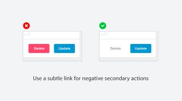
Steve Schoger is a multidisciplinary designer based in Kitchener, Ontario. When he finds time off from running his design and illustration studio, he curates 'Little UI Details' - a Twitter collection of short, useful design tips for UI/UX designers. Steve's tweets cover different elements of UI design and also include before-after mockup images that make them all the more … [Read more...]
7 Reasons Why The 7-Eleven Logo Works Even Though It Breaks Design Rules
Some logos are designed to be admired. Others are designed to disappear into everyday life so completely that they stop feeling like design altogether. The 7-Eleven logo belongs to the second category. It hangs above storefronts, appears on cups, receipts, delivery bags, roadside signs, and convenience store shelves across the world. Most people have seen it thousands of … [Read more...]
Free Minimal Line Icons For UI, Web And Mobile Design
Here's a handy set of 124 vector line icons by Madrid-based designer Situ Herrera. They're minimal, flat and basic, in keeping with current design trends. You can use them for a variety of UI, web, and mobile design projects. The zip file includes AI, EPS, and PSD files, so you can tweak them, change colors, and more. … [Read more...]
21 Free Geometric And Blurred Background Packs For Your Design Projects
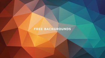
Geometric polygon and soft-blurred backgrounds are a popular trend nowadays in graphic, web and UI design. Low-poly patterns look great on print collaterals like business cards, brochures, flyers, packaging, signage, etc. They're also used in digital presentations, kiosks, app start up screens and more. Soft-blurred, gradient backgrounds became a rage after Apple started … [Read more...]
34 Beautiful Color Palettes For Your Next Design Project
Looking for color schemes for your graphic, web or UI design? Coolors is a fast and easy tool that lets you create, save and share beautiful color palettes. You can browse and filter schemes by color or popularity, save them to your account, or export them as .PNG, .PDF, .SVG, and more. Coolors is also available as an iOS App, Android App, Figma Plugin, and Chrome Extension. … [Read more...]
36 Beautiful Color Gradients For Your Next Design Project
Looking for cool gradients for your graphic, web or UI design? Product designer and front end developer Indrashish Ghosh has created a useful online tool called uiGradients – a free collection of over 260 linear gradients that you can use for design and code. You can browse gradients by color, copy their hexadecimal or CSS codes, and even download a .JPG version of each one. … [Read more...]
30 Brilliant Slider Animations For UI Inspiration

Sliders are the most commonly-used UI element, after buttons. From lock screens and image galleries to volume controls and app selections, we use sliders to navigate our way through different interfaces everyday. An effectively implemented slider enhances the user experience and makes the interface more engaging, dynamic, and memorable. … [Read more...]
29 Beautiful Color Schemes From Award-Winning Websites
Looking for color schemes for your website or UI? The design team at Visme, an online tool for creating presentations and infographics, has created a list of beautiful color schemes from websites that have been recognized by Awwwards, the world's largest web design awarding body. The list includes a wide range of color schemes - natural, earthy, contemporary, bold, elegant, … [Read more...]