How “Bionic Reading” Uses Typography to Help You Read Faster
Bionic Reading is a typographic method that bolds the first few letters of each word to guide your eyes through text faster. Created by Swiss designer Renato Casutt, it takes something we all do unconsciously and turns it into a design system. So what exactly is it, and should designers care?
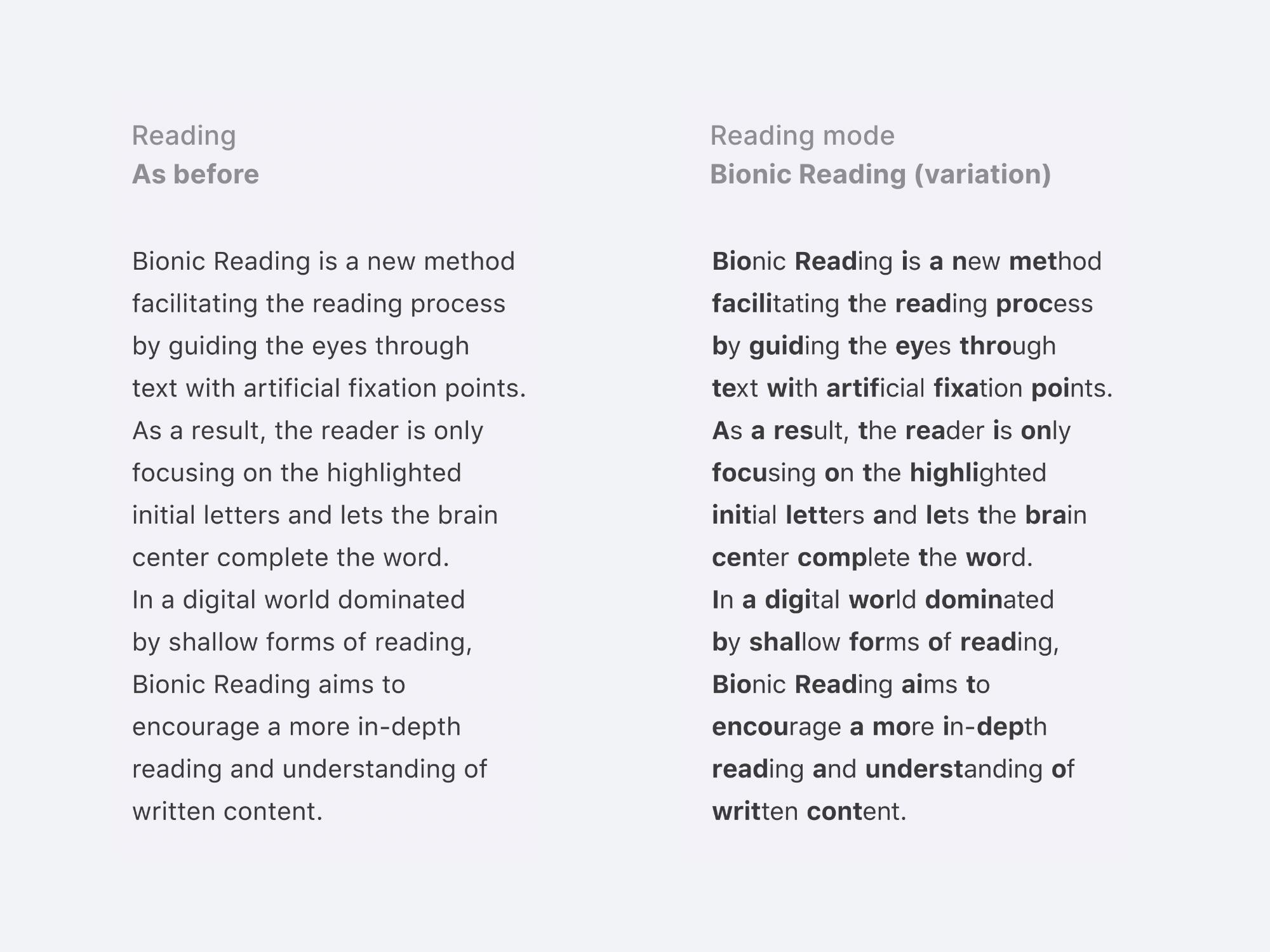
How it works: The idea rests on a quirk of how we read. Your brain doesn’t process every letter of every word. It recognises shapes, predicts what’s coming, and fills in the rest before your eyes finish the line. Bionic Reading leans into that instinct. It emphasises the opening letters of a word, creating what its inventor calls artificial fixation points, and lets your mind complete the rest on its own.
The result looks strange at first, then oddly natural. Half of each word is bold, half is light, and your eye starts hopping from anchor to anchor instead of trudging word by word. The friction seems to fall away.
Which text is easier to read?
The clever part is the design thinking behind it. Casutt took a tool from every designer’s kit, weight contrast, and pointed it at reading itself rather than at hierarchy on a page. Instead of using bold to say “this word matters more,” he used it to say “start here.”
It’s a quiet reframing of one of typography’s most basic principles, and it’s why the design world took notice so fast. It looks like a hack, but it’s really a question: what happens when typography stops decorating text and starts directing the eye?
Know more in this video
People with dyslexia and ADHD have also reported benefits from Bionic Reading, based on feedback shared by users and social media conversations. The method can further be adapted to the individual needs of readers by customizing the placement and opacity of the fixation points, which means it isn’t one fixed effect but something each reader can tune to the way their own eyes move.
What People Are Saying
It’s incredible how reading this feels like finally unlocking 100% of your brain
– @juanbuis
❤️ 1.4K
What sorcery is this?
And how do I start getting all books in this format?
– @iveneverhunted
❤️ 487
Bionic reading mode might be the best thing I’ve discovered this year.
-@joshuapekera
❤️ 361
Extremely curious how this would perform for accessibility. i.e: dyslexia\ADHD and for people who don’t quite master the language yet. Could be an interesting case study to see which user groups would benefit from this. If it works, then it could be an awesome (optional) addition.
– @babyboytaksi
❤️ 180
As someone who is dyslexic and likely ADHD too, I found the second one so easy to read. I started reading the one on the left and got bored instantly. It feels like this was designed for me to read quickly and efficiently. I WISH they wrote exam questions that way!
– @PricklyEmu
❤️ 133
ADHD here, the bionic text took less than half the time to read. Different people are saying different things but this is helpful for me.
– @beigegoat45
❤️ 117
• Get the Bionic Reading Font
• Get the Bionic Reading App
• Get the Bionic Reading Chrome Extension
Does Bionic Reading work for you? Does it make text easier to read? Share this post with a designer friend and voice your views in the comments below.