
Looking for color palettes for your next design project? Whether it’s UI, branding, or web design, the right combination of shades can set the tone and make your work stand out. Color Hex is a great tool with nearly 40,000 ready-made palettes you can explore, copy hex codes from, and even download as PNGs for quick use. We’ve handpicked some of the most versatile and … [Read more...]
This Animated Video Brilliantly Explains How To Choose The Right Colors For Your Designs
Choosing the right color palette is essential to the success of any design project. But how do we know which colors look good together and which ones don't? How do the pros do it? The answer is color theory. Artists and designers have used color theory for centuries, but anyone can learn more about it. … [Read more...]
31 Brilliant User Interface Animations
Animated interface elements don't just attract attention, they enhance user experience and help guide user flow. They reveal the functionality and process of a user interface much better than static text. Like any other element of good design, UI animations should have a purpose without being too noticeable. They should be functional above everything else. If you're looking … [Read more...]
30 Great Font Combinations For Your Next Design Project
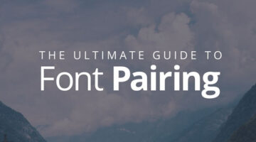
Designers often spend a lot of time deciding which typefaces to pair up and most sites don’t offer a real preview of what the text will look like. To make life easier for everyone, designer Poppie Pack from Canva has created a set of mock-ups that show different headline and body font combinations for a variety of design projects. Pack has also specified the font size and … [Read more...]
50 Beautiful Color Combinations For Your Next Design Project

Looking for some nifty color combinations for your next project? The design team at Visme, an online tool for creating presentations and infographics, has created a list of 50 beautiful color schemes you can use in your designs. These color presets are available within Visme to use in any charts or graphics that you create with it. Check out the list below. … [Read more...]
30 Beautiful Color Gradients For Your Next Design Project
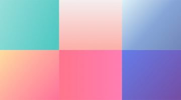
Looking for cool background gradients for your UI? Software and design company Itmeo has created a useful online tool called WebGradients – a free collection of 180 linear gradients that you can use as content backdrops in any part of your website. You can download a .PNG version of each gradient and copy their CSS3 cross-browser codes. Sketch and Photoshop packs are … [Read more...]
10 Great Google Font Combinations For Your Next Design Project
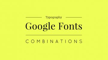
Designers often spend a lot of time deciding which typefaces to pair up and most sites just give one-sentence examples that don't offer a real preview of what the text will look like. To make life easier for everyone, the team at Milo Themes has created a set of mock-ups that show different Google Font combinations for headline and body copy. They've used filler text from … [Read more...]
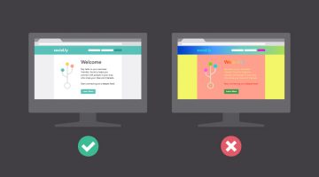
Tips To Make Your Website User-Friendly For People With Disabilities
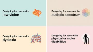
A website should be user-friendly for everyone, including those with poor vision, dyslexia, autism or physical disabilities. UK-based interaction designer Karwai Pun has created a set of six infographics that highlight the dos and don'ts of designing for accessibility. … [Read more...]
The 100 Best Web Design Tools And Resources
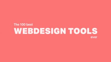
As a designer, it's imperative that you know your tools like an artist knows their paintbrushes. But with so many new apps and resources around, which ones should you bookmark? … [Read more...]
15 Great Google Font Combinations For Your Next Design Project
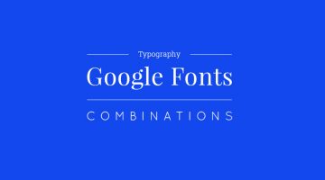
Designers often spend a lot of time deciding which typefaces to pair up and most sites just give one-sentence examples that don't offer a real preview of what the text will look like. To make life easier for everyone, the team at Milo Themes has created a set of mock-ups that show different Google Font combinations for headline and body copy. They've used filler text from … [Read more...]
A Closer Look At Web Designers And Their Funny Habits
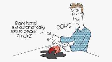
We web designers are a peculiar species. We like to do things with <style>. We refuse to eat at restaurants where the <table> layout sucks. We search for the Ctrl/Cmd Z button every time we spill our coffee. Our relationship with developers is similar to Donald Trump's relationship with immigrants. We like to keep 'other' humans at a distance, unless they know the … [Read more...]
32 Creative Loading Animations That Are Worth The Wait
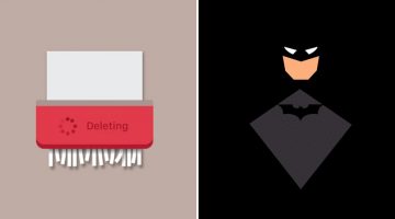
47% of users expect a webpage or an app to load in 2 seconds or less. After 4 seconds, the average user starts getting frustrated and after 8 seconds, they leave. In fact, a one second delay in your site speed can result in a 7% reduction in customer conversions. Loading time is crucial to the success of your site, app or program and if you can keep the user engaged for … [Read more...]
5 Color Choices You Must Avoid When Designing For The Web
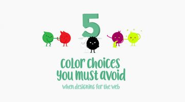
When it comes to web design, colors play a vital role in increasing conversions, reducing bounce rate and ensuring a smooth user experience. We often see websites compromising on readability by using light-colored text on light backgrounds. Also, it's never ok to use red and green in excess, even if you're making a Christmas-themed website. … [Read more...]
What Different Colors Mean And How To Use Them
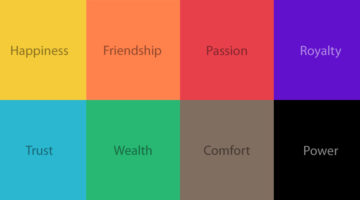
Did you know that blue is used for corporate and business designs because it represents dependability, trustworthiness and security? Orange is used to give a friendly impression without being overpowering. Darker shades of purple characterize wealth and luxury. TechKing has come up with a handy infographic that covers the psychology of different colors, their appropriate … [Read more...]
8 Dos and Don’ts Of Creating Pixel Icons In Illustrator
Chennai-based UI/UX Designer M.A. Kather has created an eight-point visual guide that covers some basic dos and don’ts of creating pixel icons in Adobe Illustrator. Kather’s visual comparison of Photoshop vs Illustrator was previously featured on our site. This new series offers a few tips and tricks that’ll come in handy for design students, beginners and professionals alike. … [Read more...]
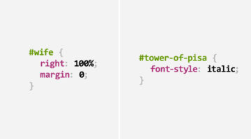
15 Graphic Design Terms That Most Designers Get Wrong
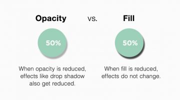
Graphic design has its own language, and most designers use it every day without thinking twice. But some of the most common graphic design terms are also the easiest to mix up. Font and typeface, letterspacing and kerning, opacity and fill, crop and trim — they sound similar, but they don’t always mean the same thing. Getting these terms right matters, especially when … [Read more...]
8 Beautiful Color Palettes For Your Next Design Project
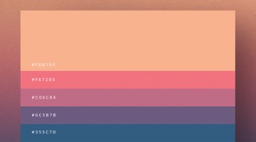
Milan-based creative director Duminda Perera has created a series of minimalist color palette posters that are both handy and beautiful. Not only do they give you color ideas (with hex codes) for your next project, you can use these posters to decorate your studio, office or home. Check them out below. … [Read more...]
36 Brilliant User Interface Animations
Animated interface elements reveal the process and functionality of a UI much better than static text. They enhance user experience and help guide user flow. Like any other element of good design, UI animations should have a purpose. They should be functional without being overly flashy. … [Read more...]
34 CSS Puns That Prove Designers Have A Great Sense Of Humor
Cascading Style Sheets (CSS) is a stylesheet language that defines how the content on a web page is to be displayed with colors, borders, fonts, backgrounds, etc. Inspired by this Reddit thread, today's post showcases 34 CSS puns that'll put a smile on every web designer's face. The interesting bit is that even if you have no clue about the technicalities, you'll still … [Read more...]
110 Free, Flat And Minimalist Icons For Personal And Commercial Use
Add a touch of elegance to your next web project with these minimalist icons that'll make your designs look professional, classy, and cohesive. Thanks to WhoIsHostingThis.com for this useful freebie. Usage & Attribution: You can use these icons for commercial and non-commercial projects as long as you provide a link back to this page on their website. There are two … [Read more...]
50 Free, Flat And Gorgeous Icon Sets For The Modern Designer
When designing user interfaces, the icons you choose are crucial because they guide users through their digital experience. Flat icons have been popular since quite a while because of their clean, straightforward design which meshes well with modern aesthetics. Today, we'll take a look at some standout flat icon sets. These icons not only look sleek but also improve … [Read more...]
8 Design Blunders That’ll Make People Leave Your Website
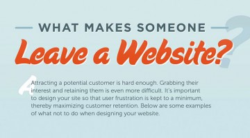
Visitors come. Visitors go. Some leave quicker coz of the reasons below. … [Read more...]