How To Make Hundreds Of Color Palettes From Just One Color
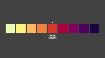
How do you create color palettes in Photoshop? What methods do you use to combine colors, and how do you know if those colors go well with each other? Greg Gunn from The Futur Academy has come up with an excellent tutorial that shows you an easy process for creating color palettes that work. He takes you through an interesting "arc" technique with which … View Post ▸
Designer Redesigns Famous Logos In The Time Of Coronavirus And Social Distancing
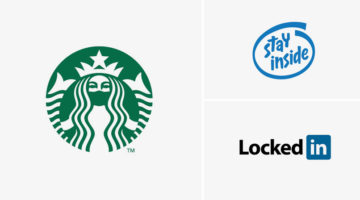
Slovenian graphic designer Jure Tovrljan has come up with a clever project that features famous logos reimagined for the age of coronavirus and social distancing. For instance, the Starbucks logo has been redesigned to show the siren wearing a mask. The "Intel Inside" logo has been rebranded to "Stay Inside", LinkedIn has been rebranded to "LockedIn", and … View Post ▸
Designer Explains Coronavirus Precautions Using Graphic Design Terms

Maaz Afzal from Pen28 Creatives has come up with a clever project that explains Covid-19 precautions using graphic and web design terms. The objective is to guide designers to practice safe procedures using terms that they relate to. For example, the project advises designers to "increase social kerning", "avoid condense layouts", and "embed yourselves at … View Post ▸
Graphic Designer Replaces Wordmarks In Popular Logos With The Fonts They Use
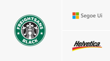
Italian graphic designer Emanuele Abrate has come up with a clever project titled Logofonts, in which he substitutes wordmarks of famous logos with the name of the fonts they use. For example, the word "Omega" in the Swiss watchmaker’s logo has been changed to "Futura" written in the same style as the original logo. Nutella’s wordmark logo has been … View Post ▸
Hidden Meanings In 50 Famous Brand Logos

Did you know that the orange arrow in the Amazon logo points from the letter "A" to "Z", symbolizing that Amazon has every item from A to Z. The Nike "Swoosh" logo is not just a checkmark. It also symbolizes the wing of Nike, the Greek goddess of victory. Apple logo designer Rob Janoff took a bite out of an apple as an experiment, then realized that … View Post ▸
Top 8 AI Tools For Graphic Designers
Artificial Intelligence can help designers boost their creativity by providing them with material and inspiration. It can also speed up workflow by taking care of boring and tedious tasks that require a lot of time and effort. Albanian UI/UX designer Dorjan Vulaj has come up with a handy list of AI tools that can help you enhance images, create font … View Post ▸
Nike Says Goodbye To Kobe Bryant With A Beautiful Tribute

They say images speak louder than words, but Nike just proved that is not always the case. The sportswear giant released a touching tribute to Kobe Bryant just ahead of the public memorial service at the Staples Center for the Lakers legend and his daughter Gianna. The two-minute video features no images or footage, just text and audio clips that … View Post ▸
Look Closer To See What People Are Actually Kissing In These Brilliant Ads By McDonald’s

McDonald's advertisements usually consist of family-friendly imagery, which is why people were taken by surprise at this steamy Valentine's Day campaign by McDonald's Thailand. The three-ad series features close-up images of a pair of lovers leaning in for a kiss. When you look closely, you realize that one of the faces is actually a McDonald's burger … View Post ▸
7 Graphic Design Mistakes That Novice Designers Make

After a few years in the design business, you realize how important it is to get the basics right. Like using the right number of fonts, maintaining consistency among UI elements, using grids, the importance of whitespace, etc. Montana-based graphic/web designer Josh Corbett has come up with a handy list of 7 graphic/UI design 'sins' that differentiate … View Post ▸
Artist Offers To ‘Remove Your Ex’ For $10 Per Photo, Gets Flooded With Requests

Ever wanted to remove your ex-boyfriend from your graduation day photograph? Or your ex-girlfriend from photos of your Hawaii trip, or that epic concert you went to? Artist and make-up enthusiast @hexappeal will remove your pesky ex from your fondest memories for just $10 per photo. After offering her services on Twitter with a sample before-and-after … View Post ▸
This Free Online Tool Will Create A Color Palette From The Letters Of Your Name
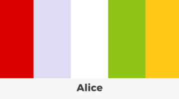
New York-based product designer Bernadette Sheridan has a condition called Grapheme-color synesthesia, in which, she perceives letters and numbers as very specific colors. As a result, when she meets new people and hears their name, her mind starts visualizing the colors of each letter. To document this phenomenon, Bernadette has launched a synesthesia … View Post ▸
Average Salaries Of Designers, Developers, And Photographers Around The World

Digital marketing service provider Yell Business looked into some of UK's most popular job roles and calculated the equivalent earnings for those jobs in other countries. We've shared the data for graphic designers, web developers, and photographers below. Yell has taken into account the cost-of-living index of each country in comparison to the UK, and … View Post ▸
How To Create Animated GIFs And Cinemagraphs With Endless Loop In Photoshop

A cinemagraph is a still photograph that contains a minor, repeated movement that is looped seamlessly to give the illusion of a never-ending animation. Photoshop instructor Unmesh Dinda from PiXimperfect has come up with a handy tutorial that shows you how to create a cinemagraph or an animated GIF with a smooth, endless loop in Photoshop. Learn how to … View Post ▸
How To Create Color Schemes For Your UI Design Using The 60-30-10 Technique
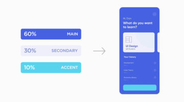
Selecting the right colors for your UI and applying them effectively can be a tricky task. You want to choose colors that go well with each other and create a sense of harmony within the design. You also want to pick the right accent colors to highlight elements like buttons and call-to-actions. Venezuelan product designer Dan Romero has come up with an … View Post ▸
This Feature In Photoshop Lets You Convert Raster To Vector With Just One Slider

Did you know that you can now convert a raster image into a vector graphic within just a few seconds in Photoshop? You can also import the vector into other Adobe applications. In this handy tutorial, Photoshop instructor Unmesh Dinda from PiXimperfect shows you how to use Libraries to open the Adobe Capture interface and create vector shapes out of … View Post ▸
Graphic Designer Replaces Wordmarks In 30 Famous Logos With The Fonts They Use
Italian graphic designer Emanuele Abrate has come up with a brilliant project titled Logofonts that replaces wordmarks of famous logos with the name of the fonts they use. For example, the word "Google" in the tech giant's logo has been changed to "Product Sans" (name of the font used) written in the same colorful style. The wordmark in Amazon's logo has … View Post ▸
How To Use Photoshop’s Content-Aware Fill To Remove Objects Like Fences In No Time
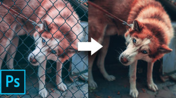
Removing complex unwanted objects from a photo can be a herculean task, but Photoshop's latest Content-Aware Fill makes it easier than ever before. In this brilliant tutorial, Photoshop instructor Unmesh Dinda from PiXimperfect shows you how to remove a chain-link fence from a photograph in three simple steps. Learn how to use the powerful new … View Post ▸
55 Valuable Resources For Logo Designers
Before you begin work on a design project, it's always good to have a list of handy resources you can browse through for tips, ideas, and inspiration. But with so many resources available online, which ones are worth bookmarking? Kalypso Designs has come up with an excellent list of logo design resources across eight categories. These include design … View Post ▸
5 Useful Tips To Help You Create Better Logos
A good logo is one that is memorable, versatile, appropriate, and timeless. It should make a great first impression of the company, and create brand recall as the years go by. From an execution point of view, the colors, typography, and geometry of the logo symbol should be relevant to the brand, to the target audience, and the industry in which the brand … View Post ▸
Ranked: Top 7 Apps To Convert Low-Res Images To High-Res
If you need to convert a low-resolution image to a high-res one, there are plenty of online image upscalers that use artificial intelligence to enlarge photos with minimum loss of quality. But which of these online services is the best? In this handy tutorial, Photoshop instructor Unmesh Dinda from PiXimperfect compares the top seven platforms for … View Post ▸
How To Convert A Negative Film Into A Digital Image At Home With Photoshop
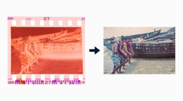
Did you know that you can use Photoshop to develop a negative film and convert it into a digital image, instead of hiring a photographer or a studio to do the same? In this handy tutorial, Photoshop instructor Unmesh Dinda from PiXimperfect shows you how to easily develop a negative film in three simple steps. He shows you how to take a picture of the … View Post ▸
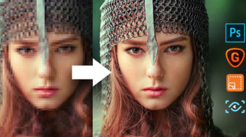
How To Convert 2D Images To 3D In Photoshop

Did you know that Photoshop isn’t just for editing photos — it also has powerful 3D capabilities built right in? Whether you're designing product mockups, adding depth to illustrations, or experimenting with light and texture, Photoshop’s 3D tools can help you transform flat 2D images into realistic three-dimensional scenes. In this brilliant tutorial, … View Post ▸
47 Beautiful Color Schemes For Your Next Design Project
Looking for color schemes for your graphic, web, or UI design? SchemeColor is a handy online tool that lets you create, save, and customize beautiful color palettes. You can browse and filter schemes by color or keywords like pastel, rainbow, monochromatic, etc. You can modify the color palettes, and download them in .PNG format. The RGB, CMYK, and … View Post ▸
This Hidden Photoshop Feature Lets You Crop And Straighten Multiple Photos In Just 1 Click
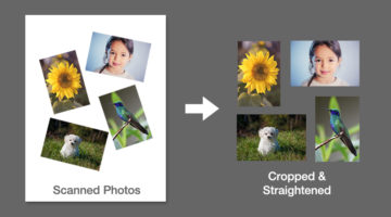
Did you know that there is a feature in Photoshop that automatically crops and straightens all the photos in a scanned image, in just one click? In this short and sweet one-minute tutorial, Photoshop instructor Unmesh Dinda from PiXimperfect shows you how to use the Automated features to help you crop, straighten, and export images. Watch below. … View Post ▸
12 Important Design Principles Explained With Simple Graphics
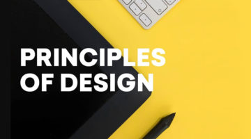
There are no formulas or fixed rules for good design, but there are a few enduring principles that quietly underpin everything we see. They’re what allow you to create design that is functional, effective, and visually compelling, whether you’re working across graphic design, branding, advertising, or UI and UX. Concepts like contrast, balance, hierarchy, … View Post ▸
Photoshop’s New ‘Object Selection Tool’ Is A Dream Come True For Designers

Adobe Photoshop has a new tool called 'Object Selection Tool' that is designed to accelerate your selection workflow. It is available from Photoshop version 21.0 onwards, and is placed above the Quick Selection and Magic Wand tools in the tool bar. To use, just select the tool and click and drag over the object in your photo. Using Adobe Sensei machine … View Post ▸
39 Clever Ads That Play With Text And Typography

“Typography is an art. Good typography is art.” – Paul Rand. Previously, we featured ads with brilliant art direction, clever copywriting, powerful social issue campaigns, and ads that make good use of negative space. In today's post, we look at some great examples of how brands use typographic art and illustrations in advertising to get their message … View Post ▸
6 Useful Tips To Help You Create Better Gradients
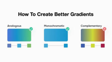
Gradients are a popular trend in graphic, web, and UI design nowadays, but it's important to know how to use them correctly. Smooth, minimal transitions look great in UIs. Use analogous and monochromatic colors instead of complementary colors. When it comes to text, you can use gradients for headings and quotes, but never for body copy. Venezuelan product … View Post ▸
8 Biggest Typography Mistakes That Novice Graphic Designers Make
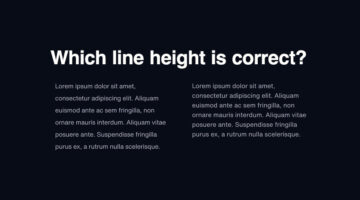
One of the key differences between an amateur designer and a professional designer is the way in which they set their type. Professional designers know how many fonts to use and in what size. They know what the correct line-height is, the optimum paragraph length, the right contrast ratio, etc. Polish designer Tom Koszyk has come up with an excellent list … View Post ▸
8 Great Google Font Combinations For Your Next Design Project
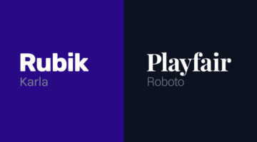
Previously, we featured 15 great Adobe Font combinations for your graphic, web, and UI design projects. In today’s post, we look at some beautiful Google Font combinations, with the help of this excellent list by Polish designer Tom Koszyk. Koszyk also suggests which font combinations to use for a particular type of app or website. For example, … View Post ▸
7 Mistakes You Should Avoid In Logo Design
Whether you're a beginner or a pro, designing a successful logo for your client is always a tricky task. You need to keep in mind the brand objective, the target audience, and the industry in which the company operates. From an execution point of view, you need to ensure your logo is scalable, the colors are relevant, and the typography is spot on. A … View Post ▸
35 Epic Memes For Graphic Designers
Are you in the middle of difficult project with a stiff deadline? Is your client giving you sleepless nights? Are you tired of your boss micromanaging everything? If yes, then what you need is a healthy dose of meme-therapy to help brighten up your day. In a study of 520 designers and developers, neuroscientists found that memes helped reduce work burnout … View Post ▸
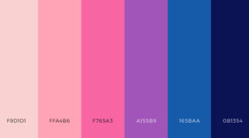
39 Beautiful Color Palettes For Your Next Design Project
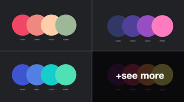
Looking for color schemes for your graphic, web, or UI design? Ocean.ui is a handy Instagram account that shares a beautiful new palette everyday, with hex codes of each color. They also share font combinations, patterns, and UI elements made using their color palettes. We’ve shortlisted some of the best palettes on the Ocean.ui page in terms of aesthetic … View Post ▸
5 Tips To Design Call-To-Action Buttons That Get Clicks
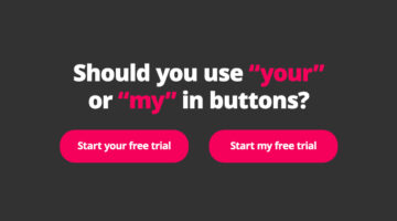
A call-to-action or CTA button is an interactive UI element that guides users to take certain actions on a website or application. For example: Sign Up, Book Now, Buy Now, Subscribe, etc. The objective of a CTA button is goal conversation for your website or application. It is the intended action you want the user to take, like buying your product, making … View Post ▸
AI Creates 100,000 Realistic Photos You Can Use For Free Without Copyright

For most design projects and presentations, you need quality portraits of people. Designers often spend a lot of time trying to find images that are free, diverse, and legal to use. To make life easier, Icons8 has come up with a brilliant free resource called Generated Photos - a diverse library of 100,000 realistic faces created by artificial … View Post ▸
- « Previous Page
- 1
- …
- 5
- 6
- 7
- 8
- 9
- …
- 38
- Next Page »