45 Typographic City Logos Based On Their Famous Landmarks
Every great city carries a silhouette you’d recognize anywhere. The sweeping shells of the Sydney Opera House. The lattice spire of the Eiffel Tower. The tiered roofline of Beijing’s Temple of Heaven. Yemen-based graphic designer Mohamed Aljaadaby took that idea one step further and asked a deceptively simple question: what if a city’s name was its landmark? The result is a series of typographic city logos that spell out each city using the very monument that made it famous.
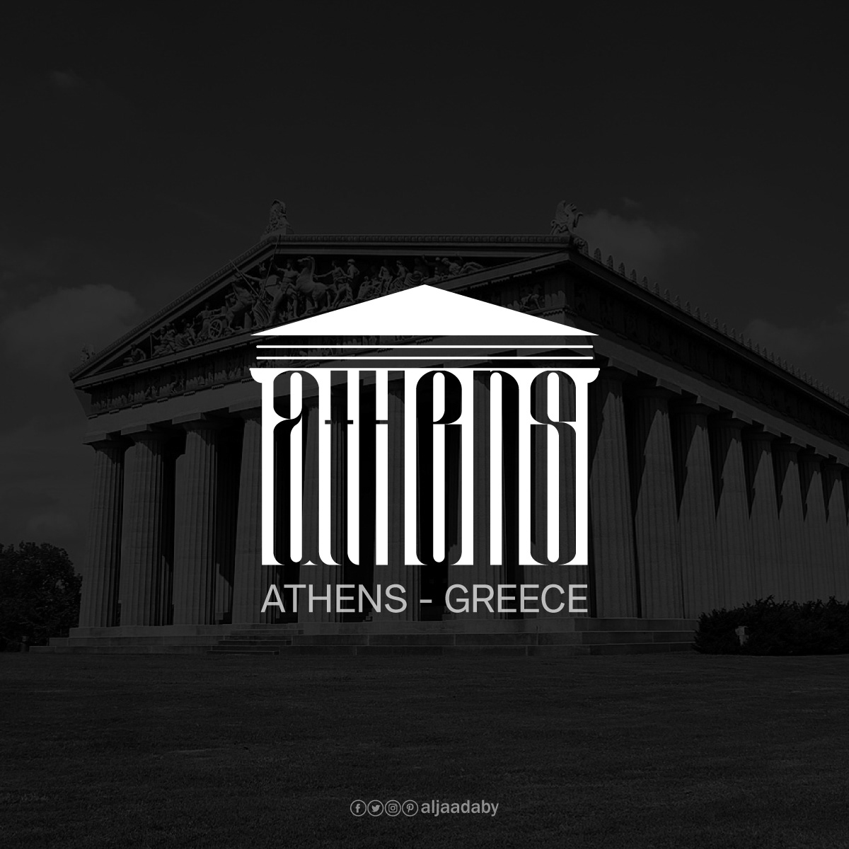
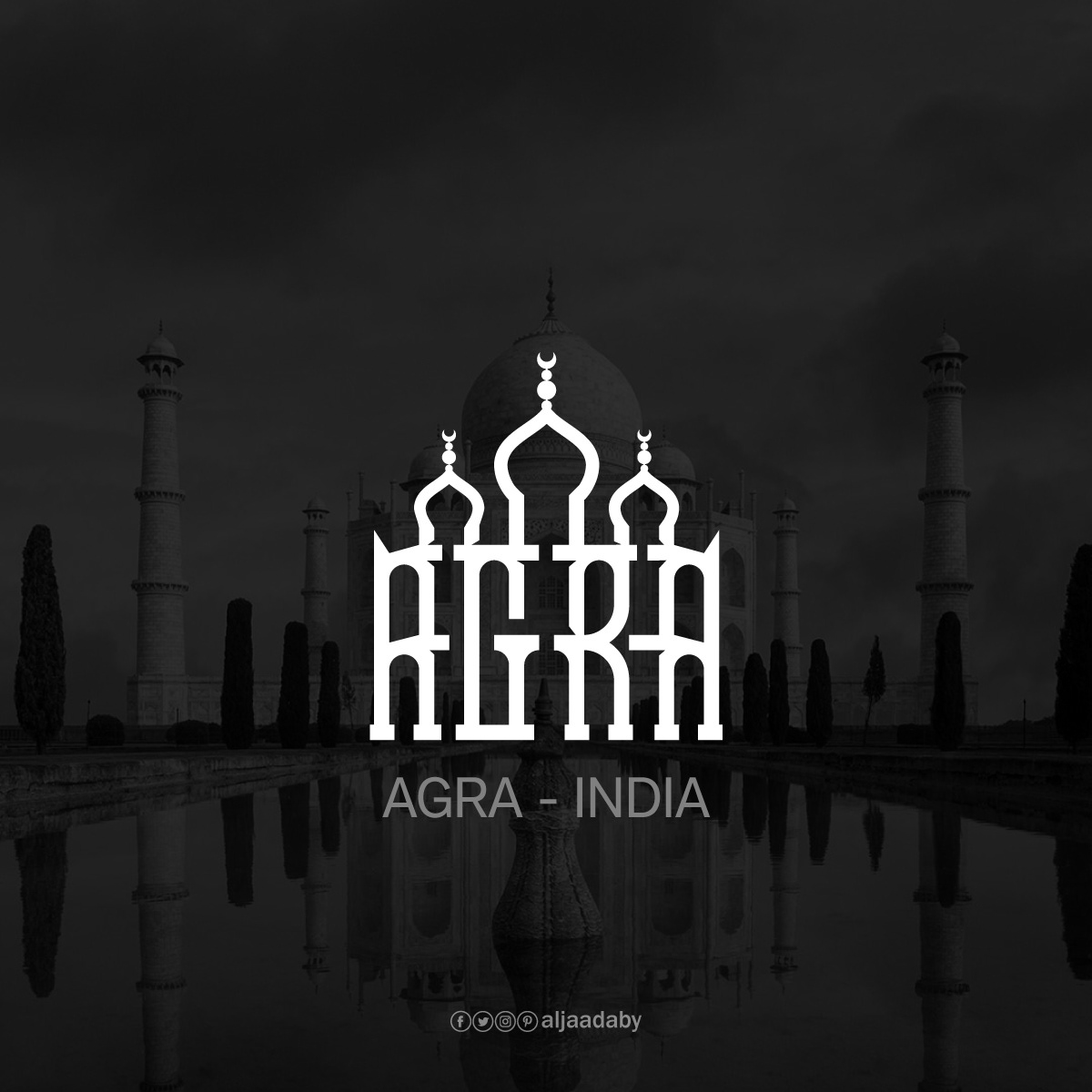
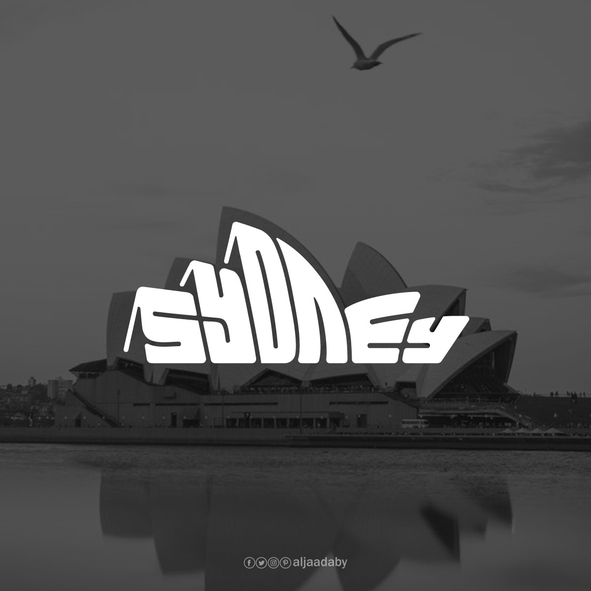
Part wordmark, part illustration, each design bends the letters of a city’s name into the contours of its most iconic structure. “Agra” rises into the domes and minarets of the Taj Mahal. “Athens” sits inside the columns of the Acropolis. “Sydney” curves into the sails of the Opera House. Read it as a word or see it as a building. The best of these logos let you do both at once.
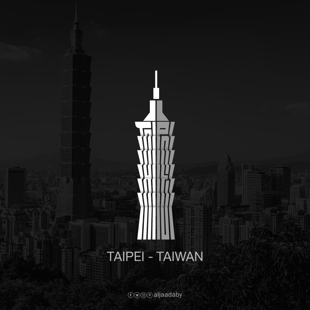
Legibility separates the clever ones from the merely pretty. The strongest marks keep the name readable even as it becomes the building, so you catch the word and the landmark in the same glance. The weaker ones lean on a shortcut, stretching the letters into rows of thin vertical strokes that suggest a tower or a facade but stop spelling anything in particular. That balance, between reading a word and seeing a monument, is the whole game here, and it’s what the best ones get right.
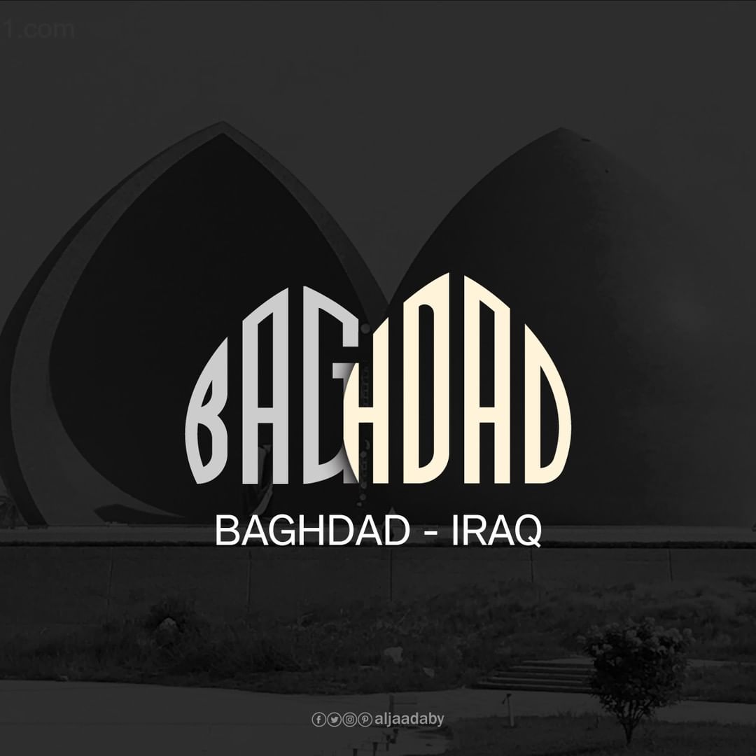
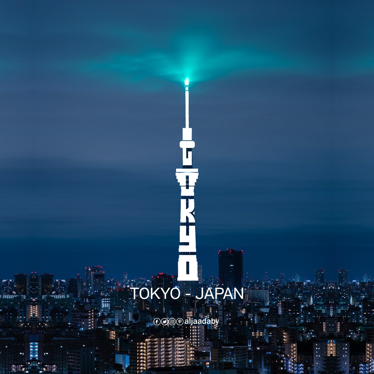
The real fun is spotting the standouts. In a set this large, some marks play it safe, tall towers and symmetrical facades start to rhyme with each other after a while, but the best few are genuinely inspired. Sydney melts into the Opera House sails. Baghdad splits across the monument’s twin domes. Tokyo climbs the Skytree in one clean vertical line. Those are the ones that stop you, and they make the whole collection worth scrolling. Some you’ll read instantly. Others reward a second look. See which cities you recognize, and decide for yourself which he absolutely nailed.
Athens
Acropolis of Athens
Agra
Taj Mahal
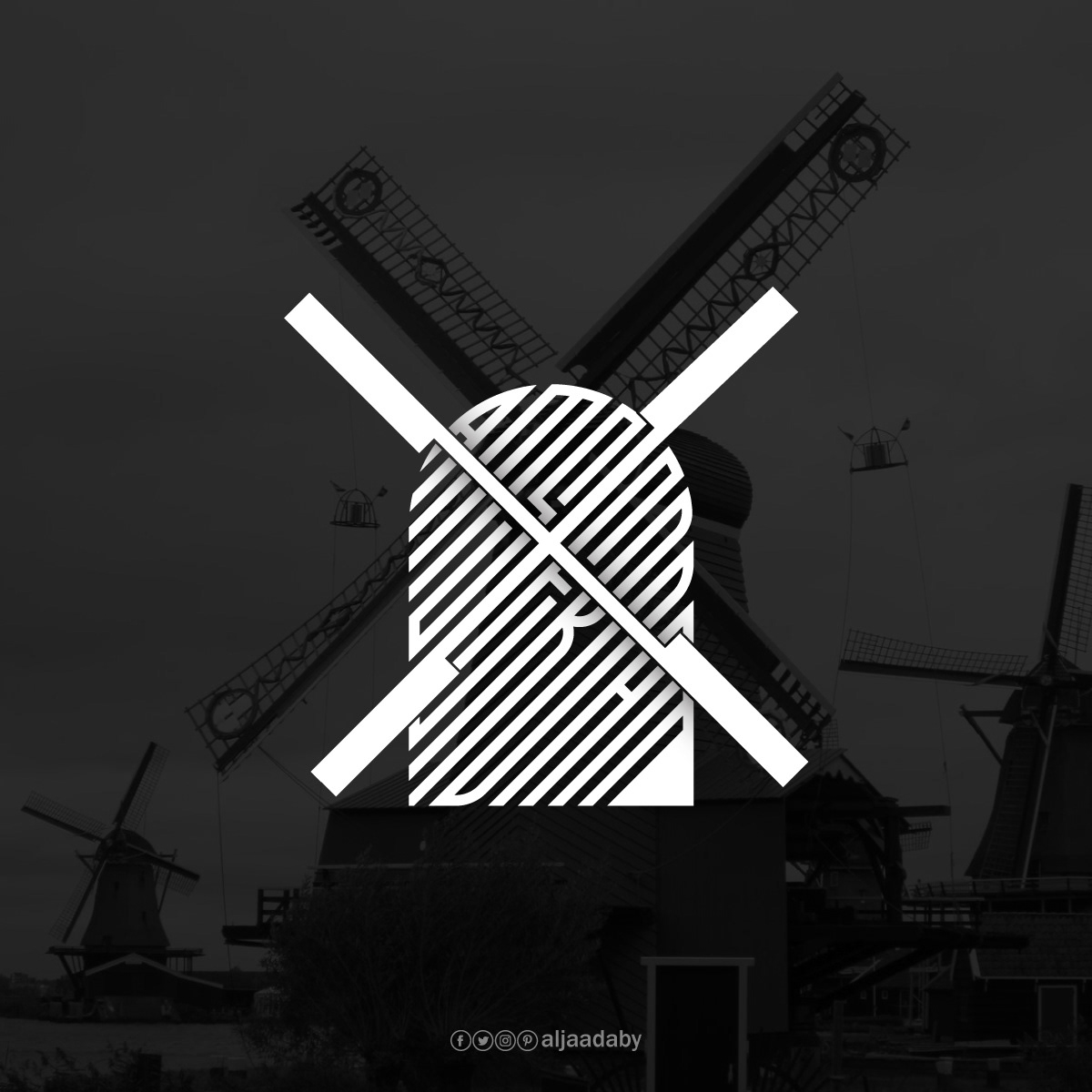
Amsterdam
Molen van Sloten
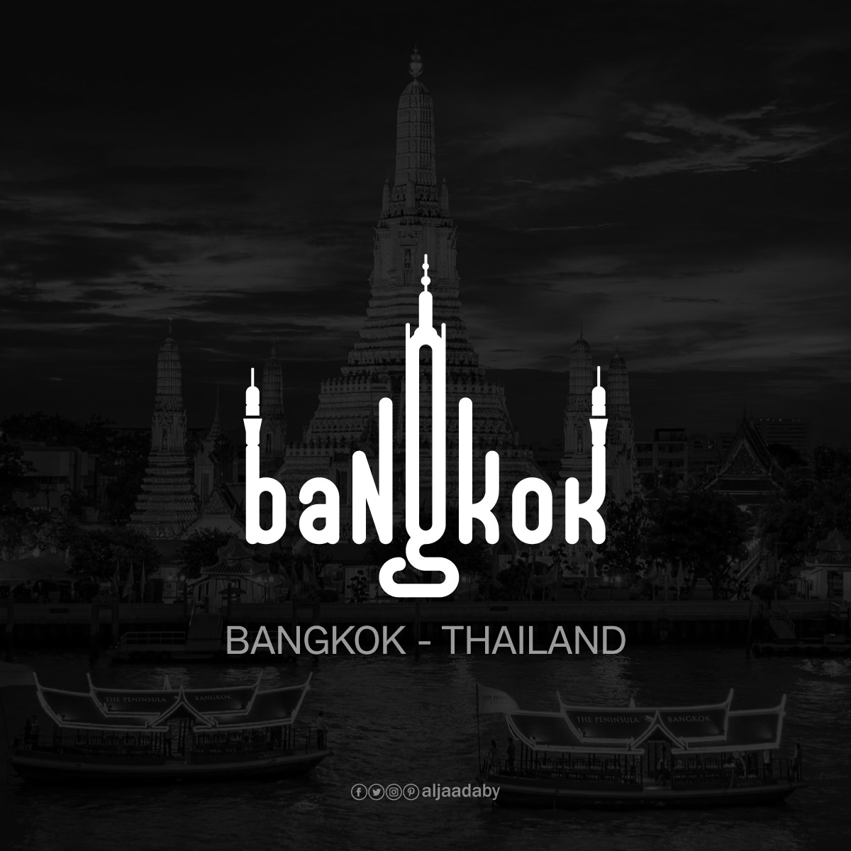
Bangkok
Wat Arun Temple
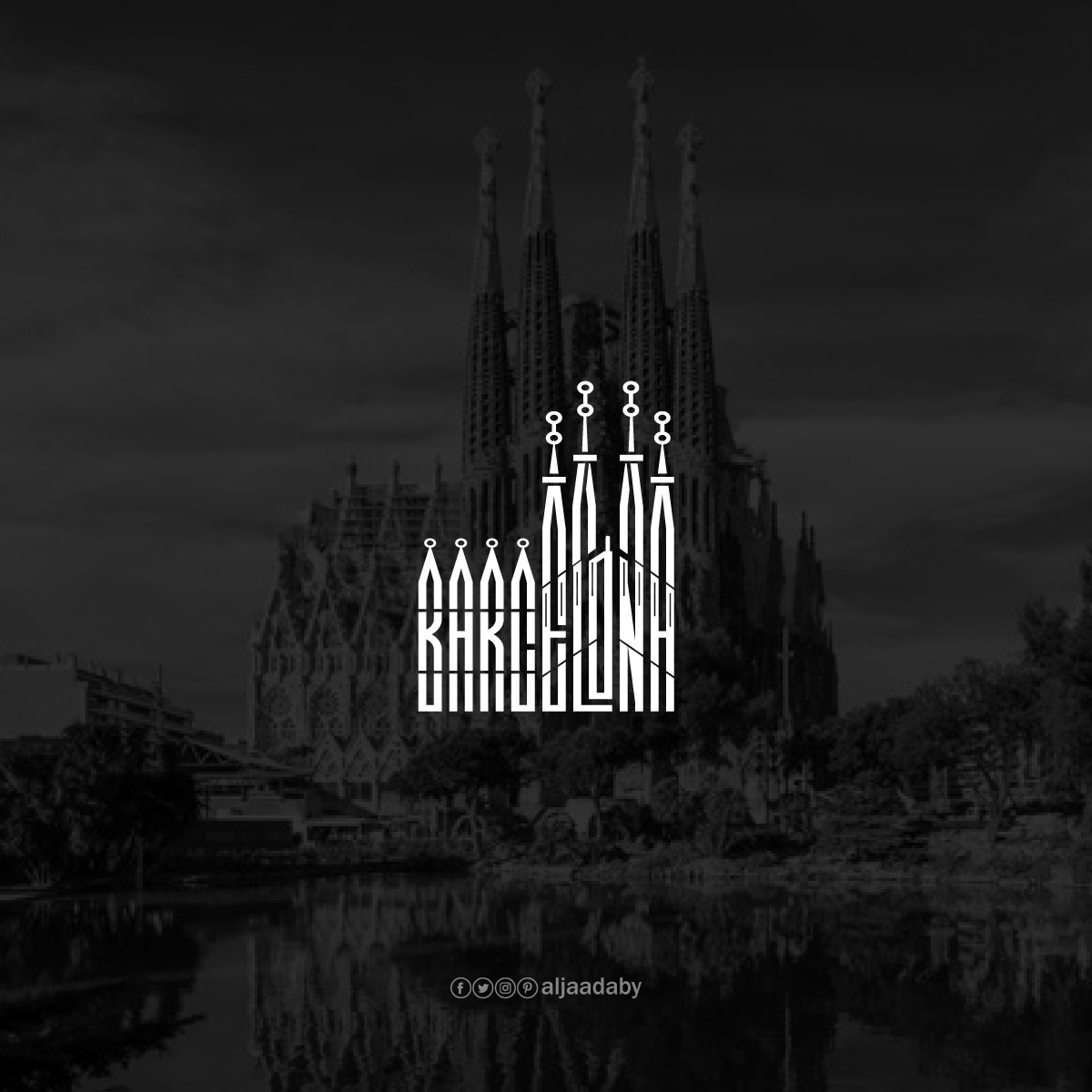
Barcelona
Sagrada Família
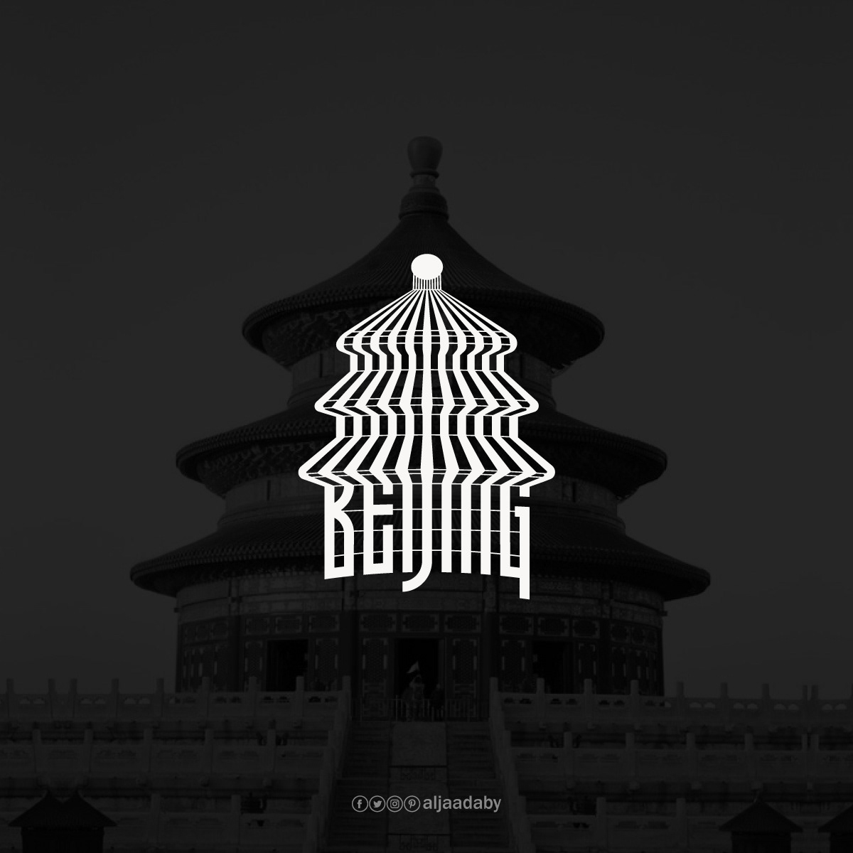
Beijing
Temple of Heaven
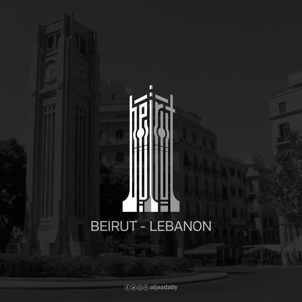
Beirut
Al-Abed Clock Tower
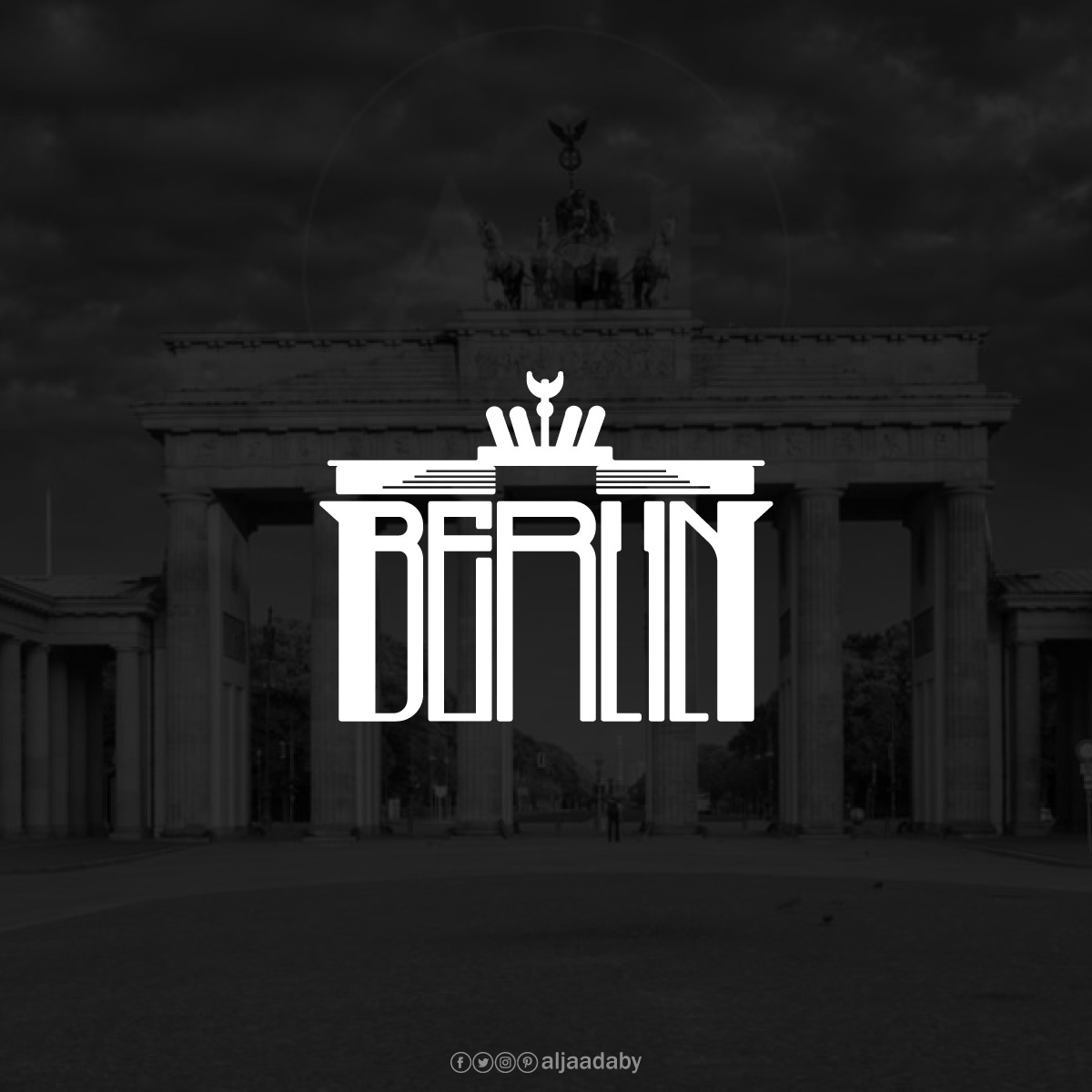
Berlin
Brandenburg Gate
Baghdad
Al-Shaheed Monument
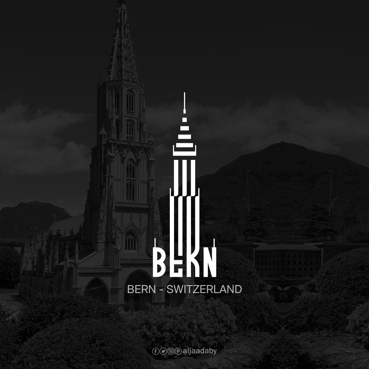
Bern
Bern Minster
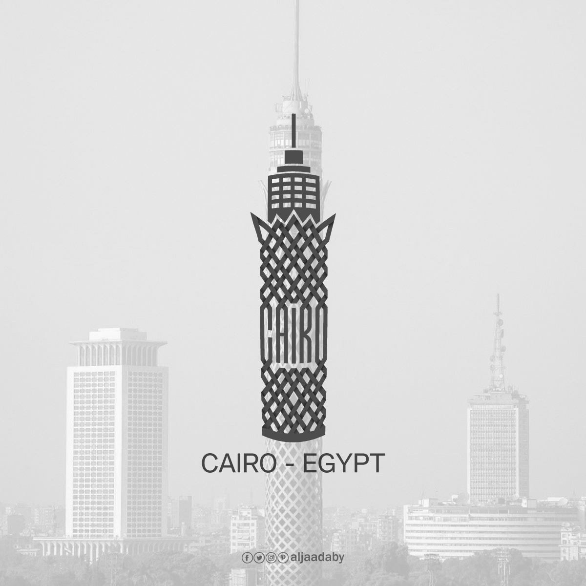
Cairo
Cairo Tower
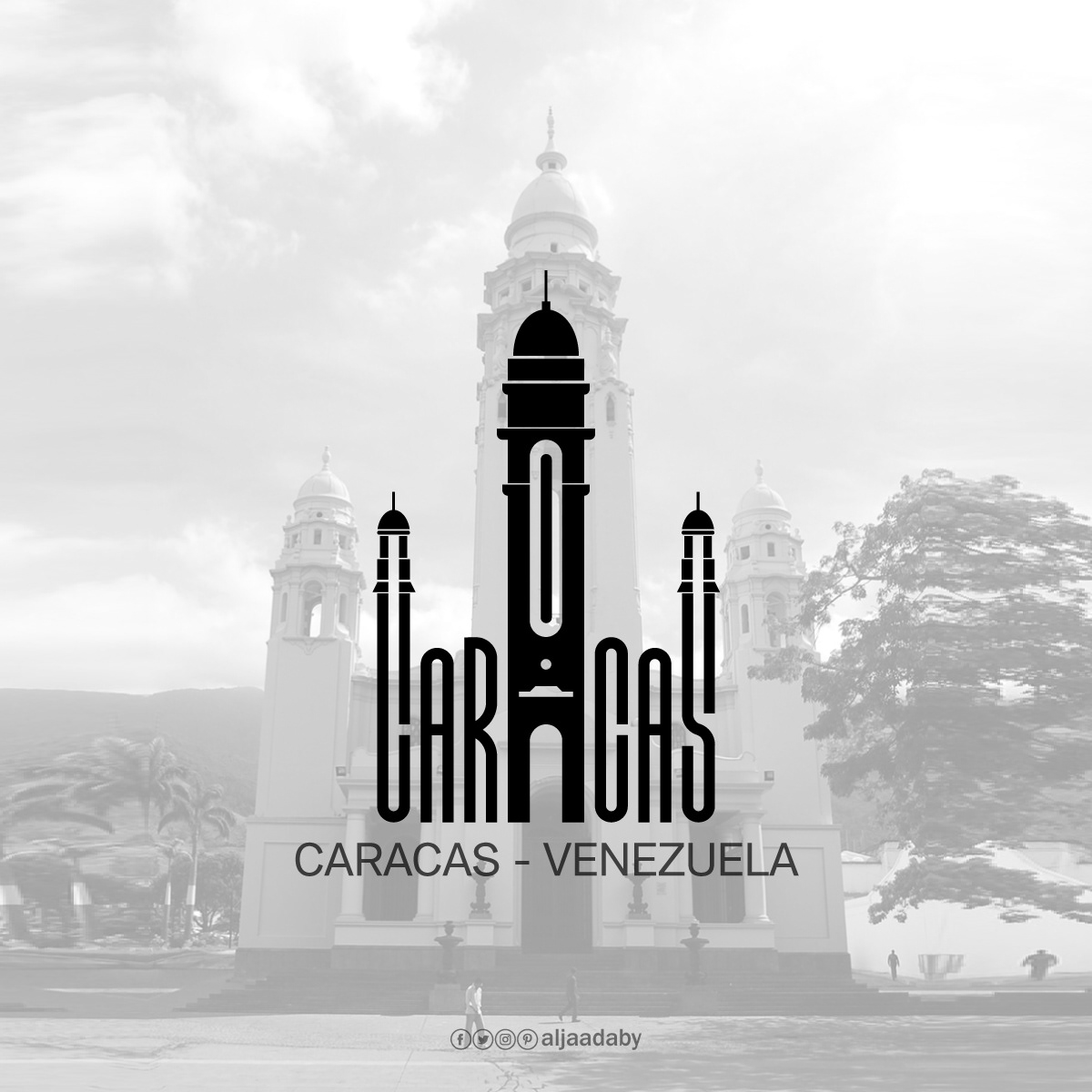
Caracas
National Pantheon of Venezuela
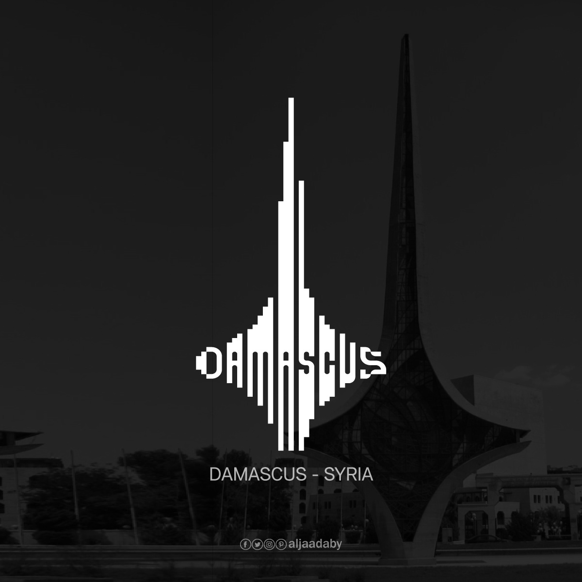
Damascus
Damascene Sword Monument
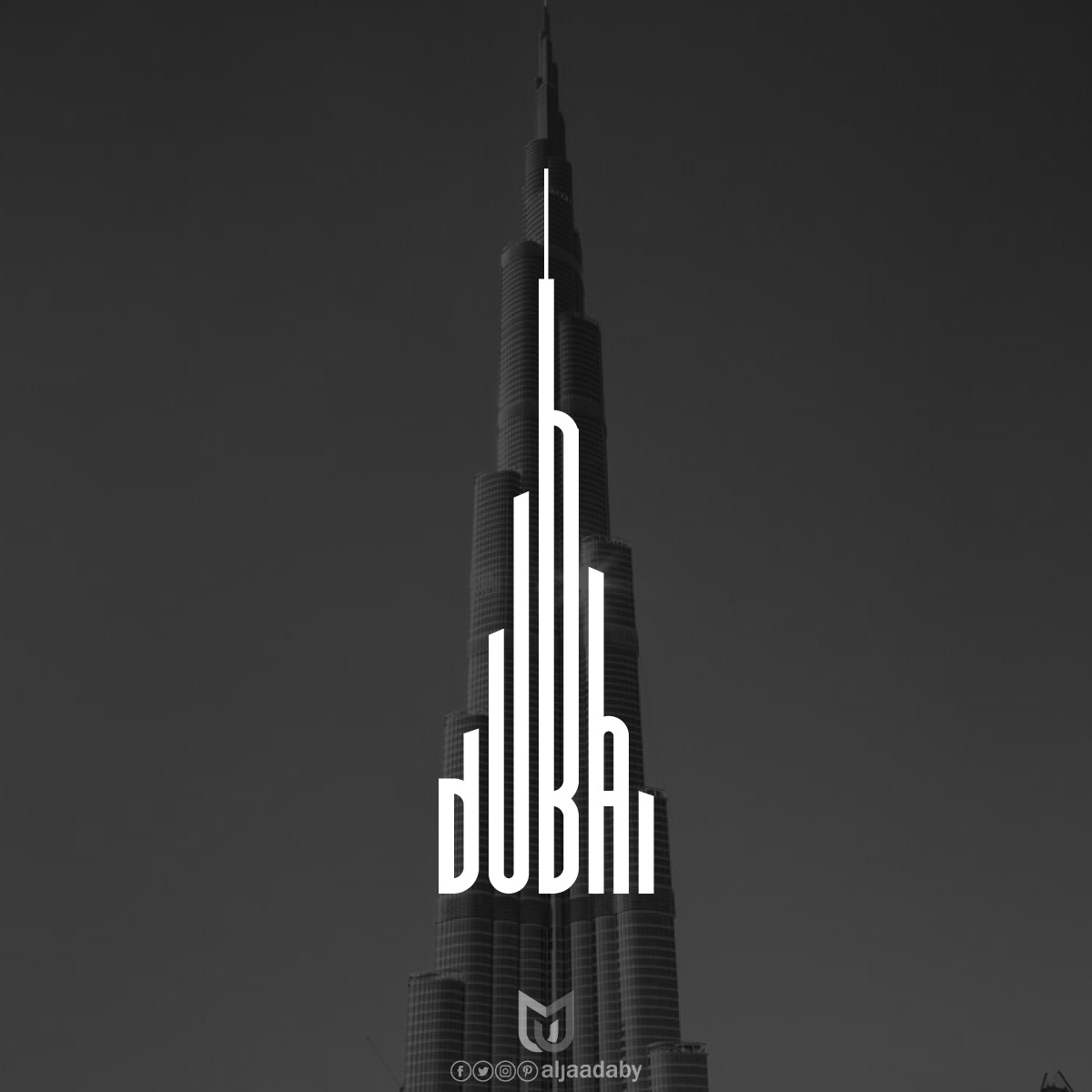
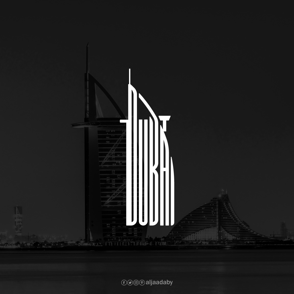
Dubai
Burj KhalifaBurj Al Arab
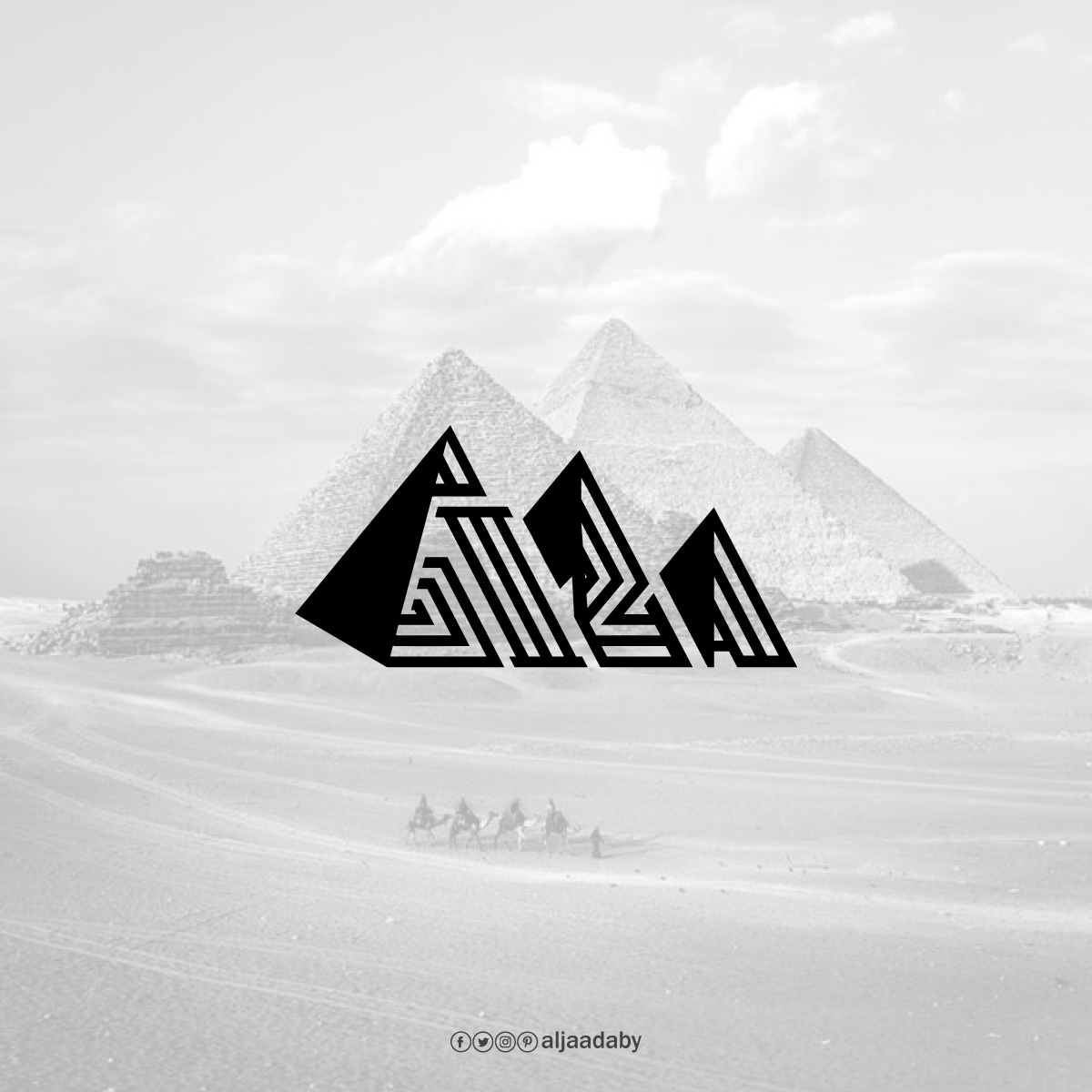
Giza
Great Pyramid of Giza
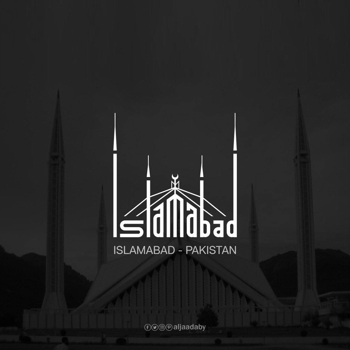
Islamabad
Faisal Mosque
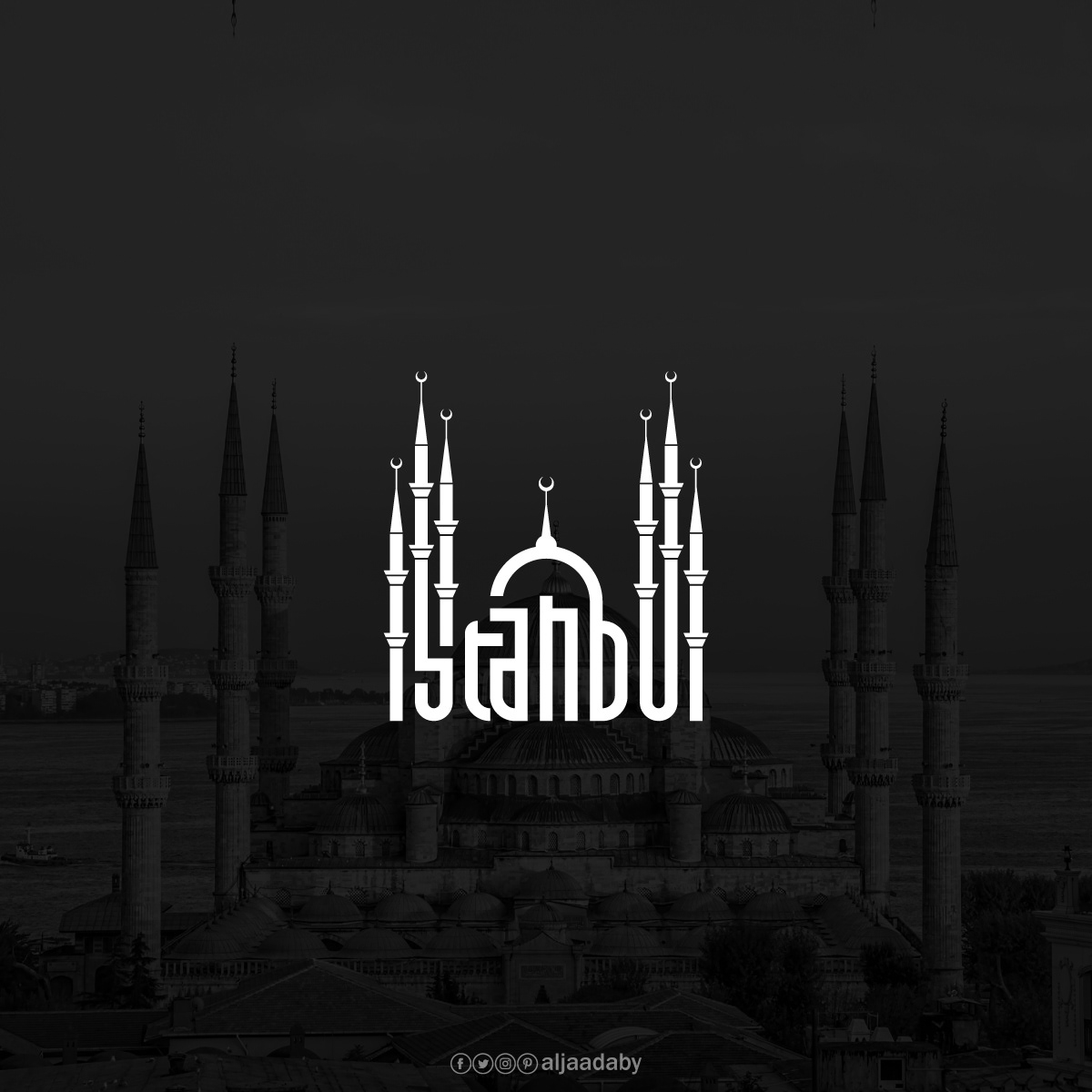
Istanbul
Blue Mosque
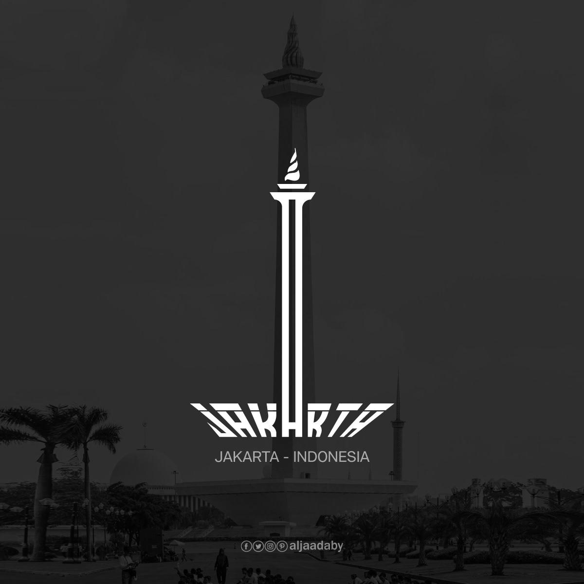
Jakarta
Monumen Nasional
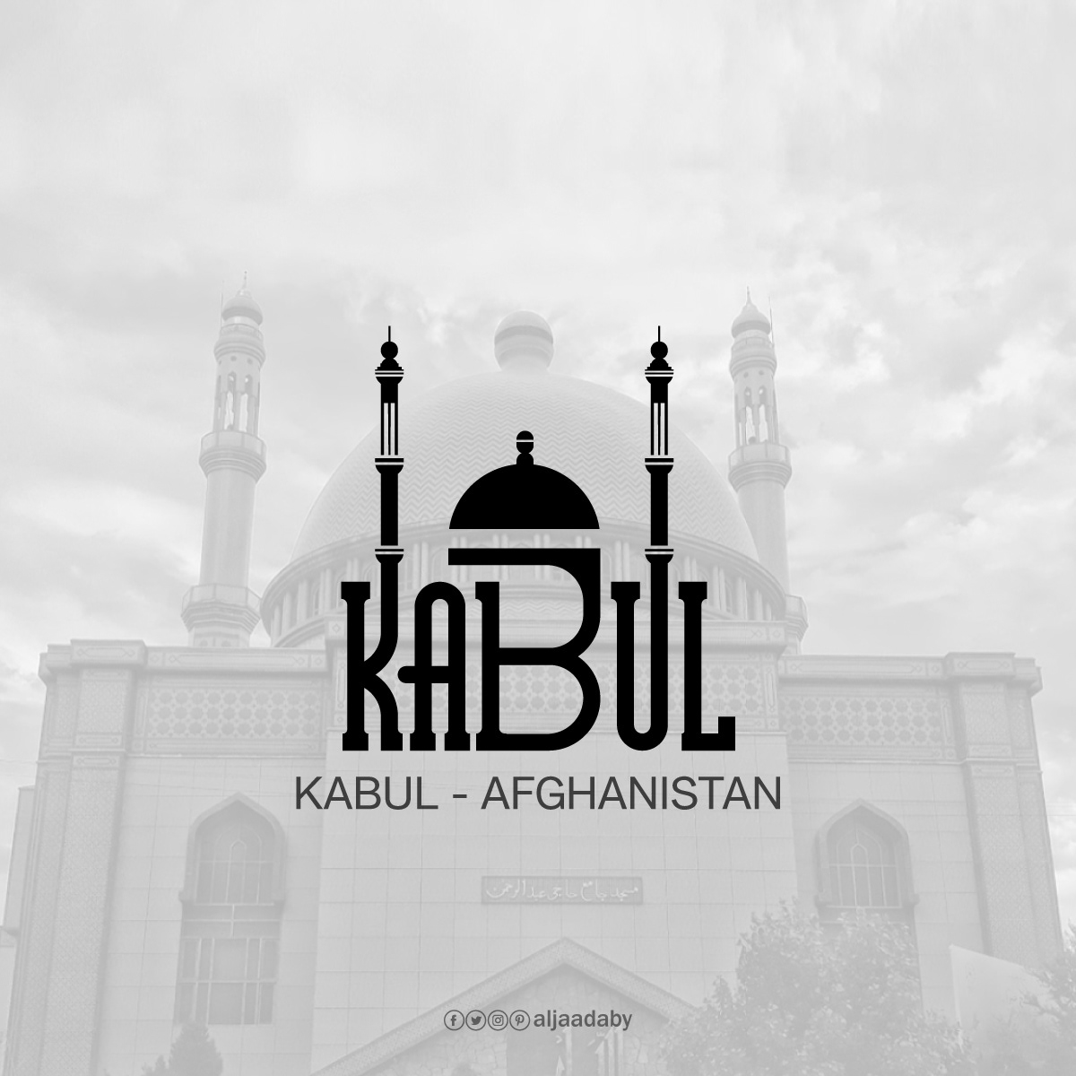
Kabul
Abdul Rahman Mosque
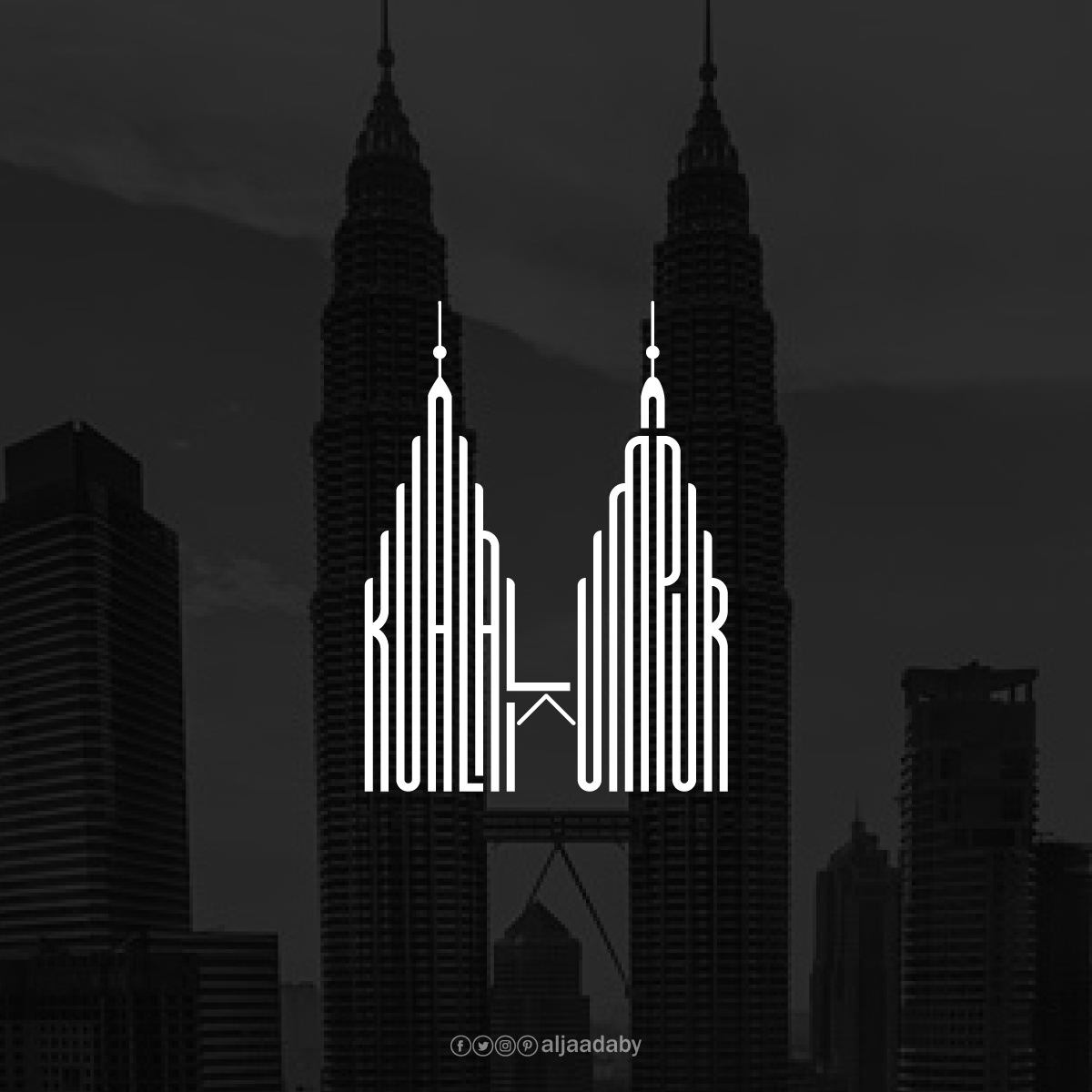
Kuala Lumpur
Petronas Towers
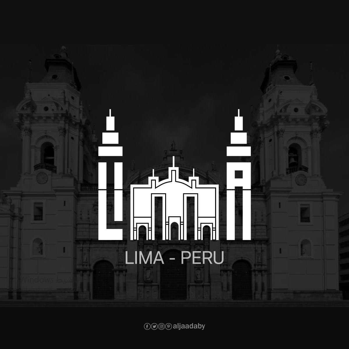
Lima
Basilica and Convent of San Francisco, Lima
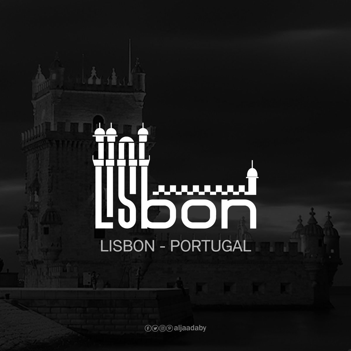
Lisbon
Belém Tower
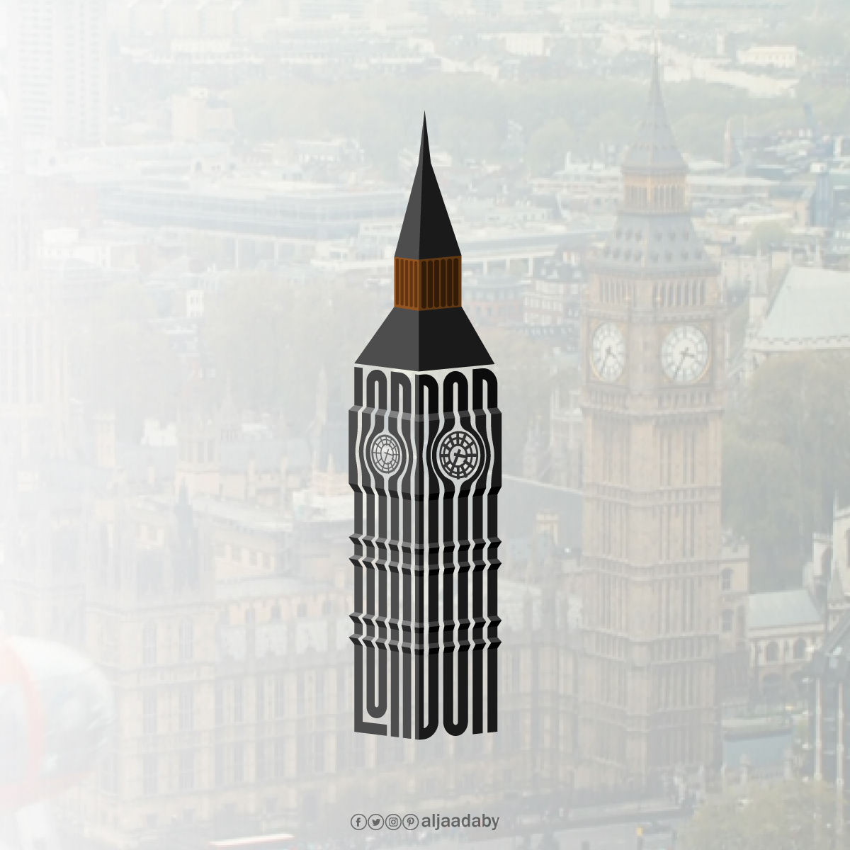
London
Big Ben
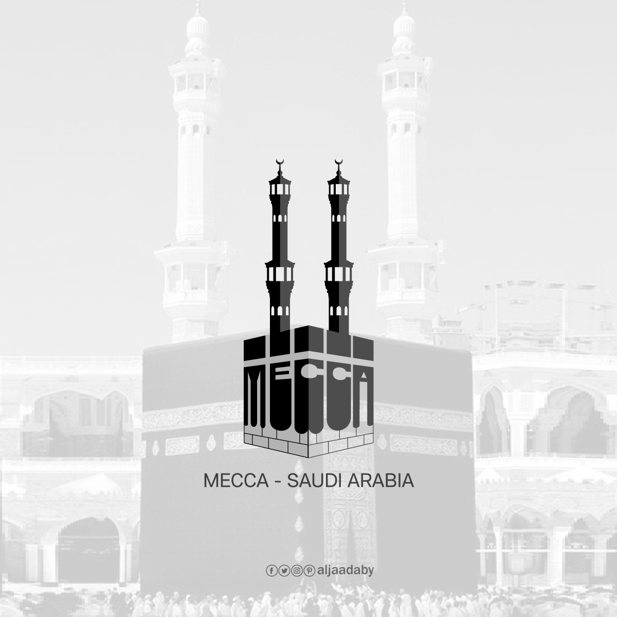
Mecca
Kaaba
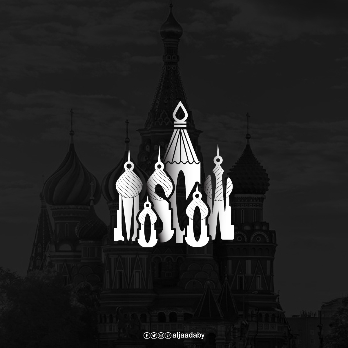
Moscow
St. Basil’s Cathedral
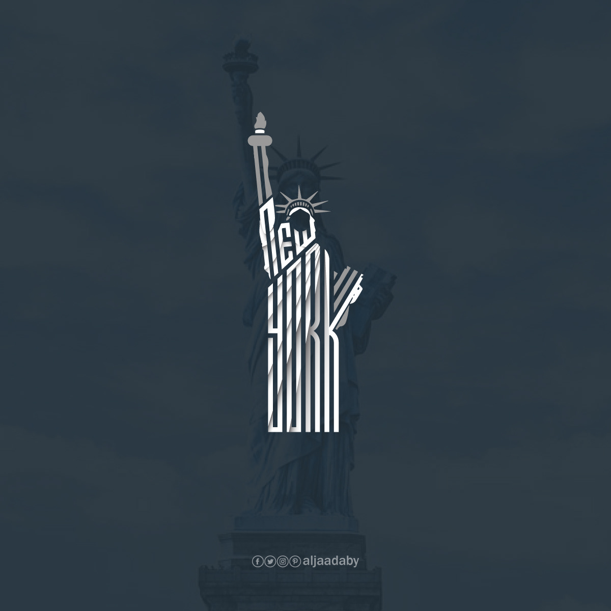
New York
Statue of Liberty
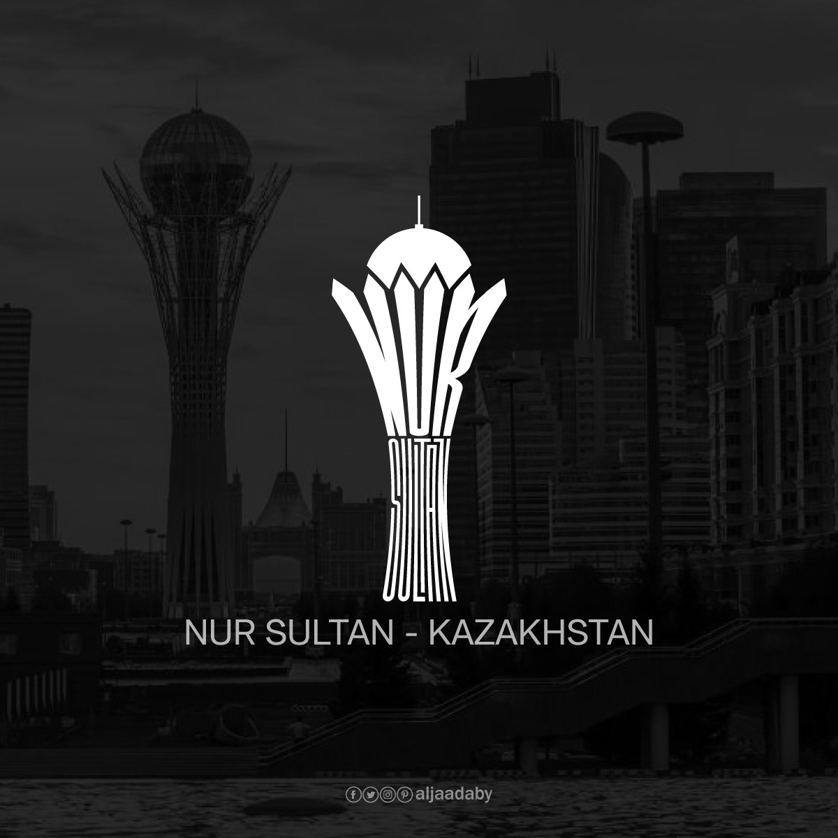
Nur Sultan
Baiterek
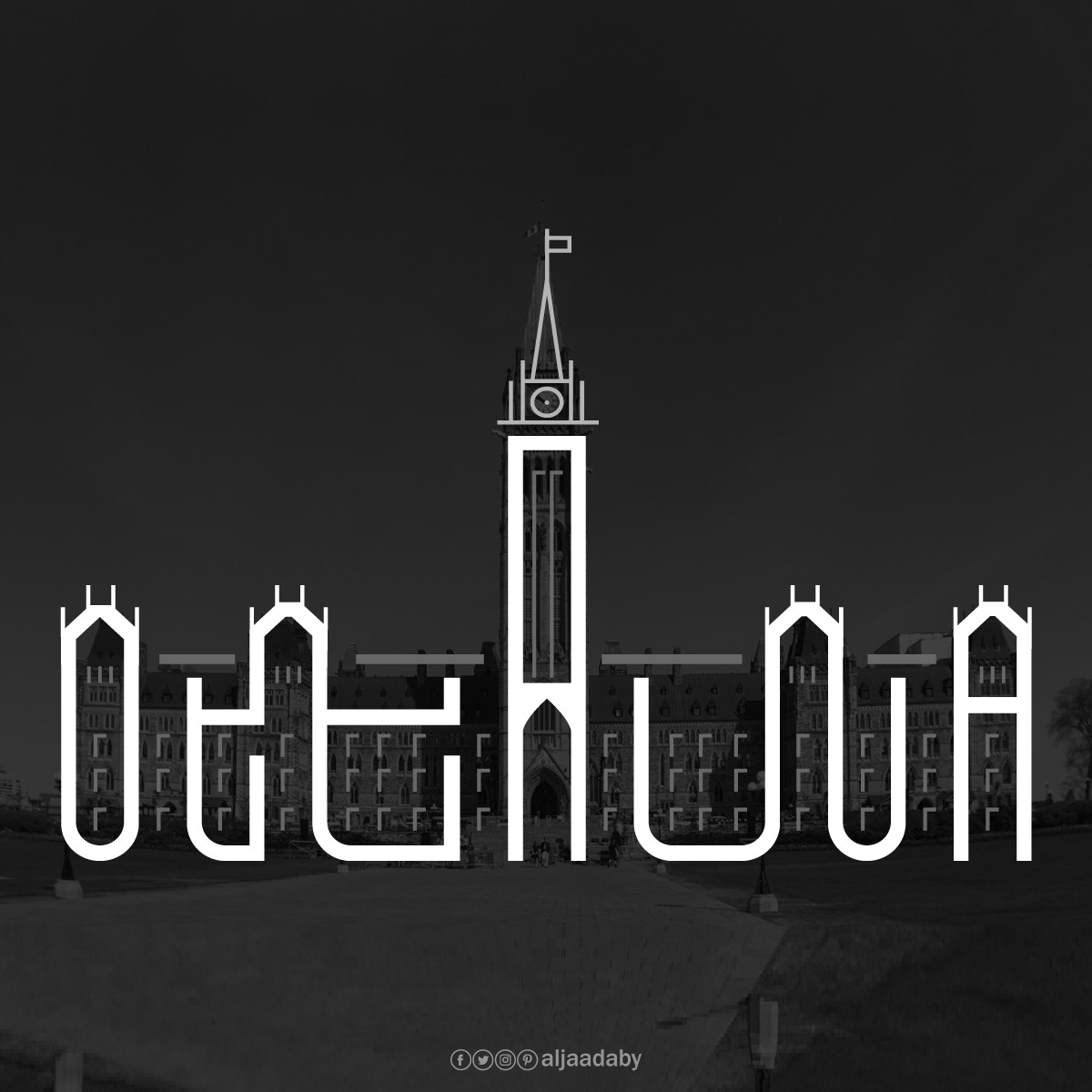
Ottawa
Centre Block
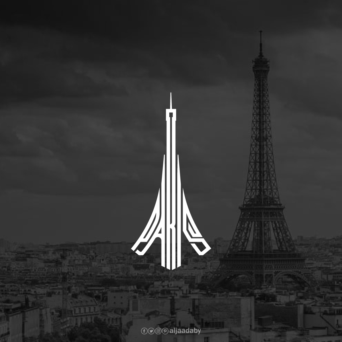
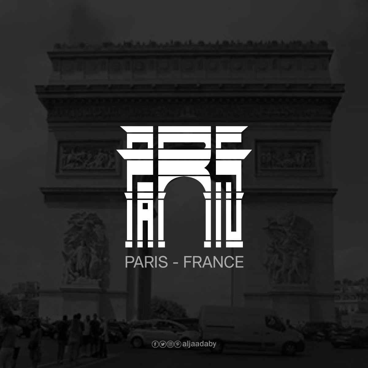
Paris
Eiffel TowerArc de Triomphe
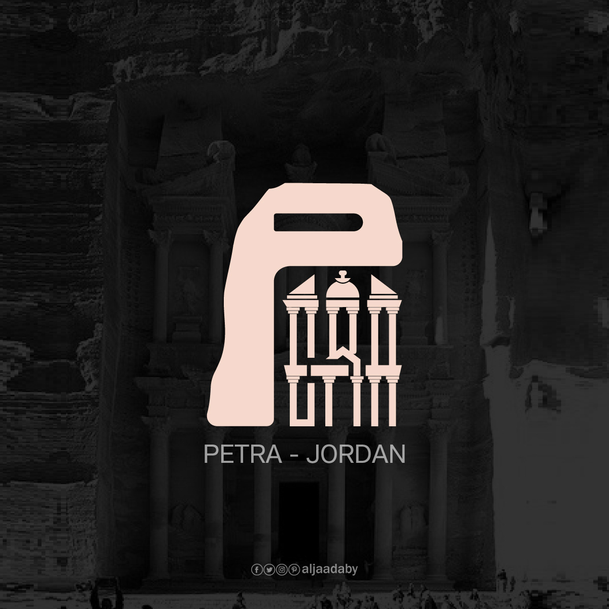
Petra
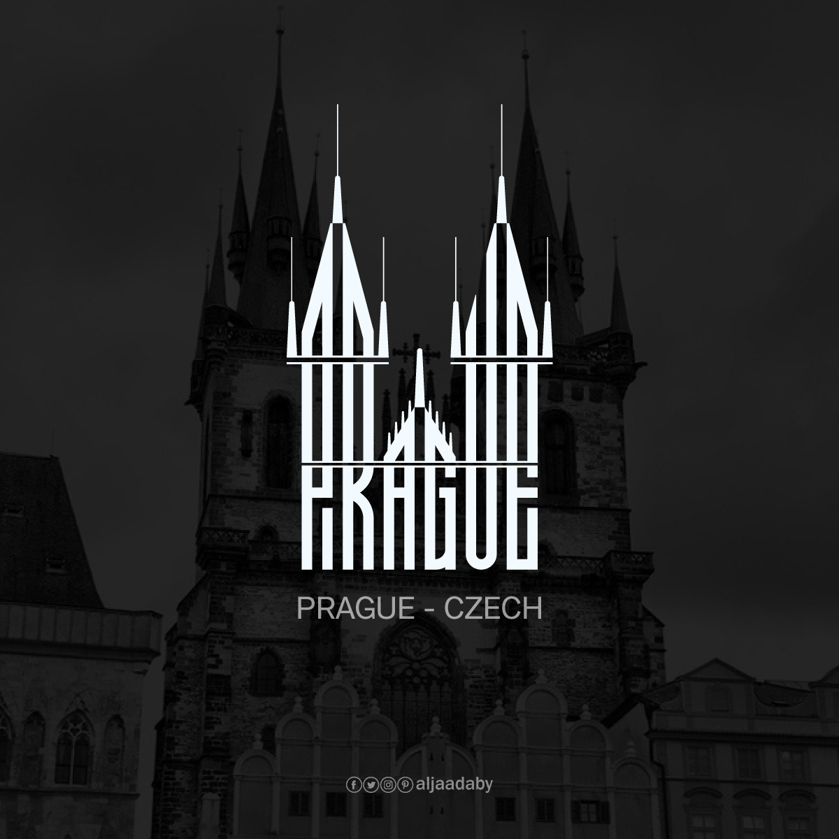
Prague
Church of Our Lady before Týn
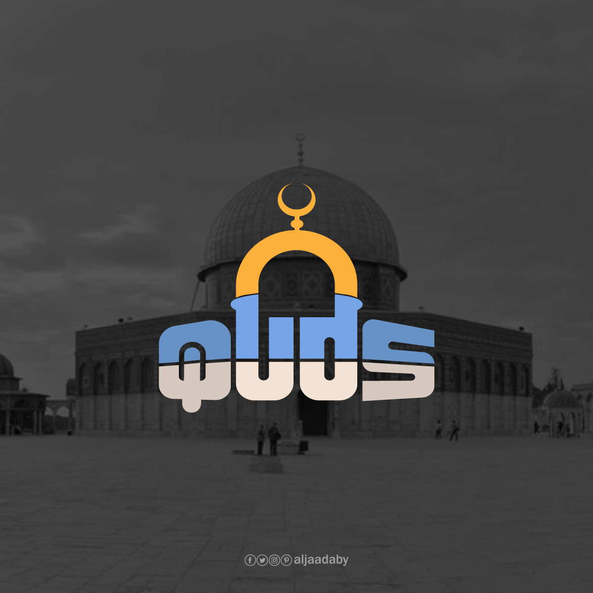
Quds
Al-Aqsa Mosque
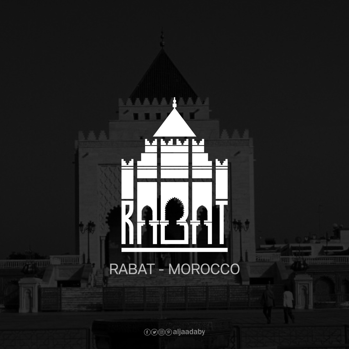
Rabat
Mausoleum of Mohammed V
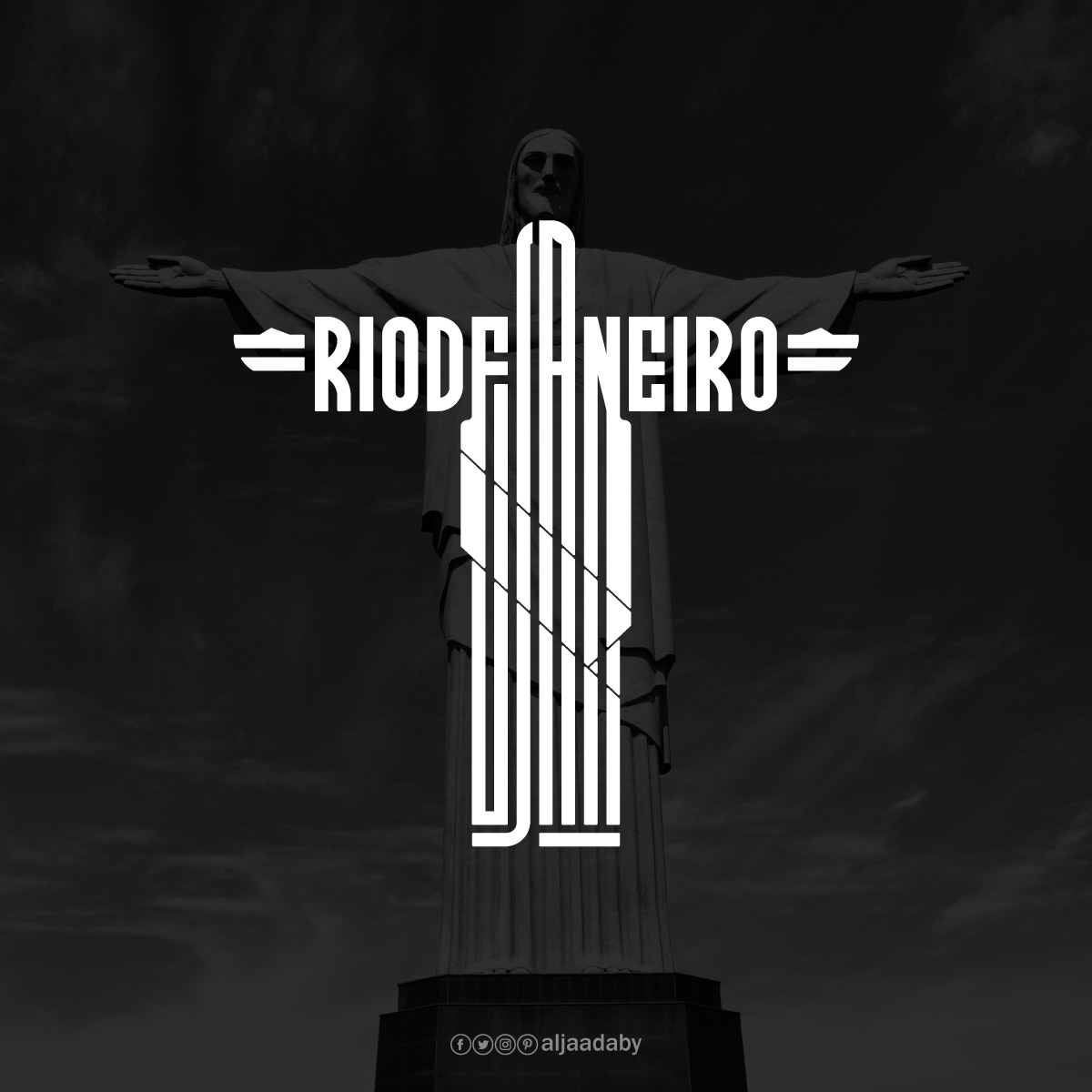
Rio de Janeiro
Christ the Redeemer Statue
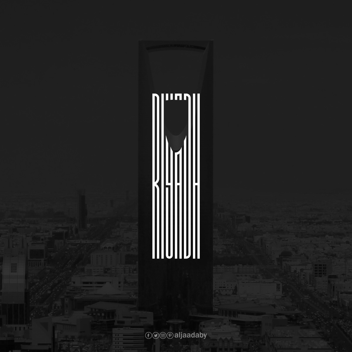
Riyadh
Kingdom Centre
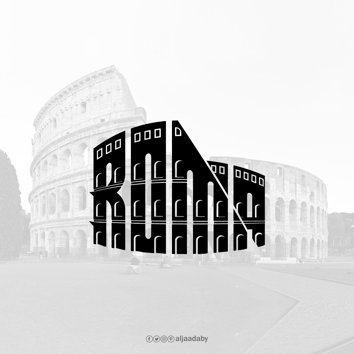
Roma
Colosseum
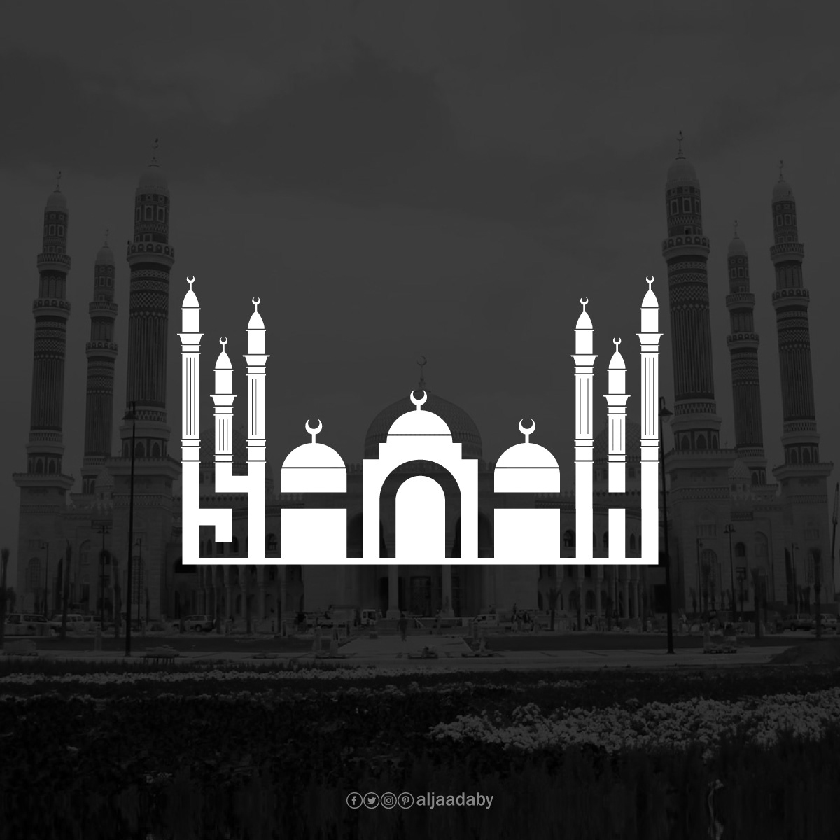
Sanaa
Al-Saleh Mosque
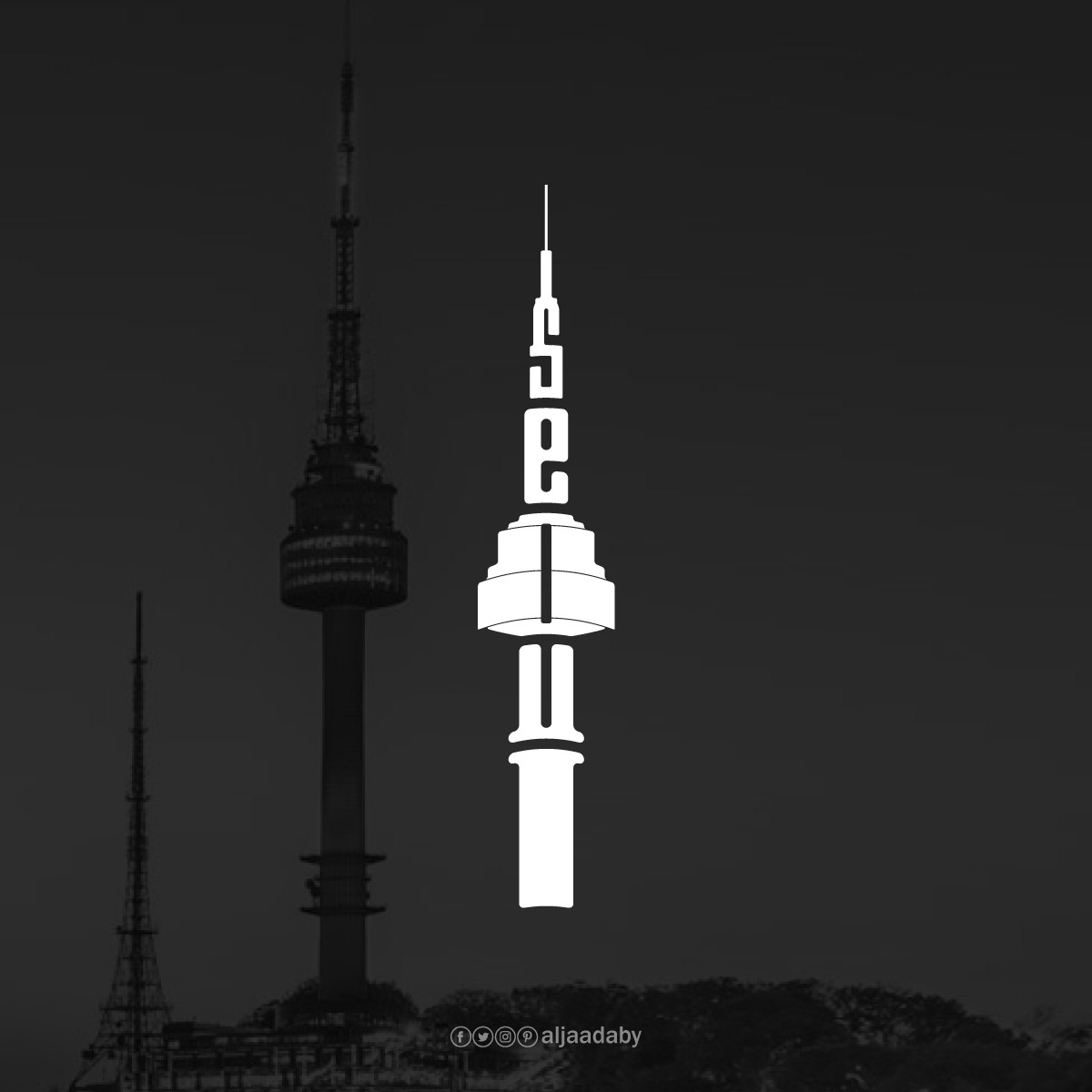
Seoul
N Seoul Tower
Sydney
Sydney Opera House
Taipei
Taipei 101
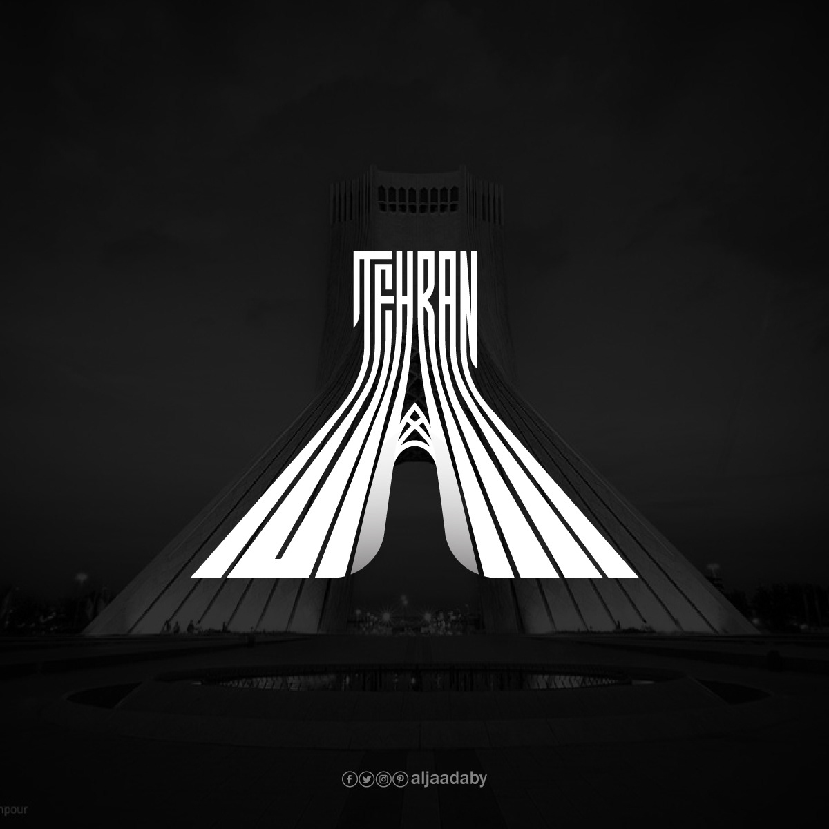
Tehran
Azadi Tower
Tokyo
Tokyo Skytree
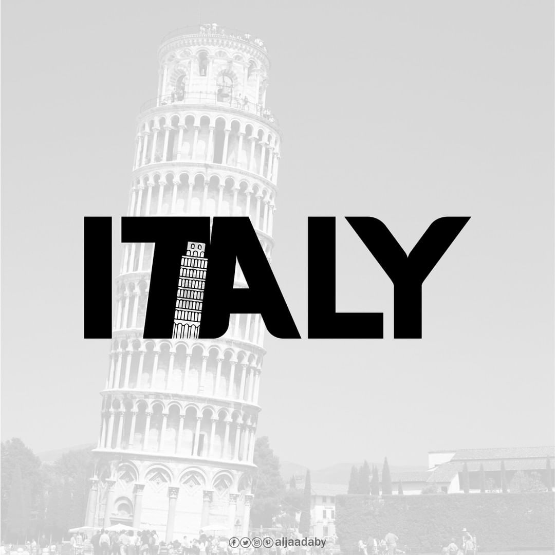
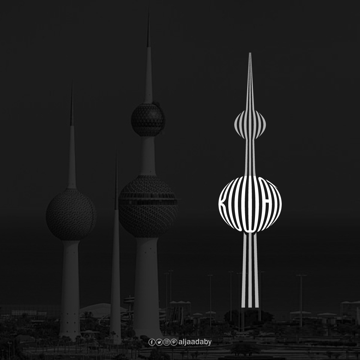
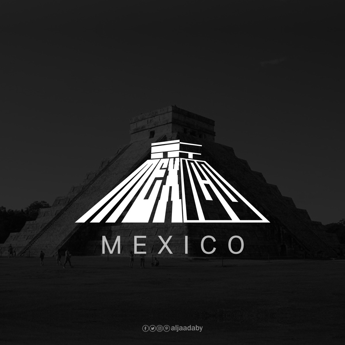
Aljaadaby also created these three country logos:
Italy
Leaning Tower of Pisa
Kuwait
Kuwait Towers
Mexico
Temple of Kukulkan
See How the Dubai Logo Was Built in Adobe Illustrator
So how would you approach a challenge like this? Every city hands you a different problem. Some names sit naturally left to right, so the landmark has to spread wide like an arena or a gate; others read best stacked top to bottom, letting a tall tower carry the whole word upward. Do you start from the building’s silhouette and force the letters to fit, or start from the word and find the structure hiding inside it? Where do you let a letter bend, and where do you protect it so the name still reads? There’s rarely one right answer, which is half the fun of it.
There’s a name for this craft: the calligram, a word or phrase arranged so its letters form an image of what they describe. It’s a centuries-old form, from Arabic and Persian poetry shaped into animals and mosques to Apollinaire’s verses printed in the outline of an Eiffel Tower, and it’s enjoying a quiet revival in modern logo and lettering design.