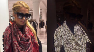
If you've ever dreamt of wearing an invisibility cloak from folklore, this device could be the next best thing. Created by London-based fashion entrepreneur Saif Siddiqui, the ISHU scarf makes it impossible for photographers to take a picture of the wearer, with the flash on. How it works: The scarf is made of a special fabric that contains thousands of nano-spherical … [Read more...]
29 Clever Illustrations That Take The Most Unexpected Turns
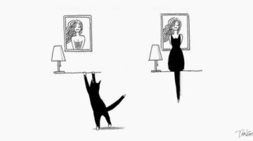
Chinese artist Gao Youjun a.k.a. Shanghai Tango is a popular cartoonist on the Chinese social network Weibo with over half a million followers. His comics usually consist of two distinct objects or animals interacting with each other and their funny, coincidental connections. He began drawing these illustrations in 2010 when a friend advised him to open a Weibo account and … [Read more...]
This Designer Has The Best Reply To People Who Ask Him To Photoshop Their Pics

Looking for someone to Photoshop your photos? James Fridman is the man. The master designer can make you look slimmer, taller and fitter in an instant. He can also remove unwanted people or add famous monuments in the background so that you can show off to your friends. Check it out below. … [Read more...]
27 Amazing Body Art Illusions That Will Make You Go Wow
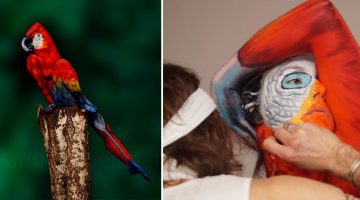
Johannes Stoetter is a self-taught artist, musician and fine art body painter born and based in South Tyrol, Italy. After completing his education at the University of Innsbruck in Austria, he developed a curious interest in body art and crafted his own unique style and technique of body painting. In 2009, he joined the international body painting community at the World … [Read more...]
Two Students Created A Short Animation That Changed Their Lives – It Won 59 Awards And Got Them Jobs At Pixar And Disney
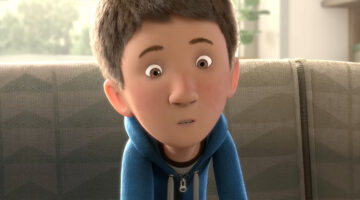
Short films have a unique ability to tell powerful stories in just a few minutes. Some leave audiences in awe, others bring them to tears, and a select few go on to shape the careers of their creators. For aspiring animators, getting a foot in the door at studios like Disney and Pixar is a dream come true. While many take years to land such opportunities, some manage to grab … [Read more...]
This Guy’s Magazine-Style Resume Got Him An Internship At GQ London, Without An Interview
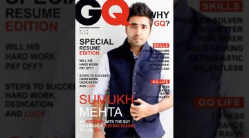
Talk about standing out from the crowd. 21-year-old Sumukh Mehta from Bangalore, India, created a 20-page magazine-style resume to apply for a marketing job at GQ. He filled the inner pages with information about his work experience, skills, education, etc. and made them look exactly like the editorial spread of a magazine. … [Read more...]
32 Creative Loading Animations That Are Worth The Wait
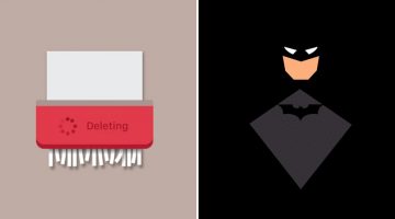
47% of users expect a webpage or an app to load in 2 seconds or less. After 4 seconds, the average user starts getting frustrated and after 8 seconds, they leave. In fact, a one second delay in your site speed can result in a 7% reduction in customer conversions. Loading time is crucial to the success of your site, app or program and if you can keep the user engaged for … [Read more...]
Husband Shares Precious Moments Spent With Wife By Drawing 1 Sketch Every Day For A Year
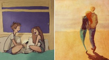
Curtis Wiklund is a Michigan-based wedding photographer and illustrator. After an inspiring conversation with his wife Jordin, who was involved in a 365-day photography project, he came up with the idea of a daily sketch blog to document the precious moments they spend together. He drew one illustration every day for 365 days and created a series of adorable sketches that … [Read more...]
13 Colorful Animal Logos Made From 13 Perfect Circles
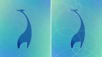
Paris-based designer and art director Dorota Pankowska was inspired by the simplicity of the Twitter logo, which was created using a pattern of 13 circles. She decided to challenge herself and see what other animals could be created using the same design principles. The result? Check it out below. … [Read more...]
Clever Hyundai Ads Make Objects Disappear When You Move Closer To The Screen
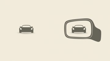
The 'No Zones' sensor on the new Hyundai Elantra detects oncoming traffic in your blind spots and alerts you accordingly. To promote this feature, Ukrainian agency Tabasco has come up with a brilliant campaign that shows how blind spots affect your vision while driving. … [Read more...]
37 Amazing Ads That Use Negative Space Brilliantly
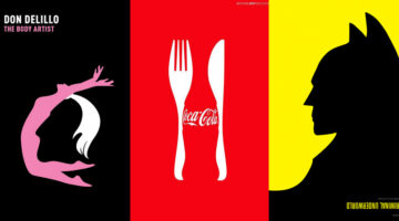
In art and design, negative space is the background space around the main object of an image. In a two-tone image (eg. black and white), the object is usually depicted in a darker color (black) than the background (white), thereby forming a silhouette. Sometimes, the tones are reversed and white is used to fill the silhouette (refer Coke examples below). When an artist … [Read more...]
16 Clever Typographic Movie Titles
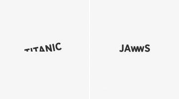
Istanbul-based digital creative Ali Erkurt has created a series of typographic movie titles that subtly hint at the plot or the central elements of the films. So, the 'w' in Jaws looks like the teeth of a shark, the 'i' in Matrix is replaced with the number 1 (the chosen one), the 'o' in Indiana Jones looks like his whip, and so on. Check them out below. … [Read more...]
Art Director Creates Memes That Show What A Designer’s Life Is Really Like
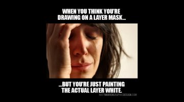
Using the famous 'crying girl' meme, Utah-based art director Matt Warren has created a series of memes that highlight the everyday struggles of designers. From Photoshop tools to plain ol' client stupidity, Matt has covered some relatable topics that every designer will identify with. Check them out below. … [Read more...]
How Cool Is This Life-Size Sand Sculpture Of An Elephant Playing Chess With A Mouse?
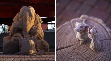
Renowned sculptor Ray Villafane and artist Sue Beatrice created this incredible 9-foot tall sand sculpture of an elephant playing chess with a field mouse, at the Sanderson Lincoln Pavilion in Carefree, Arizona. The elephant's name is Chessie Trunkston and the mouse is Hershel Higginbottom. The sculpture is on display till August, so if you’re in the area by then, do check it … [Read more...]
Designer Shares 10 Lessons He Learnt From Working In An Agency
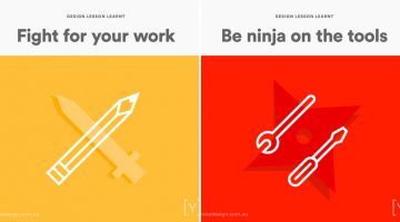
Agency life is not for everyone. The fast-paced, deadline-driven environment saps your creative juices faster than you can say "brand positioning". You do however learn a lot - like how to go three days without a shower, how to claim free meals by billing them to the client, etc. It's definitely an experience that every creative should go through before switching to the client … [Read more...]
10 GIF Memes Only Graphic Designers Will Understand
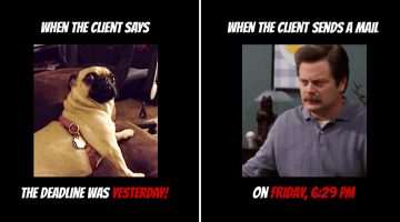
The best part about being a member of the creative tribe is that we can relate to one another, no matter which part of the globe we're in. It's not just our passion for creativity, our quirks, and our intolerance for mediocrity that bind us. It's because we all have that one annoying ass client from hell. … [Read more...]
Copywriter vs. Art Director vs. Developer – 11 Clever Posters That Show The Differences
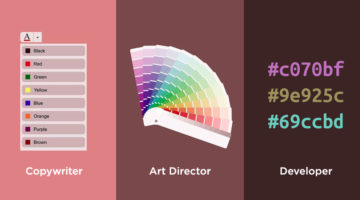
Even though they work towards a common objective, copywriters, designers, and developers could not be more different to each other. They all come with their own set of quirks and idiosyncrasies. Recently, we published a cool series of illustrations on Copywriters vs. Art Directors. Someone shared that article with Imgur user PickAndWhammy, after which, he decided to add a … [Read more...]
What Logos Of Famous Companies Looked Like When They First Started Out
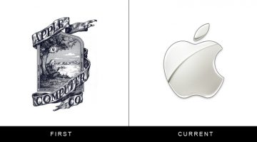
The logos of brands like Apple and IBM are iconic now, but when most of these companies started out, their logos were awkward, clip-arty and looked like they had been designed by amateurs on a budget. With time, they shed their extra weight and evolved into aesthetically pleasant shapes thanks to legendary artists like Paul Rand who were masters of brand identity … [Read more...]
28 Creative Tea Bag Designs For Tea Lovers
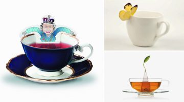
Which is the world's most widely consumed drink after water? It's not coffee or Coke. It's tea. And we're not surprised. Not only is it healthier and cheaper than coffee but also predates it by about 3000 years. It even keeps Mother Earth happy by leaving a smaller carbon footprint and wasting fewer resources in trade. … [Read more...]
Color Palettes From Famous Movies Show How Colors Set The Mood Of A Film
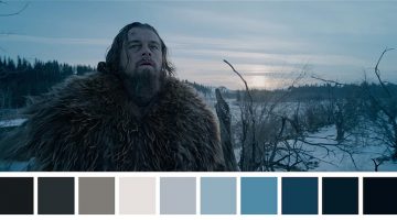
Color sets the tone and mood of a film before any of the actors have even uttered a word. Directors Lilly and Lana Wachowski used a green tint in The Matrix (1999) to create a mood palette that was suggestive of the early monochrome computer monitors. Yellow was used in Kill Bill (2003) to depict Uma Thurman’s character’s madness and instability. Romantic comedies use pastel … [Read more...]
Designer Challenges Himself To Create 30 Animal Logos In 30 Days Using The Golden Ratio
Ukranian designer Andriy Yurchenko took on a 30-day logo challenge to create one animal logo each day, using the principles of the golden ratio. The Kyiv-based artist specialises in web, UI/UX, and identity design. For this project he used Adobe Illustrator, Photoshop, and experimented with different color schemes to get the desired look. Check it out below. … [Read more...]
27 Beautiful Sci-Fi GIFs That Will Leave You Mesmerized
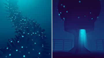
New York-based artist Carl Burton blends elements of science fiction and surrealism to create stunning monochromatic GIFs/cinemagraphs that have a hypnotic, dream-like feel to them. He uses Cinema 4D, Photoshop and After Effects to create these animated illustrations that are "influenced by nature, architecture, mundane environments and the news," he says. … [Read more...]
15 Signs You Need To Let Your Client Go
We creative types are not known for our patience. We freak out over what to eat when we see an ugly menu at a restaurant. We don't follow road signs if they're written in Comic Sans. But when it comes to clients, we listen, we hear and we understand. We're patient because (a) we want to use our creative skills to solve their problems and (b) they're paying us, damn it. … [Read more...]
This Graphic Designer Uses Her Design Skills To Make The Most Awesome Cookies
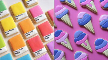
Los Angeles-based graphic designer Holly Fox combines her passion for design and baking by creating these yummy sugar cookies that are adorable to look at. Her culinary creations double as aesthetic delights, turning each bite into a colorful visual feast. Holly started baking in 2011 to try and see if she could figure out royal icing. After experimenting with different … [Read more...]
24 Useful Design Tips That’ll Help You Create A Better Logo
Most small scale businesses on modest design budgets end up with amateurish logos that use stock art, are overly complex or follow trends that look outdated in a year. No use blaming the cheap freelancer, the owners themselves don’t know what they want. … [Read more...]
19 Pun-Filled Posters That Graphic Designers Will Relate To
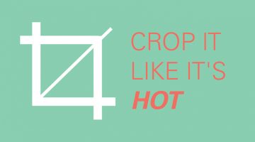
Here's a cool collection of funny posters about graphic design and typography from Dubuque-based marketing executive Sara Heffernen. Using puns on design terms and font names, Sara tells you to "Crop it like it's hot" and have a "Helvetica good time". The posters also advise you to practice safe sex design by using a condom concept and to choose sensibly between common sense … [Read more...]
20+ Clever Illustrations That Have The Weirdest Twists
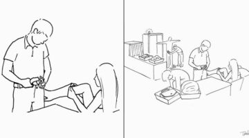
If you like witty visual humour you'll love these illustrations by Chinese artist Shanghai Tango that take the most unexpected turns in the final frame. Tango, whose real name is Gao Youjun, graduated from Tsinghua University's Academy of Arts & Design. He's been working in advertising since 1995 and now runs an agency of his own. Alongside his day job, Tango is a … [Read more...]
25 Amazing Sculptures That Will Make You Go Wow
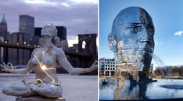
Cities across the globe are home to beautiful modern works of art, forged out of stone and metal by master sculptors and artists. No matter where you are or where you travel, you’ll find awe-inspiring sculptures that demonstrate the creative capacity of the human mind. From Singapore to Switzerland, New York to New Zealand, here’s a list of 25 such masterpieces that will leave … [Read more...]
Artist Uses Everyday Objects To Complete His Sketches
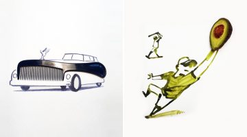
Renowned illustrator and graphic designer Christoph Niemann draws a fun series of doodles he calls 'Sunday Sketches'. He uses everyday objects like fruits, cutlery, household tools, etc. as the centrepiece and draws the artwork around them in a way that the item completes the sketch. So, a comb becomes the front grill of a Rolls Royce, an avocado becomes a baseball glove, an … [Read more...]
What Do The World’s Most Popular Logos Have In Common?
Logos may look different at first glance, but many of the world’s most successful brands share disciplined design choices. Across industries, clear patterns emerge in color, typography, shape, and structure. Strong logos are not accidental. They are built for clarity, memorability, and long term recognition. … [Read more...]
5 Color Choices You Must Avoid When Designing For The Web
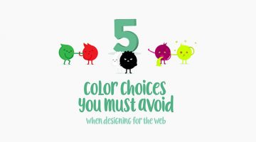
When it comes to web design, colors play a vital role in increasing conversions, reducing bounce rate and ensuring a smooth user experience. We often see websites compromising on readability by using light-colored text on light backgrounds. Also, it's never ok to use red and green in excess, even if you're making a Christmas-themed website. … [Read more...]
Pun-Based City Logos Created Using Words Within Their Names
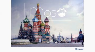
Bucharest-based designer/photographer Raluca Popescu was trying to create a representative banner for a travel agency, when she came up with the idea of creating pun-based city logos using words within their names. So the logo for Moscow has a cow in it, the logo for Cambridge has a bridge, Budapest has Buddha, and so on. Check them out below. … [Read more...]
Incredible Illustrations Of Zodiac Signs By Andreas Preis
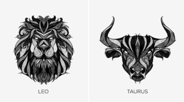
Whether you believe in astrology or not, these stunning illustrations of Zodiac signs by German artist Andreas Preis will leave you gobsmacked. Preis created this series while recovering from a knee surgery over a period of two months. He drew the artwork on paper and used Photoshop for post production. Preis' skill set includes illustration, murals, tape art and live … [Read more...]
Elegant Typography Posters That Give You Font And Color Ideas For Your Next Project
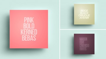
Lisbon-based designer/copywriter Filipe de Carvalho has created a series of self-descriptive posters titled MetaType that show the colors, fonts and text-styles used in them. Filipe works as a copywriter for excentricGREY and has created award-winning work for brands like Vodafone, Volvo, Samsung, Chevrolet and Heineken to name a few. … [Read more...]
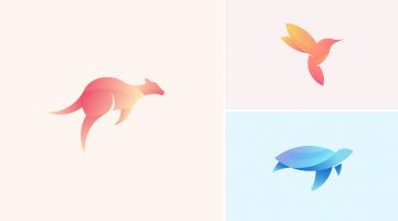
Beautiful, Vibrant Animal Logos Based On The Golden Ratio
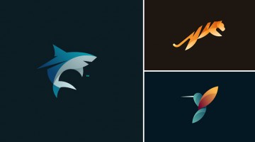
Here's a gorgeous collection of animal logos by Tom Anders Watkins, a half Finnish, half English, self-taught designer from Lincoln, UK. The 21-year-old is a multi-disciplined advertising creative and has won numerous awards such as Student of the Year from the Art Directors Club of Europe, D&AD New Blood and Adobe Photoshop's 25 Under 25. … [Read more...]
- « Previous Page
- 1
- …
- 17
- 18
- 19
- 20
- 21
- …
- 25
- Next Page »