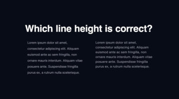
One of the key differences between an amateur designer and a professional designer is the way in which they set their type. Professional designers know how many fonts to use and in what size. They know what the correct line-height is, the optimum paragraph length, the right contrast ratio, etc. Polish designer Tom Koszyk has come up with an excellent list of do's and don'ts … [Read more...]
8 Great Google Font Combinations For Your Next Design Project
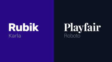
Previously, we featured 15 great Adobe Font combinations for your graphic, web, and UI design projects. In today’s post, we look at some beautiful Google Font combinations, with the help of this excellent list by Polish designer Tom Koszyk. Koszyk also suggests which font combinations to use for a particular type of app or website. For example, Merriweather and Libre … [Read more...]
35 Epic Memes For Graphic Designers
Are you in the middle of difficult project with a stiff deadline? Is your client giving you sleepless nights? Are you tired of your boss micromanaging everything? If yes, then what you need is a healthy dose of meme-therapy to help brighten up your day. In a study of 520 designers and developers, neuroscientists found that memes helped reduce work burnout by upto 64%. They … [Read more...]
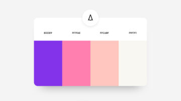
39 Beautiful Color Palettes For Your Next Design Project
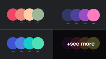
Looking for color schemes for your graphic, web, or UI design? Ocean.ui is a handy Instagram account that shares a beautiful new palette everyday, with hex codes of each color. They also share font combinations, patterns, and UI elements made using their color palettes. We’ve shortlisted some of the best palettes on the Ocean.ui page in terms of aesthetic appeal, usability, … [Read more...]
5 Tips To Design Call-To-Action Buttons That Get Clicks
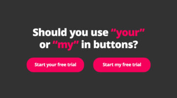
A call-to-action or CTA button is an interactive UI element that guides users to take certain actions on a website or application. For example: Sign Up, Book Now, Buy Now, Subscribe, etc. The objective of a CTA button is goal conversation for your website or application. It is the intended action you want the user to take, like buying your product, making a booking, signing … [Read more...]
AI Creates 100,000 Realistic Photos You Can Use For Free Without Copyright

For most design projects and presentations, you need quality portraits of people. Designers often spend a lot of time trying to find images that are free, diverse, and legal to use. To make life easier, Icons8 has come up with a brilliant free resource called Generated Photos - a diverse library of 100,000 realistic faces created by artificial intelligence. None of the … [Read more...]
Colors Used By Famous Brands (With Their Codes)
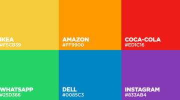
BrandColors is the largest collection of official colors of popular brands. It was created by Design Bombs to serve as a useful reference for brand color codes that are needed most often. The site features over 600 brands with 1600 colors, and the collection is ever-growing. You can search by brand name or color code. We've shortlisted some of the most well-known companies … [Read more...]
8 Great Adobe Font Combinations For Your Next Design Project

Previously, we featured 15 great Google Font combinations for your graphic, web, and UI design projects. In today's post, we look at some beautiful Adobe Font combinations, with the help of this excellent list compiled by Polish designer Tom Koszyk. Koszyk also suggests which font combinations to use for a particular type of app or website. For example, DIN and Neue Haas … [Read more...]
Top 7 Laws Of UX Design, Explained With Simple Graphics
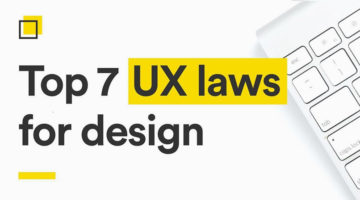
Dubai-based UI/UX designer Alejandro Ausejo has compiled a useful series of design tips titled "7 laws of UX design" based on several studies on human behavior and psychology by respectful scientists. These include: • Von Restorff Effect - Hedwig von Restorff • Hick’s Law - William Edmund Hick and Ray Hyman • Fitt’s Law - Paul Fitts • Zeigarnik Effect - Bluma Wulfovna … [Read more...]
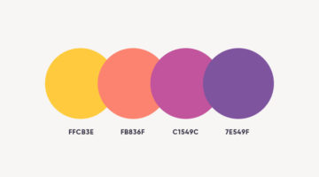
37 Beautiful Color Palettes For Your Next Design Project
Looking for color palettes for your graphic, web, or UI design? The Colour Lab is a handy Instagram account that shares a beautiful new palette everyday, with hex codes and gradients. The colors are derived from beautiful images of nature, architecture, and urban landscapes. If you design something using Colour Lab's palettes, you can get featured on their page as well. … [Read more...]
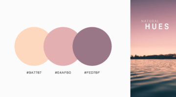
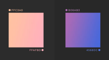
37 Beautiful Color Gradients For Your Next Design Project
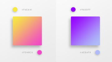
Vibrant colors and vivid gradients are one of the key trends in UI, web, and graphic design nowadays. Spain-based designer Yaroslav Iakovlev from Zeka Design has come up with a series of gradient color combinations that you can use in your next project. The hex codes of each color are mentioned on the palettes. Check them out below and tell us your favourites in the … [Read more...]
8 Useful Tips For Better UI Design
The success of an app or website depends significantly upon its UI/UX design. A recent study by Microsoft found that the average human attention span is down to 8 seconds, compared to 12 seconds in the year 2000. Users now have a lower tolerance for bad UI than ever before. If they can't find what they're looking for quickly enough, they will go elsewhere. Albanian UI/UX … [Read more...]
8 Important Rules For Perfect Icon Design
Icons are an essential element of UI design. They act as a visual aid for users to interact with the interface, identify options, and make selections. But as simple as they look, there are certain rules you should follow to ensure a seamless user experience. Albanian UI/UX designer Dorjan Vulaj has come up with a handy list of icon design rules inspired from the most used … [Read more...]
8 Must-Have Chrome Extensions For Designers
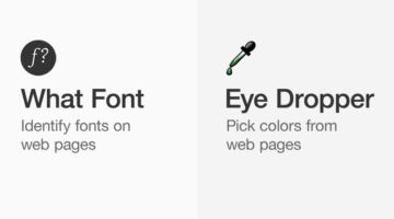
Chrome has a 63.69% market share and most designers prefer the Google-powered browser for its speed, UI, and the ability to add useful extensions. Albanian UI/UX designer Dorjan Vulaj has come up with a handy list of Chrome extensions that can help you find design inspiration, identify fonts and colors from web pages, view CSS, take full page screenshots, generate palettes, … [Read more...]
13 Useful Tips For Better Typography
"Typography is an art. Good typography is art." - Paul Rand. Good typography is what separates the pros from the rookies. It's not just about picking the right font and selecting the right size. It's about attention to details. It's about knowing how much to kern, lead, track, and justify. It's about knowing when to use uppercase and lowercase, and what weights to use. … [Read more...]
8 Important Rules For Perfect Button Design
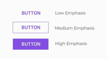
Buttons are an omnipresent element of UI design. They allow users to interact with the interface, select options, and make choices. But as simple as they look, there are certain rules you should follow to ensure a seamless user experience. Albanian UI/UX designer Dorjan Vulaj has come up with a handy list of button design rules inspired from the most used design systems at … [Read more...]
8 Important Color Rules For UI Design
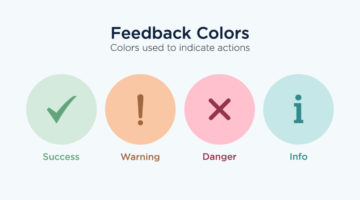
Color is one of the most important elements of UI design. Most rookie designers find an elegant palette online and incorporate the colors into their design, without considering branding, functionality, and accessibility issues like color blindness. London-based product designer Zander Whitehurst has come up with a handy list of color rules every UI designer should know. He … [Read more...]
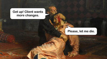
32 Epic Memes For Graphic Designers
Stuck in the middle of tough project with a stiff deadline? Is your client being an unreasonable prick? Has your boss put the entire workload on you? If yes, then now is the time to indulge in some meme-therapy and brighten up your day. Memes have been scientifically proven to reduce work-related burnout by upto 57%. In a study of 480 designers and developers, … [Read more...]
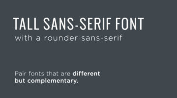
11 Great Font Combinations For Your Next Design Project
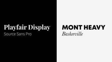
One of the best ways to tell an amateur designer from a seasoned professional is by their font pairings. A good designer knows which fonts complement each other, and how to strike typographical balance by using contrast and hierarchy. Here's a list of 10 golden rules of typography that'll help you get it right. If you're looking for examples of good font pairings, Kalypso … [Read more...]
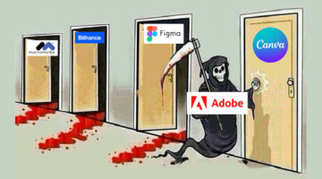
Free And Cheaper Options To Photoshop, Illustrator, And Other Adobe Creative Software
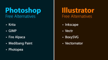
Freelance illustrator, artist, and author Michael Sexton has compiled a list of free and cheaper (single purchase) alternatives to Adobe Photoshop, Illustrator, InDesign, Animate, Lightroom, Dreamweaver, After Effects, and Audition. Michael created the list after Adobe's recent price hike of its photography plan from $9.99 to $19.99. After an outcry from creatives, the price … [Read more...]
32 Beautiful Color Palettes With Their Corresponding Gradient Palettes
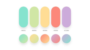
Looking for color palettes for your graphic, web, or UI design? Mr.Pugo is a handy Instagram account that shares beautiful color palettes (with hex codes) and also their corresponding gradient palettes. We’ve shortlisted some of the best ones in terms of aesthetic appeal, usability, and current design trends. Check them out below and tell us your favourites in the … [Read more...]
21 Beautiful Free Fonts For Your Next Design Project
As a designer, no matter how many fonts you have on your system, you always want more. You might use just a fraction of those fonts on a regular basis, but you need to have a gorgeous collection in your repository at all times. And what's the one thing designers love more than a beautiful font? A beautiful font that's available for FREE! Today's post is a collection of 21 … [Read more...]
What Is The Golden Ratio, And How To Use It In Graphic Design

The Golden Ratio, also known as the Golden Section or Divine Proportion, is a mathematical ratio of 1:1.618 based on the Fibonacci sequence. It can be found in nature (flower petals, seeds, shells), in food (artichokes, broccoli, pineapple), and in the human anatomy. The Golden Ratio can also be found in art (Mona Lisa, The Last Supper, Vitruvian Man) and architecture … [Read more...]
Need Images For Your Project? Create Your Own With This Useful Drag-And-Drop Tool
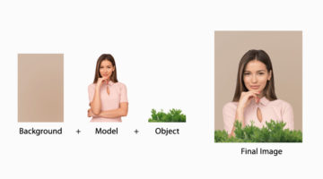
Design resource site Icons8 has come up with a handy web app called Mega Creator that lets you create realistic stock photos using drag-and-drop images of models, objects, and backgrounds. The app features over thousands of images with transparent backgrounds, so you can place one over the other and create your own composite in any size or aspect ratio. You can rotate, … [Read more...]
43 Beautiful Color Palettes For Your Next Design Project
Looking for color palettes for your graphic, web, or UI design? Awsmcolor is a handy Instagram account that shares a beautiful new palette everyday, with hex codes of each color. At the end of every month, they feature the top nine palettes for that month. If you create something exceptional using their palettes, you can get featured on their page as well. We've shortlisted … [Read more...]
41 Beautiful Color Palettes For Your Next Design Project
Looking for color palettes for your graphic, web, or UI design? Colours.cafe is a handy Instagram account that shares a beautiful new palette everyday, with hex codes of each color. They also hold design challenges in which users have to use a specific palette to create illustrations and calligraphy. The best works are then featured on their page. We've shortlisted some of … [Read more...]
10 Tips For Creating A Portfolio With WordPress
Are you a designer, photographer or other creatives? Then, you’ve definitely thought about how to make a lot of people get to know about what you do. Today, the Internet is one of the most effective ways to share information about you or the services you offer. Creating a portfolio web page you let people see your brand new works, the process of their creation, or check your … [Read more...]
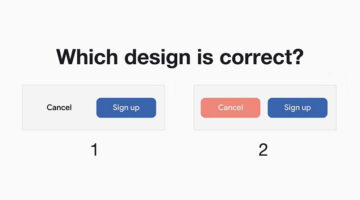
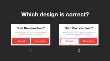
Only Expert Graphic Designers Can Reach The Platinum Level In This UI Design Quiz
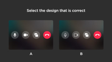
How sharp is your eye for UI/UX design details? Seattle-based UX designer Alex Kotliarskyi has created an addictive UI design quiz called Can’t Unsee that challenges your eye for detail. The web-based game presents two versions of iOS interface screens and asks you to pick which one is correct. Each right answer earns you coins, making the experience both fun and … [Read more...]
28 Epic Memes For Graphic Designers
Are you in the middle of a tough project with a stiff deadline? Is your boss or client being a d*ck? Are you tired of creating "Buy Two, Get One Free" flyers and banners? If yes, then indulge in some meme-therapy and brighten up your day. Scientific research has proven that memes help reduce work-related stress by stimulating the release of endorphins that trigger a sense of … [Read more...]
Free Photoshop Pack Of Beautiful Gradients For All Your Design Needs
Vibrant colors and gradients are one of the major trends in graphic, web, and UI design nowadays. To make life easier for designers everywhere, Paris-based graphic designer Leo Simon has compiled a set of 300 beautiful gradients into a Photoshop gradient file (GRD), available for free. We've shortlisted some of our favourites from Leo's collection and shared them below with … [Read more...]
Shit Clients Say – 13 Most Unforgettable Quotes
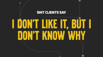
How many times have you had a client send a list of "final" changes AFTER they've approved the design? What about when they ask you to find an image from Google, or copy someone else's logo, or when they tell you to deliver designs by Monday after briefing on Friday? We all come across unreasonable client demands on a daily basis, but the folks at BeeWits have a dedicated … [Read more...]
This Brilliant Free Tool Can Remove The Background From Your Photo In Five Seconds
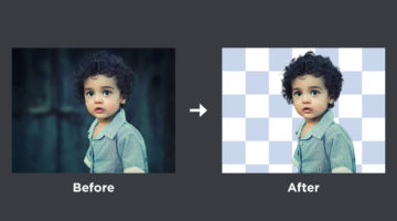
AI photo filter maker Kaleido has come up with a powerful online tool called Remove.bg that erases the background from any image in five seconds or less, and gives you a transparent PNG of the person/people in the image. It works 100% automatically, you don't have to mark the person or select the background and foreground layers manually. Just upload your image or enter its … [Read more...]
Simple, Useful Design Tips For UI/UX Designers
'Sparklin Design Tips' is a series of short, useful UI/UX tips by New Delhi-based digital agency Sparklin, shared every Tuesday on their social media channels. Using before-and-after mockup images, the team at Sparklin explains good UI/UX practices with visual examples, making them easy to understand and comprehend. Whether you're a newbie or a seasoned designer, these … [Read more...]
How To Stretch Images With Complex Backgrounds Like Trees And Buildings In Photoshop
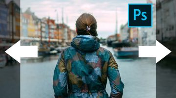
When you're designing a website or managing a social media page, sometimes you need a wide format image for your Facebook cover, Instagram post, or website hero image. But what if the image you like has a portrait orientation or isn't as wide as you want? A couple of posts ago, we featured a handy tutorial that showed you how to trick the Content-Aware Scale tool and extend … [Read more...]
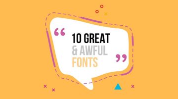
10 Great Fonts You Should Use, And 9 Awful Fonts You Should Avoid
"Typography is an art. Good typography is art." - Paul Rand. Font and typography choices can make or break your design. But with so many fonts to choose from nowadays, which ones should you use, and which ones should you avoid? Tom Cargill from Satori Graphics has come up with an excellent video that features ten prominent fonts used by professional designers, along with … [Read more...]